How to Color Scatterplot by a Variable in Matplotlib
How to color scatterplot by a variable in Matplotlib is an essential skill for data visualization enthusiasts and professionals alike. This article will delve deep into the various techniques and methods to achieve this effect, providing you with a thorough understanding of the process. We’ll explore different approaches, from basic to advanced, and offer numerous examples to illustrate each concept.
Understanding the Basics of Coloring Scatterplots in Matplotlib
Before we dive into the specifics of how to color scatterplot by a variable in Matplotlib, it’s crucial to understand the fundamentals. Matplotlib is a powerful plotting library for Python that allows for extensive customization of plots, including scatterplots. A scatterplot is a type of plot that displays values for two variables as a collection of points, where each point’s position on the horizontal and vertical axis indicates values for those variables.
When we talk about coloring a scatterplot by a variable, we’re referring to the process of assigning different colors to the points based on a third variable. This technique can reveal patterns or relationships in the data that might not be immediately apparent when using a single color.
Let’s start with a basic example of how to create a scatterplot in Matplotlib:
import matplotlib.pyplot as plt
import numpy as np

# Generate sample data
x = np.random.rand(50)
y = np.random.rand(50)

# Create a scatter plot
plt.figure(figsize=(8, 6))
plt.scatter(x, y)
plt.title('Basic Scatterplot - How to Color Scatterplot by a Variable in Matplotlib')
plt.xlabel('X-axis - how2matplotlib.com')
plt.ylabel('Y-axis - how2matplotlib.com')
plt.show()
Output:
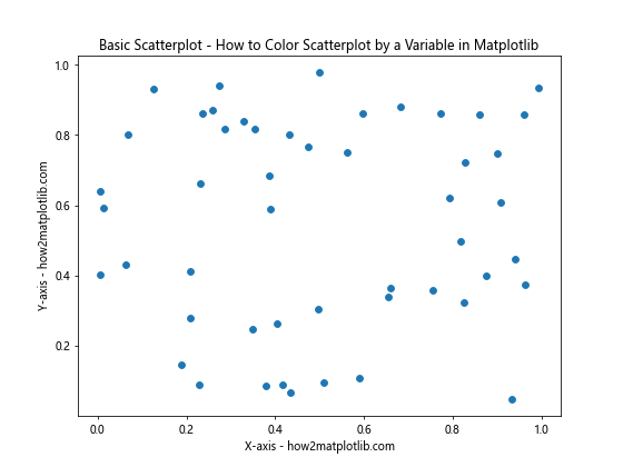
In this example, we’ve created a basic scatterplot using random data. However, all points are the same color. Our goal is to learn how to color scatterplot by a variable in Matplotlib, which we’ll explore in the following sections.
Coloring Scatterplot by a Continuous Variable
One common scenario when learning how to color scatterplot by a variable in Matplotlib is using a continuous variable to determine the color of each point. This can be particularly useful when you want to show a gradient or progression in your data.
Here’s an example of how to color scatterplot by a continuous variable in Matplotlib:
import matplotlib.pyplot as plt
import numpy as np

# Generate sample data
x = np.random.rand(100)
y = np.random.rand(100)
colors = np.random.rand(100)

# Create a scatter plot colored by a continuous variable
plt.figure(figsize=(10, 8))
scatter = plt.scatter(x, y, c=colors, cmap='viridis')
plt.colorbar(scatter)
plt.title('Scatterplot Colored by Continuous Variable - How to Color Scatterplot by a Variable in Matplotlib')
plt.xlabel('X-axis - how2matplotlib.com')
plt.ylabel('Y-axis - how2matplotlib.com')
plt.show()
Output:
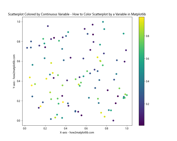
In this example, we’ve used the c parameter in the scatter function to specify the colors. The cmap parameter sets the colormap to use. We’ve also added a colorbar to show the range of values.
Using Categorical Variables to Color Scatterplots
Another important aspect of learning how to color scatterplot by a variable in Matplotlib is understanding how to use categorical variables. This is useful when you want to distinguish between different groups or categories in your data.
Here’s an example of how to color scatterplot by a categorical variable in Matplotlib:
import matplotlib.pyplot as plt
import numpy as np

# Generate sample data
x = np.random.rand(150)
y = np.random.rand(150)
categories = np.random.choice(['A', 'B', 'C'], 150)

# Create a scatter plot colored by a categorical variable
plt.figure(figsize=(10, 8))
for category in ['A', 'B', 'C']:
    mask = categories == category
    plt.scatter(x[mask], y[mask], label=category)

plt.title('Scatterplot Colored by Categorical Variable - How to Color Scatterplot by a Variable in Matplotlib')
plt.xlabel('X-axis - how2matplotlib.com')
plt.ylabel('Y-axis - how2matplotlib.com')
plt.legend()
plt.show()
Output:
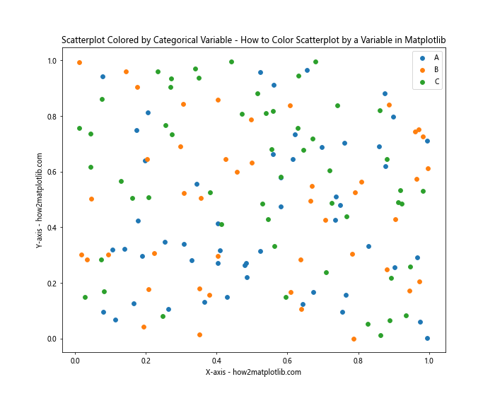
In this example, we’ve used a loop to plot each category separately, which allows us to assign different colors to each category automatically.
Advanced Techniques for Coloring Scatterplots
As we delve deeper into how to color scatterplot by a variable in Matplotlib, we’ll explore some more advanced techniques that can enhance your visualizations.
Using Custom Colormaps
Matplotlib provides a wide range of built-in colormaps, but sometimes you might want to create your own. Here’s how you can use a custom colormap to color your scatterplot:
import matplotlib.pyplot as plt
import numpy as np
from matplotlib.colors import LinearSegmentedColormap

# Generate sample data
x = np.random.rand(100)
y = np.random.rand(100)
z = np.random.rand(100)

# Create custom colormap
colors = ['red', 'yellow', 'green']
n_bins = 100
cmap = LinearSegmentedColormap.from_list('Custom', colors, N=n_bins)

# Create a scatter plot with custom colormap
plt.figure(figsize=(10, 8))
scatter = plt.scatter(x, y, c=z, cmap=cmap)
plt.colorbar(scatter)
plt.title('Scatterplot with Custom Colormap - How to Color Scatterplot by a Variable in Matplotlib')
plt.xlabel('X-axis - how2matplotlib.com')
plt.ylabel('Y-axis - how2matplotlib.com')
plt.show()
Output:
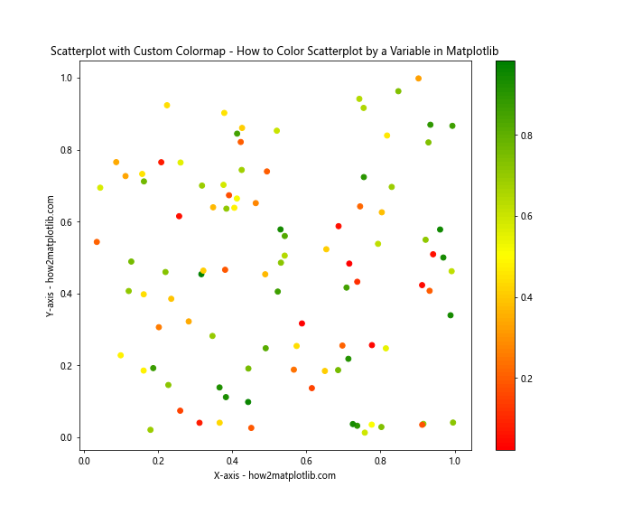
This example demonstrates how to create a custom colormap and use it to color your scatterplot. This technique gives you full control over the color scheme of your plot.
Coloring Scatterplot with Multiple Variables
Sometimes, you might want to color your scatterplot based on multiple variables. While this can be challenging, Matplotlib provides ways to achieve this effect. One approach is to use different visual elements to represent different variables.
Here’s an example of how to color scatterplot by multiple variables in Matplotlib:
import matplotlib.pyplot as plt
import numpy as np

# Generate sample data
x = np.random.rand(100)
y = np.random.rand(100)
size = np.random.rand(100) * 100
color = np.random.rand(100)

# Create a scatter plot colored by multiple variables
plt.figure(figsize=(10, 8))
scatter = plt.scatter(x, y, s=size, c=color, cmap='viridis', alpha=0.6)
plt.colorbar(scatter)
plt.title('Scatterplot Colored by Multiple Variables - How to Color Scatterplot by a Variable in Matplotlib')
plt.xlabel('X-axis - how2matplotlib.com')
plt.ylabel('Y-axis - how2matplotlib.com')
plt.show()
Output:
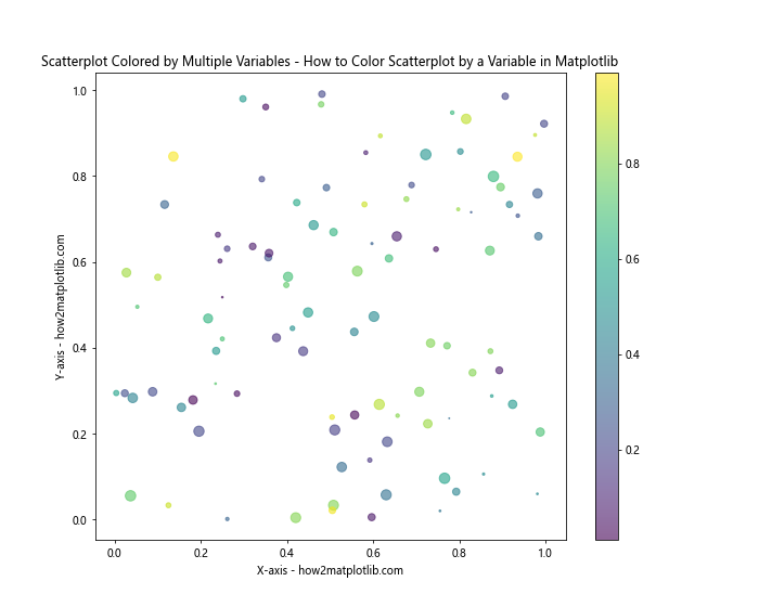
In this example, we’ve used color to represent one variable and size to represent another. This allows us to effectively visualize three dimensions of data on a 2D plot.
Combining Colored Scatterplots with Other Plot Types
Learning how to color scatterplot by a variable in Matplotlib opens up possibilities for creating more complex visualizations. You can combine colored scatterplots with other plot types to create rich, informative visualizations.
Here’s an example that combines a colored scatterplot with a contour plot:
import matplotlib.pyplot as plt
import numpy as np

# Generate sample data
x = np.random.rand(100)
y = np.random.rand(100)
z = x**2 + y**2

# Create a figure with two subplots
fig, (ax1, ax2) = plt.subplots(1, 2, figsize=(15, 6))

# Scatter plot
scatter = ax1.scatter(x, y, c=z, cmap='viridis')
ax1.set_title('Colored Scatterplot - How to Color Scatterplot by a Variable in Matplotlib')
ax1.set_xlabel('X-axis - how2matplotlib.com')
ax1.set_ylabel('Y-axis - how2matplotlib.com')
fig.colorbar(scatter, ax=ax1)

# Contour plot
xi = yi = np.linspace(0, 1, 100)
zi = np.zeros((100, 100))
for i in range(100):
    for j in range(100):
        zi[i, j] = xi[i]**2 + yi[j]**2

contour = ax2.contourf(xi, yi, zi, cmap='viridis')
ax2.set_title('Contour Plot - How to Color Scatterplot by a Variable in Matplotlib')
ax2.set_xlabel('X-axis - how2matplotlib.com')
ax2.set_ylabel('Y-axis - how2matplotlib.com')
fig.colorbar(contour, ax=ax2)

plt.tight_layout()
plt.show()
Output:
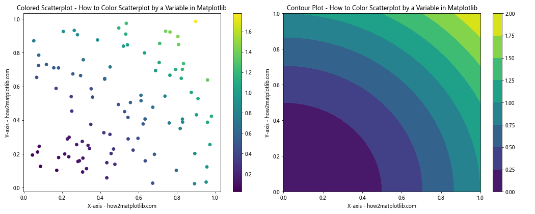
This example demonstrates how you can use the same color scheme across different plot types to create a cohesive visualization.
Handling Missing Data in Colored Scatterplots
When working with real-world data, you’ll often encounter missing values. It’s important to know how to handle these when creating colored scatterplots. Here’s an example of how to color scatterplot by a variable in Matplotlib while handling missing data:
import matplotlib.pyplot as plt
import numpy as np
import pandas as pd

# Generate sample data with missing values
n = 100
x = np.random.rand(n)
y = np.random.rand(n)
z = np.random.rand(n)
z[np.random.choice(n, 20, replace=False)] = np.nan  # Introduce missing values

df = pd.DataFrame({'x': x, 'y': y, 'z': z})

# Create a scatter plot with missing data
plt.figure(figsize=(10, 8))
scatter = plt.scatter(df['x'], df['y'], c=df['z'], cmap='viridis')
plt.colorbar(scatter)
plt.title('Scatterplot with Missing Data - How to Color Scatterplot by a Variable in Matplotlib')
plt.xlabel('X-axis - how2matplotlib.com')
plt.ylabel('Y-axis - how2matplotlib.com')

# Plot missing data points in a different color
missing = df[df['z'].isna()]
plt.scatter(missing['x'], missing['y'], c='red', label='Missing Data')

plt.legend()
plt.show()
Output:
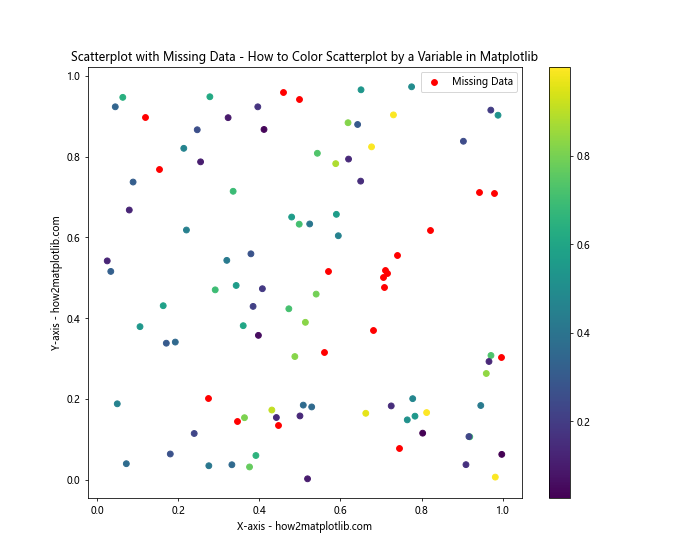
In this example, we’ve introduced missing values in our data and plotted them in a different color to distinguish them from the rest of the data points.
Creating Animated Colored Scatterplots
Animation can be a powerful tool for visualizing how data changes over time. Here’s an example of how to create an animated colored scatterplot:
import matplotlib.pyplot as plt
import numpy as np
from matplotlib.animation import FuncAnimation

# Generate initial data
n = 100
x = np.random.rand(n)
y = np.random.rand(n)
colors = np.random.rand(n)

# Create the figure and scatter plot
fig, ax = plt.subplots(figsize=(10, 8))
scatter = ax.scatter(x, y, c=colors, cmap='viridis')
ax.set_xlim(0, 1)
ax.set_ylim(0, 1)
ax.set_title('Animated Colored Scatterplot - How to Color Scatterplot by a Variable in Matplotlib')
ax.set_xlabel('X-axis - how2matplotlib.com')
ax.set_ylabel('Y-axis - how2matplotlib.com')

# Animation update function
def update(frame):
    global x, y, colors
    x += np.random.randn(n) * 0.01
    y += np.random.randn(n) * 0.01
    colors += np.random.randn(n) * 0.1
    scatter.set_offsets(np.c_[x, y])
    scatter.set_array(colors)
    return scatter,

# Create the animation
anim = FuncAnimation(fig, update, frames=200, interval=50, blit=True)

plt.show()
Output:
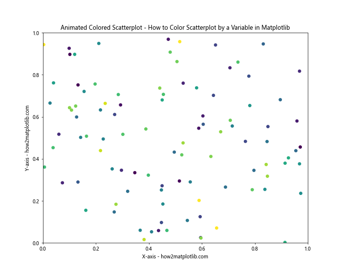
This example creates an animated scatterplot where the position and color of the points change over time.
Using 3D Scatterplots with Color
While we’ve focused on 2D scatterplots so far, it’s worth mentioning that Matplotlib also supports 3D scatterplots. Here’s an example of how to create a 3D colored scatterplot:
import matplotlib.pyplot as plt
import numpy as np
from mpl_toolkits.mplot3d import Axes3D

# Generate sample data
n = 100
x = np.random.rand(n)
y = np.random.rand(n)
z = np.random.rand(n)
colors = np.random.rand(n)

# Create a 3D scatter plot
fig = plt.figure(figsize=(10, 8))
ax = fig.add_subplot(111, projection='3d')
scatter = ax.scatter(x, y, z, c=colors, cmap='viridis')

ax.set_xlabel('X-axis - how2matplotlib.com')
ax.set_ylabel('Y-axis - how2matplotlib.com')
ax.set_zlabel('Z-axis - how2matplotlib.com')
ax.set_title('3D Colored Scatterplot - How to Color Scatterplot by a Variable in Matplotlib')

plt.colorbar(scatter)
plt.show()
Output:
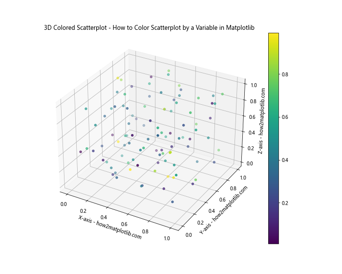
This example demonstrates how to create a 3D scatterplot where the color of each point is determined by a fourth variable.
Optimizing Color Schemes for Accessibility
When learning how to color scatterplot by a variable in Matplotlib, it’s important to consider accessibility. Not all color schemes are equally perceivable by all viewers, especially those with color vision deficiencies. Here’s an example of how to use a colorblind-friendly color scheme:
import matplotlib.pyplot as plt
import numpy as np
import seaborn as sns

# Generate sample data
x = np.random.rand(100)
y = np.random.rand(100)
z = np.random.rand(100)

# Set a colorblind-friendly color palette
sns.set_palette("colorblind")

# Create a scatter plot with a colorblind-friendly color scheme
plt.figure(figsize=(10, 8))
scatter = plt.scatter(x, y, c=z, cmap='viridis')
plt.colorbar(scatter)
plt.title('Colorblind-Friendly Scatterplot - How to Color Scatterplot by a Variable in Matplotlib')
plt.xlabel('X-axis - how2matplotlib.com')
plt.ylabel('Y-axis - how2matplotlib.com')
plt.show()
Output:
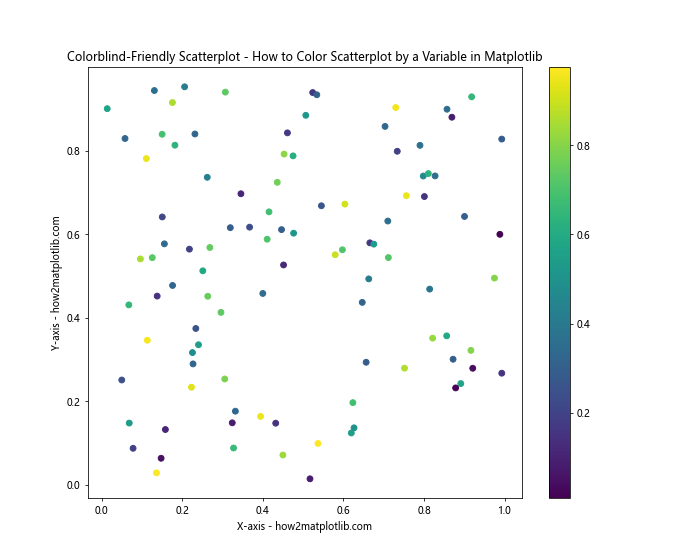
This example uses the Seaborn library to set a colorblind-friendly color palette, making the plot more accessible to a wider audience.
Using Diverging Color Maps
When your data has a meaningful midpoint (like zero in a temperature anomaly dataset), using a diverging color map can be very effective. Here’s how to color scatterplot by a variable in Matplotlib using a diverging color map:
import matplotlib.pyplot as plt
import numpy as np

# Generate sample data
n = 200
x = np.random.randn(n)
y = np.random.randn(n)
z = x * y  # This will give us both positive and negative values

# Create a scatter plot with a diverging color map
plt.figure(figsize=(10, 8))
scatter = plt.scatter(x, y, c=z, cmap='RdYlBu', vmin=-2, vmax=2)
plt.colorbar(scatter)
plt.title('Scatterplot with Diverging Color Map - How to Color Scatterplot by a Variable in Matplotlib')
plt.xlabel('X-axis - how2matplotlib.com')
plt.ylabel('Y-axis - how2matplotlib.com')
plt.show()
Output:
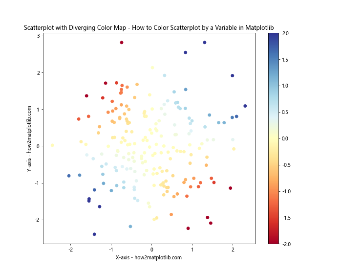
In this example, we use the ‘RdYlBu’ (Red-Yellow-Blue) colormap, which is a diverging colormap. The vmin and vmax parameters are set to ensure that the color scale is centered at zero.
Combining Multiple Coloring Techniques
As you become more proficient in how to color scatterplot by a variable in Matplotlib, you might want to combine multiple coloring techniques. Here’s an example that uses both color and size to represent different variables:
import matplotlib.pyplot as plt
import numpy as np

# Generate sample data
n = 100
x = np.random.rand(n)
y = np.random.rand(n)
colors = np.random.rand(n)
sizes = 1000 * np.random.rand(n)

# Create a scatter plot with multiple variables represented
plt.figure(figsize=(10, 8))
scatter = plt.scatter(x, y, c=colors, s=sizes, alpha=0.6, cmap='viridis')
plt.colorbar(scatter)
plt.title('Scatterplot with Multiple Variables - How to Color Scatterplot by a Variable in Matplotlib')
plt.xlabel('X-axis - how2matplotlib.com')
plt.ylabel('Y-axis - how2matplotlib.com')

# Add a legend for sizes
sizes_legend = [100, 500, 1000]
legend_elements = [plt.scatter([], [], s=size, c='gray', alpha=0.6, label=str(size)) for size in sizes_legend]
plt.legend(handles=legend_elements, title="Sizes", loc="upper left")

plt.show()
Output:
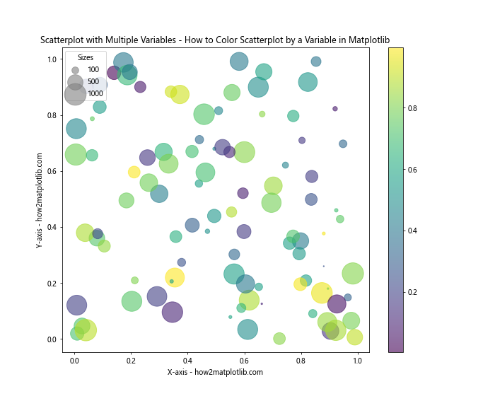
This example uses color to represent one variable and size to represent another, effectively visualizing four dimensions of data on a 2D plot.
Creating a Heatmap from a Scatterplot
Sometimes, when you have a large number of overlapping points in your scatterplot, it can be useful to convert it into a heatmap. Here’s how you can do this:
import matplotlib.pyplot as plt
import numpy as np

# Generate sample data
n = 10000
x = np.random.randn(n)
y = np.random.randn(n)

# Create a 2D histogram
plt.figure(figsize=(10, 8))
plt.hist2d(x, y, bins=50, cmap='viridis')
plt.colorbar(label='Count')
plt.title('Heatmap from Scatterplot - How to Color Scatterplot by a Variable in Matplotlib')
plt.xlabel('X-axis - how2matplotlib.com')
plt.ylabel('Y-axis - how2matplotlib.com')
plt.show()
Output:
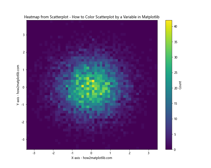
This example creates a 2D histogram, which effectively turns our scatterplot into a heatmap, showing the density of points in different regions.
Conclusion
Learning how to color scatterplot by a variable in Matplotlib is a powerful skill that can significantly enhance your data visualizations. We’ve covered a wide range of techniques, from basic coloring to advanced methods like custom colormaps, handling large datasets, creating interactive plots, and more.
Remember, the key to effective data visualization is not just about making your plots look good, but also about making them informative and easy to interpret. The color in your scatterplot should add meaningful information to your visualization.