How to Change Matplotlib Color Bar Size in Python
How to Change Matplotlib Color Bar Size in Python is an essential skill for data visualization enthusiasts and professionals alike. Matplotlib, a powerful plotting library in Python, offers extensive customization options for color bars, allowing users to enhance the visual appeal and readability of their plots. In this comprehensive guide, we’ll explore various techniques to change the size of color bars in Matplotlib, providing detailed explanations and easy-to-understand code examples.
Understanding Matplotlib Color Bars
Before diving into how to change Matplotlib color bar size, it’s crucial to understand what color bars are and their significance in data visualization. Color bars, also known as colormaps or color scales, are visual representations of the mapping between color and data values in a plot. They provide a legend that helps viewers interpret the meaning of colors in a visualization.
Matplotlib offers a wide range of built-in colormaps and allows users to create custom ones. The color bar size refers to the dimensions of the color bar displayed alongside the main plot. By adjusting the color bar size, you can improve the overall aesthetics and clarity of your visualizations.
Let’s start with a basic example of creating a plot with a color bar:
import matplotlib.pyplot as plt
import numpy as np

# Generate sample data
data = np.random.rand(10, 10)

# Create a figure and axis
fig, ax = plt.subplots(figsize=(8, 6))

# Create a heatmap with a color bar
im = ax.imshow(data, cmap='viridis')

# Add a color bar
cbar = plt.colorbar(im)

# Set title
plt.title("How to Change Matplotlib Color Bar Size - Basic Example")

# Show the plot
plt.show()
Output:
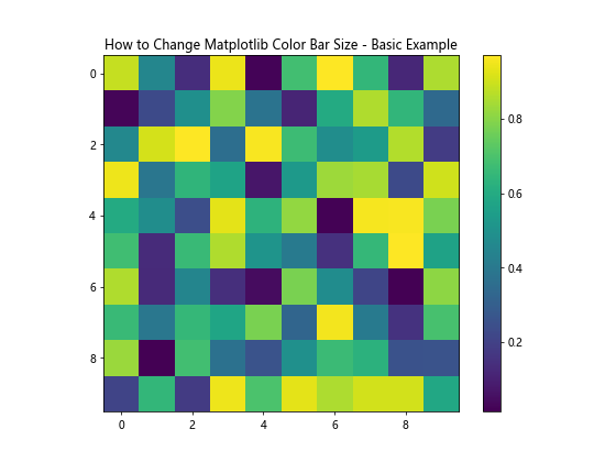
In this example, we create a simple heatmap with a default color bar. The color bar size is automatically determined by Matplotlib based on the plot size and layout.
Changing Matplotlib Color Bar Size Using shrink Parameter
One of the simplest ways to change the Matplotlib color bar size is by using the shrink parameter when creating the color bar. This parameter allows you to adjust the length of the color bar relative to the main plot.
Here’s an example demonstrating how to use the shrink parameter:
import matplotlib.pyplot as plt
import numpy as np

# Generate sample data
data = np.random.rand(10, 10)

# Create a figure and axis
fig, ax = plt.subplots(figsize=(8, 6))

# Create a heatmap with a color bar
im = ax.imshow(data, cmap='coolwarm')

# Add a color bar with reduced size
cbar = plt.colorbar(im, shrink=0.5)

# Set title
plt.title("How to Change Matplotlib Color Bar Size - Shrink Parameter")

# Show the plot
plt.show()
Output:
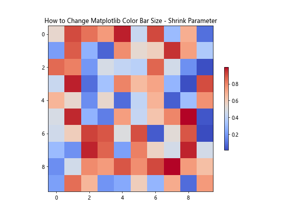
In this example, we set shrink=0.5, which reduces the color bar size to 50% of its default length. You can adjust this value between 0 and 1 to achieve the desired size.
Adjusting Color Bar Size Using aspect Parameter
Another way to change the Matplotlib color bar size is by using the aspect parameter. This parameter controls the ratio of width to height for the color bar.
Here’s an example of how to use the aspect parameter:
import matplotlib.pyplot as plt
import numpy as np

# Generate sample data
data = np.random.rand(10, 10)

# Create a figure and axis
fig, ax = plt.subplots(figsize=(8, 6))

# Create a heatmap with a color bar
im = ax.imshow(data, cmap='plasma')

# Add a color bar with adjusted aspect ratio
cbar = plt.colorbar(im, aspect=10)

# Set title
plt.title("How to Change Matplotlib Color Bar Size - Aspect Parameter")

# Show the plot
plt.show()
Output:
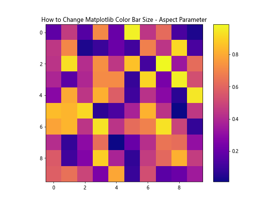
In this example, we set aspect=10, which makes the color bar thinner and longer. Adjusting this value allows you to control the width-to-height ratio of the color bar.
Changing Color Bar Size Using fraction and pad Parameters
The fraction and pad parameters provide fine-grained control over the color bar size and position. The fraction parameter determines the fraction of the original axes to use for the color bar, while the pad parameter controls the space between the main plot and the color bar.
Here’s an example demonstrating the use of these parameters:
import matplotlib.pyplot as plt
import numpy as np

# Generate sample data
data = np.random.rand(10, 10)

# Create a figure and axis
fig, ax = plt.subplots(figsize=(8, 6))

# Create a heatmap with a color bar
im = ax.imshow(data, cmap='viridis')

# Add a color bar with adjusted size and position
cbar = plt.colorbar(im, fraction=0.046, pad=0.04)

# Set title
plt.title("How to Change Matplotlib Color Bar Size - Fraction and Pad Parameters")

# Show the plot
plt.show()
Output:
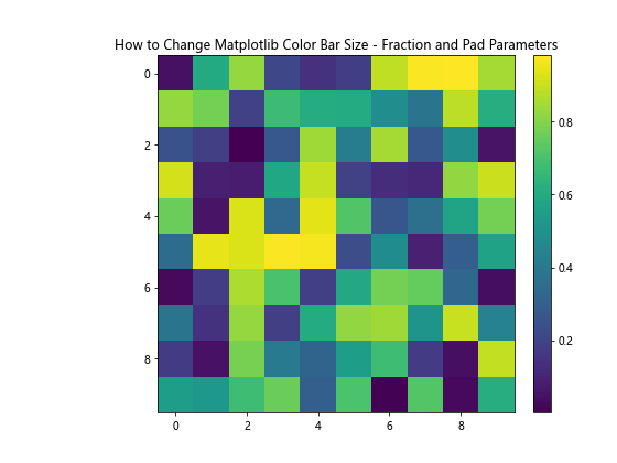
In this example, we set fraction=0.046 and pad=0.04 to adjust the size and position of the color bar. Experiment with these values to achieve the desired result for your specific plot.
Customizing Color Bar Size for Subplots
When working with subplots, you may want to adjust the color bar size to fit multiple plots. Matplotlib provides the make_axes_locatable function from the mpl_toolkits.axes_grid1 module to help with this task.
Here’s an example of how to change the color bar size for subplots:
import matplotlib.pyplot as plt
import numpy as np
from mpl_toolkits.axes_grid1 import make_axes_locatable

# Generate sample data
data1 = np.random.rand(10, 10)
data2 = np.random.rand(10, 10)

# Create a figure with two subplots
fig, (ax1, ax2) = plt.subplots(1, 2, figsize=(12, 5))

# Plot the first heatmap
im1 = ax1.imshow(data1, cmap='viridis')
ax1.set_title("Subplot 1")

# Plot the second heatmap
im2 = ax2.imshow(data2, cmap='plasma')
ax2.set_title("Subplot 2")

# Create color bars for each subplot
for ax, im in zip([ax1, ax2], [im1, im2]):
    divider = make_axes_locatable(ax)
    cax = divider.append_axes("right", size="5%", pad=0.1)
    plt.colorbar(im, cax=cax)

# Set main title
fig.suptitle("How to Change Matplotlib Color Bar Size - Subplots", fontsize=16)

# Adjust layout and show the plot
plt.tight_layout()
plt.show()
Output:
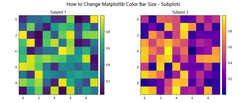
In this example, we use make_axes_locatable to create separate color bars for each subplot, adjusting their size and position relative to the main plots.
Changing Color Bar Orientation
Sometimes, you may want to change the orientation of the color bar to better fit your plot layout. Matplotlib allows you to easily switch between vertical and horizontal color bars.
Here’s an example of how to create a horizontal color bar:
import matplotlib.pyplot as plt
import numpy as np

# Generate sample data
data = np.random.rand(10, 10)

# Create a figure and axis
fig, ax = plt.subplots(figsize=(8, 6))

# Create a heatmap with a horizontal color bar
im = ax.imshow(data, cmap='coolwarm')

# Add a horizontal color bar
cbar = plt.colorbar(im, orientation='horizontal', pad=0.2)

# Set title
plt.title("How to Change Matplotlib Color Bar Size - Horizontal Orientation")

# Show the plot
plt.show()
Output:
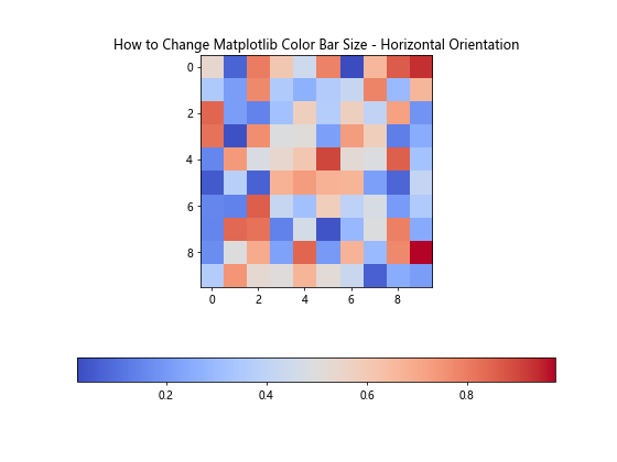
In this example, we set orientation='horizontal' to create a horizontal color bar. The pad parameter is used to adjust the space between the main plot and the color bar.
Adjusting Color Bar Tick Labels
When changing the color bar size, you may also want to adjust the tick labels to improve readability. Matplotlib provides several options for customizing tick labels.
Here’s an example of how to adjust color bar tick labels:
import matplotlib.pyplot as plt
import numpy as np

# Generate sample data
data = np.random.rand(10, 10)

# Create a figure and axis
fig, ax = plt.subplots(figsize=(8, 6))

# Create a heatmap with a color bar
im = ax.imshow(data, cmap='viridis')

# Add a color bar with customized tick labels
cbar = plt.colorbar(im, shrink=0.8)
cbar.set_ticks([0, 0.5, 1])
cbar.set_ticklabels(['Low', 'Medium', 'High'])
cbar.ax.tick_params(labelsize=10)

# Set title
plt.title("How to Change Matplotlib Color Bar Size - Custom Tick Labels")

# Show the plot
plt.show()
Output:
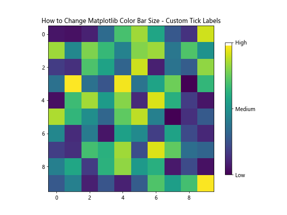
In this example, we customize the tick positions, labels, and font size of the color bar to improve its readability and interpretation.
Adjusting Color Bar Size for 3D Plots
When working with 3D plots in Matplotlib, you may need to adjust the color bar size to fit the plot layout. Here’s an example of how to change the color bar size for a 3D surface plot:
import matplotlib.pyplot as plt
import numpy as np
from mpl_toolkits.mplot3d import Axes3D

# Generate sample data
x = np.linspace(-5, 5, 100)
y = np.linspace(-5, 5, 100)
X, Y = np.meshgrid(x, y)
Z = np.sin(np.sqrt(X**2 + Y**2))

# Create a figure and 3D axis
fig = plt.figure(figsize=(10, 8))
ax = fig.add_subplot(111, projection='3d')

# Create a surface plot
surf = ax.plot_surface(X, Y, Z, cmap='viridis')

# Add a color bar with adjusted size
cbar = fig.colorbar(surf, shrink=0.6, aspect=10)

# Set labels and title
ax.set_xlabel('X-axis')
ax.set_ylabel('Y-axis')
ax.set_zlabel('Z-axis')
ax.set_title("How to Change Matplotlib Color Bar Size - 3D Plot")

# Show the plot
plt.show()
Output:
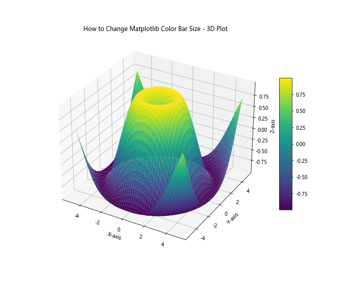
In this example, we create a 3D surface plot and adjust the color bar size using the shrink and aspect parameters to fit the 3D plot layout.
Creating a Custom Colormap and Adjusting Color Bar Size
Sometimes, you may want to create a custom colormap to better represent your data. Here’s an example of how to create a custom colormap and adjust the color bar size:
import matplotlib.pyplot as plt
import numpy as np
from matplotlib.colors import LinearSegmentedColormap

# Generate sample data
data = np.random.rand(10, 10)

# Create a custom colormap
colors = ['#1a9850', '#91cf60', '#d9ef8b', '#fee08b', '#fc8d59', '#d73027']
n_bins = 100
cmap = LinearSegmentedColormap.from_list('custom_cmap', colors, N=n_bins)

# Create a figure and axis
fig, ax = plt.subplots(figsize=(8, 6))

# Create a heatmap with the custom colormap
im = ax.imshow(data, cmap=cmap)

# Add a color bar with adjusted size
cbar = plt.colorbar(im, shrink=0.7, aspect=20)

# Set title
plt.title("How to Change Matplotlib Color Bar Size - Custom Colormap")

# Show the plot
plt.show()
Output:
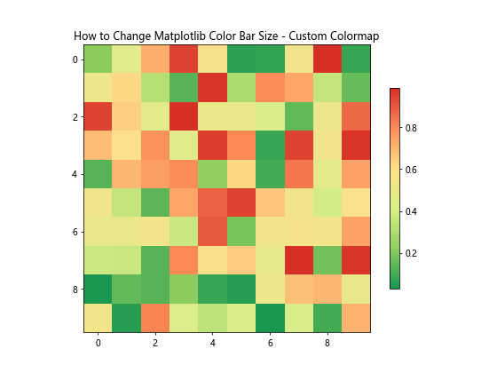
In this example, we create a custom colormap using LinearSegmentedColormap.from_list() and adjust the color bar size using the shrink and aspect parameters.
Adjusting Color Bar Size for Polar Plots
When working with polar plots, you may need to adjust the color bar size and position to fit the circular layout. Here’s an example of how to change the color bar size for a polar plot:
import matplotlib.pyplot as plt
import numpy as np

# Generate sample data
r = np.linspace(0, 2, 100)
theta = np.linspace(0, 2*np.pi, 100)
R, Theta = np.meshgrid(r, theta)
Z = R**2 * (1 - R/2) * np.cos(5*Theta)

# Create a figure and polar axis
fig, ax = plt.subplots(figsize=(8, 8), subplot_kw=dict(projection='polar'))

# Create a polar contour plot
im = ax.contourf(Theta, R, Z, cmap='viridis')

# Add a color bar with adjusted size and position
cbar = plt.colorbar(im, shrink=0.6, pad=0.1, aspect=15)

# Set title
ax.set_title("How to Change Matplotlib Color Bar Size - Polar Plot")

# Show the plot
plt.show()
Output:
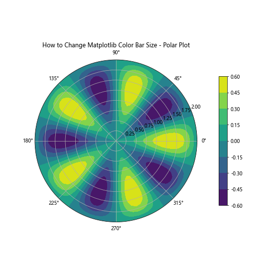
In this example, we create a polar contour plot and adjust the color bar size and position using the shrink, pad, and aspect parameters to fit the circular layout of the polar plot.
Adjusting Color Bar Size for Multiple Color Bars
In some cases, you may need to display multiple color bars in a single plot. Here’s an example of how to change the size of multiple color bars:
import matplotlib.pyplot as plt
import numpy as np

# Generate sample data
data1 = np.random.rand(10, 10)
data2 = np.random.rand(10, 10)

# Create a figure and axis
fig, ax = plt.subplots(figsize=(10, 6))

# Create two heatmaps with different colormaps
im1 = ax.imshow(data1, cmap='viridis', extent=[0, 5, 0, 5])
im2 = ax.imshow(data2, cmap='plasma', extent=[5, 10, 0, 5])

# Add color bars with adjusted sizes
cbar1 = plt.colorbar(im1, ax=ax, shrink=0.6, aspect=10, pad=0.02, location='bottom')
cbar2 = plt.colorbar(im2, ax=ax, shrink=0.6, aspect=10, pad=0.12, location='bottom')

# Set labels for color bars
cbar1.set_label('Data 1')
cbar2.set_label('Data 2')

# Set title
plt.title("How to Change Matplotlib Color Bar Size - Multiple Color Bars")

# Show the plot
plt.show()
Output:
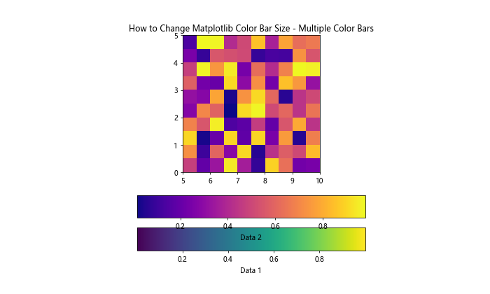
In this example, we create two heatmaps with different colormaps and add separate color bars for each, adjusting their sizes and positions using the shrink, aspect, and pad parameters.
Fine-tuning Color Bar Size with ax.inset_axes()
For more precise control over the color bar size and position, you can use the ax.inset_axes() method. This approach allows you to specify the exact dimensions and location of the color bar within the plot.
Here’s an example of how to use ax.inset_axes() to change the Matplotlib color bar size:
import matplotlib.pyplot as plt
import numpy as np

# Generate sample data
data = np.random.rand(10, 10)

# Create a figure and axis
fig, ax = plt.subplots(figsize=(8, 6))

# Create a heatmap
im = ax.imshow(data, cmap='viridis')

# Create an inset axes for the color bar
cax = ax.inset_axes([1.05, 0.2, 0.05, 0.6])

# Add a color bar to the inset axes
cbar = fig.colorbar(im, cax=cax)

# Set title
plt.title("How to Change Matplotlib Color Bar Size - Inset Axes")

# Adjust layout and show the plot
plt.tight_layout()
plt.show()
Output:
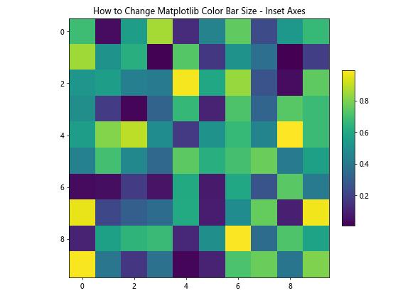
In this example, we use ax.inset_axes([1.05, 0.2, 0.05, 0.6]) to create a custom-sized color bar. The parameters represent [left, bottom, width, height] in axes coordinates.
Changing Color Bar Size for Animations
When creating animations with Matplotlib, you may want to adjust the color bar size to maintain consistency across frames. Here’s an example of how to change the color bar size in an animated plot:
import matplotlib.pyplot as plt
import numpy as np
from matplotlib.animation import FuncAnimation

# Generate sample data
def generate_data(frame):
    return np.random.rand(10, 10)

# Create a figure and axis
fig, ax = plt.subplots(figsize=(8, 6))

# Initialize the heatmap and color bar
im = ax.imshow(generate_data(0), cmap='viridis', animated=True)
cbar = plt.colorbar(im, shrink=0.8, aspect=20)

# Update function for animation
def update(frame):
    im.set_array(generate_data(frame))
    return [im]

# Create the animation
anim = FuncAnimation(fig, update, frames=100, interval=200, blit=True)

# Set title
plt.title("How to Change Matplotlib Color Bar Size - Animation")

# Show the animated plot
plt.show()
Output:
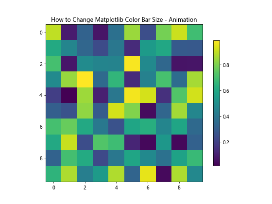
In this example, we create an animated heatmap and adjust the color bar size using the shrink and aspect parameters. The color bar size remains consistent throughout the animation.
Conclusion
In this comprehensive guide, we’ve explored various techniques on how to change Matplotlib color bar size in Python. We’ve covered a wide range of scenarios, from basic plots to more complex visualizations, including 3D plots, polar plots, and animations. By adjusting parameters such as shrink, aspect, fraction, and pad, you can fine-tune the size and position of color bars to enhance the overall appearance and readability of your plots.
Remember that the optimal color bar size may vary depending on your specific data and plot layout. Experiment with different values and combinations of parameters to find the best fit for your visualizations. Additionally, consider factors such as the plot size, orientation, and the number of subplots when adjusting color bar sizes.
By mastering these techniques, you’ll be able to create more professional and visually appealing data visualizations using Matplotlib. Whether you’re working on scientific research, data analysis, or creating reports, the ability to customize color bar sizes will help you effectively communicate your data insights.