How to Master Matplotlib Cmap: A Comprehensive Guide for Data Visualization
Matplotlib cmap is an essential tool for data visualization in Python. This comprehensive guide will explore the various aspects of matplotlib cmap, providing detailed explanations and practical examples to help you master this powerful feature. Whether you’re a beginner or an experienced data scientist, this article will equip you with the knowledge and skills to create stunning visualizations using matplotlib cmap.
Matplotlib Cmap Recommended Articles
Understanding Matplotlib Cmap
Matplotlib cmap, short for colormap, is a crucial component in data visualization that allows you to map numerical values to colors. It provides a way to represent data through color gradients, making it easier to interpret complex information visually. Matplotlib offers a wide range of built-in colormaps, and you can even create custom ones to suit your specific needs.
Let’s start with a simple example to demonstrate how to use matplotlib cmap:
import matplotlib.pyplot as plt
import numpy as np

# Generate sample data
data = np.random.rand(10, 10)

# Create a heatmap using matplotlib cmap
plt.imshow(data, cmap='viridis')
plt.colorbar()
plt.title('Simple Heatmap using Matplotlib Cmap - how2matplotlib.com')
plt.show()
Output:
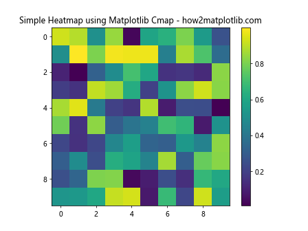
In this example, we create a simple heatmap using the ‘viridis’ colormap. The imshow() function displays the data as an image, and the colorbar() function adds a color scale to the plot. The cmap parameter in imshow() specifies the colormap to be used.
Types of Matplotlib Cmap
Matplotlib offers various types of colormaps to suit different visualization needs. Let’s explore some of the most commonly used types:
Sequential Colormaps
Sequential colormaps are ideal for representing data that progresses from low to high values. They use a gradual change in color intensity or hue to show this progression. Some popular sequential colormaps include ‘viridis’, ‘plasma’, and ‘Blues’.
Here’s an example using the ‘plasma’ colormap:
import matplotlib.pyplot as plt
import numpy as np

# Generate sample data
x = np.linspace(0, 10, 100)
y = np.linspace(0, 10, 100)
X, Y = np.meshgrid(x, y)
Z = np.sin(X) * np.cos(Y)

# Create a contour plot using a sequential colormap
plt.contourf(X, Y, Z, cmap='plasma')
plt.colorbar()
plt.title('Sequential Colormap (Plasma) - how2matplotlib.com')
plt.show()
Output:
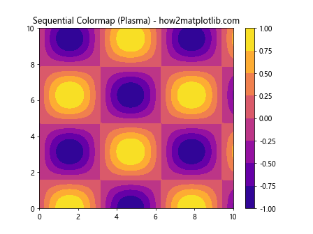
In this example, we create a contour plot using the ‘plasma’ colormap. The contourf() function fills the contours with colors from the specified colormap.
Diverging Colormaps
Diverging colormaps are useful for highlighting deviations from a central value. They typically use two different hues that diverge from a neutral color in the middle. Examples include ‘RdBu’ (Red-Blue) and ‘coolwarm’.
Let’s create a heatmap using a diverging colormap:
import matplotlib.pyplot as plt
import numpy as np

# Generate sample data
data = np.random.randn(20, 20)

# Create a heatmap using a diverging colormap
plt.imshow(data, cmap='RdBu')
plt.colorbar()
plt.title('Diverging Colormap (RdBu) - how2matplotlib.com')
plt.show()
Output:
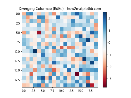
This example uses the ‘RdBu’ colormap to highlight positive and negative values in the data.
Qualitative Colormaps
Qualitative colormaps are designed for categorical data, where each color represents a distinct category. These colormaps use a set of distinct colors that are easily distinguishable from each other. Examples include ‘Set1’, ‘Set2’, and ‘Paired’.
Here’s an example using a qualitative colormap:
import matplotlib.pyplot as plt
import numpy as np

# Generate sample categorical data
categories = ['A', 'B', 'C', 'D', 'E']
values = np.random.randint(1, 10, size=5)

# Create a bar plot using a qualitative colormap
plt.bar(categories, values, color=plt.cm.Set1(np.arange(len(categories))))
plt.title('Qualitative Colormap (Set1) - how2matplotlib.com')
plt.show()
Output:
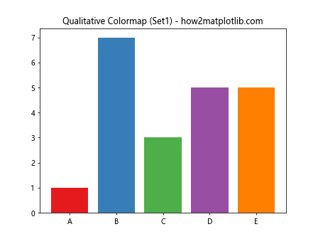
In this example, we use the ‘Set1’ colormap to assign distinct colors to each category in a bar plot.
Customizing Matplotlib Cmap
While matplotlib provides a wide range of built-in colormaps, you may sometimes need to create custom colormaps to suit your specific visualization needs. Let’s explore how to create and customize colormaps in matplotlib.
Creating a Custom Colormap
You can create a custom colormap by defining a list of colors and using the LinearSegmentedColormap class from matplotlib.colors. Here’s an example:
import matplotlib.pyplot as plt
import matplotlib.colors as mcolors
import numpy as np

# Define custom colors
colors = ['#ff0000', '#00ff00', '#0000ff']  # Red, Green, Blue

# Create a custom colormap
n_bins = 100
cmap = mcolors.LinearSegmentedColormap.from_list('custom_cmap', colors, N=n_bins)

# Generate sample data
data = np.random.rand(10, 10)

# Create a heatmap using the custom colormap
plt.imshow(data, cmap=cmap)
plt.colorbar()
plt.title('Custom Colormap - how2matplotlib.com')
plt.show()
Output:
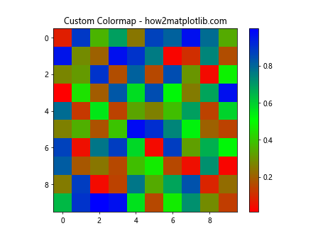
This example creates a custom colormap that transitions from red to green to blue. The from_list() method of LinearSegmentedColormap is used to create the colormap from the list of colors.
Reversing a Colormap
Sometimes, you may want to reverse the direction of a colormap. Matplotlib makes this easy by allowing you to append ‘_r’ to the name of any colormap. Here’s an example:
import matplotlib.pyplot as plt
import numpy as np

# Generate sample data
data = np.random.rand(10, 10)

# Create two subplots
fig, (ax1, ax2) = plt.subplots(1, 2, figsize=(12, 5))

# Plot with original colormap
im1 = ax1.imshow(data, cmap='viridis')
ax1.set_title('Original Viridis Colormap - how2matplotlib.com')
plt.colorbar(im1, ax=ax1)

# Plot with reversed colormap
im2 = ax2.imshow(data, cmap='viridis_r')
ax2.set_title('Reversed Viridis Colormap - how2matplotlib.com')
plt.colorbar(im2, ax=ax2)

plt.tight_layout()
plt.show()
Output:
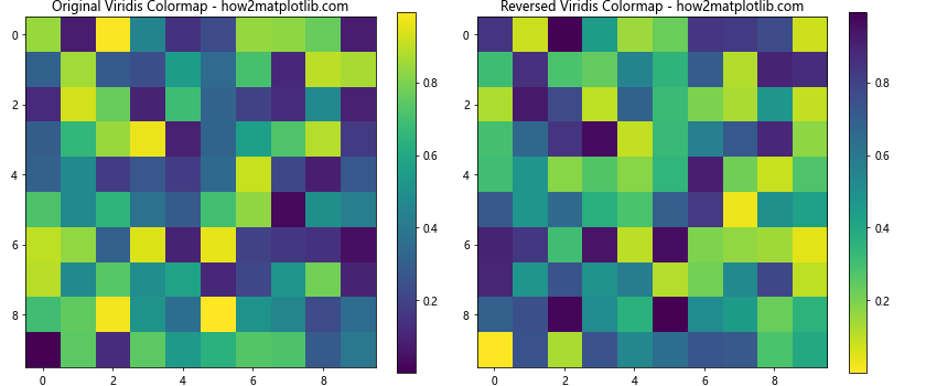
This example demonstrates the difference between the original ‘viridis’ colormap and its reversed version ‘viridis_r’.
Advanced Matplotlib Cmap Techniques
Now that we’ve covered the basics, let’s explore some advanced techniques for working with matplotlib cmap.
Using Discrete Colormaps
While continuous colormaps are great for representing smooth transitions, sometimes you may want to use discrete colors for specific ranges of values. You can achieve this using the BoundaryNorm class. Here’s an example:
import matplotlib.pyplot as plt
import matplotlib.colors as mcolors
import numpy as np

# Generate sample data
data = np.random.randn(20, 20)

# Define boundaries and colors
boundaries = [-3, -2, -1, 0, 1, 2, 3]
colors = ['#1a9850', '#91cf60', '#d9ef8b', '#ffffbf', '#fee08b', '#fc8d59', '#d73027']

# Create a BoundaryNorm object
norm = mcolors.BoundaryNorm(boundaries, len(colors))

# Create the plot
plt.imshow(data, cmap=mcolors.ListedColormap(colors), norm=norm)
plt.colorbar(ticks=boundaries)
plt.title('Discrete Colormap - how2matplotlib.com')
plt.show()
Output:
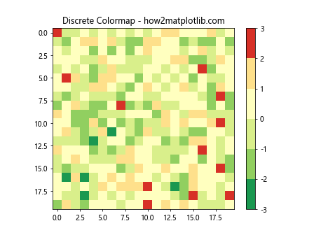
This example creates a discrete colormap with specific color boundaries. The BoundaryNorm class is used to map data values to the discrete colors.
Combining Multiple Colormaps
In some cases, you might want to combine multiple colormaps to create a more complex color scheme. Here’s an example of how to do this:
import matplotlib.pyplot as plt
import matplotlib.colors as mcolors
import numpy as np

# Define two colormaps to combine
cmap1 = plt.cm.viridis
cmap2 = plt.cm.plasma

# Combine the colormaps
colors1 = cmap1(np.linspace(0., 1, 128))
colors2 = cmap2(np.linspace(0, 1, 128))
colors = np.vstack((colors1, colors2))
combined_cmap = mcolors.LinearSegmentedColormap.from_list('combined_cmap', colors)

# Generate sample data
data = np.random.rand(20, 20)

# Create the plot
plt.imshow(data, cmap=combined_cmap)
plt.colorbar()
plt.title('Combined Colormap - how2matplotlib.com')
plt.show()
Output:
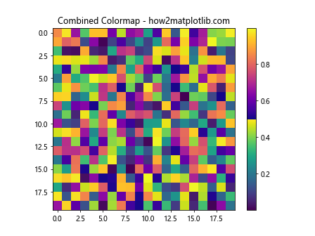
This example combines the ‘viridis’ and ‘plasma’ colormaps to create a new, custom colormap.
Matplotlib Cmap in Different Plot Types
Matplotlib cmap can be used in various types of plots. Let’s explore how to apply colormaps to different visualization techniques.
Scatter Plots with Colormap
Scatter plots can benefit from colormaps to represent an additional dimension of data. Here’s an example:
import matplotlib.pyplot as plt
import numpy as np

# Generate sample data
x = np.random.rand(100)
y = np.random.rand(100)
colors = np.random.rand(100)

# Create a scatter plot with colormap
plt.scatter(x, y, c=colors, cmap='viridis', s=50)
plt.colorbar()
plt.title('Scatter Plot with Colormap - how2matplotlib.com')
plt.show()
Output:
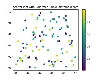
In this example, the color of each point in the scatter plot is determined by the values in the colors array, mapped to the ‘viridis’ colormap.
3D Surface Plots with Colormap
Colormaps are particularly useful in 3D surface plots to represent the height of the surface. Here’s an example:
import matplotlib.pyplot as plt
import numpy as np
from mpl_toolkits.mplot3d import Axes3D

# Generate sample data
x = np.linspace(-5, 5, 100)
y = np.linspace(-5, 5, 100)
X, Y = np.meshgrid(x, y)
Z = np.sin(np.sqrt(X**2 + Y**2))

# Create a 3D surface plot with colormap
fig = plt.figure()
ax = fig.add_subplot(111, projection='3d')
surf = ax.plot_surface(X, Y, Z, cmap='coolwarm')
fig.colorbar(surf)
ax.set_title('3D Surface Plot with Colormap - how2matplotlib.com')
plt.show()
Output:
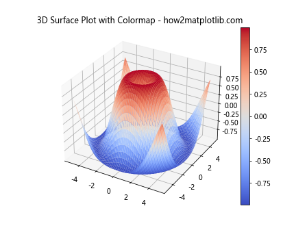
This example creates a 3D surface plot where the height and color of the surface are determined by the Z values, mapped to the ‘coolwarm’ colormap.
Customizing Colorbar
The colorbar is an essential component when using colormaps, as it provides a reference for the color-to-value mapping. Let’s explore some ways to customize the colorbar.
Adjusting Colorbar Position and Size
You can control the position and size of the colorbar using the shrink and aspect parameters. Here’s an example:
import matplotlib.pyplot as plt
import numpy as np

# Generate sample data
data = np.random.rand(10, 10)

# Create the plot
im = plt.imshow(data, cmap='viridis')

# Add a customized colorbar
cbar = plt.colorbar(im, shrink=0.8, aspect=20)
cbar.set_label('Values', rotation=270, labelpad=15)

plt.title('Customized Colorbar - how2matplotlib.com')
plt.show()
Output:
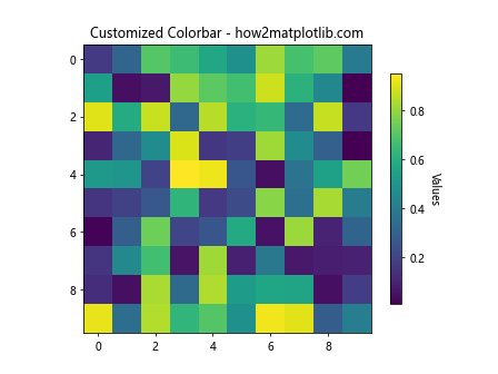
In this example, we adjust the size of the colorbar using shrink and its aspect ratio using aspect. We also add a label to the colorbar.
Setting Colorbar Ticks and Labels
You can customize the ticks and labels on the colorbar to better represent your data. Here’s an example:
import matplotlib.pyplot as plt
import numpy as np

# Generate sample data
data = np.random.rand(10, 10)

# Create the plot
im = plt.imshow(data, cmap='viridis')

# Add a customized colorbar
cbar = plt.colorbar(im)
cbar.set_ticks([0, 0.25, 0.5, 0.75, 1])
cbar.set_ticklabels(['Low', 'Medium-Low', 'Medium', 'Medium-High', 'High'])

plt.title('Colorbar with Custom Ticks and Labels - how2matplotlib.com')
plt.show()
Output:
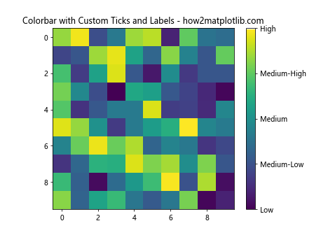
This example sets custom tick locations and labels for the colorbar, providing a more meaningful representation of the data values.
Matplotlib Cmap in Real-world Applications
Now that we’ve covered various aspects of matplotlib cmap, let’s explore some real-world applications where colormaps can be particularly useful.
Visualizing Temperature Data
Colormaps are often used to visualize temperature data, such as in weather maps. Here’s an example of how you might create a simple temperature map:
import matplotlib.pyplot as plt
import numpy as np

# Generate sample temperature data
lat = np.linspace(-90, 90, 180)
lon = np.linspace(-180, 180, 360)
LON, LAT = np.meshgrid(lon, lat)
temperature = 15 + 10 * np.cos(np.radians(LAT)) - 5 * np.cos(np.radians(2 * LON))

# Create the temperature map
plt.figure(figsize=(12, 6))
im = plt.contourf(LON, LAT, temperature, levels=20, cmap='RdBu_r')
plt.colorbar(im, label='Temperature (°C)')
plt.title('Global Temperature Map - how2matplotlib.com')
plt.xlabel('Longitude')
plt.ylabel('Latitude')
plt.show()
Output:
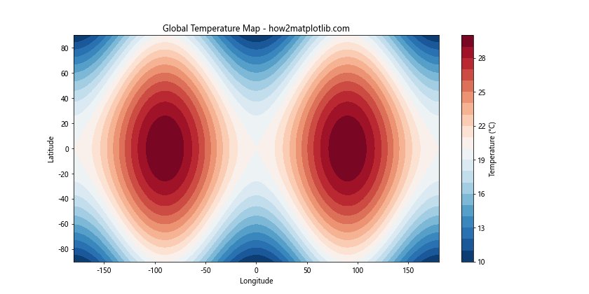
This example creates a simple global temperature map using the ‘RdBu_r’ colormap, which is well-suited for temperature data as it naturally represents cold (blue) and hot (red) temperatures.
Visualizing Correlation Matrices
Colormaps are also useful for visualizing correlation matrices in data analysis. Here’s an example:
import matplotlib.pyplot as plt
import numpy as np

# Generate a sample correlation matrix
np.random.seed(42)
corr_matrix = np.random.rand(5, 5)
corr_matrix = (corr_matrix + corr_matrix.T) / 2
np.fill_diagonal(corr_matrix, 1)

# Create the correlation matrix plot
fig, ax = plt.subplots()
im = ax.imshow(corr_matrix, cmap='coolwarm', vmin=-1, vmax=1)

# Add colorbar
cbar = ax.figure.colorbar(im, ax=ax)
cbar.ax.set_ylabel('Correlation', rotation=-90, va="bottom")

# Add labels and title
ax.set_xticks(np.arange(5))
ax.set_yticks(np.arange(5))
ax.set_xticklabels(['A', 'B', 'C', 'D', 'E'])
ax.set_yticklabels(['A', 'B', 'C', 'D', 'E'])
plt.setp(ax.get_xticklabels(), rotation=45, ha="right", rotation_mode="anchor")
ax.set_title('Correlation Matrix - how2matplotlib.com')

# Add text annotations
for i in range(5):
    for j in range(5):
        text = ax.text(j, i, f"{corr_matrix[i, j]:.2f}", ha="center", va="center", color="black")

plt.tight_layout()plt.show()
Output:
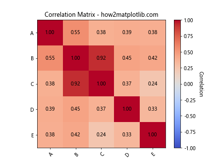
This example creates a correlation matrix visualization using the ‘coolwarm’ colormap. The colormap helps to quickly identify strong positive correlations (red), strong negative correlations (blue), and weak correlations (white).
Best Practices for Using Matplotlib Cmap
When working with matplotlib cmap, there are several best practices to keep in mind to create effective and visually appealing visualizations:
- Choose the right colormap for your data:
- Use sequential colormaps for data that progresses from low to high values.
- Use diverging colormaps for data that deviates from a central value.
- Use qualitative colormaps for categorical data.
- Consider color blindness:
- Use colormaps that are perceptually uniform and color-blind friendly, such as ‘viridis’, ‘plasma’, or ‘cividis’.
- Provide context with a colorbar:
- Always include a colorbar when using colormaps to provide a reference for the color-to-value mapping.
- Use appropriate color ranges:
- Set the color range to match the range of your data to avoid misrepresentation.
- Be mindful of the number of colors:
- Too many colors can be overwhelming and hard to interpret. Use discrete colormaps or reduce the number of colors when appropriate.
Let’s implement some of these best practices in an example:
import matplotlib.pyplot as plt
import numpy as np

# Generate sample data
np.random.seed(42)
data = np.random.randn(20, 20)

# Create the plot
fig, ax = plt.subplots(figsize=(10, 8))
im = ax.imshow(data, cmap='viridis')

# Add colorbar
cbar = ax.figure.colorbar(im, ax=ax)
cbar.ax.set_ylabel('Value', rotation=-90, va="bottom")

# Set title and labels
ax.set_title('Best Practices Example - how2matplotlib.com', fontsize=16)
ax.set_xlabel('X-axis', fontsize=12)
ax.set_ylabel('Y-axis', fontsize=12)

# Add text annotations for extreme values
max_val = np.max(data)
min_val = np.min(data)
max_pos = np.unravel_index(np.argmax(data), data.shape)
min_pos = np.unravel_index(np.argmin(data), data.shape)

ax.text(max_pos[1], max_pos[0], f'Max: {max_val:.2f}', ha='center', va='center',
        bbox=dict(facecolor='white', edgecolor='none', alpha=0.7))
ax.text(min_pos[1], min_pos[0], f'Min: {min_val:.2f}', ha='center', va='center',
        bbox=dict(facecolor='white', edgecolor='none', alpha=0.7))

plt.tight_layout()
plt.show()
Output:

This example demonstrates several best practices:
- It uses the ‘viridis’ colormap, which is perceptually uniform and color-blind friendly.
- It includes a colorbar with a clear label.
- It provides context with a title and axis labels.
- It highlights extreme values with text annotations.
Troubleshooting Common Issues with Matplotlib Cmap
When working with matplotlib cmap, you may encounter some common issues. Let’s address a few of these and provide solutions:
Issue 1: Colormap Not Showing Full Range
Sometimes, your colormap might not show the full range of colors. This can happen if your data doesn’t span the full range of the colormap.
Solution: Use the vmin and vmax parameters to set the range of the colormap explicitly.
import matplotlib.pyplot as plt
import numpy as np

# Generate sample data
data = np.random.rand(10, 10) * 0.5 + 0.25  # Data range: 0.25 to 0.75

# Create two subplots
fig, (ax1, ax2) = plt.subplots(1, 2, figsize=(12, 5))

# Plot without setting vmin and vmax
im1 = ax1.imshow(data, cmap='viridis')
ax1.set_title('Default Range - how2matplotlib.com')
plt.colorbar(im1, ax=ax1)

# Plot with vmin and vmax set
im2 = ax2.imshow(data, cmap='viridis', vmin=0, vmax=1)
ax2.set_title('Full Range (vmin=0, vmax=1) - how2matplotlib.com')
plt.colorbar(im2, ax=ax2)

plt.tight_layout()
plt.show()
Output:
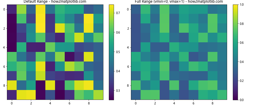
This example shows how setting vmin and vmax can ensure the full range of the colormap is used.
Issue 2: Colormap Appears Reversed
Sometimes, you might find that your colormap appears reversed from what you expected.
Solution: As mentioned earlier, you can reverse any colormap by appending ‘_r’ to its name.
import matplotlib.pyplot as plt
import numpy as np

# Generate sample data
data = np.random.rand(10, 10)

# Create two subplots
fig, (ax1, ax2) = plt.subplots(1, 2, figsize=(12, 5))

# Plot with original colormap
im1 = ax1.imshow(data, cmap='viridis')
ax1.set_title('Original Viridis - how2matplotlib.com')
plt.colorbar(im1, ax=ax1)

# Plot with reversed colormap
im2 = ax2.imshow(data, cmap='viridis_r')
ax2.set_title('Reversed Viridis - how2matplotlib.com')
plt.colorbar(im2, ax=ax2)

plt.tight_layout()
plt.show()
Output:
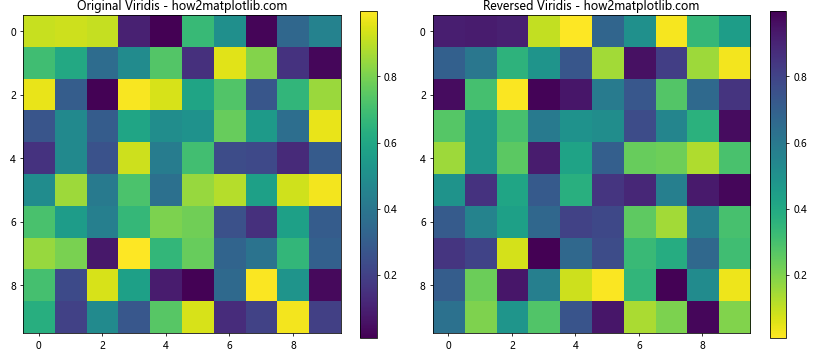
This example demonstrates how to reverse a colormap if needed.
Issue 3: Colormap Not Suitable for Data Type
Using an inappropriate colormap for your data type can lead to misleading visualizations.
Solution: Choose a colormap that’s appropriate for your data type (sequential, diverging, or qualitative).
import matplotlib.pyplot as plt
import numpy as np

# Generate sample data
data = np.random.randn(10, 10)

# Create three subplots
fig, (ax1, ax2, ax3) = plt.subplots(1, 3, figsize=(18, 5))

# Plot with sequential colormap
im1 = ax1.imshow(data, cmap='viridis')
ax1.set_title('Sequential (Viridis) - how2matplotlib.com')
plt.colorbar(im1, ax=ax1)

# Plot with diverging colormap
im2 = ax2.imshow(data, cmap='RdBu_r')
ax2.set_title('Diverging (RdBu_r) - how2matplotlib.com')
plt.colorbar(im2, ax=ax2)

# Plot with qualitative colormap (not suitable for this data)
im3 = ax3.imshow(data, cmap='Set3')
ax3.set_title('Qualitative (Set3) - Not Suitable - how2matplotlib.com')
plt.colorbar(im3, ax=ax3)

plt.tight_layout()
plt.show()
Output:

This example shows how different types of colormaps can affect the interpretation of the same data.
Advanced Topics in Matplotlib Cmap
For those looking to dive deeper into matplotlib cmap, there are several advanced topics worth exploring:
Creating Custom Colormaps with Specific Color Transitions
Sometimes, you might want to create a custom colormap with specific color transitions. Here’s how you can do this:
import matplotlib.pyplot as plt
import matplotlib.colors as mcolors
import numpy as np

# Define custom colors and positions
colors = ['darkred', 'red', 'orange', 'yellow', 'white', 'lightblue', 'blue', 'darkblue']
n_bins = 1000  # Number of color bins
positions = [0, 0.1, 0.2, 0.3, 0.5, 0.7, 0.8, 1]

# Create the colormap
cmap = mcolors.LinearSegmentedColormap.from_list('custom_cmap', list(zip(positions, colors)), N=n_bins)

# Generate sample data
data = np.random.randn(20, 20)

# Create the plot
plt.figure(figsize=(10, 8))
im = plt.imshow(data, cmap=cmap)
plt.colorbar(im)
plt.title('Custom Colormap with Specific Transitions - how2matplotlib.com')
plt.show()
Output:
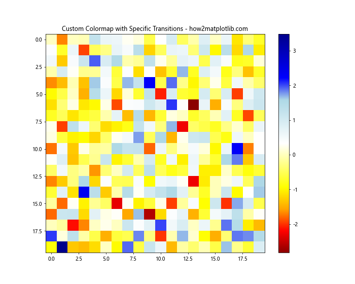
This example creates a custom colormap with specific color transitions at defined positions.
Using Colormaps for Highlighting Specific Ranges
You can use colormaps to highlight specific ranges in your data. Here’s an example:
import matplotlib.pyplot as plt
import matplotlib.colors as mcolors
import numpy as np

# Generate sample data
x = np.linspace(0, 10, 1000)
y = np.sin(x)

# Create a custom colormap
colors = ['lightgray', 'lightgray', 'red', 'red', 'lightgray', 'lightgray']
n_bins = 6
cmap = mcolors.LinearSegmentedColormap.from_list('custom_cmap', colors, N=n_bins)

# Create the plot
plt.figure(figsize=(12, 6))
plt.scatter(x, y, c=y, cmap=cmap, s=5)
plt.colorbar()
plt.title('Highlighting Specific Ranges - how2matplotlib.com')
plt.xlabel('X')
plt.ylabel('Y')
plt.show()
Output:
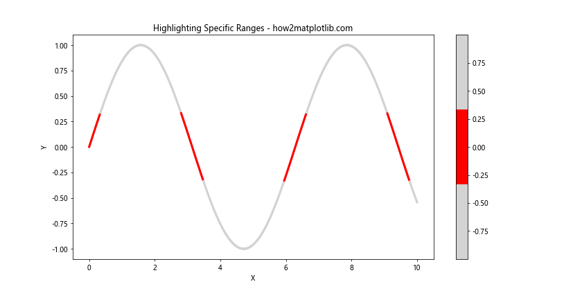
This example uses a custom colormap to highlight values in a specific range (in this case, positive values) in red.
Combining Colormaps with Contour Plots
Colormaps can be effectively combined with contour plots to create informative visualizations. Here’s an example:
import matplotlib.pyplot as plt
import numpy as np

# Generate sample data
x = np.linspace(-3, 3, 100)
y = np.linspace(-3, 3, 100)
X, Y = np.meshgrid(x, y)
Z = np.exp(-(X**2 + Y**2))

# Create the plot
fig, ax = plt.subplots(figsize=(10, 8))

# Create filled contours
cf = ax.contourf(X, Y, Z, levels=20, cmap='viridis')

# Add contour lines
cs = ax.contour(X, Y, Z, levels=20, colors='white', linewidths=0.5)

# Add contour labels
ax.clabel(cs, inline=True, fontsize=8)

# Add colorbar
plt.colorbar(cf)

plt.title('Combining Colormaps with Contour Plots - how2matplotlib.com')
plt.xlabel('X')
plt.ylabel('Y')
plt.show()
Output:
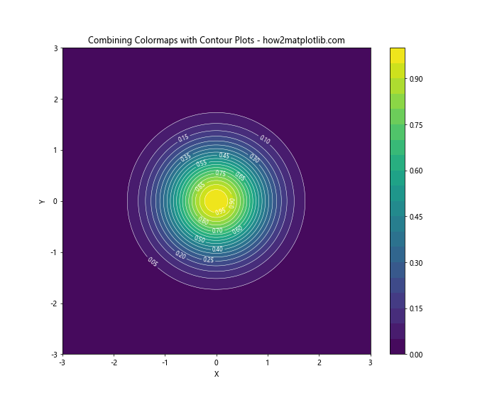
This example combines a filled contour plot using a colormap with contour lines and labels.
Matplotlib cmap Conclusion
Matplotlib cmap is a powerful tool for data visualization that allows you to represent complex information through color. From basic heatmaps to advanced 3D visualizations, colormaps can significantly enhance the interpretability and aesthetic appeal of your plots.
In this comprehensive guide, we’ve covered a wide range of topics related to matplotlib cmap, including:
- Understanding the basics of matplotlib cmap
- Exploring different types of colormaps (sequential, diverging, and qualitative)
- Customizing and creating colormaps
- Applying colormaps to various plot types
- Best practices for using colormaps effectively
- Troubleshooting common issues
- Advanced techniques for working with colormaps
By mastering matplotlib cmap, you’ll be able to create more informative and visually appealing data visualizations. Remember to choose appropriate colormaps for your data type, consider color blindness, and always provide context with colorbars and labels.
As you continue to work with matplotlib cmap, don’t be afraid to experiment with different colormaps and customizations to find what works best for your specific data and audience. With practice, you’ll develop an intuition for which colormaps work best in different situations, allowing you to create truly impactful data visualizations.