How to Master Matplotlib Cmap Range: A Comprehensive Guide
Matplotlib cmap range is a crucial concept in data visualization using Python’s Matplotlib library. This article will provide an in-depth exploration of matplotlib cmap range, covering its various aspects, applications, and best practices. We’ll dive into the intricacies of color mapping, understand how to manipulate color ranges effectively, and learn to create stunning visualizations using matplotlib cmap range.
Understanding Matplotlib Cmap Range
Matplotlib cmap range refers to the range of colors used in a colormap (cmap) to represent data values in visualizations. It allows you to map numerical data to a spectrum of colors, making it easier to interpret and analyze complex datasets. The cmap range determines how colors are distributed across the data range, enabling you to highlight specific patterns or trends in your visualizations.
Let’s start with a simple example to illustrate the concept of matplotlib cmap range:
import matplotlib.pyplot as plt
import numpy as np

# Generate sample data
x = np.linspace(0, 10, 100)
y = np.sin(x)

# Create a scatter plot with default cmap range
plt.figure(figsize=(10, 6))
plt.scatter(x, y, c=y, cmap='viridis')
plt.colorbar(label='Sin(x)')
plt.title('Matplotlib Cmap Range Example - how2matplotlib.com')
plt.xlabel('X')
plt.ylabel('Y')
plt.show()
Output:
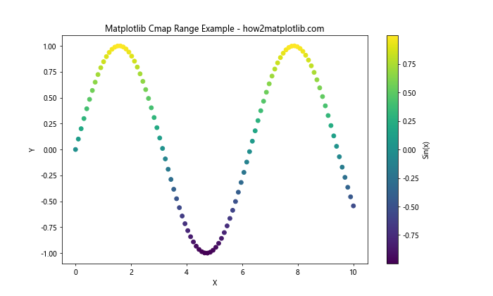
In this example, we create a scatter plot of the sine function, using the ‘viridis’ colormap to represent the y-values. The matplotlib cmap range is automatically set based on the minimum and maximum values of the data.
Customizing Matplotlib Cmap Range
One of the key advantages of matplotlib cmap range is its flexibility. You can customize the color range to better suit your data and visualization needs. Let’s explore some ways to modify the cmap range:
Setting a Fixed Cmap Range
Sometimes, you may want to set a fixed range for your colormap, regardless of the actual data range. This can be useful for comparing multiple plots or highlighting specific value ranges.
import matplotlib.pyplot as plt
import numpy as np

# Generate sample data
x = np.linspace(0, 10, 100)
y = np.sin(x)

# Create a scatter plot with a fixed cmap range
plt.figure(figsize=(10, 6))
plt.scatter(x, y, c=y, cmap='viridis', vmin=-1, vmax=1)
plt.colorbar(label='Sin(x)')
plt.title('Fixed Matplotlib Cmap Range - how2matplotlib.com')
plt.xlabel('X')
plt.ylabel('Y')
plt.show()
Output:
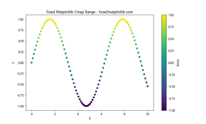
In this example, we use the vmin and vmax parameters to set a fixed range for the colormap from -1 to 1. This ensures that the full color spectrum is used, even if the data doesn’t span the entire range.
Choosing the Right Colormap
The choice of colormap is crucial in effectively representing your data. Matplotlib offers a wide range of colormaps, each suited for different types of data and visualization purposes. Let’s explore some popular colormaps and their applications:
Sequential Colormaps
Sequential colormaps are ideal for representing data that progresses from low to high values. They use a gradual change in color intensity or hue to show this progression.
import matplotlib.pyplot as plt
import numpy as np

# Generate sample data
x = np.linspace(0, 10, 20)
y = np.linspace(0, 10, 20)
X, Y = np.meshgrid(x, y)
Z = np.sin(X) * np.cos(Y)

# Create heatmaps with different sequential colormaps
fig, (ax1, ax2) = plt.subplots(1, 2, figsize=(15, 6))

im1 = ax1.imshow(Z, cmap='viridis', extent=[0, 10, 0, 10])
ax1.set_title('Viridis Colormap - how2matplotlib.com')
plt.colorbar(im1, ax=ax1)

im2 = ax2.imshow(Z, cmap='Blues', extent=[0, 10, 0, 10])
ax2.set_title('Blues Colormap - how2matplotlib.com')
plt.colorbar(im2, ax=ax2)

plt.show()
Output:
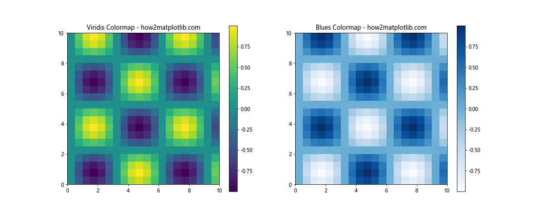
This example demonstrates two popular sequential colormaps: ‘viridis’ and ‘Blues’. The ‘viridis’ colormap is perceptually uniform and colorblind-friendly, while ‘Blues’ is useful for emphasizing higher values.
Diverging Colormaps
Diverging colormaps are useful for data that has a meaningful center point or zero value. They use two different hues that diverge from a central neutral color.
import matplotlib.pyplot as plt
import numpy as np

# Generate sample data
x = np.linspace(-5, 5, 100)
y = np.linspace(-5, 5, 100)
X, Y = np.meshgrid(x, y)
Z = X * Y

# Create heatmaps with different diverging colormaps
fig, (ax1, ax2) = plt.subplots(1, 2, figsize=(15, 6))

im1 = ax1.imshow(Z, cmap='RdBu', extent=[-5, 5, -5, 5])
ax1.set_title('RdBu Colormap - how2matplotlib.com')
plt.colorbar(im1, ax=ax1)

im2 = ax2.imshow(Z, cmap='coolwarm', extent=[-5, 5, -5, 5])
ax2.set_title('Coolwarm Colormap - how2matplotlib.com')
plt.colorbar(im2, ax=ax2)

plt.show()
Output:
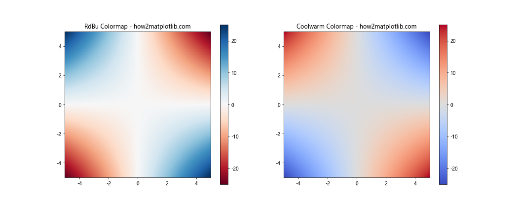
This example shows two diverging colormaps: ‘RdBu’ (Red-Blue) and ‘coolwarm’. These are excellent for highlighting deviations from a central value, such as in correlation matrices or temperature anomalies.
Advanced Matplotlib Cmap Range Techniques
Now that we’ve covered the basics, let’s explore some advanced techniques for working with matplotlib cmap range:
Custom Colormaps
While Matplotlib provides many built-in colormaps, you can also create custom colormaps tailored to your specific needs.
import matplotlib.pyplot as plt
import numpy as np
from matplotlib.colors import LinearSegmentedColormap

# Define custom colors
colors = ['darkred', 'red', 'orange', 'yellow', 'white']
n_bins = 100

# Create custom colormap
cmap_name = 'custom_fire'
cm = LinearSegmentedColormap.from_list(cmap_name, colors, N=n_bins)

# Generate sample data
x = np.linspace(0, 10, 100)
y = np.linspace(0, 10, 100)
X, Y = np.meshgrid(x, y)
Z = np.sqrt(X**2 + Y**2)

# Create heatmap with custom colormap
plt.figure(figsize=(10, 8))
im = plt.imshow(Z, cmap=cm, extent=[0, 10, 0, 10])
plt.colorbar(im, label='Distance from origin')
plt.title('Custom Fire Colormap - how2matplotlib.com')
plt.xlabel('X')
plt.ylabel('Y')
plt.show()
Output:
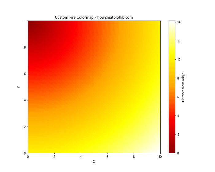
In this example, we create a custom ‘fire’ colormap using LinearSegmentedColormap.from_list(). This allows you to define your own color progression for specific visualization needs.
Matplotlib Cmap Range in 3D Plots
Matplotlib cmap range is not limited to 2D visualizations. It can also be applied to 3D plots to add an extra dimension of information. Let’s explore how to use cmap range in 3D surface plots:
import matplotlib.pyplot as plt
import numpy as np
from mpl_toolkits.mplot3d import Axes3D

# Generate sample data
x = np.linspace(-5, 5, 100)
y = np.linspace(-5, 5, 100)
X, Y = np.meshgrid(x, y)
Z = np.sin(np.sqrt(X**2 + Y**2))

# Create 3D surface plot with cmap range
fig = plt.figure(figsize=(12, 8))
ax = fig.add_subplot(111, projection='3d')
surf = ax.plot_surface(X, Y, Z, cmap='viridis', linewidth=0, antialiased=False)
fig.colorbar(surf, shrink=0.5, aspect=5, label='Z value')
ax.set_title('3D Surface Plot with Cmap Range - how2matplotlib.com')
ax.set_xlabel('X')
ax.set_ylabel('Y')
ax.set_zlabel('Z')
plt.show()
Output:
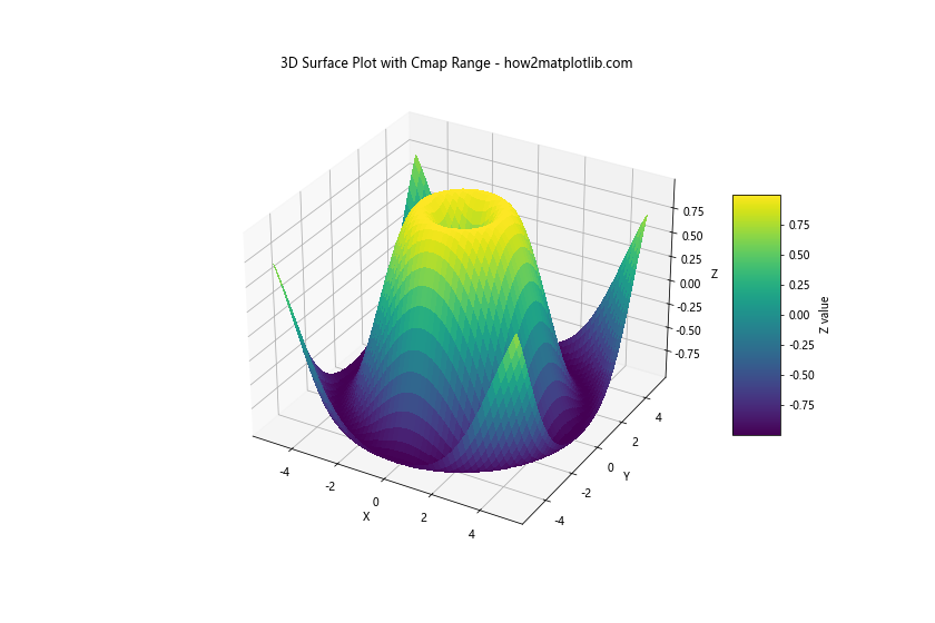
In this example, we create a 3D surface plot of a sinusoidal function, using the ‘viridis’ colormap to represent the Z-values. The colorbar provides a reference for the color-to-value mapping.
Handling Missing Data in Matplotlib Cmap Range
When working with real-world datasets, you may encounter missing or invalid data. Matplotlib provides ways to handle these cases in your cmap range visualizations:
import matplotlib.pyplot as plt
import numpy as np

# Generate sample data with missing values
np.random.seed(42)
data = np.random.rand(10, 10)
data[3:7, 3:7] = np.nan  # Set some values to NaN

# Create heatmap with missing data
plt.figure(figsize=(10, 8))
im = plt.imshow(data, cmap='YlOrRd', interpolation='nearest')
plt.colorbar(im, label='Values')
plt.title('Heatmap with Missing Data - how2matplotlib.com')
plt.xlabel('X')
plt.ylabel('Y')
plt.show()
Output:
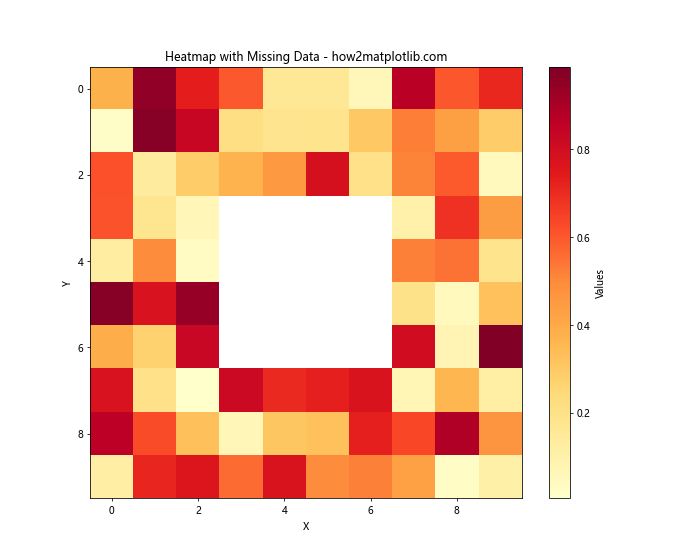
In this example, we create a heatmap with some missing (NaN) values. By default, Matplotlib represents these missing values as white spaces in the plot.
Matplotlib Cmap Range in Contour Plots
Contour plots are another powerful visualization technique that can benefit from effective use of matplotlib cmap range. Let’s explore how to create filled contour plots with custom color ranges:
import matplotlib.pyplot as plt
import numpy as np

# Generate sample data
x = np.linspace(-3, 3, 100)
y = np.linspace(-3, 3, 100)
X, Y = np.meshgrid(x, y)
Z = np.sin(X) * np.cos(Y)

# Create filled contour plot
plt.figure(figsize=(10, 8))
contour = plt.contourf(X, Y, Z, levels=20, cmap='RdYlBu')
plt.colorbar(contour, label='Z value')
plt.title('Filled Contour Plot - how2matplotlib.com')
plt.xlabel('X')
plt.ylabel('Y')
plt.show()
Output:
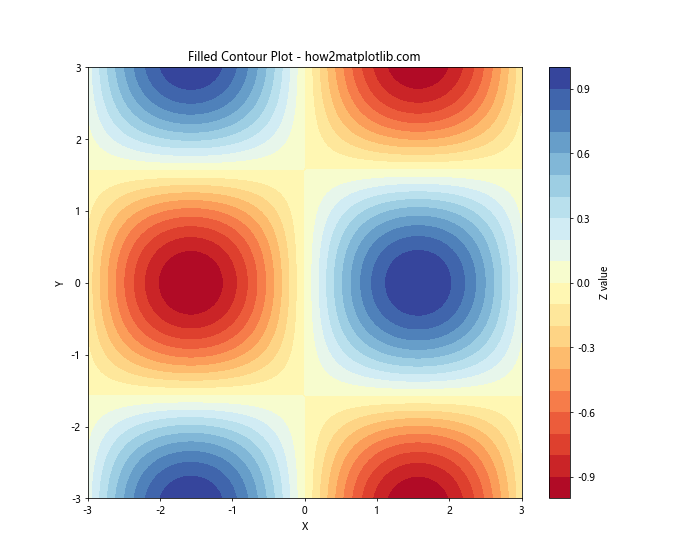
This example demonstrates a filled contour plot using the ‘RdYlBu’ colormap. The levels parameter controls the number of contour levels, effectively adjusting the granularity of the color range.
Matplotlib Cmap Range in Polar Plots
Matplotlib cmap range can also be applied to polar plots, which are useful for visualizing cyclical or directional data:
import matplotlib.pyplot as plt
import numpy as np

# Generate sample data
r = np.linspace(0, 2, 100)
theta = np.linspace(0, 2*np.pi, 100)
R, Theta = np.meshgrid(r, theta)
Z = R * np.sin(Theta)

# Create polar contour plot
plt.figure(figsize=(10, 8))
ax = plt.subplot(111, projection='polar')
contour = ax.contourf(Theta, R, Z, cmap='coolwarm')
plt.colorbar(contour, label='Z value')
ax.set_title('Polar Contour Plot - how2matplotlib.com')
plt.show()
Output:
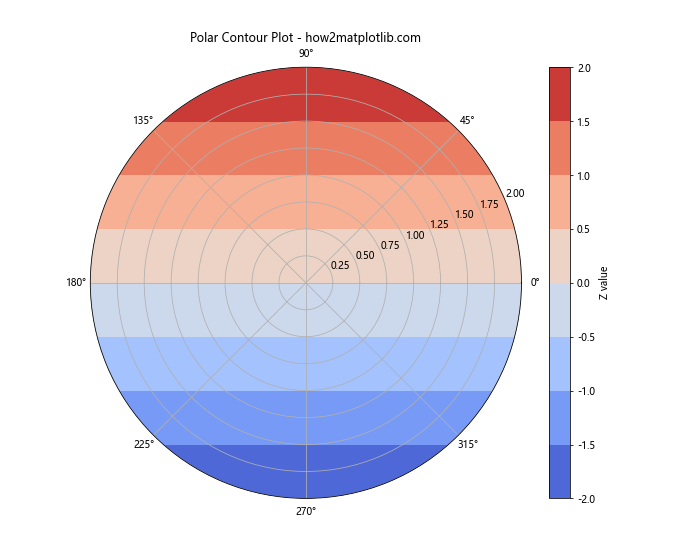
This example shows how to create a polar contour plot using the ‘coolwarm’ colormap. The color range helps visualize the variation of the Z values across different radii and angles.
Optimizing Matplotlib Cmap Range for Accessibility
When creating visualizations, it’s important to consider accessibility for all users, including those with color vision deficiencies. Here are some tips for optimizing your matplotlib cmap range for accessibility:
- Use colorblind-friendly colormaps like ‘viridis’, ‘plasma’, or ‘cividis’.
- Avoid using red and green in the same colormap, as these can be difficult to distinguish for some users.
- Consider using both color and other visual cues (like patterns or labels) to convey information.
Let’s create an example that demonstrates these principles:
import matplotlib.pyplot as plt
import numpy as np

# Generate sample data
x = np.linspace(0, 10, 100)
y = np.linspace(0, 10, 100)
X, Y = np.meshgrid(x, y)
Z = np.sin(X) * np.cos(Y)

# Create an accessible heatmap
plt.figure(figsize=(12, 8))
im = plt.imshow(Z, cmap='viridis', extent=[0, 10, 0, 10])
plt.colorbar(im, label='Z value')

plt.title('Accessible Heatmap - how2matplotlib.com')
plt.xlabel('X')
plt.ylabel('Y')

# Add contour lines for additional visual cues
contour = plt.contour(X, Y, Z, colors='white', linewidths=0.5, levels=10)
plt.clabel(contour, inline=True, fontsize=8)

plt.show()
Output:
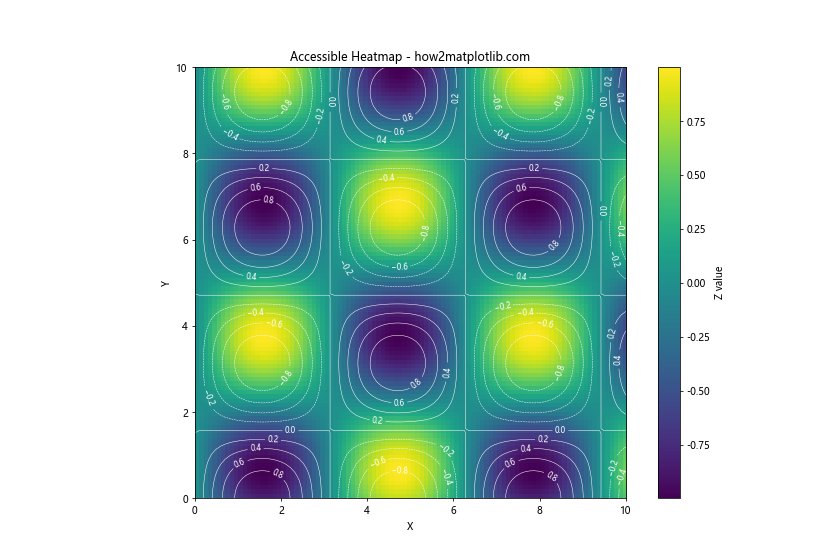
This example uses the colorblind-friendly ‘viridis’ colormap and adds white contour lines to provide additional visual cues beyond just color.
Animating Matplotlib Cmap Range
Animations can be a powerful way to visualize changing data over time. Let’s explore how to create an animated plot with a changing cmap range:
import matplotlib.pyplot as plt
import numpy as np
from matplotlib.animation import FuncAnimation

# Set up the figure and axis
fig, ax = plt.subplots(figsize=(10, 8))
plt.title('Animated Cmap Range - how2matplotlib.com')

# Generate initial data
x = np.linspace(0, 2*np.pi, 100)
y = np.linspace(0, 2*np.pi, 100)
X, Y = np.meshgrid(x, y)
Z = np.sin(X) * np.cos(Y)

# Create the initial plot
im = ax.imshow(Z, cmap='viridis', animated=True)
plt.colorbar(im, label='Z value')

# Update function for animation
def update(frame):
    Z = np.sin(X + frame/10) * np.cos(Y + frame/10)
    im.set_array(Z)
    return [im]

# Create the animation
anim = FuncAnimation(fig, update, frames=100, interval=50, blit=True)

plt.show()
Output:
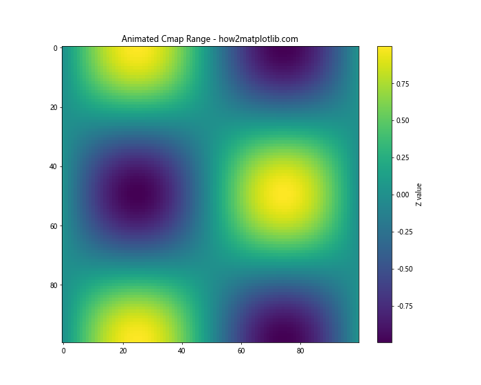
This example creates an animated heatmap where the data changes over time. The cmap range automatically adjusts to the changing data values.
Matplotlib Cmap Range in Subplots
When creating multiple subplots, you may want to ensure that the cmap range is consistent across all plots for easy comparison. Here’s how to achieve this:
import matplotlib.pyplot as plt
import numpy as np

# Generate sample data
np.random.seed(42)
data1 = np.random.rand(10, 10)
data2 = np.random.rand(10, 10) * 2
data3 = np.random.rand(10, 10) * 3
data4 = np.random.rand(10, 10) * 4

# Create subplots with consistent cmap range
fig, axs = plt.subplots(2, 2, figsize=(12, 12))
fig.suptitle('Consistent Cmap Range Across Subplots - how2matplotlib.com')

vmin = min(data1.min(), data2.min(), data3.min(), data4.min())
vmax = max(data1.max(), data2.max(), data3.max(), data4.max())

im1 = axs[0, 0].imshow(data1, cmap='viridis', vmin=vmin, vmax=vmax)
axs[0, 0].set_title('Data 1')

im2 = axs[0, 1].imshow(data2, cmap='viridis', vmin=vmin, vmax=vmax)
axs[0, 1].set_title('Data 2')

im3 = axs[1, 0].imshow(data3, cmap='viridis', vmin=vmin, vmax=vmax)
axs[1, 0].set_title('Data 3')

im4 = axs[1, 1].imshow(data4, cmap='viridis', vmin=vmin, vmax=vmax)
axs[1, 1].set_title('Data 4')

fig.colorbar(im1, ax=axs.ravel().tolist(), label='Values')

plt.tight_layout()
plt.show()
Output:
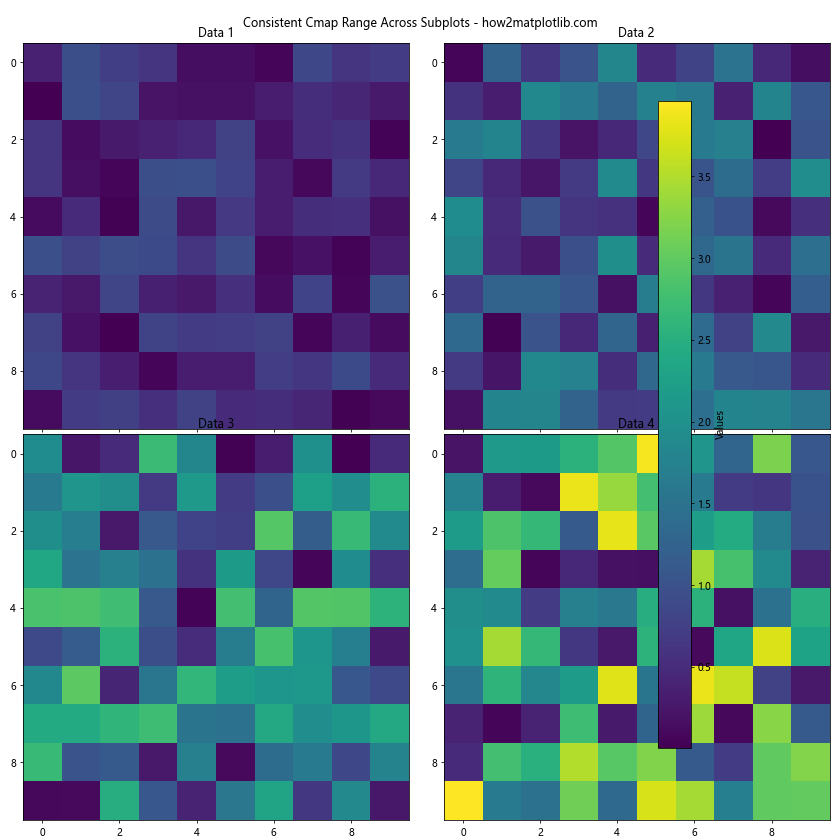
This example creates four subplots with different data ranges but uses a consistent cmap range across all of them, making it easier to compare the data visually.
Customizing Colorbar for Matplotlib Cmap Range
The colorbar is an essential component when using matplotlib cmap range. Let’s explore some ways to customize the colorbar:
import matplotlib.pyplot as plt
import numpy as np

# Generate sample data
x = np.linspace(0, 10, 100)
y = np.linspace(0, 10, 100)
X, Y = np.meshgrid(x, y)
Z = np.sin(X) * np.cos(Y)

# Create plot with customized colorbar
fig, ax = plt.subplots(figsize=(12, 8))
im = ax.imshow(Z, cmap='coolwarm', extent=[0, 10, 0, 10])

# Customize colorbar
cbar = fig.colorbar(im, ax=ax, orientation='vertical', pad=0.1)
cbar.set_label('Z Value', rotation=270, labelpad=15)
cbar.ax.tick_params(size=0)
cbar.ax.yaxis.set_ticks_position('left')
cbar.ax.yaxis.set_label_position('left')

# Add colorbar ticks at specific values
cbar.set_ticks([-1, -0.5, 0, 0.5, 1])
cbar.set_ticklabels(['Low', 'Medium-Low', 'Neutral', 'Medium-High', 'High'])

plt.title('Customized Colorbar - how2matplotlib.com')
plt.xlabel('X')
plt.ylabel('Y')
plt.show()
Output:
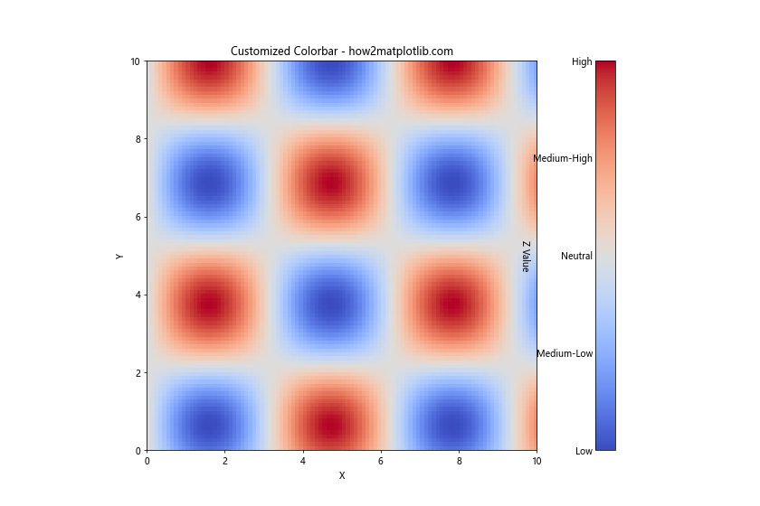
This example demonstrates various ways to customize the colorbar, including changing its position, label, tick positions, and tick labels.
Matplotlib Cmap Range with Categorical Data
While matplotlib cmap range is typically used with continuous data, it can also be applied to categorical data using a technique called color encoding:
import matplotlib.pyplot as plt
import numpy as np

# Generate sample categorical data
categories = ['A', 'B', 'C', 'D', 'E']
data = np.random.choice(categories, (10, 10))

# Create a mapping of categories to numbers
cat_to_num = {cat: i for i, cat in enumerate(categories)}
numeric_data = np.array([[cat_to_num[cell] for cell in row] for row in data])

# Create heatmap with categorical data
plt.figure(figsize=(10, 8))
im = plt.imshow(numeric_data, cmap='Set3')

# Customize colorbar
cbar = plt.colorbar(ticks=range(len(categories)))
cbar.set_ticklabels(categories)
cbar.set_label('Categories')

plt.title('Categorical Data with Cmap Range - how2matplotlib.com')
plt.xlabel('X')
plt.ylabel('Y')
plt.show()
Output:
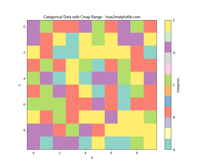
This example shows how to use a discrete colormap to represent categorical data, with each category assigned a unique color.
Matplotlib cmap range Conclusion
Matplotlib cmap range is a powerful tool for enhancing data visualizations. By mastering its various aspects, from basic usage to advanced techniques, you can create more informative and visually appealing plots. Remember to consider factors such as data distribution, colormap choice, and accessibility when working with matplotlib cmap range.
Throughout this article, we’ve explored numerous examples and techniques for effectively using matplotlib cmap range. We’ve covered topics such as customizing color ranges, creating custom colormaps, handling missing data, and applying cmap range to various plot types including 3D plots, contour plots, and polar plots.
We’ve also discussed important considerations like optimizing for accessibility, creating animations, ensuring consistency across subplots, and customizing colorbars. Additionally, we’ve shown how matplotlib cmap range can be adapted for use with categorical data.
By applying these techniques and best practices, you can significantly enhance your data visualizations and make your insights more accessible and impactful. Remember that the key to mastering matplotlib cmap range is experimentation and practice. Don’t hesitate to try different approaches and customize your plots to best suit your specific data and audience needs.
As you continue to work with matplotlib cmap range, keep exploring new colormaps, visualization techniques, and ways to combine different plot elements. The flexibility and power of matplotlib allow for endless possibilities in data visualization, and mastering cmap range is a crucial step in becoming proficient in creating compelling and informative plots.