How to Master Matplotlib Legend: A Comprehensive Guide for Data Visualization
Matplotlib legend is an essential component of data visualization in Python. When creating plots with multiple data series, a legend helps viewers understand what each line, marker, or color represents. In this comprehensive guide, we’ll explore everything you need to know about matplotlib legend, from basic usage to advanced customization techniques. Whether you’re a beginner or an experienced data scientist, this article will help you master the art of creating informative and visually appealing legends in your matplotlib plots.
Matplotlib Legend Recommended Articles
- Matplotlib Legend Location
- Matplotlib Legend Outside
- Matplotlib Legend Position
- Matplotlib Legend Outside Plot
- Matplotlib Legend Font Size
- Matplotlib Legend title
- Matplotlib Legend Size
Understanding the Basics of Matplotlib Legend
Matplotlib legend is a crucial element in data visualization that provides context and meaning to the various components of a plot. It typically appears as a box containing labeled symbols that correspond to the different data series or elements in the graph. The legend helps viewers quickly identify and interpret the information presented in the plot.
Let’s start with a simple example to demonstrate how to add a basic legend to a matplotlib plot:
import matplotlib.pyplot as plt
import numpy as np

x = np.linspace(0, 10, 100)
y1 = np.sin(x)
y2 = np.cos(x)

plt.figure(figsize=(10, 6))
plt.plot(x, y1, label='Sine Wave')
plt.plot(x, y2, label='Cosine Wave')
plt.xlabel('X-axis')
plt.ylabel('Y-axis')
plt.title('Simple Plot with Legend - how2matplotlib.com')
plt.legend()
plt.show()
Output:
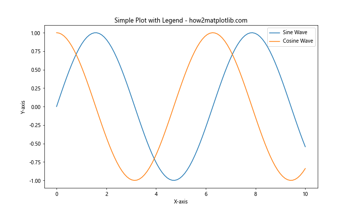
In this example, we create a simple plot with two lines representing sine and cosine waves. The label parameter in the plt.plot() function is used to specify the label for each line in the legend. The plt.legend() function is called to display the legend on the plot.
Customizing Legend Location
One of the most common customizations for matplotlib legend is adjusting its location. By default, matplotlib tries to place the legend in the best location that doesn’t overlap with the plot data. However, you can manually specify the legend’s position using the loc parameter.
Here’s an example demonstrating different legend locations:
import matplotlib.pyplot as plt
import numpy as np

x = np.linspace(0, 10, 100)
y1 = np.sin(x)
y2 = np.cos(x)

locations = ['best', 'upper right', 'upper left', 'lower left', 'lower right', 'right', 'center left', 'center right', 'lower center', 'upper center', 'center']

fig, axes = plt.subplots(4, 3, figsize=(15, 20))
axes = axes.flatten()

for i, loc in enumerate(locations):
    axes[i].plot(x, y1, label='Sine Wave')
    axes[i].plot(x, y2, label='Cosine Wave')
    axes[i].set_title(f'Legend Location: {loc} - how2matplotlib.com')
    axes[i].legend(loc=loc)

plt.tight_layout()
plt.show()
Output:
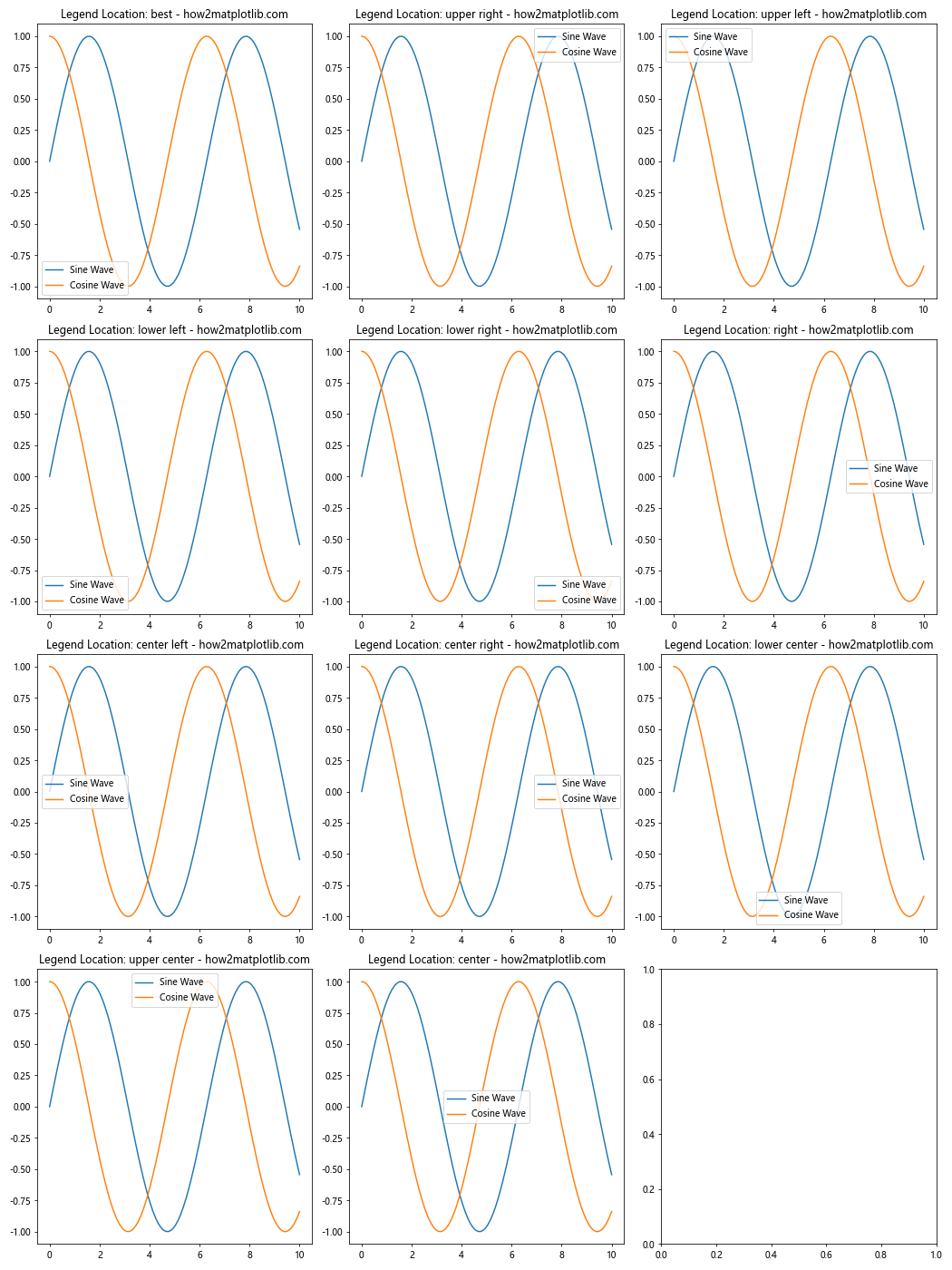
This example creates multiple subplots, each demonstrating a different legend location. The loc parameter in axes[i].legend(loc=loc) is used to specify the position of the legend.
Customizing Legend Appearance
Matplotlib legend offers various options to customize its appearance, including changing the number of columns, adjusting the font size, and modifying the background color. Let’s explore these customization options:
import matplotlib.pyplot as plt
import numpy as np

x = np.linspace(0, 10, 100)
y1 = np.sin(x)
y2 = np.cos(x)
y3 = np.tan(x)
y4 = x**2

plt.figure(figsize=(12, 8))
plt.plot(x, y1, label='Sine Wave')
plt.plot(x, y2, label='Cosine Wave')
plt.plot(x, y3, label='Tangent Wave')
plt.plot(x, y4, label='Quadratic Function')
plt.xlabel('X-axis')
plt.ylabel('Y-axis')
plt.title('Customized Legend Appearance - how2matplotlib.com')

plt.legend(
    loc='upper center',
    ncol=2,
    fontsize=12,
    fancybox=True,
    shadow=True,
    bbox_to_anchor=(0.5, 1.15),
    title='Legend Title',
    title_fontsize=14,
    framealpha=0.8,
    edgecolor='red'
)

plt.tight_layout()
plt.show()
Output:
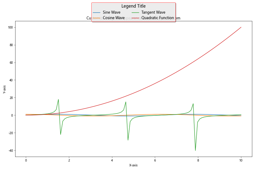
In this example, we customize various aspects of the legend:
ncol=2: Sets the number of columns in the legendfontsize=12: Adjusts the font size of the legend labelsfancybox=True: Adds rounded corners to the legend boxshadow=True: Adds a shadow effect to the legendbbox_to_anchor=(0.5, 1.15): Positions the legend above the plottitle='Legend Title': Adds a title to the legendtitle_fontsize=14: Sets the font size of the legend titleframealpha=0.8: Adjusts the transparency of the legend backgroundedgecolor='red': Changes the color of the legend border
Adding a Legend to Scatter Plots
Matplotlib legend can also be used with scatter plots to identify different data series or categories. Here’s an example of how to add a legend to a scatter plot:
import matplotlib.pyplot as plt
import numpy as np

np.random.seed(42)
x = np.random.rand(50)
y1 = np.random.rand(50)
y2 = np.random.rand(50)
y3 = np.random.rand(50)

plt.figure(figsize=(10, 6))
plt.scatter(x, y1, c='red', label='Category A')
plt.scatter(x, y2, c='blue', label='Category B')
plt.scatter(x, y3, c='green', label='Category C')
plt.xlabel('X-axis')
plt.ylabel('Y-axis')
plt.title('Scatter Plot with Legend - how2matplotlib.com')
plt.legend()
plt.show()
Output:
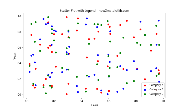
In this example, we create a scatter plot with three different categories of data points. The label parameter in the plt.scatter() function is used to specify the label for each category in the legend.
Creating a Legend for Multiple Subplots
When working with multiple subplots, you may want to create a single legend that applies to all subplots. Here’s an example of how to achieve this:
import matplotlib.pyplot as plt
import numpy as np

x = np.linspace(0, 10, 100)
y1 = np.sin(x)
y2 = np.cos(x)

fig, (ax1, ax2) = plt.subplots(1, 2, figsize=(12, 5))

line1, = ax1.plot(x, y1, 'r-', label='Sine Wave')
line2, = ax1.plot(x, y2, 'b-', label='Cosine Wave')
ax1.set_title('Subplot 1 - how2matplotlib.com')

line3, = ax2.plot(x, y1**2, 'g-', label='Sine Squared')
line4, = ax2.plot(x, y2**2, 'm-', label='Cosine Squared')
ax2.set_title('Subplot 2 - how2matplotlib.com')

fig.legend(handles=[line1, line2, line3, line4], loc='upper center', ncol=4, bbox_to_anchor=(0.5, 1.05))
plt.tight_layout()
plt.show()
Output:
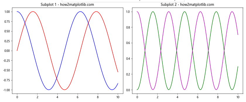
In this example, we create two subplots and add a single legend that applies to both. The fig.legend() function is used to create the legend, and the handles parameter is used to specify which lines should be included in the legend.
Customizing Legend Markers and Labels
Matplotlib legend allows you to customize the markers and labels used in the legend. This can be particularly useful when you want to create a legend that doesn’t directly correspond to the plot elements. Here’s an example:
import matplotlib.pyplot as plt
import numpy as np

x = np.linspace(0, 10, 100)
y1 = np.sin(x)
y2 = np.cos(x)

plt.figure(figsize=(10, 6))
plt.plot(x, y1, 'r-')
plt.plot(x, y2, 'b-')
plt.xlabel('X-axis')
plt.ylabel('Y-axis')
plt.title('Custom Legend Markers and Labels - how2matplotlib.com')

custom_lines = [plt.Line2D([0], [0], color='red', lw=2),
                plt.Line2D([0], [0], color='blue', lw=2),
                plt.Line2D([0], [0], color='green', marker='o', linestyle='')]

plt.legend(custom_lines, ['Sine Wave', 'Cosine Wave', 'Data Points'], loc='upper right')
plt.show()
Output:
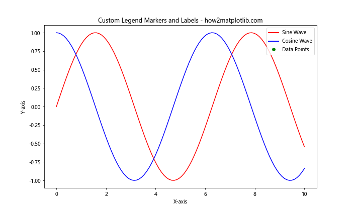
In this example, we create custom legend entries using plt.Line2D() objects. This allows us to specify custom colors, line styles, and markers for the legend entries, even if they don’t directly correspond to elements in the plot.
Adding a Legend to Bar Charts
Matplotlib legend can also be used with bar charts to identify different categories or groups. Here’s an example of how to add a legend to a bar chart:
import matplotlib.pyplot as plt
import numpy as np

categories = ['A', 'B', 'C', 'D']
values1 = [4, 7, 2, 5]
values2 = [3, 6, 4, 3]

x = np.arange(len(categories))
width = 0.35

fig, ax = plt.subplots(figsize=(10, 6))
rects1 = ax.bar(x - width/2, values1, width, label='Group 1')
rects2 = ax.bar(x + width/2, values2, width, label='Group 2')

ax.set_xlabel('Categories')
ax.set_ylabel('Values')
ax.set_title('Bar Chart with Legend - how2matplotlib.com')
ax.set_xticks(x)
ax.set_xticklabels(categories)
ax.legend()

plt.tight_layout()
plt.show()
Output:
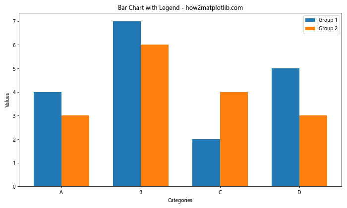
In this example, we create a bar chart with two groups of data. The label parameter in the ax.bar() function is used to specify the label for each group in the legend.
Creating a Legend for Pie Charts
Pie charts in matplotlib typically use the wedge labels as a built-in legend. However, you can create a separate legend for a pie chart if needed. Here’s an example:
import matplotlib.pyplot as plt

sizes = [30, 25, 20, 15, 10]
labels = ['A', 'B', 'C', 'D', 'E']
colors = ['red', 'blue', 'green', 'yellow', 'orange']

plt.figure(figsize=(10, 6))
plt.pie(sizes, labels=labels, colors=colors, autopct='%1.1f%%', startangle=90)
plt.axis('equal')
plt.title('Pie Chart with Separate Legend - how2matplotlib.com')

plt.legend(labels, title='Categories', loc='center left', bbox_to_anchor=(1, 0.5))
plt.tight_layout()
plt.show()
Output:
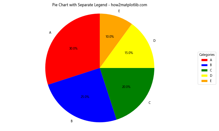
In this example, we create a pie chart and add a separate legend using the plt.legend() function. The bbox_to_anchor parameter is used to position the legend outside the pie chart.
Handling Overlapping Legend Items
When dealing with many legend items, overlapping can become an issue. Matplotlib provides options to handle this, such as adjusting the number of columns or using a smaller font size. Here’s an example:
import matplotlib.pyplot as plt
import numpy as np

x = np.linspace(0, 10, 100)
plt.figure(figsize=(12, 8))

for i in range(15):
    plt.plot(x, np.sin(x + i*0.5), label=f'Sin(x + {i*0.5:.1f})')

plt.xlabel('X-axis')
plt.ylabel('Y-axis')
plt.title('Handling Overlapping Legend Items - how2matplotlib.com')

plt.legend(ncol=3, fontsize=8, loc='upper center', bbox_to_anchor=(0.5, -0.05))
plt.tight_layout()
plt.show()
Output:
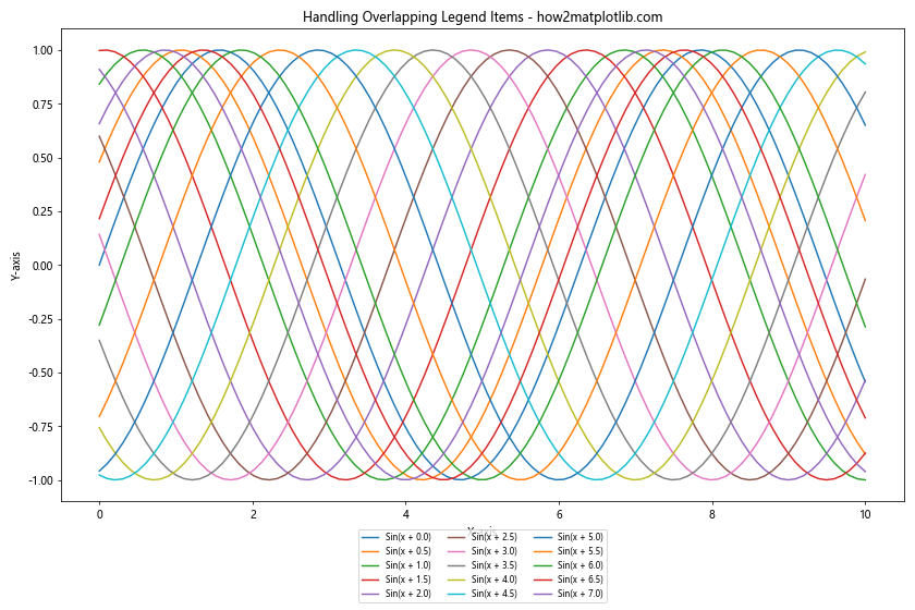
In this example, we create multiple sine waves with different phase shifts. To handle the large number of legend items, we use ncol=3 to create a three-column legend, reduce the font size with fontsize=8, and position the legend below the plot using bbox_to_anchor=(0.5, -0.05).
Creating a Legend for Filled Areas
When working with filled areas in matplotlib, such as those created by plt.fill_between(), you can add these areas to the legend. Here’s an example:
import matplotlib.pyplot as plt
import numpy as np

x = np.linspace(0, 10, 100)
y1 = np.sin(x)
y2 = np.cos(x)

plt.figure(figsize=(10, 6))
plt.plot(x, y1, 'r-', label='Sine Wave')
plt.plot(x, y2, 'b-', label='Cosine Wave')
plt.fill_between(x, y1, y2, where=(y1 > y2), color='green', alpha=0.3, label='Sine > Cosine')
plt.fill_between(x, y1, y2, where=(y1 <= y2), color='yellow', alpha=0.3, label='Sine <= Cosine')

plt.xlabel('X-axis')
plt.ylabel('Y-axis')
plt.title('Legend with Filled Areas - how2matplotlib.com')
plt.legend()
plt.show()
Output:
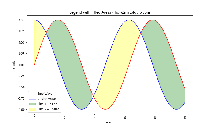
In this example, we create a plot with two lines and two filled areas. The label parameter in the plt.fill_between() function is used to add the filled areas to the legend.
Using a Custom Legend Handler
For more complex plots, you might need to create custom legend handlers to represent your data accurately. Here's an example of how to create a custom legend handler:
import matplotlib.pyplot as plt
import matplotlib.patches as mpatches

class AsteriskHandler:
    def legend_artist(self, legend, orig_handle, fontsize, handlebox):
        x0, y0 = handlebox.xdescent, handlebox.ydescent
        width, height = handlebox.width, handlebox.height
        patch = mpatches.RegularPolygon((x0 + width / 2, y0 + height / 2), 5, radius=min(width, height) / 2,
                                        facecolor='none', edgecolor=orig_handle.get_color())
        handlebox.add_artist(patch)
        return patch

plt.figure(figsize=(10, 6))
plt.plot([1, 2, 3], [1, 2, 3], 'r-', label='Line')
plt.scatter([2], [2], c='b', s=100, label='Point')

handle = plt.plot([0], [0], 'g-')[0]  # Dummy plot for custom handler
plt.legend([handle], ['Custom'], handler_map={handle: AsteriskHandler()})

plt.title('Custom Legend Handler - how2matplotlib.com')
plt.show()
Output:
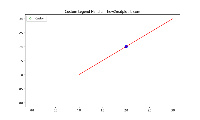
In this example, we create a custom legend handler that draws an asterisk-like symbol. The AsteriskHandler class defines how the custom symbol should be drawn in the legend.
Adding a Colorbar as a Legend
For plots that use a color scale, such as heatmaps or scatter plots with color-coded points, you can use a colorbar as a legend. Here's an example of how to add a colorbar as a legend:
import matplotlib.pyplot as plt
import numpy as np

x = np.random.rand(100)
y = np.random.rand(100)
colors = np.random.rand(100)

plt.figure(figsize=(10, 6))
scatter = plt.scatter(x, y, c=colors, cmap='viridis')
plt.xlabel('X-axis')
plt.ylabel('Y-axis')
plt.title('Scatter Plot with Colorbar Legend - how2matplotlib.com')

cbar = plt.colorbar(scatter)
cbar.set_label('Color Scale')

plt.show()
Output:
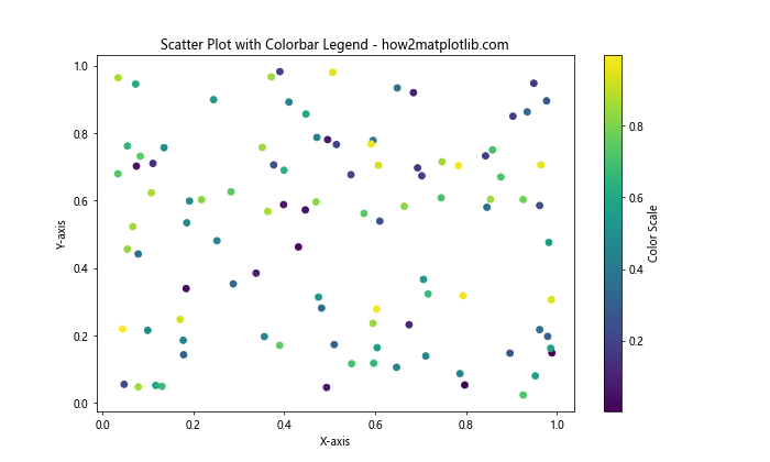
In this example, we create a scatter plot where the color of each point is determined by a value. The plt.colorbar() function is used to add a colorbar legend that shows the mapping between colors and values.
Creating a Legend for Hatched Areas
Matplotlib allows you to create hatched areas in your plots, and you can include these in your legend. Here's an example:
import matplotlib.pyplot as plt
import numpy as np

x = np.linspace(0, 10, 100)
y1 = np.sin(x)
y2 = np.cos(x)

plt.figure(figsize=(10, 6))
plt.plot(x, y1, 'r-', label='Sine Wave')
plt.plot(x, y2, 'b-', label='Cosine Wave')
plt.fill_between(x, y1, y2, where=(y1 > y2), hatch='///', facecolor='none', edgecolor='green', label='Sine > Cosine')
plt.fill_between(x, y1, y2, where=(y1 <= y2), hatch='\\\\\\', facecolor='none', edgecolor='orange', label='Sine <= Cosine')

plt.xlabel('X-axis')
plt.ylabel('Y-axis')
plt.title('Legend with Hatched Areas - how2matplotlib.com')
plt.legend()
plt.show()
Output:
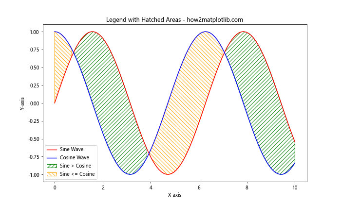
In this example, we create hatched areas using the hatch parameter in plt.fill_between(). The legend includes these hatched areas along with the line plots.
Using Multiple Legends
In some cases, you might want to have multiple legends in your plot, each representing different aspects of your data. Here's how you can achieve this:
import matplotlib.pyplot as plt
import numpy as np

x = np.linspace(0, 10, 100)
y1 = np.sin(x)
y2 = np.cos(x)

fig, ax = plt.subplots(figsize=(10, 6))
line1 = ax.plot(x, y1, 'r-', label='Sine Wave')
line2 = ax.plot(x, y2, 'b-', label='Cosine Wave')

ax.set_xlabel('X-axis')
ax.set_ylabel('Y-axis')
ax.set_title('Plot with Multiple Legends - how2matplotlib.com')

# First legend
legend1 = ax.legend(loc='upper right', title='Wave Types')

# Second legend
custom_lines = [plt.Line2D([0], [0], color='purple', lw=2),
                plt.Line2D([0], [0], color='green', lw=2)]
legend2 = ax.legend(custom_lines, ['Category A', 'Category B'], loc='lower right', title='Categories')

# Add the first legend back
ax.add_artist(legend1)

plt.show()
Output:
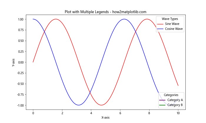
In this example, we create two separate legends. The first legend shows the wave types, while the second legend shows additional categories. We use ax.add_artist() to add the first legend back after creating the second one.
Adjusting Legend Z-order
Sometimes, the legend may be obscured by other elements in the plot. You can adjust the z-order of the legend to ensure it appears on top of other elements:
import matplotlib.pyplot as plt
import numpy as np

x = np.linspace(0, 10, 100)
y1 = np.sin(x)
y2 = np.cos(x)

plt.figure(figsize=(10, 6))
plt.plot(x, y1, 'r-', label='Sine Wave')
plt.plot(x, y2, 'b-', label='Cosine Wave')
plt.fill_between(x, y1, y2, alpha=0.3)

plt.xlabel('X-axis')
plt.ylabel('Y-axis')
plt.title('Adjusting Legend Z-order - how2matplotlib.com')

legend = plt.legend()
legend.set_zorder(100)  # Ensure legend is on top

plt.show()
Output:
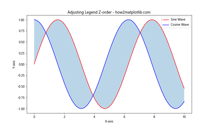
In this example, we use legend.set_zorder(100) to set a high z-order value for the legend, ensuring it appears on top of the filled area.
Creating a Legend for Stacked Plots
When working with stacked plots, such as stacked bar charts or area plots, you may want to create a legend that represents each stack. Here's an example:
import matplotlib.pyplot as plt
import numpy as np

categories = ['A', 'B', 'C', 'D']
values1 = [4, 7, 2, 5]
values2 = [3, 6, 4, 3]
values3 = [2, 4, 3, 2]

x = np.arange(len(categories))

plt.figure(figsize=(10, 6))
plt.bar(x, values1, label='Group 1')
plt.bar(x, values2, bottom=values1, label='Group 2')
plt.bar(x, values3, bottom=np.array(values1) + np.array(values2), label='Group 3')

plt.xlabel('Categories')
plt.ylabel('Values')
plt.title('Stacked Bar Chart with Legend - how2matplotlib.com')
plt.xticks(x, categories)
plt.legend()

plt.tight_layout()
plt.show()
Output:
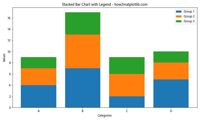
In this example, we create a stacked bar chart with three groups. The label parameter in each plt.bar() call is used to specify the label for each group in the legend.
Matplotlib Legend Conclusion
Matplotlib legend is a powerful tool for enhancing the clarity and interpretability of your data visualizations. Throughout this comprehensive guide, we've explored various aspects of working with matplotlib legend, from basic usage to advanced customization techniques. We've covered topics such as:
- Adding basic legends to plots
- Customizing legend location and appearance
- Creating legends for different types of plots (scatter, bar, pie, 3D)
- Handling overlapping legend items
- Using custom legend handlers
- Adding colorbars as legends
- Creating legends for hatched areas
- Using multiple legends in a single plot
- Adjusting legend z-order
- Creating legends for stacked plots
By mastering these techniques, you'll be able to create more informative and visually appealing data visualizations using matplotlib. Remember that the key to effective data visualization is not just in presenting the data, but in making it easily understandable to your audience. A well-crafted legend can significantly contribute to this goal.
As you continue to work with matplotlib legend, don't be afraid to experiment with different combinations of these techniques to find the best way to represent your data. The flexibility of matplotlib allows for countless customization options, so you can always find a way to create the perfect legend for your specific visualization needs.
Keep practicing and exploring the various options available in matplotlib legend, and you'll soon become proficient in creating professional-quality data visualizations that effectively communicate your insights.