Comprehensive Guide to Using Matplotlib.axis.Tick.get_figure() in Python
Matplotlib.axis.Tick.get_figure() in Python is an essential method for accessing the figure object associated with a tick in Matplotlib. This powerful function allows developers to manipulate and customize various aspects of their plots, enhancing the overall visualization experience. In this comprehensive guide, we’ll explore the intricacies of Matplotlib.axis.Tick.get_figure() in Python, providing detailed explanations and practical examples to help you master this crucial aspect of data visualization.
Understanding Matplotlib.axis.Tick.get_figure() in Python
Matplotlib.axis.Tick.get_figure() in Python is a method that belongs to the Tick class in Matplotlib’s axis module. Its primary purpose is to retrieve the Figure object associated with a specific tick on an axis. This function is particularly useful when you need to access or modify properties of the entire figure from within a tick-related context.
Let’s start with a simple example to demonstrate how to use Matplotlib.axis.Tick.get_figure() in Python:
import matplotlib.pyplot as plt

# Create a figure and axis
fig, ax = plt.subplots()

# Plot some data
ax.plot([1, 2, 3, 4], [1, 4, 2, 3], label='Data from how2matplotlib.com')

# Get the first x-axis tick
x_tick = ax.xaxis.get_major_ticks()[0]

# Use get_figure() to access the figure object
figure = x_tick.get_figure()

# Customize the figure title
figure.suptitle('Using Matplotlib.axis.Tick.get_figure() in Python')

plt.legend()
plt.show()
Output:
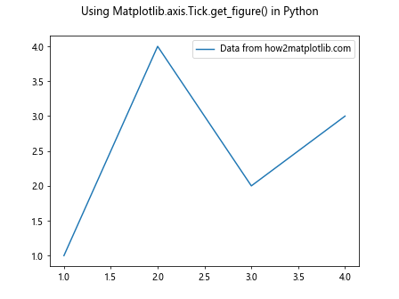
In this example, we create a simple plot and then use Matplotlib.axis.Tick.get_figure() in Python to access the figure object from one of the x-axis ticks. We then use this figure object to set a title for the entire figure.
Exploring the Power of Matplotlib.axis.Tick.get_figure() in Python
Matplotlib.axis.Tick.get_figure() in Python offers a wide range of possibilities for customizing and enhancing your plots. Let’s dive deeper into some of its applications and use cases.
Adjusting Figure Properties
One of the primary uses of Matplotlib.axis.Tick.get_figure() in Python is to modify various properties of the figure from within a tick-related context. This can be particularly useful when you want to make global changes based on specific tick information.
Here’s an example that demonstrates how to adjust the figure size based on the number of ticks:
import matplotlib.pyplot as plt

# Create a figure and axis
fig, ax = plt.subplots()

# Plot some data
ax.plot([1, 2, 3, 4, 5], [2, 4, 1, 3, 5], label='Data from how2matplotlib.com')

# Get all x-axis ticks
x_ticks = ax.xaxis.get_major_ticks()

# Use get_figure() to access the figure object
figure = x_ticks[0].get_figure()

# Adjust figure size based on the number of ticks
num_ticks = len(x_ticks)
figure.set_size_inches(num_ticks * 2, 6)

plt.legend()
plt.title('Adjusting Figure Size with Matplotlib.axis.Tick.get_figure() in Python')
plt.show()
Output:

In this example, we use Matplotlib.axis.Tick.get_figure() in Python to access the figure object and then adjust its size based on the number of x-axis ticks. This approach can be useful for creating responsive visualizations that adapt to the data being displayed.
Coordinating Multiple Subplots
Matplotlib.axis.Tick.get_figure() in Python can be particularly powerful when working with multiple subplots. It allows you to make coordinated changes across all subplots from within a single tick context.
Let’s look at an example that demonstrates this capability:
import matplotlib.pyplot as plt

# Create a figure with multiple subplots
fig, (ax1, ax2) = plt.subplots(2, 1, figsize=(8, 10))

# Plot data on both subplots
ax1.plot([1, 2, 3, 4], [1, 4, 2, 3], label='Data 1 from how2matplotlib.com')
ax2.plot([1, 2, 3, 4], [3, 1, 4, 2], label='Data 2 from how2matplotlib.com')

# Get a tick from the first subplot
tick = ax1.xaxis.get_major_ticks()[0]

# Use get_figure() to access the figure object
figure = tick.get_figure()

# Add a global title to the figure
figure.suptitle('Coordinating Subplots with Matplotlib.axis.Tick.get_figure() in Python', fontsize=16)

# Adjust the layout to prevent overlapping
figure.tight_layout(rect=[0, 0.03, 1, 0.95])

plt.legend()
plt.show()
Output:
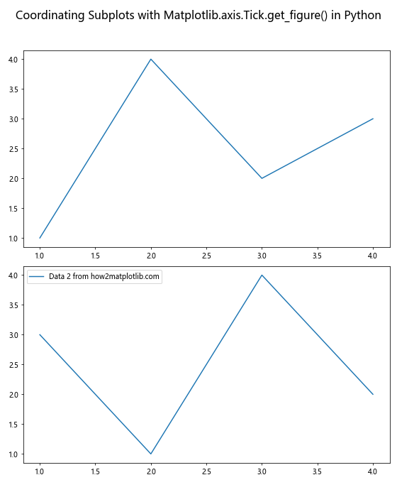
In this example, we create two subplots and use Matplotlib.axis.Tick.get_figure() in Python to access the figure object from a tick on the first subplot. We then use this figure object to add a global title and adjust the layout for both subplots simultaneously.
Dynamic Color Schemes
Matplotlib.axis.Tick.get_figure() in Python can be used to implement dynamic color schemes based on tick properties. This can be particularly useful for creating visually appealing and informative plots.
Here’s an example that demonstrates how to change the background color of a figure based on the range of x-axis ticks:
import matplotlib.pyplot as plt
import numpy as np

# Create a figure and axis
fig, ax = plt.subplots()

# Generate some data
x = np.linspace(0, 10, 100)
y = np.sin(x)

# Plot the data
ax.plot(x, y, label='Sine wave from how2matplotlib.com')

# Get the x-axis ticks
x_ticks = ax.xaxis.get_major_ticks()

# Calculate the range of x-axis values
x_range = x_ticks[-1].get_loc() - x_ticks[0].get_loc()

# Use get_figure() to access the figure object
figure = x_ticks[0].get_figure()

# Set the background color based on the x-range
if x_range < 5:
    figure.patch.set_facecolor('lightblue')
elif x_range < 8:
    figure.patch.set_facecolor('lightgreen')
else:
    figure.patch.set_facecolor('lightyellow')

plt.legend()
plt.title('Dynamic Background Color with Matplotlib.axis.Tick.get_figure() in Python')
plt.show()
Output:
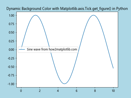
In this example, we use Matplotlib.axis.Tick.get_figure() in Python to access the figure object and then change its background color based on the range of x-axis values. This technique can be extended to create more complex dynamic color schemes that respond to various properties of the data or plot.
Advanced Techniques with Matplotlib.axis.Tick.get_figure() in Python
As we delve deeper into the capabilities of Matplotlib.axis.Tick.get_figure() in Python, we can explore more advanced techniques that leverage this powerful method to create sophisticated and interactive visualizations.
Creating Interactive Legends
Matplotlib.axis.Tick.get_figure() in Python can be used in conjunction with interactive features to create dynamic legends that respond to user input. Here's an example that demonstrates how to create a legend that can be toggled on and off by clicking on it:
import matplotlib.pyplot as plt

# Create a figure and axis
fig, ax = plt.subplots()

# Plot some data
line1, = ax.plot([1, 2, 3, 4], [1, 4, 2, 3], label='Data 1 from how2matplotlib.com')
line2, = ax.plot([1, 2, 3, 4], [3, 1, 4, 2], label='Data 2 from how2matplotlib.com')

# Create a legend
legend = ax.legend()

# Get a tick and use get_figure() to access the figure object
tick = ax.xaxis.get_major_ticks()[0]
figure = tick.get_figure()

# Function to toggle the visibility of a line
def toggle_line(event):
    if event.artist in legend.get_lines():
        line = [l for l in ax.lines if l.get_label() == event.artist.get_label()][0]
        line.set_visible(not line.get_visible())
        figure.canvas.draw()

# Connect the click event to the toggle function
figure.canvas.mpl_connect('pick_event', toggle_line)

# Make the legend clickable
legend.set_picker(True)

plt.title('Interactive Legend with Matplotlib.axis.Tick.get_figure() in Python')
plt.show()
Output:
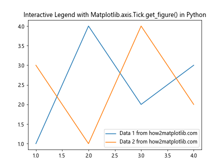
In this example, we use Matplotlib.axis.Tick.get_figure() in Python to access the figure object and connect a custom event handler that toggles the visibility of lines when the corresponding legend item is clicked. This creates an interactive plot where users can show or hide specific data series by interacting with the legend.
Synchronizing Axis Limits Across Subplots
Matplotlib.axis.Tick.get_figure() in Python can be used to synchronize axis limits across multiple subplots, ensuring that they all share the same scale. This can be particularly useful when comparing related data sets.
Here's an example that demonstrates this technique:
import matplotlib.pyplot as plt
import numpy as np

# Create a figure with multiple subplots
fig, (ax1, ax2, ax3) = plt.subplots(3, 1, figsize=(8, 12))

# Generate some data
x = np.linspace(0, 10, 100)
y1 = np.sin(x)
y2 = np.cos(x)
y3 = np.tan(x)

# Plot data on all subplots
ax1.plot(x, y1, label='Sine from how2matplotlib.com')
ax2.plot(x, y2, label='Cosine from how2matplotlib.com')
ax3.plot(x, y3, label='Tangent from how2matplotlib.com')

# Function to synchronize x-axis limits
def sync_xlim(ax):
    tick = ax.xaxis.get_major_ticks()[0]
    figure = tick.get_figure()
    axes = figure.get_axes()
    x_min = min(ax.get_xlim()[0] for ax in axes)
    x_max = max(ax.get_xlim()[1] for ax in axes)
    for ax in axes:
        ax.set_xlim(x_min, x_max)

# Synchronize x-axis limits for all subplots
sync_xlim(ax1)

plt.tight_layout()
plt.suptitle('Synchronized X-axis Limits with Matplotlib.axis.Tick.get_figure() in Python', fontsize=16)
plt.show()
Output:
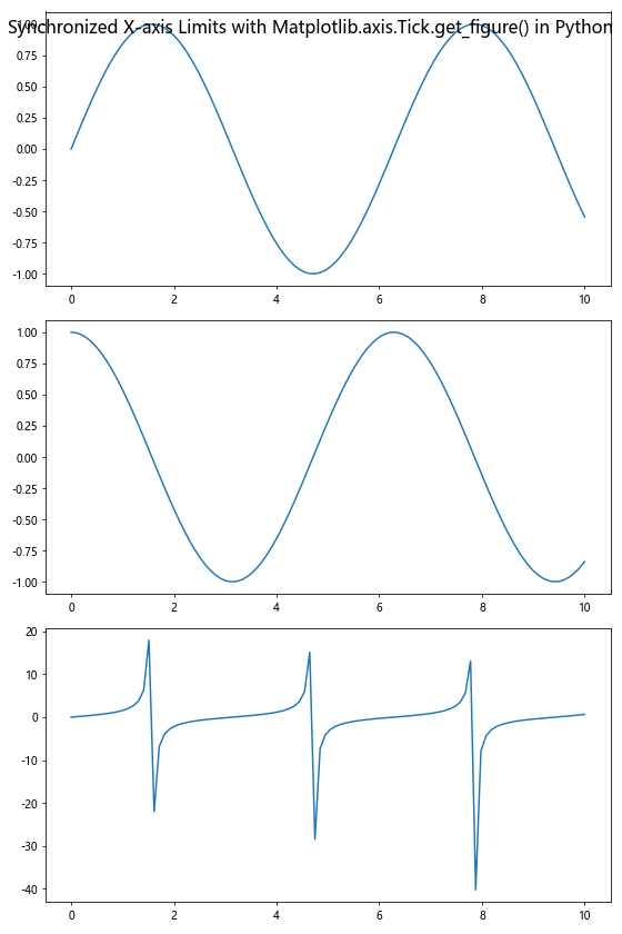
In this example, we use Matplotlib.axis.Tick.get_figure() in Python to access the figure object and then retrieve all axes in the figure. We then calculate the minimum and maximum x-axis limits across all subplots and apply these limits to each subplot, ensuring that they all share the same x-axis scale.
Creating Custom Tick Formatters
Matplotlib.axis.Tick.get_figure() in Python can be used in conjunction with custom tick formatters to create more informative and visually appealing axis labels. Here's an example that demonstrates how to create a custom formatter that adds units to tick labels:
import matplotlib.pyplot as plt
from matplotlib.ticker import FuncFormatter

# Create a figure and axis
fig, ax = plt.subplots()

# Plot some data
ax.plot([1, 2, 3, 4], [10, 20, 15, 30], label='Data from how2matplotlib.com')

# Custom formatter function
def currency_formatter(x, p):
    return f'${x:.2f}'

# Get a tick and use get_figure() to access the figure object
tick = ax.xaxis.get_major_ticks()[0]
figure = tick.get_figure()

# Set the custom formatter for the y-axis
ax.yaxis.set_major_formatter(FuncFormatter(currency_formatter))

plt.legend()
plt.title('Custom Tick Formatter with Matplotlib.axis.Tick.get_figure() in Python')
plt.show()
Output:
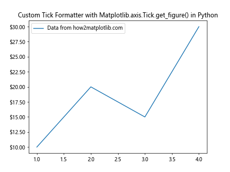
In this example, we use Matplotlib.axis.Tick.get_figure() in Python to access the figure object, which allows us to apply a custom formatter to the y-axis ticks. The custom formatter adds a dollar sign and formats the tick labels as currency values.
Optimizing Performance with Matplotlib.axis.Tick.get_figure() in Python
While Matplotlib.axis.Tick.get_figure() in Python is a powerful tool, it's important to use it efficiently to maintain good performance, especially when working with large datasets or complex visualizations.
Caching the Figure Object
When you need to access the figure object multiple times, it's more efficient to cache it rather than calling Matplotlib.axis.Tick.get_figure() in Python repeatedly. Here's an example that demonstrates this optimization:
import matplotlib.pyplot as plt
import time

# Create a figure and axis
fig, ax = plt.subplots()

# Plot some data
ax.plot([1, 2, 3, 4], [1, 4, 2, 3], label='Data from how2matplotlib.com')

# Get a tick
tick = ax.xaxis.get_major_ticks()[0]

# Measure time for multiple calls to get_figure()
start_time = time.time()
for _ in range(1000):
    figure = tick.get_figure()
end_time = time.time()
print(f"Time taken without caching: {end_time - start_time:.6f} seconds")

# Measure time with caching
start_time = time.time()
cached_figure = tick.get_figure()
for _ in range(1000):
    figure = cached_figure
end_time = time.time()
print(f"Time taken with caching: {end_time - start_time:.6f} seconds")

plt.title('Performance Optimization with Matplotlib.axis.Tick.get_figure() in Python')
plt.show()
Output:
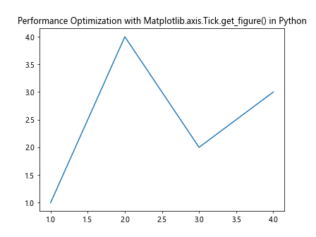
In this example, we compare the performance of repeatedly calling Matplotlib.axis.Tick.get_figure() in Python versus caching the figure object. The cached version is significantly faster, especially when you need to access the figure object many times.
Advanced Customization with Matplotlib.axis.Tick.get_figure() in Python
Matplotlib.axis.Tick.get_figure() in Python opens up possibilities for advanced customization of your plots. Let's explore some more sophisticated techniques that leverage this method.
Creating Custom Colorbars
Matplotlib.axis.Tick.get_figure() in Python can be used to create and customize colorbars that are associated with specific plots. Here's an example that demonstrates how to create a custom colorbar:
import matplotlib.pyplot as plt
import numpy as np

# Create a figure and axis
fig, ax = plt.subplots()

# Generate some data
x = np.linspace(0, 10, 20)
y = np.linspace(0, 10, 20)
X, Y = np.meshgrid(x, y)
Z = np.sin(X) * np.cos(Y)

# Create a contour plot
contour = ax.contourf(X, Y, Z, cmap='viridis')

# Get a tick and use get_figure() to access the figure object
tick = ax.xaxis.get_major_ticks()[0]
figure = tick.get_figure()

# Create a colorbar
cbar = figure.colorbar(contour, ax=ax)
cbar.set_label('Values from how2matplotlib.com')

# Customize the colorbar ticks
cbar.set_ticks([-1, -0.5, 0, 0.5, 1])
cbar.set_ticklabels(['Low', 'Medium-Low', 'Medium', 'Medium-High', 'High'])

plt.title('Custom Colorbar with Matplotlib.axis.Tick.get_figure() in Python')
plt.show()
Output:
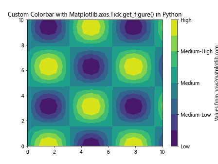
In this example, we use Matplotlib.axis.Tick.get_figure() in Python to access the figure object and create a custom colorbar for a contour plot. We then customize the colorbar's ticks and labels to provide more meaningful information about the data.
Implementing Annotations with Callbacks
Matplotlib.axis.Tick.get_figure() in Python can be used in conjunction with event callbacks to create interactive annotations. Here's an example that demonstrates how to create annotations that appear when hovering over data points:
import matplotlib.pyplot as plt
import numpy as np

# Create a figure and axis
fig, ax = plt.subplots()

# Generate some data
x = np.linspace(0, 10, 10)
y = np.sin(x)

# Plot the data
scatter = ax.scatter(x, y, label='Data from how2matplotlib.com')

# Get a tick and use get_figure() to access the figure object
tick = ax.xaxis.get_major_ticks()[0]
figure = tick.get_figure()

# Create an annotation object
annot = ax.annotate("", xy=(0,0), xytext=(20,20), textcoords="offset points",
                    bbox=dict(boxstyle="round", fc="w"),
                    arrowprops=dict(arrowstyle="->"))
annot.set_visible(False)

# Function to update the annotation
def update_annot(ind):
    pos = scatter.get_offsets()[ind["ind"][0]]
    annot.xy = pos
    text = f"({pos[0]:.2f}, {pos[1]:.2f})"
    annot.set_text(text)

# Function to handle hover events
def hover(event):
    vis = annot.get_visible()
    if event.inaxes == ax:
        cont, ind = scatter.contains(event)
        if cont:
            update_annot(ind)
            annot.set_visible(True)
            figure.canvas.draw_idle()
        else:
            if vis:
                annot.set_visible(False)
                figure.canvas.draw_idle()

# Connect the hover event to the callback function
figure.canvas.mpl_connect("motion_notify_event", hover)

plt.legend()
plt.title('Interactive Annotations with Matplotlib.axis.Tick.get_figure() in Python')
plt.show()
Output:
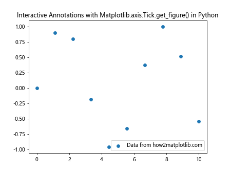
In this example, we use Matplotlib.axis.Tick.get_figure() in Python to access the figure object and connect a custom event handler that creates annotations when hovering over data points. This creates an interactive plot where users can see detailed information about specific data points by moving their cursor over the plot.
Best Practices for Using Matplotlib.axis.Tick.get_figure() in Python
To make the most of Matplotlib.axis.Tick.get_figure() in Python, it's important to follow some best practices. Here are some tips to help you use this method effectively:
- Cache the figure object: As mentioned earlier, if you need to access the figure object multiple times, it's more efficient to cache it rather than calling Matplotlib.axis.Tick.get_figure() in Python repeatedly.
Use it sparingly: While Matplotlib.axis.Tick.get_figure() in Python is powerful, it's not always necessary. For simple plots, you can often achieve what you need using more direct methods provided by Matplotlib.
Combine with other Matplotlib features: Matplotlib.axis.Tick.get_figure() in Python works best when combined with other Matplotlib features and methods. Don't hesitate to explore the full Matplotlib API to create more sophisticated visualizations.
Consider performance: When working with large datasets or complex visualizations, be mindful of performance. Use batch processing and other optimization techniques when appropriate.
Document your code: When using Matplotlib.axis.Tick.get_figure() in Python, especially for complex customizations, make sure to document your code clearly. This will help others (and your future self) understand your intentions and maintain the code.
Troubleshooting Common Issues with Matplotlib.axis.Tick.get_figure() in Python
While Matplotlib.axis.Tick.get_figure() in Python is generally straightforward to use, you may encounter some issues. Here are some common problems and their solutions: