How to Master Matplotlib Scatter Plots: A Comprehensive Guide
Matplotlib scatter plots are an essential tool for data visualization in Python. This comprehensive guide will explore the ins and outs of creating and customizing scatter plots using Matplotlib, one of the most popular plotting libraries in the Python ecosystem. Whether you’re a beginner or an experienced data scientist, this article will provide you with the knowledge and skills to create stunning scatter plots for your data analysis projects.
Matplotlib Scatter Recommended Articles
- matplotlib scatter color by value
- matplotlib scatter label each point
- matplotlib scatter label points
- matplotlib scatter label
- matplotlib scatter marker size
- matplotlib scatter marker styles
- matplotlib scatter point size
- matplotlib scatter size
- matplotlib scatter 3d
Introduction to Matplotlib Scatter Plots
Matplotlib scatter plots are a powerful way to visualize the relationship between two variables in a dataset. They are particularly useful for identifying patterns, trends, and outliers in your data. The scatter() function in Matplotlib allows you to create these plots with ease, offering a wide range of customization options to make your visualizations both informative and visually appealing.
Let’s start with a basic example of how to create a simple scatter plot using Matplotlib:
import matplotlib.pyplot as plt
import numpy as np

# Generate sample data
x = np.random.rand(50)
y = np.random.rand(50)

# Create scatter plot
plt.scatter(x, y)
plt.title("Basic Matplotlib Scatter Plot - how2matplotlib.com")
plt.xlabel("X-axis")
plt.ylabel("Y-axis")
plt.show()
Output:
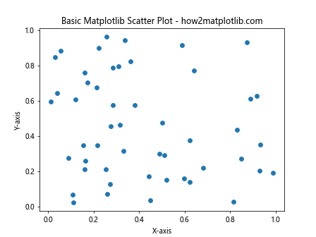
In this example, we import Matplotlib and NumPy, generate random data for x and y coordinates, and then use the scatter() function to create a basic scatter plot. We also add a title and axis labels to make the plot more informative.
Customizing Matplotlib Scatter Plots
One of the strengths of Matplotlib scatter plots is the ability to customize various aspects of the plot to better represent your data and convey your message. Let’s explore some of the most common customization options:
Changing Marker Size and Color
You can easily change the size and color of the markers in your scatter plot:
import matplotlib.pyplot as plt
import numpy as np

x = np.random.rand(50)
y = np.random.rand(50)

plt.scatter(x, y, s=100, c='red', alpha=0.5)
plt.title("Customized Matplotlib Scatter Plot - how2matplotlib.com")
plt.xlabel("X-axis")
plt.ylabel("Y-axis")
plt.show()
Output:
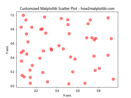
In this example, we set the marker size to 100 using the s parameter, change the color to red using the c parameter, and set the transparency to 50% using the alpha parameter.
Using Different Marker Styles
Matplotlib offers a variety of marker styles for scatter plots:
import matplotlib.pyplot as plt
import numpy as np

x = np.random.rand(50)
y = np.random.rand(50)

marker_styles = ['o', 's', '^', 'D', 'v']
colors = ['red', 'blue', 'green', 'purple', 'orange']

for i in range(5):
    plt.scatter(x[i::5], y[i::5], marker=marker_styles[i], c=colors[i], label=f'Group {i+1}')

plt.title("Matplotlib Scatter Plot with Different Markers - how2matplotlib.com")
plt.xlabel("X-axis")
plt.ylabel("Y-axis")
plt.legend()
plt.show()
Output:
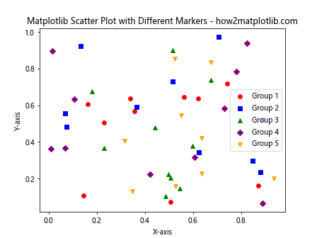
This example demonstrates how to use different marker styles and colors for different groups of data points. We use a loop to create multiple scatter plots with different markers and colors, and add a legend to identify each group.
Adding a Colorbar
You can use a colorbar to represent an additional dimension in your scatter plot:
import matplotlib.pyplot as plt
import numpy as np

x = np.random.rand(100)
y = np.random.rand(100)
colors = np.random.rand(100)

scatter = plt.scatter(x, y, c=colors, cmap='viridis')
plt.colorbar(scatter)
plt.title("Matplotlib Scatter Plot with Colorbar - how2matplotlib.com")
plt.xlabel("X-axis")
plt.ylabel("Y-axis")
plt.show()
Output:
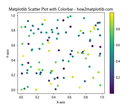
In this example, we use the c parameter to set the color of each point based on a third variable, and specify a colormap using cmap. We then add a colorbar to show the range of values represented by the colors.
Advanced Matplotlib Scatter Plot Techniques
Now that we’ve covered the basics, let’s explore some more advanced techniques for creating and customizing Matplotlib scatter plots.
Bubble Charts
Bubble charts are a variation of scatter plots where the size of each point represents a third variable:
import matplotlib.pyplot as plt
import numpy as np

x = np.random.rand(50)
y = np.random.rand(50)
sizes = np.random.rand(50) * 1000

plt.scatter(x, y, s=sizes, alpha=0.5)
plt.title("Matplotlib Bubble Chart - how2matplotlib.com")
plt.xlabel("X-axis")
plt.ylabel("Y-axis")
plt.show()
Output:
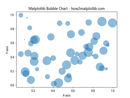
In this example, we use the s parameter to set the size of each point based on a third variable. The alpha parameter is used to make the bubbles semi-transparent, which helps when bubbles overlap.
3D Scatter Plots
Matplotlib also supports 3D scatter plots:
import matplotlib.pyplot as plt
from mpl_toolkits.mplot3d import Axes3D
import numpy as np

fig = plt.figure()
ax = fig.add_subplot(111, projection='3d')

n = 100
x = np.random.rand(n)
y = np.random.rand(n)
z = np.random.rand(n)

ax.scatter(x, y, z)
ax.set_title("3D Matplotlib Scatter Plot - how2matplotlib.com")
ax.set_xlabel("X-axis")
ax.set_ylabel("Y-axis")
ax.set_zlabel("Z-axis")
plt.show()
Output:
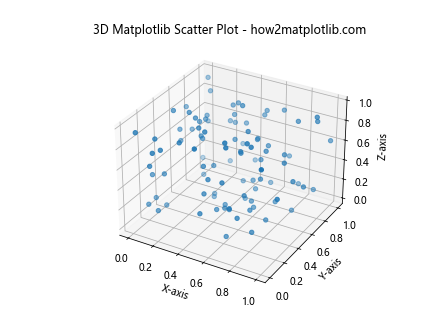
This example demonstrates how to create a 3D scatter plot using Matplotlib. We import the Axes3D module and set the projection to ‘3d’ when creating the subplot.
Scatter Plots with Error Bars
You can add error bars to your scatter plots to represent uncertainty in your data:
import matplotlib.pyplot as plt
import numpy as np

x = np.random.rand(20)
y = np.random.rand(20)
xerr = np.random.rand(20) * 0.1
yerr = np.random.rand(20) * 0.1

plt.errorbar(x, y, xerr=xerr, yerr=yerr, fmt='o')
plt.title("Matplotlib Scatter Plot with Error Bars - how2matplotlib.com")
plt.xlabel("X-axis")
plt.ylabel("Y-axis")
plt.show()
Output:
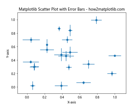
In this example, we use the errorbar() function to create a scatter plot with error bars. The xerr and yerr parameters specify the size of the error bars in the x and y directions, respectively.
Customizing Matplotlib Scatter Plot Axes
Customizing the axes of your scatter plot can greatly enhance its readability and visual appeal. Let’s explore some techniques for axis customization:
Setting Axis Limits
You can set custom limits for your x and y axes:
import matplotlib.pyplot as plt
import numpy as np

x = np.random.rand(50)
y = np.random.rand(50)

plt.scatter(x, y)
plt.xlim(0, 1)
plt.ylim(0, 1)
plt.title("Matplotlib Scatter Plot with Custom Axis Limits - how2matplotlib.com")
plt.xlabel("X-axis")
plt.ylabel("Y-axis")
plt.show()
Output:
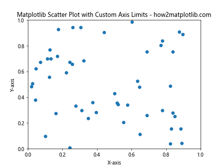
In this example, we use plt.xlim() and plt.ylim() to set the limits of the x and y axes, respectively.
Log Scale Axes
For data that spans multiple orders of magnitude, log scale axes can be useful:
import matplotlib.pyplot as plt
import numpy as np

x = np.logspace(0, 3, 50)
y = np.random.rand(50) * 1000

plt.scatter(x, y)
plt.xscale('log')
plt.yscale('log')
plt.title("Matplotlib Scatter Plot with Log Scale Axes - how2matplotlib.com")
plt.xlabel("X-axis (log scale)")
plt.ylabel("Y-axis (log scale)")
plt.show()
Output:
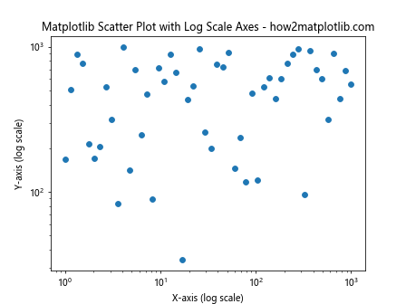
This example demonstrates how to create a scatter plot with logarithmic scales on both axes using plt.xscale('log') and plt.yscale('log').
Custom Tick Labels
You can customize the tick labels on your axes for better readability:
import matplotlib.pyplot as plt
import numpy as np

x = np.arange(5)
y = np.random.rand(5)

plt.scatter(x, y)
plt.xticks(x, ['A', 'B', 'C', 'D', 'E'])
plt.title("Matplotlib Scatter Plot with Custom Tick Labels - how2matplotlib.com")
plt.xlabel("Categories")
plt.ylabel("Values")
plt.show()
Output:
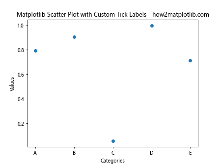
In this example, we use plt.xticks() to set custom labels for the x-axis ticks.
Adding Annotations to Matplotlib Scatter Plots
Annotations can provide additional context and information to your scatter plots. Let’s explore some ways to add annotations:
Text Annotations
You can add text annotations to specific points in your scatter plot:
import matplotlib.pyplot as plt
import numpy as np

x = np.random.rand(10)
y = np.random.rand(10)

plt.scatter(x, y)
for i, (xi, yi) in enumerate(zip(x, y)):
    plt.annotate(f'Point {i+1}', (xi, yi), xytext=(5, 5), textcoords='offset points')

plt.title("Matplotlib Scatter Plot with Text Annotations - how2matplotlib.com")
plt.xlabel("X-axis")
plt.ylabel("Y-axis")
plt.show()
Output:
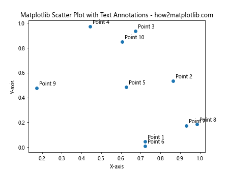
This example demonstrates how to add text annotations to each point in the scatter plot using plt.annotate().
Arrow Annotations
You can use arrows to highlight specific points or regions in your scatter plot:
import matplotlib.pyplot as plt
import numpy as np

x = np.random.rand(20)
y = np.random.rand(20)

plt.scatter(x, y)
max_y_index = np.argmax(y)
plt.annotate('Highest point', xy=(x[max_y_index], y[max_y_index]),
             xytext=(0.8, 0.8), textcoords='axes fraction',
             arrowprops=dict(facecolor='black', shrink=0.05))

plt.title("Matplotlib Scatter Plot with Arrow Annotation - how2matplotlib.com")
plt.xlabel("X-axis")
plt.ylabel("Y-axis")
plt.show()
Output:
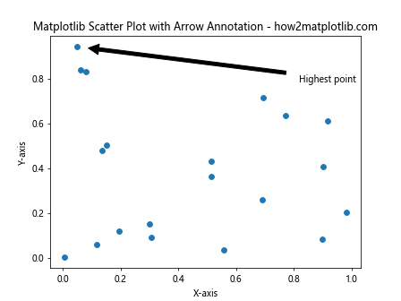
In this example, we add an arrow annotation to highlight the point with the highest y-value in the scatter plot.
Combining Matplotlib Scatter Plots with Other Plot Types
Matplotlib allows you to combine scatter plots with other types of plots to create more complex visualizations. Let’s explore some examples:
Scatter Plot with Trend Line
You can add a trend line to your scatter plot to show the overall relationship between variables:
import matplotlib.pyplot as plt
import numpy as np

x = np.random.rand(50)
y = 2 * x + np.random.rand(50)

plt.scatter(x, y)
z = np.polyfit(x, y, 1)
p = np.poly1d(z)
plt.plot(x, p(x), "r--")

plt.title("Matplotlib Scatter Plot with Trend Line - how2matplotlib.com")
plt.xlabel("X-axis")
plt.ylabel("Y-axis")
plt.show()
Output:
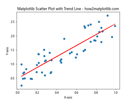
This example demonstrates how to add a linear trend line to a scatter plot using np.polyfit() and np.poly1d().
Scatter Plot with Histograms
You can combine a scatter plot with histograms to show the distribution of each variable:
import matplotlib.pyplot as plt
import numpy as np

x = np.random.randn(1000)
y = np.random.randn(1000)

fig, axs = plt.subplots(2, 2, figsize=(10, 10))
fig.suptitle("Matplotlib Scatter Plot with Histograms - how2matplotlib.com")

axs[0, 0].hist(x, bins=20)
axs[0, 0].set_title('X Histogram')

axs[1, 1].hist(y, bins=20, orientation='horizontal')
axs[1, 1].set_title('Y Histogram')

axs[1, 0].scatter(x, y)
axs[1, 0].set_xlabel('X-axis')
axs[1, 0].set_ylabel('Y-axis')
axs[1, 0].set_title('Scatter Plot')

axs[0, 1].axis('off')

plt.tight_layout()
plt.show()
Output:
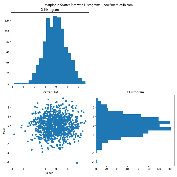
This example shows how to create a scatter plot with histograms for both x and y variables using subplots.
Saving and Exporting Matplotlib Scatter Plots
Once you’ve created your perfect scatter plot, you’ll want to save it for later use or export it for publication. Matplotlib provides several options for saving your plots:
Saving as an Image File
You can save your scatter plot as various image formats:
import matplotlib.pyplot as plt
import numpy as np

x = np.random.rand(50)
y = np.random.rand(50)

plt.scatter(x, y)
plt.title("Matplotlib Scatter Plot to Save - how2matplotlib.com")
plt.xlabel("X-axis")
plt.ylabel("Y-axis")

# Save as PNG
plt.savefig('scatter_plot.png', dpi=300, bbox_inches='tight')

# Save as SVG
plt.savefig('scatter_plot.svg', format='svg', bbox_inches='tight')

plt.show()
Output:
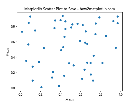
This example demonstrates how to save your scatter plot as both a PNG and an SVG file. The dpi parameter sets the resolution for raster formats, while bbox_inches='tight' ensures that the entire plot, including labels, is saved without being cut off.
Best Practices for Creating Effective Matplotlib Scatter Plots
To create effective and informative scatter plots using Matplotlib, consider the following best practices:
- Choose appropriate marker sizes: Ensure that your markers are large enough to be visible but not so large that they obscure other data points or make the plot cluttered.
Use color effectively: Choose colors that are easily distinguishable and consider using color to represent an additional variable in your data.
Add clear labels and titles: Always include descriptive axis labels and a clear title to provide context for your scatter plot.
Consider data density: For large datasets, consider using transparency or density plots to avoid overplotting.
Use appropriate scales: Choose linear or logarithmic scales based on the nature of your data and the relationships you want to highlight.
Include a legend when necessary: If your scatter plot includes multiple groups or categories, add a legend to explain what each color or marker type represents.
Add context with annotations: Use text and arrow annotations to highlight important points or trends in your data.
Choose appropriate aspect ratios: Adjust the figure size and aspect ratio to best represent your data and avoid distortion.
Use error bars when applicable: If your data includes uncertainty measurements, consider adding error bars to your scatter plot.
Combine with other plot types: When appropriate, combine scatter plots with other visualization types like histograms or trend lines to provide additional insights.
Troubleshooting Common Issues with Matplotlib Scatter Plots
Even experienced users can encounter issues when creating scatter plots with Matplotlib. Here are some common problems and their solutions: