How to Master Matplotlib Colors: A Comprehensive Guide for Data Visualization
Matplotlib colors are an essential aspect of data visualization in Python. Understanding how to effectively use colors in your plots can greatly enhance the clarity and impact of your visualizations. In this comprehensive guide, we’ll explore the various ways to work with matplotlib colors, from basic color specifications to advanced color mapping techniques. Whether you’re a beginner or an experienced data scientist, this article will help you master the art of using colors in matplotlib.
Matplotlib Colors Recommended Articles
- matplotlib bar colors
- matplotlib colors list
- matplotlib colors palette
- matplotlib colors select
- matplotlib default colors
- matplotlib hex colors display
- matplotlib hex colors
- matplotlib label colors
- matplotlib legend colors
- matplotlib named colors
- matplotlib specify colorspace
- matplotlib tab colors
- matplotlib title with different colors
- matplotlib two colors one line
Introduction to Matplotlib Colors
Matplotlib colors are a fundamental component of creating visually appealing and informative plots. Colors can be used to differentiate between data series, highlight important information, and create aesthetically pleasing visualizations. Matplotlib provides a wide range of color options and methods for specifying colors in your plots.
Let’s start with a simple example of using matplotlib colors:
import matplotlib.pyplot as plt

x = [1, 2, 3, 4, 5]
y = [2, 4, 6, 8, 10]

plt.plot(x, y, color='red', label='how2matplotlib.com')
plt.title('Simple Plot with Matplotlib Colors')
plt.xlabel('X-axis')
plt.ylabel('Y-axis')
plt.legend()
plt.show()
Output:
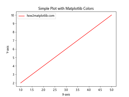
In this example, we’ve created a basic line plot using matplotlib colors by setting the color parameter to ‘red’. This demonstrates how easy it is to apply colors to your plots using matplotlib.
Specifying Matplotlib Colors
Matplotlib colors can be specified in various ways, including:
- Color names
- Hex color codes
- RGB tuples
- RGBA tuples (including alpha for transparency)
Let’s explore each of these methods for specifying matplotlib colors:
Color Names
Matplotlib provides a set of predefined color names that you can use in your plots. Here’s an example demonstrating the use of color names:
import matplotlib.pyplot as plt

colors = ['red', 'blue', 'green', 'yellow', 'purple']
x = range(1, 6)
y = [i**2 for i in x]

for i, color in enumerate(colors):
    plt.plot(x, [j + i*5 for j in y], color=color, label=f'{color} - how2matplotlib.com')

plt.title('Matplotlib Colors: Color Names')
plt.xlabel('X-axis')
plt.ylabel('Y-axis')
plt.legend()
plt.show()
Output:
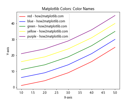
This example demonstrates how to use different color names to create multiple lines in a single plot. Matplotlib recognizes a wide range of color names, making it easy to specify colors without remembering specific codes.
Hex Color Codes
Hex color codes provide a more precise way to specify matplotlib colors. Here’s an example using hex codes:
import matplotlib.pyplot as plt

hex_colors = ['#FF0000', '#00FF00', '#0000FF', '#FFFF00', '#FF00FF']
x = range(1, 6)
y = [i**2 for i in x]

for i, color in enumerate(hex_colors):
    plt.plot(x, [j + i*5 for j in y], color=color, label=f'Color {i+1} - how2matplotlib.com')

plt.title('Matplotlib Colors: Hex Color Codes')
plt.xlabel('X-axis')
plt.ylabel('Y-axis')
plt.legend()
plt.show()
Output:
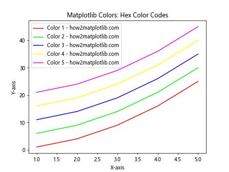
In this example, we use hex color codes to specify the colors of our plot lines. Hex codes offer more flexibility and precision in color selection compared to color names.
RGB Tuples
RGB tuples allow you to specify matplotlib colors using red, green, and blue values. Here’s an example:
import matplotlib.pyplot as plt

rgb_colors = [(1, 0, 0), (0, 1, 0), (0, 0, 1), (1, 1, 0), (1, 0, 1)]
x = range(1, 6)
y = [i**2 for i in x]

for i, color in enumerate(rgb_colors):
    plt.plot(x, [j + i*5 for j in y], color=color, label=f'RGB {color} - how2matplotlib.com')

plt.title('Matplotlib Colors: RGB Tuples')
plt.xlabel('X-axis')
plt.ylabel('Y-axis')
plt.legend()
plt.show()
Output:
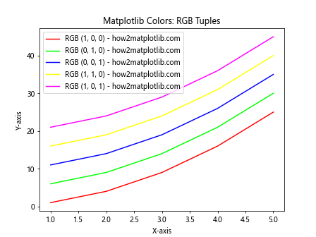
This example demonstrates how to use RGB tuples to specify colors in matplotlib. Each tuple contains values between 0 and 1 for red, green, and blue components.
RGBA Tuples
RGBA tuples are similar to RGB tuples but include an additional alpha value for transparency. Here’s an example:
import matplotlib.pyplot as plt

rgba_colors = [(1, 0, 0, 0.5), (0, 1, 0, 0.5), (0, 0, 1, 0.5), (1, 1, 0, 0.5), (1, 0, 1, 0.5)]
x = range(1, 6)
y = [i**2 for i in x]

for i, color in enumerate(rgba_colors):
    plt.plot(x, [j + i*5 for j in y], color=color, label=f'RGBA {color} - how2matplotlib.com')

plt.title('Matplotlib Colors: RGBA Tuples')
plt.xlabel('X-axis')
plt.ylabel('Y-axis')
plt.legend()
plt.show()
Output:
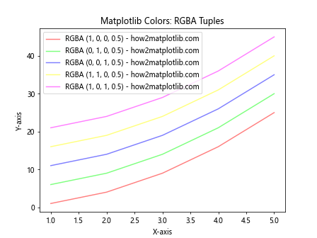
This example shows how to use RGBA tuples to specify colors with transparency in matplotlib. The alpha value ranges from 0 (completely transparent) to 1 (completely opaque).
Color Maps in Matplotlib
Color maps are an essential feature of matplotlib colors, allowing you to map a range of values to a spectrum of colors. This is particularly useful for visualizing continuous data or creating heatmaps. Matplotlib provides a wide variety of built-in color maps, and you can also create custom color maps.
Let’s explore some examples of using color maps in matplotlib:
Using Built-in Color Maps
import matplotlib.pyplot as plt
import numpy as np

x = np.linspace(0, 10, 100)
y = np.sin(x)

plt.scatter(x, y, c=y, cmap='viridis', label='how2matplotlib.com')
plt.colorbar(label='Sin(x)')
plt.title('Matplotlib Colors: Built-in Color Map (Viridis)')
plt.xlabel('X-axis')
plt.ylabel('Y-axis')
plt.legend()
plt.show()
Output:
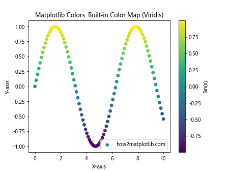
In this example, we use the built-in ‘viridis’ color map to color the scatter points based on their y-values. The colorbar function adds a color scale to the plot.
Creating Custom Color Maps
You can create custom color maps in matplotlib by defining a list of colors and using the LinearSegmentedColormap class. Here’s an example:
import matplotlib.pyplot as plt
import matplotlib.colors as mcolors
import numpy as np

custom_colors = ['#FF0000', '#00FF00', '#0000FF']
n_bins = 100
custom_cmap = mcolors.LinearSegmentedColormap.from_list('custom_cmap', custom_colors, N=n_bins)

x = np.linspace(0, 10, 100)
y = np.cos(x)

plt.scatter(x, y, c=y, cmap=custom_cmap, label='how2matplotlib.com')
plt.colorbar(label='Cos(x)')
plt.title('Matplotlib Colors: Custom Color Map')
plt.xlabel('X-axis')
plt.ylabel('Y-axis')
plt.legend()
plt.show()
Output:
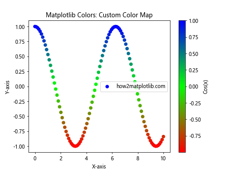
This example demonstrates how to create a custom color map using a list of colors. The resulting color map is then applied to a scatter plot.
Color Normalization
Color normalization is an important concept in matplotlib colors, allowing you to map data values to colors in a specific range. Matplotlib provides several normalization classes, including Normalize, LogNorm, and SymLogNorm.
Let’s explore some examples of color normalization:
Linear Normalization
import matplotlib.pyplot as plt
import matplotlib.colors as mcolors
import numpy as np

x = np.linspace(0, 10, 100)
y = np.exp(x)

norm = mcolors.Normalize(vmin=y.min(), vmax=y.max())

plt.scatter(x, y, c=y, cmap='plasma', norm=norm, label='how2matplotlib.com')
plt.colorbar(label='exp(x)')
plt.title('Matplotlib Colors: Linear Normalization')
plt.xlabel('X-axis')
plt.ylabel('Y-axis')
plt.legend()
plt.show()
Output:
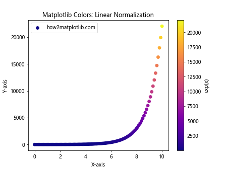
This example demonstrates linear normalization using the Normalize class. The color mapping is applied linearly across the range of y-values.
Logarithmic Normalization
import matplotlib.pyplot as plt
import matplotlib.colors as mcolors
import numpy as np

x = np.linspace(0, 10, 100)
y = np.exp(x)

norm = mcolors.LogNorm(vmin=y.min(), vmax=y.max())

plt.scatter(x, y, c=y, cmap='viridis', norm=norm, label='how2matplotlib.com')
plt.colorbar(label='exp(x)')
plt.title('Matplotlib Colors: Logarithmic Normalization')
plt.xlabel('X-axis')
plt.ylabel('Y-axis')
plt.yscale('log')
plt.legend()
plt.show()
Output:
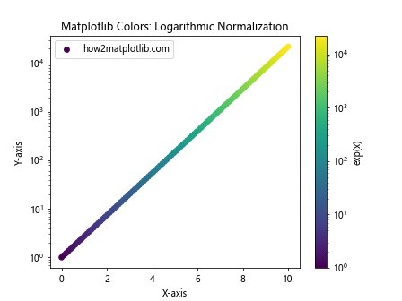
This example uses logarithmic normalization with the LogNorm class, which is particularly useful for data with a large range of values.
Discrete Color Maps
While continuous color maps are useful for many applications, sometimes you need to represent discrete categories with distinct colors. Matplotlib provides several ways to create discrete color maps.
Using ListedColormap
import matplotlib.pyplot as plt
import matplotlib.colors as mcolors
import numpy as np

categories = ['A', 'B', 'C', 'D', 'E']
colors = ['#FF0000', '#00FF00', '#0000FF', '#FFFF00', '#FF00FF']
cmap = mcolors.ListedColormap(colors)

x = np.random.rand(100)
y = np.random.rand(100)
c = np.random.randint(0, len(categories), 100)

plt.scatter(x, y, c=c, cmap=cmap, label='how2matplotlib.com')
plt.colorbar(ticks=range(len(categories)), label='Categories')
plt.clim(-0.5, len(categories)-0.5)
plt.title('Matplotlib Colors: Discrete Color Map')
plt.xlabel('X-axis')
plt.ylabel('Y-axis')
plt.legend()
plt.show()
Output:
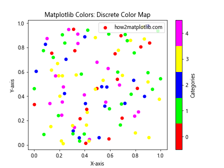
This example demonstrates how to create a discrete color map using ListedColormap. Each category is assigned a distinct color from the specified list.
Color Cycling
Color cycling is a useful feature in matplotlib colors that allows you to automatically cycle through a set of colors when plotting multiple data series. This is particularly helpful when you have many data series and don’t want to manually specify colors for each one.
Here’s an example of color cycling in matplotlib:
import matplotlib.pyplot as plt
import numpy as np

plt.rcParams['axes.prop_cycle'] = plt.cycler(color=plt.cm.tab10.colors)

x = np.linspace(0, 10, 100)

for i in range(5):
    plt.plot(x, np.sin(x + i), label=f'Series {i+1} - how2matplotlib.com')

plt.title('Matplotlib Colors: Color Cycling')
plt.xlabel('X-axis')
plt.ylabel('Y-axis')
plt.legend()
plt.show()
Output:
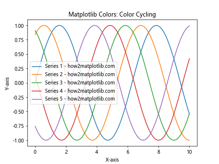
In this example, we use the plt.cycler function to set up a color cycle using the ‘tab10’ color map. The plot automatically cycles through these colors for each data series.
Alpha Blending and Transparency
Alpha blending is an important aspect of matplotlib colors, allowing you to create semi-transparent plots that can reveal underlying data or create visually appealing overlays.
Let’s explore some examples of using alpha blending in matplotlib:
Transparent Scatter Plot
import matplotlib.pyplot as plt
import numpy as np

np.random.seed(42)
x = np.random.rand(100)
y = np.random.rand(100)

plt.scatter(x, y, alpha=0.5, s=100, c='blue', label='how2matplotlib.com')
plt.title('Matplotlib Colors: Transparent Scatter Plot')
plt.xlabel('X-axis')
plt.ylabel('Y-axis')
plt.legend()
plt.show()
Output:
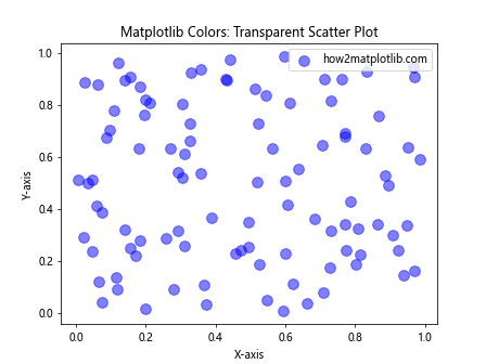
This example creates a scatter plot with semi-transparent points, allowing overlapping points to be visible.
Overlapping Histograms
import matplotlib.pyplot as plt
import numpy as np

np.random.seed(42)
data1 = np.random.normal(0, 1, 1000)
data2 = np.random.normal(1, 1, 1000)

plt.hist(data1, bins=30, alpha=0.5, color='blue', label='Data 1 - how2matplotlib.com')
plt.hist(data2, bins=30, alpha=0.5, color='red', label='Data 2 - how2matplotlib.com')
plt.title('Matplotlib Colors: Overlapping Histograms')
plt.xlabel('Value')
plt.ylabel('Frequency')
plt.legend()
plt.show()
Output:
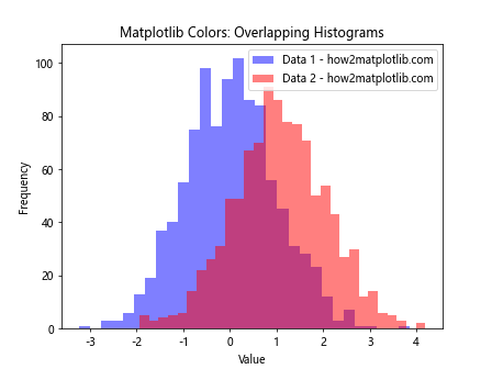
This example demonstrates how to create overlapping histograms using alpha blending, allowing both distributions to be visible simultaneously.
Color Palettes and Styles
Matplotlib provides various predefined color palettes and styles that can be used to quickly create visually appealing plots. These palettes are designed to work well together and can be easily applied to your visualizations.
Let’s explore some examples of using color palettes and styles in matplotlib:
Using Seaborn Color Palettes
Seaborn, a statistical data visualization library built on top of matplotlib, provides additional color palettes that can be used in matplotlib plots.
import matplotlib.pyplot as plt
import seaborn as sns
import numpy as np

sns.set_palette("husl")

x = np.linspace(0, 10, 100)

for i in range(5):
    plt.plot(x, np.sin(x + i), label=f'Series {i+1} - how2matplotlib.com')

plt.title('Matplotlib Colors: Seaborn Color Palette')
plt.xlabel('X-axis')
plt.ylabel('Y-axis')
plt.legend()
plt.show()
Output:
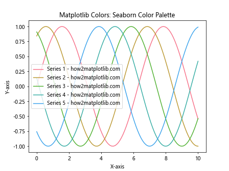
This example demonstrates how to use a Seaborn color palette in a matplotlib plot.
Using Matplotlib Style Sheets
Matplotlib provides built-in style sheets that can be used to quickly change the overall appearance of your plots, including colors.
import matplotlib.pyplot as plt
import numpy as np

plt.style.use('seaborn')

x = np.linspace(0, 10, 100)
y1 = np.sin(x)
y2 = np.cos(x)

plt.plot(x, y1, label='Sin(x) - how2matplotlib.com')
plt.plot(x, y2, label='Cos(x) - how2matplotlib.com')
plt.title('Matplotlib Colors: Style Sheet Example')
plt.xlabel('X-axis')
plt.ylabel('Y-axis')
plt.legend()
plt.show()
This example demonstrates how to use a built-in matplotlib style sheet to change the overall appearance of the plot.
Advanced Color Techniques
Now that we’ve covered the basics of matplotlib colors, let’s explore some advanced techniques for working with colors in your visualizations.
Custom Colormaps with Gradients
You can create custom colormaps with gradients to achieve specific visual effects. Here’s an example:
import matplotlib.pyplot as plt
import matplotlib.colors as mcolors
import numpy as np

def custom_cmap(start_color, end_color, n_steps):
    r1, g1, b1 = mcolors.to_rgb(start_color)
    r2, g2, b2 = mcolors.to_rgb(end_color)
    r = np.linspace(r1, r2, n_steps)
    g = np.linspace(g1, g2, n_steps)
    b = np.linspace(b1, b2, n_steps)
    return mcolors.ListedColormap(list(zip(r, g, b)))

start_color = '#FF0000'  # Red
end_color = '#0000FF'    # Blue
n_steps = 256

custom_gradient = custom_cmap(start_color, end_color, n_steps)

x = np.linspace(0, 10, 100)
y = np.sin(x)

plt.scatter(x, y, c=y, cmap=custom_gradient, label='how2matplotlib.com')
plt.colorbar(label='Sin(x)')
plt.title('Matplotlib Colors: Custom Gradient Colormap')
plt.xlabel('X-axis')
plt.ylabel('Y-axis')
plt.legend()
plt.show()
Output:
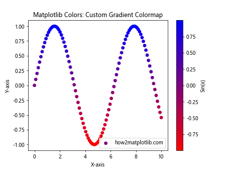
This example demonstrates how to create a custom colormap with a gradient from red to blue. The custom_cmap function generates a colormap based on the start and end colors, and the number of steps in between.
Color Mapping with Discrete Boundaries
Sometimes you may want to map colors to specific ranges of values. Here’s an example of how to achieve this:
import matplotlib.pyplot as plt
import matplotlib.colors as mcolors
import numpy as np

data = np.random.randn(1000)
bounds = [-3, -2, -1, 0, 1, 2, 3]
norm = mcolors.BoundaryNorm(bounds, len(bounds) - 1)
cmap = plt.get_cmap('RdYlBu')

plt.hist(data, bins=50, density=True, color=cmap(norm(data)), label='how2matplotlib.com')
plt.colorbar(plt.cm.ScalarMappable(norm=norm, cmap=cmap), label='Value Range')
plt.title('Matplotlib Colors: Discrete Color Mapping')
plt.xlabel('Value')
plt.ylabel('Frequency')
plt.legend()
plt.show()
In this example, we use BoundaryNorm to map specific ranges of values to discrete colors. This is particularly useful when you want to highlight certain ranges in your data.
Color Accessibility and Perception
When working with matplotlib colors, it’s important to consider color accessibility and perception. Some color combinations may be difficult for colorblind individuals to distinguish, or may not reproduce well in grayscale.
Here are some tips for creating accessible and perceptually effective visualizations:
- Use colorblind-friendly palettes
- Ensure sufficient contrast between colors
- Avoid relying solely on color to convey information
- Test your visualizations in grayscale
Let’s explore an example of using a colorblind-friendly palette:
import matplotlib.pyplot as plt
import seaborn as sns
import numpy as np

# Set a colorblind-friendly palette
sns.set_palette("colorblind")

x = np.linspace(0, 10, 100)

for i in range(5):
    plt.plot(x, np.sin(x + i), label=f'Series {i+1} - how2matplotlib.com')

plt.title('Matplotlib Colors: Colorblind-Friendly Palette')
plt.xlabel('X-axis')
plt.ylabel('Y-axis')
plt.legend()
plt.show()
Output:
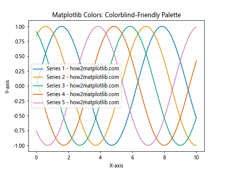
This example uses Seaborn’s colorblind-friendly palette to create a plot that is more accessible to individuals with color vision deficiencies.
Combining Multiple Color Techniques
In practice, you may need to combine multiple color techniques to create complex and informative visualizations. Let’s look at an example that combines several of the techniques we’ve discussed:
import matplotlib.pyplot as plt
import matplotlib.colors as mcolors
import numpy as np

# Create custom colormap
custom_colors = ['#FF0000', '#00FF00', '#0000FF', '#FFFF00', '#FF00FF']
custom_cmap = mcolors.LinearSegmentedColormap.from_list('custom_cmap', custom_colors, N=256)

# Generate data
x = np.linspace(0, 10, 100)
y1 = np.sin(x)
y2 = np.cos(x)
y3 = np.tan(x)

# Create plot with multiple techniques
fig, (ax1, ax2) = plt.subplots(1, 2, figsize=(12, 5))

# Left subplot: Custom colormap and alpha blending
scatter = ax1.scatter(x, y1, c=y1, cmap=custom_cmap, alpha=0.7, label='Sin(x) - how2matplotlib.com')
ax1.plot(x, y2, color='purple', alpha=0.5, label='Cos(x) - how2matplotlib.com')
ax1.set_title('Custom Colormap and Alpha Blending')
ax1.set_xlabel('X-axis')
ax1.set_ylabel('Y-axis')
ax1.legend()
fig.colorbar(scatter, ax=ax1, label='Sin(x) Value')

# Right subplot: Color cycling and normalization
norm = mcolors.Normalize(vmin=-10, vmax=10)
lines = ax2.plot(x, y3, c=y3, norm=norm, cmap='viridis', label='Tan(x) - how2matplotlib.com')
ax2.set_title('Color Cycling and Normalization')
ax2.set_xlabel('X-axis')
ax2.set_ylabel('Y-axis')
ax2.legend()
fig.colorbar(plt.cm.ScalarMappable(norm=norm, cmap='viridis'), ax=ax2, label='Tan(x) Value')

plt.tight_layout()
plt.show()
This example combines custom colormaps, alpha blending, color cycling, and normalization techniques to create a complex visualization with multiple subplots.
Matplotlib colors Conclusion
Mastering matplotlib colors is essential for creating effective and visually appealing data visualizations. In this comprehensive guide, we’ve explored various aspects of working with colors in matplotlib, including:
- Basic color specification methods
- Color maps and custom color maps
- Color normalization techniques
- Discrete color mapping
- Color cycling
- Alpha blending and transparency
- Color palettes and styles
- Advanced color techniques
- Color accessibility and perception
- Combining multiple color techniques
By understanding and applying these concepts, you can create more informative, aesthetically pleasing, and accessible visualizations using matplotlib. Remember to consider your audience and the purpose of your visualization when choosing colors and color mapping techniques.