How to Master Matplotlib Bar Colors: A Comprehensive Guide
Matplotlib bar colors are an essential aspect of data visualization in Python. This comprehensive guide will explore various techniques and methods to customize and enhance the colors of bar plots using Matplotlib. We’ll cover everything from basic color assignments to advanced color mapping and gradients, providing you with the knowledge and tools to create visually appealing and informative bar charts.
Understanding Matplotlib Bar Colors Basics
Matplotlib bar colors play a crucial role in creating effective and visually appealing bar charts. By default, Matplotlib uses a predefined color cycle for bar plots, but you have the flexibility to customize these colors to suit your specific needs. Let’s start with a basic example of how to create a simple bar plot with custom colors:
import matplotlib.pyplot as plt

categories = ['A', 'B', 'C', 'D']
values = [10, 20, 15, 25]
colors = ['red', 'green', 'blue', 'orange']

plt.figure(figsize=(8, 6))
plt.bar(categories, values, color=colors)
plt.title('Basic Bar Plot with Custom Colors - how2matplotlib.com')
plt.xlabel('Categories')
plt.ylabel('Values')
plt.show()
Output:
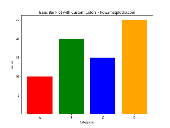
In this example, we create a basic bar plot with four categories and assign custom colors to each bar. The color parameter in the plt.bar() function allows us to specify a list of colors corresponding to each bar.
Exploring Color Palettes for Matplotlib Bar Colors
Matplotlib offers various built-in color palettes that you can use to enhance your bar plots. These palettes provide a range of harmonious colors that work well together. Let’s explore how to use different color palettes:
import matplotlib.pyplot as plt
import numpy as np

categories = ['A', 'B', 'C', 'D', 'E']
values = np.random.randint(10, 50, 5)

plt.figure(figsize=(10, 6))
plt.bar(categories, values, color=plt.cm.Set3(np.arange(len(categories))))
plt.title('Bar Plot with Set3 Color Palette - how2matplotlib.com')
plt.xlabel('Categories')
plt.ylabel('Values')
plt.show()
Output:
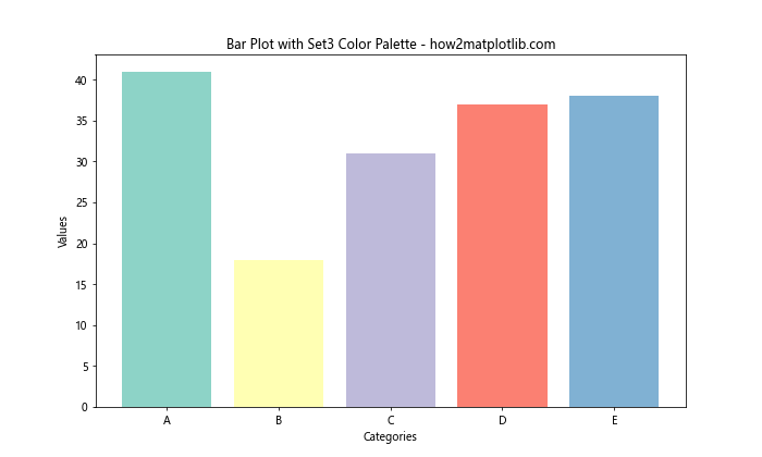
In this example, we use the Set3 color palette from Matplotlib’s colormap (plt.cm) to assign colors to the bars. The np.arange(len(categories)) generates an array of indices that are then mapped to colors from the chosen palette.
Customizing Matplotlib Bar Colors with RGB and RGBA Values
For more precise control over Matplotlib bar colors, you can use RGB (Red, Green, Blue) or RGBA (Red, Green, Blue, Alpha) values. This allows you to create custom colors and adjust transparency. Here’s an example:
import matplotlib.pyplot as plt

categories = ['A', 'B', 'C', 'D']
values = [15, 30, 25, 35]
colors = [
    (1, 0, 0, 0.5),  # Red with 50% opacity
    (0, 1, 0, 0.7),  # Green with 70% opacity
    (0, 0, 1, 0.9),  # Blue with 90% opacity
    (1, 0.5, 0, 1)   # Orange with 100% opacity
]

plt.figure(figsize=(8, 6))
plt.bar(categories, values, color=colors)
plt.title('Bar Plot with Custom RGBA Colors - how2matplotlib.com')
plt.xlabel('Categories')
plt.ylabel('Values')
plt.show()
Output:
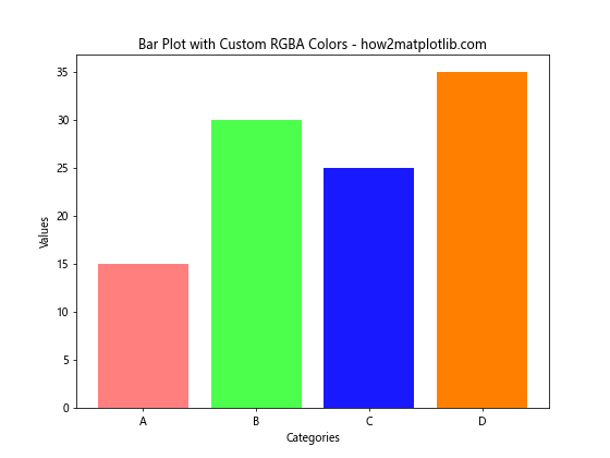
In this example, we use RGBA values to define custom colors for each bar. The values range from 0 to 1, where the fourth value represents the alpha (opacity) of the color.
Implementing Color Gradients in Matplotlib Bar Colors
Color gradients can add a visually appealing dimension to your bar plots. You can create gradients based on the values of your data or use predefined color maps. Here’s an example of how to implement a color gradient:
import matplotlib.pyplot as plt
import numpy as np

categories = ['A', 'B', 'C', 'D', 'E', 'F', 'G', 'H']
values = np.random.randint(10, 100, 8)

plt.figure(figsize=(10, 6))
bars = plt.bar(categories, values)

# Create a color map
cm = plt.cm.get_cmap('viridis')
colors = cm(np.linspace(0, 1, len(categories)))

# Apply colors to bars
for bar, color in zip(bars, colors):
    bar.set_color(color)

plt.title('Bar Plot with Color Gradient - how2matplotlib.com')
plt.xlabel('Categories')
plt.ylabel('Values')
plt.colorbar(plt.cm.ScalarMappable(cmap=cm), label='Color Scale')
plt.show()
This example demonstrates how to create a color gradient using the ‘viridis’ colormap. We use np.linspace() to generate evenly spaced values between 0 and 1, which are then mapped to colors from the chosen colormap.
Applying Matplotlib Bar Colors Based on Data Values
You can make your bar plots more informative by applying colors based on the data values themselves. This technique is particularly useful for highlighting specific ranges or thresholds in your data. Here’s an example:
import matplotlib.pyplot as plt
import numpy as np

categories = ['A', 'B', 'C', 'D', 'E', 'F', 'G', 'H']
values = np.random.randint(-50, 50, 8)

plt.figure(figsize=(10, 6))
bars = plt.bar(categories, values)

# Color bars based on values
for bar in bars:
    if bar.get_height() < 0:
        bar.set_color('red')
    elif bar.get_height() > 30:
        bar.set_color('green')
    else:
        bar.set_color('blue')

plt.title('Bar Plot with Colors Based on Values - how2matplotlib.com')
plt.xlabel('Categories')
plt.ylabel('Values')
plt.axhline(y=0, color='black', linestyle='-', linewidth=0.5)
plt.show()
Output:
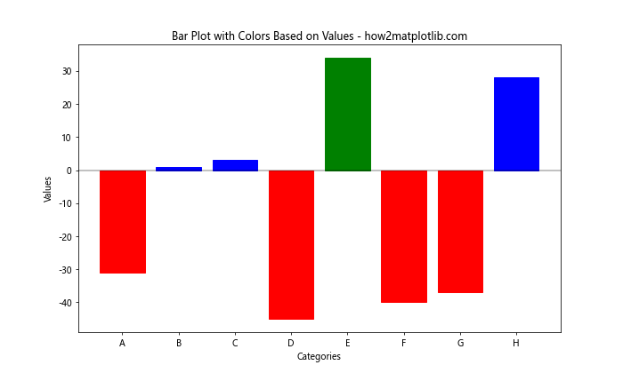
In this example, we color the bars based on their values: red for negative values, green for values above 30, and blue for the rest. This approach helps to quickly identify different categories of data within the plot.
Creating Stacked Bar Charts with Multiple Matplotlib Bar Colors
Stacked bar charts are an excellent way to display multiple categories of data in a single bar. Matplotlib allows you to create these charts with different colors for each stack. Here’s how you can do it:
import matplotlib.pyplot as plt
import numpy as np

categories = ['A', 'B', 'C', 'D']
values1 = np.random.randint(10, 30, 4)
values2 = np.random.randint(10, 30, 4)
values3 = np.random.randint(10, 30, 4)

plt.figure(figsize=(10, 6))
plt.bar(categories, values1, label='Group 1', color='skyblue')
plt.bar(categories, values2, bottom=values1, label='Group 2', color='lightgreen')
plt.bar(categories, values3, bottom=values1+values2, label='Group 3', color='salmon')

plt.title('Stacked Bar Chart with Multiple Colors - how2matplotlib.com')
plt.xlabel('Categories')
plt.ylabel('Values')
plt.legend()
plt.show()
Output:
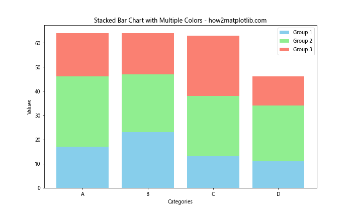
This example creates a stacked bar chart with three different groups, each represented by a different color. The bottom parameter is used to stack the bars on top of each other.
Implementing Hatching Patterns with Matplotlib Bar Colors
Hatching patterns can be combined with colors to add texture to your bar plots, making them more visually interesting and potentially easier to distinguish. Here’s an example of how to implement hatching patterns:
import matplotlib.pyplot as plt
import numpy as np

categories = ['A', 'B', 'C', 'D']
values = np.random.randint(20, 50, 4)
colors = ['red', 'green', 'blue', 'orange']
hatches = ['/', '\\', '|', '-']

plt.figure(figsize=(10, 6))
bars = plt.bar(categories, values, color=colors)

for bar, hatch in zip(bars, hatches):
    bar.set_hatch(hatch)

plt.title('Bar Plot with Colors and Hatching Patterns - how2matplotlib.com')
plt.xlabel('Categories')
plt.ylabel('Values')
plt.show()
Output:
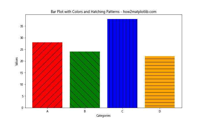
In this example, we combine colors with different hatching patterns to create a visually distinct appearance for each bar.
Using Colorblind-Friendly Matplotlib Bar Colors
When creating visualizations, it’s important to consider accessibility for colorblind individuals. Matplotlib provides colorblind-friendly palettes that you can use in your bar plots. Here’s an example:
import matplotlib.pyplot as plt
import numpy as np

categories = ['A', 'B', 'C', 'D', 'E']
values = np.random.randint(10, 50, 5)

# Colorblind-friendly palette
colors = ['#0072B2', '#D55E00', '#CC79A7', '#E69F00', '#56B4E9']

plt.figure(figsize=(10, 6))
plt.bar(categories, values, color=colors)
plt.title('Bar Plot with Colorblind-Friendly Colors - how2matplotlib.com')
plt.xlabel('Categories')
plt.ylabel('Values')
plt.show()
Output:
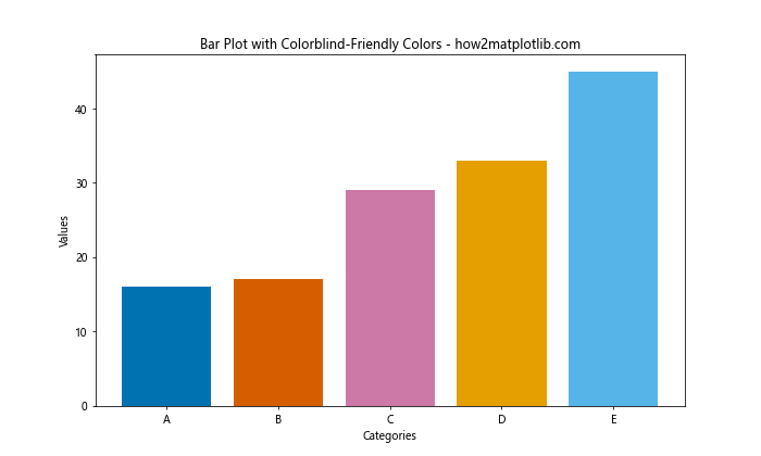
This example uses a colorblind-friendly palette to ensure that the bar plot is accessible to a wider audience.
Creating Grouped Bar Charts with Different Matplotlib Bar Colors
Grouped bar charts are useful for comparing multiple sets of data across categories. You can use different colors for each group to make the comparison more clear. Here’s how to create a grouped bar chart:
import matplotlib.pyplot as plt
import numpy as np

categories = ['A', 'B', 'C', 'D']
group1 = np.random.randint(10, 30, 4)
group2 = np.random.randint(10, 30, 4)
group3 = np.random.randint(10, 30, 4)

x = np.arange(len(categories))
width = 0.25

plt.figure(figsize=(12, 6))
plt.bar(x - width, group1, width, label='Group 1', color='skyblue')
plt.bar(x, group2, width, label='Group 2', color='lightgreen')
plt.bar(x + width, group3, width, label='Group 3', color='salmon')

plt.title('Grouped Bar Chart with Different Colors - how2matplotlib.com')
plt.xlabel('Categories')
plt.ylabel('Values')
plt.xticks(x, categories)
plt.legend()
plt.show()
Output:
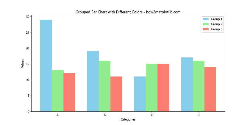
This example creates a grouped bar chart with three groups, each represented by a different color. The width parameter is used to control the width of the bars and their positioning.
Implementing Color Fading Effects in Matplotlib Bar Colors
Color fading effects can add depth and visual interest to your bar plots. You can create a fading effect by gradually changing the color or opacity of the bars. Here’s an example:
import matplotlib.pyplot as plt
import numpy as np

categories = ['A', 'B', 'C', 'D', 'E', 'F', 'G', 'H']
values = np.random.randint(10, 50, 8)

plt.figure(figsize=(12, 6))
bars = plt.bar(categories, values)

# Create color fading effect
base_color = plt.cm.Blues(0.5)
faded_colors = [plt.cm.Blues(1 - i/len(categories)) for i in range(len(categories))]

for bar, color in zip(bars, faded_colors):
    bar.set_color(color)

plt.title('Bar Plot with Color Fading Effect - how2matplotlib.com')
plt.xlabel('Categories')
plt.ylabel('Values')
plt.show()
Output:
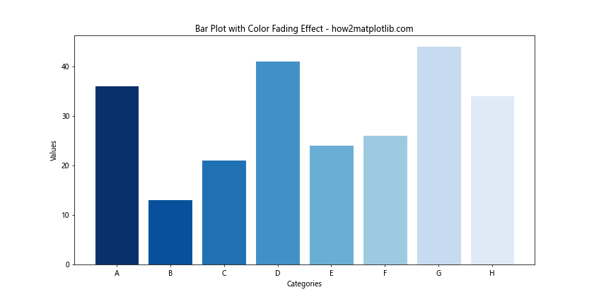
In this example, we use the ‘Blues’ colormap to create a fading effect from dark to light blue across the bars.
Using Custom Color Cycles for Matplotlib Bar Colors
While Matplotlib provides default color cycles, you can create your own custom color cycles to match your specific design needs. Here’s how to implement a custom color cycle:
import matplotlib.pyplot as plt
import numpy as np
from cycler import cycler

categories = ['A', 'B', 'C', 'D', 'E', 'F', 'G', 'H']
values = np.random.randint(10, 50, 8)

# Define custom color cycle
custom_colors = ['#FF9999', '#66B2FF', '#99FF99', '#FFCC99', '#FF99CC', '#99CCFF', '#CCFF99', '#CC99FF']
plt.rc('axes', prop_cycle=(cycler('color', custom_colors)))

plt.figure(figsize=(12, 6))
plt.bar(categories, values)
plt.title('Bar Plot with Custom Color Cycle - how2matplotlib.com')
plt.xlabel('Categories')
plt.ylabel('Values')
plt.show()
Output:
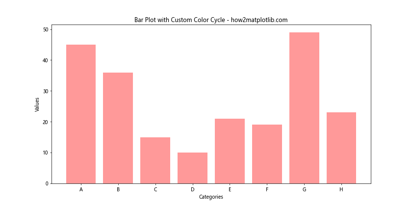
This example demonstrates how to create and use a custom color cycle for your bar plot, allowing you to have full control over the color scheme.
Creating Animated Bar Charts with Changing Matplotlib Bar Colors
Animated bar charts can be a great way to show changes over time or to create engaging presentations. You can animate both the height of the bars and their colors. Here’s a simple example of how to create an animated bar chart:
import matplotlib.pyplot as plt
import matplotlib.animation as animation
import numpy as np

fig, ax = plt.subplots(figsize=(10, 6))

categories = ['A', 'B', 'C', 'D', 'E']
values = np.random.randint(10, 50, 5)

bars = ax.bar(categories, values, color=plt.cm.viridis(np.linspace(0, 1, 5)))

def update(frame):
    new_values = np.random.randint(10, 50, 5)
    for bar, value in zip(bars, new_values):
        bar.set_height(value)
        bar.set_color(plt.cm.viridis(value / 50))
    ax.set_ylim(0, 50)
    ax.set_title(f'Animated Bar Chart - Frame {frame} - how2matplotlib.com')

ani = animation.FuncAnimation(fig, update, frames=100, interval=200, repeat=False)

plt.xlabel('Categories')
plt.ylabel('Values')
plt.show()
Output:
This example creates an animated bar chart where both the heights and colors of the bars change over time. The FuncAnimation function is used to create the animation, updating the bar heights and colors in each frame.
Implementing Gradient Fills in Matplotlib Bar Colors
Gradient fills can add a sophisticated look to your bar plots. Instead of solid colors, you can fill each bar with a gradient that transitions between two or more colors. Here’s how to implement gradient fills:
import matplotlib.pyplot as plt
import numpy as np
from matplotlib.colors import LinearSegmentedColormap

categories = ['A', 'B', 'C', 'D', 'E']
values = np.random.randint(20, 80, 5)

fig, ax = plt.subplots(figsize=(10, 6))

# Create custom colormaps for each bar
colormaps = [
    LinearSegmentedColormap.from_list("", ["#FF9999", "#FF0000"]),
    LinearSegmentedColormap.from_list("", ["#99FF99", "#00FF00"]),
    LinearSegmentedColormap.from_list("", ["#9999FF", "#0000FF"]),
    LinearSegmentedColormap.from_list("", ["#FFFF99", "#FFFF00"]),
    LinearSegmentedColormap.from_list("", ["#FF99FF", "#FF00FF"])
]

for i, (category, value) in enumerate(zip(categories, values)):
    gradient = np.linspace(0, 1, 256).reshape(1, -1)
    colors = colormaps[i](gradient)[0]
    ax.bar(category, value, color=colors, edgecolor='black')

plt.title('Bar Plot with Gradient Fills - how2matplotlib.com')
plt.xlabel('Categories')
plt.ylabel('Values')
plt.show()
Output:
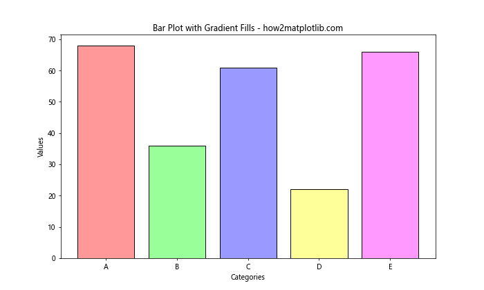
In this example, we create custom colormaps for each bar and use them to create gradient fills. This technique allows for more visually complex and appealing bar charts.
Using Matplotlib Bar Colors to Represent Data Uncertainty
Colors can be used to represent data uncertainty in bar plots. By using different shades or opacities, you can visually indicate the confidence level of your data. Here’s an example:
import matplotlib.pyplot as plt
import numpy as np

categories = ['A', 'B', 'C', 'D', 'E']
values = np.random.randint(30, 70, 5)
uncertainties = np.random.randint(5, 15, 5)

fig, ax = plt.subplots(figsize=(10, 6))

# Plot main bars
bars = ax.bar(categories, values, color='skyblue', edgecolor='black')

# Plot uncertainty bars
for i, (value, uncertainty) in enumerate(zip(values, uncertainties)):
    ax.bar(categories[i], uncertainty * 2, bottom=value - uncertainty,
           color='lightgray', alpha=0.5, edgecolor='none')

plt.title('Bar Plot with Uncertainty Representation - how2matplotlib.com')
plt.xlabel('Categories')
plt.ylabel('Values')
plt.show()
Output:
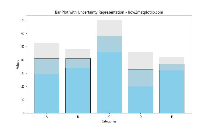
This example uses lighter colored bars to represent the range of uncertainty for each data point, providing a visual indication of the data’s reliability.
Creating Multi-Colored Single Bars in Matplotlib
Sometimes, you might want to represent multiple values within a single bar using different colors. This can be achieved by stacking multiple thin bars next to each other. Here’s how to create multi-colored single bars:
import matplotlib.pyplot as plt
import numpy as np

categories = ['A', 'B', 'C', 'D']
values = np.random.randint(50, 100, 4)
sub_values = np.random.randint(10, 30, (4, 3))

fig, ax = plt.subplots(figsize=(10, 6))

bar_width = 0.8
sub_bar_width = bar_width / 3

for i, (category, value) in enumerate(zip(categories, values)):
    x = i - bar_width/2 + sub_bar_width/2
    ax.bar(x, sub_values[i, 0], width=sub_bar_width, color='red')
    ax.bar(x + sub_bar_width, sub_values[i, 1], width=sub_bar_width, color='green')
    ax.bar(x + 2*sub_bar_width, sub_values[i, 2], width=sub_bar_width, color='blue')

ax.set_xticks(range(len(categories)))
ax.set_xticklabels(categories)

plt.title('Multi-Colored Single Bars - how2matplotlib.com')
plt.xlabel('Categories')
plt.ylabel('Values')
plt.show()
Output:
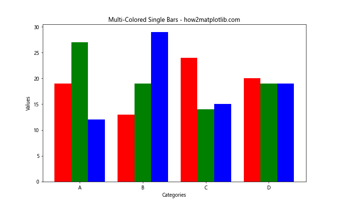
This example creates bars that appear as single units but are actually composed of three different colored sub-bars, allowing for the representation of multiple related values for each category.
Matplotlib bar colors Conclusion
Mastering Matplotlib bar colors is an essential skill for creating effective and visually appealing data visualizations. Throughout this comprehensive guide, we’ve explored various techniques for customizing and enhancing bar plots using Matplotlib. From basic color assignments to advanced color mapping and gradient effects, you now have a robust toolkit for creating stunning bar charts.
Remember that the key to effective data visualization is not just about making your plots look good, but also about conveying information clearly and accurately. Use colors purposefully to highlight important data points, show trends, or differentiate between categories. Always consider your audience and the context in which your visualizations will be viewed.