Comprehensive Guide to Matplotlib Colors List: Enhancing Data Visualization
Matplotlib colors list is an essential aspect of data visualization in Python. This comprehensive guide will explore the various ways to use and customize colors in Matplotlib, providing you with the knowledge and tools to create visually appealing and informative plots. From basic color specifications to advanced color mapping techniques, we’ll cover everything you need to know about working with colors in Matplotlib.
Understanding the Matplotlib Colors List
The Matplotlib colors list is a collection of predefined color names and values that can be used to customize the appearance of plots, charts, and other visualizations. These colors are easily accessible and can be applied to various elements of a plot, such as lines, markers, fills, and text.
Basic Color Specification
Matplotlib offers several ways to specify colors:
- Color names: Matplotlib recognizes a wide range of color names, such as ‘red’, ‘blue’, ‘green’, etc.
- Hex color codes: Colors can be specified using hexadecimal codes, like ‘#FF0000’ for red.
- RGB tuples: Colors can be defined as tuples of red, green, and blue values, ranging from 0 to 1.
- RGBA tuples: Similar to RGB, but with an additional alpha value for transparency.
Let’s look at an example that demonstrates these different color specifications:
import matplotlib.pyplot as plt

# Create a simple plot with different color specifications
plt.figure(figsize=(10, 6))
plt.plot([1, 2, 3, 4], [1, 4, 2, 3], color='red', label='Color name')
plt.plot([1, 2, 3, 4], [2, 3, 4, 1], color='#00FF00', label='Hex code')
plt.plot([1, 2, 3, 4], [3, 2, 1, 4], color=(0, 0, 1), label='RGB tuple')
plt.plot([1, 2, 3, 4], [4, 1, 3, 2], color=(1, 0, 1, 0.5), label='RGBA tuple')

plt.title('Matplotlib Colors List Example - how2matplotlib.com')
plt.xlabel('X-axis')
plt.ylabel('Y-axis')
plt.legend()
plt.show()
Output:
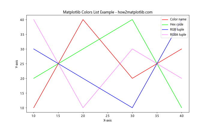
In this example, we create four line plots using different color specifications. The first line uses the color name ‘red’, the second uses a hex code for green, the third uses an RGB tuple for blue, and the fourth uses an RGBA tuple for semi-transparent magenta.
Exploring the Matplotlib Colors List
Matplotlib provides a comprehensive list of named colors that can be used in your visualizations. These colors are organized into several categories:
- Base colors
- Tableau colors
- CSS colors
- XKCD colors
Base Colors
The base colors in Matplotlib are a set of commonly used colors that are easily accessible. These include:
- ‘blue’
- ‘green’
- ‘red’
- ‘cyan’
- ‘magenta’
- ‘yellow’
- ‘black’
- ‘white’
Let’s create a bar plot using these base colors:
import matplotlib.pyplot as plt

base_colors = ['blue', 'green', 'red', 'cyan', 'magenta', 'yellow', 'black', 'white']
values = [3, 7, 2, 5, 8, 1, 4, 6]

plt.figure(figsize=(12, 6))
plt.bar(base_colors, values, color=base_colors)
plt.title('Matplotlib Colors List: Base Colors - how2matplotlib.com')
plt.xlabel('Colors')
plt.ylabel('Values')
plt.show()
Output:
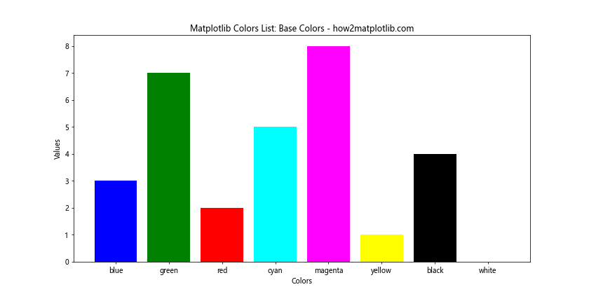
This example creates a bar plot using the base colors in Matplotlib. Each bar represents a color and is filled with its corresponding color.
Tableau Colors
Tableau colors are a set of color palettes designed for data visualization. Matplotlib includes these colors, which can be accessed using the ‘tab:’ prefix. Some examples include:
- ‘tab:blue’
- ‘tab:orange’
- ‘tab:green’
- ‘tab:red’
- ‘tab:purple’
- ‘tab:brown’
- ‘tab:pink’
- ‘tab:gray’
- ‘tab:olive’
- ‘tab:cyan’
Let’s create a scatter plot using Tableau colors:
import matplotlib.pyplot as plt
import numpy as np

tableau_colors = ['tab:blue', 'tab:orange', 'tab:green', 'tab:red', 'tab:purple',
                  'tab:brown', 'tab:pink', 'tab:gray', 'tab:olive', 'tab:cyan']

x = np.random.rand(10, 10)
y = np.random.rand(10, 10)

plt.figure(figsize=(12, 8))
for i in range(10):
    plt.scatter(x[i], y[i], c=tableau_colors[i], label=tableau_colors[i], s=100)

plt.title('Matplotlib Colors List: Tableau Colors - how2matplotlib.com')
plt.xlabel('X-axis')
plt.ylabel('Y-axis')
plt.legend()
plt.show()
Output:
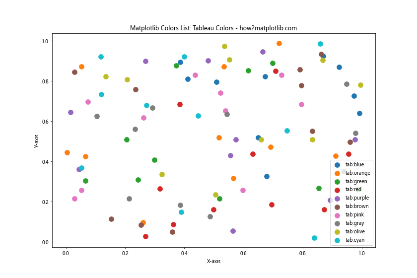
This example creates a scatter plot with 10 different groups of points, each represented by a Tableau color.
CSS Colors
Matplotlib also supports CSS color names, which provide a wide range of color options. Some examples include:
- ‘aliceblue’
- ‘antiquewhite’
- ‘aqua’
- ‘aquamarine’
- ‘azure’
- ‘beige’
- ‘bisque’
- ‘blanchedalmond’
Let’s create a pie chart using some CSS colors:
import matplotlib.pyplot as plt

css_colors = ['aliceblue', 'antiquewhite', 'aqua', 'aquamarine', 'azure', 'beige', 'bisque', 'blanchedalmond']
sizes = [15, 30, 25, 10, 5, 5, 5, 5]

plt.figure(figsize=(10, 10))
plt.pie(sizes, labels=css_colors, colors=css_colors, autopct='%1.1f%%', startangle=90)
plt.title('Matplotlib Colors List: CSS Colors - how2matplotlib.com')
plt.axis('equal')
plt.show()
Output:
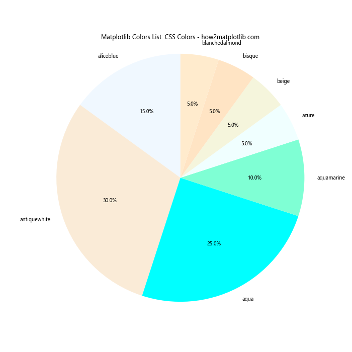
This example creates a pie chart using CSS color names for both the slice colors and labels.
XKCD Colors
XKCD colors are a set of color names derived from a color survey conducted by the XKCD webcomic. These colors can be accessed using the ‘xkcd:’ prefix. Some examples include:
- ‘xkcd:sky blue’
- ‘xkcd:grass green’
- ‘xkcd:blood red’
- ‘xkcd:sunflower yellow’
- ‘xkcd:lavender’
Let’s create a horizontal bar plot using XKCD colors:
import matplotlib.pyplot as plt

xkcd_colors = ['xkcd:sky blue', 'xkcd:grass green', 'xkcd:blood red', 'xkcd:sunflower yellow', 'xkcd:lavender']
values = [4, 7, 2, 5, 3]

plt.figure(figsize=(12, 6))
plt.barh(xkcd_colors, values, color=xkcd_colors)
plt.title('Matplotlib Colors List: XKCD Colors - how2matplotlib.com')
plt.xlabel('Values')
plt.ylabel('Colors')
plt.show()
Output:
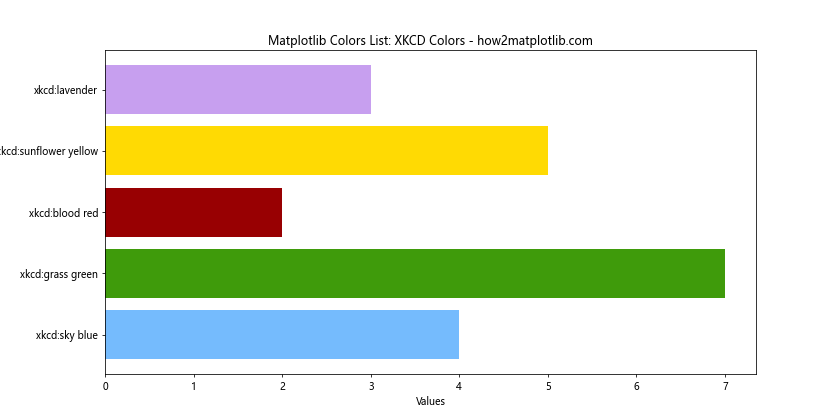
This example creates a horizontal bar plot using XKCD color names for both the bar colors and labels.
Working with Color Maps
Color maps are an essential tool in Matplotlib for representing continuous data. They provide a way to map numerical values to colors, creating visually appealing and informative visualizations.
Built-in Color Maps
Matplotlib offers a wide range of built-in color maps that can be used for various types of data and visualization purposes. Some popular color maps include:
- ‘viridis’
- ‘plasma’
- ‘inferno’
- ‘magma’
- ‘cividis’
- ‘coolwarm’
- ‘RdYlBu’
- ‘jet’
Let’s create a heatmap using the ‘viridis’ color map:
import matplotlib.pyplot as plt
import numpy as np

data = np.random.rand(10, 10)

plt.figure(figsize=(10, 8))
plt.imshow(data, cmap='viridis')
plt.colorbar(label='Values')
plt.title('Matplotlib Colors List: Viridis Color Map - how2matplotlib.com')
plt.xlabel('X-axis')
plt.ylabel('Y-axis')
plt.show()
Output:
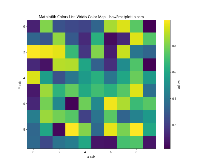
This example creates a heatmap using random data and the ‘viridis’ color map. The colorbar shows the mapping between values and colors.
Custom Color Maps
In addition to built-in color maps, Matplotlib allows you to create custom color maps tailored to your specific needs. You can create a custom color map using a list of colors and the LinearSegmentedColormap class from matplotlib.colors.
Here’s an example of creating and using a custom color map:
import matplotlib.pyplot as plt
import numpy as np
from matplotlib.colors import LinearSegmentedColormap

# Define custom colors
colors = ['#FF0000', '#00FF00', '#0000FF']  # Red, Green, Blue

# Create custom color map
n_bins = 100
cmap = LinearSegmentedColormap.from_list('custom_cmap', colors, N=n_bins)

# Generate sample data
x = np.linspace(0, 10, 100)
y = np.linspace(0, 10, 100)
X, Y = np.meshgrid(x, y)
Z = np.sin(X) * np.cos(Y)

# Create plot
plt.figure(figsize=(10, 8))
plt.pcolormesh(X, Y, Z, cmap=cmap, shading='auto')
plt.colorbar(label='Values')
plt.title('Matplotlib Colors List: Custom Color Map - how2matplotlib.com')
plt.xlabel('X-axis')
plt.ylabel('Y-axis')
plt.show()
Output:
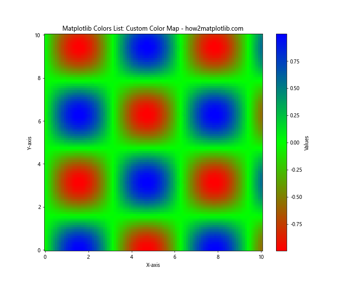
This example creates a custom color map using red, green, and blue colors, and applies it to a 2D plot of sine and cosine functions.
Color Cycling
Color cycling is a feature in Matplotlib that automatically assigns different colors to plot elements when multiple datasets are plotted on the same axes. This is particularly useful when creating plots with multiple lines or scatter points.
Let’s create an example that demonstrates color cycling:
import matplotlib.pyplot as plt
import numpy as np

# Generate sample data
x = np.linspace(0, 10, 100)
y1 = np.sin(x)
y2 = np.cos(x)
y3 = np.tan(x)
y4 = x**2
y5 = x**3

# Create plot with color cycling
plt.figure(figsize=(12, 6))
plt.plot(x, y1, label='sin(x)')
plt.plot(x, y2, label='cos(x)')
plt.plot(x, y3, label='tan(x)')
plt.plot(x, y4, label='x^2')
plt.plot(x, y5, label='x^3')

plt.title('Matplotlib Colors List: Color Cycling - how2matplotlib.com')
plt.xlabel('X-axis')
plt.ylabel('Y-axis')
plt.legend()
plt.grid(True)
plt.show()
Output:
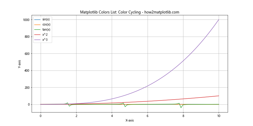
In this example, we plot five different functions on the same axes. Matplotlib automatically assigns different colors to each line, making it easy to distinguish between the different datasets.
Customizing Color Cycles
While Matplotlib’s default color cycle is suitable for many applications, you may want to customize it to match your specific needs or branding requirements. You can do this by setting the prop_cycle property of the axes.
Here’s an example of how to customize the color cycle:
import matplotlib.pyplot as plt
import numpy as np
from cycler import cycler

# Define custom colors
custom_colors = ['#FF1493', '#00CED1', '#FF8C00', '#32CD32', '#BA55D3']

# Set custom color cycle
plt.rc('axes', prop_cycle=(cycler('color', custom_colors)))

# Generate sample data
x = np.linspace(0, 10, 100)
y1 = np.sin(x)
y2 = np.cos(x)
y3 = np.tan(x)
y4 = x**2
y5 = x**3

# Create plot with custom color cycle
plt.figure(figsize=(12, 6))
plt.plot(x, y1, label='sin(x)')
plt.plot(x, y2, label='cos(x)')
plt.plot(x, y3, label='tan(x)')
plt.plot(x, y4, label='x^2')
plt.plot(x, y5, label='x^3')

plt.title('Matplotlib Colors List: Custom Color Cycle - how2matplotlib.com')
plt.xlabel('X-axis')
plt.ylabel('Y-axis')
plt.legend()
plt.grid(True)
plt.show()
Output:
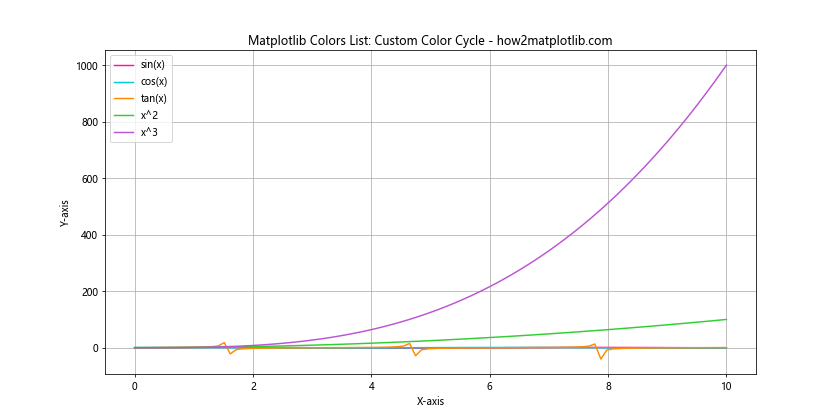
This example sets a custom color cycle using five distinct colors. The plot now uses these colors for the different lines, providing a unique and customized appearance.
Color Normalization
Color normalization is the process of mapping data values to colors in a consistent and meaningful way. Matplotlib provides several normalization classes that can be used to control how colors are mapped to data values.
Linear Normalization
Linear normalization is the default normalization method in Matplotlib. It maps data values linearly to colors in the color map.
Let’s create an example using linear normalization:
import matplotlib.pyplot as plt
import numpy as np
from matplotlib.colors import Normalize

# Generate sample data
x = np.linspace(0, 10, 100)
y = np.linspace(0, 10, 100)
X, Y = np.meshgrid(x, y)
Z = np.sin(X) * np.cos(Y)

# Create plot with linear normalization
plt.figure(figsize=(10, 8))
plt.pcolormesh(X, Y, Z, cmap='viridis', norm=Normalize(vmin=-1, vmax=1))
plt.colorbar(label='Values')
plt.title('Matplotlib Colors List: Linear Normalization - how2matplotlib.com')
plt.xlabel('X-axis')
plt.ylabel('Y-axis')
plt.show()
Output:
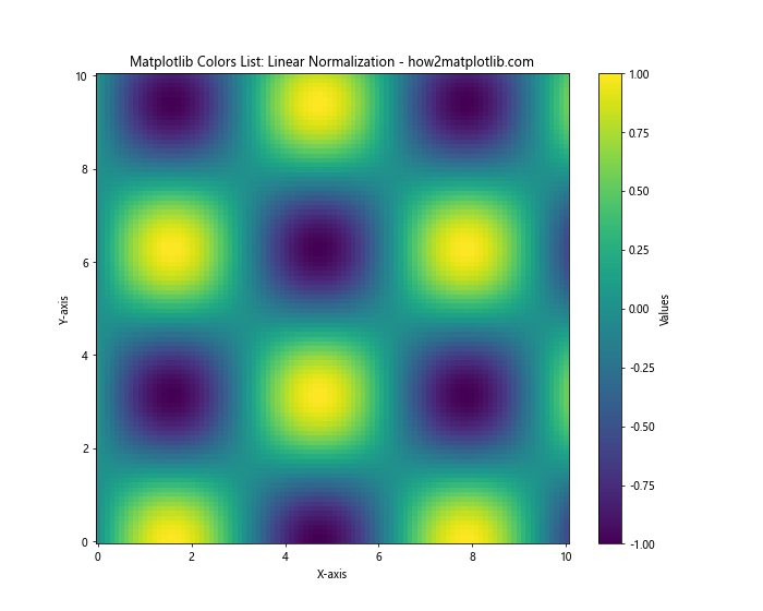
This example uses linear normalization to map the data values between -1 and 1 to colors in the ‘viridis’ color map.
Logarithmic Normalization
Logarithmic normalization is useful when dealing with data that spans several orders of magnitude. It maps data values logarithmically to colors in the color map.
Here’s an example using logarithmic normalization:
import matplotlib.pyplot as plt
import numpy as np
from matplotlib.colors import LogNorm

# Generate sample data
x = np.linspace(1, 10, 100)
y = np.linspace(1, 10, 100)
X, Y = np.meshgrid(x, y)
Z = X * Y

# Create plot with logarithmic normalization
plt.figure(figsize=(10, 8))
plt.pcolormesh(X, Y, Z, cmap='plasma', norm=LogNorm(vmin=1, vmax=100))
plt.colorbar(label='Values')
plt.title('Matplotlib Colors List: Logarithmic Normalization - how2matplotlib.com')
plt.xlabel('X-axis')
plt.ylabel('Y-axis')
plt.show()
Output:
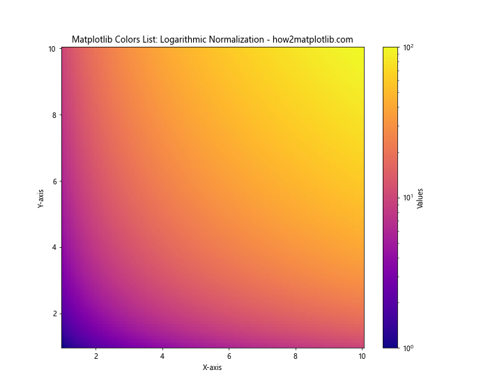
This example uses logarithmic normalization to map the data values between 1 and 100 to colors in the ‘plasma’ color map.
Advanced Color Techniques
Alpha Blending
Alpha blending allows you to create semi-transparent colors, which can be useful for overlaying multiple datasets orcreating visual effects. You can specify alpha values for individual plot elements or use color maps with alpha channels.
Here’s an example demonstrating alpha blending:
import matplotlib.pyplot as plt
import numpy as np

# Generate sample data
x = np.linspace(0, 10, 100)
y1 = np.sin(x)
y2 = np.cos(x)

plt.figure(figsize=(10, 6))
plt.plot(x, y1, color='red', alpha=0.5, linewidth=3, label='sin(x)')
plt.plot(x, y2, color='blue', alpha=0.5, linewidth=3, label='cos(x)')
plt.fill_between(x, y1, y2, color='purple', alpha=0.2)

plt.title('Matplotlib Colors List: Alpha Blending - how2matplotlib.com')
plt.xlabel('X-axis')
plt.ylabel('Y-axis')
plt.legend()
plt.grid(True)
plt.show()
Output:
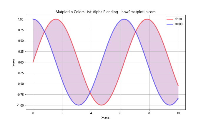
This example creates two overlapping plots with semi-transparent lines and fills the area between them with a semi-transparent color.
Gradients and Color Interpolation
Matplotlib allows you to create gradients and interpolate colors for more complex visualizations. This can be particularly useful for creating custom color maps or applying gradients to plot elements.
Let’s create an example that demonstrates color interpolation:
import matplotlib.pyplot as plt
import numpy as np
from matplotlib.colors import LinearSegmentedColormap

# Define custom color gradient
colors = ['#FF0000', '#00FF00', '#0000FF']  # Red, Green, Blue
n_bins = 100
cmap = LinearSegmentedColormap.from_list('custom_cmap', colors, N=n_bins)

# Generate sample data
x = np.linspace(0, 10, 100)
y = np.sin(x)

plt.figure(figsize=(12, 6))
for i in range(len(x) - 1):
    plt.plot(x[i:i+2], y[i:i+2], color=cmap(i / len(x)), linewidth=2)

plt.title('Matplotlib Colors List: Color Interpolation - how2matplotlib.com')
plt.xlabel('X-axis')
plt.ylabel('Y-axis')
plt.colorbar(plt.cm.ScalarMappable(cmap=cmap), label='Color Gradient')
plt.show()
This example creates a sine wave plot where the color of the line gradually changes from red to green to blue along its length.
Color Accessibility
When working with colors in data visualization, it’s important to consider color accessibility to ensure that your plots are readable and understandable for all users, including those with color vision deficiencies.
Colorblind-friendly Color Palettes
Matplotlib provides several colorblind-friendly color palettes that can be used to create accessible visualizations. One such palette is ‘viridis’, which is designed to be perceptually uniform and colorblind-friendly.
Let’s create an example using a colorblind-friendly palette:
import matplotlib.pyplot as plt
import numpy as np

# Generate sample data
categories = ['A', 'B', 'C', 'D', 'E']
values = np.random.rand(5)

plt.figure(figsize=(10, 6))
bars = plt.bar(categories, values)

# Use a colorblind-friendly color palette
colors = plt.cm.viridis(np.linspace(0, 1, len(bars)))
for bar, color in zip(bars, colors):
    bar.set_color(color)

plt.title('Matplotlib Colors List: Colorblind-friendly Palette - how2matplotlib.com')
plt.xlabel('Categories')
plt.ylabel('Values')
plt.show()
Output:
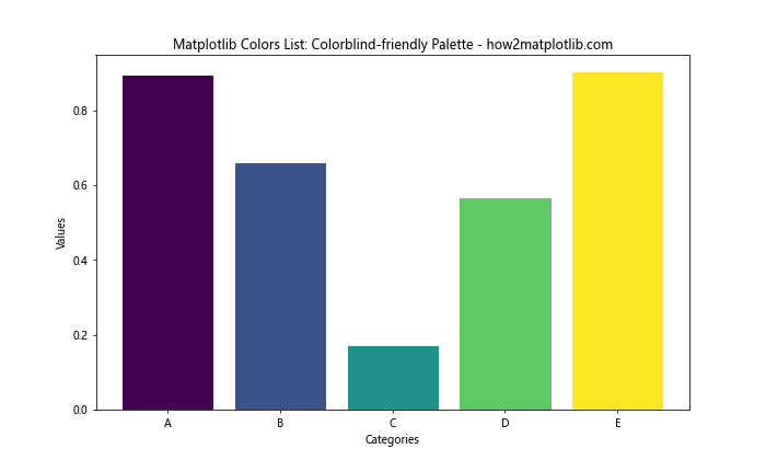
This example creates a bar plot using colors from the ‘viridis’ colormap, which is designed to be colorblind-friendly.
Best Practices for Using Colors in Matplotlib
When working with the Matplotlib colors list, it’s important to follow some best practices to create effective and visually appealing visualizations:
- Choose appropriate color schemes: Select colors that complement each other and are suitable for the type of data you’re visualizing.
Use color consistently: Maintain consistency in your color choices throughout your visualizations to avoid confusion.
Consider color blindness: Use colorblind-friendly palettes or check your visualizations with color blindness simulators.
Limit the number of colors: Too many colors can be overwhelming. Stick to a limited palette for clarity.
Use color to highlight important information: Use color strategically to draw attention to key data points or trends.
Provide alternative ways to convey information: Don’t rely solely on color to convey important information. Use other visual cues like patterns, shapes, or labels.
Test your visualizations: View your plots on different devices and in different lighting conditions to ensure they’re readable.
Matplotlib colors list Conclusion
The Matplotlib colors list is a powerful tool for creating visually appealing and informative data visualizations. From basic color specifications to advanced techniques like custom color maps and color normalization, Matplotlib offers a wide range of options for working with colors. By understanding the various color options available in Matplotlib and following best practices for color usage, you can create effective visualizations that communicate your data clearly and engagingly. Remember to consider color accessibility and choose appropriate color schemes for your specific visualization needs.