How to Master Matplotlib Colors and Palettes: A Comprehensive Guide
Matplotlib colors and palettes are essential components for creating visually appealing and informative data visualizations. In this comprehensive guide, we’ll explore the various aspects of working with colors and palettes in Matplotlib, providing you with the knowledge and tools to enhance your plots and charts. From basic color selection to advanced color mapping techniques, we’ll cover everything you need to know about Matplotlib colors and palettes.
Understanding Matplotlib Colors and Color Systems
Matplotlib colors are fundamental to creating visually appealing plots. The library supports various color systems, including named colors, RGB tuples, and hexadecimal color codes. Let’s explore these color systems and how to use them in Matplotlib.
Named Colors in Matplotlib
Matplotlib provides a wide range of named colors that you can use in your plots. These colors are easy to use and remember, making them a popular choice for beginners and experienced users alike.
import matplotlib.pyplot as plt

plt.figure(figsize=(8, 6))
plt.plot([1, 2, 3, 4], [1, 4, 2, 3], color='red', label='Red Line')
plt.plot([1, 2, 3, 4], [2, 3, 4, 1], color='blue', label='Blue Line')
plt.title('Using Named Colors in Matplotlib - how2matplotlib.com')
plt.xlabel('X-axis')
plt.ylabel('Y-axis')
plt.legend()
plt.show()
Output:
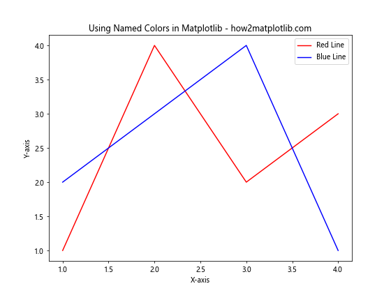
In this example, we use the named colors ‘red’ and ‘blue’ to create two line plots. Matplotlib recognizes these color names and applies them to the respective lines.
RGB and RGBA Colors
RGB (Red, Green, Blue) and RGBA (Red, Green, Blue, Alpha) color systems allow you to specify colors using numerical values. This provides more flexibility in color selection and enables you to create custom colors.
import matplotlib.pyplot as plt

plt.figure(figsize=(8, 6))
plt.scatter([1, 2, 3, 4], [1, 4, 2, 3], color=(0.8, 0.2, 0.1), label='RGB Color')
plt.scatter([1, 2, 3, 4], [2, 3, 4, 1], color=(0.1, 0.5, 0.9, 0.5), label='RGBA Color')
plt.title('Using RGB and RGBA Colors in Matplotlib - how2matplotlib.com')
plt.xlabel('X-axis')
plt.ylabel('Y-axis')
plt.legend()
plt.show()
Output:
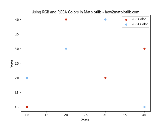
In this example, we use RGB and RGBA tuples to specify colors for scatter plots. The RGB values range from 0 to 1, representing the intensity of each color channel. The fourth value in RGBA represents the alpha (transparency) channel.
Hexadecimal Color Codes
Hexadecimal color codes are another popular way to specify colors in Matplotlib. These codes are widely used in web design and provide a compact representation of RGB colors.
import matplotlib.pyplot as plt

plt.figure(figsize=(8, 6))
plt.bar([1, 2, 3, 4], [1, 4, 2, 3], color='#FF5733', label='Hex Color 1')
plt.bar([1.5, 2.5, 3.5, 4.5], [2, 3, 4, 1], color='#33FF57', label='Hex Color 2')
plt.title('Using Hexadecimal Color Codes in Matplotlib - how2matplotlib.com')
plt.xlabel('X-axis')
plt.ylabel('Y-axis')
plt.legend()
plt.show()
Output:
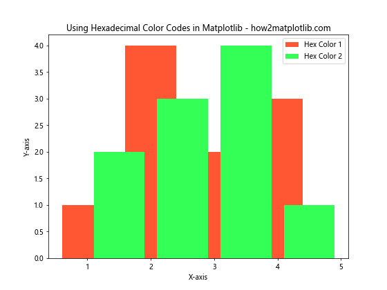
In this example, we use hexadecimal color codes to specify colors for bar plots. The ‘#’ symbol precedes the six-digit code, which represents the RGB values in hexadecimal format.
Exploring Matplotlib Color Palettes
Matplotlib color palettes, also known as colormaps, are predefined sets of colors that can be used to represent data in a visually appealing and meaningful way. These palettes are particularly useful for creating heatmaps, contour plots, and other visualizations that require a range of colors.
Built-in Matplotlib Color Palettes
Matplotlib comes with a variety of built-in color palettes that cater to different visualization needs. Let’s explore some of the most commonly used palettes.
import matplotlib.pyplot as plt
import numpy as np

data = np.random.rand(10, 10)
plt.figure(figsize=(12, 4))

palettes = ['viridis', 'plasma', 'inferno', 'magma']

for i, palette in enumerate(palettes):
    plt.subplot(1, 4, i+1)
    plt.imshow(data, cmap=palette)
    plt.title(f'{palette.capitalize()} - how2matplotlib.com')
    plt.axis('off')

plt.tight_layout()
plt.show()
Output:
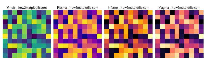
This example demonstrates four popular built-in color palettes in Matplotlib: viridis, plasma, inferno, and magma. These palettes are designed to be perceptually uniform and colorblind-friendly.
Creating Custom Color Palettes
While Matplotlib offers a wide range of built-in color palettes, you may sometimes need to create custom palettes to suit your specific visualization needs. Let’s explore how to create custom color palettes using Matplotlib’s LinearSegmentedColormap class.
import matplotlib.pyplot as plt
import matplotlib.colors as mcolors
import numpy as np

# Define custom colors
colors = ['#FF0000', '#00FF00', '#0000FF']
n_bins = 100

# Create custom colormap
custom_cmap = mcolors.LinearSegmentedColormap.from_list('custom_cmap', colors, N=n_bins)

# Generate sample data
data = np.random.rand(10, 10)

plt.figure(figsize=(8, 6))
plt.imshow(data, cmap=custom_cmap)
plt.colorbar(label='Custom Colormap')
plt.title('Custom Color Palette in Matplotlib - how2matplotlib.com')
plt.axis('off')
plt.show()
Output:

In this example, we create a custom color palette using three colors: red, green, and blue. The LinearSegmentedColormap.from_list() method is used to generate a smooth transition between these colors.
Applying Matplotlib Colors and Palettes to Different Plot Types
Now that we’ve explored the basics of Matplotlib colors and palettes, let’s see how to apply them to various types of plots.
Line Plots with Custom Colors
Line plots are one of the most common types of visualizations. Let’s create a line plot with custom colors and styles.
import matplotlib.pyplot as plt
import numpy as np

x = np.linspace(0, 10, 100)
y1 = np.sin(x)
y2 = np.cos(x)

plt.figure(figsize=(10, 6))
plt.plot(x, y1, color='#FF5733', linestyle='-', linewidth=2, label='Sine')
plt.plot(x, y2, color='#3366FF', linestyle='--', linewidth=2, label='Cosine')
plt.title('Line Plot with Custom Colors - how2matplotlib.com')
plt.xlabel('X-axis')
plt.ylabel('Y-axis')
plt.legend()
plt.grid(True, linestyle=':')
plt.show()
Output:
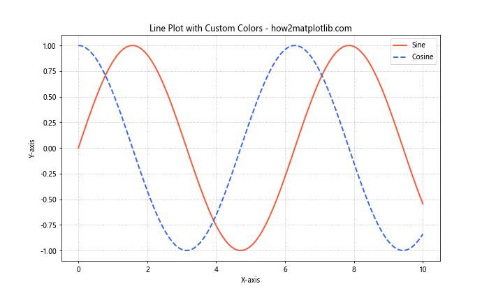
In this example, we create two line plots with custom colors, line styles, and widths. The use of distinct colors helps differentiate between the sine and cosine curves.
Scatter Plots with Color Mapping
Scatter plots can benefit from color mapping to represent an additional dimension of data. Let’s create a scatter plot with colors mapped to a third variable.
import matplotlib.pyplot as plt
import numpy as np

np.random.seed(42)
x = np.random.rand(50)
y = np.random.rand(50)
colors = np.random.rand(50)
sizes = 1000 * np.random.rand(50)

plt.figure(figsize=(10, 8))
scatter = plt.scatter(x, y, c=colors, s=sizes, alpha=0.6, cmap='viridis')
plt.colorbar(scatter, label='Color Value')
plt.title('Scatter Plot with Color Mapping - how2matplotlib.com')
plt.xlabel('X-axis')
plt.ylabel('Y-axis')
plt.show()
Output:
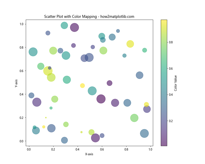
In this example, we create a scatter plot where the color of each point is determined by a third variable. The size of each point is also varied to demonstrate how multiple dimensions can be represented in a single plot.
Heatmaps with Custom Color Palettes
Heatmaps are an excellent way to visualize 2D data, and color palettes play a crucial role in their effectiveness. Let’s create a heatmap with a custom color palette.
import matplotlib.pyplot as plt
import numpy as np

data = np.random.rand(10, 10)
custom_cmap = plt.cm.get_cmap('coolwarm')

plt.figure(figsize=(10, 8))
heatmap = plt.imshow(data, cmap=custom_cmap)
plt.colorbar(heatmap, label='Value')
plt.title('Heatmap with Custom Color Palette - how2matplotlib.com')
plt.xlabel('X-axis')
plt.ylabel('Y-axis')
plt.show()
Output:

In this example, we create a heatmap using the ‘coolwarm’ color palette. This palette is effective for highlighting differences between high and low values in the data.
Advanced Techniques for Matplotlib Colors and Palettes
As you become more comfortable with Matplotlib colors and palettes, you can explore advanced techniques to create even more sophisticated visualizations.
Color Normalization
Color normalization allows you to map your data to colors in a more controlled way. This is particularly useful when dealing with data that has outliers or requires specific color mapping.
import matplotlib.pyplot as plt
import matplotlib.colors as mcolors
import numpy as np

data = np.random.randn(100, 100)
norm = mcolors.TwoSlopeNorm(vmin=-2, vcenter=0, vmax=2)

plt.figure(figsize=(10, 8))
heatmap = plt.imshow(data, cmap='RdYlBu_r', norm=norm)
plt.colorbar(heatmap, label='Value')
plt.title('Heatmap with Color Normalization - how2matplotlib.com')
plt.xlabel('X-axis')
plt.ylabel('Y-axis')
plt.show()
Output:
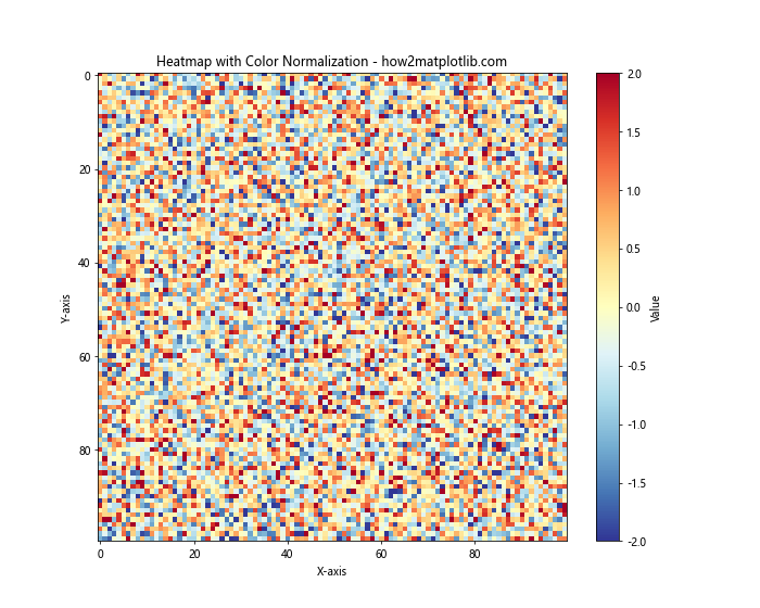
In this example, we use the TwoSlopeNorm class to create a diverging color scheme centered around zero. This technique is useful for highlighting positive and negative values in your data.
Discrete Color Palettes
While continuous color palettes are common, discrete color palettes can be useful for categorical data or when you want to emphasize distinct levels in your data.
import matplotlib.pyplot as plt
import numpy as np

data = np.random.randint(0, 5, (10, 10))
discrete_cmap = plt.cm.get_cmap('Set3', 5)

plt.figure(figsize=(10, 8))
heatmap = plt.imshow(data, cmap=discrete_cmap)
plt.colorbar(heatmap, label='Category', ticks=range(5))
plt.title('Heatmap with Discrete Color Palette - how2matplotlib.com')
plt.xlabel('X-axis')
plt.ylabel('Y-axis')
plt.show()
Output:
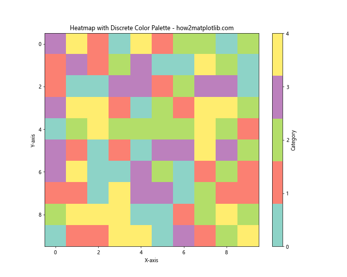
In this example, we create a discrete color palette using the ‘Set3’ colormap with 5 distinct colors. This is useful for visualizing categorical data or data with distinct levels.
Combining Multiple Color Palettes
Sometimes, you may need to use multiple color palettes in a single visualization. Let’s explore how to combine different palettes effectively.
import matplotlib.pyplot as plt
import numpy as np

x = np.linspace(0, 10, 100)
y1 = np.sin(x)
y2 = np.cos(x)

fig, (ax1, ax2) = plt.subplots(2, 1, figsize=(10, 12))

# First subplot with viridis colormap
scatter1 = ax1.scatter(x, y1, c=y1, cmap='viridis')
ax1.set_title('Sine Wave with Viridis Colormap - how2matplotlib.com')
fig.colorbar(scatter1, ax=ax1, label='Sine Value')

# Second subplot with plasma colormap
scatter2 = ax2.scatter(x, y2, c=y2, cmap='plasma')
ax2.set_title('Cosine Wave with Plasma Colormap - how2matplotlib.com')
fig.colorbar(scatter2, ax=ax2, label='Cosine Value')

plt.tight_layout()
plt.show()
Output:
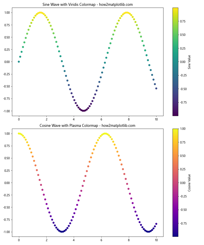
In this example, we create two subplots, each using a different color palette. This technique allows you to represent different aspects of your data using distinct color schemes.
Best Practices for Using Matplotlib Colors and Palettes
When working with Matplotlib colors and palettes, it’s important to follow best practices to ensure your visualizations are effective and accessible. Here are some key considerations:
- Choose appropriate color palettes for your data type:
- Use sequential palettes for continuous data
- Use diverging palettes for data with a meaningful center point
- Use qualitative palettes for categorical data
- Consider color blindness and accessibility:
- Use colorblind-friendly palettes like ‘viridis’ or ‘cividis’
- Avoid relying solely on color to convey information
- Be consistent with color usage across related visualizations
Use color to highlight important information or draw attention to specific data points
Avoid using too many colors in a single visualization, as it can be overwhelming
Let’s create an example that demonstrates some of these best practices: