How to Specify Colorspace in Matplotlib: A Comprehensive Guide
Matplotlib specify colorspace is an essential aspect of data visualization that allows users to control the color representation of their plots and charts. In this comprehensive guide, we’ll explore various methods to specify colorspace in Matplotlib, providing detailed explanations and practical examples to help you master this crucial feature.
Understanding Colorspace in Matplotlib
Before diving into the specifics of how to specify colorspace in Matplotlib, it’s important to understand what colorspace means in the context of data visualization. Colorspace refers to the way colors are represented and organized in a given system. In Matplotlib, users have the flexibility to work with different colorspaces, allowing for precise control over the appearance of their visualizations.
Matplotlib specify colorspace options include RGB (Red, Green, Blue), HSV (Hue, Saturation, Value), and various other color models. By specifying the colorspace, you can ensure that your plots accurately represent the data and convey the intended message effectively.
Let’s start with a simple example of how to specify colorspace in Matplotlib:
import matplotlib.pyplot as plt
import numpy as np

# Generate sample data
x = np.linspace(0, 10, 100)
y = np.sin(x)

# Create a plot with RGB colorspace
plt.figure(figsize=(8, 6))
plt.plot(x, y, color='rgb(255, 0, 0)')  # Red color in RGB
plt.title('Sine Wave in RGB Colorspace - how2matplotlib.com')
plt.xlabel('X-axis')
plt.ylabel('Y-axis')
plt.show()
In this example, we’ve specified the color of the plot using the RGB colorspace. The color='rgb(255, 0, 0)' parameter sets the line color to red. This demonstrates how to explicitly use RGB values when specifying colors in Matplotlib.
RGB Colorspace in Matplotlib
RGB (Red, Green, Blue) is one of the most commonly used colorspaces in Matplotlib. It allows you to specify colors by combining different intensities of red, green, and blue light. Let’s explore how to use RGB colorspace effectively in Matplotlib.
Specifying RGB Colors Using Tuples
Matplotlib allows you to specify RGB colors using tuples of values between 0 and 1. Here’s an example:
import matplotlib.pyplot as plt
import numpy as np

# Generate sample data
x = np.linspace(0, 10, 100)
y1 = np.sin(x)
y2 = np.cos(x)

# Create a plot with RGB colors specified as tuples
plt.figure(figsize=(10, 6))
plt.plot(x, y1, color=(1, 0, 0))  # Red
plt.plot(x, y2, color=(0, 0, 1))  # Blue
plt.title('Sine and Cosine Waves with RGB Colors - how2matplotlib.com')
plt.xlabel('X-axis')
plt.ylabel('Y-axis')
plt.legend(['Sine', 'Cosine'])
plt.show()
Output:
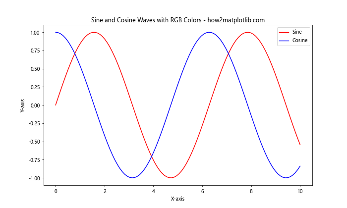
In this example, we’ve used RGB tuples to specify the colors of two different plots. The tuple (1, 0, 0) represents pure red, while (0, 0, 1) represents pure blue. This method of specifying colorspace in Matplotlib is particularly useful when you need precise control over the color values.
Using Named Colors in RGB Colorspace
Matplotlib also provides a set of named colors that correspond to specific RGB values. This can be a convenient way to specify colorspace without having to remember exact RGB values. Here’s an example:
import matplotlib.pyplot as plt
import numpy as np

# Generate sample data
categories = ['A', 'B', 'C', 'D', 'E']
values = [23, 45, 56, 78, 32]

# Create a bar plot with named colors
plt.figure(figsize=(10, 6))
plt.bar(categories, values, color=['red', 'green', 'blue', 'yellow', 'purple'])
plt.title('Bar Plot with Named Colors - how2matplotlib.com')
plt.xlabel('Categories')
plt.ylabel('Values')
plt.show()
Output:
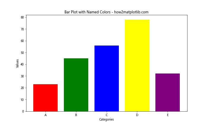
In this example, we’ve used named colors to specify the colorspace for each bar in the plot. Matplotlib automatically converts these named colors to their corresponding RGB values.
HSV Colorspace in Matplotlib
HSV (Hue, Saturation, Value) is another popular colorspace that can be used in Matplotlib. It provides a more intuitive way to specify colors, especially when creating color gradients or adjusting color properties. Let’s explore how to specify colorspace using HSV in Matplotlib.
Converting HSV to RGB
To use HSV colorspace in Matplotlib, you typically need to convert HSV values to RGB. Matplotlib provides a convenient function for this conversion. Here’s an example:
import matplotlib.pyplot as plt
import matplotlib.colors as mcolors
import numpy as np

# Generate sample data
x = np.linspace(0, 10, 100)
y = np.sin(x)

# Convert HSV to RGB
hsv_color = (0.7, 1, 1)  # Purple in HSV
rgb_color = mcolors.hsv_to_rgb(hsv_color)

# Create a plot with HSV-derived color
plt.figure(figsize=(8, 6))
plt.plot(x, y, color=rgb_color)
plt.title('Sine Wave with HSV-derived Color - how2matplotlib.com')
plt.xlabel('X-axis')
plt.ylabel('Y-axis')
plt.show()
Output:
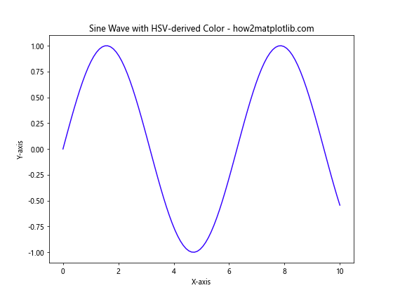
In this example, we’ve specified a color in HSV colorspace (0.7, 1, 1), which represents a purple hue. We then convert it to RGB using mcolors.hsv_to_rgb() before applying it to the plot.
Creating Color Gradients with HSV
One of the advantages of using HSV colorspace in Matplotlib is the ease of creating color gradients. Here’s an example that demonstrates this:
import matplotlib.pyplot as plt
import matplotlib.colors as mcolors
import numpy as np

# Generate sample data
x = np.linspace(0, 10, 100)
y = np.sin(x)

# Create a color gradient using HSV
num_lines = 5
colors = [mcolors.hsv_to_rgb((i / num_lines, 1, 1)) for i in range(num_lines)]

# Plot multiple lines with the color gradient
plt.figure(figsize=(10, 6))
for i in range(num_lines):
    plt.plot(x, y + i*0.5, color=colors[i])

plt.title('Color Gradient using HSV Colorspace - how2matplotlib.com')
plt.xlabel('X-axis')
plt.ylabel('Y-axis')
plt.show()
Output:
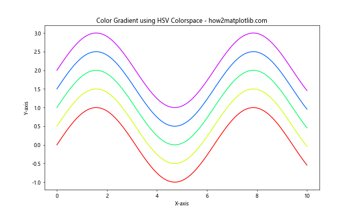
This example creates a color gradient by varying the hue component of the HSV colorspace. Each line in the plot is assigned a color from this gradient, resulting in a visually appealing representation of the data.
Specifying Colorspace in Colormaps
Colormaps are an essential tool in Matplotlib for representing continuous data. When specifying colorspace in colormaps, you have several options. Let’s explore some of them.
Using Built-in Colormaps
Matplotlib provides a wide range of built-in colormaps that you can use to specify colorspace. Here’s an example:
import matplotlib.pyplot as plt
import numpy as np

# Generate sample data
x = np.linspace(-5, 5, 100)
y = np.linspace(-5, 5, 100)
X, Y = np.meshgrid(x, y)
Z = np.sin(np.sqrt(X**2 + Y**2))

# Create a contour plot with a built-in colormap
plt.figure(figsize=(10, 8))
contour = plt.contourf(X, Y, Z, cmap='viridis')
plt.colorbar(contour)
plt.title('Contour Plot with Viridis Colormap - how2matplotlib.com')
plt.xlabel('X-axis')
plt.ylabel('Y-axis')
plt.show()
Output:
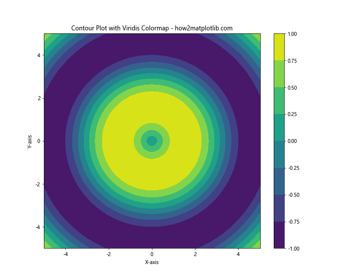
In this example, we’ve used the ‘viridis’ colormap to specify the colorspace for our contour plot. Matplotlib offers many other built-in colormaps like ‘plasma’, ‘inferno’, ‘magma’, etc., each with its own unique color representation.
Creating Custom Colormaps
For more control over the colorspace, you can create custom colormaps in Matplotlib. Here’s an example:
import matplotlib.pyplot as plt
import matplotlib.colors as mcolors
import numpy as np

# Define custom colors
colors = ['#ff0000', '#00ff00', '#0000ff']  # Red, Green, Blue
n_bins = 100  # Number of color gradations

# Create custom colormap
custom_cmap = mcolors.LinearSegmentedColormap.from_list('custom', colors, N=n_bins)

# Generate sample data
x = np.linspace(0, 10, 100)
y = np.linspace(0, 10, 100)
X, Y = np.meshgrid(x, y)
Z = np.sin(X) * np.cos(Y)

# Create a plot with the custom colormap
plt.figure(figsize=(10, 8))
plt.pcolormesh(X, Y, Z, cmap=custom_cmap, shading='auto')
plt.colorbar()
plt.title('Custom Colormap Example - how2matplotlib.com')
plt.xlabel('X-axis')
plt.ylabel('Y-axis')
plt.show()
Output:
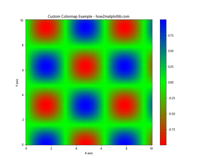
This example demonstrates how to create a custom colormap using a list of colors. The LinearSegmentedColormap.from_list() function is used to generate a smooth transition between the specified colors.
Alpha Channel and Transparency
When specifying colorspace in Matplotlib, you can also control the transparency of your plots using the alpha channel. This is particularly useful when overlaying multiple datasets or creating semi-transparent visualizations.
Adding Transparency to Colors
Here’s an example of how to add transparency when specifying colorspace:
import matplotlib.pyplot as plt
import numpy as np

# Generate sample data
x = np.linspace(0, 10, 100)
y1 = np.sin(x)
y2 = np.cos(x)

# Create a plot with transparent colors
plt.figure(figsize=(10, 6))
plt.plot(x, y1, color='red', alpha=0.5, linewidth=3)
plt.plot(x, y2, color='blue', alpha=0.5, linewidth=3)
plt.title('Transparent Colors in Matplotlib - how2matplotlib.com')
plt.xlabel('X-axis')
plt.ylabel('Y-axis')
plt.legend(['Sine', 'Cosine'])
plt.show()
Output:
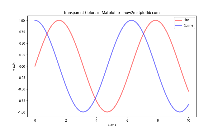
In this example, we’ve added transparency to our line plots by setting alpha=0.5. This allows the overlapping regions of the two curves to be visible, enhancing the visual representation of the data.
Transparency in Filled Plots
Transparency can also be applied to filled plots, such as histograms or area plots. Here’s an example:
import matplotlib.pyplot as plt
import numpy as np

# Generate sample data
data1 = np.random.normal(0, 1, 1000)
data2 = np.random.normal(1, 1, 1000)

# Create histograms with transparency
plt.figure(figsize=(10, 6))
plt.hist(data1, bins=30, alpha=0.5, color='red', label='Dataset 1')
plt.hist(data2, bins=30, alpha=0.5, color='blue', label='Dataset 2')
plt.title('Overlapping Histograms with Transparency - how2matplotlib.com')
plt.xlabel('Values')
plt.ylabel('Frequency')
plt.legend()
plt.show()
Output:
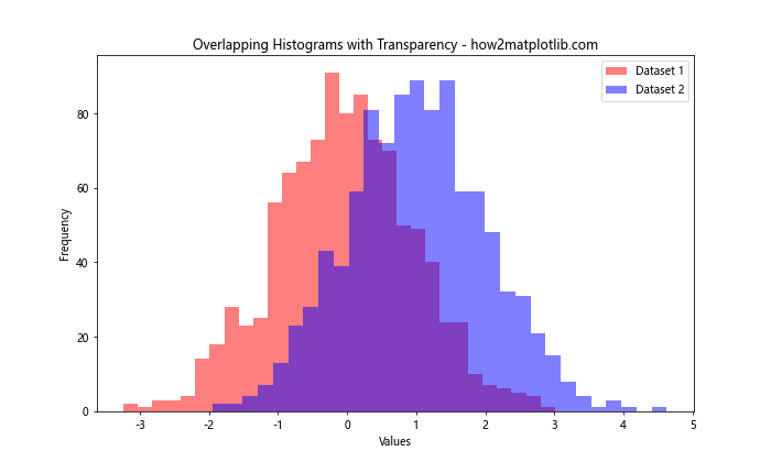
This example creates two overlapping histograms with semi-transparent fills, allowing both distributions to be visible simultaneously.
Color Normalization
When working with colorspace in Matplotlib, color normalization is an important concept, especially when dealing with data that has a wide range of values. Matplotlib provides several normalization techniques to map your data values to colors effectively.
Linear Normalization
Linear normalization is the default method in Matplotlib. It maps the minimum value in your data to the start of the colormap and the maximum value to the end. Here’s an example:
import matplotlib.pyplot as plt
import numpy as np

# Generate sample data
x = np.linspace(0, 10, 100)
y = np.linspace(0, 10, 100)
X, Y = np.meshgrid(x, y)
Z = np.sin(X) * np.cos(Y)

# Create a plot with linear color normalization
plt.figure(figsize=(10, 8))
plt.pcolormesh(X, Y, Z, cmap='viridis', shading='auto')
plt.colorbar(label='Values')
plt.title('Linear Color Normalization - how2matplotlib.com')
plt.xlabel('X-axis')
plt.ylabel('Y-axis')
plt.show()
Output:
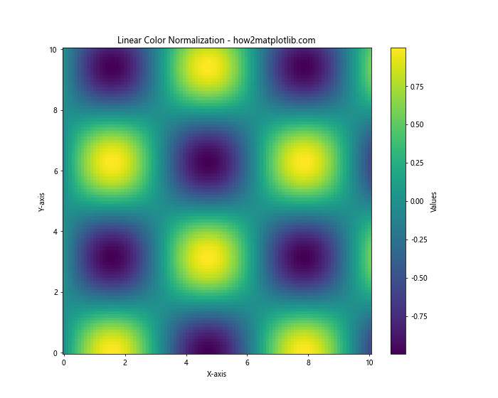
In this example, the colors are linearly mapped to the data values, with the darkest color representing the minimum value and the brightest color representing the maximum value.
Logarithmic Normalization
For data with a large dynamic range, logarithmic normalization can be more appropriate. Here’s how to implement it:
import matplotlib.pyplot as plt
import matplotlib.colors as mcolors
import numpy as np

# Generate sample data with exponential distribution
x = np.linspace(0, 10, 100)
y = np.linspace(0, 10, 100)
X, Y = np.meshgrid(x, y)
Z = np.exp(X + Y)

# Create a plot with logarithmic color normalization
plt.figure(figsize=(10, 8))
plt.pcolormesh(X, Y, Z, norm=mcolors.LogNorm(), cmap='viridis', shading='auto')
plt.colorbar(label='Values (log scale)')
plt.title('Logarithmic Color Normalization - how2matplotlib.com')
plt.xlabel('X-axis')
plt.ylabel('Y-axis')
plt.show()
Output:
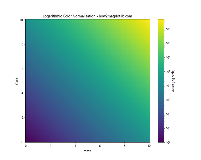
This example uses LogNorm() to apply logarithmic normalization to the colormap, which is particularly useful for data that spans several orders of magnitude.
Colorspace in 3D Plots
Matplotlib’s 3D plotting capabilities also allow for specifying colorspace, adding an extra dimension of information to your visualizations. Let’s explore how to incorporate colorspace into 3D plots.
Surface Plots with Colorspace
Here’s an example of a 3D surface plot with colorspace mapping:
import matplotlib.pyplot as plt
import numpy as np
from mpl_toolkits.mplot3d import Axes3D

# Generate sample data
x = np.linspace(-5, 5, 100)
y = np.linspace(-5, 5, 100)
X, Y = np.meshgrid(x, y)
Z = np.sin(np.sqrt(X**2 + Y**2))

# Create a 3D surface plot with colorspace mapping
fig = plt.figure(figsize=(12, 8))
ax = fig.add_subplot(111, projection='3d')
surf = ax.plot_surface(X, Y, Z, cmap='viridis', linewidth=0, antialiased=False)
fig.colorbar(surf, shrink=0.5, aspect=5)
ax.set_title('3D Surface Plot with Colorspace Mapping - how2matplotlib.com')
ax.set_xlabel('X-axis')
ax.set_ylabel('Y-axis')
ax.set_zlabel('Z-axis')
plt.show()
Output:
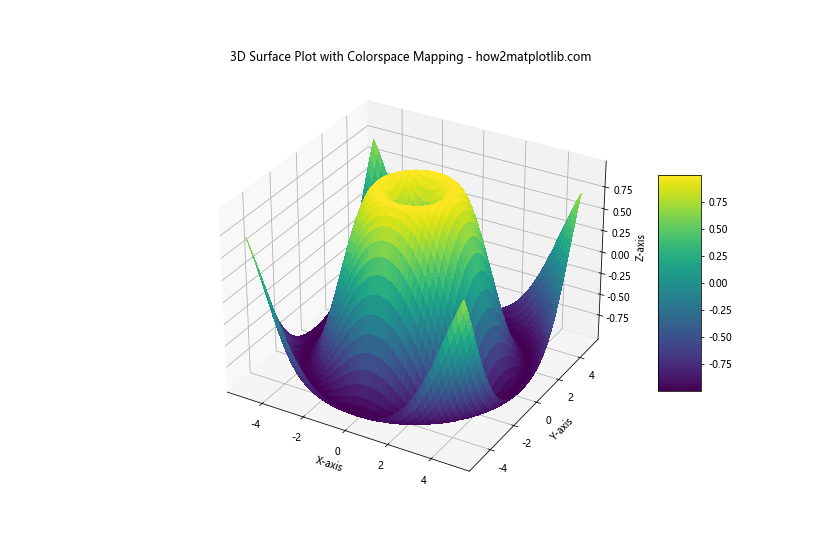
In this example, we’ve created a 3D surface plot where the height (Z-axis) is represented both by the surface elevation and the color mapping. The viridis colormap is used to provide a clear visual representation of the data values.
Scatter Plots in 3D with Color Coding
You can also use colorspace to add an extra dimension of information to 3D scatter plots:
import matplotlib.pyplot as plt
import numpy as np
from mpl_toolkits.mplot3d import Axes3D

# Generate sample data
n = 1000
x = np.random.rand(n)
y = np.random.rand(n)
z = np.random.rand(n)
colors = np.random.rand(n)

# Create a 3D scatter plot with color coding
fig = plt.figure(figsize=(12, 8))
ax = fig.add_subplot(111, projection='3d')
scatter = ax.scatter(x, y, z, c=colors, cmap='viridis')
fig.colorbar(scatter)
ax.set_title('3D Scatter Plot with Color Coding - how2matplotlib.com')
ax.set_xlabel('X-axis')
ax.set_ylabel('Y-axis')
ax.set_zlabel('Z-axis')
plt.show()
Output:
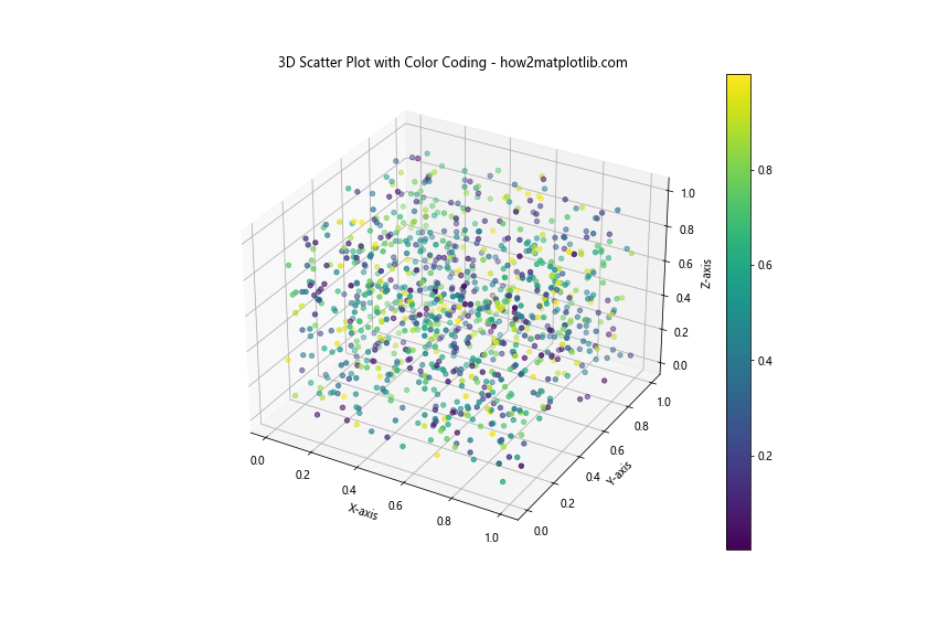
In this example, we’ve created a 3D scatter plot where each point’s color is determined by a fourth dimension of data. This allows us to represent four-dimensional data in a three-dimensional plot.
Colorspace in Animations
Matplotlib also allows you to specify colorspace in animations, adding dynamic color changes to your visualizations. Let’s explore how to incorporate colorspace into animated plots.
Animated Color Gradient
Here’s an example of an animated plot with a changing color gradient:
import matplotlib.pyplot as plt
import matplotlib.animation as animation
import numpy as np

# Set up the figure and axis
fig, ax = plt.subplots(figsize=(10, 6))
line, = ax.plot([], [], lw=2)
ax.set_xlim(0, 2*np.pi)
ax.set_ylim(-1, 1)
ax.set_title('Animated Sine Wave with Color Gradient - how2matplotlib.com')

# Animation function
def animate(frame):
    x = np.linspace(0, 2*np.pi, 100)
    y = np.sin(x + frame/10)
    color = plt.cm.viridis(frame / 100)
    line.set_data(x, y)
    line.set_color(color)
    return line,

# Create the animation
anim = animation.FuncAnimation(fig, animate, frames=100, interval=50, blit=True)

plt.show()
Output:
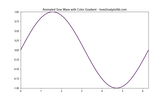
This example creates an animated sine wave where the color of the line changes gradually over time, cycling through the ‘viridis’ colormap.
Colorspace in Heatmaps
Heatmaps are a powerful way to visualize 2D data, and specifying colorspace is crucial for their effectiveness. Let’s look at how to create heatmaps with custom colorspaces in Matplotlib.
Basic Heatmap with Custom Colormap
Here’s an example of creating a heatmap with a custom colormap:
import matplotlib.pyplot as plt
import numpy as np

# Generate sample data
data = np.random.rand(10, 10)

# Create a custom colormap
colors = ['#ff0000', '#ffff00', '#00ff00']  # Red, Yellow, Green
n_bins = 100
custom_cmap = plt.cm.LinearSegmentedColormap.from_list('custom', colors, N=n_bins)

# Create the heatmap
plt.figure(figsize=(10, 8))
heatmap = plt.imshow(data, cmap=custom_cmap)
plt.colorbar(heatmap)
plt.title('Heatmap with Custom Colormap - how2matplotlib.com')
plt.xlabel('X-axis')
plt.ylabel('Y-axis')
plt.show()
This example creates a heatmap using a custom colormap that transitions from red to yellow to green. The colormap is created using LinearSegmentedColormap.from_list(), allowing for precise control over the color representation.
Colorspace in Polar Plots
Polar plots in Matplotlib also support colorspace specification, allowing for rich visualizations of angular data. Let’s explore how to incorporate colorspace into polar plots.
Polar Plot with Color Gradient
Here’s an example of a polar plot with a color gradient:
import matplotlib.pyplot as plt
import numpy as np

# Generate sample data
r = np.linspace(0, 2, 100)
theta = 2 * np.pi * r

# Create the polar plot
fig, ax = plt.subplots(subplot_kw=dict(projection='polar'), figsize=(10, 8))
c = ax.scatter(theta, r, c=r, cmap='viridis')
plt.colorbar(c)
ax.set_title('Polar Plot with Color Gradient - how2matplotlib.com')
plt.show()
Output:
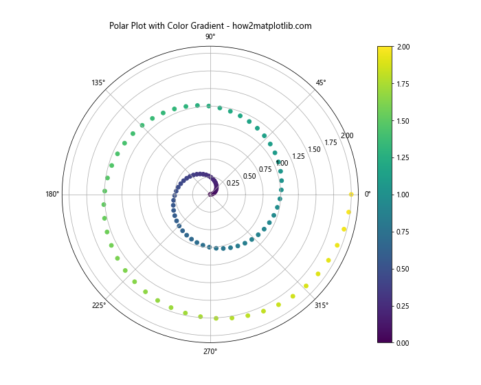
In this example, we’ve created a polar plot where the color of each point is determined by its radial distance from the center. This adds an extra dimension of information to the visualization.
Colorspace in Contour Plots
Contour plots are excellent for visualizing 3D surfaces on a 2D plane, and specifying colorspace can greatly enhance their interpretability. Let’s look at how to create contour plots with custom colorspaces.
Filled Contour Plot with Custom Colormap
Here’s an example of a filled contour plot with a custom colormap:
import matplotlib.pyplot as plt
import numpy as np

# Generate sample data
x = np.linspace(-3, 3, 100)
y = np.linspace(-3, 3, 100)
X, Y = np.meshgrid(x, y)
Z = np.sin(X) * np.cos(Y)

# Create a custom colormap
colors = ['#0000ff', '#ffffff', '#ff0000']  # Blue, White, Red
n_bins = 100
custom_cmap = plt.cm.LinearSegmentedColormap.from_list('custom', colors, N=n_bins)

# Create the filled contour plot
plt.figure(figsize=(10, 8))
contour = plt.contourf(X, Y, Z, cmap=custom_cmap, levels=20)
plt.colorbar(contour)
plt.title('Filled Contour Plot with Custom Colormap - how2matplotlib.com')
plt.xlabel('X-axis')
plt.ylabel('Y-axis')
plt.show()
This example creates a filled contour plot using a custom colormap that transitions from blue to white to red. The contourf() function is used to create the filled contours, and the custom colormap is applied to represent the data values.
Colorspace in Violin Plots
Violin plots are a great way to visualize the distribution of data across different categories. By specifying colorspace in violin plots, you can enhance the visual appeal and interpretability of your data. Let’s explore how to incorporate colorspace into violin plots.
Violin Plot with Custom Colors
Here’s an example of a violin plot with custom colors:
import matplotlib.pyplot as plt
import numpy as np

# Generate sample data
np.random.seed(10)
data = [np.random.normal(0, std, 100) for std in range(1, 5)]

# Create the violin plot with custom colors
fig, ax = plt.subplots(figsize=(10, 6))
violin_parts = ax.violinplot(data, showmeans=False, showmedians=True)

# Customize colors
colors = ['#FF9999', '#66B2FF', '#99FF99', '#FFCC99']
for i, pc in enumerate(violin_parts['bodies']):
    pc.set_facecolor(colors[i])
    pc.set_edgecolor('black')
    pc.set_alpha(0.7)

ax.set_title('Violin Plot with Custom Colors - how2matplotlib.com')
ax.set_xlabel('Categories')
ax.set_ylabel('Values')
ax.set_xticks([1, 2, 3, 4])
ax.set_xticklabels(['A', 'B', 'C', 'D'])

plt.show()
Output:
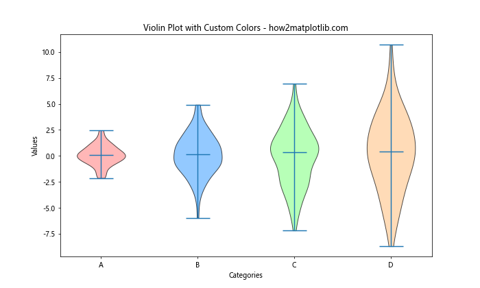
In this example, we’ve created a violin plot with four distributions, each represented by a different color. The violinplot() function is used to create the plot, and we then customize the colors of each violin using a list of predefined colors.
Colorspace in Pie Charts
Pie charts are a classic way to represent proportional data, and specifying colorspace can make them more visually appealing and easier to interpret. Let’s look at how to create pie charts with custom colorspaces in Matplotlib.
Pie Chart with Custom Color Palette
Here’s an example of a pie chart with a custom color palette:
import matplotlib.pyplot as plt

# Sample data
sizes = [30, 20, 25, 15, 10]
labels = ['A', 'B', 'C', 'D', 'E']

# Custom color palette
colors = ['#FF9999', '#66B2FF', '#99FF99', '#FFCC99', '#FF99CC']

# Create the pie chart
plt.figure(figsize=(10, 8))
plt.pie(sizes, labels=labels, colors=colors, autopct='%1.1f%%', startangle=90)
plt.axis('equal')  # Equal aspect ratio ensures that pie is drawn as a circle
plt.title('Pie Chart with Custom Color Palette - how2matplotlib.com')
plt.show()
Output:
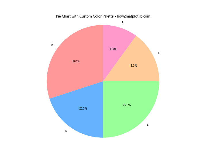
In this example, we’ve created a pie chart where each slice is represented by a different color from our custom palette. The pie() function is used to create the chart, and we specify our custom colors using the colors parameter.
Matplotlib specify colorspace Conclusion
Specifying colorspace in Matplotlib is a powerful tool for enhancing the visual appeal and interpretability of your data visualizations. From basic plots to complex 3D visualizations and animations, Matplotlib offers a wide range of options for customizing colorspace to suit your needs.
Throughout this guide, we’ve explored various methods to specify colorspace in Matplotlib, including:
- Using RGB and HSV colorspaces
- Working with built-in and custom colormaps
- Applying transparency with the alpha channel
- Implementing color normalization techniques
- Incorporating colorspace in 3D plots and animations
- Creating heatmaps and contour plots with custom colorspaces
- Enhancing violin plots and pie charts with custom color palettes
By mastering these techniques, you can create more effective and visually appealing data visualizations that accurately represent your data and convey your message clearly.
Remember that the key to effective use of colorspace in Matplotlib is to choose color schemes that are appropriate for your data and audience. Consider factors such as color blindness, printing requirements, and the nature of your data when making your color choices.