Matplotlib Colorbar: A Comprehensive Guide
Matplotlib Colorbar is an essential component in data visualization, providing a visual reference for color-coded data in plots. This comprehensive guide will explore the various aspects of Matplotlib Colorbar, from basic usage to advanced customization techniques. By the end of this article, you’ll have a thorough understanding of how to effectively use and customize colorbars in your Matplotlib plots.
Matplotlib Colorbar Recommended Articles
- matplotlib colorbar range
- matplotlib colorbar limits
- matplotlib colorbar scale
- matplotlib colorbar horizontal
- matplotlib colorbar min max
Introduction to Matplotlib Colorbar
Matplotlib Colorbar is a powerful tool that helps interpret color-mapped data in visualizations. It serves as a legend for color-coded plots, allowing viewers to understand the relationship between colors and data values. Colorbars are particularly useful in heatmaps, contour plots, and scatter plots where color represents a third dimension of data.
Let’s start with a simple example to demonstrate the basic usage of Matplotlib Colorbar:
import matplotlib.pyplot as plt
import numpy as np

# Generate sample data
data = np.random.rand(10, 10)

# Create a figure and axis
fig, ax = plt.subplots()

# Create a color-mapped plot
im = ax.imshow(data)

# Add a colorbar
cbar = plt.colorbar(im)

# Set labels
ax.set_title("How2matplotlib.com: Basic Colorbar Example")
cbar.set_label("Random Values")

plt.show()
Output:
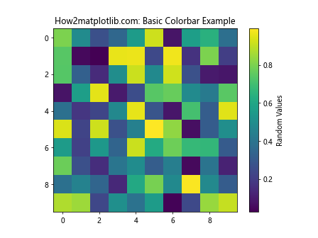
In this example, we create a simple heatmap using imshow() and add a colorbar using plt.colorbar(). The colorbar automatically adjusts to the color range of the plot.
Creating Colorbars for Different Plot Types
Matplotlib Colorbar can be used with various types of plots. Let’s explore how to add colorbars to different plot types:
Colorbar for Scatter Plots
import matplotlib.pyplot as plt
import numpy as np

# Generate sample data
x = np.random.rand(100)
y = np.random.rand(100)
colors = np.random.rand(100)

# Create a scatter plot with color-coded points
fig, ax = plt.subplots()
scatter = ax.scatter(x, y, c=colors, cmap='viridis')

# Add a colorbar
cbar = plt.colorbar(scatter)

# Set labels
ax.set_title("How2matplotlib.com: Scatter Plot with Colorbar")
ax.set_xlabel("X-axis")
ax.set_ylabel("Y-axis")
cbar.set_label("Color Values")

plt.show()
Output:
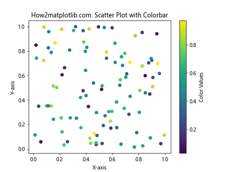
In this example, we create a scatter plot where the color of each point is determined by the colors array. The colorbar helps interpret the color-coding of the points.
Colorbar for Contour Plots
import matplotlib.pyplot as plt
import numpy as np

# Generate sample data
x = np.linspace(-3, 3, 100)
y = np.linspace(-3, 3, 100)
X, Y = np.meshgrid(x, y)
Z = np.sin(X) * np.cos(Y)

# Create a contour plot
fig, ax = plt.subplots()
contour = ax.contourf(X, Y, Z, cmap='coolwarm')

# Add a colorbar
cbar = plt.colorbar(contour)

# Set labels
ax.set_title("How2matplotlib.com: Contour Plot with Colorbar")
ax.set_xlabel("X-axis")
ax.set_ylabel("Y-axis")
cbar.set_label("Z Values")

plt.show()
Output:

This example demonstrates how to add a colorbar to a contour plot. The colorbar helps interpret the color-coding of the contour levels.
Customizing Matplotlib Colorbar Appearance
Matplotlib Colorbar offers various customization options to enhance the appearance and readability of your plots. Let’s explore some common customization techniques:
Changing Colorbar Orientation
By default, colorbars are displayed vertically. However, you can easily change the orientation to horizontal:
import matplotlib.pyplot as plt
import numpy as np

# Generate sample data
data = np.random.rand(10, 10)

# Create a figure and axis
fig, ax = plt.subplots()

# Create a color-mapped plot
im = ax.imshow(data)

# Add a horizontal colorbar
cbar = plt.colorbar(im, orientation='horizontal')

# Set labels
ax.set_title("How2matplotlib.com: Horizontal Colorbar")
cbar.set_label("Random Values")

plt.show()
Output:
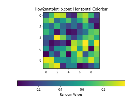
In this example, we set the orientation parameter to ‘horizontal’ when creating the colorbar.
Adjusting Colorbar Size and Position
You can control the size and position of the colorbar using the shrink and pad parameters:
import matplotlib.pyplot as plt
import numpy as np

# Generate sample data
data = np.random.rand(10, 10)

# Create a figure and axis
fig, ax = plt.subplots()

# Create a color-mapped plot
im = ax.imshow(data)

# Add a customized colorbar
cbar = plt.colorbar(im, shrink=0.8, pad=0.1)

# Set labels
ax.set_title("How2matplotlib.com: Customized Colorbar Size and Position")
cbar.set_label("Random Values")

plt.show()
Output:
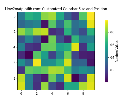
In this example, shrink=0.8 reduces the colorbar’s size to 80% of its default size, and pad=0.1 adds some padding between the plot and the colorbar.
Changing Colorbar Ticks and Labels
You can customize the ticks and labels of the colorbar to better represent your data:
import matplotlib.pyplot as plt
import numpy as np

# Generate sample data
data = np.random.rand(10, 10)

# Create a figure and axis
fig, ax = plt.subplots()

# Create a color-mapped plot
im = ax.imshow(data, vmin=0, vmax=1)

# Add a colorbar with custom ticks and labels
cbar = plt.colorbar(im, ticks=[0, 0.5, 1])
cbar.set_ticklabels(['Low', 'Medium', 'High'])

# Set labels
ax.set_title("How2matplotlib.com: Customized Colorbar Ticks and Labels")
cbar.set_label("Value Range")

plt.show()
Output:
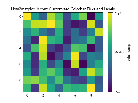
In this example, we set custom ticks at 0, 0.5, and 1, and replace the numeric labels with descriptive text.
Advanced Matplotlib Colorbar Techniques
Now that we’ve covered the basics, let’s explore some advanced techniques for working with Matplotlib Colorbar:
Creating Multiple Colorbars
In some cases, you may need to display multiple colorbars in a single figure. Here’s how you can achieve this:
import matplotlib.pyplot as plt
import numpy as np

# Generate sample data
data1 = np.random.rand(10, 10)
data2 = np.random.randn(10, 10)

# Create a figure with two subplots
fig, (ax1, ax2) = plt.subplots(1, 2, figsize=(12, 5))

# Create color-mapped plots
im1 = ax1.imshow(data1, cmap='viridis')
im2 = ax2.imshow(data2, cmap='coolwarm')

# Add colorbars to each subplot
cbar1 = plt.colorbar(im1, ax=ax1)
cbar2 = plt.colorbar(im2, ax=ax2)

# Set labels
ax1.set_title("How2matplotlib.com: Plot 1")
ax2.set_title("How2matplotlib.com: Plot 2")
cbar1.set_label("Random Values")
cbar2.set_label("Normal Distribution")

plt.tight_layout()
plt.show()
Output:
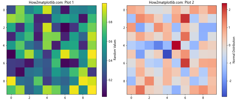
This example creates two subplots, each with its own colorbar. The ax parameter in plt.colorbar() ensures that each colorbar is associated with the correct subplot.
Creating a Discrete Colorbar
For categorical data, you may want to create a discrete colorbar with distinct color levels:
import matplotlib.pyplot as plt
import numpy as np

# Generate sample categorical data
data = np.random.randint(0, 5, (10, 10))

# Create a figure and axis
fig, ax = plt.subplots()

# Create a discrete color map
cmap = plt.cm.get_cmap('Set1', 5)  # 5 distinct colors

# Create a color-mapped plot
im = ax.imshow(data, cmap=cmap)

# Add a colorbar
cbar = plt.colorbar(im, ticks=np.arange(5))
cbar.set_ticklabels(['Category A', 'Category B', 'Category C', 'Category D', 'Category E'])

# Set labels
ax.set_title("How2matplotlib.com: Discrete Colorbar")
cbar.set_label("Categories")

plt.show()
Output:
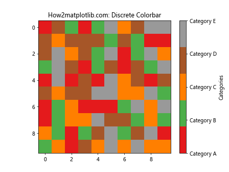
In this example, we use a discrete colormap with 5 distinct colors and set custom labels for each category.
Matplotlib Colorbar and Custom Colormaps
Matplotlib offers a wide range of built-in colormaps, but you can also create custom colormaps to suit your specific needs. Let’s explore how to use custom colormaps with Matplotlib Colorbar:
Using Built-in Colormaps
Matplotlib provides many built-in colormaps that you can use with your colorbars. Here’s an example showcasing different colormaps:
import matplotlib.pyplot as plt
import numpy as np

# Generate sample data
data = np.random.rand(10, 10)

# Create a figure with multiple subplots
fig, axes = plt.subplots(2, 2, figsize=(12, 10))

# List of colormaps to showcase
cmaps = ['viridis', 'plasma', 'inferno', 'magma']

for ax, cmap in zip(axes.flat, cmaps):
    # Create a color-mapped plot
    im = ax.imshow(data, cmap=cmap)

    # Add a colorbar
    cbar = plt.colorbar(im, ax=ax)

    # Set labels
    ax.set_title(f"How2matplotlib.com: {cmap.capitalize()} Colormap")
    cbar.set_label("Values")

plt.tight_layout()
plt.show()
Output:
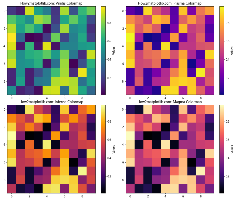
This example demonstrates four popular colormaps: viridis, plasma, inferno, and magma. Each subplot uses a different colormap to visualize the same data.
Creating a Custom Colormap
You can create custom colormaps to represent your data in a way that best suits your needs. Here’s an example of creating a simple custom colormap:
import matplotlib.pyplot as plt
import numpy as np
from matplotlib.colors import LinearSegmentedColormap

# Generate sample data
data = np.random.rand(10, 10)

# Create a custom colormap
colors = ['#ff0000', '#00ff00', '#0000ff']  # Red, Green, Blue
n_bins = 100  # Number of color gradations
custom_cmap = LinearSegmentedColormap.from_list("custom", colors, N=n_bins)

# Create a figure and axis
fig, ax = plt.subplots()

# Create a color-mapped plot with the custom colormap
im = ax.imshow(data, cmap=custom_cmap)

# Add a colorbar
cbar = plt.colorbar(im)

# Set labels
ax.set_title("How2matplotlib.com: Custom Colormap")
cbar.set_label("Custom Color Scale")

plt.show()
Output:
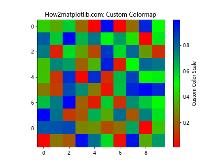
In this example, we create a custom colormap that transitions from red to green to blue. The LinearSegmentedColormap.from_list() function is used to create the colormap from a list of colors.
Matplotlib Colorbar in 3D Plots
Matplotlib Colorbar can also be used with 3D plots to represent an additional dimension of data. Let’s explore how to add colorbars to 3D plots:
Colorbar for 3D Surface Plot
import matplotlib.pyplot as plt
import numpy as np
from mpl_toolkits.mplot3d import Axes3D

# Generate sample data
x = np.linspace(-5, 5, 100)
y = np.linspace(-5, 5, 100)
X, Y = np.meshgrid(x, y)
Z = np.sin(np.sqrt(X**2 + Y**2))

# Create a figure and 3D axis
fig = plt.figure()
ax = fig.add_subplot(111, projection='3d')

# Create a surface plot
surf = ax.plot_surface(X, Y, Z, cmap='viridis')

# Add a colorbar
cbar = fig.colorbar(surf)

# Set labels
ax.set_title("How2matplotlib.com: 3D Surface Plot with Colorbar")
ax.set_xlabel("X-axis")
ax.set_ylabel("Y-axis")
ax.set_zlabel("Z-axis")
cbar.set_label("Z Values")

plt.show()
Output:
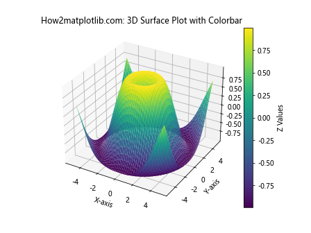
This example creates a 3D surface plot with a colorbar representing the Z-axis values.
Colorbar for 3D Scatter Plot
import matplotlib.pyplot as plt
import numpy as np
from mpl_toolkits.mplot3d import Axes3D

# Generate sample data
n = 1000
x = np.random.rand(n)
y = np.random.rand(n)
z = np.random.rand(n)
colors = np.random.rand(n)

# Create a figure and 3D axis
fig = plt.figure()
ax = fig.add_subplot(111, projection='3d')

# Create a 3D scatter plot
scatter = ax.scatter(x, y, z, c=colors, cmap='viridis')

# Add a colorbar
cbar = fig.colorbar(scatter)

# Set labels
ax.set_title("How2matplotlib.com: 3D Scatter Plot with Colorbar")
ax.set_xlabel("X-axis")
ax.set_ylabel("Y-axis")
ax.set_zlabel("Z-axis")
cbar.set_label("Color Values")

plt.show()
Output:
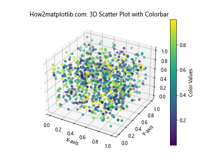
This example creates a 3D scatter plot where the color of each point is determined by the colors array, and a colorbar is added to interpret the color-coding.
Matplotlib Colorbar and Animations
Matplotlib Colorbar can also be used in animations to represent changing data over time. Let’s create a simple animation with a colorbar:
import matplotlib.pyplot as plt
import numpy as np
from matplotlib.animation import FuncAnimation

# Generate initial data
data = np.random.rand(10, 10)

# Create a figure and axis
fig, ax = plt.subplots()

# Create an initial plot
im = ax.imshow(data, animated=True)
cbar = plt.colorbar(im)

# Set labels
ax.set_title("How2matplotlib.com: Animated Colorbar")
cbar.set_label("Random Values")

# Update function for animation
def update(frame):
    data = np.random.rand(10, 10)
    im.set_array(data)
    return [im]

# Create the animation
anim = FuncAnimation(fig, update, frames=100, interval=100, blit=True)

plt.show()
Output:
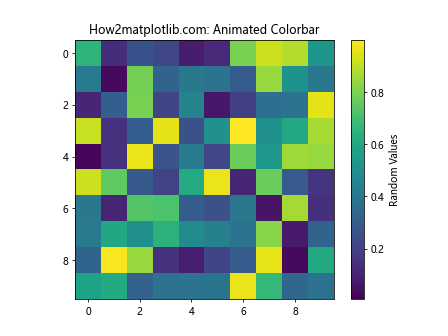
This example creates an animation where the data and colorbar update every 100 milliseconds. The colorbar automatically adjusts to the changing data range.
Best Practices for Using Matplotlib Colorbar
To effectively use Matplotlib Colorbar in your visualizations, consider the following best practices:
- Choose appropriate colormaps: Select colormaps that are suitable for your data type and purpose. For example, use sequential colormaps for continuous data and diverging colormaps for data with a meaningful center point.
Ensure colorbar readability: Make sure the colorbar is large enough to be easily read and interpreted. Adjust the size and position as needed.
Use consistent colormaps: When comparing multiple plots, use the same colormap across all plots to maintain consistency.
Consider color blindness: Choose colormaps that are accessible to color-blind individuals, such as viridis or plasma.
Add clear labels: Always include a descriptive label for your colorbar to explain what the colors represent.
Normalize data when necessary: For data with extreme outliers, consider using logarithmic scales or other normalization techniques to improve visualization.
Customize ticks and labels: Adjust colorbar ticks and labels to match the scale and units of your data.
Use discrete colorbars for categorical data: For categorical or discrete data, use a discrete colorbar with distinct color levels.
Let’s implement some of these best practices in an example: