Matplotlib Colorbar Scale: A Comprehensive Guide
Matplotlib colorbar scale is an essential feature for data visualization in Python. This article will provide an in-depth exploration of how to effectively use and customize colorbars and their scales in Matplotlib. We’ll cover various aspects of colorbar creation, manipulation, and scaling to help you create informative and visually appealing plots.
Understanding Matplotlib Colorbar Scale Basics
Matplotlib colorbar scale is a crucial component when creating color-coded plots such as heatmaps, contour plots, or scatter plots with color-mapped data points. The colorbar serves as a legend that maps colors to numerical values, allowing viewers to interpret the data represented by different colors in the plot.
Let’s start with a simple example to demonstrate the basic usage of a colorbar:
import matplotlib.pyplot as plt
import numpy as np

# Create sample data
data = np.random.rand(10, 10)

# Create a figure and axis
fig, ax = plt.subplots(figsize=(8, 6))

# Create a color-mapped plot
im = ax.imshow(data, cmap='viridis')

# Add a colorbar
cbar = plt.colorbar(im)
cbar.set_label('Values from how2matplotlib.com')

plt.title('Basic Matplotlib Colorbar Scale Example')
plt.show()
Output:
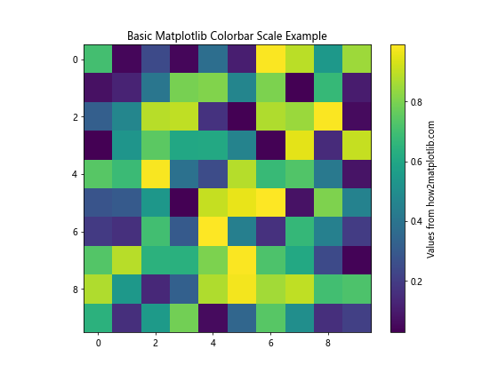
In this example, we create a simple heatmap using imshow() and add a colorbar using plt.colorbar(). The colorbar automatically adjusts its scale based on the data range.
Customizing Matplotlib Colorbar Scale
Matplotlib offers various options to customize the colorbar scale to better suit your visualization needs. Let’s explore some common customization techniques:
Adjusting Colorbar Position and Size
You can control the position and size of the colorbar using the shrink, aspect, and pad parameters:
import matplotlib.pyplot as plt
import numpy as np

data = np.random.rand(10, 10)

fig, ax = plt.subplots(figsize=(8, 6))
im = ax.imshow(data, cmap='coolwarm')

cbar = plt.colorbar(im, shrink=0.8, aspect=20, pad=0.12)
cbar.set_label('Custom colorbar from how2matplotlib.com')

plt.title('Customized Matplotlib Colorbar Scale Position')
plt.show()
Output:
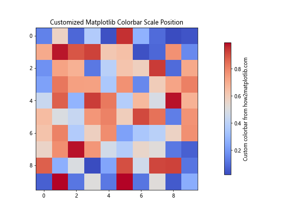
In this example, we adjust the colorbar’s size (shrink), aspect ratio (aspect), and distance from the plot (pad).
Changing Colorbar Orientation
You can change the orientation of the colorbar from vertical to horizontal:
import matplotlib.pyplot as plt
import numpy as np

data = np.random.rand(10, 10)

fig, ax = plt.subplots(figsize=(8, 6))
im = ax.imshow(data, cmap='plasma')

cbar = plt.colorbar(im, orientation='horizontal')
cbar.set_label('Horizontal colorbar from how2matplotlib.com')

plt.title('Matplotlib Colorbar Scale with Horizontal Orientation')
plt.show()
Output:
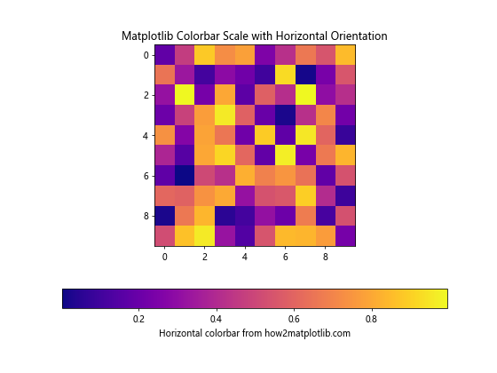
This example demonstrates how to create a horizontal colorbar using the orientation parameter.
Matplotlib Colorbar Scale Normalization
Normalization is a crucial aspect of colorbar scaling. It determines how data values are mapped to colors. Matplotlib provides several normalization options:
Linear Normalization
Linear normalization is the default and maps data values linearly to colors:
import matplotlib.pyplot as plt
import numpy as np
from matplotlib.colors import Normalize

data = np.random.rand(10, 10) * 100

fig, ax = plt.subplots(figsize=(8, 6))
im = ax.imshow(data, cmap='viridis', norm=Normalize(vmin=0, vmax=100))

cbar = plt.colorbar(im)
cbar.set_label('Linear scale from how2matplotlib.com')

plt.title('Matplotlib Colorbar Scale with Linear Normalization')
plt.show()
Output:
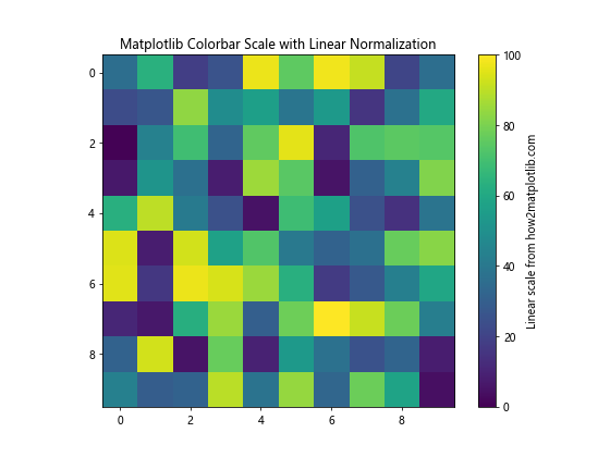
This example uses Normalize to set the minimum and maximum values for the colorbar scale.
Logarithmic Normalization
For data with a large range of values, logarithmic normalization can be useful:
import matplotlib.pyplot as plt
import numpy as np
from matplotlib.colors import LogNorm

data = np.random.rand(10, 10) * 1000

fig, ax = plt.subplots(figsize=(8, 6))
im = ax.imshow(data, cmap='inferno', norm=LogNorm(vmin=1, vmax=1000))

cbar = plt.colorbar(im)
cbar.set_label('Log scale from how2matplotlib.com')

plt.title('Matplotlib Colorbar Scale with Logarithmic Normalization')
plt.show()
Output:
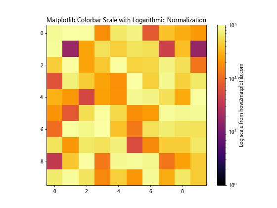
This example uses LogNorm to create a logarithmic scale for the colorbar.
Symmetric Normalization
For data centered around zero, symmetric normalization can be helpful:
import matplotlib.pyplot as plt
import numpy as np
from matplotlib.colors import TwoSlopeNorm

data = np.random.randn(10, 10)

fig, ax = plt.subplots(figsize=(8, 6))
norm = TwoSlopeNorm(vmin=-3, vcenter=0, vmax=3)
im = ax.imshow(data, cmap='RdBu_r', norm=norm)

cbar = plt.colorbar(im)
cbar.set_label('Symmetric scale from how2matplotlib.com')

plt.title('Matplotlib Colorbar Scale with Symmetric Normalization')
plt.show()
Output:
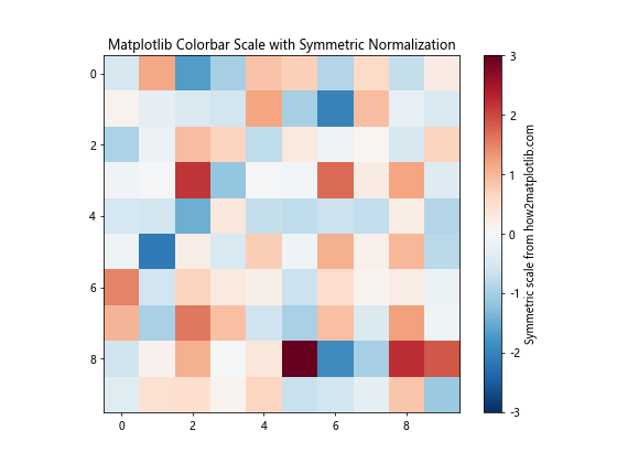
This example uses TwoSlopeNorm to create a symmetric colorbar scale centered at zero.
Advanced Matplotlib Colorbar Scale Techniques
Let’s explore some advanced techniques for working with Matplotlib colorbar scales:
Custom Colormap Creation
You can create custom colormaps to suit your specific needs:
import matplotlib.pyplot as plt
import numpy as np
from matplotlib.colors import LinearSegmentedColormap

# Define custom colors
colors = ['#ff0000', '#00ff00', '#0000ff']
n_bins = 100
cmap = LinearSegmentedColormap.from_list('custom_cmap', colors, N=n_bins)

data = np.random.rand(10, 10)

fig, ax = plt.subplots(figsize=(8, 6))
im = ax.imshow(data, cmap=cmap)

cbar = plt.colorbar(im)
cbar.set_label('Custom colormap from how2matplotlib.com')

plt.title('Matplotlib Colorbar Scale with Custom Colormap')
plt.show()
Output:
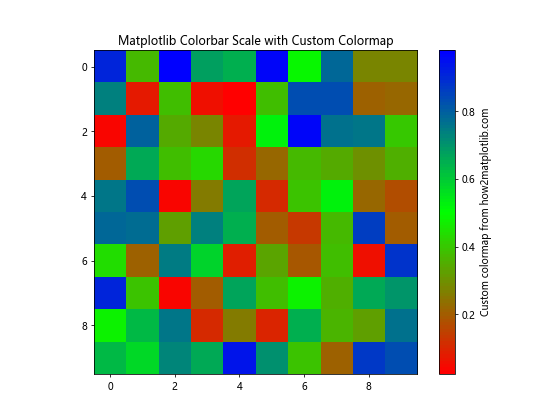
This example demonstrates how to create a custom colormap using LinearSegmentedColormap.
Discrete Colorbar Scale
For categorical data, you might want to use a discrete colorbar:
import matplotlib.pyplot as plt
import numpy as np
from matplotlib.colors import BoundaryNorm
from matplotlib.cm import get_cmap

data = np.random.randint(0, 5, (10, 10))
cmap = get_cmap('Set1')
bounds = np.arange(6) - 0.5
norm = BoundaryNorm(bounds, cmap.N)

fig, ax = plt.subplots(figsize=(8, 6))
im = ax.imshow(data, cmap=cmap, norm=norm)

cbar = plt.colorbar(im, boundaries=bounds, ticks=np.arange(5))
cbar.set_label('Discrete scale from how2matplotlib.com')

plt.title('Matplotlib Colorbar Scale with Discrete Values')
plt.show()
Output:
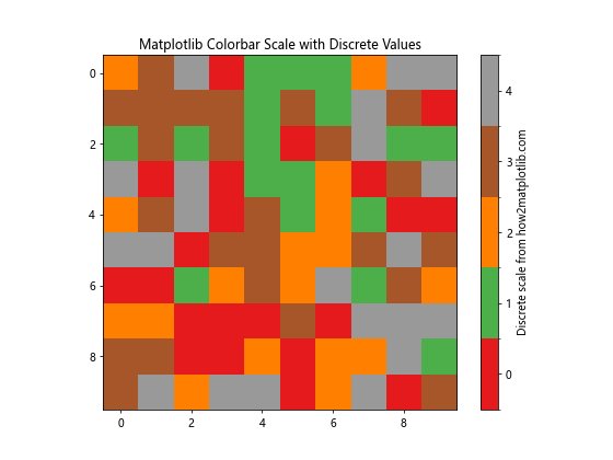
This example uses BoundaryNorm to create a discrete colorbar scale.
Multiple Colorbars
In some cases, you might need multiple colorbars in a single plot:
import matplotlib.pyplot as plt
import numpy as np

data1 = np.random.rand(10, 10)
data2 = np.random.rand(10, 10)

fig, (ax1, ax2) = plt.subplots(1, 2, figsize=(12, 5))

im1 = ax1.imshow(data1, cmap='viridis')
im2 = ax2.imshow(data2, cmap='plasma')

cbar1 = plt.colorbar(im1, ax=ax1)
cbar2 = plt.colorbar(im2, ax=ax2)

cbar1.set_label('Scale 1 from how2matplotlib.com')
cbar2.set_label('Scale 2 from how2matplotlib.com')

ax1.set_title('Plot 1')
ax2.set_title('Plot 2')

plt.suptitle('Matplotlib Colorbar Scale with Multiple Colorbars')
plt.tight_layout()
plt.show()
Output:
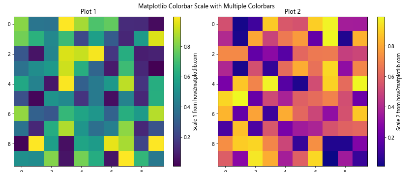
This example demonstrates how to add multiple colorbars to a figure with subplots.
Matplotlib Colorbar Scale for Different Plot Types
Let’s explore how to use colorbars with different types of plots:
Contour Plot with Colorbar
Contour plots are often used with colorbars to show level sets:
import matplotlib.pyplot as plt
import numpy as np

x = np.linspace(-3, 3, 100)
y = np.linspace(-3, 3, 100)
X, Y = np.meshgrid(x, y)
Z = np.sin(X) * np.cos(Y)

fig, ax = plt.subplots(figsize=(8, 6))
cs = ax.contourf(X, Y, Z, cmap='RdYlBu_r')

cbar = plt.colorbar(cs)
cbar.set_label('Contour levels from how2matplotlib.com')

plt.title('Matplotlib Colorbar Scale with Contour Plot')
plt.show()
Output:
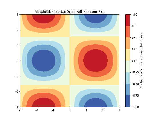
This example creates a contour plot with a colorbar showing the contour levels.
Scatter Plot with Colorbar
Scatter plots can use colorbars to represent an additional dimension of data:
import matplotlib.pyplot as plt
import numpy as np

x = np.random.rand(100)
y = np.random.rand(100)
colors = np.random.rand(100)

fig, ax = plt.subplots(figsize=(8, 6))
sc = ax.scatter(x, y, c=colors, cmap='viridis')

cbar = plt.colorbar(sc)
cbar.set_label('Color values from how2matplotlib.com')

plt.title('Matplotlib Colorbar Scale with Scatter Plot')
plt.show()
Output:
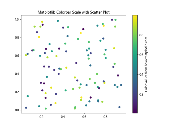
This example creates a scatter plot where the color of each point is determined by a third variable.
Fine-tuning Matplotlib Colorbar Scale
Let’s look at some techniques for fine-tuning your colorbar scales:
Adjusting Tick Locations and Labels
You can customize the tick locations and labels on your colorbar:
import matplotlib.pyplot as plt
import numpy as np

data = np.random.rand(10, 10) * 100

fig, ax = plt.subplots(figsize=(8, 6))
im = ax.imshow(data, cmap='YlOrRd')

cbar = plt.colorbar(im)
cbar.set_ticks([0, 25, 50, 75, 100])
cbar.set_ticklabels(['Low', 'Medium-Low', 'Medium', 'Medium-High', 'High'])
cbar.set_label('Custom ticks from how2matplotlib.com')

plt.title('Matplotlib Colorbar Scale with Custom Ticks')
plt.show()
Output:
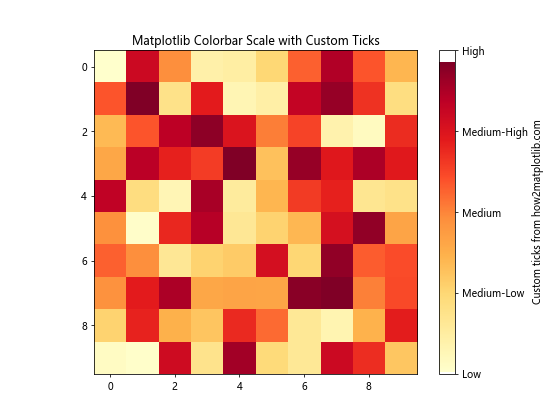
This example demonstrates how to set custom tick locations and labels for the colorbar.
Adding Colorbar Extensions
For data that extends beyond the colorbar range, you can add extensions:
import matplotlib.pyplot as plt
import numpy as np

data = np.random.randn(10, 10)

fig, ax = plt.subplots(figsize=(8, 6))
im = ax.imshow(data, cmap='seismic', vmin=-2, vmax=2)

cbar = plt.colorbar(im, extend='both')
cbar.set_label('Extended scale from how2matplotlib.com')

plt.title('Matplotlib Colorbar Scale with Extensions')
plt.show()
Output:
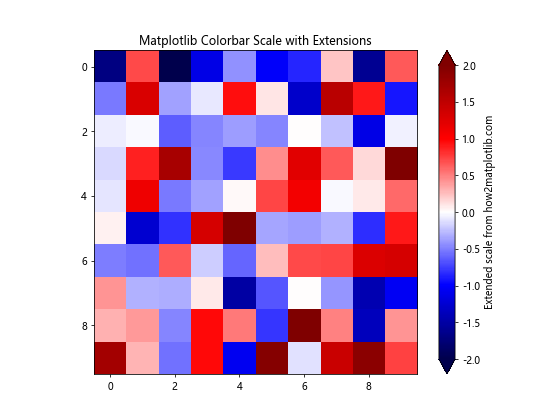
This example adds extensions to both ends of the colorbar for values outside the specified range.
Matplotlib Colorbar Scale in 3D Plots
Colorbars can also be used with 3D plots:
import matplotlib.pyplot as plt
import numpy as np

fig = plt.figure(figsize=(8, 6))
ax = fig.add_subplot(111, projection='3d')

x = np.linspace(-5, 5, 100)
y = np.linspace(-5, 5, 100)
X, Y = np.meshgrid(x, y)
Z = np.sin(np.sqrt(X**2 + Y**2))

surf = ax.plot_surface(X, Y, Z, cmap='coolwarm')

cbar = fig.colorbar(surf)
cbar.set_label('Z values from how2matplotlib.com')

plt.title('Matplotlib Colorbar Scale in 3D Plot')
plt.show()
Output:
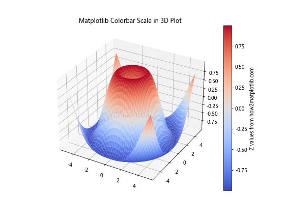
This example demonstrates how to add a colorbar to a 3D surface plot.
Matplotlib colorbar scale Conclusion
Matplotlib colorbar scale is a powerful tool for enhancing data visualizations. By mastering the techniques covered in this article, you’ll be able to create more informative and visually appealing plots. Remember to experiment with different normalization methods, colormaps, and customization options to find the best representation for your data.
As you continue to work with Matplotlib colorbar scales, keep in mind the following key points:
- Choose appropriate normalization methods based on your data distribution.
- Select colormaps that effectively represent your data and are accessible to all viewers.
- Customize colorbar position, size, and orientation to fit your plot layout.
- Use discrete colorbars for categorical data and continuous colorbars for numerical data.
- Fine-tune tick locations and labels to provide clear and meaningful information.
- Consider using colorbar extensions for data that extends beyond the specified range.
- Experiment with different plot types and 3D visualizations to find the best way to represent your data.
By applying these principles and techniques, you’ll be able to create professional-quality visualizations that effectively communicate your data insights using Matplotlib colorbar scales.