How to Master Matplotlib Colormap: A Comprehensive Guide
Matplotlib Colormap is an essential feature in data visualization that allows you to represent data values using different colors. In this comprehensive guide, we’ll explore everything you need to know about Matplotlib Colormap, from basic concepts to advanced techniques. By the end of this article, you’ll be able to create stunning visualizations using Matplotlib Colormap with ease.
Understanding Matplotlib Colormap Basics
Matplotlib Colormap is a powerful tool for mapping data values to colors in visualizations. It helps in representing continuous data ranges using a spectrum of colors, making it easier to interpret complex datasets. Let’s start with a simple example to demonstrate how to use a colormap in Matplotlib:
import matplotlib.pyplot as plt
import numpy as np

# Create sample data
x = np.linspace(0, 10, 100)
y = np.sin(x)

# Create a scatter plot with a colormap
plt.scatter(x, y, c=y, cmap='viridis')
plt.colorbar(label='Sin(x)')
plt.title('Matplotlib Colormap Example - how2matplotlib.com')
plt.xlabel('X-axis')
plt.ylabel('Y-axis')
plt.show()
Output:
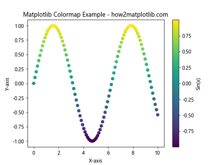
In this example, we create a scatter plot of the sine function and use the ‘viridis’ colormap to represent the y-values. The plt.colorbar() function adds a color scale to the plot, showing the mapping between colors and data values.
Types of Matplotlib Colormaps
Matplotlib offers various types of colormaps to suit different visualization needs. The main categories are:
- Sequential Matplotlib colormaps
- Diverging Matplotlib colormaps
- Qualitative Matplotlib colormaps
- Cyclic Matplotlib colormaps
Let’s explore each type with examples:
Sequential Matplotlib Colormaps
Sequential colormaps are ideal for representing data that progresses from low to high values. They use a gradual change in color intensity or hue to show this progression.
import matplotlib.pyplot as plt
import numpy as np

# Create sample data
data = np.random.rand(10, 10)

# Create a heatmap with a sequential colormap
plt.imshow(data, cmap='Blues')
plt.colorbar(label='Values')
plt.title('Sequential Colormap Example - how2matplotlib.com')
plt.show()
Output:
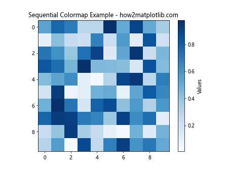
In this example, we use the ‘Blues’ sequential colormap to create a heatmap of random data. The colormap ranges from light to dark blue, representing low to high values.
Diverging Matplotlib Colormaps
Diverging colormaps are useful for data that has a meaningful center point or zero value. They use two different color scales that diverge from a central color.
import matplotlib.pyplot as plt
import numpy as np

# Create sample data
x = np.linspace(-2, 2, 100)
y = np.linspace(-2, 2, 100)
X, Y = np.meshgrid(x, y)
Z = X * np.exp(-X**2 - Y**2)

# Create a contour plot with a diverging colormap
plt.contourf(X, Y, Z, cmap='RdBu_r')
plt.colorbar(label='Values')
plt.title('Diverging Colormap Example - how2matplotlib.com')
plt.xlabel('X-axis')
plt.ylabel('Y-axis')
plt.show()
Output:
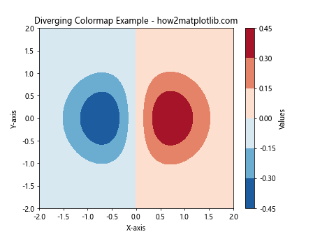
This example uses the ‘RdBu_r’ diverging colormap to visualize a function with positive and negative values. The colormap transitions from red (negative) through white (zero) to blue (positive).
Qualitative Matplotlib Colormaps
Qualitative colormaps are designed for categorical data, where each color represents a distinct category.
import matplotlib.pyplot as plt
import numpy as np

# Create sample data
categories = ['A', 'B', 'C', 'D', 'E']
values = np.random.randint(1, 10, size=5)

# Create a bar plot with a qualitative colormap
plt.bar(categories, values, color=plt.cm.Set3(np.arange(len(categories))))
plt.title('Qualitative Colormap Example - how2matplotlib.com')
plt.xlabel('Categories')
plt.ylabel('Values')
plt.show()
Output:
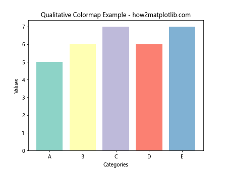
In this example, we use the ‘Set3’ qualitative colormap to assign distinct colors to different categories in a bar plot.
Cyclic Matplotlib Colormaps
Cyclic colormaps are useful for data that wraps around, such as angles or phases.
import matplotlib.pyplot as plt
import numpy as np

# Create sample data
theta = np.linspace(0, 2*np.pi, 100)
r = np.linspace(0, 1, 100)
T, R = np.meshgrid(theta, r)
Z = np.cos(T)

# Create a polar plot with a cyclic colormap
plt.subplot(projection='polar')
plt.pcolormesh(T, R, Z, cmap='hsv')
plt.colorbar(label='Cos(θ)')
plt.title('Cyclic Colormap Example - how2matplotlib.com')
plt.show()
Output:
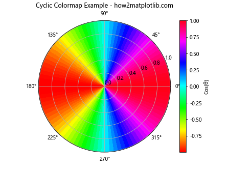
This example demonstrates the use of the ‘hsv’ cyclic colormap in a polar plot to represent periodic data.
Customizing Matplotlib Colormaps
Matplotlib allows you to customize colormaps to suit your specific needs. Let’s explore some customization techniques:
Creating a Custom Matplotlib Colormap
You can create a custom colormap by defining a list of colors and using LinearSegmentedColormap:
import matplotlib.pyplot as plt
import matplotlib.colors as mcolors
import numpy as np

# Define custom colors
colors = ['#ff0000', '#00ff00', '#0000ff']
n_bins = 100

# Create a custom colormap
custom_cmap =
mcolors.LinearSegmentedColormap.from_list('custom_cmap', colors, N=n_bins)

# Create sample data
data = np.random.rand(10, 10)

# Create a heatmap with the custom colormap
plt.imshow(data, cmap=custom_cmap)
plt.colorbar(label='Values')
plt.title('Custom Colormap Example - how2matplotlib.com')
plt.show()
Output:
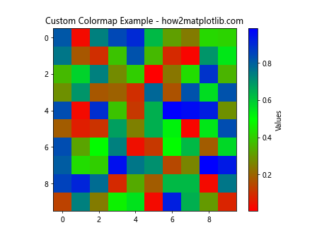
This example creates a custom colormap that transitions from red to green to blue.
Reversing a Matplotlib Colormap
You can reverse any colormap by appending ‘_r’ to its name:
import matplotlib.pyplot as plt
import numpy as np

# Create sample data
x = np.linspace(0, 10, 100)
y = np.sin(x)

# Create two subplots
fig, (ax1, ax2) = plt.subplots(1, 2, figsize=(12, 5))

# Plot with original colormap
im1 = ax1.scatter(x, y, c=y, cmap='viridis')
ax1.set_title('Original Colormap - how2matplotlib.com')
plt.colorbar(im1, ax=ax1, label='Sin(x)')

# Plot with reversed colormap
im2 = ax2.scatter(x, y, c=y, cmap='viridis_r')
ax2.set_title('Reversed Colormap - how2matplotlib.com')
plt.colorbar(im2, ax=ax2, label='Sin(x)')

plt.tight_layout()
plt.show()
Output:
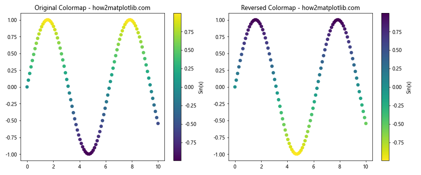
This example demonstrates the difference between the original ‘viridis’ colormap and its reversed version ‘viridis_r’.
Advanced Matplotlib Colormap Techniques
Now that we’ve covered the basics, let’s explore some advanced techniques for working with Matplotlib Colormaps:
Using Discrete Matplotlib Colormaps
Sometimes, you may want to use a discrete set of colors instead of a continuous colormap. You can achieve this using the BoundaryNorm class:
import matplotlib.pyplot as plt
import matplotlib.colors as mcolors
import numpy as np

# Create sample data
data = np.random.randn(20, 20)

# Define discrete color levels
levels = [-3, -2, -1, 0, 1, 2, 3]
colors = ['#3333ff', '#6666ff', '#9999ff', '#ffffff', '#ffcccc', '#ff9999', '#ff6666']

# Create a discrete colormap
cmap = mcolors.ListedColormap(colors)
norm = mcolors.BoundaryNorm(levels, cmap.N)

# Create a heatmap with the discrete colormap
plt.imshow(data, cmap=cmap, norm=norm)
plt.colorbar(label='Values', ticks=levels)
plt.title('Discrete Colormap Example - how2matplotlib.com')
plt.show()
Output:
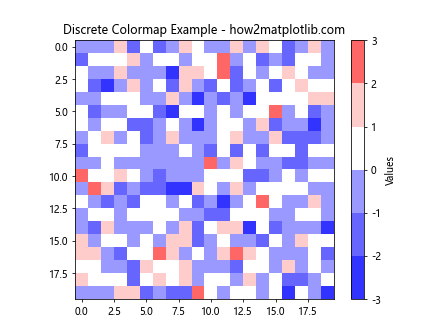
This example creates a discrete colormap with specific color boundaries, which can be useful for representing data in distinct categories.
Combining Multiple Colormaps
You can create complex visualizations by combining multiple colormaps:
import matplotlib.pyplot as plt
import matplotlib.colors as mcolors
import numpy as np

# Create sample data
x = np.linspace(0, 10, 100)
y = np.linspace(0, 10, 100)
X, Y = np.meshgrid(x, y)
Z1 = np.sin(X) * np.cos(Y)
Z2 = np.cos(X) * np.sin(Y)

# Create a custom colormap by combining two existing colormaps
cmap1 = plt.get_cmap('viridis')
cmap2 = plt.get_cmap('plasma')
combined_cmap = mcolors.LinearSegmentedColormap.from_list('combined_cmap',
                                                          [cmap1(i) for i in range(cmap1.N)] +
                                                          [cmap2(i) for i in range(cmap2.N)])

# Create a plot with the combined colormap
plt.imshow(Z1, extent=[0, 10, 0, 10], cmap=combined_cmap, alpha=0.5)
plt.imshow(Z2, extent=[0, 10, 0, 10], cmap=combined_cmap, alpha=0.5)
plt.colorbar(label='Values')
plt.title('Combined Colormap Example - how2matplotlib.com')
plt.xlabel('X-axis')
plt.ylabel('Y-axis')
plt.show()
Output:
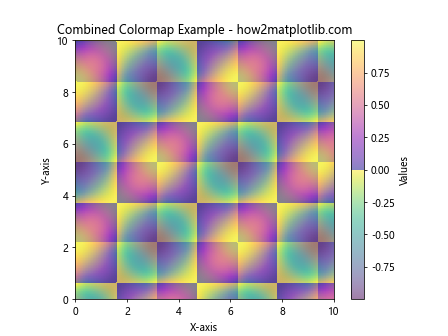
This example combines the ‘viridis’ and ‘plasma’ colormaps to create a new colormap, which is then used to visualize two overlapping datasets.
Using Colormaps for 3D Plots
Matplotlib Colormaps can also be applied to 3D plots:
import matplotlib.pyplot as plt
import numpy as np

# Create sample data
x = np.linspace(-5, 5, 50)
y = np.linspace(-5, 5, 50)
X, Y = np.meshgrid(x, y)
Z = np.sin(np.sqrt(X**2 + Y**2))

# Create a 3D surface plot with a colormap
fig = plt.figure()
ax = fig.add_subplot(111, projection='3d')
surf = ax.plot_surface(X, Y, Z, cmap='coolwarm', linewidth=0, antialiased=False)
fig.colorbar(surf, shrink=0.5, aspect=5, label='Sin(r)')
ax.set_title('3D Surface Plot with Colormap - how2matplotlib.com')
ax.set_xlabel('X-axis')
ax.set_ylabel('Y-axis')
ax.set_zlabel('Z-axis')
plt.show()
Output:
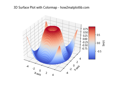
This example creates a 3D surface plot using the ‘coolwarm’ colormap to represent the z-values.
Matplotlib Colormap Best Practices
To make the most of Matplotlib Colormaps, consider the following best practices:
- Choose appropriate colormaps for your data type (sequential, diverging, qualitative, or cyclic).
- Use perceptually uniform colormaps like ‘viridis’ for better data representation.
- Consider color-blind friendly colormaps for accessibility.
- Add a colorbar to your plots to provide a reference for the color scale.
- Use discrete colormaps when representing categorical data.
Let’s implement some of these best practices in an example:
import matplotlib.pyplot as plt
import numpy as np

# Create sample data
x = np.linspace(0, 10, 100)
y = np.linspace(0, 10, 100)
X, Y = np.meshgrid(x, y)
Z = np.sin(X) * np.cos(Y)

# Create a plot with best practices
fig, ax = plt.subplots(figsize=(10, 8))
im = ax.imshow(Z, extent=[0, 10, 0, 10], cmap='viridis', aspect='auto')
cbar = fig.colorbar(im, ax=ax, label='Sin(X) * Cos(Y)')
ax.set_title('Matplotlib Colormap Best Practices - how2matplotlib.com')
ax.set_xlabel('X-axis')
ax.set_ylabel('Y-axis')
plt.show()
Output:
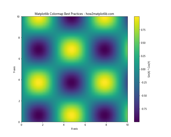
This example demonstrates the use of a perceptually uniform colormap (‘viridis’), includes a colorbar with a label, and uses appropriate axis labels and title.
Matplotlib Colormap and Data Normalization
Data normalization is crucial when working with colormaps, especially when dealing with data that has outliers or skewed distributions. Matplotlib provides several normalization methods:
- LogNorm
- SymLogNorm
- PowerNorm
Let’s explore these normalization methods with examples:
LogNorm
import matplotlib.pyplot as plt
import matplotlib.colors as mcolors
import numpy as np

# Create sample data with a wide range of values
data = np.random.lognormal(0, 2, (10, 10))

# Create a heatmap with LogNorm
plt.imshow(data, cmap='viridis', norm=mcolors.LogNorm())
plt.colorbar(label='Values (log scale)')
plt.title('LogNorm Example - how2matplotlib.com')
plt.show()
Output:
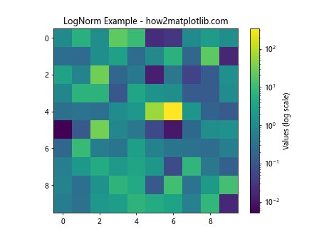
LogNorm is useful for data that spans several orders of magnitude.
SymLogNorm
import matplotlib.pyplot as plt
import matplotlib.colors as mcolors
import numpy as np

# Create sample data with positive and negative values
data = np.random.randn(10, 10) * 1000

# Create a heatmap with SymLogNorm
plt.imshow(data, cmap='RdBu_r', norm=mcolors.SymLogNorm(linthresh=10, linscale=1, vmin=-1000, vmax=1000))
plt.colorbar(label='Values (symlog scale)')
plt.title('SymLogNorm Example - how2matplotlib.com')
plt.show()
Output:
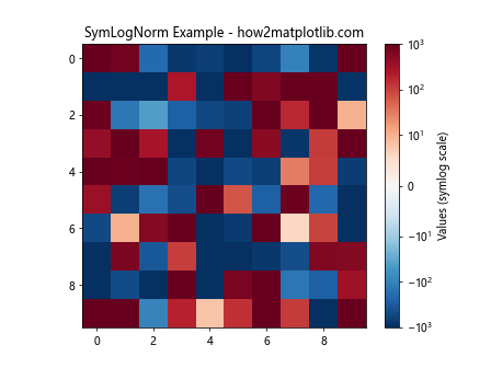
SymLogNorm is useful for data that has both positive and negative values and spans several orders of magnitude.
PowerNorm
import matplotlib.pyplot as plt
import matplotlib.colors as mcolors
import numpy as np

# Create sample data with a power-law distribution
data = np.random.power(0.5, (10, 10))

# Create a heatmap with PowerNorm
plt.imshow(data, cmap='viridis', norm=mcolors.PowerNorm(gamma=0.5))
plt.colorbar(label='Values (power scale)')
plt.title('PowerNorm Example - how2matplotlib.com')
plt.show()
Output:
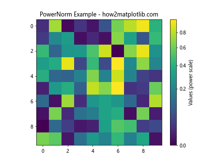
PowerNorm is useful for data that follows a power-law distribution.
Matplotlib Colormap and Annotations
Adding annotations to your plots can enhance their interpretability. Let’s explore how to combine colormaps with annotations:
import matplotlib.pyplot as plt
import numpy as np

# Create sample data
x = np.linspace(0, 10, 20)
y = np.linspace(0, 10, 20)
X, Y = np.meshgrid(x, y)
Z = np.sin(X) * np.cos(Y)

# Create a heatmap with annotations
fig, ax = plt.subplots(figsize=(12, 10))
im = ax.imshow(Z, cmap='viridis', extent=[0, 10, 0, 10])
cbar = fig.colorbar(im, ax=ax, label='Sin(X) * Cos(Y)')

# Add text annotations
for i in range(len(x)):
    for j in range(len(y)):
        ax.text(x[i], y[j], f'{Z[j, i]:.2f}', ha='center', va='center', color='white')

ax.set_title('Matplotlib Colormap with Annotations - how2matplotlib.com')
ax.set_xlabel('X-axis')
ax.set_ylabel('Y-axis')
plt.show()
Output:
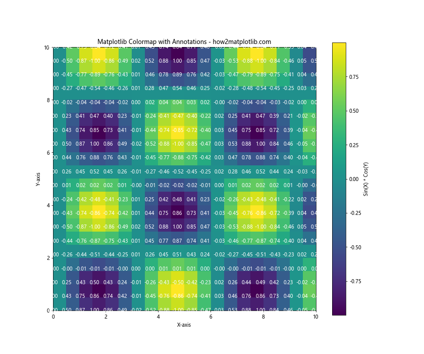
This example demonstrates how to add text annotations to a heatmap, displaying the actual values at each point.
Matplotlib Colormap and Subplots
When working with multiple subplots, you can use colormaps to create visually appealing and informative comparisons:
import matplotlib.pyplot as plt
import numpy as np

# Create sample data
x = np.linspace(0, 10, 100)
y = np.linspace(0, 10, 100)
X, Y = np.meshgrid(x, y)
Z1 = np.sin(X) * np.cos(Y)
Z2 = np.cos(X) * np.sin(Y)
Z3 = np.sin(X + Y)
Z4 = np.cos(X - Y)

# Create subplots with different colormaps
fig, axs = plt.subplots(2, 2, figsize=(12, 12))
fig.suptitle('Matplotlib Colormap and Subplots - how2matplotlib.com', fontsize=16)

im1 = axs[0, 0].imshow(Z1, cmap='viridis', extent=[0, 10, 0, 10])
axs[0, 0].set_title('Sin(X) * Cos(Y)')
fig.colorbar(im1, ax=axs[0, 0])

im2 = axs[0, 1].imshow(Z2, cmap='plasma', extent=[0, 10, 0, 10])
axs[0, 1].set_title('Cos(X) * Sin(Y)')
fig.colorbar(im2, ax=axs[0, 1])

im3 = axs[1, 0].imshow(Z3, cmap='magma', extent=[0, 10, 0, 10])
axs[1, 0].set_title('Sin(X + Y)')
fig.colorbar(im3, ax=axs[1, 0])

im4 = axs[1, 1].imshow(Z4, cmap='inferno', extent=[0, 10, 0, 10])
axs[1, 1].set_title('Cos(X - Y)')
fig.colorbar(im4, ax=axs[1, 1])

plt.tight_layout()
plt.show()
Output:
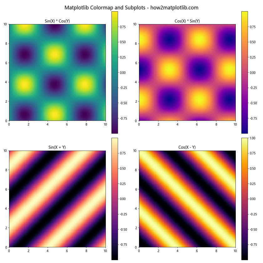
This example creates four subplots, each using a different colormap to visualize related but distinct datasets.
Matplotlib Colormap and Animation
Colormaps can also be used in animations to create dynamic visualizations:
import matplotlib.pyplot as plt
import matplotlib.animation as animation
import numpy as np

# Create sample data
x = np.linspace(0, 10, 100)
y = np.linspace(0, 10, 100)
X, Y = np.meshgrid(x, y)

# Create a figure and axis
fig, ax = plt.subplots()

# Initialize the plot
im = ax.imshow(np.zeros((100, 100)), cmap='viridis', animated=True)
fig.colorbar(im, label='Values')
ax.set_title('Matplotlib Colormap Animation - how2matplotlib.com')

# Update function for animation
def update(frame):
    Z = np.sin(X + frame/10) * np.cos(Y + frame/10)
    im.set_array(Z)
    return [im]

# Create the animation
anim = animation.FuncAnimation(fig, update, frames=100, interval=50, blit=True)

plt.show()
Output:
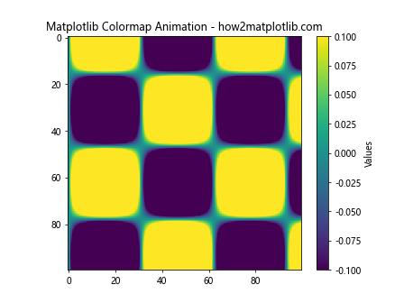
This example creates an animation of a changing 2D function using the ‘viridis’ colormap.
Matplotlib Colormap and Geographical Data
Colormaps are particularly useful when working with geographical data. Let’s create a simple example using a world map:
import matplotlib.pyplot as plt
import numpy as np
from mpl_toolkits.basemap import Basemap

# Create a world map
fig = plt.figure(figsize=(12, 8))
m = Basemap(projection='robin', resolution='c', lat_0=0, lon_0=0)

# Generate random data for countries
lats = np.random.uniform(-90, 90, 50)
lons = np.random.uniform(-180, 180, 50)
data = np.random.rand(50)

# Plot the data on the map
sc = m.scatter(lons, lats, c=data, cmap='YlOrRd', s=50, latlon=True)
m.drawcoastlines()
m.drawcountries()

# Add a colorbar
plt.colorbar(sc, label='Random Values')
plt.title('Matplotlib Colormap with Geographical Data - how2matplotlib.com')
plt.show()
Output:
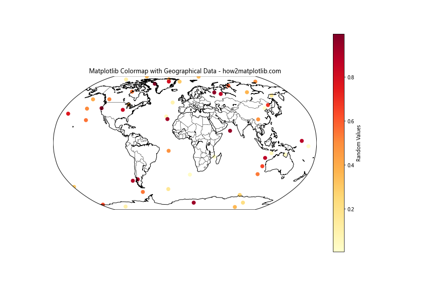
This example uses the Basemap toolkit to create a world map and plots random data points using the ‘YlOrRd’ colormap.
Matplotlib Colormap Conclusion
Matplotlib Colormap is a powerful tool for data visualization that allows you to represent complex datasets using color. In this comprehensive guide, we’ve explored various aspects of Matplotlib Colormap, including:
- Basic concepts and types of colormaps
- Customization techniques
- Advanced usage and best practices
- Data normalization methods
- Combining colormaps with annotations, subplots, and animations
- Using colormaps with geographical data
By mastering these techniques, you’ll be able to create more informative and visually appealing data visualizations. Remember to choose appropriate colormaps for your data type, consider color accessibility, and always include a colorbar for reference.
As you continue to work with Matplotlib Colormap, experiment with different combinations and techniques to find the best way to represent your data. With practice, you’ll develop an intuition for which colormaps work best for different types of data and visualization goals.
Keep exploring the vast possibilities of Matplotlib Colormap, and don’t hesitate to refer back to this guide whenever you need a refresher on specific techniques or best practices. Happy visualizing!