How to Master Matplotlib Colormaps: A Comprehensive Guide for Data Visualization
Matplotlib colormaps are an essential tool for data visualization in Python. They provide a way to map numerical data to colors, allowing for intuitive and visually appealing representations of complex datasets. In this comprehensive guide, we’ll explore the world of matplotlib colormaps, from basic concepts to advanced techniques, helping you become a master of color-based data visualization.
Matplotlib Colormaps Recommended Articles
- matplotlib colormaps from table
- matplotlib colormaps get_cmap
- matplotlib colormaps gray
- matplotlib colormaps list
- matplotlib colormaps names
- matplotlib colormaps reverse
Understanding Matplotlib Colormaps
Matplotlib colormaps are functions that map scalar data to colors. They are crucial for creating effective visualizations, as they can highlight patterns, trends, and relationships in your data. Matplotlib offers a wide variety of built-in colormaps, each designed for specific types of data and visualization needs.
Let’s start with a simple example of how to use a matplotlib colormap:
import matplotlib.pyplot as plt
import numpy as np

# Create some sample data
data = np.random.rand(10, 10)

# Create a figure and axis
fig, ax = plt.subplots()

# Plot the data using a colormap
im = ax.imshow(data, cmap='viridis')

# Add a colorbar
plt.colorbar(im)

# Set the title
plt.title('Sample Matplotlib Colormap: how2matplotlib.com')

# Show the plot
plt.show()
Output:
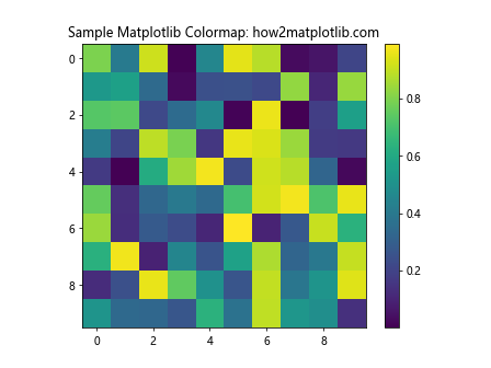
In this example, we’re using the ‘viridis’ colormap to visualize a 10×10 array of random data. The imshow function automatically maps the data values to colors using the specified colormap.
Types of Matplotlib Colormaps
Matplotlib offers several categories of colormaps, each suited for different types of data and visualization goals:
- Sequential colormaps
- Diverging colormaps
- Cyclic colormaps
- Qualitative colormaps
Let’s explore each type in detail.
Sequential Matplotlib Colormaps
Sequential colormaps are ideal for representing data that has a natural ordering or progression. They typically range from a light color for low values to a dark color for high values. Some popular sequential matplotlib colormaps include ‘viridis’, ‘plasma’, ‘inferno’, and ‘magma’.
Here’s an example using the ‘plasma’ colormap:
import matplotlib.pyplot as plt
import numpy as np

# Create some sample data
x = np.linspace(0, 10, 100)
y = np.linspace(0, 10, 100)
X, Y = np.meshgrid(x, y)
Z = np.sin(X) * np.cos(Y)

# Create a figure and axis
fig, ax = plt.subplots()

# Plot the data using a sequential colormap
im = ax.pcolormesh(X, Y, Z, cmap='plasma')

# Add a colorbar
plt.colorbar(im)

# Set the title
plt.title('Sequential Matplotlib Colormap (plasma): how2matplotlib.com')

# Show the plot
plt.show()
Output:
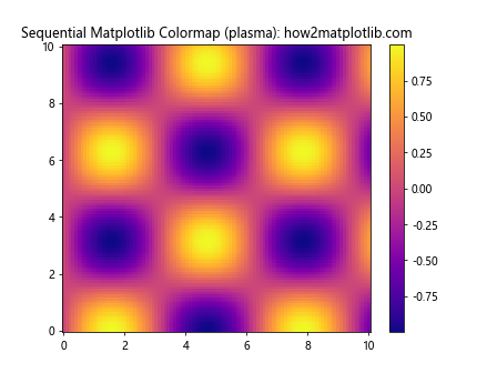
This example demonstrates how the ‘plasma’ colormap effectively represents the continuous variation in the sine-cosine function.
Diverging Matplotlib Colormaps
Diverging colormaps are useful for data that has a meaningful midpoint or zero value. They typically use two different hues that diverge from a neutral color at the midpoint. Common diverging matplotlib colormaps include ‘RdBu’, ‘RdYlBu’, and ‘coolwarm’.
Let’s see an example using the ‘coolwarm’ colormap:
import matplotlib.pyplot as plt
import numpy as np

# Create some sample data
x = np.linspace(-2, 2, 100)
y = np.linspace(-2, 2, 100)
X, Y = np.meshgrid(x, y)
Z = X * Y

# Create a figure and axis
fig, ax = plt.subplots()

# Plot the data using a diverging colormap
im = ax.pcolormesh(X, Y, Z, cmap='coolwarm', vmin=-4, vmax=4)

# Add a colorbar
plt.colorbar(im)

# Set the title
plt.title('Diverging Matplotlib Colormap (coolwarm): how2matplotlib.com')

# Show the plot
plt.show()
Output:
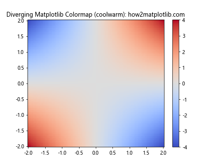
This example shows how the ‘coolwarm’ colormap effectively highlights positive and negative values, with white representing values close to zero.
Cyclic Matplotlib Colormaps
Cyclic colormaps are designed for data that wraps around, such as angles or phases. They use colors that form a natural cycle, making it easy to identify periodic patterns. Examples of cyclic matplotlib colormaps include ‘hsv’, ‘twilight’, and ‘twilight_shifted’.
Here’s an example using the ‘twilight’ colormap:
import matplotlib.pyplot as plt
import numpy as np

# Create some sample data
theta = np.linspace(0, 2*np.pi, 100)
r = np.linspace(0, 1, 50)
T, R = np.meshgrid(theta, r)
Z = np.cos(5*T)

# Create a figure and axis
fig, ax = plt.subplots(subplot_kw=dict(projection='polar'))

# Plot the data using a cyclic colormap
im = ax.pcolormesh(T, R, Z, cmap='twilight')

# Add a colorbar
plt.colorbar(im)

# Set the title
plt.title('Cyclic Matplotlib Colormap (twilight): how2matplotlib.com')

# Show the plot
plt.show()
Output:
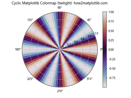
This example demonstrates how the ‘twilight’ colormap effectively represents periodic data in a polar coordinate system.
Qualitative Matplotlib Colormaps
Qualitative colormaps are used for categorical data where there is no inherent ordering. They use distinct colors to represent different categories. Examples of qualitative matplotlib colormaps include ‘Set1’, ‘Set2’, ‘Set3’, and ‘Pastel1’.
Let’s see an example using the ‘Set3’ colormap:
import matplotlib.pyplot as plt
import numpy as np

# Create some sample data
categories = ['A', 'B', 'C', 'D', 'E', 'F', 'G', 'H']
values = np.random.rand(len(categories))

# Create a figure and axis
fig, ax = plt.subplots()

# Plot the data using a qualitative colormap
bars = ax.bar(categories, values, color=plt.cm.Set3(np.linspace(0, 1, len(categories))))

# Set the title
plt.title('Qualitative Matplotlib Colormap (Set3): how2matplotlib.com')

# Show the plot
plt.show()
Output:
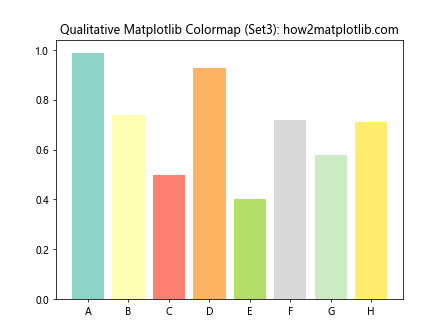
This example shows how the ‘Set3’ colormap provides distinct colors for different categories in a bar chart.
Customizing Matplotlib Colormaps
While matplotlib offers a wide range of built-in colormaps, you can also create custom colormaps to suit your specific needs. There are several ways to customize matplotlib colormaps:
- Creating a colormap from a list of colors
- Combining existing colormaps
- Modifying existing colormaps
Let’s explore each of these methods.
Creating a Matplotlib Colormap from a List of Colors
You can create a custom matplotlib colormap by specifying a list of colors. This is useful when you want to use specific colors that are not available in the built-in colormaps.
Here’s an example of creating a custom colormap:
import matplotlib.pyplot as plt
import numpy as np
from matplotlib.colors import LinearSegmentedColormap

# Define the colors for the custom colormap
colors = ['#ff0000', '#00ff00', '#0000ff']  # Red, Green, Blue

# Create the custom colormap
custom_cmap = LinearSegmentedColormap.from_list('custom_cmap', colors)

# Create some sample data
data = np.random.rand(10, 10)

# Create a figure and axis
fig, ax = plt.subplots()

# Plot the data using the custom colormap
im = ax.imshow(data, cmap=custom_cmap)

# Add a colorbar
plt.colorbar(im)

# Set the title
plt.title('Custom Matplotlib Colormap: how2matplotlib.com')

# Show the plot
plt.show()
Output:
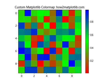
This example creates a custom colormap that transitions from red to green to blue.
Combining Existing Matplotlib Colormaps
You can also create new colormaps by combining existing matplotlib colormaps. This is useful when you want to create a colormap that has properties of multiple existing colormaps.
Here’s an example of combining two colormaps:
import matplotlib.pyplot as plt
import numpy as np
from matplotlib.colors import LinearSegmentedColormap

# Get the color lists from two existing colormaps
cmap1 = plt.get_cmap('viridis')
cmap2 = plt.get_cmap('plasma')

# Combine the color lists
combined_colors = np.vstack((cmap1(np.linspace(0, 1, 128)),
                             cmap2(np.linspace(0, 1, 128))))

# Create a new colormap from the combined colors
combined_cmap = LinearSegmentedColormap.from_list('combined_cmap', combined_colors)

# Create some sample data
data = np.random.rand(10, 10)

# Create a figure and axis
fig, ax = plt.subplots()

# Plot the data using the combined colormap
im = ax.imshow(data, cmap=combined_cmap)

# Add a colorbar
plt.colorbar(im)

# Set the title
plt.title('Combined Matplotlib Colormap: how2matplotlib.com')

# Show the plot
plt.show()
Output:
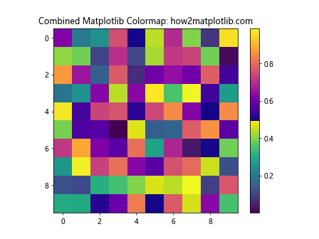
This example creates a new colormap by combining the ‘viridis’ and ‘plasma’ colormaps.
Modifying Existing Matplotlib Colormaps
You can also modify existing matplotlib colormaps to create new variations. This can be done by adjusting the colors or reversing the colormap.
Here’s an example of modifying an existing colormap:
import matplotlib.pyplot as plt
import numpy as np
from matplotlib.colors import LinearSegmentedColormap

# Get an existing colormap
original_cmap = plt.get_cmap('viridis')

# Modify the colormap by increasing the saturation
modified_colors = original_cmap(np.linspace(0, 1, 256))
modified_colors[:, :3] *= 1.2  # Increase RGB values by 20%
modified_colors[:, :3] = np.clip(modified_colors[:, :3], 0, 1)  # Clip values to [0, 1]

# Create a new colormap from the modified colors
modified_cmap = LinearSegmentedColormap.from_list('modified_cmap', modified_colors)

# Create some sample data
data = np.random.rand(10, 10)

# Create a figure and axis
fig, ax = plt.subplots()

# Plot the data using the modified colormap
im = ax.imshow(data, cmap=modified_cmap)

# Add a colorbar
plt.colorbar(im)

# Set the title
plt.title('Modified Matplotlib Colormap: how2matplotlib.com')

# Show the plot
plt.show()
Output:
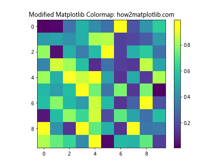
This example modifies the ‘viridis’ colormap by increasing its saturation.
Advanced Techniques with Matplotlib Colormaps
Now that we’ve covered the basics of matplotlib colormaps, let’s explore some advanced techniques that can enhance your data visualizations.
Using Discrete Matplotlib Colormaps
Sometimes, you may want to use a discrete colormap instead of a continuous one. This is particularly useful when dealing with categorical data or when you want to emphasize specific ranges of values.
Here’s an example of using a discrete colormap:
import matplotlib.pyplot as plt
import numpy as np
from matplotlib.colors import BoundaryNorm, ListedColormap

# Create some sample data
data = np.random.randint(0, 5, (10, 10))

# Define the boundaries for the discrete colormap
boundaries = [-0.5, 0.5, 1.5, 2.5, 3.5, 4.5]

# Create a custom colormap
colors = ['#ff0000', '#00ff00', '#0000ff', '#ffff00', '#ff00ff']
cmap = ListedColormap(colors)

# Create a norm to map the data to colormap indices
norm = BoundaryNorm(boundaries, cmap.N)

# Create a figure and axis
fig, ax = plt.subplots()

# Plot the data using the discrete colormap
im = ax.imshow(data, cmap=cmap, norm=norm)

# Add a colorbar
plt.colorbar(im, ticks=[0, 1, 2, 3, 4])

# Set the title
plt.title('Discrete Matplotlib Colormap: how2matplotlib.com')

# Show the plot
plt.show()
Output:
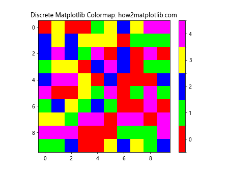
This example creates a discrete colormap with five distinct colors for integer values from 0 to 4.
Creating Bivariate Matplotlib Colormaps
Bivariate colormaps allow you to visualize two variables simultaneously using color. This can be particularly useful when you want to show the relationship between two continuous variables.
Here’s an example of creating a bivariate colormap:
import matplotlib.pyplot as plt
import numpy as np
from matplotlib.colors import LinearSegmentedColormap

# Create some sample data
x = np.linspace(0, 1, 100)
y = np.linspace(0, 1, 100)
X, Y = np.meshgrid(x, y)

# Create a custom bivariate colormap
cdict = {
    'red':   ((0.0, 0.0, 0.0),
               (0.5, 0.0, 0.0),
               (1.0, 1.0, 1.0)),
    'green': ((0.0, 0.0, 0.0),
               (0.5, 1.0, 1.0),
               (1.0, 1.0, 1.0)),
    'blue':  ((0.0, 0.0, 0.0),
               (0.5, 0.0, 0.0),
               (1.0, 0.0, 0.0))
}
bivariate_cmap = LinearSegmentedColormap('bivariate_cmap', cdict)

# Create a figure and axis
fig, ax = plt.subplots()

# Plot the data using the bivariate colormap
im = ax.imshow(np.dstack((X, Y, np.zeros_like(X))), cmap=bivariate_cmap)

# Add a colorbar
plt.colorbar(im)

# Set the title
plt.title('Bivariate Matplotlib Colormap: how2matplotlib.com')

# Show the plot
plt.show()
Output:
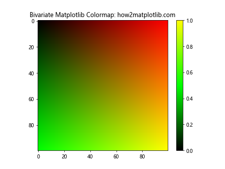
This example creates a bivariate colormap that represents two variables using red and green channels.
Using Matplotlib Colormaps with 3D Plots
Matplotlib colormaps can also be used effectively in 3D plots to add an extra dimension of information to your visualizations.
Here’s an example of using a colormap in a 3D surface plot:
import matplotlib.pyplot as plt
import numpy as np
from mpl_toolkits.mplot3d import Axes3D

# Create some sample data
x = np.linspace(-5, 5, 100)
y = np.linspace(-5, 5, 100)
X, Y = np.meshgrid(x, y)
Z = np.sin(np.sqrt(X**2 + Y**2))

# Create a figure and 3D axis
fig = plt.figure()
ax = fig.add_subplot(111, projection='3d')

# Plot the surface with a colormap
surf = ax.plot_surface(X, Y, Z, cmap='viridis', linewidth=0, antialiased=False)

# Add a colorbar
plt.colorbar(surf)

# Set the title
plt.title('3D Plot with Matplotlib Colormap: how2matplotlib.com')

# Show the plot
plt.show()
Output:
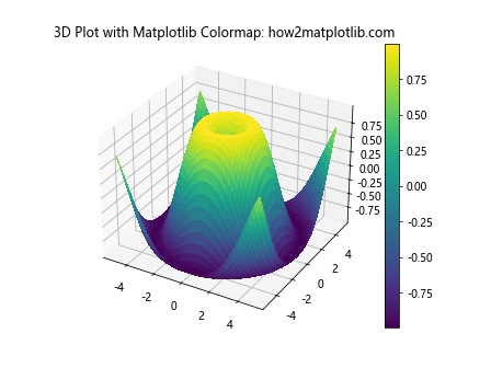
This example demonstrates how to use the ‘viridis’ colormap in a 3D surface plot to represent the height of the surface.
Animating Matplotlib Colormaps
Animating colormaps can be a powerful way to visualize changing data over time. Here’s an example of how to create an animated colormap:
import matplotlib.pyplot as plt
import numpy as np
from matplotlib.animation import FuncAnimation

# Create some sample data
x = np.linspace(0, 2*np.pi, 100)
y = np.linspace(0, 2*np.pi, 100)
X, Y = np.meshgrid(x, y)

# Create a figure and axis
fig, ax = plt.subplots()

# Initialize the plot
im = ax.imshow(np.zeros((100, 100)), cmap='viridis', animated=True)

# Update function for the animation
def update(frame):
    Z = np.sin(X + frame/10) * np.cos(Y + frame/10)
    im.set_array(Z)
    return [im]

# Create the animation
anim = FuncAnimation(fig, update, frames=100, interval=50, blit=True)

# Set the title
plt.title('Animated Matplotlib Colormap: how2matplotlib.com')

# Show the animation
plt.show()
Output:
This example creates an animation of a changing 2D sine-cosine pattern using the ‘viridis’ colormap.
Best Practices for Using Matplotlib Colormaps
When working with matplotlib colormaps, it’s important to follow some best practices to ensure your visualizations are effective and easy to interpret:
- Choose the right type of colormap for your data
- Consider color blindness and accessibility
- Use perceptually uniform colormaps
- Avoid rainbow colormaps for continuous data
- Provide clear labels and legends
Let’s explore each of these best practices in more detail.
Choosing the Right Matplotlib Colormap
Selecting the appropriate colormap is crucial for effective data visualization. Here are some guidelines:
- Use sequential colormaps for data that has a natural ordering
- Use diverging colormaps for data with a meaningful midpoint
- Use cyclic colormaps for periodic data
- Use qualitative colormaps for categorical data
Here’s an example demonstrating the importance of choosing the right colormap:
import matplotlib.pyplot as plt
import numpy as np

# Create some sample data
data = np.random.normal(0, 1, (10, 10))

# Create a figure with two subplots
fig, (ax1, ax2) = plt.subplots(1, 2, figsize=(12, 5))

# Plot with an appropriate colormap (sequential)
im1 = ax1.imshow(data, cmap='viridis')
ax1.set_title('Appropriate Colormap (viridis)')
plt.colorbar(im1, ax=ax1)

# Plot with an inappropriate colormap (qualitative)
im2 = ax2.imshow(data, cmap='Set3')
ax2.set_title('Inappropriate Colormap (Set3)')
plt.colorbar(im2, ax=ax2)

# Set the main title
fig.suptitle('Choosing the Right Matplotlib Colormap: how2matplotlib.com')

# Show the plot
plt.show()
Output:
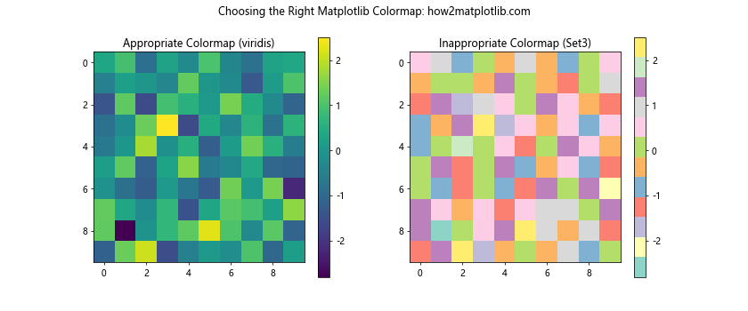
This example shows how using an appropriate colormap (sequential ‘viridis’) for continuous data provides a more accurate representation compared to an inappropriate colormap (qualitative ‘Set3’).
Considering Color Blindness and Accessibility
When creating visualizations, it’s important to consider color blindness and ensure your plots are accessible to all viewers. Matplotlib provides colormaps that are designed to be perceptually uniform and color-blind friendly.
Here’s an example comparing a color-blind friendly colormap with a problematic one:
import matplotlib.pyplot as plt
import numpy as np

# Create some sample data
data = np.random.rand(10, 10)

# Create a figure with two subplots
fig, (ax1, ax2) = plt.subplots(1, 2, figsize=(12, 5))

# Plot with a color-blind friendly colormap
im1 = ax1.imshow(data, cmap='viridis')
ax1.set_title('Color-blind Friendly (viridis)')
plt.colorbar(im1, ax=ax1)

# Plot with a problematic colormap for color blindness
im2 = ax2.imshow(data, cmap='jet')
ax2.set_title('Problematic for Color Blindness (jet)')
plt.colorbar(im2, ax=ax2)

# Set the main title
fig.suptitle('Color Blindness Considerations in Matplotlib Colormaps: how2matplotlib.com')

# Show the plot
plt.show()
Output:
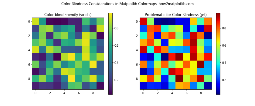
This example demonstrates how the ‘viridis’ colormap is more accessible for color-blind viewers compared to the ‘jet’ colormap.
Using Perceptually Uniform Matplotlib Colormaps
Perceptually uniform colormaps ensure that the perceived difference between colors is proportional to the difference in the underlying data values. This makes it easier for viewers to accurately interpret the data.
Here’s an example comparing a perceptually uniform colormap with a non-uniform one:
import matplotlib.pyplot as plt
import numpy as np

# Create some sample data
x = np.linspace(0, 10, 1000)
y = np.sin(x)

# Create a figure with two subplots
fig, (ax1, ax2) = plt.subplots(1, 2, figsize=(12, 5))

# Plot with a perceptually uniform colormap
im1 = ax1.scatter(x, y, c=y, cmap='viridis')
ax1.set_title('Perceptually Uniform (viridis)')
plt.colorbar(im1, ax=ax1)

# Plot with a non-uniform colormap
im2 = ax2.scatter(x, y, c=y, cmap='jet')
ax2.set_title('Non-uniform (jet)')
plt.colorbar(im2, ax=ax2)

# Set the main title
fig.suptitle('Perceptually Uniform Matplotlib Colormaps: how2matplotlib.com')

# Show the plot
plt.show()
Output:
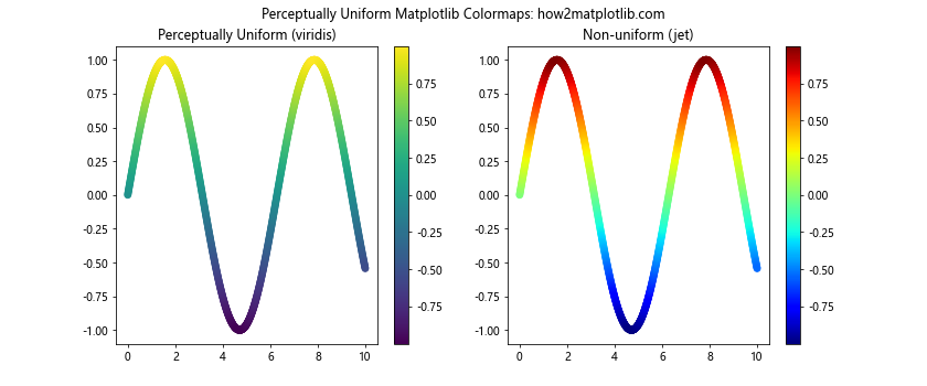
This example shows how the perceptually uniform ‘viridis’ colormap provides a more accurate representation of the data compared to the non-uniform ‘jet’ colormap.
Avoiding Rainbow Matplotlib Colormaps for Continuous Data
Rainbow colormaps, while visually appealing, can be misleading for continuous data. They can create artificial boundaries and make it difficult to perceive the true structure of the data.
Here’s an example illustrating why rainbow colormaps should be avoided for continuous data:
import matplotlib.pyplot as plt
import numpy as np

# Create some sample data
x = np.linspace(0, 10, 1000)
y = np.sin(x) + np.random.normal(0, 0.1, 1000)

# Create a figure with two subplots
fig, (ax1, ax2) = plt.subplots(1, 2, figsize=(12, 5))

# Plot with a sequential colormap
im1 = ax1.scatter(x, y, c=y, cmap='viridis')
ax1.set_title('Sequential Colormap (viridis)')
plt.colorbar(im1, ax=ax1)

# Plot with a rainbow colormap
im2 = ax2.scatter(x, y, c=y, cmap='rainbow')
ax2.set_title('Rainbow Colormap (rainbow)')
plt.colorbar(im2, ax=ax2)

# Set the main title
fig.suptitle('Avoiding Rainbow Matplotlib Colormaps: how2matplotlib.com')

# Show the plot
plt.show()
Output:
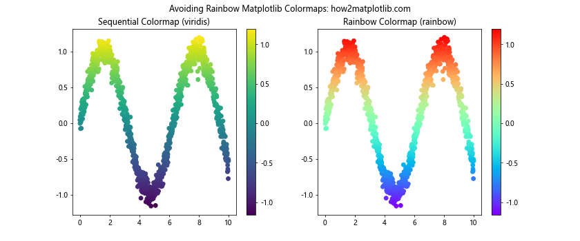
This example demonstrates how a sequential colormap like ‘viridis’ provides a clearer representation of the continuous data compared to the rainbow colormap.
Providing Clear Labels and Legends with Matplotlib Colormaps
To make your visualizations more informative, it’s important to provide clear labels and legends when using colormaps. This helps viewers understand the meaning of the colors and interpret the data correctly.
Here’s an example of how to add informative labels and legends to a plot using a colormap:
import matplotlib.pyplot as plt
import numpy as np

# Create some sample data
x = np.linspace(0, 10, 100)
y = np.linspace(0, 10, 100)
X, Y = np.meshgrid(x, y)
Z = np.sin(X) * np.cos(Y)

# Create a figure and axis
fig, ax = plt.subplots()

# Plot the data using a colormap
im = ax.pcolormesh(X, Y, Z, cmap='coolwarm', shading='auto')

# Add a colorbar with a label
cbar = plt.colorbar(im)
cbar.set_label('Value', rotation=270, labelpad=15)

# Set axis labels
ax.set_xlabel('X-axis')
ax.set_ylabel('Y-axis')

# Set the title
plt.title('Clear Labels and Legends with Matplotlib Colormaps: how2matplotlib.com')

# Show the plot
plt.show()
Output:
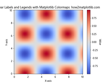
This example demonstrates how to add clear axis labels, a colorbar label, and a title to make the visualization more informative.
Matplotlib colormaps Conclusion
Matplotlib colormaps are a powerful tool for data visualization, allowing you to represent complex datasets in intuitive and visually appealing ways. By understanding the different types of colormaps, learning how to customize them, and following best practices, you can create effective and informative visualizations that accurately represent your data.
Remember to choose the appropriate colormap for your data type, consider accessibility and perceptual uniformity, and provide clear labels and legends. With these skills and knowledge, you’ll be well-equipped to create stunning and informative visualizations using matplotlib colormaps.