How to Reverse Matplotlib Colormaps: A Comprehensive Guide
Matplotlib colormaps reverse is a powerful technique that allows you to invert the color scheme of your visualizations in Matplotlib. By reversing colormaps, you can create visually striking and informative plots that highlight different aspects of your data. In this comprehensive guide, we’ll explore various methods to reverse Matplotlib colormaps, providing detailed explanations and easy-to-understand code examples along the way.
Understanding Matplotlib Colormaps
Before diving into reversing Matplotlib colormaps, it’s essential to understand what colormaps are and how they work in Matplotlib. Colormaps are functions that map scalar data to colors, allowing you to represent data values using different hues, saturations, and brightness levels. Matplotlib offers a wide range of built-in colormaps, each designed for specific types of data and visualization purposes.
Types of Matplotlib Colormaps
Matplotlib provides several categories of colormaps:
- Sequential colormaps: These are ideal for representing data that progresses from low to high values.
- Diverging colormaps: These are useful for data that deviates from a central value.
- Cyclic colormaps: These are designed for data that wraps around, such as angles or phases.
- Qualitative colormaps: These are used for categorical data without inherent order.
Why Reverse Matplotlib Colormaps?
Reversing Matplotlib colormaps can be beneficial in various scenarios:
- Enhancing contrast: Reversing a colormap can make certain features of your data more prominent.
- Adapting to different backgrounds: A reversed colormap might be more suitable for dark or light backgrounds.
- Matching domain-specific conventions: Some fields have established color schemes that may require reversed colormaps.
- Aesthetic preferences: Sometimes, a reversed colormap simply looks better for your specific visualization.
Methods to Reverse Matplotlib Colormaps
Now, let’s explore different methods to reverse Matplotlib colormaps, complete with code examples and explanations.
Method 1: Using the ‘_r’ Suffix
The simplest way to reverse a Matplotlib colormap is by appending ‘_r’ to the colormap name. This method works for all built-in colormaps.
import matplotlib.pyplot as plt
import numpy as np

# Generate sample data
x = np.linspace(0, 10, 100)
y = np.sin(x)

# Create a plot with the original 'viridis' colormap
plt.figure(figsize=(10, 4))
plt.subplot(121)
plt.scatter(x, y, c=y, cmap='viridis')
plt.colorbar()
plt.title('Original Viridis Colormap - how2matplotlib.com')

# Create a plot with the reversed 'viridis' colormap
plt.subplot(122)
plt.scatter(x, y, c=y, cmap='viridis_r')
plt.colorbar()
plt.title('Reversed Viridis Colormap - how2matplotlib.com')

plt.tight_layout()
plt.show()
Output:
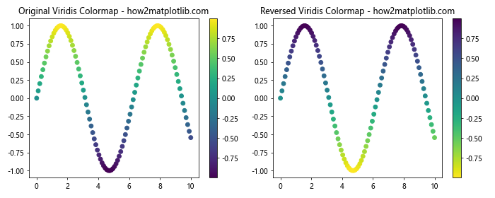
In this example, we create two scatter plots side by side. The left plot uses the original ‘viridis’ colormap, while the right plot uses the reversed ‘viridis_r’ colormap. By simply adding ‘_r’ to the colormap name, we achieve a reversed color scheme.
Method 2: Using plt.cm.get_cmap() and reversed()
Another way to reverse Matplotlib colormaps is by using the plt.cm.get_cmap() function along with the reversed() function. This method provides more flexibility and allows you to reverse custom colormaps as well.
import matplotlib.pyplot as plt
import numpy as np

# Generate sample data
x = np.linspace(0, 10, 100)
y = np.cos(x)

# Get the original 'plasma' colormap
original_cmap = plt.cm.get_cmap('plasma')

# Create a reversed colormap
reversed_cmap = original_cmap.reversed()

# Create a plot with the original and reversed colormaps
plt.figure(figsize=(10, 4))

plt.subplot(121)
plt.imshow(y.reshape(10, 10), cmap=original_cmap)
plt.colorbar()
plt.title('Original Plasma Colormap - how2matplotlib.com')

plt.subplot(122)
plt.imshow(y.reshape(10, 10), cmap=reversed_cmap)
plt.colorbar()
plt.title('Reversed Plasma Colormap - how2matplotlib.com')

plt.tight_layout()
plt.show()
Output:
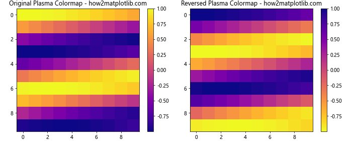
In this example, we use plt.cm.get_cmap('plasma') to get the original ‘plasma’ colormap. We then create a reversed version using the reversed() method. The resulting plots demonstrate the original and reversed colormaps applied to a 2D image.
Method 3: Creating a Custom Reversed Colormap
For more advanced control over your colormaps, you can create a custom reversed colormap using LinearSegmentedColormap from matplotlib.colors.
import matplotlib.pyplot as plt
import numpy as np
from matplotlib.colors import LinearSegmentedColormap

# Define custom colors
colors = ['#ff0000', '#00ff00', '#0000ff']  # Red, Green, Blue

# Create a custom colormap
custom_cmap = LinearSegmentedColormap.from_list('custom_cmap', colors)

# Create a reversed version of the custom colormap
reversed_custom_cmap = LinearSegmentedColormap.from_list('reversed_custom_cmap', colors[::-1])

# Generate sample data
x = np.linspace(0, 10, 100)
y = np.tan(x)

# Create plots with the custom and reversed custom colormaps
plt.figure(figsize=(10, 4))

plt.subplot(121)
plt.scatter(x, y, c=y, cmap=custom_cmap)
plt.colorbar()
plt.title('Custom Colormap - how2matplotlib.com')

plt.subplot(122)
plt.scatter(x, y, c=y, cmap=reversed_custom_cmap)
plt.colorbar()
plt.title('Reversed Custom Colormap - how2matplotlib.com')

plt.tight_layout()
plt.show()
Output:
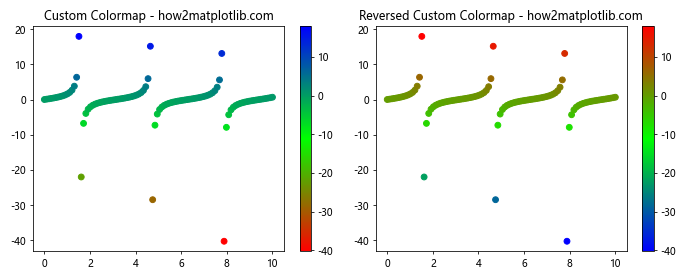
In this example, we define a custom colormap using three colors: red, green, and blue. We create the original colormap using LinearSegmentedColormap.from_list(). To create the reversed version, we simply reverse the order of the colors using colors[::-1]. The resulting plots show the custom colormap and its reversed version applied to a scatter plot.
Applying Reversed Colormaps to Different Plot Types
Now that we’ve explored various methods to reverse Matplotlib colormaps, let’s see how we can apply them to different types of plots.
Heatmaps with Reversed Colormaps
Heatmaps are an excellent way to visualize 2D data, and reversed colormaps can often enhance their readability.
import matplotlib.pyplot as plt
import numpy as np

# Generate sample data
data = np.random.rand(10, 10)

# Create heatmaps with original and reversed colormaps
plt.figure(figsize=(10, 4))

plt.subplot(121)
plt.imshow(data, cmap='coolwarm')
plt.colorbar()
plt.title('Original Coolwarm Heatmap - how2matplotlib.com')

plt.subplot(122)
plt.imshow(data, cmap='coolwarm_r')
plt.colorbar()
plt.title('Reversed Coolwarm Heatmap - how2matplotlib.com')

plt.tight_layout()
plt.show()
Output:
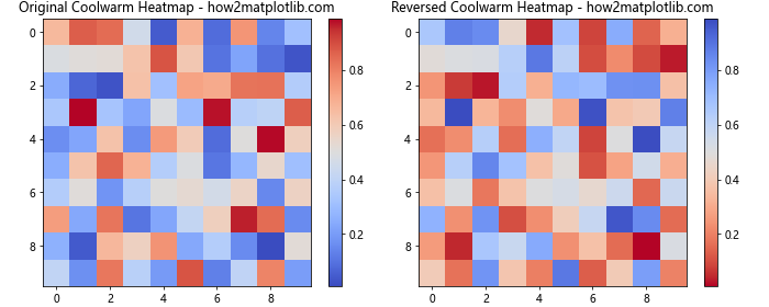
In this example, we create two heatmaps using the ‘coolwarm’ colormap. The left heatmap uses the original colormap, while the right one uses the reversed version. This can be particularly useful when you want to emphasize different ranges of your data.
Contour Plots with Reversed Colormaps
Contour plots are great for visualizing 3D surfaces on a 2D plane. Reversed colormaps can help highlight different features of your data.
import matplotlib.pyplot as plt
import numpy as np

# Generate sample data
x = np.linspace(-3, 3, 100)
y = np.linspace(-3, 3, 100)
X, Y = np.meshgrid(x, y)
Z = np.sin(X) * np.cos(Y)

# Create contour plots with original and reversed colormaps
plt.figure(figsize=(10, 4))

plt.subplot(121)
cs = plt.contourf(X, Y, Z, cmap='viridis')
plt.colorbar(cs)
plt.title('Original Viridis Contour Plot - how2matplotlib.com')

plt.subplot(122)
cs_r = plt.contourf(X, Y, Z, cmap='viridis_r')
plt.colorbar(cs_r)
plt.title('Reversed Viridis Contour Plot - how2matplotlib.com')

plt.tight_layout()
plt.show()
Output:
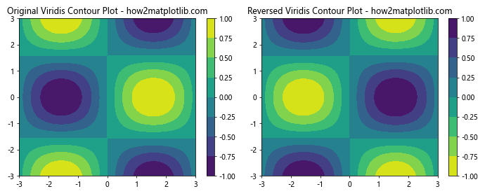
This example demonstrates how reversing the ‘viridis’ colormap affects the appearance of a contour plot. The reversed colormap may make certain contours more prominent, depending on your data.
3D Surface Plots with Reversed Colormaps
For 3D surface plots, reversed colormaps can provide a different perspective on your data’s topology.
import matplotlib.pyplot as plt
import numpy as np
from mpl_toolkits.mplot3d import Axes3D

# Generate sample data
x = np.linspace(-5, 5, 50)
y = np.linspace(-5, 5, 50)
X, Y = np.meshgrid(x, y)
Z = np.sin(np.sqrt(X**2 + Y**2))

# Create 3D surface plots with original and reversed colormaps
fig = plt.figure(figsize=(12, 5))

ax1 = fig.add_subplot(121, projection='3d')
surf1 = ax1.plot_surface(X, Y, Z, cmap='plasma', linewidth=0, antialiased=False)
fig.colorbar(surf1, ax=ax1, shrink=0.5, aspect=5)
ax1.set_title('Original Plasma 3D Surface - how2matplotlib.com')

ax2 = fig.add_subplot(122, projection='3d')
surf2 = ax2.plot_surface(X, Y, Z, cmap='plasma_r', linewidth=0, antialiased=False)
fig.colorbar(surf2, ax=ax2, shrink=0.5, aspect=5)
ax2.set_title('Reversed Plasma 3D Surface - how2matplotlib.com')

plt.tight_layout()
plt.show()
Output:
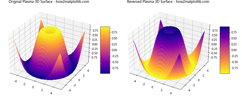
In this example, we create two 3D surface plots using the ‘plasma’ colormap. The left plot uses the original colormap, while the right one uses the reversed version. This can help emphasize different aspects of your 3D data.
Advanced Techniques for Reversing Matplotlib Colormaps
Now that we’ve covered the basics, let’s explore some advanced techniques for reversing and customizing Matplotlib colormaps.
Partially Reversing Colormaps
Sometimes, you may want to reverse only a portion of a colormap. This can be achieved by creating a custom colormap using LinearSegmentedColormap.
import matplotlib.pyplot as plt
import numpy as np
from matplotlib.colors import LinearSegmentedColormap

# Generate sample data
x = np.linspace(0, 10, 100)
y = np.sin(x) * np.cos(x)

# Create a partially reversed colormap
colors = plt.cm.viridis(np.linspace(0, 1, 256))
partial_reversed = np.vstack((colors[:128][::-1], colors[128:]))
partial_reversed_cmap = LinearSegmentedColormap.from_list('partial_reversed', partial_reversed)

# Create plots with original and partially reversed colormaps
plt.figure(figsize=(10, 4))

plt.subplot(121)
plt.scatter(x, y, c=y, cmap='viridis')
plt.colorbar()
plt.title('Original Viridis Colormap - how2matplotlib.com')

plt.subplot(122)
plt.scatter(x, y, c=y, cmap=partial_reversed_cmap)
plt.colorbar()
plt.title('Partially Reversed Viridis Colormap - how2matplotlib.com')

plt.tight_layout()
plt.show()
Output:
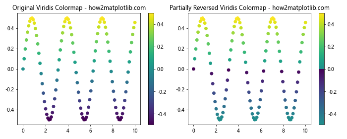
In this example, we create a partially reversed ‘viridis’ colormap by reversing only the first half of the color values. This technique allows for more nuanced control over your colormap’s appearance.
Combining Multiple Colormaps
You can create interesting effects by combining multiple colormaps, including reversed ones.
import matplotlib.pyplot as plt
import numpy as np
from matplotlib.colors import LinearSegmentedColormap

# Generate sample data
x = np.linspace(0, 10, 100)
y = np.exp(-x/10) * np.sin(x)

# Combine original and reversed colormaps
colors1 = plt.cm.viridis(np.linspace(0, 1, 128))
colors2 = plt.cm.plasma_r(np.linspace(0, 1, 128))
combined_colors = np.vstack((colors1, colors2))
combined_cmap = LinearSegmentedColormap.from_list('combined_cmap', combined_colors)

# Create plots with original and combined colormaps
plt.figure(figsize=(10, 4))

plt.subplot(121)
plt.scatter(x, y, c=y, cmap='viridis')
plt.colorbar()
plt.title('Original Viridis Colormap - how2matplotlib.com')

plt.subplot(122)
plt.scatter(x, y, c=y, cmap=combined_cmap)
plt.colorbar()
plt.title('Combined Viridis and Reversed Plasma - how2matplotlib.com')

plt.tight_layout()
plt.show()
Output:
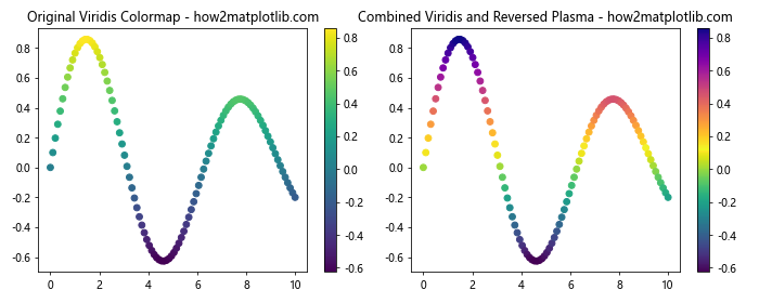
This example demonstrates how to combine the original ‘viridis’ colormap with a reversed ‘plasma’ colormap to create a unique color scheme for your visualization.
Best Practices for Using Reversed Matplotlib Colormaps
When working with reversed Matplotlib colormaps, keep these best practices in mind:
- Consider your data: Choose a colormap (reversed or not) that best represents the nature of your data.
- Think about color perception: Some colormaps may be more perceptually uniform than others when reversed.
- Test for colorblindness: Ensure your reversed colormaps are still accessible to colorblind viewers.
- Be consistent: If you’re creating multiple plots, use consistent colormaps (reversed or not) across related visualizations.
- Provide context: Always include a colorbar to help viewers interpret your reversed colormaps.
Troubleshooting Common Issues with Reversed Colormaps
When working with reversed Matplotlib colormaps, you may encounter some common issues. Here are some problems and their solutions:
Issue 1: Colormap Not Reversing
If you’re having trouble reversing a colormap, make sure you’re using the correct syntax.
import matplotlib.pyplot as plt
import numpy as np

# Generate sample data
x = np.linspace(0, 10, 100)
y = np.sin(x)

# Correct way to reverse a colormap
plt.figure(figsize=(10, 4))

plt.subplot(121)
plt.scatter(x, y, c=y, cmap='viridis_r')  # Note the '_r' suffix
plt.colorbar()
plt.title('Correctly Reversed Viridis - how2matplotlib.com')

# Incorrect way (this won't reverse the colormap)
plt.subplot(122)
plt.scatter(x, y, c=y, cmap='viridis')
plt.gca().invert_yaxis()  # This doesn't reverse the colormap
plt.colorbar()
plt.title('Incorrectly "Reversed" Viridis - how2matplotlib.com')

plt.tight_layoutplt.show()
Output:
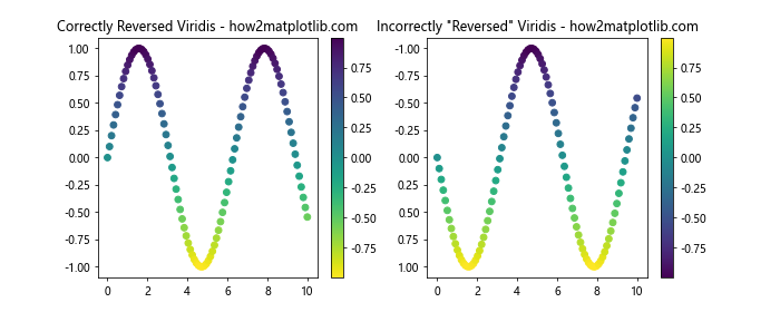
In this example, we demonstrate the correct way to reverse a colormap using the ‘_r’ suffix, and an incorrect attempt that doesn’t actually reverse the colormap.
Advanced Applications of Reversed Matplotlib Colormaps
Let’s explore some advanced applications of reversed Matplotlib colormaps to showcase their versatility and power.
Diverging Colormaps for Correlation Matrices
Reversed diverging colormaps can be particularly useful for visualizing correlation matrices.
import matplotlib.pyplot as plt
import numpy as np
import seaborn as sns

# Generate a sample correlation matrix
np.random.seed(42)
corr_matrix = np.random.rand(10, 10)
corr_matrix = (corr_matrix + corr_matrix.T) / 2
np.fill_diagonal(corr_matrix, 1)

# Create heatmaps with original and reversed diverging colormaps
fig, (ax1, ax2) = plt.subplots(1, 2, figsize=(12, 5))

sns.heatmap(corr_matrix, cmap='RdBu', center=0, ax=ax1)
ax1.set_title('Original RdBu Colormap - how2matplotlib.com')

sns.heatmap(corr_matrix, cmap='RdBu_r', center=0, ax=ax2)
ax2.set_title('Reversed RdBu Colormap - how2matplotlib.com')

plt.tight_layout()
plt.show()
Output:
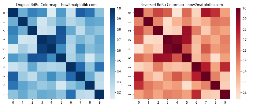
In this example, we use Seaborn to create heatmaps of a correlation matrix. The reversed ‘RdBu’ colormap can help emphasize different aspects of the correlations.
Terrain Visualization with Reversed Colormaps
Reversed colormaps can be effective for visualizing terrain data, especially when you want to emphasize different elevation ranges.
import matplotlib.pyplot as plt
import numpy as np

# Generate sample terrain data
x = np.linspace(0, 10, 100)
y = np.linspace(0, 10, 100)
X, Y = np.meshgrid(x, y)
Z = 2 * np.sin(0.5 * X) * np.cos(0.5 * Y) + np.random.rand(100, 100) * 0.2

# Create terrain plots with original and reversed colormaps
fig, (ax1, ax2) = plt.subplots(1, 2, figsize=(12, 5))

im1 = ax1.imshow(Z, cmap='terrain', extent=[0, 10, 0, 10])
ax1.set_title('Original Terrain Colormap - how2matplotlib.com')
plt.colorbar(im1, ax=ax1)

im2 = ax2.imshow(Z, cmap='terrain_r', extent=[0, 10, 0, 10])
ax2.set_title('Reversed Terrain Colormap - how2matplotlib.com')
plt.colorbar(im2, ax=ax2)

plt.tight_layout()
plt.show()
Output:
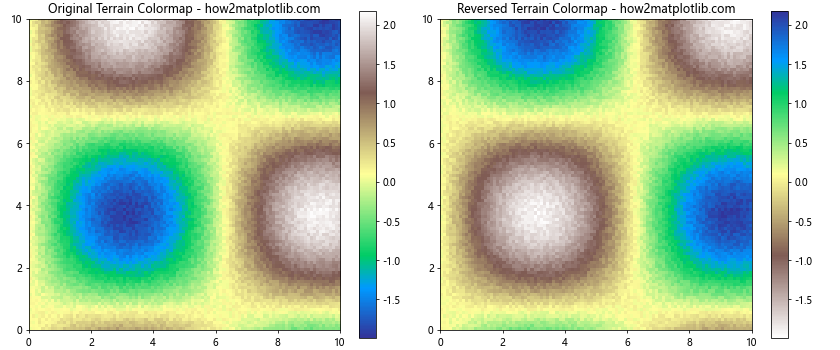
This example demonstrates how reversing the ‘terrain’ colormap can provide a different perspective on elevation data.
Customizing Reversed Colormaps
Sometimes, you may want to create a custom reversed colormap that’s not available in Matplotlib’s built-in options. Here’s how you can do that:
import matplotlib.pyplot as plt
import numpy as np
from matplotlib.colors import LinearSegmentedColormap

# Define custom colors
colors = ['#ff0000', '#00ff00', '#0000ff', '#ffff00']  # Red, Green, Blue, Yellow

# Create a custom colormap
custom_cmap = LinearSegmentedColormap.from_list('custom_cmap', colors)

# Create a reversed version of the custom colormap
reversed_custom_cmap = LinearSegmentedColormap.from_list('reversed_custom_cmap', colors[::-1])

# Generate sample data
x = np.linspace(0, 10, 100)
y = np.sin(x) * np.exp(-x/10)

# Create plots with custom and reversed custom colormaps
plt.figure(figsize=(10, 4))

plt.subplot(121)
plt.scatter(x, y, c=y, cmap=custom_cmap)
plt.colorbar()
plt.title('Custom Colormap - how2matplotlib.com')

plt.subplot(122)
plt.scatter(x, y, c=y, cmap=reversed_custom_cmap)
plt.colorbar()
plt.title('Reversed Custom Colormap - how2matplotlib.com')

plt.tight_layout()
plt.show()
Output:
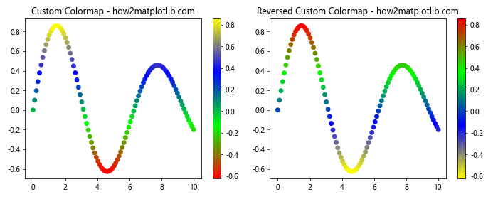
This example shows how to create a custom colormap and its reversed version using LinearSegmentedColormap.
Comparing Multiple Reversed Colormaps
When working on a project, you might want to compare several reversed colormaps to find the best one for your data. Here’s how you can do that:
import matplotlib.pyplot as plt
import numpy as np

# Generate sample data
x = np.linspace(0, 10, 100)
y = np.linspace(0, 10, 100)
X, Y = np.meshgrid(x, y)
Z = np.sin(X) * np.cos(Y)

# List of colormaps to compare
cmaps = ['viridis_r', 'plasma_r', 'inferno_r', 'magma_r']

# Create a grid of plots
fig, axes = plt.subplots(2, 2, figsize=(12, 10))
axes = axes.flatten()

for ax, cmap in zip(axes, cmaps):
    im = ax.imshow(Z, cmap=cmap)
    ax.set_title(f'{cmap} - how2matplotlib.com')
    plt.colorbar(im, ax=ax)

plt.tight_layout()
plt.show()
Output:
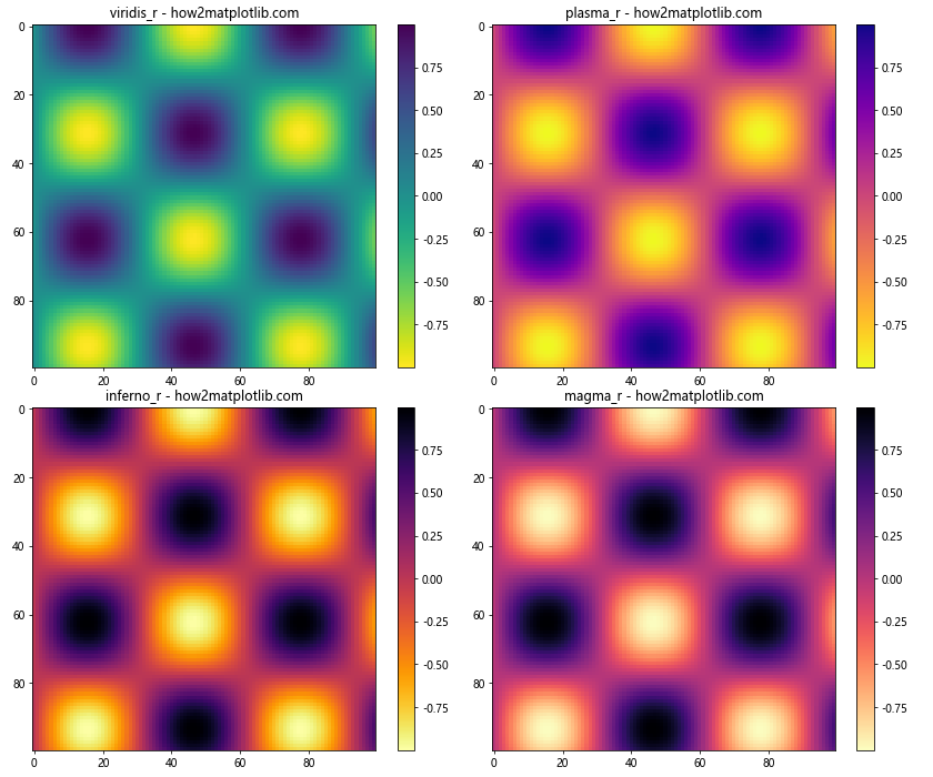
This example creates a grid of plots, each using a different reversed colormap, allowing for easy comparison.
Matplotlib colormaps reverse Conclusion
Reversing Matplotlib colormaps is a powerful technique that can enhance your data visualizations and provide new insights into your data. By understanding the various methods to reverse colormaps, applying them to different plot types, and following best practices, you can create more effective and visually appealing plots.
Remember that the choice of colormap, reversed or not, should always be guided by the nature of your data and the message you want to convey. Experiment with different colormaps and their reversed versions to find the best representation for your specific use case.