Comprehensive Guide to Matplotlib Colormaps Names: How to Enhance Your Data Visualization
Matplotlib colormaps names are an essential aspect of data visualization in Python. Colormaps in Matplotlib provide a way to map numerical values to colors, allowing for effective representation of data in plots and charts. This article will delve deep into the world of Matplotlib colormaps names, exploring their types, usage, and best practices for creating stunning visualizations.
Understanding Matplotlib Colormaps Names
Matplotlib colormaps names refer to the predefined color schemes available in the Matplotlib library. These colormaps are used to assign colors to data points based on their values, creating visually appealing and informative plots. Matplotlib offers a wide variety of colormaps, each with its own unique name and color palette.
Let’s start with a simple example to demonstrate how to use Matplotlib colormaps names:
import matplotlib.pyplot as plt
import numpy as np

# Create sample data
x = np.linspace(0, 10, 100)
y = np.sin(x)

# Create a plot using the 'viridis' colormap
plt.figure(figsize=(10, 6))
plt.scatter(x, y, c=y, cmap='viridis')
plt.colorbar(label='Value')
plt.title('Scatter plot using viridis colormap - how2matplotlib.com')
plt.xlabel('X-axis')
plt.ylabel('Y-axis')
plt.show()
Output:
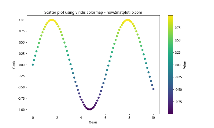
In this example, we use the ‘viridis’ colormap to color the scatter plot points based on their y-values. The cmap parameter in the scatter function specifies the colormap name.
Types of Matplotlib Colormaps Names
Matplotlib colormaps names can be categorized into several types based on their intended use and color progression. Understanding these types will help you choose the most appropriate colormap for your data visualization needs.
Sequential Colormaps
Sequential Matplotlib colormaps names are designed to represent data that progresses from low to high values. These colormaps typically use a single hue that varies in lightness or saturation. Some popular sequential Matplotlib colormaps names include ‘viridis’, ‘plasma’, ‘inferno’, and ‘magma’.
Here’s an example using the ‘plasma’ colormap:
import matplotlib.pyplot as plt
import numpy as np

# Create sample data
x = np.linspace(0, 10, 20)
y = np.linspace(0, 10, 20)
X, Y = np.meshgrid(x, y)
Z = np.sin(X) * np.cos(Y)

# Create a plot using the 'plasma' colormap
plt.figure(figsize=(10, 8))
plt.pcolormesh(X, Y, Z, cmap='plasma')
plt.colorbar(label='Value')
plt.title('Heatmap using plasma colormap - how2matplotlib.com')
plt.xlabel('X-axis')
plt.ylabel('Y-axis')
plt.show()
Output:
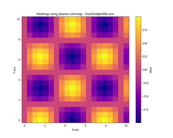
This example demonstrates the use of the ‘plasma’ colormap in a heatmap visualization.
Diverging Colormaps
Diverging Matplotlib colormaps names are useful for data that has a meaningful center point or zero value. These colormaps typically use two different hues that diverge from a neutral color in the middle. Examples of diverging Matplotlib colormaps names include ‘coolwarm’, ‘RdYlBu’, and ‘BrBG’.
Let’s create a plot using the ‘coolwarm’ colormap:
import matplotlib.pyplot as plt
import numpy as np

# Create sample data
x = np.linspace(-5, 5, 100)
y = np.linspace(-5, 5, 100)
X, Y = np.meshgrid(x, y)
Z = X * Y

# Create a plot using the 'coolwarm' colormap
plt.figure(figsize=(10, 8))
plt.contourf(X, Y, Z, cmap='coolwarm', levels=20)
plt.colorbar(label='Value')
plt.title('Contour plot using coolwarm colormap - how2matplotlib.com')
plt.xlabel('X-axis')
plt.ylabel('Y-axis')
plt.show()
Output:
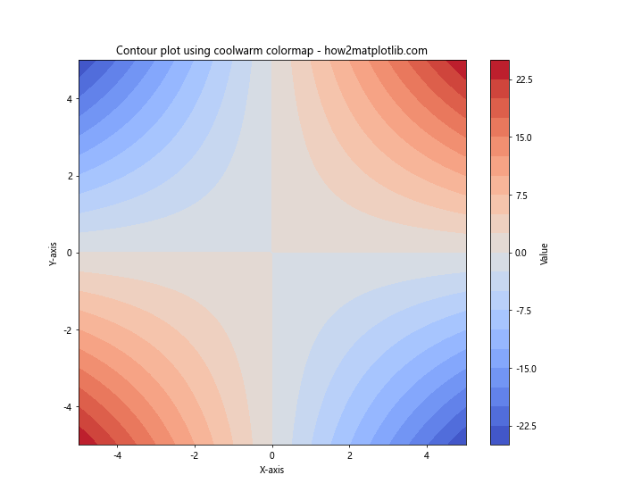
This example showcases the ‘coolwarm’ colormap in a contour plot, highlighting the diverging nature of the data.
Qualitative Colormaps
Qualitative Matplotlib colormaps names are designed for categorical data where there is no inherent ordering. These colormaps use distinct colors to represent different categories. Examples of qualitative Matplotlib colormaps names include ‘Set1’, ‘Set2’, ‘Set3’, and ‘Paired’.
Here’s an example using the ‘Set3’ colormap:
import matplotlib.pyplot as plt
import numpy as np

# Create sample data
categories = ['A', 'B', 'C', 'D', 'E']
values = [23, 45, 56, 78, 32]

# Create a bar plot using the 'Set3' colormap
plt.figure(figsize=(10, 6))
bars = plt.bar(categories, values, color=plt.cm.Set3(np.linspace(0, 1, len(categories))))
plt.colorbar(plt.cm.ScalarMappable(cmap='Set3'), label='Category')
plt.title('Bar plot using Set3 colormap - how2matplotlib.com')
plt.xlabel('Categories')
plt.ylabel('Values')
plt.show()
This example demonstrates the use of the ‘Set3’ colormap in a bar plot to represent different categories.
Customizing Matplotlib Colormaps Names
While Matplotlib provides a wide range of predefined colormaps, you can also create custom colormaps to suit your specific needs. This section will explore various ways to customize Matplotlib colormaps names.
Creating a Custom Colormap
You can create a custom colormap by defining a list of colors and using the LinearSegmentedColormap class from Matplotlib. Here’s an example:
import matplotlib.pyplot as plt
import matplotlib.colors as mcolors
import numpy as np

# Define custom colors
colors = ['#FF0000', '#00FF00', '#0000FF']  # Red, Green, Blue

# Create a custom colormap
n_bins = 100
cmap = mcolors.LinearSegmentedColormap.from_list('custom_cmap', colors, N=n_bins)

# Create sample data
x = np.linspace(0, 10, 100)
y = np.sin(x)

# Create a plot using the custom colormap
plt.figure(figsize=(10, 6))
plt.scatter(x, y, c=y, cmap=cmap)
plt.colorbar(label='Value')
plt.title('Scatter plot using custom colormap - how2matplotlib.com')
plt.xlabel('X-axis')
plt.ylabel('Y-axis')
plt.show()
Output:
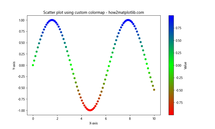
This example creates a custom colormap that transitions from red to green to blue.
Reversing a Colormap
You can easily reverse any Matplotlib colormap by appending ‘_r’ to its name. This is useful when you want to invert the color progression of a colormap.
import matplotlib.pyplot as plt
import numpy as np

# Create sample data
x = np.linspace(0, 10, 100)
y = np.cos(x)

# Create plots using original and reversed colormaps
fig, (ax1, ax2) = plt.subplots(1, 2, figsize=(15, 6))

ax1.scatter(x, y, c=y, cmap='viridis')
ax1.set_title('Original viridis colormap - how2matplotlib.com')
ax1.set_xlabel('X-axis')
ax1.set_ylabel('Y-axis')
plt.colorbar(ax1.collections[0], ax=ax1, label='Value')

ax2.scatter(x, y, c=y, cmap='viridis_r')
ax2.set_title('Reversed viridis colormap - how2matplotlib.com')
ax2.set_xlabel('X-axis')
ax2.set_ylabel('Y-axis')
plt.colorbar(ax2.collections[0], ax=ax2, label='Value')

plt.tight_layout()
plt.show()
Output:
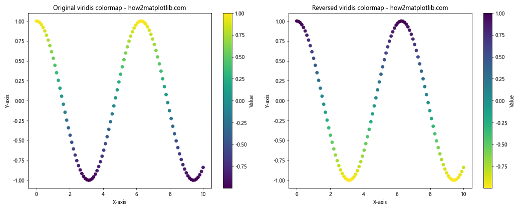
This example demonstrates the difference between the original ‘viridis’ colormap and its reversed version ‘viridis_r’.
Best Practices for Using Matplotlib Colormaps Names
When working with Matplotlib colormaps names, it’s important to follow some best practices to ensure your visualizations are effective and accessible. Here are some key considerations:
Choosing the Right Colormap
Selecting the appropriate Matplotlib colormap name for your data is crucial. Consider the following guidelines:
- Use sequential colormaps for data that progresses from low to high values.
- Use diverging colormaps for data with a meaningful center point or zero value.
- Use qualitative colormaps for categorical data without inherent ordering.
Here’s an example demonstrating the use of different colormaps for different types of data:
import matplotlib.pyplot as plt
import numpy as np

# Create sample data
x = np.linspace(0, 10, 100)
y1 = np.exp(x/5)
y2 = np.sin(x)
categories = ['A', 'B', 'C', 'D', 'E']
values = [23, 45, 56, 78, 32]

# Create subplots
fig, (ax1, ax2, ax3) = plt.subplots(1, 3, figsize=(18, 6))

# Sequential colormap for exponential data
im1 = ax1.scatter(x, y1, c=y1, cmap='viridis')
ax1.set_title('Sequential: viridis - how2matplotlib.com')
ax1.set_xlabel('X-axis')
ax1.set_ylabel('Y-axis')
plt.colorbar(im1, ax=ax1, label='Value')

# Diverging colormap for sinusoidal data
im2 = ax2.scatter(x, y2, c=y2, cmap='coolwarm')
ax2.set_title('Diverging: coolwarm - how2matplotlib.com')
ax2.set_xlabel('X-axis')
ax2.set_ylabel('Y-axis')
plt.colorbar(im2, ax=ax2, label='Value')

# Qualitative colormap for categorical data
im3 = ax3.bar(categories, values, color=plt.cm.Set3(np.linspace(0, 1, len(categories))))
ax3.set_title('Qualitative: Set3 - how2matplotlib.com')
ax3.set_xlabel('Categories')
ax3.set_ylabel('Values')
plt.colorbar(plt.cm.ScalarMappable(cmap='Set3'), ax=ax3, label='Category')

plt.tight_layout()
plt.show()
Output:
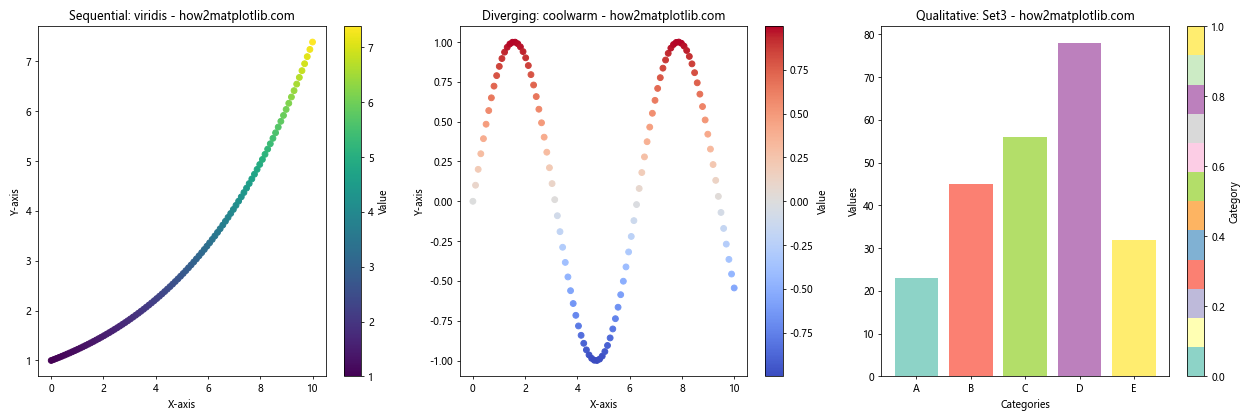
This example showcases the appropriate use of different colormaps for various types of data.
Considering Color Blindness
When choosing Matplotlib colormaps names, it’s important to consider color blindness to ensure your visualizations are accessible to all viewers. Some colormaps, such as ‘viridis’, ‘plasma’, and ‘cividis’, are designed to be perceptually uniform and color-blind friendly.
Here’s an example comparing a color-blind friendly colormap with a potentially problematic one:
import matplotlib.pyplot as plt
import numpy as np

# Create sample data
x = np.linspace(0, 10, 100)
y = np.linspace(0, 10, 100)
X, Y = np.meshgrid(x, y)
Z = np.sin(X) * np.cos(Y)

# Create subplots
fig, (ax1, ax2) = plt.subplots(1, 2, figsize=(15, 6))

# Color-blind friendly colormap: viridis
im1 = ax1.pcolormesh(X, Y, Z, cmap='viridis')
ax1.set_title('Color-blind friendly: viridis - how2matplotlib.com')
ax1.set_xlabel('X-axis')
ax1.set_ylabel('Y-axis')
plt.colorbar(im1, ax=ax1, label='Value')

# Potentially problematic colormap: jet
im2 = ax2.pcolormesh(X, Y, Z, cmap='jet')
ax2.set_title('Potentially problematic: jet - how2matplotlib.com')
ax2.set_xlabel('X-axis')
ax2.set_ylabel('Y-axis')
plt.colorbar(im2, ax=ax2, label='Value')

plt.tight_layout()
plt.show()
Output:
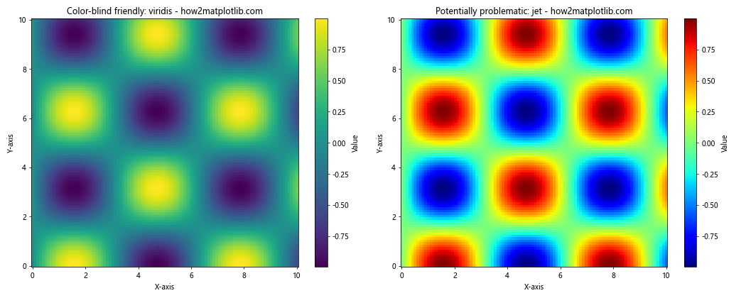
This example compares the color-blind friendly ‘viridis’ colormap with the potentially problematic ‘jet’ colormap.
Advanced Techniques with Matplotlib Colormaps Names
Now that we’ve covered the basics of Matplotlib colormaps names, let’s explore some advanced techniques to further enhance your data visualizations.
Combining Multiple Colormaps
In some cases, you may want to use different colormaps for different parts of your visualization. Matplotlib allows you to combine multiple colormaps in a single plot. Here’s an example:
import matplotlib.pyplot as plt
import numpy as np
from matplotlib.colors import LinearSegmentedColormap

# Create sample data
x = np.linspace(0, 10, 100)
y1 = np.sin(x)
y2 = np.cos(x)

# Create a custom colormap by combining two existing colormaps
cmap1 = plt.get_cmap('viridis')
cmap2 = plt.get_cmap('plasma')
colors1 = cmap1(np.linspace(0., 1, 128))
colors2 = cmap2(np.linspace(0, 1, 128))
colors = np.vstack((colors1, colors2))
combined_cmap = LinearSegmentedColormap.from_list('combined_cmap', colors)

# Create the plot
plt.figure(figsize=(12, 6))
plt.scatter(x, y1, c=y1, cmap=cmap1, label='Sin')
plt.scatter(x, y2, c=y2, cmap=cmap2, label='Cos')
plt.colorbar(label='Value', cmap=combined_cmap)
plt.title('Combining multiple colormaps - how2matplotlib.com')
plt.xlabel('X-axis')
plt.ylabel('Y-axis')
plt.legend()
plt.show()
Output:
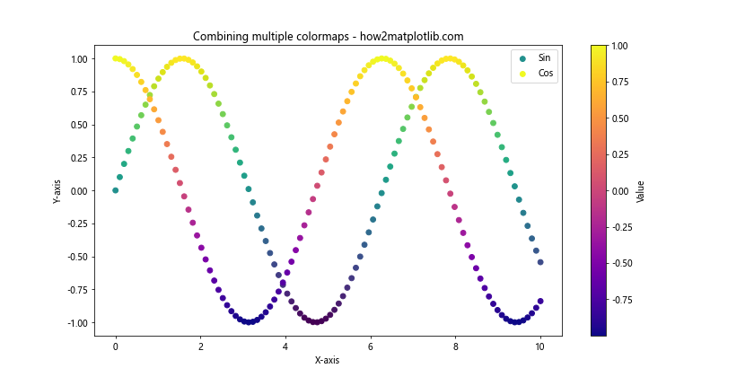
This example demonstrates how to combine the ‘viridis’ and ‘plasma’ colormaps to create a custom colormap for a plot with two different datasets.
Using Discrete Colormaps
While continuous colormaps are common, sometimes you may want to use discrete colors for specific value ranges. Matplotlib allows you to create discrete colormaps using the BoundaryNorm class. Here’s an example:
import matplotlib.pyplot as plt
import numpy as np
from matplotlib.colors import BoundaryNorm

# Create sample data
x = np.linspace(0, 10, 100)
y = np.linspace(0, 10, 100)
X, Y = np.meshgrid(x, y)
Z = np.sin(X) * np.cos(Y)

# Define discrete color boundaries and labels
boundaries = [-1, -0.5, 0, 0.5, 1]
labels = ['Very Low', 'Low', 'Medium', 'High']

# Create a discrete colormap
cmap = plt.get_cmap('RdYlBu')
norm = BoundaryNorm(boundaries, cmap.N, clip=True)

# Create the plot
plt.figure(figsize=(10, 8))
im = plt.pcolormesh(X, Y, Z, cmap=cmap, norm=norm)
plt.colorbar(im, label='Value', ticks=boundaries[:-1] + np.diff(boundaries)/2)
plt.clim(boundaries[0], boundaries[-1])
plt.title('Discrete colormap - how2matplotlib.com')
plt.xlabel('X-axis')
plt.ylabel('Y-axis')

# Add custom labels to the colorbar
cbar = plt.gca().collections[0].colorbar
cbar.set_ticks(boundaries[:-1] + np.diff(boundaries)/2)
cbar.set_ticklabels(labels)

plt.show()
Output:
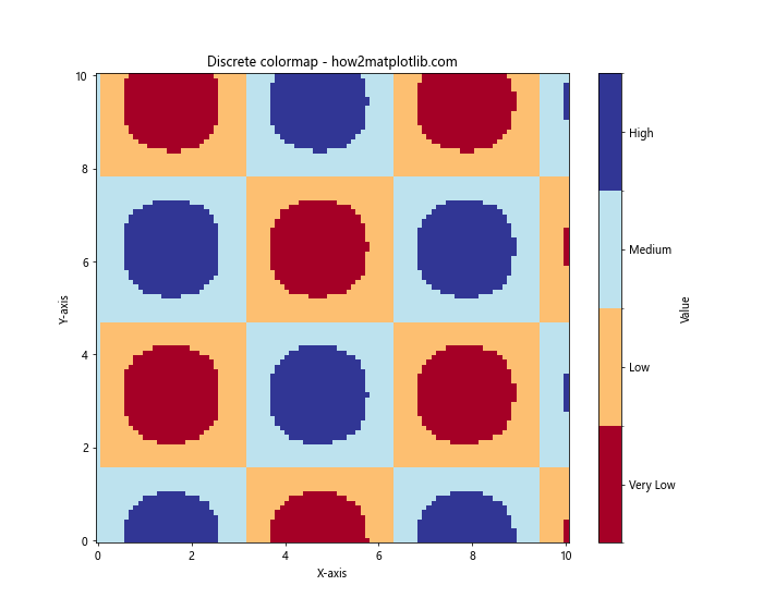
This example demonstrates how to create a discrete colormap with custom boundaries and labels, which can be useful for categorizing data into specific ranges.
Exploring Less Common Matplotlib Colormaps Names
While we’ve covered some of the most popular Matplotlib colormaps names, there are many more available that can be useful in specific situations. Let’s explore some less common but equally valuable colormaps.
Perceptually Uniform Colormaps
Perceptually uniform colormaps are designed to represent data in a way that is consistent with human perception of color differences. Some examples include ‘cividis’, ‘twilight’, and ‘twilight_shifted’. Here’s an example using the ‘cividis’ colormap:
import matplotlib.pyplot as plt
import numpy as np

# Create sample data
x = np.linspace(0, 10, 100)
y = np.linspace(0, 10, 100)
X, Y = np.meshgrid(x, y)
Z = np.sin(X) * np.cos(Y)

# Create a plot using the 'cividis' colormap
plt.figure(figsize=(10, 8))
plt.pcolormesh(X, Y, Z, cmap='cividis')
plt.colorbar(label='Value')
plt.title('Perceptually uniform colormap: cividis - how2matplotlib.com')
plt.xlabel('X-axis')
plt.ylabel('Y-axis')
plt.show()
Output:
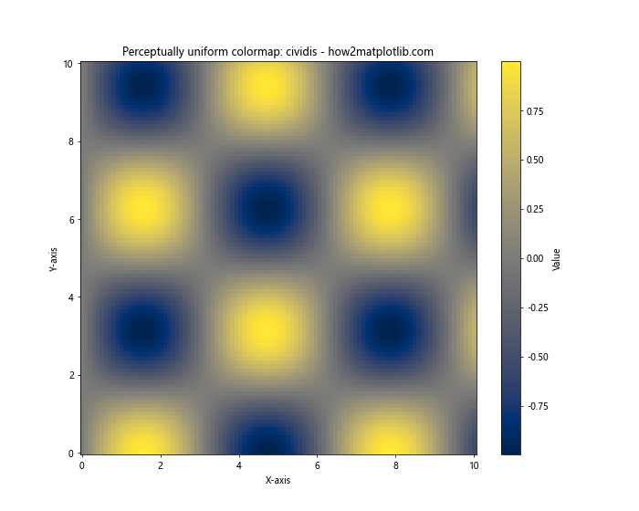
This example showcases the ‘cividis’ colormap, which is designed to be perceptually uniform and color-blind friendly.
Cyclic Colormaps
Cyclic colormaps are useful for data that wraps around, such as angles or phases. Examples include ‘hsv’, ‘twilight’, and ‘twilight_shifted’. Here’s an example using the ‘twilight’ colormap:
import matplotlib.pyplot as plt
import numpy as np

# Create sample data
theta = np.linspace(0, 2*np.pi, 100)
r = np.linspace(0, 1, 100)
T, R = np.meshgrid(theta, r)
Z = np.sin(5*T)

# Create a polar plot using the 'twilight' colormap
plt.figure(figsize=(10, 8))
ax = plt.subplot(projection='polar')
im = ax.pcolormesh(T, R, Z, cmap='twilight')
plt.colorbar(im, label='Value')
plt.title('Cyclic colormap: twilight - how2matplotlib.com')
plt.show()
Output:
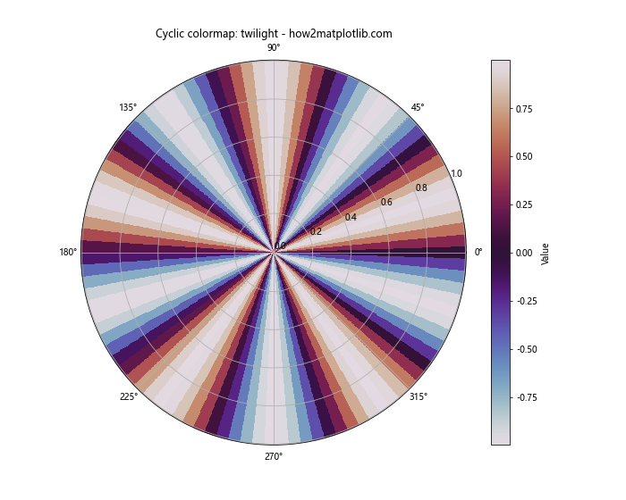
This example demonstrates the use of the ‘twilight’ cyclic colormap in a polar plot, which is particularly suitable for angular data.
Matplotlib Colormaps Names and Data Types
Different types of data may benefit from specific Matplotlib colormaps names. Let’s explore how to choose the right colormap for various data types.
Continuous Data
For continuous data, sequential or diverging colormaps are often the best choice. Here’s an example using a sequential colormap for continuous data:
import matplotlib.pyplot as plt
import numpy as np

# Create sample continuous data
x = np.linspace(0, 10, 100)
y = np.linspace(0, 10, 100)
X, Y = np.meshgrid(x, y)
Z = np.sqrt(X**2 + Y**2)

# Create a plot using the 'viridis' colormap for continuous data
plt.figure(figsize=(10, 8))
plt.pcolormesh(X, Y, Z, cmap='viridis')
plt.colorbar(label='Distance from origin')
plt.title('Continuous data with viridis colormap - how2matplotlib.com')
plt.xlabel('X-axis')
plt.ylabel('Y-axis')
plt.show()
Output:
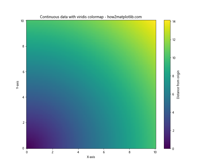
This example uses the ‘viridis’ colormap to represent continuous distance data.
Discrete Data
For discrete or categorical data, qualitative colormaps are often the best choice. Here’s an example using a qualitative colormap for discrete data:
import matplotlib.pyplot as plt
import numpy as np

# Create sample discrete data
categories = ['Category A', 'Category B', 'Category C', 'Category D', 'Category E']
values = [23, 45, 56, 78, 32]

# Create a bar plot using the 'Set3' qualitative colormap
plt.figure(figsize=(10, 6))
bars = plt.bar(categories, values, color=plt.cm.Set3(np.linspace(0, 1, len(categories))))
plt.colorbar(plt.cm.ScalarMappable(cmap='Set3'), label='Category')
plt.title('Discrete data with Set3 colormap - how2matplotlib.com')
plt.xlabel('Categories')
plt.ylabel('Values')
plt.xticks(rotation=45)
plt.show()
This example uses the ‘Set3’ qualitative colormap to represent discrete categorical data.
Matplotlib Colormaps Names in 3D Plots
Matplotlib colormaps names can also be applied to 3D plots, adding an extra dimension of information to your visualizations. Let’s explore how to use colormaps in 3D plots.
Surface Plots
Here’s an example of using a colormap in a 3D surface plot:
import matplotlib.pyplot as plt
import numpy as np
from mpl_toolkits.mplot3d import Axes3D

# Create sample data
x = np.linspace(-5, 5, 100)
y = np.linspace(-5, 5, 100)
X, Y = np.meshgrid(x, y)
Z = np.sin(np.sqrt(X**2 + Y**2))

# Create a 3D surface plot using the 'plasma' colormap
fig = plt.figure(figsize=(12, 8))
ax = fig.add_subplot(111, projection='3d')
surf = ax.plot_surface(X, Y, Z, cmap='plasma', linewidth=0, antialiased=False)
fig.colorbar(surf, shrink=0.5, aspect=5, label='Value')
ax.set_title('3D surface plot with plasma colormap - how2matplotlib.com')
ax.set_xlabel('X-axis')
ax.set_ylabel('Y-axis')
ax.set_zlabel('Z-axis')
plt.show()
Output:
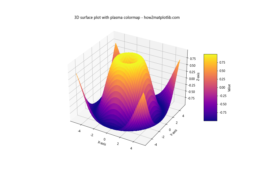
This example demonstrates how to apply the ‘plasma’ colormap to a 3D surface plot, enhancing the visualization of the surface’s height.
Scatter Plots in 3D
Colormaps can also be applied to 3D scatter plots. Here’s an example:
import matplotlib.pyplot as plt
import numpy as np
from mpl_toolkits.mplot3d import Axes3D

# Create sample data
n = 1000
x = np.random.rand(n)
y = np.random.rand(n)
z = np.random.rand(n)
colors = np.sqrt(x**2 + y**2 + z**2)

# Create a 3D scatter plot using the 'viridis' colormap
fig = plt.figure(figsize=(12, 8))
ax = fig.add_subplot(111, projection='3d')
scatter = ax.scatter(x, y, z, c=colors, cmap='viridis')
fig.colorbar(scatter, label='Distance from origin')
ax.set_title('3D scatter plot with viridis colormap - how2matplotlib.com')
ax.set_xlabel('X-axis')
ax.set_ylabel('Y-axis')
ax.set_zlabel('Z-axis')
plt.show()
Output:
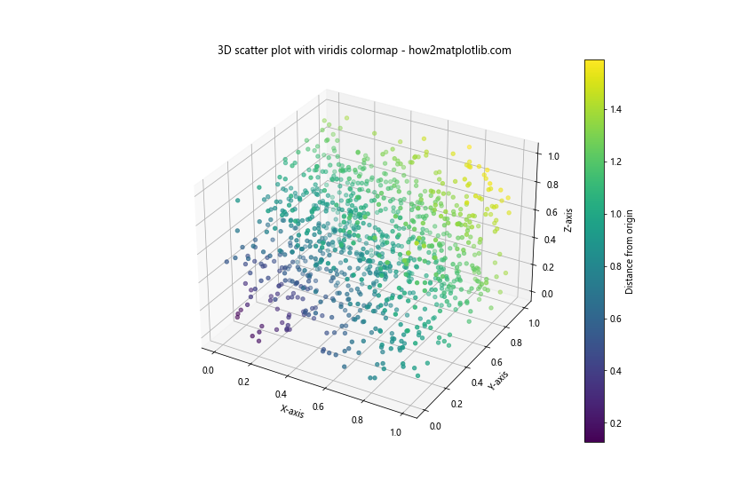
This example shows how to use the ‘viridis’ colormap in a 3D scatter plot, where the color represents the distance of each point from the origin.
Matplotlib colormaps names Conclusion
Matplotlib colormaps names are a powerful tool for enhancing data visualizations in Python. From basic plots to advanced 3D visualizations and animations, colormaps provide an effective way to represent additional dimensions of data through color. By understanding the different types of Matplotlib colormaps names, their appropriate uses, and best practices, you can create more informative and visually appealing plots.
Remember to consider the nature of your data when choosing a colormap, and always keep accessibility in mind by using perceptually uniform and color-blind friendly options when possible. With the wide variety of Matplotlib colormaps names available and the ability to create custom colormaps, you have the flexibility to tailor your visualizations to best represent your data and convey your message effectively.