How to Master Matplotlib Axvline: A Comprehensive Guide for Data Visualization
Matplotlib axvline is a powerful tool for adding vertical lines to your plots in Python. This comprehensive guide will explore the various aspects of matplotlib axvline, providing you with the knowledge and skills to enhance your data visualization projects. We’ll cover everything from basic usage to advanced techniques, ensuring you become proficient in utilizing matplotlib axvline for your plotting needs.
Matplotlib axvline Recommended Articles
- matplotlib axvline color
- matplotlib axvline datetime
- matplotlib axvline label
- matplotlib axvline multiple lines
Understanding the Basics of Matplotlib Axvline
Matplotlib axvline is a function that allows you to add vertical lines to your plots. It’s particularly useful for highlighting specific x-axis values or creating visual separators in your charts. The axvline function is part of the matplotlib.pyplot module, which is commonly imported as plt.
Let’s start with a simple example to demonstrate the basic usage of matplotlib axvline:
import matplotlib.pyplot as plt
import numpy as np

x = np.linspace(0, 10, 100)
y = np.sin(x)

plt.plot(x, y)
plt.axvline(x=5, color='r', linestyle='--', label='Vertical Line')
plt.title('Simple Matplotlib Axvline Example - how2matplotlib.com')
plt.legend()
plt.show()
Output:
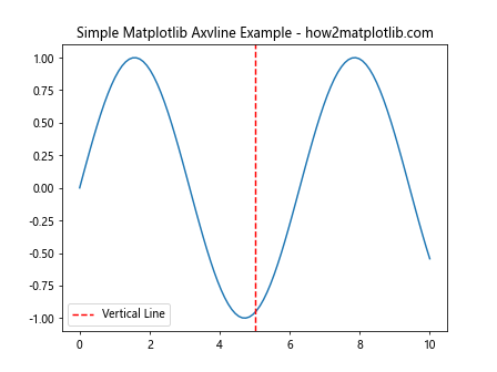
In this example, we create a simple sine wave plot and add a vertical line at x=5 using matplotlib axvline. The line is red, dashed, and labeled “Vertical Line”. This demonstrates the basic syntax and parameters of the axvline function.
Customizing Matplotlib Axvline Appearance
One of the strengths of matplotlib axvline is its flexibility in terms of customization. You can adjust various properties of the vertical line to suit your visualization needs. Let’s explore some of these customization options:
Changing Line Color and Style
You can easily modify the color and style of the vertical line using the ‘color’ and ‘linestyle’ parameters:
import matplotlib.pyplot as plt
import numpy as np

x = np.linspace(0, 10, 100)
y = np.cos(x)

plt.plot(x, y)
plt.axvline(x=3, color='g', linestyle=':', linewidth=2)
plt.axvline(x=7, color='b', linestyle='-.', linewidth=1.5)
plt.title('Customized Matplotlib Axvline - how2matplotlib.com')
plt.show()
Output:
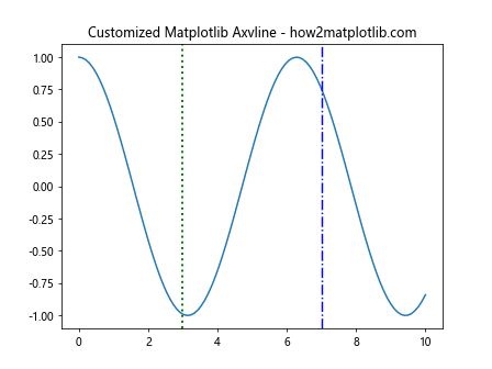
In this example, we’ve added two vertical lines with different colors, styles, and widths. The first line at x=3 is green, dotted, and thicker, while the second line at x=7 is blue, dash-dotted, and slightly thinner.
Adding Labels and Annotations
Matplotlib axvline can be enhanced with labels and annotations to provide more context to your plots:
import matplotlib.pyplot as plt
import numpy as np

x = np.linspace(0, 10, 100)
y = np.exp(-x/10) * np.sin(x)

plt.plot(x, y)
plt.axvline(x=5, color='r', label='Peak')
plt.text(5.1, 0.5, 'Important Point', rotation=90, va='center')
plt.title('Matplotlib Axvline with Labels - how2matplotlib.com')
plt.legend()
plt.show()
Output:
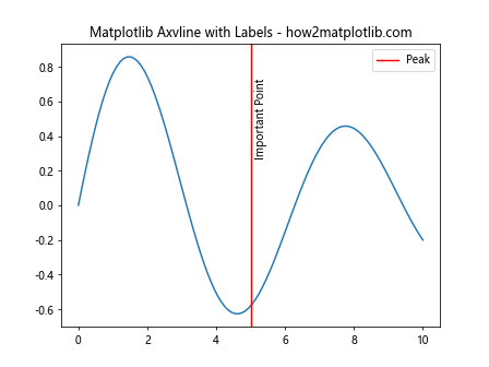
Here, we’ve added a label to the vertical line and used the plt.text() function to add an annotation next to it. The rotation parameter is set to 90 degrees to align the text vertically.
Using Matplotlib Axvline in Multiple Subplots
Matplotlib axvline can be used effectively in plots with multiple subplots. This is particularly useful when you want to highlight the same x-value across different plots:
import matplotlib.pyplot as plt
import numpy as np

x = np.linspace(0, 10, 100)
y1 = np.sin(x)
y2 = np.cos(x)

fig, (ax1, ax2) = plt.subplots(2, 1, sharex=True)
ax1.plot(x, y1)
ax2.plot(x, y2)

plt.axvline(x=5, color='r', linestyle='--', linewidth=2)
ax1.set_title('Sine Wave - how2matplotlib.com')
ax2.set_title('Cosine Wave - how2matplotlib.com')
plt.tight_layout()
plt.show()
Output:
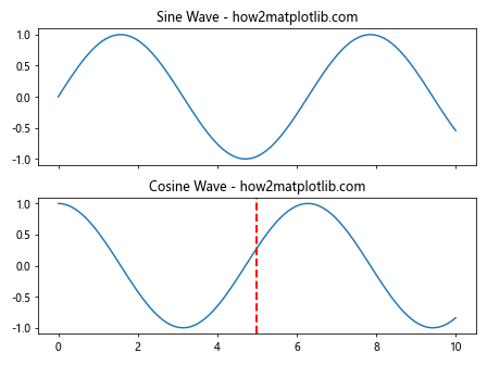
In this example, we create two subplots sharing the same x-axis. The matplotlib axvline is added to both plots simultaneously, creating a visual connection between them.
Combining Matplotlib Axvline with Other Plot Elements
Matplotlib axvline can be combined with other plot elements to create more informative visualizations. Let’s explore some combinations:
Axvline with Filled Areas
You can use matplotlib axvline in conjunction with plt.fill_between() to highlight specific regions of your plot:
import matplotlib.pyplot as plt
import numpy as np

x = np.linspace(0, 10, 100)
y = np.sin(x)

plt.plot(x, y)
plt.axvline(x=3, color='r', linestyle='--')
plt.axvline(x=7, color='r', linestyle='--')
plt.fill_between(x, y, where=(x > 3) & (x < 7), alpha=0.3)
plt.title('Matplotlib Axvline with Filled Area - how2matplotlib.com')
plt.show()
Output:
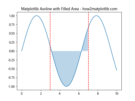
This example uses two matplotlib axvline calls to create vertical lines at x=3 and x=7, and then fills the area between these lines using plt.fill_between().
Axvline with Annotations and Arrows
Combining matplotlib axvline with annotations and arrows can create highly informative plots:
import matplotlib.pyplot as plt
import numpy as np

x = np.linspace(0, 10, 100)
y = np.sin(x) * np.exp(-x/10)

plt.plot(x, y)
plt.axvline(x=4.5, color='g', linestyle='--')
plt.annotate('Maximum', xy=(4.5, 0.6), xytext=(6, 0.8),
             arrowprops=dict(facecolor='black', shrink=0.05))
plt.title('Matplotlib Axvline with Annotation - how2matplotlib.com')
plt.show()
Output:
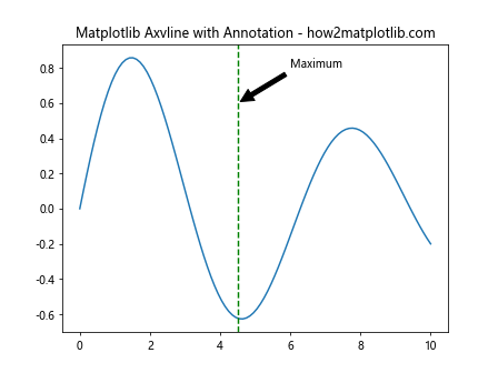
In this example, we use matplotlib axvline to mark a specific x-value and then add an annotation with an arrow pointing to that line.
Advanced Techniques with Matplotlib Axvline
As you become more comfortable with matplotlib axvline, you can explore more advanced techniques to create sophisticated visualizations:
Using Axvline in Logarithmic Plots
Matplotlib axvline works seamlessly with logarithmic scales:
import matplotlib.pyplot as plt
import numpy as np

x = np.logspace(0, 3, 100)
y = np.log10(x)

plt.semilogx(x, y)
plt.axvline(x=100, color='r', linestyle='--')
plt.title('Matplotlib Axvline in Logarithmic Plot - how2matplotlib.com')
plt.show()
Output:
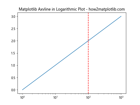
This example demonstrates how matplotlib axvline can be used in a semi-logarithmic plot to highlight a specific x-value.
Creating Dynamic Axvlines
You can create dynamic vertical lines that respond to user input or data changes:
import matplotlib.pyplot as plt
import numpy as np

x = np.linspace(0, 10, 100)
y = np.sin(x)

fig, ax = plt.subplots()
ax.plot(x, y)

line = ax.axvline(x=0, color='r', linestyle='--')

def update_line(event):
    if event.xdata is not None:
        line.set_xdata(event.xdata)
        fig.canvas.draw()

fig.canvas.mpl_connect('motion_notify_event', update_line)
plt.title('Dynamic Matplotlib Axvline - how2matplotlib.com')
plt.show()
Output:
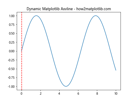
This interactive example creates a vertical line that follows the mouse cursor as it moves across the plot.
Matplotlib Axvline in Statistical Visualizations
Matplotlib axvline is particularly useful in statistical visualizations, where it can be used to highlight important values or thresholds:
Axvline in Histograms
You can use matplotlib axvline to mark specific values in a histogram:
import matplotlib.pyplot as plt
import numpy as np

data = np.random.normal(0, 1, 1000)

plt.hist(data, bins=30, edgecolor='black')
plt.axvline(x=np.mean(data), color='r', linestyle='--', label='Mean')
plt.axvline(x=np.median(data), color='g', linestyle='-.', label='Median')
plt.title('Histogram with Matplotlib Axvline - how2matplotlib.com')
plt.legend()
plt.show()
Output:
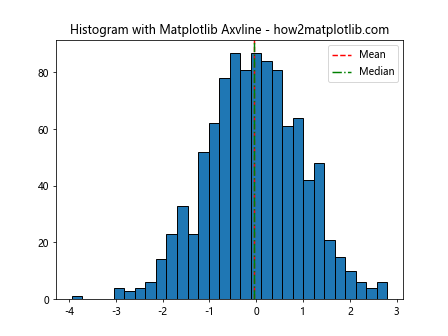
This example creates a histogram of normally distributed data and uses matplotlib axvline to mark the mean and median values.
Axvline in Box Plots
Matplotlib axvline can be used to add reference lines to box plots:
import matplotlib.pyplot as plt
import numpy as np

data = [np.random.normal(0, std, 100) for std in range(1, 4)]

plt.boxplot(data)
plt.axvline(x=2, color='r', linestyle='--', label='Reference')
plt.title('Box Plot with Matplotlib Axvline - how2matplotlib.com')
plt.legend()
plt.show()
Output:
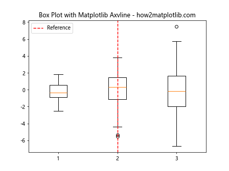
In this example, we create a box plot of three datasets and use matplotlib axvline to add a reference line.
Combining Axvline with Axhline
While this guide focuses on matplotlib axvline, it's worth noting that you can combine it with axhline to create grid-like structures:
import matplotlib.pyplot as plt
import numpy as np

x = np.linspace(0, 10, 100)
y = np.sin(x)

plt.plot(x, y)
plt.axvline(x=5, color='r', linestyle='--')
plt.axhline(y=0, color='g', linestyle=':')
plt.title('Combining Axvline and Axhline - how2matplotlib.com')
plt.show()
Output:
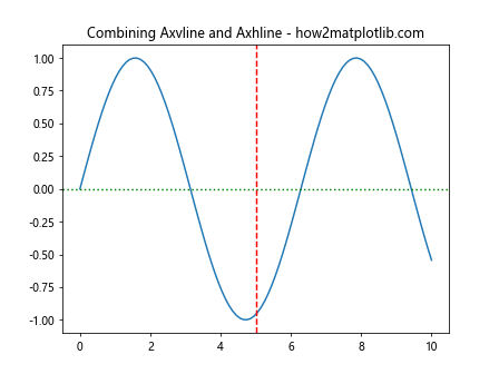
This example demonstrates how matplotlib axvline can be used in conjunction with axhline to create a cross-hair effect on the plot.
Matplotlib Axvline in Time Series Data
Matplotlib axvline is particularly useful when working with time series data, where it can be used to mark specific dates or events:
import matplotlib.pyplot as plt
import pandas as pd
import numpy as np

dates = pd.date_range(start='2023-01-01', end='2023-12-31', freq='D')
values = np.cumsum(np.random.randn(len(dates)))

plt.plot(dates, values)
plt.axvline(x=pd.Timestamp('2023-07-01'), color='r', linestyle='--', label='Mid-year')
plt.title('Time Series with Matplotlib Axvline - how2matplotlib.com')
plt.legend()
plt.gcf().autofmt_xdate()  # Rotate and align the tick labels
plt.show()
Output:
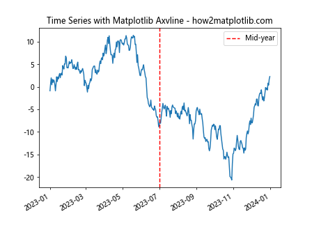
This example creates a time series plot and uses matplotlib axvline to mark the middle of the year.
Using Matplotlib Axvline in Heatmaps
Matplotlib axvline can be used to highlight specific columns in heatmaps:
import matplotlib.pyplot as plt
import numpy as np

data = np.random.rand(10, 12)

plt.imshow(data, cmap='viridis', aspect='auto')
plt.colorbar()
plt.axvline(x=5.5, color='r', linestyle='--')
plt.title('Heatmap with Matplotlib Axvline - how2matplotlib.com')
plt.show()
Output:
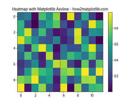
In this example, we create a heatmap and use matplotlib axvline to highlight a specific column.
Matplotlib Axvline in 3D Plots
While matplotlib axvline is primarily used in 2D plots, it can also be applied to 3D plots to create vertical planes:
import matplotlib.pyplot as plt
import numpy as np
from mpl_toolkits.mplot3d import Axes3D

fig = plt.figure()
ax = fig.add_subplot(111, projection='3d')

x = np.linspace(-5, 5, 100)
y = np.linspace(-5, 5, 100)
X, Y = np.meshgrid(x, y)
Z = np.sin(np.sqrt(X**2 + Y**2))

ax.plot_surface(X, Y, Z, cmap='viridis')
ax.contour(X, Y, Z, zdir='z', offset=-2, cmap='viridis')
ax.axvline(x=0, ymin=0, ymax=1, color='r', linestyle='--')

plt.title('3D Plot with Matplotlib Axvline - how2matplotlib.com')
plt.show()
Output:
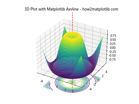
This example creates a 3D surface plot and uses matplotlib axvline to add a vertical line along the y-axis.
Best Practices for Using Matplotlib Axvline
To make the most of matplotlib axvline in your visualizations, consider the following best practices:
- Use consistent colors and styles for similar types of vertical lines across your plots.
- Add labels or annotations to explain the significance of the vertical lines.
- Consider the visual hierarchy of your plot - make sure the vertical lines don't overshadow the main data.
- Use alpha values to make the lines semi-transparent if they overlap with important data points.
- Combine matplotlib axvline with other plot elements to create more informative visualizations.
Troubleshooting Common Issues with Matplotlib Axvline
When working with matplotlib axvline, you might encounter some common issues. Here are some tips for troubleshooting:
- If the vertical line doesn't appear, check that its x-value is within the range of your plot.
- If the line extends beyond your plot area, you can use the ymin and ymax parameters to control its length.
- For plots with multiple subplots, make sure you're adding the axvline to the correct axes object.
- If you're working with datetime x-axes, ensure you're passing a compatible datetime object to axvline.
Matplotlib axvline Conclusion
Matplotlib axvline is a versatile and powerful tool for enhancing your data visualizations. From simple vertical lines to complex, interactive plots, axvline offers a wide range of possibilities. By mastering the techniques and best practices outlined in this guide, you'll be well-equipped to create informative and visually appealing plots using matplotlib axvline.
Remember to experiment with different combinations of plot elements and to always consider the story you're trying to tell with your data. With practice and creativity, matplotlib axvline can become an invaluable part of your data visualization toolkit.
Whether you're working on simple charts or complex statistical analyses, the ability to add precise vertical lines to your plots can greatly enhance the clarity and impact of your visualizations. Keep exploring and pushing the boundaries of what's possible with matplotlib axvline!