How to Master Matplotlib Axvline Color: A Comprehensive Guide
Matplotlib axvline color is an essential feature for data visualization enthusiasts and professionals alike. This article will delve deep into the world of matplotlib axvline color, exploring its various aspects, use cases, and customization options. By the end of this comprehensive guide, you’ll be well-equipped to leverage the power of matplotlib axvline color in your data visualization projects.
Understanding Matplotlib Axvline and Color
Matplotlib is a powerful plotting library in Python, and the axvline function is a crucial tool for adding vertical lines to your plots. The color parameter in matplotlib axvline allows you to customize the appearance of these lines, making them stand out or blend in as needed. Let’s start with a basic example of using matplotlib axvline color:
import matplotlib.pyplot as plt
import numpy as np

x = np.linspace(0, 10, 100)
y = np.sin(x)

plt.plot(x, y)
plt.axvline(x=5, color='red', linestyle='--', label='Vertical Line')
plt.title('Matplotlib Axvline Color Example - how2matplotlib.com')
plt.legend()
plt.show()
Output:
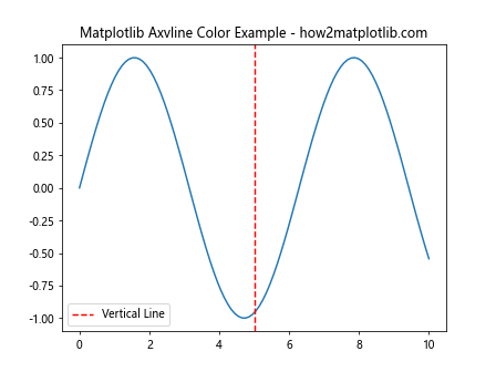
In this example, we’ve created a simple sine wave plot and added a vertical red dashed line at x=5 using matplotlib axvline color. The color parameter is set to ‘red’, making the line easily visible against the blue sine wave.
Customizing Matplotlib Axvline Color
One of the key advantages of matplotlib axvline color is its flexibility. You can use various color formats to achieve the desired look for your vertical lines. Let’s explore some of these options:
Using Named Colors
Matplotlib supports a wide range of named colors that you can use with axvline:
import matplotlib.pyplot as plt

plt.figure(figsize=(10, 6))
plt.axvline(x=1, color='red', label='Red')
plt.axvline(x=2, color='green', label='Green')
plt.axvline(x=3, color='blue', label='Blue')
plt.axvline(x=4, color='cyan', label='Cyan')
plt.axvline(x=5, color='magenta', label='Magenta')
plt.axvline(x=6, color='yellow', label='Yellow')
plt.title('Matplotlib Axvline Color with Named Colors - how2matplotlib.com')
plt.legend()
plt.show()
Output:
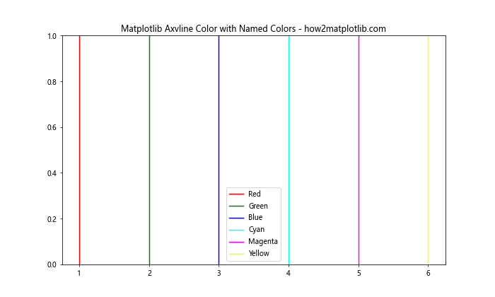
This example demonstrates how to use different named colors for matplotlib axvline. Each vertical line is assigned a distinct color, making it easy to differentiate between them.
Using RGB Values
For more precise control over matplotlib axvline color, you can use RGB (Red, Green, Blue) values:
import matplotlib.pyplot as plt

plt.figure(figsize=(10, 6))
plt.axvline(x=1, color=(1, 0, 0), label='Pure Red')
plt.axvline(x=2, color=(0, 1, 0), label='Pure Green')
plt.axvline(x=3, color=(0, 0, 1), label='Pure Blue')
plt.axvline(x=4, color=(0.5, 0.5, 0.5), label='Gray')
plt.axvline(x=5, color=(1, 0.5, 0), label='Orange')
plt.title('Matplotlib Axvline Color with RGB Values - how2matplotlib.com')
plt.legend()
plt.show()
Output:
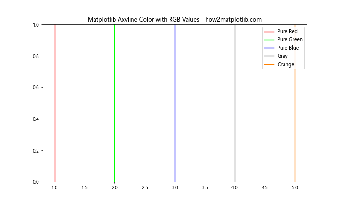
In this example, we’ve used RGB tuples to define custom colors for matplotlib axvline. Each tuple contains three values between 0 and 1, representing the intensity of red, green, and blue respectively.
Using Hexadecimal Color Codes
Another popular method for specifying matplotlib axvline color is using hexadecimal color codes:
import matplotlib.pyplot as plt

plt.figure(figsize=(10, 6))
plt.axvline(x=1, color='#FF0000', label='Red')
plt.axvline(x=2, color='#00FF00', label='Green')
plt.axvline(x=3, color='#0000FF', label='Blue')
plt.axvline(x=4, color='#FF00FF', label='Magenta')
plt.axvline(x=5, color='#FFFF00', label='Yellow')
plt.title('Matplotlib Axvline Color with Hex Codes - how2matplotlib.com')
plt.legend()
plt.show()
Output:
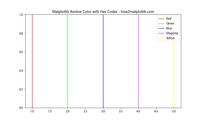
Hexadecimal color codes provide a concise way to specify colors in matplotlib axvline. Each code starts with a ‘#’ followed by six characters representing the RGB values in hexadecimal format.
Advanced Matplotlib Axvline Color Techniques
Now that we’ve covered the basics of matplotlib axvline color, let’s explore some more advanced techniques to enhance your data visualizations.
Using Alpha for Transparency
The alpha parameter allows you to adjust the transparency of matplotlib axvline color:
import matplotlib.pyplot as plt
import numpy as np

x = np.linspace(0, 10, 100)
y = np.sin(x)

plt.plot(x, y)
plt.axvline(x=3, color='red', alpha=0.3, label='30% Opacity')
plt.axvline(x=5, color='red', alpha=0.6, label='60% Opacity')
plt.axvline(x=7, color='red', alpha=1.0, label='100% Opacity')
plt.title('Matplotlib Axvline Color with Alpha - how2matplotlib.com')
plt.legend()
plt.show()
Output:
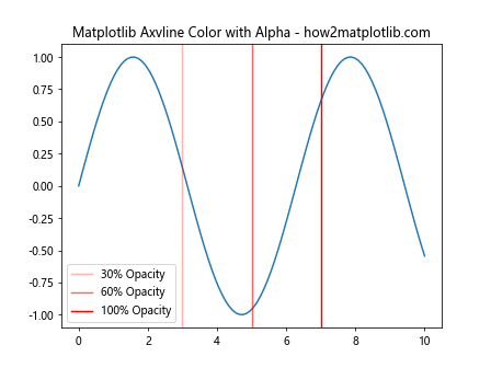
This example demonstrates how to use the alpha parameter to create vertical lines with varying levels of transparency. This can be particularly useful when you want to highlight certain areas without obscuring the underlying data.
Combining Color and Linestyle
You can combine matplotlib axvline color with different line styles for even more customization:
import matplotlib.pyplot as plt

plt.figure(figsize=(10, 6))
plt.axvline(x=1, color='red', linestyle='-', label='Solid Red')
plt.axvline(x=2, color='blue', linestyle='--', label='Dashed Blue')
plt.axvline(x=3, color='green', linestyle=':', label='Dotted Green')
plt.axvline(x=4, color='purple', linestyle='-.', label='Dash-Dot Purple')
plt.title('Matplotlib Axvline Color and Linestyle Combinations - how2matplotlib.com')
plt.legend()
plt.show()
Output:
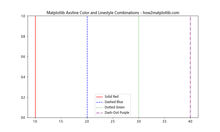
This example showcases how to combine different colors with various line styles in matplotlib axvline. This technique can help you create visually distinct vertical lines that convey different types of information.
Using Colormaps
Matplotlib offers a wide range of colormaps that you can use to create gradients of colors for your axvlines:
import matplotlib.pyplot as plt
import numpy as np

plt.figure(figsize=(10, 6))
cmap = plt.get_cmap('viridis')
for i in range(10):
    color = cmap(i / 10)
    plt.axvline(x=i, color=color, label=f'Line {i+1}')

plt.title('Matplotlib Axvline Color with Colormap - how2matplotlib.com')
plt.legend(bbox_to_anchor=(1.05, 1), loc='upper left')
plt.tight_layout()
plt.show()
Output:
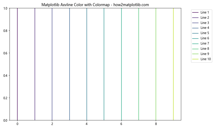
In this example, we’ve used the ‘viridis’ colormap to create a gradient of colors for multiple axvlines. This technique can be particularly useful when you want to represent a continuous range of values using color.
Practical Applications of Matplotlib Axvline Color
Now that we’ve explored various ways to customize matplotlib axvline color, let’s look at some practical applications in data visualization.
Highlighting Time Series Events
Matplotlib axvline color can be used to highlight specific events in time series data:
import matplotlib.pyplot as plt
import numpy as np
import pandas as pd

dates = pd.date_range(start='2023-01-01', end='2023-12-31', freq='D')
values = np.cumsum(np.random.randn(len(dates)))

plt.figure(figsize=(12, 6))
plt.plot(dates, values)
plt.axvline(x=pd.Timestamp('2023-03-15'), color='red', linestyle='--', label='Important Event')
plt.axvline(x=pd.Timestamp('2023-07-01'), color='green', linestyle='--', label='Another Event')
plt.title('Time Series with Highlighted Events - how2matplotlib.com')
plt.legend()
plt.show()
Output:
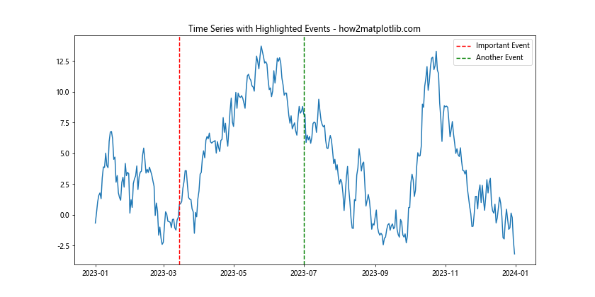
This example demonstrates how to use matplotlib axvline color to mark important dates in a time series plot. The red and green vertical lines clearly indicate specific events of interest.
Visualizing Distribution Quartiles
Matplotlib axvline color can be useful for visualizing quartiles in a distribution:
import matplotlib.pyplot as plt
import numpy as np

data = np.random.normal(0, 1, 1000)

plt.figure(figsize=(10, 6))
plt.hist(data, bins=30, edgecolor='black')
plt.axvline(x=np.percentile(data, 25), color='red', linestyle='--', label='25th Percentile')
plt.axvline(x=np.percentile(data, 50), color='green', linestyle='--', label='Median')
plt.axvline(x=np.percentile(data, 75), color='blue', linestyle='--', label='75th Percentile')
plt.title('Distribution with Quartiles - how2matplotlib.com')
plt.legend()
plt.show()
Output:
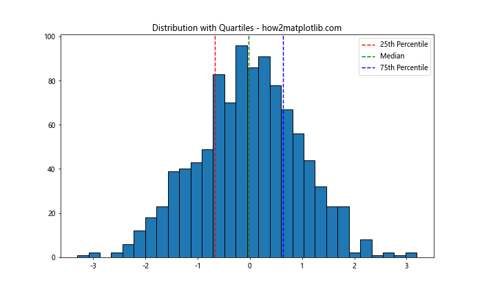
In this example, we’ve used matplotlib axvline color to mark the quartiles of a normal distribution. The different colors make it easy to identify the 25th percentile, median, and 75th percentile.
Marking Thresholds in Scatter Plots
Matplotlib axvline color can be used to indicate thresholds or decision boundaries in scatter plots:
import matplotlib.pyplot as plt
import numpy as np

x = np.random.rand(100)
y = np.random.rand(100)

plt.figure(figsize=(10, 6))
plt.scatter(x, y)
plt.axvline(x=0.5, color='red', linestyle='--', label='X Threshold')
plt.axhline(y=0.5, color='green', linestyle='--', label='Y Threshold')
plt.title('Scatter Plot with Thresholds - how2matplotlib.com')
plt.legend()
plt.show()
Output:
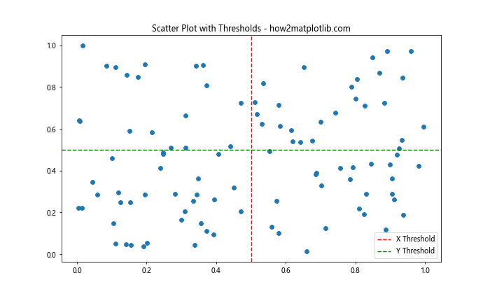
This example shows how to use matplotlib axvline color (and axhline for horizontal lines) to mark thresholds in a scatter plot. The red vertical line and green horizontal line divide the plot into quadrants, which can be useful for categorizing data points.
Best Practices for Using Matplotlib Axvline Color
To make the most of matplotlib axvline color in your visualizations, consider the following best practices:
- Choose colors wisely: Select colors that contrast well with your main plot elements and are easy to distinguish.
Use consistent colors: If you’re using multiple axvlines to represent similar concepts, use the same color for consistency.
Combine with other properties: Don’t rely solely on color; use line styles, widths, and labels to convey information.
Consider color blindness: Choose color combinations that are accessible to color-blind individuals.
Use alpha for overlapping elements: When axvlines might overlap with other plot elements, use transparency to maintain visibility.
Let’s implement these best practices in an example: