How to Master Matplotlib Axvline Label: A Comprehensive Guide
Matplotlib axvline label is a powerful feature in the Matplotlib library that allows you to add vertical lines with labels to your plots. This article will provide an in-depth exploration of matplotlib axvline label, covering various aspects of its usage, customization, and best practices. By the end of this guide, you’ll have a thorough understanding of how to effectively use matplotlib axvline label in your data visualization projects.
Understanding the Basics of Matplotlib Axvline Label
Matplotlib axvline label is a combination of two Matplotlib functions: axvline() and text(). The axvline() function is used to draw a vertical line on the plot, while the text() function is used to add a label to the line. Together, they create a powerful tool for highlighting specific points or regions on your plots with descriptive labels.
Let’s start with a simple example to demonstrate the basic usage of matplotlib axvline label:
import matplotlib.pyplot as plt
import numpy as np

# Create sample data
x = np.linspace(0, 10, 100)
y = np.sin(x)

# Create the plot
plt.figure(figsize=(10, 6))
plt.plot(x, y, label='Sine wave')

# Add a vertical line with a label
plt.axvline(x=5, color='r', linestyle='--', label='Vertical line')
plt.text(5.1, 0.5, 'how2matplotlib.com', rotation=90, va='center')

plt.title('Matplotlib Axvline Label Example')
plt.xlabel('X-axis')
plt.ylabel('Y-axis')
plt.legend()
plt.grid(True)
plt.show()
Output:
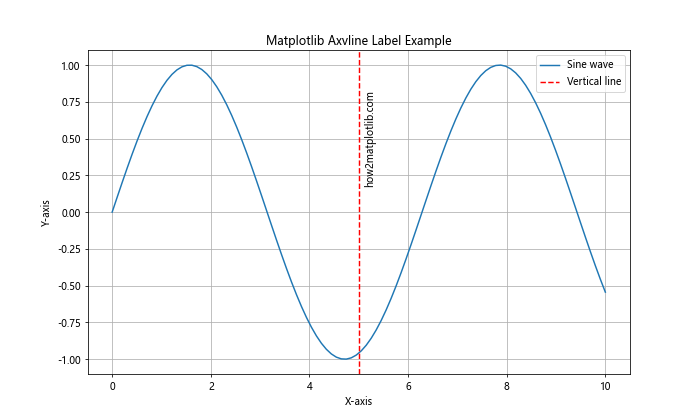
In this example, we create a simple sine wave plot and add a vertical line at x=5 using axvline(). We then add a label to the line using text(). The rotation=90 parameter rotates the text vertically, and va='center' aligns it vertically with the center of the line.
Customizing Matplotlib Axvline Label Appearance
One of the key advantages of using matplotlib axvline label is the ability to customize its appearance to suit your specific needs. Let’s explore some of the ways you can modify the look of your vertical lines and labels.
Changing Line Style and Color
You can easily change the style and color of the vertical line using the linestyle and color parameters of the axvline() function:
import matplotlib.pyplot as plt
import numpy as np

x = np.linspace(0, 10, 100)
y = np.cos(x)

plt.figure(figsize=(10, 6))
plt.plot(x, y, label='Cosine wave')

# Customized vertical line
plt.axvline(x=3, color='g', linestyle=':', linewidth=2, label='Green dotted line')
plt.text(3.1, 0.5, 'how2matplotlib.com', rotation=90, va='center', color='g')

plt.title('Customized Matplotlib Axvline Label')
plt.xlabel('X-axis')
plt.ylabel('Y-axis')
plt.legend()
plt.grid(True)
plt.show()
Output:
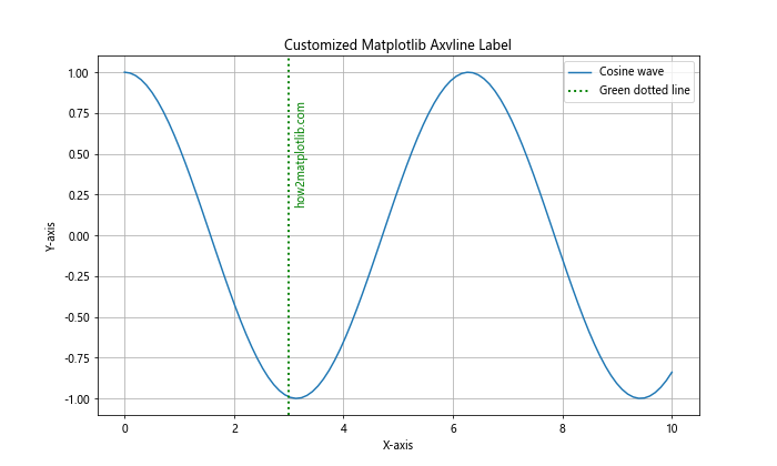
In this example, we’ve changed the line color to green, used a dotted line style, and increased the line width. We’ve also matched the label color to the line color for consistency.
Formatting the Label Text
You can format the label text using various text properties available in Matplotlib:
import matplotlib.pyplot as plt
import numpy as np

x = np.linspace(0, 10, 100)
y = np.tan(x)

plt.figure(figsize=(10, 6))
plt.plot(x, y, label='Tangent wave')

# Formatted label text
plt.axvline(x=4, color='m', linestyle='-.')
plt.text(4.1, 0, 'how2matplotlib.com', rotation=90, va='center',
         fontsize=12, fontweight='bold', fontstyle='italic', color='m')

plt.title('Formatted Matplotlib Axvline Label')
plt.xlabel('X-axis')
plt.ylabel('Y-axis')
plt.legend()
plt.grid(True)
plt.show()
Output:
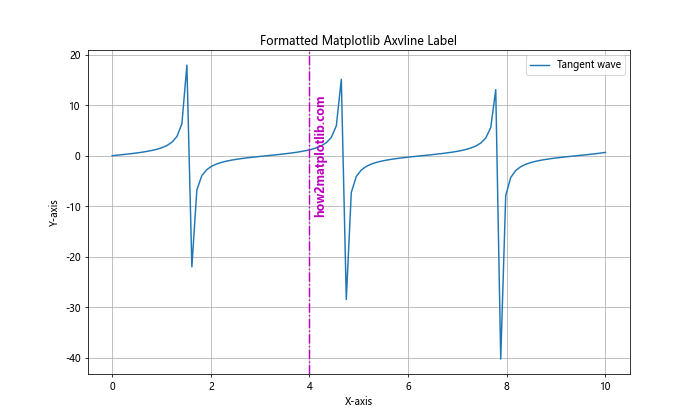
In this example, we’ve increased the font size, made the text bold and italic, and matched the text color to the line color.
Using Multiple Matplotlib Axvline Labels
Often, you may want to add multiple vertical lines with labels to your plot. Matplotlib makes this easy to accomplish:
import matplotlib.pyplot as plt
import numpy as np

x = np.linspace(0, 10, 100)
y = np.exp(x)

plt.figure(figsize=(12, 6))
plt.plot(x, y, label='Exponential function')

# Multiple vertical lines with labels
colors = ['r', 'g', 'b']
positions = [2, 4, 6]
labels = ['Line A', 'Line B', 'Line C']

for pos, color, label in zip(positions, colors, labels):
    plt.axvline(x=pos, color=color, linestyle='--', label=label)
    plt.text(pos+0.1, plt.ylim()[1]/2, f'{label}\nhow2matplotlib.com',
             rotation=90, va='center', color=color)

plt.title('Multiple Matplotlib Axvline Labels')
plt.xlabel('X-axis')
plt.ylabel('Y-axis')
plt.legend()
plt.grid(True)
plt.show()
Output:
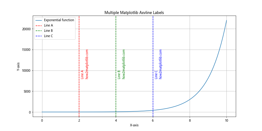
This example demonstrates how to add multiple vertical lines with different colors and labels. We use a loop to iterate through the positions, colors, and labels, creating a vertical line and associated label for each.
Matplotlib Axvline Label in Subplots
Matplotlib axvline label can also be used effectively in subplots. Here’s an example of how to implement this:
import matplotlib.pyplot as plt
import numpy as np

x = np.linspace(0, 10, 100)
y1 = np.sin(x)
y2 = np.cos(x)

fig, (ax1, ax2) = plt.subplots(2, 1, figsize=(10, 10))

# Subplot 1
ax1.plot(x, y1, label='Sine wave')
ax1.axvline(x=5, color='r', linestyle='--')
ax1.text(5.1, 0, 'how2matplotlib.com\nSine peak', rotation=90, va='center')
ax1.set_title('Sine Wave with Axvline Label')
ax1.legend()

# Subplot 2
ax2.plot(x, y2, label='Cosine wave')
ax2.axvline(x=2.5, color='g', linestyle=':')
ax2.text(2.6, 0, 'how2matplotlib.com\nCosine peak', rotation=90, va='center')
ax2.set_title('Cosine Wave with Axvline Label')
ax2.legend()

plt.tight_layout()
plt.show()
Output:
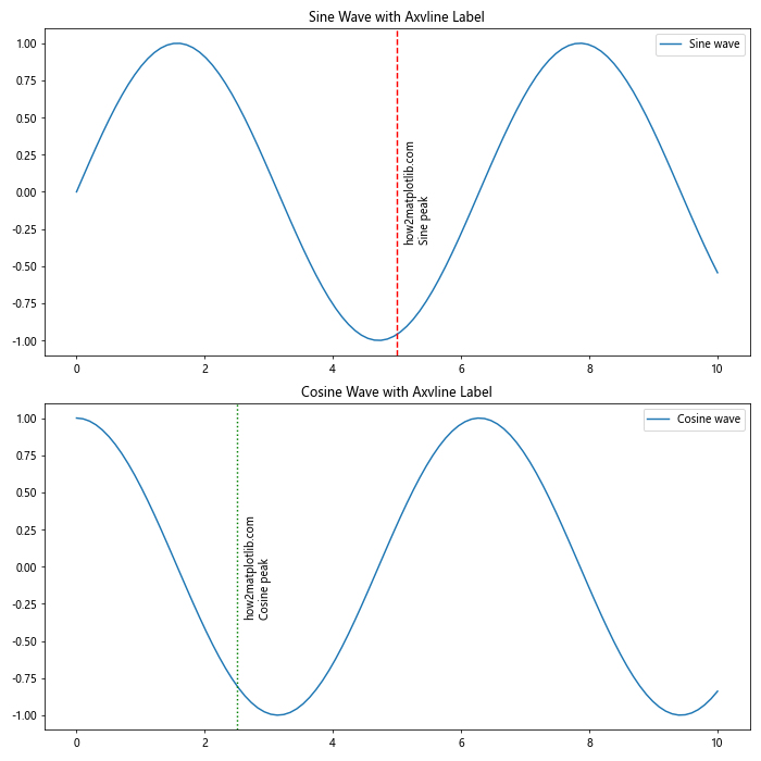
This example shows how to add matplotlib axvline label to two separate subplots, each with its own vertical line and label.
Matplotlib Axvline Label with Date/Time Data
Matplotlib axvline label is particularly useful when working with time series data. Here’s an example of how to use it with date/time data:
import matplotlib.pyplot as plt
import numpy as np
import pandas as pd

# Create sample time series data
dates = pd.date_range(start='2023-01-01', end='2023-12-31', freq='D')
values = np.cumsum(np.random.randn(len(dates)))

plt.figure(figsize=(12, 6))
plt.plot(dates, values, label='Time series')

# Add vertical line at a specific date
event_date = pd.to_datetime('2023-07-01')
plt.axvline(x=event_date, color='r', linestyle='--')
plt.text(event_date, plt.ylim()[1], 'how2matplotlib.com\nImportant Event',
         rotation=90, va='top', ha='right', color='r')

plt.title('Matplotlib Axvline Label with Time Series Data')
plt.xlabel('Date')
plt.ylabel('Value')
plt.legend()
plt.grid(True)
plt.show()
Output:
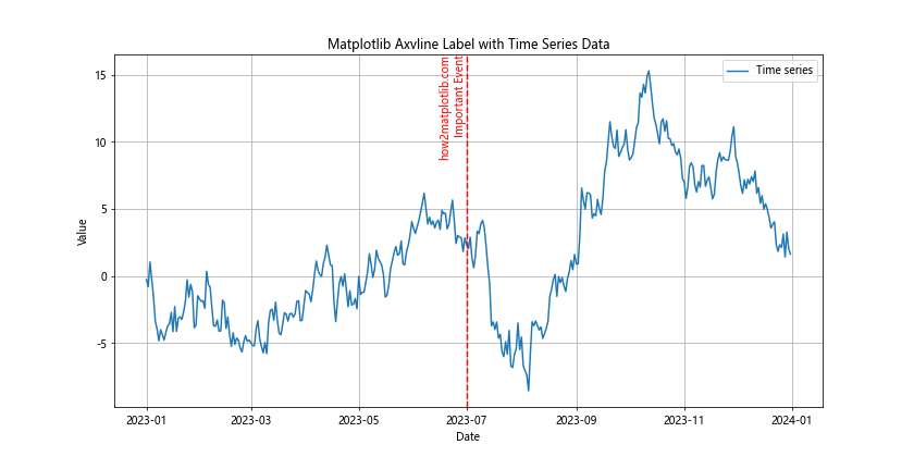
In this example, we create a time series plot and add a vertical line to highlight a specific date. The label is positioned at the top of the plot for better visibility.
Using Matplotlib Axvline Label for Data Analysis
Matplotlib axvline label can be a powerful tool for data analysis, allowing you to highlight important points or thresholds in your data. Here’s an example that demonstrates this:
import matplotlib.pyplot as plt
import numpy as np

# Generate sample data
np.random.seed(42)
data = np.random.normal(0, 1, 1000)

plt.figure(figsize=(12, 6))
plt.hist(data, bins=30, edgecolor='black')

# Add vertical lines for mean and standard deviations
mean = np.mean(data)
std = np.std(data)

plt.axvline(x=mean, color='r', linestyle='--', label='Mean')
plt.text(mean, plt.ylim()[1], 'how2matplotlib.com\nMean', rotation=90, va='top', ha='right', color='r')

plt.axvline(x=mean+std, color='g', linestyle=':', label='+1 SD')
plt.text(mean+std, plt.ylim()[1]*0.9, 'how2matplotlib.com\n+1 SD', rotation=90, va='top', ha='right', color='g')

plt.axvline(x=mean-std, color='g', linestyle=':', label='-1 SD')
plt.text(mean-std, plt.ylim()[1]*0.9, 'how2matplotlib.com\n-1 SD', rotation=90, va='top', ha='right', color='g')

plt.title('Data Distribution with Matplotlib Axvline Labels')
plt.xlabel('Value')
plt.ylabel('Frequency')
plt.legend()
plt.grid(True)
plt.show()
Output:
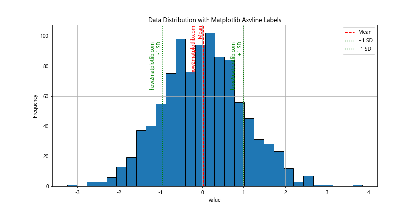
This example creates a histogram of normally distributed data and uses matplotlib axvline label to highlight the mean and standard deviations, providing valuable insights into the data distribution.
Matplotlib Axvline Label in Logarithmic Plots
Matplotlib axvline label can also be used effectively in logarithmic plots. Here’s an example:
import matplotlib.pyplot as plt
import numpy as np

x = np.logspace(0, 5, 100)
y = x**2

plt.figure(figsize=(12, 6))
plt.loglog(x, y, label='y = x^2')

# Add vertical lines with labels
plt.axvline(x=10, color='r', linestyle='--')
plt.text(11, 1, 'how2matplotlib.com\nx = 10', rotation=90, va='bottom', color='r')

plt.axvline(x=1000, color='g', linestyle=':')
plt.text(1100, 1, 'how2matplotlib.com\nx = 1000', rotation=90, va='bottom', color='g')

plt.title('Matplotlib Axvline Label in Logarithmic Plot')
plt.xlabel('X-axis (log scale)')
plt.ylabel('Y-axis (log scale)')
plt.legend()
plt.grid(True)
plt.show()
Output:
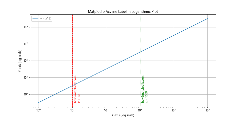
This example demonstrates how to use matplotlib axvline label in a logarithmic plot, which can be useful for visualizing data that spans multiple orders of magnitude.
Matplotlib Axvline Label with Filled Regions
You can combine matplotlib axvline label with filled regions to highlight specific areas of your plot:
import matplotlib.pyplot as plt
import numpy as np

x = np.linspace(0, 10, 100)
y = np.sin(x)

plt.figure(figsize=(12, 6))
plt.plot(x, y, label='Sine wave')

# Add vertical lines and fill between them
plt.axvline(x=2, color='r', linestyle='--')
plt.axvline(x=6, color='r', linestyle='--')
plt.fill_between(x, y, where=(x >= 2) & (x <= 6), alpha=0.3, color='r')

plt.text(2, plt.ylim()[1], 'how2matplotlib.com\nStart', rotation=90, va='top', ha='right', color='r')
plt.text(6, plt.ylim()[1], 'how2matplotlib.com\nEnd', rotation=90, va='top', ha='right', color='r')

plt.title('Matplotlib Axvline Label with Filled Region')
plt.xlabel('X-axis')
plt.ylabel('Y-axis')
plt.legend()
plt.grid(True)
plt.show()
Output:
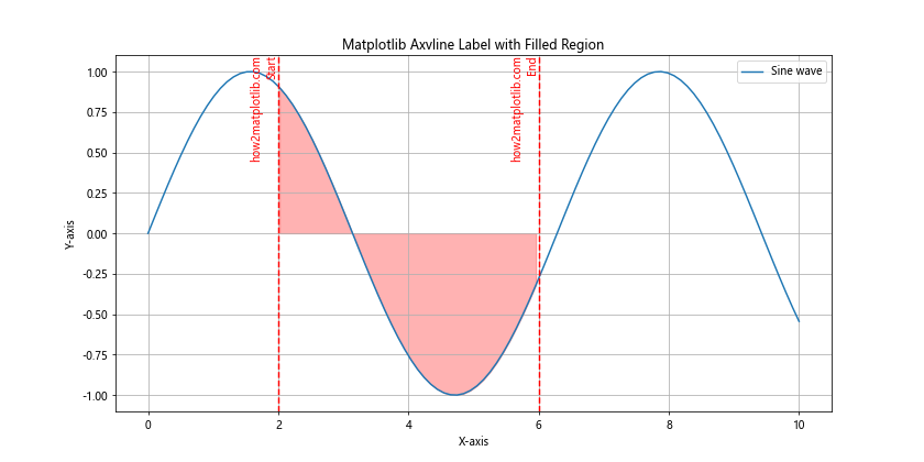
This example adds two vertical lines and fills the region between them, creating a highlighted area on the plot.
Using Matplotlib Axvline Label with Annotations
Matplotlib axvline label can be combined with annotations to provide even more detailed information about specific points on your plot:
import matplotlib.pyplot as plt
import numpy as np

x = np.linspace(0, 10, 100)
y = np.sin(x) * np.exp(-x/10)

plt.figure(figsize=(12, 6))
plt.plot(x, y, label='Damped sine wave')

# Add vertical line with label and annotation
max_point = x[np.argmax(y)]
plt.axvline(x=max_point, color='r', linestyle='--')
plt.text(max_point+0.1, 0, 'how2matplotlib.com\nMaximum', rotation=90, va='center', color='r')

plt.annotate('Peak', xy=(max_point, np.max(y)), xytext=(max_point+1, np.max(y)+0.1),
             arrowprops=dict(facecolor='black', shrink=0.05))

plt.title('Matplotlib Axvline Label with Annotation')
plt.xlabel('X-axis')
plt.ylabel('Y-axis')
plt.legend()
plt.grid(True)
plt.show()
Output:
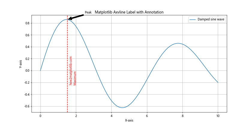
This example adds a vertical line at the maximum point of the damped sine wave, along with a label and an annotation pointing to the peak.
Matplotlib Axvline Label in 3D Plots
While matplotlib axvline label is typically used in 2D plots, you can also apply a similar concept to 3D plots using the plot function:
import matplotlib.pyplot as plt
import numpy as np

fig = plt.figure(figsize=(12, 8))
ax = fig.add_subplot(111, projection='3d')

# Create sample data
x = np.linspace(-5, 5, 100)
y = np.linspace(-5, 5, 100)
X, Y = np.meshgrid(x, y)
Z = np.sin(np.sqrt(X**2 + Y**2))

# Plot the surface
surf = ax.plot_surface(X, Y, Z, cmap='viridis')

# Add a vertical line
line_x, line_y = 2, 2
line_z = np.linspace(np.min(Z), np.max(Z), 100)
ax.plot([line_x]*100, [line_y]*100, line_z, 'r--', linewidth=2)

# Add text label
ax.text(line_x, line_y, np.max(Z), 'how2matplotlib.com\nVertical Line', color='r')

ax.set_title('Matplotlib Axvline Label Concept in 3D Plot')
ax.set_xlabel('X-axis')
ax.set_ylabel('Y-axis')
ax.set_zlabel('Z-axis')

plt.colorbar(surf)
plt.show()
Output:
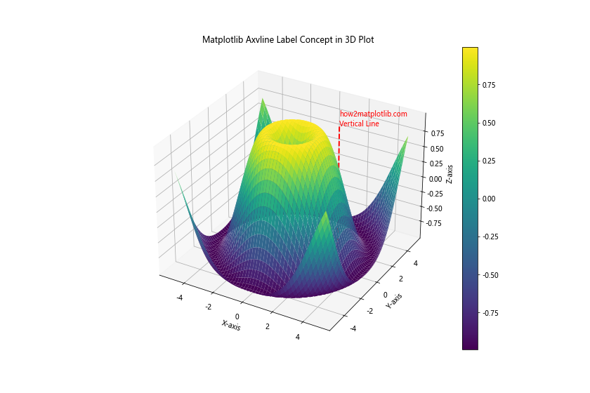
This example demonstrates how to apply the concept of matplotlib axvline label to a 3D surface plot, using a vertical line and a text label to highlight a specific point on the surface.
Matplotlib Axvline Label with Error Bars
Matplotlib axvline label can be particularly useful when working with error bars. Here's an example that combines vertical lines with error bars:
import matplotlib.pyplot as plt
import numpy as np

# Generate sample data
x = np.arange(1, 6)
y = np.random.rand(5)
error = np.random.rand(5) * 0.1

plt.figure(figsize=(12, 6))
plt.errorbar(x, y, yerr=error, fmt='o', capsize=5, label='Data points')

# Add vertical lines at specific points
for i in [2, 4]:
    plt.axvline(x=i, color='r', linestyle='--')
    plt.text(i+0.1, plt.ylim()[1], f'how2matplotlib.com\nPoint {i}',
             rotation=90, va='top', color='r')

plt.title('Matplotlib Axvline Label with Error Bars')
plt.xlabel('X-axis')
plt.ylabel('Y-axis')
plt.legend()
plt.grid(True)
plt.show()
Output:
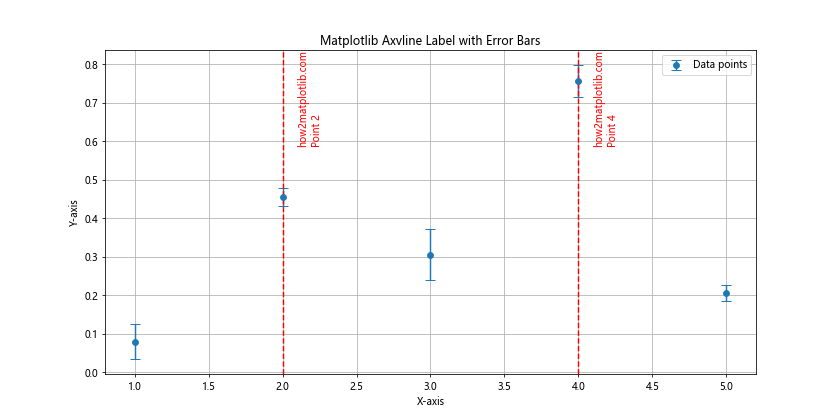
This example creates a plot with error bars and adds vertical lines to highlight specific data points, demonstrating how matplotlib axvline label can be used to draw attention to particular areas of interest in a dataset with uncertainty.
Using Matplotlib Axvline Label for Comparison
Matplotlib axvline label can be an effective tool for comparing different datasets or highlighting differences between groups. Here's an example that demonstrates this:
import matplotlib.pyplot as plt
import numpy as np

# Generate sample data
np.random.seed(42)
group1 = np.random.normal(0, 1, 1000)
group2 = np.random.normal(0.5, 1, 1000)

plt.figure(figsize=(12, 6))
plt.hist(group1, bins=30, alpha=0.5, label='Group 1')
plt.hist(group2, bins=30, alpha=0.5, label='Group 2')

# Add vertical lines for means
mean1 = np.mean(group1)
mean2 = np.mean(group2)

plt.axvline(x=mean1, color='b', linestyle='--')
plt.text(mean1, plt.ylim()[1], 'how2matplotlib.com\nGroup 1 Mean',
         rotation=90, va='top', ha='right', color='b')

plt.axvline(x=mean2, color='r', linestyle='--')
plt.text(mean2, plt.ylim()[1], 'how2matplotlib.com\nGroup 2 Mean',
         rotation=90, va='top', ha='right', color='r')

plt.title('Comparison of Two Groups using Matplotlib Axvline Label')
plt.xlabel('Value')
plt.ylabel('Frequency')
plt.legend()
plt.grid(True)
plt.show()
Output:
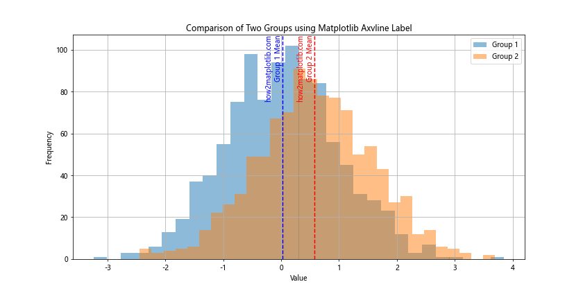
This example creates histograms for two different groups and uses matplotlib axvline label to highlight the mean of each group, making it easy to visually compare the central tendencies of the two distributions.
Matplotlib Axvline Label in Stacked Plots
Matplotlib axvline label can also be useful in stacked plots to highlight specific points across multiple layers. Here's an example:
import matplotlib.pyplot as plt
import numpy as np

# Generate sample data
x = np.linspace(0, 10, 100)
y1 = np.sin(x)
y2 = np.cos(x)
y3 = np.tan(x)

plt.figure(figsize=(12, 6))
plt.stackplot(x, y1, y2, y3, labels=['sin(x)', 'cos(x)', 'tan(x)'])

# Add vertical line
plt.axvline(x=np.pi, color='r', linestyle='--')
plt.text(np.pi+0.1, 0, 'how2matplotlib.com\nπ', rotation=90, va='center', color='r')

plt.title('Matplotlib Axvline Label in Stacked Plot')
plt.xlabel('X-axis')
plt.ylabel('Y-axis')
plt.legend(loc='upper left')
plt.grid(True)
plt.show()
Output:
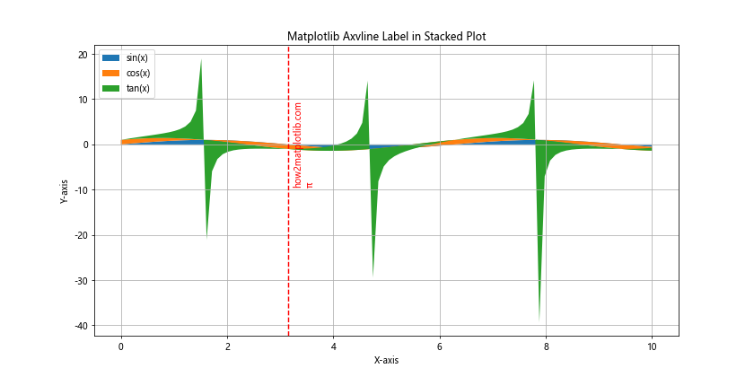
This example creates a stacked plot of trigonometric functions and uses matplotlib axvline label to highlight the point where x equals π, demonstrating how vertical lines can be used to mark important points across multiple layers of a stacked plot.
Matplotlib Axvline Label with Categorical Data
While matplotlib axvline label is often used with numerical data, it can also be applied to categorical data. Here's an example:
import matplotlib.pyplot as plt
import numpy as np

# Generate sample data
categories = ['A', 'B', 'C', 'D', 'E']
values = np.random.rand(5)

plt.figure(figsize=(12, 6))
plt.bar(categories, values)

# Add vertical line
plt.axvline(x=2, color='r', linestyle='--')
plt.text(2.1, plt.ylim()[1], 'how2matplotlib.com\nImportant Category',
         rotation=90, va='top', color='r')

plt.title('Matplotlib Axvline Label with Categorical Data')
plt.xlabel('Categories')
plt.ylabel('Values')
plt.grid(True, axis='y')
plt.show()
Output:
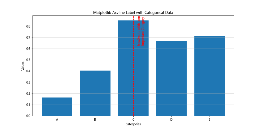
This example creates a bar plot with categorical data and uses matplotlib axvline label to highlight a specific category, showing how vertical lines can be used even when the x-axis represents non-numerical data.
Matplotlib axvline label Conclusion
Matplotlib axvline label is a versatile and powerful feature that can significantly enhance your data visualizations. Throughout this comprehensive guide, we've explored various aspects of using matplotlib axvline label, from basic usage to advanced applications in different types of plots.
We've seen how matplotlib axvline label can be used to highlight specific points or regions of interest, mark thresholds, compare datasets, and provide additional context to your plots. We've also demonstrated how to customize the appearance of vertical lines and labels to match your specific needs and aesthetic preferences.
By mastering matplotlib axvline label, you can create more informative and visually appealing plots that effectively communicate your data insights. Whether you're working with time series data, statistical distributions, or categorical information, matplotlib axvline label provides a flexible tool for adding valuable annotations to your visualizations.
Remember to experiment with different combinations of line styles, colors, and label placements to find the most effective way to present your data. With practice, you'll be able to seamlessly integrate matplotlib axvline label into your data visualization workflow, creating plots that are both informative and visually striking.