How to Use Matplotlib Axvline for Multiple Lines: A Comprehensive Guide
Matplotlib axvline multiple lines is a powerful feature in the Matplotlib library that allows you to add vertical lines to your plots. This article will explore the various aspects of using axvline for multiple lines, providing detailed explanations and examples to help you master this technique.
Introduction to Matplotlib Axvline Multiple Lines
Matplotlib axvline multiple lines is a versatile tool for adding vertical lines to your plots. The axvline function is particularly useful when you need to highlight specific x-axis values or create visual separators in your graphs. By using axvline for multiple lines, you can enhance the readability and interpretability of your data visualizations.
Let’s start with a basic example of using matplotlib axvline for multiple lines:
import matplotlib.pyplot as plt
import numpy as np

x = np.linspace(0, 10, 100)
y = np.sin(x)

plt.figure(figsize=(10, 6))
plt.plot(x, y, label='Sine Wave')
plt.axvline(x=2, color='r', linestyle='--', label='Line 1')
plt.axvline(x=5, color='g', linestyle=':', label='Line 2')
plt.axvline(x=8, color='b', linestyle='-.', label='Line 3')
plt.title('Matplotlib Axvline Multiple Lines - how2matplotlib.com')
plt.xlabel('X-axis')
plt.ylabel('Y-axis')
plt.legend()
plt.show()
Output:
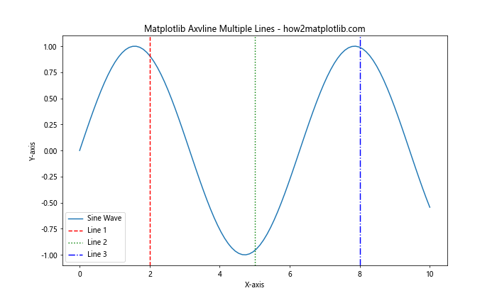
In this example, we create a simple sine wave plot and add three vertical lines using matplotlib axvline multiple lines. Each line has a different x-coordinate, color, and linestyle to demonstrate the versatility of the axvline function.
Customizing Matplotlib Axvline Multiple Lines
When working with matplotlib axvline multiple lines, you have various options for customization. Let’s explore some of these options in more detail.
Line Color and Style
You can easily change the color and style of your vertical lines using the color and linestyle parameters. Here’s an example:
import matplotlib.pyplot as plt
import numpy as np

x = np.linspace(0, 10, 100)
y = np.cos(x)

plt.figure(figsize=(10, 6))
plt.plot(x, y, label='Cosine Wave')
plt.axvline(x=2, color='purple', linestyle='-', linewidth=2, label='Solid Line')
plt.axvline(x=5, color='orange', linestyle='--', linewidth=2, label='Dashed Line')
plt.axvline(x=8, color='cyan', linestyle=':', linewidth=2, label='Dotted Line')
plt.title('Customized Matplotlib Axvline Multiple Lines - how2matplotlib.com')
plt.xlabel('X-axis')
plt.ylabel('Y-axis')
plt.legend()
plt.show()
Output:
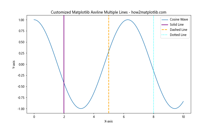
In this example, we use different colors and line styles for each vertical line, demonstrating the flexibility of matplotlib axvline multiple lines.
Line Width and Alpha
You can adjust the width and transparency of your vertical lines using the linewidth and alpha parameters:
import matplotlib.pyplot as plt
import numpy as np

x = np.linspace(0, 10, 100)
y = np.tan(x)

plt.figure(figsize=(10, 6))
plt.plot(x, y, label='Tangent Wave')
plt.axvline(x=2, color='red', linewidth=1, alpha=0.5, label='Thin Line')
plt.axvline(x=5, color='green', linewidth=3, alpha=0.7, label='Medium Line')
plt.axvline(x=8, color='blue', linewidth=5, alpha=0.9, label='Thick Line')
plt.title('Line Width and Alpha in Matplotlib Axvline Multiple Lines - how2matplotlib.com')
plt.xlabel('X-axis')
plt.ylabel('Y-axis')
plt.legend()
plt.ylim(-5, 5)
plt.show()
Output:
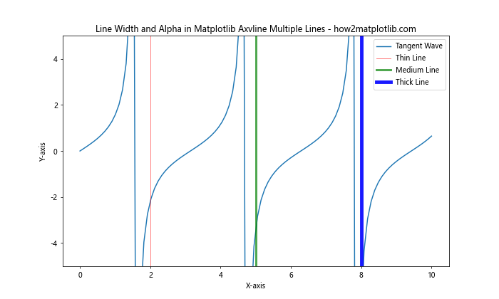
This example demonstrates how to use different line widths and alpha values for matplotlib axvline multiple lines, creating a variety of visual effects.
Adding Labels and Annotations to Matplotlib Axvline Multiple Lines
When using matplotlib axvline multiple lines, it’s often helpful to add labels or annotations to provide context for your vertical lines. Let’s explore some techniques for doing this.
Using Text Annotations
You can add text annotations to your vertical lines using the plt.text() function:
import matplotlib.pyplot as plt
import numpy as np

x = np.linspace(0, 10, 100)
y = np.exp(x)

plt.figure(figsize=(10, 6))
plt.plot(x, y, label='Exponential Function')
plt.axvline(x=2, color='red', linestyle='--', label='Line 1')
plt.axvline(x=5, color='green', linestyle='--', label='Line 2')
plt.axvline(x=8, color='blue', linestyle='--', label='Line 3')

plt.text(2, plt.ylim()[1], 'Important Event', rotation=90, va='bottom', ha='right')
plt.text(5, plt.ylim()[1], 'Milestone', rotation=90, va='bottom', ha='right')
plt.text(8, plt.ylim()[1], 'Deadline', rotation=90, va='bottom', ha='right')

plt.title('Annotated Matplotlib Axvline Multiple Lines - how2matplotlib.com')
plt.xlabel('X-axis')
plt.ylabel('Y-axis')
plt.legend()
plt.show()
Output:
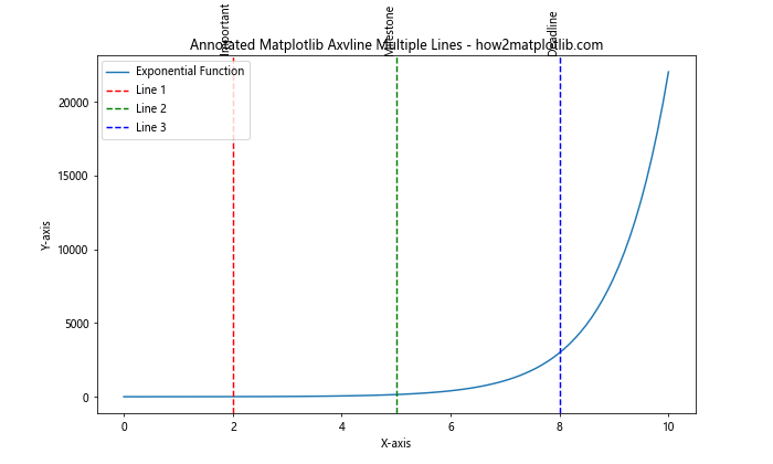
This example shows how to add rotated text annotations to your matplotlib axvline multiple lines, providing additional context for each vertical line.
Using Arrow Annotations
You can also use arrow annotations to highlight your vertical lines:
import matplotlib.pyplot as plt
import numpy as np

x = np.linspace(0, 10, 100)
y = np.log(x + 1)

plt.figure(figsize=(10, 6))
plt.plot(x, y, label='Logarithmic Function')
plt.axvline(x=2, color='red', linestyle='--', label='Line 1')
plt.axvline(x=5, color='green', linestyle='--', label='Line 2')
plt.axvline(x=8, color='blue', linestyle='--', label='Line 3')

plt.annotate('Start', xy=(2, 0), xytext=(2.5, 0.5), arrowprops=dict(facecolor='red', shrink=0.05))
plt.annotate('Middle', xy=(5, 0), xytext=(5.5, 1), arrowprops=dict(facecolor='green', shrink=0.05))
plt.annotate('End', xy=(8, 0), xytext=(8.5, 1.5), arrowprops=dict(facecolor='blue', shrink=0.05))

plt.title('Arrow Annotations with Matplotlib Axvline Multiple Lines - how2matplotlib.com')
plt.xlabel('X-axis')
plt.ylabel('Y-axis')
plt.legend()
plt.show()
Output:
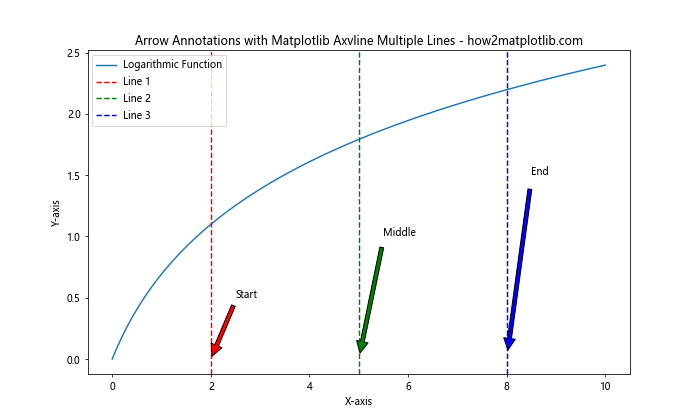
This example demonstrates how to use arrow annotations to highlight your matplotlib axvline multiple lines, providing a visually appealing way to draw attention to specific points on your plot.
Using Matplotlib Axvline Multiple Lines in Subplots
Matplotlib axvline multiple lines can be particularly useful when working with subplots. Let’s explore how to use this technique in a multi-plot layout.
Basic Subplots with Axvline
Here’s an example of using matplotlib axvline multiple lines in a 2×2 subplot layout:
import matplotlib.pyplot as plt
import numpy as np

x = np.linspace(0, 10, 100)
y1 = np.sin(x)
y2 = np.cos(x)
y3 = np.tan(x)
y4 = np.exp(x)

fig, axs = plt.subplots(2, 2, figsize=(12, 10))
fig.suptitle('Matplotlib Axvline Multiple Lines in Subplots - how2matplotlib.com')

axs[0, 0].plot(x, y1)
axs[0, 0].axvline(x=3, color='r', linestyle='--')
axs[0, 0].axvline(x=7, color='g', linestyle='--')
axs[0, 0].set_title('Sine Wave')

axs[0, 1].plot(x, y2)
axs[0, 1].axvline(x=2, color='b', linestyle=':')
axs[0, 1].axvline(x=8, color='m', linestyle=':')
axs[0, 1].set_title('Cosine Wave')

axs[1, 0].plot(x, y3)
axs[1, 0].axvline(x=1, color='c', linestyle='-.')
axs[1, 0].axvline(x=9, color='y', linestyle='-.')
axs[1, 0].set_title('Tangent Wave')

axs[1, 1].plot(x, y4)
axs[1, 1].axvline(x=4, color='k', linestyle='-')
axs[1, 1].axvline(x=6, color='orange', linestyle='-')
axs[1, 1].set_title('Exponential Function')

plt.tight_layout()
plt.show()
Output:
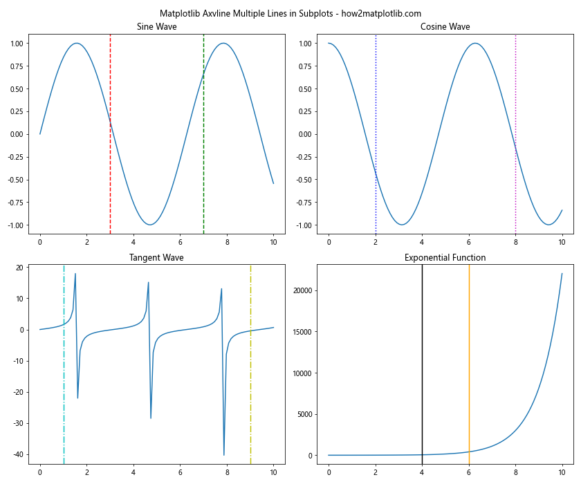
This example demonstrates how to use matplotlib axvline multiple lines in a subplot layout, allowing you to compare different datasets with vertical line markers.
Shared Axvline Across Subplots
You can also create a shared vertical line across multiple subplots:
import matplotlib.pyplot as plt
import numpy as np

x = np.linspace(0, 10, 100)
y1 = np.sin(x)
y2 = np.cos(x)
y3 = np.tan(x)

fig, (ax1, ax2, ax3) = plt.subplots(3, 1, figsize=(10, 12), sharex=True)
fig.suptitle('Shared Matplotlib Axvline Multiple Lines - how2matplotlib.com')

ax1.plot(x, y1)
ax1.set_title('Sine Wave')

ax2.plot(x, y2)
ax2.set_title('Cosine Wave')

ax3.plot(x, y3)
ax3.set_title('Tangent Wave')

for ax in (ax1, ax2, ax3):
    ax.axvline(x=3, color='r', linestyle='--', label='Event 1')
    ax.axvline(x=7, color='g', linestyle='--', label='Event 2')
    ax.legend()

plt.tight_layout()
plt.show()
Output:
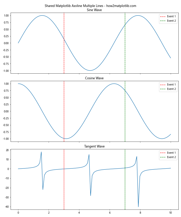
This example shows how to create shared matplotlib axvline multiple lines across different subplots, which can be useful for highlighting events or time points that are relevant to all datasets.
Advanced Techniques for Matplotlib Axvline Multiple Lines
Let’s explore some advanced techniques for using matplotlib axvline multiple lines to create more complex and informative visualizations.
Combining Axvline with Axhline
You can combine matplotlib axvline multiple lines with horizontal lines (axhline) to create a grid or highlight specific regions:
import matplotlib.pyplot as plt
import numpy as np

x = np.linspace(0, 10, 100)
y = np.sin(x) * np.exp(-x/10)

plt.figure(figsize=(10, 6))
plt.plot(x, y, label='Damped Sine Wave')

plt.axvline(x=2, color='r', linestyle='--', label='Vertical Line 1')
plt.axvline(x=6, color='g', linestyle='--', label='Vertical Line 2')
plt.axhline(y=0.5, color='b', linestyle=':', label='Horizontal Line 1')
plt.axhline(y=-0.5, color='m', linestyle=':', label='Horizontal Line 2')

plt.title('Combining Axvline and Axhline - how2matplotlib.com')
plt.xlabel('X-axis')
plt.ylabel('Y-axis')
plt.legend()
plt.grid(True, linestyle='-', alpha=0.7)
plt.show()
Output:
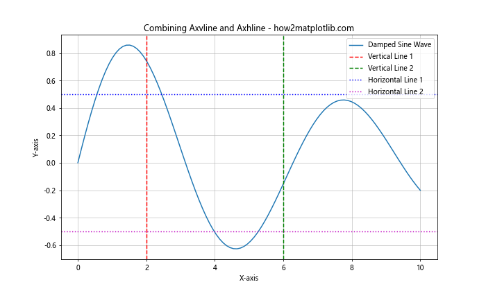
This example demonstrates how to combine matplotlib axvline multiple lines with horizontal lines to create a more complex visualization.
Using Axvline to Highlight Regions
You can use matplotlib axvline multiple lines to highlight specific regions of your plot:
import matplotlib.pyplot as plt
import numpy as np

x = np.linspace(0, 10, 100)
y = np.sin(x) * np.cos(x)

plt.figure(figsize=(10, 6))
plt.plot(x, y, label='Sin(x) * Cos(x)')

plt.axvline(x=2, color='r', linestyle='--', label='Region Start')
plt.axvline(x=6, color='r', linestyle='--', label='Region End')
plt.axvspan(2, 6, alpha=0.2, color='yellow', label='Highlighted Region')

plt.title('Highlighting Regions with Matplotlib Axvline Multiple Lines - how2matplotlib.com')
plt.xlabel('X-axis')
plt.ylabel('Y-axis')
plt.legend()
plt.show()
Output:
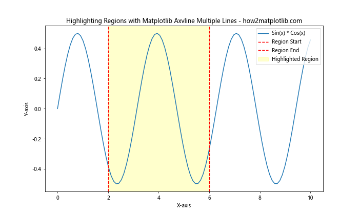
This example shows how to use matplotlib axvline multiple lines to define the boundaries of a highlighted region, which is then filled using the axvspan function.
Matplotlib Axvline Multiple Lines in Time Series Data
Matplotlib axvline multiple lines can be particularly useful when working with time series data. Let’s explore some examples of how to use this technique with datetime data.
Basic Time Series Plot with Axvline
Here’s an example of using matplotlib axvline multiple lines in a time series plot:
import matplotlib.pyplot as plt
import numpy as np
import pandas as pd

# Generate sample time series data
dates = pd.date_range(start='2023-01-01', end='2023-12-31', freq='D')
values = np.cumsum(np.random.randn(len(dates)))

plt.figure(figsize=(12, 6))
plt.plot(dates, values, label='Time Series Data')

plt.axvline(pd.Timestamp('2023-03-15'), color='r', linestyle='--', label='Event 1')
plt.axvline(pd.Timestamp('2023-07-01'), color='g', linestyle='--', label='Event 2')
plt.axvline(pd.Timestamp('2023-11-30'), color='b', linestyle='--', label='Event 3')

plt.title('Time Series Data with Matplotlib Axvline Multiple Lines - how2matplotlib.com')
plt.xlabel('Date')
plt.ylabel('Value')
plt.legend()
plt.grid(True)
plt.show()
Output:
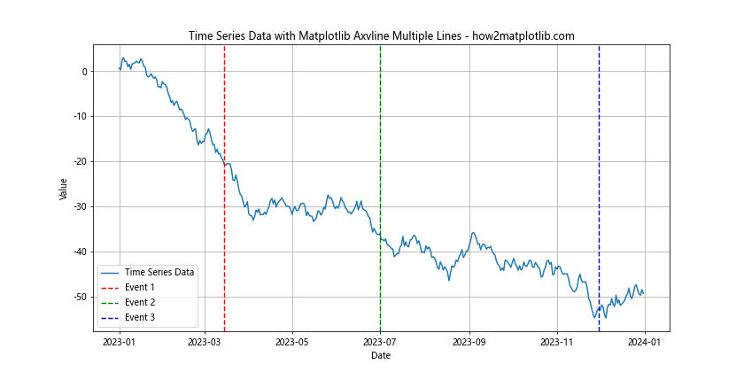
This example demonstrates how to use matplotlib axvline multiple lines to highlight specific dates in a time series plot.
Highlighting Weekends in Time Series Data
You can use matplotlib axvline multiple lines to highlight weekends in a time series plot:
import matplotlib.pyplot as plt
import numpy as np
import pandas as pd

# Generate sample time series data
dates = pd.date_range(start='2023-01-01', end='2023-01-31', freq='D')
values = np.cumsum(np.random.randn(len(dates)))

plt.figure(figsize=(12, 6))
plt.plot(dates, values, label='Time Series Data')

for date in dates[dates.dayofweek.isin([5, 6])]:
    plt.axvspan(date, date + pd.Timedelta(days=1), alpha=0.2, color='yellow')

plt.title('Highlighting Weekends with Matplotlib Axvline Multiple Lines - how2matplotlib.com')
plt.xlabel('Date')
plt.ylabel('Value')
plt.legend()
plt.grid(True)
plt.show()
Output:
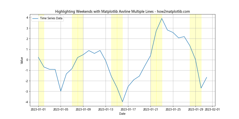
This example shows how to use matplotlib axvline multiple lines to highlight weekends in a time series plot, making it easier to identify patterns related to weekdays and weekends.
Matplotlib Axvline Multiple Lines in Statistical Visualizations
Matplotlib axvline multiple lines can be very useful in statistical visualizations, such as histograms and box plots. Let’s explore some examples of how to use this technique in statistical contexts.
Adding Percentiles to a Histogram
You can use matplotlib axvline multiple lines to add percentile markers to a histogram:
import matplotlib.pyplot as plt
import numpy as np

data = np.random.normal(0, 1, 1000)
percentiles = np.percentile(data, [25, 50, 75])

plt.figure(figsize=(10, 6))
plt.hist(data, bins=30, edgecolor='black')

for i, p in enumerate(percentiles):
    plt.axvline(p, color=['r', 'g', 'b'][i], linestyle='--',
                label=f'{[25, 50, 75][i]}th Percentile')

plt.title('Histogram with Percentiles using Matplotlib Axvline Multiple Lines - how2matplotlib.com')
plt.xlabel('Value')
plt.ylabel('Frequency')
plt.legend()
plt.show()
Output:
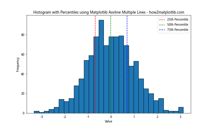
This example demonstrates how to use matplotlib axvline multiple lines to add percentile markers to a histogram, providing additional statistical information about the distribution.
Adding Reference Lines to a Box Plot
You can use matplotlib axvline multiple lines to add reference lines to a box plot:
import matplotlib.pyplot as plt
import numpy as np

data = [np.random.normal(0, std, 100) for std in range(1, 4)]

fig, ax = plt.subplots(figsize=(10, 6))
ax.boxplot(data)

ax.axhline(y=0, color='r', linestyle='--', label='Mean')
ax.axhline(y=1, color='g', linestyle=':', label='1 Std Dev')
ax.axhline(y=-1, color='g', linestyle=':', label='-1 Std Dev')

plt.title('Box Plot with Reference Lines using Matplotlib Axvline Multiple Lines - how2matplotlib.com')
plt.xlabel('Group')
plt.ylabel('Value')
plt.legend()
plt.show()
Output:
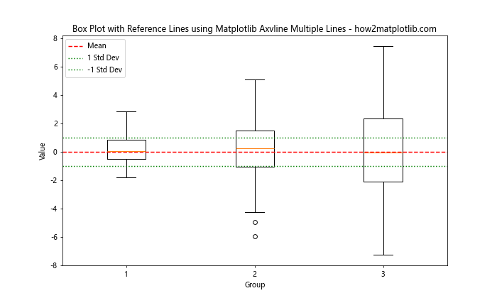
This example shows how to use matplotlib axvline multiple lines (in this case, horizontal lines) to add reference lines to a box plot, making it easier to compare the distributions to standard statistical measures.
Matplotlib Axvline Multiple Lines in Heatmaps
Matplotlib axvline multiple lines can be used to highlight specific columns or rows in heatmaps. Let’s explore an example of this technique.
Highlighting Columns in a Heatmap
Here’s an example of using matplotlib axvline multiple lines to highlight specific columns in a heatmap:
import matplotlib.pyplot as plt
import numpy as np

data = np.random.rand(10, 12)
fig, ax = plt.subplots(figsize=(12, 8))
im = ax.imshow(data, cmap='viridis')

ax.set_xticks(np.arange(data.shape[1]))
ax.set_yticks(np.arange(data.shape[0]))
ax.set_xticklabels([f'Col {i+1}' for i in range(data.shape[1])])
ax.set_yticklabels([f'Row {i+1}' for i in range(data.shape[0])])

plt.setp(ax.get_xticklabels(), rotation=45, ha="right", rotation_mode="anchor")

for i in [2, 5, 8]:
    ax.axvline(x=i-0.5, color='r', linestyle='--')

plt.colorbar(im)
plt.title('Heatmap with Highlighted Columns using Matplotlib Axvline Multiple Lines - how2matplotlib.com')
plt.tight_layout()
plt.show()
Output:
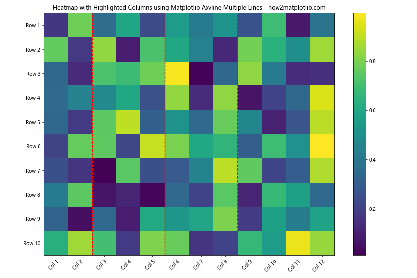
This example demonstrates how to use matplotlib axvline multiple lines to highlight specific columns in a heatmap, which can be useful for drawing attention to particular features or time points in your data.
Matplotlib Axvline Multiple Lines in 3D Plots
While axvline is primarily used in 2D plots, you can adapt the concept to 3D plots by using the plot function to create vertical lines. Here’s an example:
import matplotlib.pyplot as plt
import numpy as np

fig = plt.figure(figsize=(10, 8))
ax = fig.add_subplot(111, projection='3d')

x = np.linspace(-5, 5, 100)
y = np.linspace(-5, 5, 100)
X, Y = np.meshgrid(x, y)
Z = np.sin(np.sqrt(X**2 + Y**2))

ax.plot_surface(X, Y, Z, cmap='viridis')

for x_val in [-3, 0, 3]:
    ax.plot([x_val, x_val], [-5, 5], [-1, 1], color='r', linestyle='--')

ax.set_xlabel('X-axis')
ax.set_ylabel('Y-axis')
ax.set_zlabel('Z-axis')
ax.set_title('3D Plot with Vertical Lines - how2matplotlib.com')
plt.show()
Output:
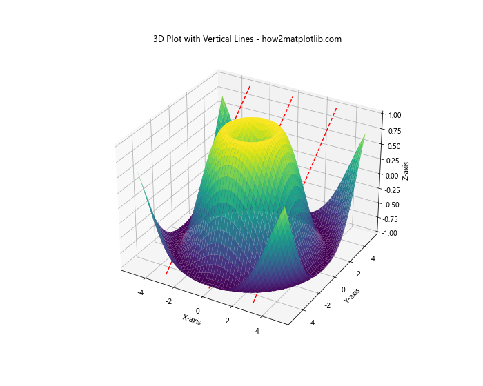
This example shows how to create vertical lines in a 3D plot, which is analogous to using matplotlib axvline multiple lines in 2D plots.
Best Practices for Using Matplotlib Axvline Multiple Lines
When working with matplotlib axvline multiple lines, it’s important to follow some best practices to ensure your visualizations are clear and effective. Here are some tips:
- Use consistent colors and styles: When adding multiple vertical lines, try to use a consistent color scheme and line style that complements your main plot.
Add labels and annotations: Always provide context for your vertical lines by adding labels or annotations that explain their significance.
Consider line width and transparency: Adjust the line width and transparency to ensure your vertical lines are visible but don’t overpower the main data.
Use legends effectively: Include your vertical lines in the plot legend to provide a clear explanation of what each line represents.
Limit the number of lines: While matplotlib axvline multiple lines can be powerful, too many lines can clutter your plot. Use them judiciously to highlight the most important points.
Combine with other plot elements: Consider combining axvline with other plot elements like text annotations, arrows, or shaded regions to create more informative visualizations.
Pay attention to z-order: If your vertical lines are being obscured by other plot elements, you may need to adjust their z-order to ensure they’re visible.
Troubleshooting Common Issues with Matplotlib Axvline Multiple Lines
When working with matplotlib axvline multiple lines, you may encounter some common issues. Here are some problems and their solutions: