Comprehensive Guide to Matplotlib Colormaps List: How to Enhance Your Data Visualization
Matplotlib colormaps list is an essential aspect of data visualization in Python. Colormaps in Matplotlib provide a powerful way to represent data through color, enhancing the readability and interpretability of your plots. This comprehensive guide will explore the various aspects of Matplotlib colormaps list, from basic usage to advanced techniques, helping you master the art of color-based data representation.
Understanding Matplotlib Colormaps List
Matplotlib colormaps list refers to the collection of predefined color schemes available in the Matplotlib library. These colormaps are used to map scalar data to colors, allowing for effective visualization of data trends, patterns, and distributions. The Matplotlib colormaps list offers a wide range of options, from sequential and diverging colormaps to qualitative and perceptually uniform colormaps.
Let’s start with a basic example of how to use a colormap from the Matplotlib colormaps list:
import matplotlib.pyplot as plt
import numpy as np

# Generate sample data
data = np.random.rand(10, 10)

# Create a figure and axis
fig, ax = plt.subplots()

# Plot the data using a colormap from the Matplotlib colormaps list
im = ax.imshow(data, cmap='viridis')

# Add a colorbar
plt.colorbar(im)

# Set the title
plt.title('Using Matplotlib Colormaps List - how2matplotlib.com')

# Display the plot
plt.show()
Output:
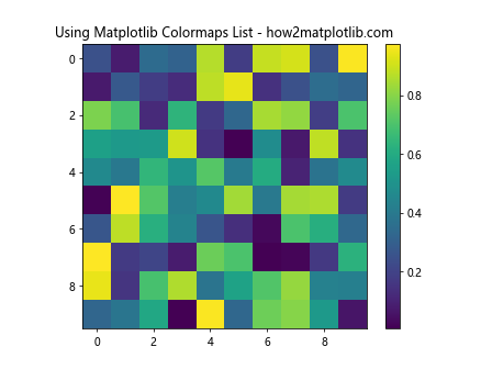
In this example, we use the ‘viridis’ colormap from the Matplotlib colormaps list to visualize a 2D array of random data. The imshow function maps the data values to colors using the specified colormap.
Exploring the Matplotlib Colormaps List
The Matplotlib colormaps list contains a variety of colormaps suitable for different types of data and visualization needs. Let’s explore some of the main categories of colormaps available in the Matplotlib colormaps list:
Sequential Colormaps in Matplotlib Colormaps List
Sequential colormaps in the Matplotlib colormaps list are ideal for representing data that progresses from low to high values. These colormaps use a gradual change in color intensity or hue to show the progression of data values.
Here’s an example using a sequential colormap from the Matplotlib colormaps list:
import matplotlib.pyplot as plt
import numpy as np

# Generate sample data
x = np.linspace(0, 10, 100)
y = np.linspace(0, 10, 100)
X, Y = np.meshgrid(x, y)
Z = np.sin(X) * np.cos(Y)

# Create a figure and axis
fig, ax = plt.subplots()

# Plot the data using a sequential colormap from the Matplotlib colormaps list
im = ax.contourf(X, Y, Z, cmap='Blues')

# Add a colorbar
plt.colorbar(im)

# Set the title
plt.title('Sequential Colormap from Matplotlib Colormaps List - how2matplotlib.com')

# Display the plot
plt.show()
Output:
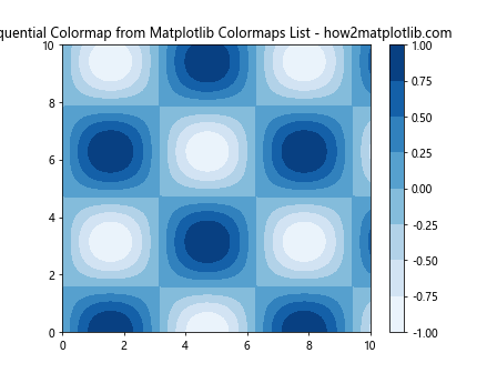
In this example, we use the ‘Blues’ sequential colormap from the Matplotlib colormaps list to visualize a 2D sinusoidal function. The contourf function creates a filled contour plot, mapping the data values to colors using the specified colormap.
Diverging Colormaps in Matplotlib Colormaps List
Diverging colormaps in the Matplotlib colormaps list are useful for data that has a meaningful midpoint or zero value. These colormaps typically use two different hues that diverge from a neutral color at the midpoint.
Let’s see an example of using a diverging colormap from the Matplotlib colormaps list:
import matplotlib.pyplot as plt
import numpy as np

# Generate sample data
x = np.linspace(-5, 5, 100)
y = np.linspace(-5, 5, 100)
X, Y = np.meshgrid(x, y)
Z = X * Y

# Create a figure and axis
fig, ax = plt.subplots()

# Plot the data using a diverging colormap from the Matplotlib colormaps list
im = ax.pcolormesh(X, Y, Z, cmap='RdBu', shading='auto')

# Add a colorbar
plt.colorbar(im)

# Set the title
plt.title('Diverging Colormap from Matplotlib Colormaps List - how2matplotlib.com')

# Display the plot
plt.show()
Output:
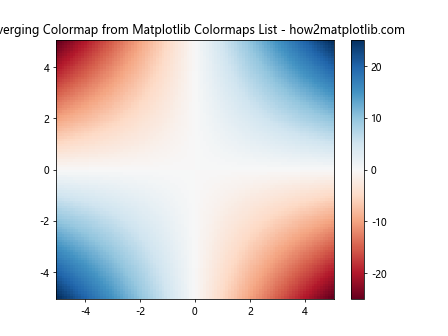
In this example, we use the ‘RdBu’ diverging colormap from the Matplotlib colormaps list to visualize a 2D function where the product of X and Y coordinates determines the color. The pcolormesh function creates a pseudocolor plot, mapping the data values to colors using the specified colormap.
Qualitative Colormaps in Matplotlib Colormaps List
Qualitative colormaps in the Matplotlib colormaps list are designed for categorical data, where distinct colors represent different categories or classes. These colormaps use a set of distinct colors that are easily distinguishable from each other.
Here’s an example of using a qualitative colormap from the Matplotlib colormaps list:
import matplotlib.pyplot as plt
import numpy as np

# Generate sample data
categories = ['A', 'B', 'C', 'D', 'E']
values = np.random.rand(5)

# Create a figure and axis
fig, ax = plt.subplots()

# Plot the data using a qualitative colormap from the Matplotlib colormaps list
bars = ax.bar(categories, values, color=plt.cm.Set3(np.arange(len(categories))))

# Set the title
plt.title('Qualitative Colormap from Matplotlib Colormaps List - how2matplotlib.com')

# Display the plot
plt.show()
Output:
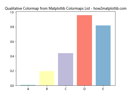
In this example, we use the ‘Set3’ qualitative colormap from the Matplotlib colormaps list to assign distinct colors to different categories in a bar plot. The plt.cm.Set3 function is used to generate colors from the colormap.
Customizing Colormaps in Matplotlib Colormaps List
While the Matplotlib colormaps list provides a wide range of predefined colormaps, you can also create custom colormaps to suit your specific visualization needs. Let’s explore some ways to customize colormaps in Matplotlib:
Creating a Custom Colormap
You can create a custom colormap by defining a list of colors and using the LinearSegmentedColormap class from Matplotlib. Here’s an example:
import matplotlib.pyplot as plt
import matplotlib.colors as mcolors
import numpy as np

# Define custom colors
colors = ['#FF0000', '#00FF00', '#0000FF']  # Red, Green, Blue

# Create a custom colormap
custom_cmap = mcolors.LinearSegmentedColormap.from_list('custom', colors)

# Generate sample data
data = np.random.rand(10, 10)

# Create a figure and axis
fig, ax = plt.subplots()

# Plot the data using the custom colormap
im = ax.imshow(data, cmap=custom_cmap)

# Add a colorbar
plt.colorbar(im)

# Set the title
plt.title('Custom Colormap in Matplotlib Colormaps List - how2matplotlib.com')

# Display the plot
plt.show()
Output:
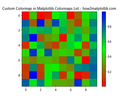
In this example, we create a custom colormap using three colors: red, green, and blue. The LinearSegmentedColormap.from_list function is used to create the colormap, which is then applied to the data visualization.
Reversing a Colormap
Sometimes, you may want to reverse the direction of a colormap from the Matplotlib colormaps list. You can easily do this by appending ‘_r’ to the colormap name. Here’s an example:
import matplotlib.pyplot as plt
import numpy as np

# Generate sample data
x = np.linspace(0, 10, 100)
y = np.linspace(0, 10, 100)
X, Y = np.meshgrid(x, y)
Z = np.sin(X) * np.cos(Y)

# Create a figure with two subplots
fig, (ax1, ax2) = plt.subplots(1, 2, figsize=(12, 5))

# Plot using the original colormap
im1 = ax1.contourf(X, Y, Z, cmap='viridis')
ax1.set_title('Original Colormap - how2matplotlib.com')
plt.colorbar(im1, ax=ax1)

# Plot using the reversed colormap
im2 = ax2.contourf(X, Y, Z, cmap='viridis_r')
ax2.set_title('Reversed Colormap - how2matplotlib.com')
plt.colorbar(im2, ax=ax2)

# Adjust layout and display the plot
plt.tight_layout()
plt.show()
Output:
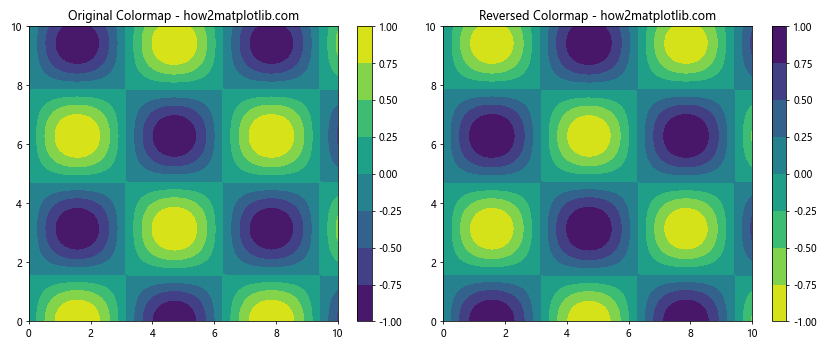
In this example, we create two subplots: one using the original ‘viridis’ colormap and another using the reversed ‘viridis_r’ colormap. This allows for easy comparison of the original and reversed colormaps from the Matplotlib colormaps list.
Advanced Techniques with Matplotlib Colormaps List
Now that we’ve covered the basics of using colormaps from the Matplotlib colormaps list, let’s explore some advanced techniques to enhance your data visualizations:
Normalizing Colormaps
Normalizing colormaps allows you to map your data to a specific range of colors. This is particularly useful when dealing with data that has outliers or when you want to focus on a specific range of values. Matplotlib provides several normalization classes, such as Normalize, LogNorm, and SymLogNorm.
Here’s an example of using LogNorm with a colormap from the Matplotlib colormaps list:
import matplotlib.pyplot as plt
import matplotlib.colors as mcolors
import numpy as np

# Generate sample data with a large range of values
data = np.random.lognormal(mean=0, sigma=2, size=(20, 20))

# Create a figure and axis
fig, ax = plt.subplots()

# Plot the data using a colormap from the Matplotlib colormaps list with LogNorm
im = ax.imshow(data, cmap='plasma', norm=mcolors.LogNorm())

# Add a colorbar
plt.colorbar(im)

# Set the title
plt.title('LogNorm with Matplotlib Colormaps List - how2matplotlib.com')

# Display the plot
plt.show()
Output:
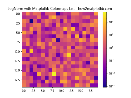
In this example, we use LogNorm to apply a logarithmic scaling to the colormap. This is particularly useful for data with a large range of values, as it helps to visualize both small and large values effectively.
Discrete Colormaps
While continuous colormaps are useful for representing continuous data, discrete colormaps can be more appropriate for categorical data or when you want to emphasize specific value ranges. You can create a discrete colormap by using the BoundaryNorm class along with a colormap from the Matplotlib colormaps list.
Here’s an example of creating a discrete colormap:
import matplotlib.pyplot as plt
import matplotlib.colors as mcolors
import numpy as np

# Generate sample data
data = np.random.rand(10, 10)

# Define the boundaries for discrete colors
bounds = [0, 0.2, 0.4, 0.6, 0.8, 1]

# Create a discrete colormap
norm = mcolors.BoundaryNorm(bounds, plt.get_cmap('viridis').N)

# Create a figure and axis
fig, ax = plt.subplots()

# Plot the data using the discrete colormap
im = ax.imshow(data, cmap='viridis', norm=norm)

# Add a colorbar
plt.colorbar(im, boundaries=bounds, ticks=bounds)

# Set the title
plt.title('Discrete Colormap from Matplotlib Colormaps List - how2matplotlib.com')

# Display the plot
plt.show()
Output:
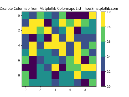
In this example, we create a discrete colormap by defining boundaries and using BoundaryNorm. This results in a visualization where the data is mapped to distinct color ranges based on the specified boundaries.
Combining Multiple Colormaps
Sometimes, you may want to use different colormaps for different parts of your data. Matplotlib allows you to create custom colormaps by combining existing colormaps from the Matplotlib colormaps list. Here’s an example of how to do this:
import matplotlib.pyplot as plt
import matplotlib.colors as mcolors
import numpy as np

# Create a custom colormap by combining two existing colormaps
cmap1 = plt.get_cmap('viridis')
cmap2 = plt.get_cmap('plasma')
colors1 = cmap1(np.linspace(0, 1, 128))
colors2 = cmap2(np.linspace(0, 1, 128))
combined_colors = np.vstack((colors1, colors2))
combined_cmap = mcolors.LinearSegmentedColormap.from_list('combined', combined_colors)

# Generate sample data
data = np.random.rand(20, 20)

# Create a figure and axis
fig, ax = plt.subplots()

# Plot the data using the combined colormap
im = ax.imshow(data, cmap=combined_cmap)

# Add a colorbar
plt.colorbar(im)

# Set the title
plt.title('Combined Colormap from Matplotlib Colormaps List - how2matplotlib.com')

# Display the plot
plt.show()
Output:
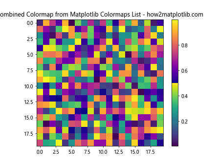
In this example, we create a new colormap by combining the ‘viridis’ and ‘plasma’ colormaps from the Matplotlib colormaps list. This allows for more flexibility in color representation and can be useful for highlighting different aspects of your data.
Best Practices for Using Matplotlib Colormaps List
When working with colormaps from the Matplotlib colormaps list, it’s important to follow some best practices to ensure effective and accurate data visualization:
- Choose appropriate colormaps: Select colormaps that are suitable for your data type and the message you want to convey. For example, use sequential colormaps for continuous data and qualitative colormaps for categorical data.
Consider color perception: Be mindful of color perception issues, such as color blindness. Use perceptually uniform colormaps like ‘viridis’ or ‘plasma’ for better readability across different viewers.
Use diverging colormaps wisely: When using diverging colormaps, ensure that the midpoint of the colormap aligns with a meaningful value in your data, such as zero or the mean.
Avoid rainbow colormaps: While visually appealing, rainbow colormaps like ‘jet’ can be misleading and difficult to interpret. Opt for perceptually uniform colormaps instead.
Provide context with colorbars: Always include a colorbar when using colormaps to provide context and help viewers interpret the data accurately.
Consider data range: Use normalization techniques when dealing with data that has a large range or outliers to ensure all important features are visible.
Test your visualizations: View your plots on different devices and in different lighting conditions to ensure they are clear and easy to interpret.
Let’s implement some of these best practices in an example: