How to Master Matplotlib Colormaps: A Comprehensive Guide to get_cmap
Matplotlib colormaps and the get_cmap function are essential tools for data visualization in Python. This comprehensive guide will explore the intricacies of matplotlib colormaps and how to effectively use the get_cmap function to enhance your plots and charts. We’ll cover everything from basic concepts to advanced techniques, providing you with the knowledge and skills to create stunning visualizations using matplotlib colormaps.
Understanding Matplotlib Colormaps
Matplotlib colormaps are a crucial component of data visualization, allowing you to represent data values using a range of colors. The get_cmap function in matplotlib is the primary method for accessing and applying these colormaps to your plots. Before we dive into the specifics of get_cmap, let’s first explore the concept of colormaps in matplotlib.
A colormap in matplotlib is a mapping of data values to colors. It defines how numerical values are translated into visual representations through color. Matplotlib offers a wide variety of built-in colormaps, each designed for different types of data and visualization needs. These colormaps can be broadly categorized into sequential, diverging, and qualitative types.
Let’s start with a simple example to demonstrate how to use a matplotlib colormap:
import matplotlib.pyplot as plt
import numpy as np

# Create some sample data
x = np.linspace(0, 10, 100)
y = np.sin(x)

# Create a plot with a colormap
plt.figure(figsize=(10, 6))
plt.scatter(x, y, c=y, cmap='viridis')
plt.colorbar(label='Sin(x)')
plt.title('Matplotlib Colormap Example - how2matplotlib.com')
plt.xlabel('X')
plt.ylabel('Y')
plt.show()
Output:
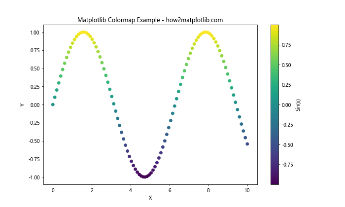
In this example, we create a scatter plot of sine values and use the ‘viridis’ colormap to represent the y-values. The plt.scatter function automatically applies the colormap based on the ‘c’ parameter, which specifies the values to be mapped to colors.
Introducing the get_cmap Function
The get_cmap function is a powerful tool in matplotlib that allows you to retrieve and manipulate colormaps. It’s part of the matplotlib.cm module and provides a way to access both built-in and custom colormaps. Let’s explore how to use get_cmap in your matplotlib visualizations.
Here’s a basic example of using get_cmap:
import matplotlib.pyplot as plt
import matplotlib.cm as cm
import numpy as np

# Create some sample data
x = np.linspace(0, 10, 100)
y = np.cos(x)

# Get a colormap using get_cmap
cmap = cm.get_cmap('plasma')

# Create a plot with the retrieved colormap
plt.figure(figsize=(10, 6))
plt.scatter(x, y, c=y, cmap=cmap)
plt.colorbar(label='Cos(x)')
plt.title('Using get_cmap in Matplotlib - how2matplotlib.com')
plt.xlabel('X')
plt.ylabel('Y')
plt.show()
Output:
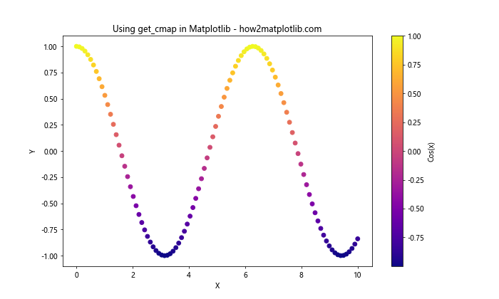
In this example, we use get_cmap to retrieve the ‘plasma’ colormap and apply it to our scatter plot. The get_cmap function returns a colormap object that can be directly used in plotting functions.
Exploring Built-in Matplotlib Colormaps
Matplotlib offers a wide range of built-in colormaps that can be accessed using the get_cmap function. These colormaps are designed to suit various data types and visualization needs. Let’s explore some of the most commonly used built-in colormaps in matplotlib.
Sequential Colormaps
Sequential colormaps are ideal for representing data that progresses from low to high values. They typically use a single hue that varies in lightness or saturation. Here’s an example using the ‘viridis’ sequential colormap:
import matplotlib.pyplot as plt
import matplotlib.cm as cm
import numpy as np

# Create sample data
x = np.linspace(0, 10, 20)
y = np.linspace(0, 10, 20)
X, Y = np.meshgrid(x, y)
Z = np.sin(X) * np.cos(Y)

# Get the viridis colormap
cmap = cm.get_cmap('viridis')

# Create a plot with the viridis colormap
plt.figure(figsize=(10, 8))
plt.pcolormesh(X, Y, Z, cmap=cmap)
plt.colorbar(label='Z values')
plt.title('Sequential Colormap (Viridis) - how2matplotlib.com')
plt.xlabel('X')
plt.ylabel('Y')
plt.show()
Output:
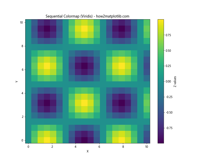
This example demonstrates how to use the ‘viridis’ colormap to represent a 2D array of data. The pcolormesh function creates a pseudocolor plot, and the colormap is applied to represent the Z values.
Diverging Colormaps
Diverging colormaps are useful for data that has a meaningful center point or zero value. They typically use two different hues that diverge from a neutral color at the midpoint. Let’s use the ‘coolwarm’ diverging colormap as an example:
import matplotlib.pyplot as plt
import matplotlib.cm as cm
import numpy as np

# Create sample data
x = np.linspace(-5, 5, 100)
y = np.linspace(-5, 5, 100)
X, Y = np.meshgrid(x, y)
Z = X * Y

# Get the coolwarm colormap
cmap = cm.get_cmap('coolwarm')

# Create a plot with the coolwarm colormap
plt.figure(figsize=(10, 8))
plt.contourf(X, Y, Z, cmap=cmap, levels=20)
plt.colorbar(label='Z values')
plt.title('Diverging Colormap (Coolwarm) - how2matplotlib.com')
plt.xlabel('X')
plt.ylabel('Y')
plt.show()
Output:
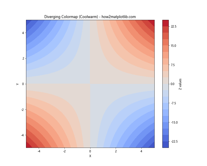
In this example, we use the ‘coolwarm’ colormap to visualize a function where positive and negative values are represented by different colors, diverging from a neutral color at zero.
Qualitative Colormaps
Qualitative colormaps are designed for categorical data, where each color represents a distinct category. These colormaps use a set of distinct colors that are easily distinguishable. Let’s use the ‘Set3’ qualitative colormap as an example:
import matplotlib.pyplot as plt
import matplotlib.cm as cm
import numpy as np

# Create sample categorical data
categories = ['A', 'B', 'C', 'D', 'E', 'F', 'G', 'H']
values = np.random.rand(len(categories))

# Get the Set3 colormap
cmap = cm.get_cmap('Set3')

# Create a bar plot with the Set3 colormap
plt.figure(figsize=(12, 6))
bars = plt.bar(categories, values, color=cmap(np.linspace(0, 1, len(categories))))
plt.colorbar(plt.cm.ScalarMappable(cmap=cmap), label='Category')
plt.title('Qualitative Colormap (Set3) - how2matplotlib.com')
plt.xlabel('Categories')
plt.ylabel('Values')
plt.show()
This example demonstrates how to use the ‘Set3’ qualitative colormap to represent different categories in a bar plot. Each bar is assigned a distinct color from the colormap.
Customizing Colormaps with get_cmap
The get_cmap function in matplotlib not only allows you to access built-in colormaps but also provides options for customizing and modifying colormaps. Let’s explore some advanced techniques for working with colormaps using get_cmap.
Reversing Colormaps
You can easily reverse a colormap by appending ‘_r’ to its name when using get_cmap. This is useful when you want to invert the color progression of a colormap. Here’s an example:
import matplotlib.pyplot as plt
import matplotlib.cm as cm
import numpy as np

# Create sample data
x = np.linspace(0, 10, 100)
y = np.sin(x)

# Get the original and reversed colormaps
cmap_original = cm.get_cmap('viridis')
cmap_reversed = cm.get_cmap('viridis_r')

# Create subplots
fig, (ax1, ax2) = plt.subplots(1, 2, figsize=(15, 6))

# Plot with original colormap
scatter1 = ax1.scatter(x, y, c=y, cmap=cmap_original)
ax1.set_title('Original Viridis Colormap - how2matplotlib.com')
plt.colorbar(scatter1, ax=ax1, label='Sin(x)')

# Plot with reversed colormap
scatter2 = ax2.scatter(x, y, c=y, cmap=cmap_reversed)
ax2.set_title('Reversed Viridis Colormap - how2matplotlib.com')
plt.colorbar(scatter2, ax=ax2, label='Sin(x)')

plt.tight_layout()
plt.show()
Output:
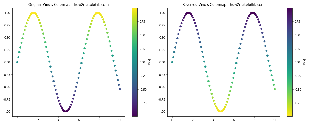
This example demonstrates how to use both the original ‘viridis’ colormap and its reversed version ‘viridis_r’ to visualize the same data, showing the effect of reversing a colormap.
Creating Custom Colormaps
While matplotlib provides a wide range of built-in colormaps, you may sometimes need to create a custom colormap tailored to your specific needs. The get_cmap function can be used in conjunction with LinearSegmentedColormap to create custom colormaps. Here’s an example:
import matplotlib.pyplot as plt
import matplotlib.cm as cm
import matplotlib.colors as colors
import numpy as np

# Define custom colors
colors_list = ['#FF0000', '#00FF00', '#0000FF']  # Red, Green, Blue

# Create a custom colormap
n_bins = 100  # Number of color bins
custom_cmap = colors.LinearSegmentedColormap.from_list('custom_cmap', colors_list, N=n_bins)

# Register the custom colormap
plt.register_cmap(cmap=custom_cmap)

# Get the custom colormap using get_cmap
cmap = cm.get_cmap('custom_cmap')

# Create sample data
x = np.linspace(0, 10, 100)
y = np.sin(x) * np.cos(x)

# Create a plot with the custom colormap
plt.figure(figsize=(10, 6))
plt.scatter(x, y, c=y, cmap=cmap)
plt.colorbar(label='Sin(x) * Cos(x)')
plt.title('Custom Colormap Example - how2matplotlib.com')
plt.xlabel('X')
plt.ylabel('Y')
plt.show()
Output:
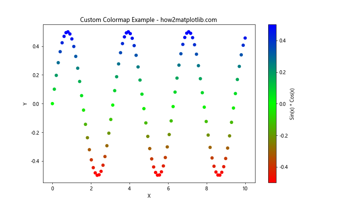
In this example, we create a custom colormap that transitions from red to green to blue. We then register this colormap and use get_cmap to retrieve it for our plot.
Advanced Techniques with get_cmap
Now that we’ve covered the basics of using get_cmap and explored various types of colormaps, let’s dive into some advanced techniques that can enhance your data visualizations using matplotlib colormaps.
Discrete Colormaps
While continuous colormaps are great for representing smooth transitions in data, sometimes you may want to use discrete color levels. The get_cmap function can be used to create discrete colormaps by specifying the number of levels. Here’s an example:
import matplotlib.pyplot as plt
import matplotlib.cm as cm
import numpy as np

# Create sample data
x = np.linspace(0, 10, 100)
y = np.sin(x)

# Get a continuous colormap
continuous_cmap = cm.get_cmap('viridis')

# Create a discrete colormap with 5 levels
n_levels = 5
discrete_cmap = cm.get_cmap('viridis', n_levels)

# Create subplots
fig, (ax1, ax2) = plt.subplots(1, 2, figsize=(15, 6))

# Plot with continuous colormap
scatter1 = ax1.scatter(x, y, c=y, cmap=continuous_cmap)
ax1.set_title('Continuous Colormap - how2matplotlib.com')
plt.colorbar(scatter1, ax=ax1, label='Sin(x)')

# Plot with discrete colormap
scatter2 = ax2.scatter(x, y, c=y, cmap=discrete_cmap)
ax2.set_title('Discrete Colormap (5 levels) - how2matplotlib.com')
plt.colorbar(scatter2, ax=ax2, label='Sin(x)', ticks=np.linspace(y.min(), y.max(), n_levels))

plt.tight_layout()
plt.show()
Output:
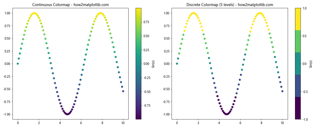
This example demonstrates the difference between a continuous colormap and a discrete colormap with 5 levels. The discrete colormap quantizes the color range into distinct steps.
Combining Multiple Colormaps
Sometimes, you may want to combine multiple colormaps to create a more complex color scheme. The get_cmap function can be used in conjunction with ListedColormap to achieve this. Here’s an example:
import matplotlib.pyplot as plt
import matplotlib.cm as cm
import matplotlib.colors as colors
import numpy as np

# Get two existing colormaps
cmap1 = cm.get_cmap('viridis')
cmap2 = cm.get_cmap('plasma')

# Combine the colormaps
combined_colors = np.vstack((cmap1(np.linspace(0, 1, 128)),
                             cmap2(np.linspace(0, 1, 128))))
combined_cmap = colors.ListedColormap(combined_colors)

# Create sample data
x = np.linspace(0, 10, 100)
y = np.linspace(0, 10, 100)
X, Y = np.meshgrid(x, y)
Z = np.sin(X) * np.cos(Y)

# Create a plot with the combined colormap
plt.figure(figsize=(10, 8))
plt.pcolormesh(X, Y, Z, cmap=combined_cmap)
plt.colorbar(label='Z values')
plt.title('Combined Colormap (Viridis + Plasma) - how2matplotlib.com')
plt.xlabel('X')
plt.ylabel('Y')
plt.show()
Output:
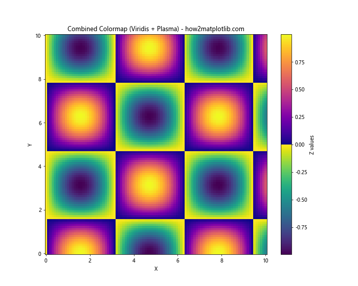
In this example, we combine the ‘viridis’ and ‘plasma’ colormaps to create a new colormap that transitions from one to the other. This technique can be useful for creating custom color schemes that highlight different ranges of your data.
Using Colormaps for Categorical Data
While colormaps are often used for continuous data, they can also be applied to categorical data. The get_cmap function can be used to create a discrete colormap for categorical variables. Here’s an example:
import matplotlib.pyplot as plt
import matplotlib.cm as cm
import numpy as np

# Create sample categorical data
categories = ['A', 'B', 'C', 'D', 'E']
values = [3, 7, 2, 5, 8]

# Get a colormap and create a color list
cmap = cm.get_cmap('Set1')
colors = cmap(np.linspace(0, 1, len(categories)))

# Create a bar plot with categorical colors
plt.figure(figsize=(10, 6))
bars = plt.bar(categories, values, color=colors)

# Add a color legend
for cat, color in zip(categories, colors):
    plt.plot([], [], 's', color=color, label=cat)
plt.legend(title='Categories')

plt.title('Categorical Data with Colormap - how2matplotlib.com')
plt.xlabel('Categories')
plt.ylabel('Values')
plt.show()
Output:
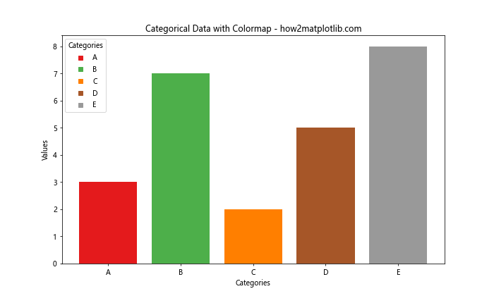
This example demonstrates how to use a colormap to assign distinct colors to categorical data in a bar plot. The ‘Set1’ colormap is used to generate a set of distinct colors for each category.
Best Practices for Using Matplotlib Colormaps and get_cmap
When working with matplotlib colormaps and the get_cmap function, it’s important to follow somebest practices to ensure your visualizations are effective and informative. Here are some key considerations:
- Choose the Right Colormap: Select a colormap that is appropriate for your data type and the message you want to convey. Use sequential colormaps for ordered data, diverging colormaps for data with a meaningful midpoint, and qualitative colormaps for categorical data.
Consider Color Blindness: When selecting or creating colormaps, consider color blindness accessibility. Matplotlib provides colorblind-friendly colormaps like ‘viridis’ and ‘cividis’.
Use Perceptually Uniform Colormaps: Opt for perceptually uniform colormaps like ‘viridis’, ‘plasma’, or ‘inferno’ for continuous data to ensure that changes in color accurately represent changes in data values.
Avoid Rainbow Colormaps: While visually striking, rainbow colormaps like ‘jet’ can be misleading and are generally discouraged in scientific visualization.
Provide Color Scales: Always include a colorbar or legend to help viewers interpret the relationship between colors and data values.
Limit the Number of Colors: For categorical data, limit the number of distinct colors to 7-10 to avoid overwhelming the viewer.
Consider the Background: Ensure that your colormap contrasts well with the background of your plot for better readability.
Let’s implement some of these best practices in an example: