How to Set Matplotlib Colorbar Min and Max Values: A Comprehensive Guide
Matplotlib colorbar min max is an essential aspect of data visualization in Python. When working with Matplotlib, understanding how to set the minimum and maximum values of a colorbar can greatly enhance the clarity and effectiveness of your plots. This comprehensive guide will explore various techniques and best practices for manipulating Matplotlib colorbar min max settings, providing you with the knowledge to create more informative and visually appealing visualizations.
Understanding Matplotlib Colorbar Min Max
Before diving into the specifics of setting Matplotlib colorbar min max values, it’s important to understand what a colorbar is and why controlling its range is crucial. A colorbar in Matplotlib is a visual representation of the mapping between color and data values in a plot. By adjusting the minimum and maximum values of the colorbar, you can control how your data is represented visually, highlighting specific ranges or normalizing the color scale across different datasets.
Let’s start with a basic example to illustrate the concept of Matplotlib colorbar min max:
import matplotlib.pyplot as plt
import numpy as np

# Generate sample data
data = np.random.rand(10, 10)

# Create a figure and axis
fig, ax = plt.subplots()

# Create a heatmap with a colorbar
im = ax.imshow(data)
cbar = plt.colorbar(im)

# Set the title
plt.title("Basic Colorbar Example - how2matplotlib.com")

plt.show()
Output:
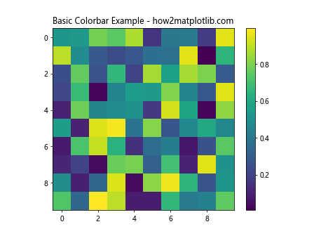
In this example, we create a simple heatmap using random data and add a default colorbar. The colorbar’s minimum and maximum values are automatically set based on the data range. However, there are many scenarios where you might want to customize these values to better represent your data or maintain consistency across multiple plots.
Setting Matplotlib Colorbar Min Max Using vmin and vmax
One of the most straightforward ways to set Matplotlib colorbar min max values is by using the vmin and vmax parameters when creating your plot. These parameters allow you to specify the range of values that the colorbar should represent.
Here’s an example demonstrating how to use vmin and vmax:
import matplotlib.pyplot as plt
import numpy as np

# Generate sample data
data = np.random.rand(10, 10) * 100

# Create a figure and axis
fig, ax = plt.subplots()

# Create a heatmap with a colorbar, setting vmin and vmax
im = ax.imshow(data, vmin=20, vmax=80)
cbar = plt.colorbar(im)

# Set the title
plt.title("Colorbar with vmin and vmax - how2matplotlib.com")

plt.show()
Output:
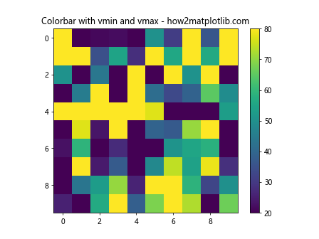
In this example, we’ve set vmin=20 and vmax=80, which means that the colorbar will represent values between 20 and 80, regardless of the actual minimum and maximum values in the data. This can be useful when you want to focus on a specific range of values or maintain consistency across multiple plots with different data ranges.
Normalizing Matplotlib Colorbar Min Max
Sometimes, you may want to normalize your colorbar to represent values between 0 and 1, regardless of the actual data range. Matplotlib provides the Normalize class for this purpose. Here’s an example of how to use it:
import matplotlib.pyplot as plt
import numpy as np
from matplotlib.colors import Normalize

# Generate sample data
data = np.random.rand(10, 10) * 100

# Create a figure and axis
fig, ax = plt.subplots()

# Create a normalized colormap
norm = Normalize(vmin=0, vmax=100)

# Create a heatmap with a normalized colorbar
im = ax.imshow(data, norm=norm)
cbar = plt.colorbar(im)

# Set the title
plt.title("Normalized Colorbar - how2matplotlib.com")

plt.show()
Output:
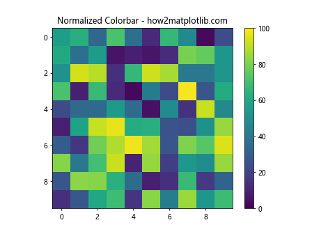
In this example, we use the Normalize class to map our data values (which range from 0 to 100) to a normalized range between 0 and 1. This can be particularly useful when dealing with datasets that have very different scales but need to be compared visually.
Using LogNorm for Matplotlib Colorbar Min Max
When dealing with data that spans several orders of magnitude, a linear colorbar may not be the best choice. In such cases, you can use a logarithmic scale for your colorbar. Matplotlib provides the LogNorm class for this purpose:
import matplotlib.pyplot as plt
import numpy as np
from matplotlib.colors import LogNorm

# Generate sample data with a large range
data = np.random.rand(10, 10) * 1000000

# Create a figure and axis
fig, ax = plt.subplots()

# Create a logarithmic colormap
norm = LogNorm(vmin=1, vmax=1000000)

# Create a heatmap with a logarithmic colorbar
im = ax.imshow(data, norm=norm)
cbar = plt.colorbar(im)

# Set the title
plt.title("Logarithmic Colorbar - how2matplotlib.com")

plt.show()
Output:
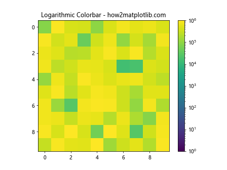
This example demonstrates how to use LogNorm to create a logarithmic colorbar. This is particularly useful for data with a large dynamic range, as it allows you to visualize both small and large values effectively.
Customizing Matplotlib Colorbar Min Max Ticks
In addition to setting the minimum and maximum values of your colorbar, you may want to customize the tick locations and labels. Matplotlib provides several ways to do this. Let’s explore a few options:
Setting Custom Tick Locations
You can set custom tick locations using the set_ticks method of the colorbar:
import matplotlib.pyplot as plt
import numpy as np

# Generate sample data
data = np.random.rand(10, 10) * 100

# Create a figure and axis
fig, ax = plt.subplots()

# Create a heatmap with a colorbar
im = ax.imshow(data)
cbar = plt.colorbar(im)

# Set custom tick locations
cbar.set_ticks([0, 25, 50, 75, 100])

# Set the title
plt.title("Colorbar with Custom Ticks - how2matplotlib.com")

plt.show()
Output:
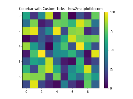
In this example, we’ve set custom tick locations at 0, 25, 50, 75, and 100. This allows you to highlight specific values or ranges on your colorbar.
Setting Custom Tick Labels
You can also customize the labels for your colorbar ticks using the set_ticklabels method:
import matplotlib.pyplot as plt
import numpy as np

# Generate sample data
data = np.random.rand(10, 10) * 100

# Create a figure and axis
fig, ax = plt.subplots()

# Create a heatmap with a colorbar
im = ax.imshow(data)
cbar = plt.colorbar(im)

# Set custom tick locations and labels
cbar.set_ticks([0, 25, 50, 75, 100])
cbar.set_ticklabels(['Low', 'Medium-Low', 'Medium', 'Medium-High', 'High'])

# Set the title
plt.title("Colorbar with Custom Tick Labels - how2matplotlib.com")

plt.show()
Output:
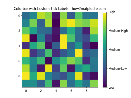
This example demonstrates how to set custom labels for your colorbar ticks, which can be useful for providing more descriptive information about the data ranges.
Extending Matplotlib Colorbar Min Max Range
Sometimes, you may want to extend your colorbar beyond the actual data range to indicate values that are above or below certain thresholds. Matplotlib provides the extend parameter for this purpose:
import matplotlib.pyplot as plt
import numpy as np

# Generate sample data
data = np.random.rand(10, 10) * 100

# Create a figure and axis
fig, ax = plt.subplots()

# Create a heatmap with an extended colorbar
im = ax.imshow(data, vmin=20, vmax=80)
cbar = plt.colorbar(im, extend='both')

# Set the title
plt.title("Extended Colorbar - how2matplotlib.com")

plt.show()
Output:
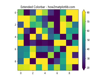
In this example, we’ve used extend='both' to add triangular extensions to both ends of the colorbar, indicating values below 20 and above 80. You can also use extend='min' or extend='max' to extend only one end of the colorbar.
Creating Discrete Matplotlib Colorbar Min Max Ranges
For some visualizations, you may want to create a colorbar with discrete ranges rather than a continuous spectrum. This can be achieved using the BoundaryNorm class:
import matplotlib.pyplot as plt
import numpy as np
from matplotlib.colors import BoundaryNorm
from matplotlib.cm import get_cmap

# Generate sample data
data = np.random.rand(10, 10) * 100

# Create a figure and axis
fig, ax = plt.subplots()

# Define the boundaries and colormap
boundaries = [0, 20, 40, 60, 80, 100]
cmap = get_cmap('viridis')
norm = BoundaryNorm(boundaries, cmap.N, clip=True)

# Create a heatmap with a discrete colorbar
im = ax.imshow(data, cmap=cmap, norm=norm)
cbar = plt.colorbar(im, boundaries=boundaries, ticks=boundaries)

# Set the title
plt.title("Discrete Colorbar - how2matplotlib.com")

plt.show()
Output:
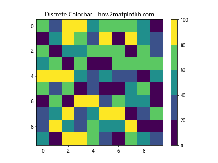
This example creates a colorbar with discrete ranges defined by the boundaries list. This can be useful for categorizing data into specific ranges or classes.
Synchronizing Matplotlib Colorbar Min Max Across Multiple Plots
When creating multiple plots that should be compared directly, it’s often important to ensure that their colorbars have the same min and max values. Here’s an example of how to achieve this:
import matplotlib.pyplot as plt
import numpy as np

# Generate sample data for two plots
data1 = np.random.rand(10, 10) * 100
data2 = np.random.rand(10, 10) * 100

# Find the overall min and max values
vmin = min(data1.min(), data2.min())
vmax = max(data1.max(), data2.max())

# Create a figure with two subplots
fig, (ax1, ax2) = plt.subplots(1, 2, figsize=(12, 5))

# Create the first heatmap
im1 = ax1.imshow(data1, vmin=vmin, vmax=vmax)
plt.colorbar(im1, ax=ax1)
ax1.set_title("Plot 1 - how2matplotlib.com")

# Create the second heatmap
im2 = ax2.imshow(data2, vmin=vmin, vmax=vmax)
plt.colorbar(im2, ax=ax2)
ax2.set_title("Plot 2 - how2matplotlib.com")

plt.tight_layout()
plt.show()
Output:
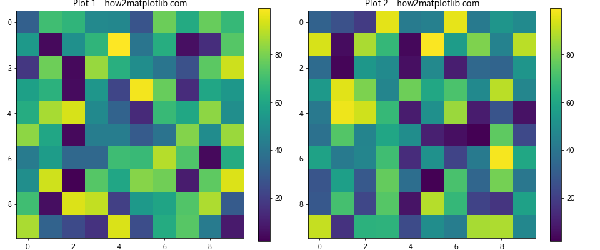
In this example, we calculate the overall minimum and maximum values across both datasets and use these to set the vmin and vmax for both plots. This ensures that the colorbars are synchronized and directly comparable.
Advanced Matplotlib Colorbar Min Max Techniques
As you become more comfortable with Matplotlib colorbar min max settings, you may want to explore some more advanced techniques. Let’s look at a few:
Using Custom Colormaps
While Matplotlib provides many built-in colormaps, you can also create your own custom colormaps:
import matplotlib.pyplot as plt
import numpy as np
from matplotlib.colors import LinearSegmentedColormap

# Generate sample data
data = np.random.rand(10, 10)

# Create a custom colormap
colors = ['darkblue', 'blue', 'lightblue', 'white', 'yellow', 'orange', 'red']
n_bins = len(colors)
cmap = LinearSegmentedColormap.from_list('custom_cmap', colors, N=n_bins)

# Create a figure and axis
fig, ax = plt.subplots()

# Create a heatmap with the custom colormap
im = ax.imshow(data, cmap=cmap)
cbar = plt.colorbar(im)

# Set the title
plt.title("Custom Colormap - how2matplotlib.com")

plt.show()
Output:
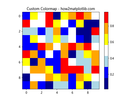
This example demonstrates how to create a custom colormap using LinearSegmentedColormap.from_list(). You can adjust the colors and number of bins to create a colormap that best represents your data.
Colorbar with Diverging Norm
For data that has a meaningful center point (such as temperature anomalies), you might want to use a diverging colormap with a centered norm:
import matplotlib.pyplot as plt
import numpy as np
from matplotlib.colors import TwoSlopeNorm

# Generate sample data
data = np.random.randn(10, 10) * 5

# Create a figure and axis
fig, ax = plt.subplots()

# Create a diverging norm
divnorm = TwoSlopeNorm(vmin=-10, vcenter=0, vmax=10)

# Create a heatmap with a diverging colorbar
im = ax.imshow(data, cmap='RdBu_r', norm=divnorm)
cbar = plt.colorbar(im)

# Set the title
plt.title("Diverging Colorbar - how2matplotlib.com")

plt.show()
Output:
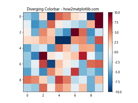
This example uses TwoSlopeNorm to create a diverging colormap centered at zero, which is useful for data that has both positive and negative values.
Best Practices for Matplotlib Colorbar Min Max
When working with Matplotlib colorbar min max settings, keep these best practices in mind:
- Choose appropriate min and max values: Select values that best represent your data range and highlight the important features.
Use consistent colorbars across related plots: This makes it easier to compare different datasets or time series.
Consider the nature of your data: Use linear scales for evenly distributed data and logarithmic scales for data spanning multiple orders of magnitude.
Provide clear labels: Always include units and clear descriptions for your colorbar to ensure your visualization is easily interpretable.
Use colorblind-friendly colormaps: Consider using colormaps that are accessible to individuals with color vision deficiencies.
Avoid rainbow colormaps: While visually striking, rainbow colormaps can be misleading and difficult to interpret accurately.
Test different colormaps: Experiment with various colormaps to find the one that best represents your data.
Use discrete colorbars when appropriate: For categorical data or when you want to emphasize specific ranges, consider using discrete colorbars.
Extend colorbars when necessary: Use the
extendparameter to indicate values outside your specified range.Consider the context: Think about how your colorbar choices affect the overall message of your visualization.
Troubleshooting Common Matplotlib Colorbar Min Max Issues
Even with a solid understanding of Matplotlib colorbar min max techniques, you may encounter some common issues. Here are some problems you might face and how to solve them: