Matplotlib Colorbar Range
The colorbar is a useful tool in data visualization that provides additional information about the colors used in a plot. It serves as a visual representation of the range of values in a plot. Matplotlib, a popular data visualization library in Python, allows us to easily add a colorbar to our plots. In this article, we will explore how to set the range of values in a colorbar using Matplotlib.
Setting the Colorbar Range in Matplotlib
The colorbar range determines the minimum and maximum values that correspond to the colors in the plot. By default, Matplotlib automatically sets the colorbar range based on the minimum and maximum data values in the plot. However, we can specify the colorbar range manually using the vmin and vmax parameters in the imshow() function or the set_ticks() method.
Let’s now explore a few examples to understand how to set the colorbar range in Matplotlib.
Example 1: Setting Colorbar Range using vmin and vmax
In this example, we will create a scatter plot and set the colorbar range manually using the vmin and vmax parameters.
import matplotlib.pyplot as plt
import numpy as np

# Generate random data
np.random.seed(42)
x = np.random.randn(100)
y = np.random.randn(100)
z = np.random.randn(100)

# Create scatter plot
plt.scatter(x, y, c=z)

# Set colorbar range
colorbar = plt.colorbar(fraction=0.05, pad=0.04,)
colorbar.set_ticks([-3, 0, 3])

# Show plot
plt.show()
Output:
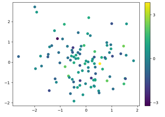
In this example, we set the colorbar range from -3 to 3 using the set_ticks() method. The colorbar range is manually adjusted to highlight the range of values present in the plot.
Example 2: Setting Colorbar Range for Contour Plot
In this example, we will create a contour plot and set the colorbar range manually using the vmin and vmax parameters.
import matplotlib.pyplot as plt
import numpy as np

# Generate data
X, Y = np.meshgrid(np.linspace(-5, 5, 100), np.linspace(-5, 5, 100))
Z = np.sin(np.sqrt(X**2 + Y**2))

# Create contour plot
plt.contourf(X, Y, Z, cmap='coolwarm')

# Set colorbar range
colorbar = plt.colorbar()
colorbar.set_ticks([-1, 0, 1])

# Show plot
plt.show()
Output:
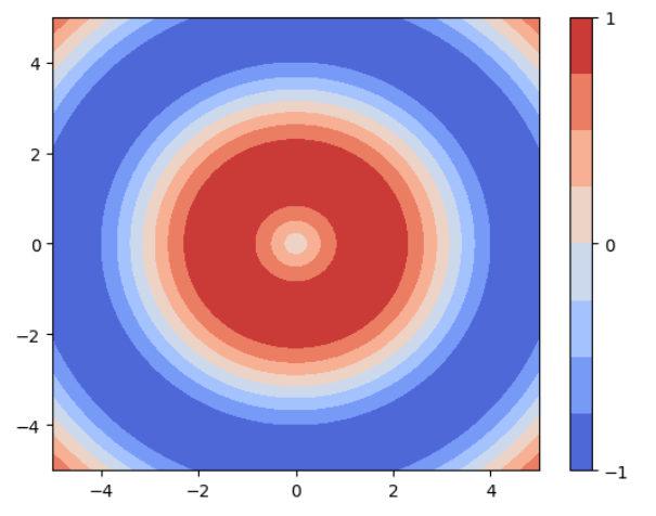
In this example, we set the colorbar range from -1 to 1 using the set_ticks() method. The colorbar range is manually adjusted to highlight the range of values present in the contour plot.
Example 3: Setting Colorbar Range for Image Plot
In this example, we will create an image plot and set the colorbar range manually using the vmin and vmax parameters.
import matplotlib.pyplot as plt
import numpy as np

# Generate random data
np.random.seed(42)
data = np.random.random((10, 10))

# Create image plot
plt.imshow(data, cmap='hot')

# Set colorbar range
colorbar = plt.colorbar()
colorbar.set_ticks([0,  1])

# Show plot
plt.show()
Output:
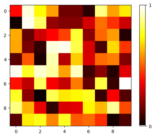
In this example, we set the colorbar range from 0 to 1 using the set_ticks() method. The colorbar range is manually adjusted to highlight the range of values present in the image plot.
Example 4: Setting Colorbar Range with Subplots
In this example, we will create subplots and set the colorbar range manually for each subplot.
import matplotlib.pyplot as plt
import numpy as np

# Generate data
x = np.linspace(-5, 5, 100)
y = np.linspace(-5, 5, 100)

X, Y = np.meshgrid(x, y)
Z1 = np.sin(np.sqrt(X**2 + Y**2))
Z2 = np.cos(np.sqrt(X**2 + Y**2))

# Create subplots
fig, axs = plt.subplots(1, 2)

# Plot first subplot
im1 = axs[0].imshow(Z1, cmap='coolwarm')
axs[0].set_title('Subplot 1')

# Set colorbar range for first subplot
cbar1 = plt.colorbar(im1, ax=axs[0])
cbar1.set_ticks([-1, 0, 1])

# Plot second subplot
im2 = axs[1].imshow(Z2, cmap='coolwarm')
axs[1].set_title('Subplot 2')

# Set colorbar range for second subplot
cbar2 = plt.colorbar(im2, ax=axs[1])
cbar2.set_ticks([-1, 0, 1])

# Show plot
plt.show()
Output:
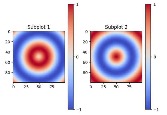
In this example, we create subplots and set the colorbar range manually for each subplot using the set_ticks() method. Each subplot can have a different colorbar range, allowing us to highlight the range of values in each subplot.
Example 5: Setting Symmetric Colorbar Range
In some cases, it may be useful to set a symmetric colorbar range around a specific value. In this example, we will create a scatter plot and set a symmetric colorbar range around zero.
import matplotlib.pyplot as plt
import numpy as np

# Generate random data
np.random.seed(42)
x = np.random.randn(100)
y = np.random.randn(100)
z = np.random.randn(100)

# Create scatter plot
plt.scatter(x, y, c=z)

# Set symmetric colorbar range
vmax = np.abs(z).max()
colorbar = plt.colorbar(fraction=0.05, pad=0.04)
colorbar.set_ticks([-vmax, 0, vmax])

# Show plot
plt.show()
Output:
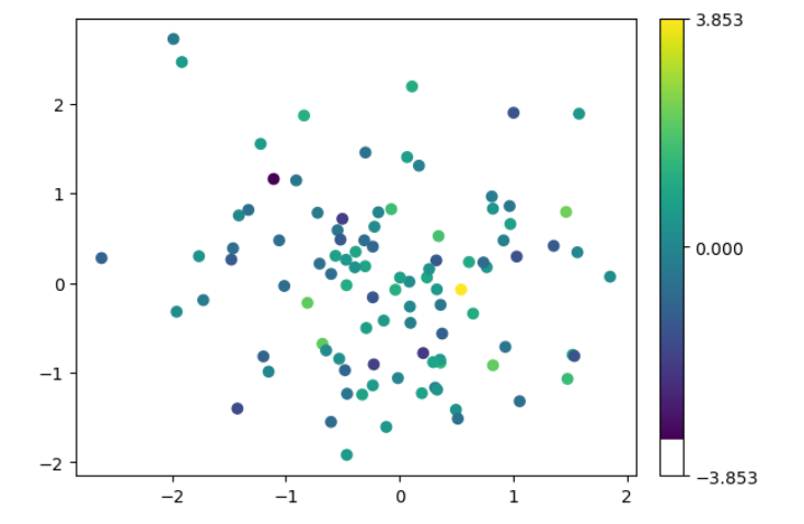
In this example, we set a symmetric colorbar range around zero using the maximum absolute value of the data. This allows us to focus on the positive and negative deviations from zero in the scatter plot.
Example 6: Setting a Logarithmic Colorbar Range
In this example, we will create a scatter plot and set a logarithmic colorbar range.
import matplotlib.pyplot as plt
import matplotlib.ticker as ticker
import numpy as np

# Generate random data
np.random.seed(42)
x = np.random.randn(100)
y = np.random.randn(100)
z = np.random.randint(1, 100, 100)

# Create scatter plot
sc = plt.scatter(x, y, c=z, cmap='hot')

# Set logarithmic colorbar range
colorbar = plt.colorbar(sc, fraction=0.05, pad=0.04)
colorbar.set_ticks([1, 100])

# Set colorbar scale to logarithmic using LogLocator and LogFormatter
colorbar.set_label('Value')
colorbar.set_ticks([1, 100])
colorbar.set_ticklabels(['1', '100'])
colorbar.ax.yaxis.set_major_locator(ticker.LogLocator(base=10))
colorbar.ax.yaxis.set_major_formatter(ticker.LogFormatter())

# Show plot
plt.show()
Output:
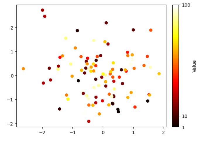
In this example, we set a logarithmic colorbar range using the set_ticks() method and then update the colorbar scale to logarithmic using the set_scale() method. This can be useful when dealing with data that spans several orders of magnitude.
Matplotlib Colorbar Range Conclusion
In this article, we have explored different examples of setting the colorbar range in Matplotlib. We learned how to manually set the colorbar range using the vmin and vmax parameters, and how to update the colorbar range using the set_ticks() method. Additionally, we saw examples of setting symmetric, logarithmic, and manual colorbar ranges for different types of plots. Understanding how to control the colorbar range allows us to focus on specific ranges of values and enhances our data visualization capabilities in Matplotlib.