How to Use Matplotlib Named Colors: A Comprehensive Guide
Matplotlib named colors are an essential feature of the popular data visualization library Matplotlib. These predefined color names provide an easy and intuitive way to specify colors in your plots without having to remember RGB values or hex codes. In this comprehensive guide, we’ll explore everything you need to know about Matplotlib named colors, from basic usage to advanced techniques.
Introduction to Matplotlib Named Colors
Matplotlib named colors are a set of predefined color names that can be used in various Matplotlib functions to specify colors for different plot elements. These named colors offer a convenient alternative to using RGB tuples or hex color codes, making your code more readable and easier to understand.
Let’s start with a simple example to demonstrate how to use Matplotlib named colors:
import matplotlib.pyplot as plt

plt.figure(figsize=(8, 6))
plt.plot([1, 2, 3, 4], [1, 4, 2, 3], color='red', linewidth=2, label='how2matplotlib.com')
plt.title('Using Matplotlib Named Colors')
plt.xlabel('X-axis')
plt.ylabel('Y-axis')
plt.legend()
plt.show()
Output:
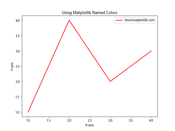
In this example, we used the named color ‘red’ to set the color of the line plot. Matplotlib recognizes this color name and applies the corresponding RGB values automatically.
Exploring the Matplotlib Named Colors Palette
Matplotlib provides a wide range of named colors that you can use in your plots. These colors are organized into different categories, including base colors, CSS colors, and XKCD colors. Let’s explore each of these categories and learn how to use them effectively.
Base Colors in Matplotlib
Matplotlib includes a set of base colors that are commonly used in data visualization. These colors are:
- red
- green
- blue
- cyan
- magenta
- yellow
- black
- white
Here’s an example that demonstrates how to use these base colors in a bar plot:
import matplotlib.pyplot as plt

categories = ['A', 'B', 'C', 'D', 'E']
values = [3, 7, 2, 5, 8]
colors = ['red', 'green', 'blue', 'cyan', 'magenta']

plt.figure(figsize=(10, 6))
plt.bar(categories, values, color=colors)
plt.title('Bar Plot with Matplotlib Named Colors')
plt.xlabel('Categories')
plt.ylabel('Values')
plt.text(0, 9, 'how2matplotlib.com', fontsize=12, ha='left', va='top')
plt.show()
Output:
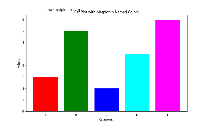
In this example, we used the base colors to create a colorful bar plot. Each bar is assigned a different color from the base color palette.
CSS Colors in Matplotlib
In addition to the base colors, Matplotlib supports a wide range of CSS color names. These color names are derived from the CSS3 specification and include various shades and hues. Some examples of CSS color names are:
- aqua
- coral
- darkgreen
- gold
- lavender
- navy
- orange
- purple
- teal
Let’s create a scatter plot using some of these CSS color names:
import matplotlib.pyplot as plt
import numpy as np

np.random.seed(42)
x = np.random.rand(50)
y = np.random.rand(50)
colors = ['aqua', 'coral', 'darkgreen', 'gold', 'lavender']

plt.figure(figsize=(10, 8))
for i in range(5):
    plt.scatter(x[i*10:(i+1)*10], y[i*10:(i+1)*10], c=colors[i], label=f'Group {i+1}')

plt.title('Scatter Plot with CSS Colors')
plt.xlabel('X-axis')
plt.ylabel('Y-axis')
plt.legend()
plt.text(0.05, 0.95, 'how2matplotlib.com', fontsize=12, ha='left', va='top', transform=plt.gca().transAxes)
plt.show()
Output:
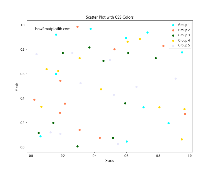
This example demonstrates how to use CSS color names to create a scatter plot with different colored groups.
XKCD Colors in Matplotlib
Matplotlib also includes a set of color names based on the XKCD color survey. These colors are more descriptive and often have humorous names. To use XKCD colors, you need to prefix the color name with ‘xkcd:’. Some examples of XKCD color names are:
- xkcd:sky blue
- xkcd:grass green
- xkcd:blood red
- xkcd:sunshine yellow
- xkcd:dusty purple
Let’s create a pie chart using XKCD colors:
import matplotlib.pyplot as plt

sizes = [30, 20, 25, 15, 10]
labels = ['A', 'B', 'C', 'D', 'E']
colors = ['xkcd:sky blue', 'xkcd:grass green', 'xkcd:blood red', 'xkcd:sunshine yellow', 'xkcd:dusty purple']

plt.figure(figsize=(10, 8))
plt.pie(sizes, labels=labels, colors=colors, autopct='%1.1f%%', startangle=90)
plt.title('Pie Chart with XKCD Colors')
plt.text(0.5, -1.1, 'how2matplotlib.com', fontsize=12, ha='center', va='center')
plt.axis('equal')
plt.show()
Output:

This example shows how to use XKCD color names to create a colorful pie chart.
Using Matplotlib Named Colors in Different Plot Types
Matplotlib named colors can be used in various types of plots and chart elements. Let’s explore how to apply named colors to different plot types and components.
Line Plots with Named Colors
Line plots are one of the most common types of visualizations. You can use named colors to differentiate between multiple lines or to highlight specific data points. Here’s an example:
import matplotlib.pyplot as plt
import numpy as np

x = np.linspace(0, 10, 100)
y1 = np.sin(x)
y2 = np.cos(x)

plt.figure(figsize=(12, 6))
plt.plot(x, y1, color='dodgerblue', label='Sin(x)')
plt.plot(x, y2, color='forestgreen', label='Cos(x)')
plt.plot(x, y1 + y2, color='crimson', linestyle='--', label='Sin(x) + Cos(x)')

plt.title('Line Plot with Named Colors')
plt.xlabel('X-axis')
plt.ylabel('Y-axis')
plt.legend()
plt.grid(True, linestyle=':')
plt.text(0.5, -1.5, 'how2matplotlib.com', fontsize=12, ha='center', va='center')
plt.show()
Output:
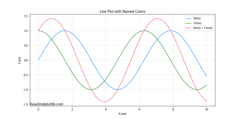
In this example, we used different named colors for each line to make them easily distinguishable.
Bar Plots with Named Colors
Bar plots can benefit from the use of named colors to represent different categories or to highlight specific bars. Here’s an example of a grouped bar plot using named colors:
import matplotlib.pyplot as plt
import numpy as np

categories = ['A', 'B', 'C', 'D']
group1 = [4, 7, 3, 6]
group2 = [3, 5, 2, 4]

x = np.arange(len(categories))
width = 0.35

fig, ax = plt.subplots(figsize=(10, 6))
rects1 = ax.bar(x - width/2, group1, width, label='Group 1', color='skyblue')
rects2 = ax.bar(x + width/2, group2, width, label='Group 2', color='lightcoral')

ax.set_ylabel('Values')
ax.set_title('Grouped Bar Plot with Named Colors')
ax.set_xticks(x)
ax.set_xticklabels(categories)
ax.legend()

plt.text(0.5, -0.15, 'how2matplotlib.com', fontsize=12, ha='center', va='center', transform=ax.transAxes)
plt.tight_layout()
plt.show()
Output:
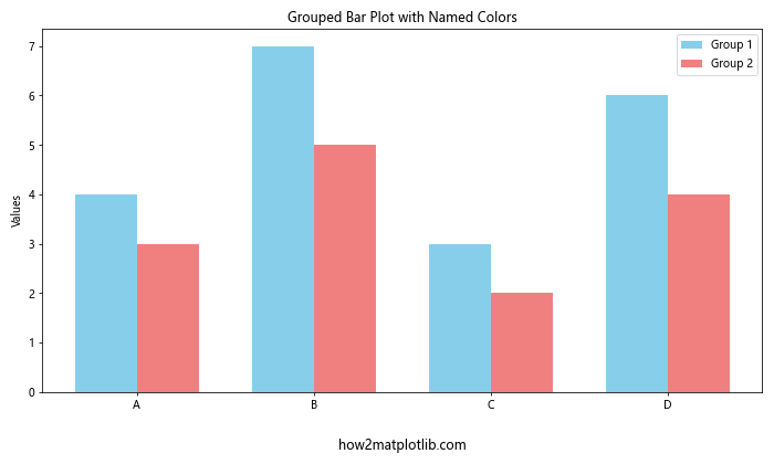
This example demonstrates how to use named colors to differentiate between two groups in a bar plot.
Scatter Plots with Named Colors
Scatter plots can use named colors to represent different categories or to create a color gradient based on a third variable. Here’s an example of a scatter plot with named colors:
import matplotlib.pyplot as plt
import numpy as np

np.random.seed(42)
x = np.random.rand(100)
y = np.random.rand(100)
colors = np.random.choice(['royalblue', 'forestgreen', 'firebrick', 'gold'], size=100)
sizes = np.random.randint(20, 200, size=100)

plt.figure(figsize=(10, 8))
plt.scatter(x, y, c=colors, s=sizes, alpha=0.6)

plt.title('Scatter Plot with Named Colors')
plt.xlabel('X-axis')
plt.ylabel('Y-axis')
plt.text(0.05, 0.95, 'how2matplotlib.com', fontsize=12, ha='left', va='top', transform=plt.gca().transAxes)
plt.colorbar(ticks=[], label='Color Categories')
plt.show()
Output:
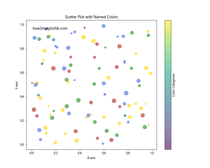
In this example, we used named colors to represent different categories in the scatter plot, with varying point sizes for added visual interest.
Advanced Techniques with Matplotlib Named Colors
Now that we’ve covered the basics of using Matplotlib named colors, let’s explore some advanced techniques to enhance your visualizations.
Creating Custom Colormaps with Named Colors
You can create custom colormaps using Matplotlib named colors. This is useful when you want to define a specific color scheme for your plots. Here’s an example:
import matplotlib.pyplot as plt
import matplotlib.colors as mcolors
import numpy as np

custom_colors = ['darkblue', 'royalblue', 'skyblue', 'lightblue', 'paleturquoise']
n_bins = 100
custom_cmap = mcolors.LinearSegmentedColormap.from_list('custom_blues', custom_colors, N=n_bins)

data = np.random.randn(100, 100)

plt.figure(figsize=(10, 8))
plt.imshow(data, cmap=custom_cmap)
plt.colorbar(label='Values')
plt.title('Custom Colormap with Named Colors')
plt.text(0.5, -0.1, 'how2matplotlib.com', fontsize=12, ha='center', va='center', transform=plt.gca().transAxes)
plt.show()
Output:

This example demonstrates how to create a custom colormap using a list of named colors and apply it to an image plot.
Using Named Colors with Alpha Transparency
Matplotlib named colors can be combined with alpha transparency to create semi-transparent plot elements. This is useful for overlaying multiple data series or creating visual effects. Here’s an example:
import matplotlib.pyplot as plt
import numpy as np

x = np.linspace(0, 10, 100)
y1 = np.sin(x)
y2 = np.cos(x)

plt.figure(figsize=(12, 6))
plt.plot(x, y1, color='red', label='Sin(x)')
plt.plot(x, y2, color='blue', label='Cos(x)')
plt.fill_between(x, y1, y2, color='purple', alpha=0.3)

plt.title('Using Named Colors with Alpha Transparency')
plt.xlabel('X-axis')
plt.ylabel('Y-axis')
plt.legend()
plt.text(0.5, -1.5, 'how2matplotlib.com', fontsize=12, ha='center', va='center')
plt.show()
Output:
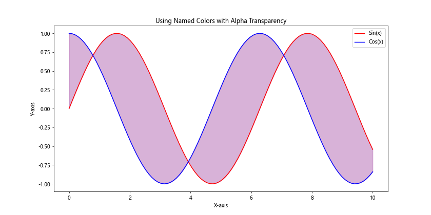
In this example, we used named colors for the lines and a semi-transparent fill between them using the ‘purple’ color with an alpha value of 0.3.
Cycling Through Named Colors
When working with multiple data series, you can automatically cycle through a list of named colors. This is particularly useful when you have an unknown number of data series. Here’s an example:
import matplotlib.pyplot as plt
import numpy as np

plt.figure(figsize=(12, 6))

color_cycle = plt.rcParams['axes.prop_cycle'].by_key()['color']
n_lines = 5

for i in range(n_lines):
    x = np.linspace(0, 10, 100)
    y = np.sin(x + i*np.pi/4)
    plt.plot(x, y, color=color_cycle[i % len(color_cycle)], label=f'Line {i+1}')

plt.title('Cycling Through Named Colors')
plt.xlabel('X-axis')
plt.ylabel('Y-axis')
plt.legend()
plt.text(0.5, -1.5, 'how2matplotlib.com', fontsize=12, ha='center', va='center')
plt.show()
Output:
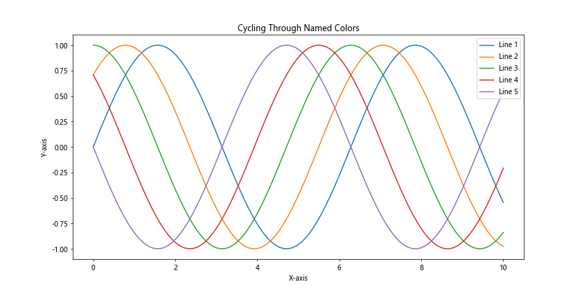
This example demonstrates how to use the default color cycle to automatically assign colors to multiple lines in a plot.
Best Practices for Using Matplotlib Named Colors
When working with Matplotlib named colors, it’s important to follow some best practices to create effective and visually appealing visualizations. Here are some tips to keep in mind:
- Choose colors that are easily distinguishable: When using multiple colors in a single plot, make sure they are distinct enough to be easily differentiated by the viewer.
Consider color blindness: Use color schemes that are accessible to people with color vision deficiencies. Tools like ColorBrewer (https://colorbrewer2.org/) can help you choose color-blind friendly palettes.
Use consistent color schemes: If you’re creating multiple plots for a single project or presentation, maintain a consistent color scheme across all visualizations.
Avoid using too many colors: While Matplotlib offers a wide range of named colors, using too many in a single plot can be overwhelming. Stick to a limited palette for clarity.
Use color to convey meaning: Choose colors that align with the data or message you’re trying to convey. For example, use red for negative values and green for positive values in financial data.
Let’s create an example that demonstrates these best practices: