How to Select and Use Colors in Matplotlib: A Comprehensive Guide
Matplotlib colors select is an essential aspect of data visualization using the popular Python library Matplotlib. Colors play a crucial role in making your plots visually appealing and easy to understand. In this comprehensive guide, we’ll explore various ways to select and use colors in Matplotlib, providing detailed explanations and examples along the way.
Understanding Matplotlib Colors Select Options
Matplotlib offers a wide range of color selection options, allowing you to customize your plots to suit your needs. The library provides several ways to specify colors, including:
- Named colors
- Hex color codes
- RGB and RGBA tuples
- Color maps (colormaps)
Let’s dive into each of these options and see how we can use them effectively in our Matplotlib plots.
Named Colors in Matplotlib
Matplotlib includes a set of predefined named colors that you can use in your plots. These named colors are easy to remember and use, making them a popular choice for quick visualizations.
Here’s an example of using named colors in a simple line plot:
import matplotlib.pyplot as plt

x = [1, 2, 3, 4, 5]
y1 = [2, 4, 6, 8, 10]
y2 = [1, 3, 5, 7, 9]

plt.figure(figsize=(8, 6))
plt.plot(x, y1, color='red', label='Line 1')
plt.plot(x, y2, color='blue', label='Line 2')
plt.title('Using Named Colors in Matplotlib - how2matplotlib.com')
plt.xlabel('X-axis')
plt.ylabel('Y-axis')
plt.legend()
plt.show()
Output:
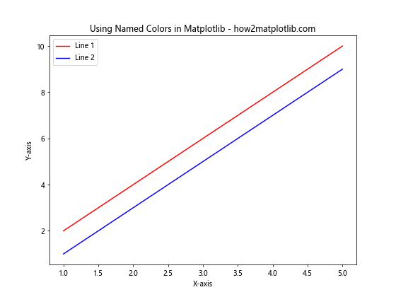
In this example, we’ve used the named colors ‘red’ and ‘blue’ for our two lines. Matplotlib supports a wide range of named colors, including basic colors like ‘green’, ‘yellow’, and ‘purple’, as well as more specific shades like ‘lightblue’, ‘darkgreen’, and ‘orangered’.
Using Hex Color Codes in Matplotlib
Hex color codes provide a more precise way to specify colors in Matplotlib. These codes consist of a ‘#’ symbol followed by six hexadecimal digits, representing the red, green, and blue components of the color.
Here’s an example of using hex color codes in a bar plot:
import matplotlib.pyplot as plt

categories = ['A', 'B', 'C', 'D']
values = [15, 30, 45, 10]

plt.figure(figsize=(8, 6))
plt.bar(categories, values, color='#FF5733')
plt.title('Using Hex Color Codes in Matplotlib - how2matplotlib.com')
plt.xlabel('Categories')
plt.ylabel('Values')
plt.show()
Output:
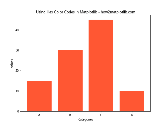
In this example, we’ve used the hex color code ‘#FF5733’ for our bars, which represents a shade of orange.
RGB and RGBA Tuples for Color Selection
RGB (Red, Green, Blue) and RGBA (Red, Green, Blue, Alpha) tuples offer another way to specify colors in Matplotlib. These tuples consist of values between 0 and 1 for each color component, with an optional alpha value for transparency.
Here’s an example of using RGB and RGBA tuples in a scatter plot:
import matplotlib.pyplot as plt
import numpy as np

x = np.random.rand(50)
y = np.random.rand(50)

plt.figure(figsize=(8, 6))
plt.scatter(x, y, color=(0.2, 0.4, 0.6), label='RGB')
plt.scatter(x + 0.1, y + 0.1, color=(0.8, 0.2, 0.3, 0.5), label='RGBA')
plt.title('Using RGB and RGBA Tuples in Matplotlib - how2matplotlib.com')
plt.xlabel('X-axis')
plt.ylabel('Y-axis')
plt.legend()
plt.show()
Output:
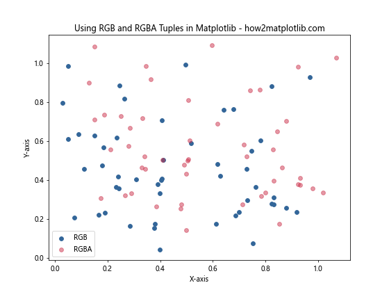
In this example, we’ve used an RGB tuple (0.2, 0.4, 0.6) for the first set of points and an RGBA tuple (0.8, 0.2, 0.3, 0.5) for the second set, demonstrating how to use transparency.
Exploring Matplotlib Color Maps
Color maps, or colormaps, are an essential tool for visualizing continuous data in Matplotlib. They provide a way to map numerical values to colors, creating visually appealing and informative plots.
Understanding Built-in Colormaps
Matplotlib comes with a variety of built-in colormaps that you can use in your visualizations. These colormaps are categorized into several types:
- Sequential colormaps
- Diverging colormaps
- Qualitative colormaps
- Miscellaneous colormaps
Let’s explore each of these categories and see how to use them in our plots.
Sequential Colormaps
Sequential colormaps are ideal for representing data that has a natural ordering or progression. They typically range from light to dark colors or vice versa.
Here’s an example of using a sequential colormap in a heatmap:
import matplotlib.pyplot as plt
import numpy as np

data = np.random.rand(10, 10)

plt.figure(figsize=(8, 6))
plt.imshow(data, cmap='viridis')
plt.colorbar(label='Values')
plt.title('Sequential Colormap (viridis) - how2matplotlib.com')
plt.show()
Output:
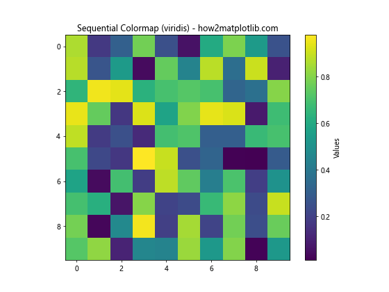
In this example, we’ve used the ‘viridis’ colormap, which is a popular sequential colormap in Matplotlib.
Diverging Colormaps
Diverging colormaps are useful for representing data that has a meaningful midpoint or zero value. They typically use two different hues that diverge from a neutral color in the middle.
Here’s an example of using a diverging colormap in a contour plot:
import matplotlib.pyplot as plt
import numpy as np

x = np.linspace(-5, 5, 100)
y = np.linspace(-5, 5, 100)
X, Y = np.meshgrid(x, y)
Z = np.sin(X) * np.cos(Y)

plt.figure(figsize=(8, 6))
plt.contourf(X, Y, Z, cmap='RdBu', levels=20)
plt.colorbar(label='Values')
plt.title('Diverging Colormap (RdBu) - how2matplotlib.com')
plt.xlabel('X-axis')
plt.ylabel('Y-axis')
plt.show()
Output:
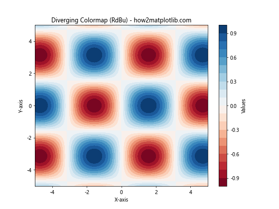
In this example, we’ve used the ‘RdBu’ (Red-Blue) diverging colormap to represent positive and negative values in our contour plot.
Qualitative Colormaps
Qualitative colormaps are designed for representing categorical data where there is no inherent ordering. These colormaps use distinct colors to differentiate between categories.
Here’s an example of using a qualitative colormap in a pie chart:
import matplotlib.pyplot as plt

categories = ['A', 'B', 'C', 'D', 'E']
sizes = [15, 30, 25, 10, 20]

plt.figure(figsize=(8, 6))
plt.pie(sizes, labels=categories, autopct='%1.1f%%', colors=plt.cm.Set3(np.arange(len(categories))))
plt.title('Qualitative Colormap (Set3) - how2matplotlib.com')
plt.axis('equal')
plt.show()
In this example, we’ve used the ‘Set3’ qualitative colormap to assign distinct colors to each category in our pie chart.
Creating Custom Colormaps
While Matplotlib provides a wide range of built-in colormaps, you may sometimes need to create custom colormaps to suit your specific needs. Matplotlib allows you to create custom colormaps using the LinearSegmentedColormap class from the matplotlib.colors module.
Here’s an example of creating and using a custom colormap:
import matplotlib.pyplot as plt
import matplotlib.colors as mcolors
import numpy as np

# Define custom colors
colors = ['#FF0000', '#00FF00', '#0000FF']
n_bins = 100

# Create custom colormap
custom_cmap = mcolors.LinearSegmentedColormap.from_list('custom_cmap', colors, N=n_bins)

# Generate sample data
data = np.random.rand(10, 10)

plt.figure(figsize=(8, 6))
plt.imshow(data, cmap=custom_cmap)
plt.colorbar(label='Values')
plt.title('Custom Colormap - how2matplotlib.com')
plt.show()
Output:
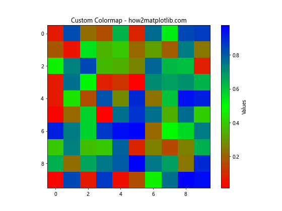
In this example, we’ve created a custom colormap that transitions from red to green to blue. You can adjust the colors and the number of bins to create your desired colormap.
Advanced Color Selection Techniques in Matplotlib
Now that we’ve covered the basics of color selection in Matplotlib, let’s explore some advanced techniques that can help you create more sophisticated and visually appealing plots.
Using Color Cycles
Matplotlib provides a color cycle feature that automatically assigns colors to plot elements when you don’t explicitly specify them. This is particularly useful when plotting multiple lines or data series.
Here’s an example of using the default color cycle:
import matplotlib.pyplot as plt
import numpy as np

x = np.linspace(0, 10, 100)
y1 = np.sin(x)
y2 = np.cos(x)
y3 = np.tan(x)

plt.figure(figsize=(8, 6))
plt.plot(x, y1, label='sin(x)')
plt.plot(x, y2, label='cos(x)')
plt.plot(x, y3, label='tan(x)')
plt.title('Default Color Cycle in Matplotlib - how2matplotlib.com')
plt.xlabel('X-axis')
plt.ylabel('Y-axis')
plt.legend()
plt.show()
Output:
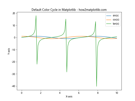
In this example, Matplotlib automatically assigns different colors to each line using its default color cycle.
You can also customize the color cycle to use your preferred set of colors:
import matplotlib.pyplot as plt
import numpy as np

# Set custom color cycle
plt.rcParams['axes.prop_cycle'] = plt.cycler(color=['#1f77b4', '#ff7f0e', '#2ca02c', '#d62728', '#9467bd'])

x = np.linspace(0, 10, 100)
y1 = np.sin(x)
y2 = np.cos(x)
y3 = np.tan(x)

plt.figure(figsize=(8, 6))
plt.plot(x, y1, label='sin(x)')
plt.plot(x, y2, label='cos(x)')
plt.plot(x, y3, label='tan(x)')
plt.title('Custom Color Cycle in Matplotlib - how2matplotlib.com')
plt.xlabel('X-axis')
plt.ylabel('Y-axis')
plt.legend()
plt.show()
Output:
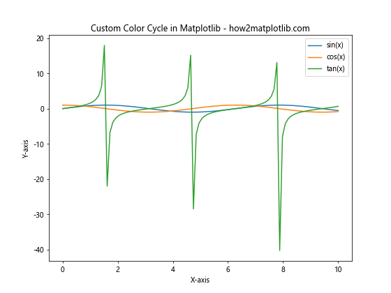
In this example, we’ve set a custom color cycle using hex color codes.
Color Normalization
Color normalization is a technique used to map data values to colors in a consistent way, especially when dealing with data that has a wide range of values or outliers.
Matplotlib provides several normalization classes in the matplotlib.colors module, including Normalize, LogNorm, and SymLogNorm.
Here’s an example of using color normalization in a scatter plot:
import matplotlib.pyplot as plt
import matplotlib.colors as mcolors
import numpy as np

x = np.random.rand(100)
y = np.random.rand(100)
z = np.random.rand(100) * 1000  # Values with a wide range

plt.figure(figsize=(8, 6))
scatter = plt.scatter(x, y, c=z, cmap='viridis', norm=mcolors.LogNorm())
plt.colorbar(scatter, label='Values (log scale)')
plt.title('Color Normalization in Matplotlib - how2matplotlib.com')
plt.xlabel('X-axis')
plt.ylabel('Y-axis')
plt.show()
Output:
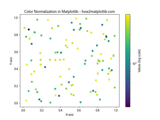
In this example, we’ve used LogNorm to normalize the color mapping for our scatter plot, which is useful for data with a wide range of values.
Alpha Blending and Transparency
Alpha blending allows you to create semi-transparent plot elements, which can be useful for visualizing overlapping data or creating layered effects.
Here’s an example of using alpha blending in a histogram:
import matplotlib.pyplot as plt
import numpy as np

data1 = np.random.normal(0, 1, 1000)
data2 = np.random.normal(2, 1, 1000)

plt.figure(figsize=(8, 6))
plt.hist(data1, bins=30, alpha=0.5, color='blue', label='Dataset 1')
plt.hist(data2, bins=30, alpha=0.5, color='red', label='Dataset 2')
plt.title('Alpha Blending in Matplotlib Histograms - how2matplotlib.com')
plt.xlabel('Values')
plt.ylabel('Frequency')
plt.legend()
plt.show()
Output:
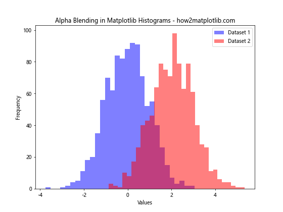
In this example, we’ve used alpha=0.5 to make both histograms semi-transparent, allowing us to see the overlap between the two datasets.
Best Practices for Color Selection in Matplotlib
When selecting colors for your Matplotlib plots, it’s important to consider several factors to ensure your visualizations are effective and accessible. Here are some best practices to keep in mind:
- Color blindness considerations: Choose color schemes that are distinguishable for people with color vision deficiencies. Matplotlib provides colorblind-friendly colormaps like ‘viridis’ and ‘cividis’.
Consistency: Use consistent color schemes across related plots to maintain visual coherence in your data presentation.
Contrast: Ensure there’s sufficient contrast between your plot elements and the background for readability.
Meaningful color mapping: When using colormaps, choose ones that accurately represent your data. For example, use sequential colormaps for ordered data and diverging colormaps for data with a meaningful midpoint.
Limit the number of colors: Too many colors can be overwhelming. Stick to a limited palette, especially for categorical data.
Consider the medium: Keep in mind how your plots will be viewed (e.g., on screen, in print) and choose colors accordingly.
Here’s an example that demonstrates some of these best practices: