How to Use Matplotlib Tab Colors: A Comprehensive Guide
Matplotlib tab colors are a set of predefined color palettes that provide a convenient and visually appealing way to add color to your plots and visualizations. These tab colors are designed to be easily distinguishable and aesthetically pleasing, making them an excellent choice for creating professional-looking charts and graphs. In this comprehensive guide, we’ll explore the various aspects of matplotlib tab colors, including how to use them, customize them, and incorporate them into your data visualization projects.
Understanding Matplotlib Tab Colors
Matplotlib tab colors are a set of ten distinct colors that are part of the default color cycle in matplotlib. These colors are designed to be visually appealing and easily distinguishable from one another, making them ideal for use in various types of plots and charts. The tab colors are named after common web browser tab colors, hence the name “tab colors.”
Let’s start by importing matplotlib and examining the available tab colors:
import matplotlib.pyplot as plt
import matplotlib.colors as mcolors

print("Available tab colors:")
for color in mcolors.TABLEAU_COLORS:
    print(f"- {color}")

plt.figure(figsize=(10, 2))
for i, color in enumerate(mcolors.TABLEAU_COLORS):
    plt.bar(i, 1, color=color, label=color)
plt.title("Matplotlib Tab Colors - how2matplotlib.com")
plt.legend(bbox_to_anchor=(1.05, 1), loc='upper left')
plt.axis('off')
plt.tight_layout()
plt.show()
Output:

This code snippet will print the names of the available tab colors and create a simple bar plot showcasing each color. The tab colors include:
- tab:blue
- tab:orange
- tab:green
- tab:red
- tab:purple
- tab:brown
- tab:pink
- tab:gray
- tab:olive
- tab:cyan
Using Matplotlib Tab Colors in Line Plots
One of the most common uses for matplotlib tab colors is in line plots. These colors can help distinguish between different data series and make your plots more visually appealing. Let’s create a simple line plot using tab colors:
import matplotlib.pyplot as plt
import numpy as np

x = np.linspace(0, 10, 100)
y1 = np.sin(x)
y2 = np.cos(x)
y3 = np.tan(x)

plt.figure(figsize=(10, 6))
plt.plot(x, y1, color='tab:blue', label='Sin')
plt.plot(x, y2, color='tab:orange', label='Cos')
plt.plot(x, y3, color='tab:green', label='Tan')
plt.title("Trigonometric Functions - how2matplotlib.com")
plt.xlabel("x")
plt.ylabel("y")
plt.legend()
plt.grid(True)
plt.show()
Output:
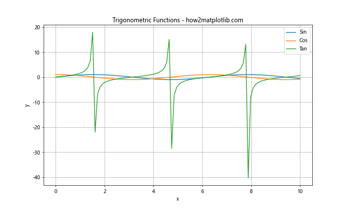
In this example, we’ve used three different tab colors (blue, orange, and green) to represent the sine, cosine, and tangent functions. The use of distinct colors makes it easy to differentiate between the three curves.
Incorporating Matplotlib Tab Colors in Bar Charts
Bar charts are another type of visualization where matplotlib tab colors can be particularly effective. Let’s create a simple bar chart using tab colors:
import matplotlib.pyplot as plt

categories = ['A', 'B', 'C', 'D', 'E']
values = [23, 45, 56, 78, 32]
colors = ['tab:blue', 'tab:orange', 'tab:green', 'tab:red', 'tab:purple']

plt.figure(figsize=(10, 6))
plt.bar(categories, values, color=colors)
plt.title("Sample Bar Chart - how2matplotlib.com")
plt.xlabel("Categories")
plt.ylabel("Values")
plt.show()
Output:
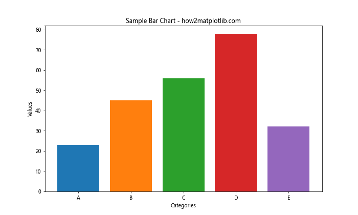
In this example, we’ve used five different tab colors to represent different categories in our bar chart. This use of color helps to visually separate the bars and make the chart more engaging.
Using Matplotlib Tab Colors in Scatter Plots
Scatter plots are yet another type of visualization where matplotlib tab colors can be effectively used. Let’s create a scatter plot using tab colors to distinguish between different groups of data:
import matplotlib.pyplot as plt
import numpy as np

np.random.seed(42)
group1_x = np.random.normal(0, 1, 100)
group1_y = np.random.normal(0, 1, 100)
group2_x = np.random.normal(3, 1, 100)
group2_y = np.random.normal(3, 1, 100)

plt.figure(figsize=(10, 6))
plt.scatter(group1_x, group1_y, color='tab:blue', label='Group 1')
plt.scatter(group2_x, group2_y, color='tab:orange', label='Group 2')
plt.title("Scatter Plot with Tab Colors - how2matplotlib.com")
plt.xlabel("X-axis")
plt.ylabel("Y-axis")
plt.legend()
plt.grid(True)
plt.show()
Output:
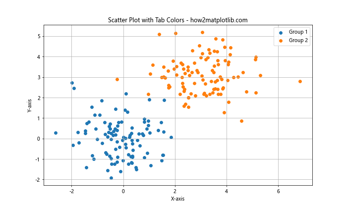
In this scatter plot, we’ve used two tab colors (blue and orange) to distinguish between two different groups of data points. This color coding makes it easy to visually separate the two groups and identify any patterns or clusters.
Customizing Matplotlib Tab Colors
While the default tab colors are well-designed and visually appealing, you may want to customize them for your specific needs. Matplotlib allows you to modify the tab colors or create your own color palettes based on the tab colors. Here’s an example of how to create a custom color palette using tab colors:
import matplotlib.pyplot as plt
import matplotlib.colors as mcolors

custom_colors = [mcolors.TABLEAU_COLORS[f'tab:{color}'] for color in ['blue', 'orange', 'green', 'red', 'purple']]

data = [10, 20, 30, 40, 50]
labels = ['A', 'B', 'C', 'D', 'E']

plt.figure(figsize=(10, 6))
plt.pie(data, labels=labels, colors=custom_colors, autopct='%1.1f%%')
plt.title("Custom Color Palette - how2matplotlib.com")
plt.show()
Output:
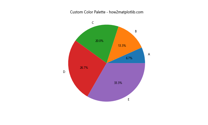
In this example, we’ve created a custom color palette using a subset of the tab colors. We then used this custom palette to create a pie chart, demonstrating how you can adapt the tab colors to suit your specific visualization needs.
Using Matplotlib Tab Colors with Colormaps
Colormaps are an essential tool in data visualization, especially when dealing with continuous data. Matplotlib tab colors can be used to create custom colormaps for your visualizations. Here’s an example of how to create a custom colormap using tab colors:
import matplotlib.pyplot as plt
import matplotlib.colors as mcolors
import numpy as np

tab_colors = [mcolors.TABLEAU_COLORS[f'tab:{color}'] for color in ['blue', 'orange', 'green', 'red', 'purple']]
custom_cmap = mcolors.LinearSegmentedColormap.from_list("Custom", tab_colors)

data = np.random.rand(10, 10)

plt.figure(figsize=(10, 8))
plt.imshow(data, cmap=custom_cmap)
plt.colorbar(label='Values')
plt.title("Custom Colormap with Tab Colors - how2matplotlib.com")
plt.show()
Output:
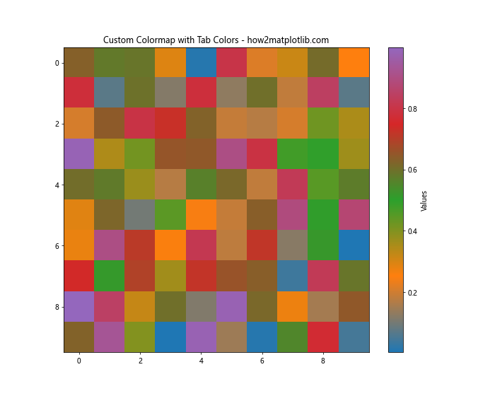
In this example, we’ve created a custom colormap using five tab colors. We then used this colormap to visualize a 2D array of random data using the imshow function. This demonstrates how tab colors can be used to create unique and visually appealing colormaps for your data.
Applying Matplotlib Tab Colors to Subplots
When working with multiple subplots, matplotlib tab colors can help maintain consistency across your visualizations. Here’s an example of how to use tab colors in a subplot layout:
import matplotlib.pyplot as plt
import numpy as np

x = np.linspace(0, 10, 100)
y1 = np.sin(x)
y2 = np.cos(x)
y3 = np.exp(-x/10) * np.sin(x)

fig, (ax1, ax2, ax3) = plt.subplots(3, 1, figsize=(10, 12))

ax1.plot(x, y1, color='tab:blue')
ax1.set_title("Sine Wave - how2matplotlib.com")

ax2.plot(x, y2, color='tab:orange')
ax2.set_title("Cosine Wave - how2matplotlib.com")

ax3.plot(x, y3, color='tab:green')
ax3.set_title("Damped Sine Wave - how2matplotlib.com")

for ax in (ax1, ax2, ax3):
    ax.set_xlabel("X-axis")
    ax.set_ylabel("Y-axis")
    ax.grid(True)

plt.tight_layout()
plt.show()
Output:
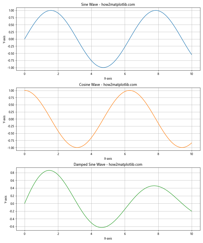
In this example, we’ve created three subplots, each using a different tab color for its line plot. This use of color helps to visually separate the subplots while maintaining a cohesive overall look.
Using Matplotlib Tab Colors in 3D Plots
Matplotlib tab colors can also be effectively used in 3D plots to enhance the visual appeal and clarity of your visualizations. Here’s an example of how to use tab colors in a 3D surface plot:
import matplotlib.pyplot as plt
import numpy as np
from mpl_toolkits.mplot3d import Axes3D

fig = plt.figure(figsize=(12, 8))
ax = fig.add_subplot(111, projection='3d')

x = np.linspace(-5, 5, 100)
y = np.linspace(-5, 5, 100)
X, Y = np.meshgrid(x, y)
Z = np.sin(np.sqrt(X**2 + Y**2))

surf = ax.plot_surface(X, Y, Z, cmap='tab10', linewidth=0, antialiased=False)

ax.set_xlabel('X-axis')
ax.set_ylabel('Y-axis')
ax.set_zlabel('Z-axis')
ax.set_title("3D Surface Plot with Tab Colors - how2matplotlib.com")

fig.colorbar(surf, shrink=0.5, aspect=5)
plt.show()
Output:
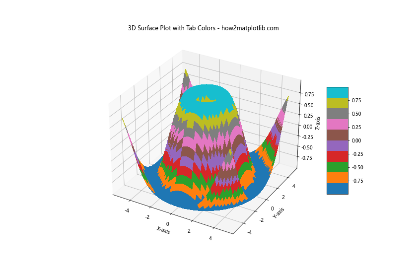
In this example, we’ve used the ‘tab10’ colormap, which is based on the tab colors, to create a 3D surface plot. The use of tab colors in this 3D visualization helps to highlight the variations in the surface and make the plot more visually engaging.
Combining Matplotlib Tab Colors with Other Color Schemes
While matplotlib tab colors are versatile and visually appealing, you may sometimes want to combine them with other color schemes for more complex visualizations. Here’s an example of how to combine tab colors with a sequential colormap:
import matplotlib.pyplot as plt
import numpy as np

categories = ['A', 'B', 'C', 'D', 'E']
values = [23, 45, 56, 78, 32]
colors = plt.cm.viridis(np.linspace(0, 1, len(categories)))

plt.figure(figsize=(12, 6))

# Bar chart with viridis colormap
plt.subplot(121)
plt.bar(categories, values, color=colors)
plt.title("Viridis Colormap - how2matplotlib.com")
plt.xlabel("Categories")
plt.ylabel("Values")

# Bar chart with tab colors
plt.subplot(122)
plt.bar(categories, values, color=['tab:blue', 'tab:orange', 'tab:green', 'tab:red', 'tab:purple'])
plt.title("Tab Colors - how2matplotlib.com")
plt.xlabel("Categories")
plt.ylabel("Values")

plt.tight_layout()
plt.show()
Output:
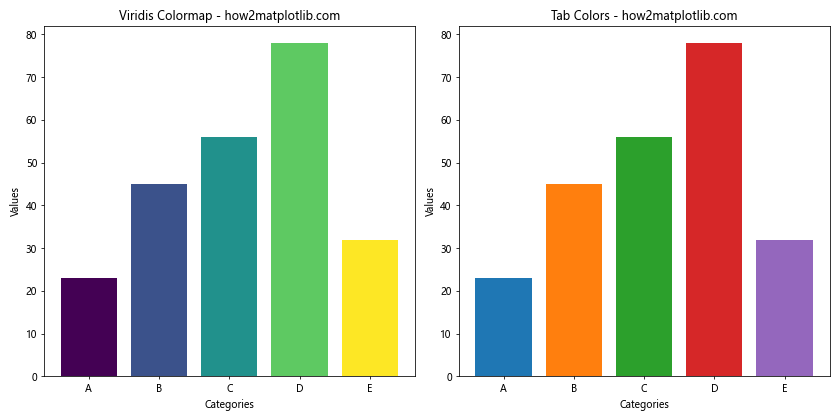
In this example, we’ve created two bar charts side by side. The first uses the viridis colormap, while the second uses tab colors. This comparison demonstrates how tab colors can be used alongside other color schemes to create diverse and visually appealing visualizations.
Using Matplotlib Tab Colors for Highlighting
Tab colors can be particularly effective when used to highlight specific elements in your plots. Here’s an example of how to use a tab color to highlight a specific data point in a scatter plot:
import matplotlib.pyplot as plt
import numpy as np

np.random.seed(42)
x = np.random.rand(50)
y = np.random.rand(50)

plt.figure(figsize=(10, 6))
plt.scatter(x, y, color='gray', alpha=0.5)

# Highlight a specific point
highlight_x, highlight_y = 0.5, 0.5
plt.scatter(highlight_x, highlight_y, color='tab:red', s=100, label='Highlighted Point')

plt.title("Scatter Plot with Highlighted Point - how2matplotlib.com")
plt.xlabel("X-axis")
plt.ylabel("Y-axis")
plt.legend()
plt.grid(True)
plt.show()
Output:
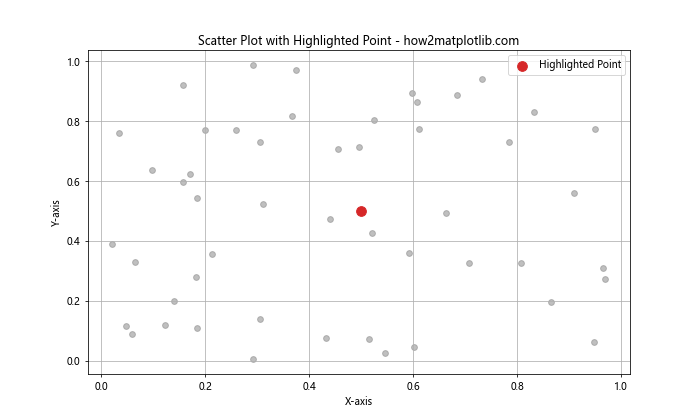
In this example, we’ve used a tab color (red) to highlight a specific point in the scatter plot. This use of color draws attention to the highlighted point, making it stand out from the rest of the data.
Applying Matplotlib Tab Colors to Different Plot Elements
Matplotlib tab colors can be applied to various elements of a plot, not just the main data representation. Here’s an example that demonstrates how to use tab colors for different plot elements:
import matplotlib.pyplot as plt
import numpy as np

x = np.linspace(0, 10, 100)
y = np.sin(x)

plt.figure(figsize=(10, 6))
plt.plot(x, y, color='tab:blue', label='Sine Wave')
plt.fill_between(x, y, where=(y > 0), color='tab:green', alpha=0.3, label='Positive Area')
plt.fill_between(x, y, where=(y < 0), color='tab:red', alpha=0.3, label='Negative Area')
plt.axhline(y=0, color='tab:gray', linestyle='--', label='Zero Line')
plt.title("Sine Wave with Colored Areas - how2matplotlib.com", color='tab:purple')
plt.xlabel("X-axis", color='tab:orange')
plt.ylabel("Y-axis", color='tab:orange')
plt.legend()
plt.grid(True, color='tab:gray', alpha=0.3)
plt.show()
Output:
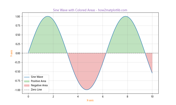
In this example, we've used different tab colors for various elements of the plot:
- The main sine wave is plotted in blue
- Positive areas are filled with green
- Negative areas are filled with red
- The zero line is drawn in gray
- The title is in purple
- The axis labels are in orange
- The grid lines are in gray
This demonstrates how tab colors can be used to create a cohesive color scheme across all elements of a plot.
Creating Custom Color Cycles with Matplotlib Tab Colors
While matplotlib provides a default color cycle, you can create your own custom color cycles using tab colors. This can be useful when you want to control the order and selection of colors used in your plots. Here's an example:
import matplotlib.pyplot as plt
import matplotlib.colors as mcolors
import numpy as np

custom_cycle = plt.cycler(color=['tab:blue', 'tab:orange', 'tab:green', 'tab:red', 'tab:purple'])
plt.rc('axes', prop_cycle=custom_cycle)

x = np.linspace(0, 10, 100)

plt.figure(figsize=(10, 6))
for i in range(5):
    plt.plot(x, np.sin(x + i), label=f'Wave {i+1}')

plt.title("Custom Color Cycle - how2matplotlib.com")
plt.xlabel("X-axis")
plt.ylabel("Y-axis")
plt.legend()
plt.grid(True)
plt.show()
Output:
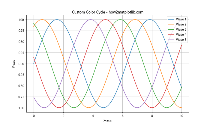
In this example, we've created a custom color cycle using five tab colors. We then used this cycle to plot five sine waves, each with a different phase shift. The custom color cycle ensures that each line is plotted with a different tab color, creating a visually appealing and easily distinguishable set of curves.
Using Matplotlib Tab Colors in Heatmaps
Heatmaps are an excellent way to visualize 2D data, and matplotlib tab colors can be used to create visually striking heatmaps. Here's an example:
import matplotlib.pyplot as plt
import numpy as np

data = np.random.rand(10, 10)
tab_cmap = plt.cm.get_cmap('tab10')

plt.figure(figsize=(10, 8))
heatmap = plt.imshow(data, cmap=tab_cmap)
plt.colorbar(heatmap)
plt.title("Heatmap with Tab Colors - how2matplotlib.com")
plt.xlabel("X-axis")
plt.ylabel("Y-axis")
plt.show()
Output:
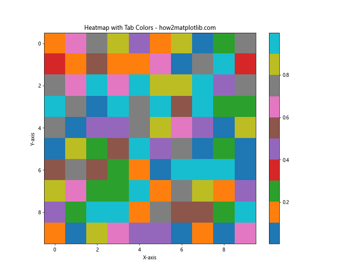
In this example, we've used the 'tab10' colormap, which is based on the tab colors, to create a heatmap of random data. The discrete nature of the tab colors creates a unique and visually interesting heatmap.
Applying Matplotlib Tab Colors to Boxplots
Boxplots are a great way to visualize the distribution of data, and matplotlib tab colors can be used to make these plots more visually appealing. Here's an example:
import matplotlib.pyplot as plt
import numpy as np

np.random.seed(42)
data = [np.random.normal(0, std, 100) for std in range(1, 6)]

fig, ax = plt.subplots(figsize=(10, 6))
bp = ax.boxplot(data, patch_artist=True)

colors = ['tab:blue', 'tab:orange', 'tab:green', 'tab:red', 'tab:purple']
for patch, color in zip(bp['boxes'], colors):
    patch.set_facecolor(color)

ax.set_xticklabels(['A', 'B', 'C', 'D', 'E'])
ax.set_title("Boxplot with Tab Colors - how2matplotlib.com")
ax.set_xlabel("Groups")
ax.set_ylabel("Values")
plt.show()
Output:
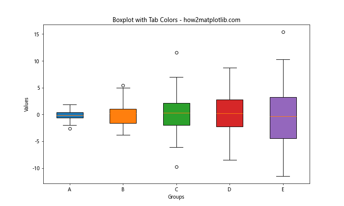
In this example, we've created five boxplots and colored each box using a different tab color. This use of color helps to visually separate the different groups and makes the plot more engaging.
Using Matplotlib Tab Colors in Polar Plots
Polar plots are useful for visualizing cyclic data, and matplotlib tab colors can be effectively used in these plots. Here's an example:
import matplotlib.pyplot as plt
import numpy as np

theta = np.linspace(0, 2*np.pi, 100)
r1 = np.sin(theta)
r2 = np.cos(theta)
r3 = np.sin(2*theta)

fig, ax = plt.subplots(figsize=(10, 10), subplot_kw=dict(projection='polar'))
ax.plot(theta, r1, color='tab:blue', label='sin(θ)')
ax.plot(theta, r2, color='tab:orange', label='cos(θ)')
ax.plot(theta, r3, color='tab:green', label='sin(2θ)')
ax.set_title("Polar Plot with Tab Colors - how2matplotlib.com")
ax.legend()
plt.show()
Output:
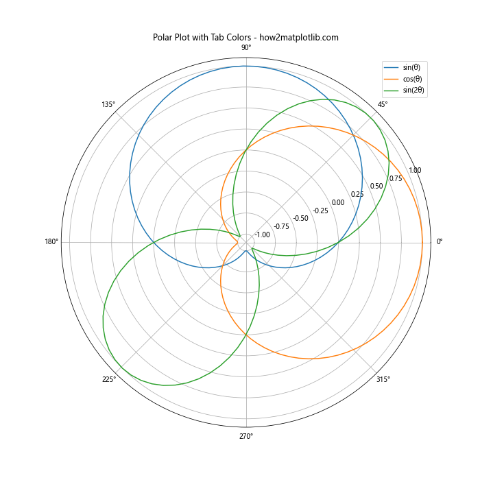
In this example, we've created a polar plot with three different curves, each using a different tab color. The use of distinct colors helps to differentiate between the curves in the polar coordinate system.
Combining Matplotlib Tab Colors with Markers
When creating scatter plots or line plots, you can combine matplotlib tab colors with different marker styles to create even more visually distinct data series. Here's an example:
import matplotlib.pyplot as plt
import numpy as np

x = np.linspace(0, 10, 10)
y1 = np.sin(x)
y2 = np.cos(x)
y3 = np.tan(x)

plt.figure(figsize=(10, 6))
plt.plot(x, y1, color='tab:blue', marker='o', label='Sin')
plt.plot(x, y2, color='tab:orange', marker='s', label='Cos')
plt.plot(x, y3, color='tab:green', marker='^', label='Tan')
plt.title("Combining Tab Colors with Markers - how2matplotlib.com")
plt.xlabel("X-axis")
plt.ylabel("Y-axis")
plt.legend()
plt.grid(True)
plt.show()
Output:
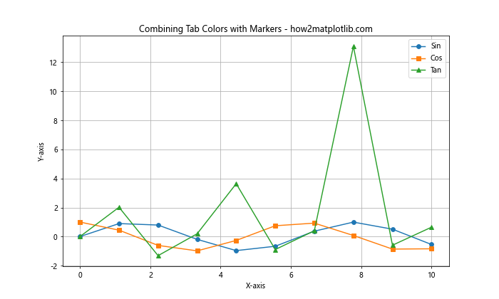
In this example, we've combined three different tab colors with three different marker styles to create visually distinct data series. This combination of color and marker style can be particularly useful when plotting multiple data series on the same axes.
Using Matplotlib Tab Colors in Stacked Plots
Stacked plots are useful for showing the composition of a whole over time or categories. Matplotlib tab colors can be effectively used in these plots to distinguish between different components. Here's an example of a stacked area plot:
import matplotlib.pyplot as plt
import numpy as np

x = np.linspace(0, 10, 100)
y1 = np.exp(-x/10) * np.sin(x)
y2 = np.exp(-x/10) * np.cos(x)
y3 = np.exp(-x/5)

plt.figure(figsize=(10, 6))
plt.stackplot(x, y1, y2, y3, labels=['Component 1', 'Component 2', 'Component 3'],
              colors=['tab:blue', 'tab:orange', 'tab:green'])
plt.title("Stacked Area Plot with Tab Colors - how2matplotlib.com")
plt.xlabel("X-axis")
plt.ylabel("Y-axis")
plt.legend(loc='upper right')
plt.grid(True)
plt.show()
Output:
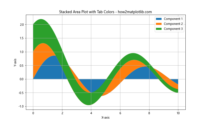
In this example, we've created a stacked area plot using three different tab colors to represent three different components. The use of distinct colors makes it easy to see the contribution of each component to the whole.
Applying Matplotlib Tab Colors to Network Graphs
Network graphs are a powerful way to visualize relationships between entities, and matplotlib tab colors can be used to enhance these visualizations. Here's an example using the NetworkX library:
import matplotlib.pyplot as plt
import networkx as nx

G = nx.karate_club_graph()
colors = ['tab:blue', 'tab:orange', 'tab:green', 'tab:red', 'tab:purple']

plt.figure(figsize=(12, 8))
pos = nx.spring_layout(G)
nx.draw_networkx_nodes(G, pos, node_color=colors, node_size=500)
nx.draw_networkx_edges(G, pos, alpha=0.3)
nx.draw_networkx_labels(G, pos)
plt.title("Network Graph with Tab Colors - how2matplotlib.com")
plt.axis('off')
plt.tight_layout()
plt.show()
In this example, we've used tab colors to color the nodes in a network graph. The use of distinct colors helps to visually group nodes and can be used to represent different categories or attributes of the nodes.
Matplotlib tab colors Conclusion
Matplotlib tab colors provide a versatile and visually appealing set of colors that can be used in a wide variety of data visualization tasks. From simple line plots to complex 3D visualizations, network graphs, and custom colormaps, tab colors offer a consistent and attractive color palette that can enhance the clarity and impact of your visualizations.
Throughout this guide, we've explored numerous ways to incorporate matplotlib tab colors into your plots, including:
- Using tab colors in basic plot types like line plots, bar charts, and scatter plots
- Customizing tab colors and creating custom color palettes
- Applying tab colors to different plot elements
- Creating custom color cycles
- Using tab colors in specialized plot types like heatmaps, boxplots, and polar plots
- Combining tab colors with other visual elements like markers and fill areas
- Applying tab colors to more advanced visualizations like network graphs
By mastering the use of matplotlib tab colors, you can create more visually appealing and effective data visualizations that communicate your insights clearly and professionally. Whether you're creating simple charts for reports or complex visualizations for data analysis, matplotlib tab colors provide a reliable and attractive color scheme that can elevate the quality of your work.
Remember to experiment with different combinations of tab colors and plot types to find the most effective way to represent your data. With practice and creativity, you can leverage the full potential of matplotlib tab colors to create stunning and informative visualizations that effectively communicate your data-driven insights.