How to Master Matplotlib Legend Colors: A Comprehensive Guide
Matplotlib legend colors play a crucial role in creating informative and visually appealing plots. In this comprehensive guide, we’ll explore various techniques to customize and enhance your matplotlib legend colors. From basic color settings to advanced styling options, you’ll learn how to make your legends stand out and effectively communicate your data. Let’s dive into the world of matplotlib legend colors and discover how to leverage this powerful feature to create stunning visualizations.
Understanding the Basics of Matplotlib Legend Colors
Before we delve into more advanced techniques, it’s essential to grasp the fundamentals of matplotlib legend colors. The legend is a key component of any plot, providing context and explanations for the data represented. By default, matplotlib assigns colors to legend entries based on the plot elements they represent. However, you have the power to customize these colors to suit your needs.
Let’s start with a simple example to illustrate how matplotlib legend colors work:
import matplotlib.pyplot as plt

# Data for the plot
x = [1, 2, 3, 4, 5]
y1 = [2, 4, 6, 8, 10]
y2 = [1, 3, 5, 7, 9]

# Create the plot
plt.plot(x, y1, label='Line 1')
plt.plot(x, y2, label='Line 2')

# Add a legend
plt.legend()

# Add a title
plt.title('Basic Matplotlib Legend Colors - how2matplotlib.com')

# Display the plot
plt.show()
Output:
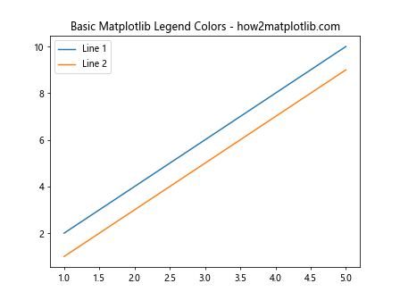
In this example, we’ve created a simple line plot with two lines and added a legend. By default, matplotlib assigns different colors to each line and reflects these colors in the legend. The legend colors are automatically chosen to match the plot elements they represent.
Customizing Matplotlib Legend Colors
Now that we understand the basics, let’s explore how to customize matplotlib legend colors. There are several ways to modify the colors of legend entries, allowing you to create visually appealing and informative plots.
Setting Legend Colors Manually
One of the simplest ways to customize matplotlib legend colors is by setting them manually when creating the plot. Here’s an example:
import matplotlib.pyplot as plt

# Data for the plot
x = [1, 2, 3, 4, 5]
y1 = [2, 4, 6, 8, 10]
y2 = [1, 3, 5, 7, 9]

# Create the plot with custom colors
plt.plot(x, y1, color='red', label='Line 1')
plt.plot(x, y2, color='blue', label='Line 2')

# Add a legend
plt.legend()

# Add a title
plt.title('Custom Matplotlib Legend Colors - how2matplotlib.com')

# Display the plot
plt.show()
Output:
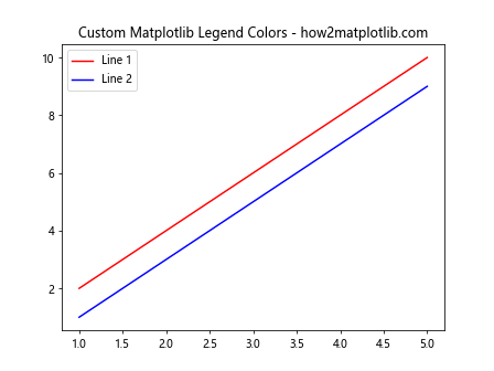
In this example, we’ve specified custom colors for each line using the color parameter. The legend automatically reflects these colors, creating a consistent visual representation.
Using Color Maps for Matplotlib Legend Colors
Color maps provide a powerful way to generate a range of colors for your matplotlib legend. This is particularly useful when dealing with multiple plot elements. Here’s an example:
import matplotlib.pyplot as plt
import numpy as np

# Generate data
x = np.linspace(0, 10, 100)
y1 = np.sin(x)
y2 = np.cos(x)
y3 = np.tan(x)

# Create a color map
cmap = plt.cm.get_cmap('viridis')

# Plot the data with colors from the color map
plt.plot(x, y1, color=cmap(0.1), label='Sin')
plt.plot(x, y2, color=cmap(0.5), label='Cos')
plt.plot(x, y3, color=cmap(0.9), label='Tan')

# Add a legend
plt.legend()

# Add a title
plt.title('Matplotlib Legend Colors with Color Map - how2matplotlib.com')

# Display the plot
plt.show()
Output:
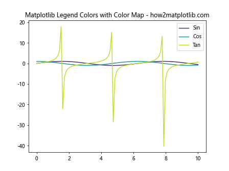
In this example, we’ve used the ‘viridis’ color map to assign colors to our plot elements. The cmap(value) function returns a color based on the given value between 0 and 1. This approach allows for consistent and visually appealing color schemes in your matplotlib legend colors.
Advanced Techniques for Matplotlib Legend Colors
As we dive deeper into matplotlib legend colors, let’s explore some advanced techniques that can take your visualizations to the next level.
Customizing Legend Face and Edge Colors
Matplotlib allows you to customize both the face color (the fill color of the legend box) and the edge color (the outline color of the legend box). Here’s an example:
import matplotlib.pyplot as plt

# Data for the plot
x = [1, 2, 3, 4, 5]
y1 = [2, 4, 6, 8, 10]
y2 = [1, 3, 5, 7, 9]

# Create the plot
plt.plot(x, y1, label='Line 1')
plt.plot(x, y2, label='Line 2')

# Add a legend with custom face and edge colors
plt.legend(facecolor='lightgray', edgecolor='red')

# Add a title
plt.title('Custom Legend Face and Edge Colors - how2matplotlib.com')

# Display the plot
plt.show()
Output:
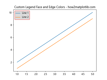
In this example, we’ve set the face color of the legend to light gray and the edge color to red. This customization helps the legend stand out from the plot background and adds a touch of visual interest.
Using Transparency in Matplotlib Legend Colors
Transparency can be a powerful tool when working with matplotlib legend colors. It allows you to create subtle effects and prevent the legend from obscuring important parts of your plot. Here’s how you can apply transparency:
import matplotlib.pyplot as plt
import numpy as np

# Generate data
x = np.linspace(0, 10, 100)
y1 = np.sin(x)
y2 = np.cos(x)

# Create the plot
plt.plot(x, y1, label='Sin')
plt.plot(x, y2, label='Cos')

# Add a legend with transparency
plt.legend(facecolor='white', edgecolor='black', framealpha=0.5)

# Add a title
plt.title('Transparent Legend - how2matplotlib.com')

# Display the plot
plt.show()
Output:
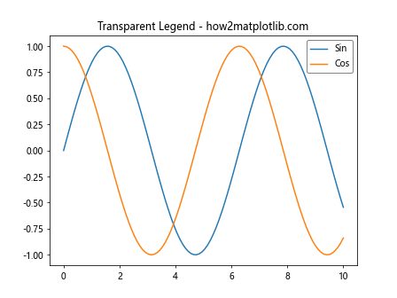
In this example, we’ve set the framealpha parameter to 0.5, which makes the legend box 50% transparent. This allows the plot behind the legend to remain partially visible.
Handling Multiple Legends with Different Colors
Sometimes, you may need to include multiple legends in a single plot, each with its own set of colors. Matplotlib provides ways to achieve this. Let’s look at an example:
import matplotlib.pyplot as plt

# Data for the plot
x = [1, 2, 3, 4, 5]
y1 = [2, 4, 6, 8, 10]
y2 = [1, 3, 5, 7, 9]
y3 = [5, 4, 3, 2, 1]
y4 = [10, 8, 6, 4, 2]

# Create the plot
fig, ax = plt.subplots()

# Plot the first set of lines
line1, = ax.plot(x, y1, color='red', label='Line 1')
line2, = ax.plot(x, y2, color='blue', label='Line 2')

# Plot the second set of lines
line3, = ax.plot(x, y3, color='green', label='Line 3')
line4, = ax.plot(x, y4, color='purple', label='Line 4')

# Create the first legend
legend1 = ax.legend(handles=[line1, line2], loc='upper left', title='Legend 1')

# Add the first legend to the plot
ax.add_artist(legend1)

# Create the second legend
ax.legend(handles=[line3, line4], loc='upper right', title='Legend 2')

# Add a title
plt.title('Multiple Legends with Different Colors - how2matplotlib.com')

# Display the plot
plt.show()
Output:
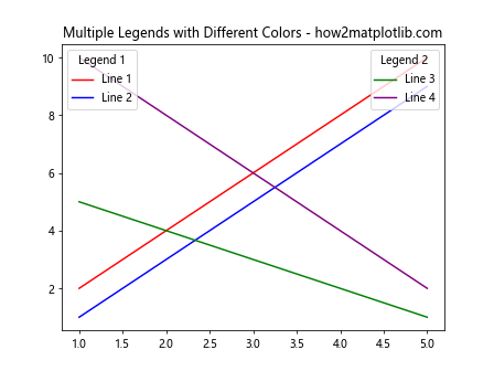
In this example, we’ve created two separate legends, each with its own set of matplotlib legend colors. This technique is useful when you need to group related plot elements together or when you have different categories of data in your visualization.
Customizing Legend Markers and Line Styles
In addition to colors, you can also customize the markers and line styles in your matplotlib legend. This can help differentiate between different types of data or emphasize certain plot elements. Here’s an example:
import matplotlib.pyplot as plt

# Data for the plot
x = [1, 2, 3, 4, 5]
y1 = [2, 4, 6, 8, 10]
y2 = [1, 3, 5, 7, 9]
y3 = [5, 4, 3, 2, 1]

# Create the plot with custom markers and line styles
plt.plot(x, y1, color='red', linestyle='-', marker='o', label='Line 1')
plt.plot(x, y2, color='blue', linestyle='--', marker='s', label='Line 2')
plt.plot(x, y3, color='green', linestyle=':', marker='^', label='Line 3')

# Add a legend
plt.legend()

# Add a title
plt.title('Custom Markers and Line Styles - how2matplotlib.com')

# Display the plot
plt.show()
Output:
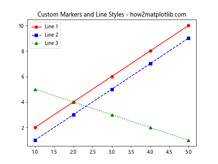
In this example, we’ve used different colors, line styles, and markers for each plot element. The legend automatically reflects these customizations, providing a clear visual reference for each line in the plot.
Using Hatching in Matplotlib Legend Colors
Hatching is another interesting technique you can use to enhance your matplotlib legend colors, especially in bar plots or other filled shapes. Here’s an example:
import matplotlib.pyplot as plt
import numpy as np

# Data for the plot
categories = ['A', 'B', 'C', 'D']
values = [4, 7, 2, 8]

# Create the bar plot with hatching
plt.bar(categories, values, color=['red', 'blue', 'green', 'purple'],
        hatch=['/', '\\', 'x', 'o'], edgecolor='black')

# Add a legend
plt.legend(categories, loc='upper right', title='Categories')

# Add a title
plt.title('Bar Plot with Hatching - how2matplotlib.com')

# Display the plot
plt.show()
Output:
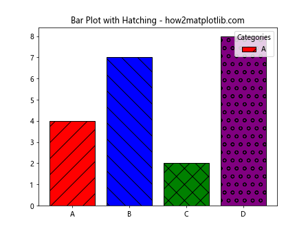
In this example, we’ve added different hatching patterns to each bar in addition to the colors. The legend reflects both the colors and the hatching patterns, providing a rich visual representation of the data.
Creating a Custom Color Palette for Matplotlib Legend Colors
Sometimes, you may want to use a specific color palette that matches your brand or adheres to certain design guidelines. Matplotlib allows you to create custom color palettes for your legend colors. Here’s how you can do it:
import matplotlib.pyplot as plt
import numpy as np

# Define a custom color palette
custom_palette = ['#FF9999', '#66B2FF', '#99FF99', '#FFCC99']

# Generate data
x = np.linspace(0, 10, 100)
y1 = np.sin(x)
y2 = np.cos(x)
y3 = np.tan(x)
y4 = np.exp(-x/10)

# Create the plot using the custom palette
plt.plot(x, y1, color=custom_palette[0], label='Sin')
plt.plot(x, y2, color=custom_palette[1], label='Cos')
plt.plot(x, y3, color=custom_palette[2], label='Tan')
plt.plot(x, y4, color=custom_palette[3], label='Exp')

# Add a legend
plt.legend()

# Add a title
plt.title('Custom Color Palette - how2matplotlib.com')

# Display the plot
plt.show()
Output:
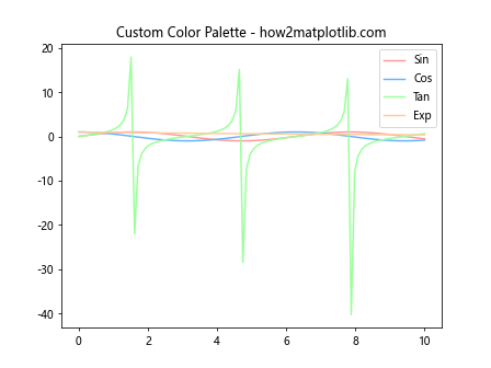
In this example, we’ve defined a custom color palette using hex color codes. We then use these colors for our plot elements, resulting in a consistent and visually appealing color scheme in both the plot and the legend.
Handling Overlapping Legend Entries
When dealing with many plot elements, legend entries may overlap, making them difficult to read. Matplotlib provides options to handle this situation. Let’s look at an example:
import matplotlib.pyplot as plt
import numpy as np

# Generate data
x = np.linspace(0, 10, 100)
y_values = [np.sin(x + i) for i in range(10)]

# Create the plot
for i, y in enumerate(y_values):
    plt.plot(x, y, label=f'Line {i+1}')

# Add a legend with multiple columns
plt.legend(ncol=2, loc='upper center', bbox_to_anchor=(0.5, -0.05))

# Add a title
plt.title('Handling Overlapping Legend Entries - how2matplotlib.com')

# Adjust the plot layout
plt.tight_layout()

# Display the plot
plt.show()
Output:
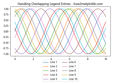
In this example, we’ve created a plot with multiple lines and used the ncol parameter in the legend to arrange the entries in two columns. We’ve also adjusted the legend position using bbox_to_anchor to place it below the plot. This approach helps prevent overlapping and makes the legend more readable.
Using Gradients in Matplotlib Legend Colors
Gradients can add a sophisticated touch to your matplotlib legend colors, especially when representing continuous data. Here’s an example of how to use gradients:
import matplotlib.pyplot as plt
import numpy as np

# Generate data
x = np.linspace(0, 10, 100)
y = np.sin(x)

# Create the plot
plt.scatter(x, y, c=y, cmap='viridis', label='Sin(x)')

# Add a colorbar
cbar = plt.colorbar()
cbar.set_label('Value')

# Add a legend
plt.legend()

# Add a title
plt.title('Gradient Colors in Legend - how2matplotlib.com')

# Display the plot
plt.show()
Output:
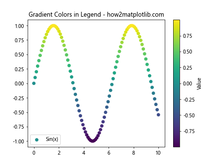
In this example, we’ve used a scatter plot with points colored according to their y-values. The colorbar serves as a legend, showing the gradient of colors used in the plot. This technique is particularly useful for visualizing continuous data or trends.
Animating Matplotlib Legend Colors
For dynamic visualizations, you might want to animate your matplotlib legend colors. While this is a more advanced technique, it can create engaging and informative plots. Here’s a simple example:
import matplotlib.pyplot as plt
import numpy as np
from matplotlib.animation import FuncAnimation

# Set up the figure and axis
fig, ax = plt.subplots()

# Initialize an empty line
line, = ax.plot([], [], lw=2)

# Set the x-range
x = np.linspace(0, 4*np.pi, 100)

# Animation function
def animate(i):
    y = np.sin(x + i/10.0)
    line.set_data(x, y)
    line.set_color(plt.cm.viridis(i/100))
    return line,

# Create the animation
anim = FuncAnimation(fig, animate, frames=100, interval=50, blit=True)

# Add a legend that updates with each frame
legend = ax.legend(['Sin(x)'], loc='upper right')

# Update the legend in each frame
def update_legend(frame):
    legend.get_texts()[0].set_color(plt.cm.viridis(frame/100))

anim.event_source.add_callback(update_legend)

# Add a title
plt.title('Animated Legend Colors - how2matplotlib.com')

# Display the animation
plt.show()
Output:
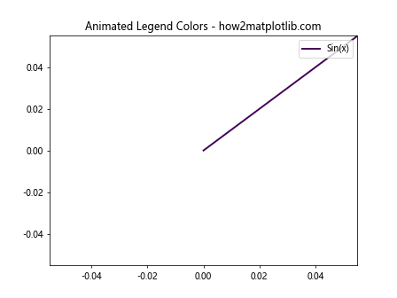
In this example, we’ve created an animation where both the line color and the legend color change over time. The legend color updates to match the current color of the line in each frame of the animation.
Best Practices for Matplotlib Legend Colors
When working with matplotlib legend colors, it’s important to follow some best practices to ensure your visualizations are effective and accessible. Here are some tips:
- Use contrasting colors: Ensure that your legend colors are easily distinguishable from each other and from the background.
2.2. Consider color blindness: Choose color schemes that are accessible to people with color vision deficiencies.
- Be consistent: Use the same color scheme throughout your visualization and related plots.
Limit the number of colors: Too many colors can be overwhelming. Stick to a manageable number of distinct colors.
Use color meaningfully: Assign colors to categories or values in a way that makes sense and aids understanding.
Provide sufficient contrast with the background: Ensure that your legend is easily readable against the plot background.
Use transparency judiciously: While transparency can be useful, make sure it doesn’t compromise legibility.
Let’s look at an example that incorporates some of these best practices: