How to Create Matplotlib Titles with Different Colors: A Comprehensive Guide
Matplotlib title with different colors is a powerful technique to enhance the visual appeal and information hierarchy of your plots. By using different colors for your titles, you can draw attention to specific elements, create contrast, and improve the overall aesthetics of your data visualizations. In this comprehensive guide, we’ll explore various methods and techniques to create matplotlib titles with different colors, providing you with the knowledge and tools to elevate your data visualization game.
Understanding the Basics of Matplotlib Titles
Before diving into the world of colorful titles, it’s essential to understand the basics of matplotlib titles. Matplotlib is a popular plotting library in Python that allows you to create a wide range of static, animated, and interactive visualizations. Titles play a crucial role in providing context and information about your plots.
To add a title to your matplotlib plot, you typically use the title() function. Here’s a simple example:
import matplotlib.pyplot as plt

plt.figure(figsize=(8, 6))
plt.plot([1, 2, 3, 4], [1, 4, 2, 3])
plt.title("How2Matplotlib.com: Basic Title Example")
plt.show()
Output:
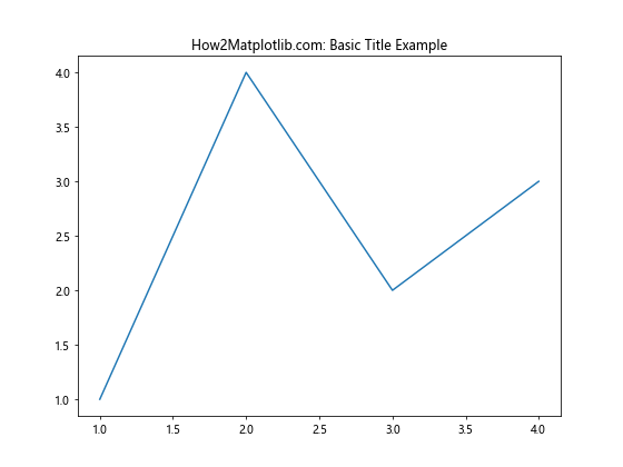
In this example, we create a basic line plot and add a title using the title() function. However, this title uses the default color, which is typically black. To create matplotlib titles with different colors, we need to explore more advanced techniques.
Using Color Names for Matplotlib Titles
One of the simplest ways to add color to your matplotlib titles is by using color names. Matplotlib supports a wide range of color names that you can use to specify the color of your title. Here’s an example of how to create a matplotlib title with different colors using color names:
import matplotlib.pyplot as plt

plt.figure(figsize=(8, 6))
plt.plot([1, 2, 3, 4], [1, 4, 2, 3])
plt.title("How2Matplotlib.com: Red Title Example", color="red")
plt.show()
Output:
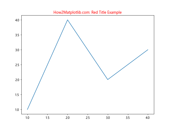
In this example, we set the color parameter of the title() function to “red”. This changes the color of the entire title to red. You can experiment with different color names like “blue”, “green”, “purple”, etc., to create matplotlib titles with different colors.
Using RGB Values for Precise Color Control
While color names are convenient, they offer limited control over the exact shade you want. For more precise control over your matplotlib title colors, you can use RGB (Red, Green, Blue) values. RGB values allow you to specify exact shades by combining different amounts of red, green, and blue.
Here’s an example of how to create a matplotlib title with different colors using RGB values:
import matplotlib.pyplot as plt

plt.figure(figsize=(8, 6))
plt.plot([1, 2, 3, 4], [1, 4, 2, 3])
plt.title("How2Matplotlib.com: Custom RGB Title", color=(0.2, 0.6, 0.8))
plt.show()
Output:
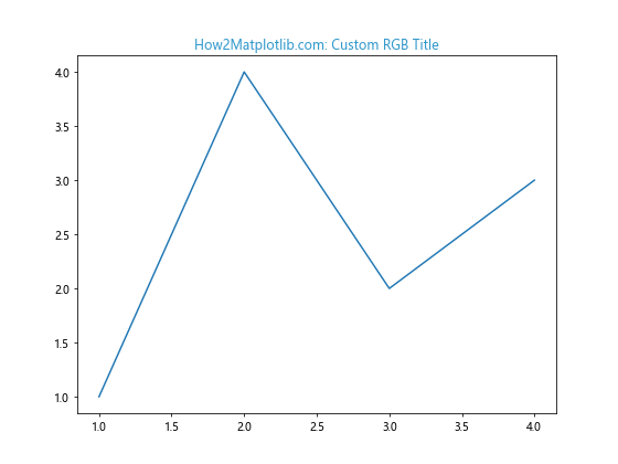
In this example, we set the color parameter to a tuple of three values between 0 and 1, representing the intensity of red, green, and blue respectively. This creates a custom blue-green color for our title.
Utilizing Hexadecimal Color Codes
Another popular method for specifying colors in matplotlib titles is using hexadecimal color codes. Hexadecimal codes provide a standardized way to represent colors and are widely used in web design and graphics.
Here’s how you can create matplotlib titles with different colors using hexadecimal codes:
import matplotlib.pyplot as plt

plt.figure(figsize=(8, 6))
plt.plot([1, 2, 3, 4], [1, 4, 2, 3])
plt.title("How2Matplotlib.com: Hexadecimal Color Title", color="#FF5733")
plt.show()
Output:
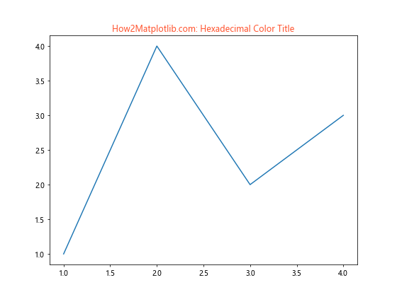
In this example, we use the hexadecimal color code “#FF5733” to create an orange-red title. Hexadecimal codes allow for precise color selection and are especially useful when you want to match colors from other design elements or branding guidelines.
Creating Gradient Titles with Multiple Colors
To take your matplotlib titles with different colors to the next level, you can create gradient effects by using multiple colors within a single title. This technique involves splitting your title into multiple parts and applying different colors to each part.
Here’s an example of how to create a gradient title:
import matplotlib.pyplot as plt

fig, ax = plt.subplots(figsize=(10, 6))
ax.plot([1, 2, 3, 4], [1, 4, 2, 3])

title = ax.set_title("How2Matplotlib.com: Gradient Title")
title.set_color('none')
title.set_path_effects([plt.patheffects.withStroke(linewidth=3, foreground='r'),
                        plt.patheffects.Normal()])

gradient = ax.text(0.5, 1.05, "How2Matplotlib.com: Gradient Title",
                   ha='center', va='center', transform=ax.transAxes,
                   fontsize=16, fontweight='bold')

gradient.set_path_effects([plt.patheffects.LinearGradient(0, (0, 0, 1), (1, 0, 0))])

plt.show()
In this example, we create a gradient effect that transitions from blue to red across the title. We use the set_path_effects() method to apply a linear gradient to the text.
Applying Different Colors to Specific Words
Sometimes, you may want to apply different colors to specific words within your matplotlib title. This can be achieved by breaking down your title into multiple text elements and applying colors individually.
Here’s an example of how to create matplotlib titles with different colors for specific words:
import matplotlib.pyplot as plt

fig, ax = plt.subplots(figsize=(10, 6))
ax.plot([1, 2, 3, 4], [1, 4, 2, 3])

ax.text(0.5, 1.05, "How2Matplotlib.com:", transform=ax.transAxes, ha='center', va='center', fontsize=16, color='blue')
ax.text(0.5, 1.02, "Colorful", transform=ax.transAxes, ha='center', va='center', fontsize=16, color='red')
ax.text(0.5, 0.99, "Title", transform=ax.transAxes, ha='center', va='center', fontsize=16, color='green')
ax.text(0.5, 0.96, "Example", transform=ax.transAxes, ha='center', va='center', fontsize=16, color='purple')

plt.show()
Output:
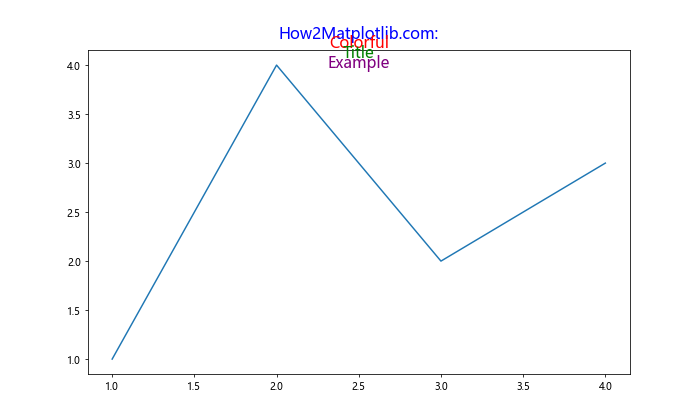
In this example, we use multiple text() calls to create a title with different words in different colors. Each word is positioned separately and given its own color.
Using Color Maps for Dynamic Title Colors
Color maps are a powerful feature in matplotlib that allow you to map colors to values. You can leverage color maps to create dynamic title colors based on data or other parameters.
Here’s an example of how to use color maps for matplotlib titles with different colors:
import matplotlib.pyplot as plt
import numpy as np

data = np.random.rand(10, 10)
fig, ax = plt.subplots(figsize=(10, 8))
im = ax.imshow(data, cmap='viridis')

cmap = plt.get_cmap('viridis')
title_color = cmap(np.mean(data))

ax.set_title("How2Matplotlib.com: Color Map Title", color=title_color, fontsize=16)

plt.colorbar(im)
plt.show()
Output:
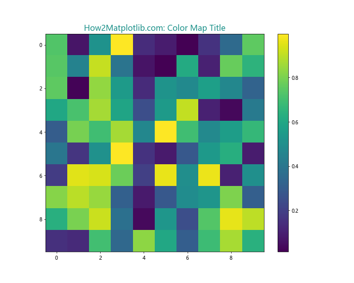
In this example, we create a heatmap using random data and the ‘viridis’ color map. We then use the mean value of the data to select a color from the same color map for our title. This creates a title color that is dynamically linked to the data being visualized.
Animating Title Colors for Eye-Catching Visualizations
To create truly dynamic matplotlib titles with different colors, you can animate the title color over time. This technique can be particularly effective for presentations or interactive visualizations.
Here’s an example of how to create an animated title with changing colors:
import matplotlib.pyplot as plt
import matplotlib.animation as animation
import numpy as np

fig, ax = plt.subplots(figsize=(10, 6))
ax.plot([1, 2, 3, 4], [1, 4, 2, 3])

title = ax.set_title("How2Matplotlib.com: Animated Title", fontsize=16)

def update(frame):
    r = (np.sin(frame * 0.1) + 1) / 2
    g = (np.sin(frame * 0.1 + 2*np.pi/3) + 1) / 2
    b = (np.sin(frame * 0.1 + 4*np.pi/3) + 1) / 2
    title.set_color((r, g, b))
    return title,

ani = animation.FuncAnimation(fig, update, frames=200, interval=50, blit=True)
plt.show()
Output:
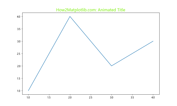
In this example, we create an animation that smoothly transitions the title color through various hues. The update() function calculates new RGB values based on the current frame, creating a continuous color cycle.
Combining Multiple Techniques for Complex Title Designs
To create truly unique matplotlib titles with different colors, you can combine multiple techniques. This allows for complex title designs that can incorporate gradients, multiple colors, and even custom fonts.
Here’s an example that combines several techniques:
import matplotlib.pyplot as plt
from matplotlib import patheffects

fig, ax = plt.subplots(figsize=(12, 8))
ax.plot([1, 2, 3, 4], [1, 4, 2, 3])

main_title = ax.text(0.5, 1.05, "How2Matplotlib.com:", transform=ax.transAxes, ha='center', va='center', fontsize=20, fontweight='bold')
main_title.set_path_effects([patheffects.withStroke(linewidth=3, foreground='blue')])

subtitle1 = ax.text(0.5, 1.00, "Advanced", transform=ax.transAxes, ha='center', va='center', fontsize=16, color='red')
subtitle2 = ax.text(0.5, 0.96, "Title", transform=ax.transAxes, ha='center', va='center', fontsize=16, color='green')
subtitle3 = ax.text(0.5, 0.92, "Techniques", transform=ax.transAxes, ha='center', va='center', fontsize=16)

subtitle3.set_path_effects([patheffects.LinearGradient(0, (1, 0, 0), (0, 0, 1))])

plt.show()
In this example, we create a complex title design that includes:
- A main title with a blue stroke effect
- Subtitles in different colors
- A subtitle with a linear gradient effect
This combination of techniques allows for highly customized and visually striking matplotlib titles with different colors.
Using Custom Fonts for Enhanced Title Aesthetics
While color plays a crucial role in title design, combining different colors with custom fonts can take your matplotlib titles to the next level. Matplotlib allows you to use custom fonts, which can greatly enhance the overall aesthetics of your visualizations.
Here’s an example of how to use a custom font with colored titles:
import matplotlib.pyplot as plt
from matplotlib import font_manager

# Add a custom font
font_path = '/path/to/your/custom/font.ttf'  # Replace with your font path
font_manager.fontManager.addfont(font_path)
custom_font = font_manager.FontProperties(fname=font_path)

fig, ax = plt.subplots(figsize=(10, 6))
ax.plot([1, 2, 3, 4], [1, 4, 2, 3])

ax.set_title("How2Matplotlib.com: Custom Font Title", fontproperties=custom_font, color='#FF5733', fontsize=20)

plt.show()
In this example, we load a custom font and apply it to our title along with a custom color. Make sure to replace the font_path with the path to your desired font file.
Creating 3D Titles with Color Depth
For 3D plots, you can create titles that have a sense of depth by using color gradients and shadows. This technique can make your titles appear to float above the plot, adding an extra dimension to your visualization.
Here’s an example of how to create a 3D-like title with color depth:
import matplotlib.pyplot as plt
from mpl_toolkits.mplot3d import Axes3D

fig = plt.figure(figsize=(10, 8))
ax = fig.add_subplot(111, projection='3d')

# Create some sample 3D data
X, Y = np.meshgrid(range(10), range(10))
Z = np.sin(X) + np.cos(Y)

ax.plot_surface(X, Y, Z)

# Create main title
ax.text2D(0.5, 1.05, "How2Matplotlib.com:", transform=ax.transAxes, ha='center', va='center', fontsize=20, fontweight='bold', color='navy')

# Create shadow effect
ax.text2D(0.502, 1.048, "3D Title Example", transform=ax.transAxes, ha='center', va='center', fontsize=18, color='lightgray', alpha=0.5)

# Create main subtitle
ax.text2D(0.5, 1.05, "3D Title Example", transform=ax.transAxes, ha='center', va='center', fontsize=18, color='skyblue')

plt.show()
In this example, we create a 3D surface plot and add a title with a shadow effect. The main title is in navy blue, with a light gray shadow slightly offset, and a sky blue subtitle on top. This creates an illusion of depth for the title.
Implementing Color-Changing Titles Based on Data
You can make your matplotlib titles with different colors even more informative by dynamically changing the color based on the data being visualized. This technique can be particularly useful for dashboards or real-time data visualization.
Here’s an example of how to implement a color-changing title based on data:
import matplotlib.pyplot as plt
import numpy as np

def get_title_color(value):
    if value < 0:
        return 'red'
    elif value > 0:
        return 'green'
    else:
        return 'blue'

data = np.random.randn(100).cumsum()
latest_value = data[-1]

fig, ax = plt.subplots(figsize=(10, 6))
ax.plot(data)

title_color = get_title_color(latest_value)
ax.set_title(f"How2Matplotlib.com: Data-Driven Title (Value: {latest_value:.2f})", color=title_color, fontsize=16)

plt.show()
Output:
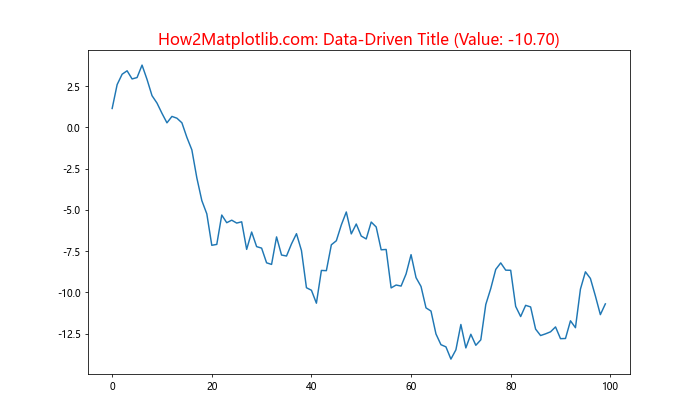
In this example, we create a simple line plot of cumulative random data. The title color changes based on the latest data point: red for negative values, green for positive values, and blue for zero.
Creating Titles with Color-Coded Information
Another powerful technique for matplotlib titles with different colors is to use color coding to convey additional information. This can be particularly useful when you want to highlight different aspects of your data or analysis in the title itself.
Here’s an example of how to create a title with color-coded information:
import matplotlib.pyplot as plt

fig, ax = plt.subplots(figsize=(10, 6))

data = [25, 40, 30, 55, 70]
categories = ['A', 'B', 'C', 'D', 'E']

ax.bar(categories, data)

# Create a color-coded title
ax.text(0.5, 1.05, "How2Matplotlib.com: ", transform=ax.transAxes, ha='center', va='center', fontsize=16, color='black')
ax.text(0.5, 1.02, "Category A ", transform=ax.transAxes, ha='center', va='center', fontsize=16, color='red')
ax.text(0.5, 0.99, "vs ", transform=ax.transAxes, ha='center', va='center', fontsize=16, color='black')
ax.text(0.5, 0.96, "Category E", transform=ax.transAxes, ha='center', va='center', fontsize=16, color='green')

plt.show()
Output:
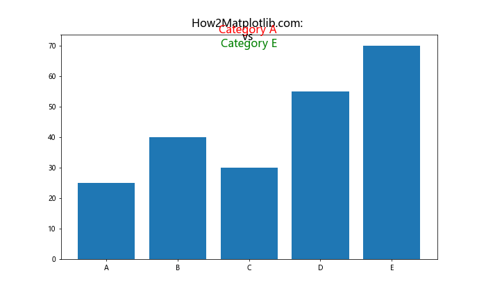
In this example, we create a bar chart and use a color-coded title to highlight specific categories. The title emphasizes categories A and E by coloring them red and green respectively, while keeping the rest of the text black.
Implementing Accessibility-Friendly Color Schemes
When creating matplotlib titles with different colors, it’s important to consider accessibility. Some color combinations may be difficult to read for people with color vision deficiencies. Here’s an example of how to create an accessibility-friendly title using a colorblind-safe palette:
import matplotlib.pyplot as plt
import seaborn as sns

# Use a colorblind-friendly palette
colors = sns.color_palette("colorblind")

fig, ax = plt.subplots(figsize=(10, 6))
ax.plot([1, 2, 3, 4], [1, 4, 2, 3])

ax.set_title("How2Matplotlib.com: Accessibility-Friendly Title", fontsize=16)
ax.text(0.5, 1.05, "Important", transform=ax.transAxes, ha='center', va='center', fontsize=14, color=colors[0])
ax.text(0.5, 1.02, "Information", transform=ax.transAxes, ha='center', va='center', fontsize=14, color=colors[1])

plt.show()
Output:
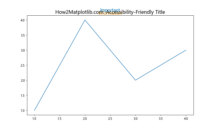
In this example, we use Seaborn’s colorblind-friendly palette to ensure that the colors used in the title are distinguishable for most people, including those with color vision deficiencies.
Creating Interactive Titles with Hover Effects
For interactive matplotlib plots, you can create titles that change color when the user hovers over them. This can be achieved using libraries like mpld3 that allow for interactive matplotlib plots in web browsers.
Here’s an example of how to create an interactive title with hover effects:
import matplotlib.pyplot as plt
import mpld3

fig, ax = plt.subplots(figsize=(10, 6))
ax.plot([1, 2, 3, 4], [1, 4, 2, 3])

title = ax.set_title("How2Matplotlib.com: Interactive Title", fontsize=16)

# Add hover effect
hover = mpld3.plugins.HoverPlugin(points=[title], label="Click for more info!")
mpld3.plugins.connect(fig, hover)

mpld3.show()
In this example, we create a simple plot and add an interactive title using mpld3. When the user hovers over the title, a tooltip appears with additional information.
Implementing Color Themes for Consistent Visualization
When working on a series of plots or a dashboard, it’s important to maintain a consistent color theme. You can create a custom color theme for your matplotlib titles and apply it across multiple plots.
Here’s an example of how to implement a custom color theme:
import matplotlib.pyplot as plt

# Define a custom color theme
theme_colors = {
    'primary': '#3498db',
    'secondary': '#e74c3c',
    'accent': '#2ecc71',
    'text': '#34495e'
}

def apply_theme(ax, title, subtitle):
    ax.set_title(title, color=theme_colors['primary'], fontsize=16)
    ax.text(0.5, 0.95, subtitle, transform=ax.transAxes, ha='center', va='center',
            color=theme_colors['secondary'], fontsize=14)
    ax.tick_params(colors=theme_colors['text'])
    ax.spines['bottom'].set_color(theme_colors['text'])
    ax.spines['top'].set_color(theme_colors['text'])
    ax.spines['left'].set_color(theme_colors['text'])
    ax.spines['right'].set_color(theme_colors['text'])

# Create multiple plots with consistent theme
fig, (ax1, ax2) = plt.subplots(1, 2, figsize=(15, 6))

ax1.plot([1, 2, 3, 4], [1, 4, 2, 3])
apply_theme(ax1, "How2Matplotlib.com: Plot 1", "Data Analysis")

ax2.scatter([1, 2, 3, 4], [1, 4, 2, 3])
apply_theme(ax2, "How2Matplotlib.com: Plot 2", "Data Visualization")

plt.tight_layout()
plt.show()
Output:
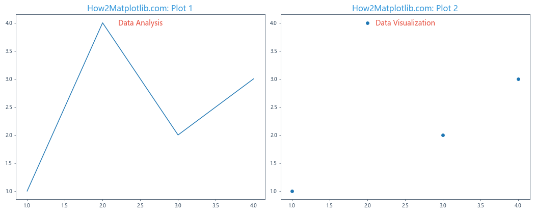
In this example, we define a custom color theme and create a function to apply this theme consistently across multiple plots. This ensures that all titles and subtitles have a cohesive look.
Using Color to Highlight Statistical Significance
When presenting statistical results in your plots, you can use color in your titles to highlight significant findings. This technique can quickly draw attention to important results.
Here’s an example of how to use color to highlight statistical significance in your titles:
import matplotlib.pyplot as plt
import numpy as np
from scipy import stats

# Generate some sample data
group1 = np.random.normal(5, 2, 100)
group2 = np.random.normal(6, 2, 100)

# Perform t-test
t_stat, p_value = stats.ttest_ind(group1, group2)

fig, ax = plt.subplots(figsize=(10, 6))
ax.boxplot([group1, group2], labels=['Group 1', 'Group 2'])

# Set title color based on p-value
if p_value < 0.05:
    title_color = 'green'
    significance = 'Significant'
else:
    title_color = 'red'
    significance = 'Not Significant'

ax.set_title(f"How2Matplotlib.com: Comparison of Groups\n(p={p_value:.4f}, {significance})",
             color=title_color, fontsize=16)

plt.show()
Output:
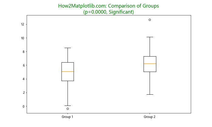
In this example, we perform a t-test to compare two groups and color the title based on the statistical significance of the result. A green title indicates a significant difference, while a red title indicates no significant difference.
Creating Titles with Emoji for Visual Appeal
To add a fun and modern touch to your matplotlib titles with different colors, you can incorporate emojis. Emojis can help convey information quickly and add visual appeal to your plots.
Here's an example of how to create titles with emojis:
import matplotlib.pyplot as plt

fig, ax = plt.subplots(figsize=(10, 6))
ax.plot([1, 2, 3, 4], [1, 4, 2, 3])

ax.set_title("How2Matplotlib.com: 📊 Data Visualization 🎨", fontsize=16)
ax.text(0.5, 0.95, "📈 Trend Analysis", transform=ax.transAxes, ha='center', va='center',
        color='green', fontsize=14)
ax.text(0.5, 0.90, "🔍 Insights", transform=ax.transAxes, ha='center', va='center',
        color='blue', fontsize=14)

plt.show()
Output:
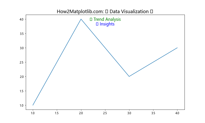
In this example, we use emojis in both the main title and subtitles to add visual elements that complement the text. Note that the ability to display emojis depends on the font support in your system.
Implementing Dynamic Title Colors for Time Series Data
For time series data, you can create dynamic title colors that change based on the time of day or seasonality of your data. This can provide immediate context to your viewers about when the data was collected or what period it represents.
Here's an example of how to implement dynamic title colors for time series data:
import matplotlib.pyplot as plt
import pandas as pd
import numpy as np

# Generate sample time series data
dates = pd.date_range(start='2023-01-01', end='2023-12-31', freq='D')
values = np.cumsum(np.random.randn(len(dates)))
df = pd.DataFrame({'Date': dates, 'Value': values})

def get_season_color(month):
    if month in [12, 1, 2]:
        return 'blue'  # Winter
    elif month in [3, 4, 5]:
        return 'green'  # Spring
    elif month in [6, 7, 8]:
        return 'red'  # Summer
    else:
        return 'orange'  # Fall

fig, ax = plt.subplots(figsize=(12, 6))
ax.plot(df['Date'], df['Value'])

last_date = df['Date'].iloc[-1]
season_color = get_season_color(last_date.month)

ax.set_title(f"How2Matplotlib.com: Time Series Data\nLast Update: {last_date.strftime('%Y-%m-%d')}",
             color=season_color, fontsize=16)

plt.show()
Output:
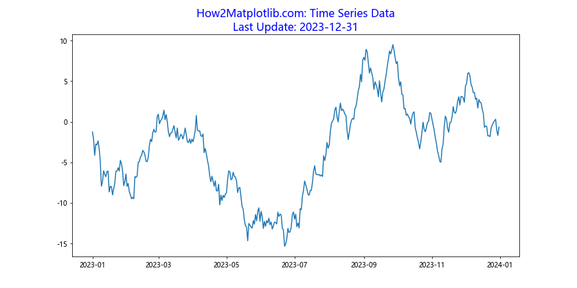
In this example, we create a time series plot and color the title based on the season of the last data point. This provides immediate visual feedback about the temporal context of the data.
Matplotlib title with different colors Conclusion
Matplotlib titles with different colors offer a powerful way to enhance your data visualizations. From simple color changes to complex gradient effects, animated titles, and data-driven color schemes, the possibilities are vast. By mastering these techniques, you can create more engaging, informative, and visually appealing plots that effectively communicate your data insights.
Remember to consider factors such as readability, accessibility, and consistency when choosing colors for your titles. Experiment with different combinations and techniques to find what works best for your specific data and audience. With practice and creativity, you'll be able to leverage matplotlib titles with different colors to create stunning and informative visualizations that stand out.