How to Use and Display Matplotlib Hex Colors: A Comprehensive Guide
Matplotlib hex colors display is an essential aspect of data visualization in Python. Hex colors provide a wide range of color options for customizing plots and charts in Matplotlib. This article will explore various ways to use and display hex colors in Matplotlib, providing detailed explanations and examples to help you master this important feature.
Understanding Matplotlib Hex Colors Display
Matplotlib hex colors display refers to the use of hexadecimal color codes in Matplotlib plots. Hex colors are a way to represent colors using a six-digit code, where each pair of digits represents the intensity of red, green, and blue components. For example, “#FF0000” represents pure red, “#00FF00” represents pure green, and “#0000FF” represents pure blue.
Using hex colors in Matplotlib allows for precise control over the colors used in your visualizations. Let’s start with a simple example of how to use hex colors in a basic plot:
import matplotlib.pyplot as plt

x = [1, 2, 3, 4, 5]
y = [2, 4, 6, 8, 10]

plt.figure(figsize=(8, 6))
plt.plot(x, y, color='#FF5733', linewidth=2, label='how2matplotlib.com')
plt.title('Simple Plot with Hex Color')
plt.xlabel('X-axis')
plt.ylabel('Y-axis')
plt.legend()
plt.show()
Output:
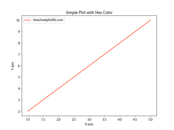
In this example, we use the hex color “#FF5733” to set the color of the line plot. This hex code represents a shade of orange-red.
Creating Custom Color Palettes with Matplotlib Hex Colors Display
One of the advantages of using hex colors in Matplotlib is the ability to create custom color palettes. This is particularly useful when you want to maintain a consistent color scheme across multiple plots or when you need to match your company’s branding colors.
Here’s an example of how to create a custom color palette using hex colors:
import matplotlib.pyplot as plt
import numpy as np

# Define custom color palette
custom_colors = ['#1F77B4', '#FF7F0E', '#2CA02C', '#D62728', '#9467BD']

x = np.linspace(0, 10, 100)
fig, ax = plt.subplots(figsize=(10, 6))

for i, color in enumerate(custom_colors):
    y = np.sin(x + i)
    ax.plot(x, y, color=color, label=f'Line {i+1} - how2matplotlib.com')

ax.set_title('Custom Color Palette with Hex Colors')
ax.set_xlabel('X-axis')
ax.set_ylabel('Y-axis')
ax.legend()
plt.show()
Output:
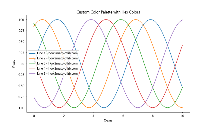
In this example, we define a custom color palette using hex colors and use it to plot multiple sine waves. Each line is assigned a different color from our custom palette.
Using Matplotlib Hex Colors Display in Scatter Plots
Scatter plots are another common type of visualization where hex colors can be effectively used. Let’s look at an example of how to use hex colors in a scatter plot:
import matplotlib.pyplot as plt
import numpy as np

np.random.seed(42)
x = np.random.rand(50)
y = np.random.rand(50)
colors = np.random.rand(50)

plt.figure(figsize=(8, 6))
scatter = plt.scatter(x, y, c=colors, cmap='viridis', s=100, alpha=0.7)
plt.colorbar(scatter, label='Color Scale - how2matplotlib.com')
plt.title('Scatter Plot with Hex Colors')
plt.xlabel('X-axis')
plt.ylabel('Y-axis')
plt.show()
Output:
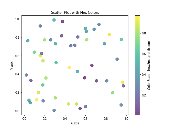
In this example, we create a scatter plot where the color of each point is determined by a colormap. While we don’t explicitly use hex colors here, Matplotlib internally converts the colormap values to hex colors for display.
Matplotlib Hex Colors Display in Bar Charts
Bar charts are another type of plot where hex colors can be effectively used to distinguish between different categories. Here’s an example:
import matplotlib.pyplot as plt

categories = ['A', 'B', 'C', 'D', 'E']
values = [23, 45, 56, 78, 32]
colors = ['#FF9999', '#66B2FF', '#99FF99', '#FFCC99', '#FF99CC']

plt.figure(figsize=(10, 6))
bars = plt.bar(categories, values, color=colors)

plt.title('Bar Chart with Custom Hex Colors')
plt.xlabel('Categories')
plt.ylabel('Values')

for bar in bars:
    height = bar.get_height()
    plt.text(bar.get_x() + bar.get_width()/2., height,
             f'{height} - how2matplotlib.com',
             ha='center', va='bottom')

plt.show()
Output:
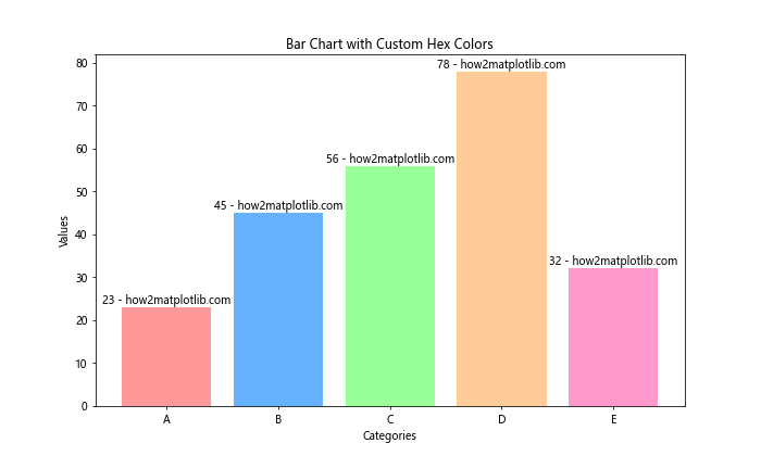
In this example, we use different hex colors for each bar in the chart, making it easy to distinguish between categories.
Creating Color Gradients with Matplotlib Hex Colors Display
Hex colors can also be used to create color gradients in Matplotlib. This is particularly useful when you want to show a progression or intensity in your data. Here’s an example of how to create a color gradient using hex colors:
import matplotlib.pyplot as plt
import matplotlib.colors as mcolors

def hex_to_rgb(hex_color):
    return mcolors.to_rgb(hex_color)

def create_color_gradient(start_color, end_color, n_steps):
    start_rgb = hex_to_rgb(start_color)
    end_rgb = hex_to_rgb(end_color)

    r = np.linspace(start_rgb[0], end_rgb[0], n_steps)
    g = np.linspace(start_rgb[1], end_rgb[1], n_steps)
    b = np.linspace(start_rgb[2], end_rgb[2], n_steps)

    return [(r[i], g[i], b[i]) for i in range(n_steps)]

start_color = '#FF0000'  # Red
end_color = '#0000FF'    # Blue
n_steps = 10

gradient_colors = create_color_gradient(start_color, end_color, n_steps)

fig, ax = plt.subplots(figsize=(10, 2))
for i, color in enumerate(gradient_colors):
    ax.add_patch(plt.Rectangle((i, 0), 1, 1, color=color))

ax.set_xlim(0, n_steps)
ax.set_ylim(0, 1)
ax.set_xticks([])
ax.set_yticks([])
ax.set_title('Color Gradient from Red to Blue - how2matplotlib.com')
plt.show()
This example creates a color gradient from red to blue using hex colors as the start and end points.
Using Matplotlib Hex Colors Display with Colormaps
Matplotlib provides a wide range of built-in colormaps that can be used to map numerical data to colors. While these colormaps are typically accessed using their names, you can also create custom colormaps using hex colors. Here’s an example:
import matplotlib.pyplot as plt
import matplotlib.colors as mcolors
import numpy as np

# Define custom colormap using hex colors
hex_colors = ['#FF0000', '#00FF00', '#0000FF', '#FFFF00', '#FF00FF']
n_bins = 100
custom_cmap = mcolors.LinearSegmentedColormap.from_list('custom', hex_colors, N=n_bins)

# Generate some data
x = np.linspace(0, 10, 100)
y = np.linspace(0, 10, 100)
X, Y = np.meshgrid(x, y)
Z = np.sin(X) * np.cos(Y)

# Create the plot
fig, ax = plt.subplots(figsize=(10, 8))
im = ax.imshow(Z, cmap=custom_cmap, extent=[0, 10, 0, 10])
plt.colorbar(im, label='Custom Colormap - how2matplotlib.com')
ax.set_title('Custom Colormap with Hex Colors')
ax.set_xlabel('X-axis')
ax.set_ylabel('Y-axis')
plt.show()
Output:
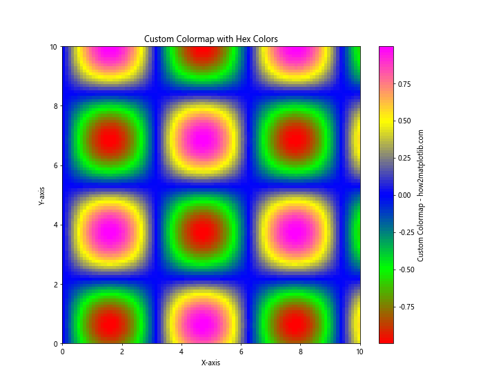
In this example, we create a custom colormap using hex colors and apply it to a 2D plot.
Matplotlib Hex Colors Display in Pie Charts
Pie charts are another type of visualization where hex colors can be effectively used to distinguish between different categories. Here’s an example:
import matplotlib.pyplot as plt

sizes = [30, 25, 20, 15, 10]
labels = ['A', 'B', 'C', 'D', 'E']
colors = ['#FF9999', '#66B2FF', '#99FF99', '#FFCC99', '#FF99CC']
explode = (0.1, 0, 0, 0, 0)  # explode the 1st slice

plt.figure(figsize=(10, 8))
plt.pie(sizes, explode=explode, labels=labels, colors=colors, autopct='%1.1f%%',
        shadow=True, startangle=90)
plt.axis('equal')  # Equal aspect ratio ensures that pie is drawn as a circle
plt.title('Pie Chart with Custom Hex Colors - how2matplotlib.com')
plt.show()
Output:
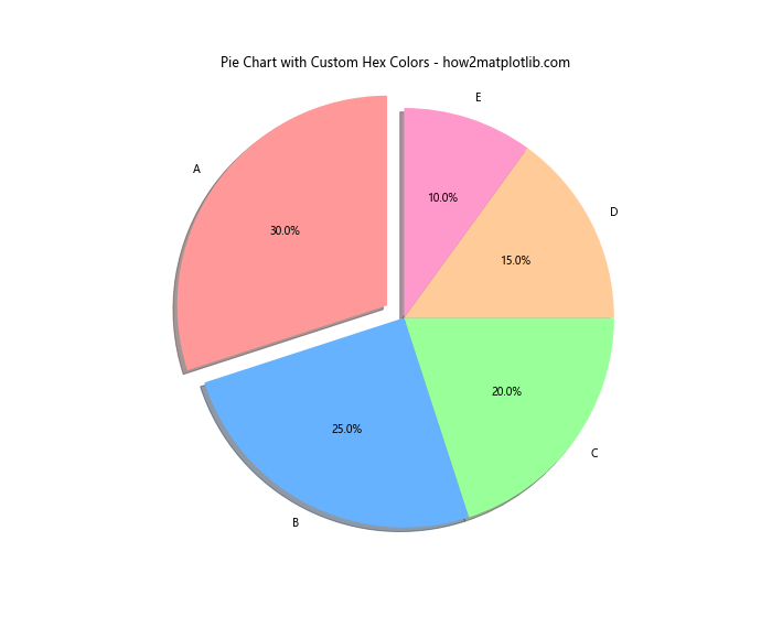
In this example, we use different hex colors for each slice of the pie chart, making it easy to distinguish between categories.
Using Matplotlib Hex Colors Display in Heatmaps
Heatmaps are a great way to visualize 2D data, and hex colors can be used effectively to represent different values. Here’s an example:
import matplotlib.pyplot as plt
import numpy as np

# Generate some random data
data = np.random.rand(10, 10)

# Define custom colormap
hex_colors = ['#FFFFFF', '#FFA07A', '#FF0000']
n_bins = 100
custom_cmap = plt.cm.colors.LinearSegmentedColormap.from_list('custom', hex_colors, N=n_bins)

fig, ax = plt.subplots(figsize=(10, 8))
im = ax.imshow(data, cmap=custom_cmap)

# Add colorbar
cbar = plt.colorbar(im)
cbar.set_label('Values - how2matplotlib.com', rotation=270, labelpad=15)

# Customize the plot
ax.set_title('Heatmap with Custom Hex Colors')
ax.set_xlabel('X-axis')
ax.set_ylabel('Y-axis')

plt.show()
Output:
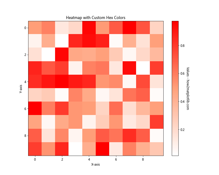
In this example, we create a custom colormap using hex colors and apply it to a heatmap.
Matplotlib Hex Colors Display in 3D Plots
Hex colors can also be used effectively in 3D plots. Here’s an example of a 3D surface plot using hex colors:
import matplotlib.pyplot as plt
import numpy as np
from mpl_toolkits.mplot3d import Axes3D

# Generate data for the 3D surface
x = np.linspace(-5, 5, 100)
y = np.linspace(-5, 5, 100)
X, Y = np.meshgrid(x, y)
Z = np.sin(np.sqrt(X**2 + Y**2))

# Create the 3D plot
fig = plt.figure(figsize=(12, 8))
ax = fig.add_subplot(111, projection='3d')

# Plot the surface with a custom color
surf = ax.plot_surface(X, Y, Z, cmap='viridis', linewidth=0, antialiased=False)

# Customize the plot
ax.set_title('3D Surface Plot with Custom Colors - how2matplotlib.com')
ax.set_xlabel('X-axis')
ax.set_ylabel('Y-axis')
ax.set_zlabel('Z-axis')

# Add a color bar
fig.colorbar(surf, shrink=0.5, aspect=5)

plt.show()
Output:
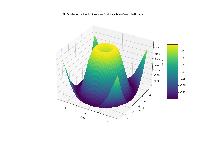
In this example, we use the ‘viridis’ colormap, which is defined using hex colors internally by Matplotlib.
Using Matplotlib Hex Colors Display for Text and Annotations
Hex colors can also be used to customize text and annotations in Matplotlib plots. Here’s an example:
import matplotlib.pyplot as plt

fig, ax = plt.subplots(figsize=(10, 6))

# Plot some data
x = [1, 2, 3, 4, 5]
y = [2, 4, 6, 8, 10]
ax.plot(x, y, 'o-', color='#1F77B4')

# Add text with custom colors
ax.text(2, 4, 'Important Point', color='#FF0000', fontsize=12, fontweight='bold')
ax.annotate('Annotation', xy=(4, 8), xytext=(4.5, 9),
            arrowprops=dict(facecolor='#00FF00', shrink=0.05))

# Customize the plot
ax.set_title('Plot with Colored Text and Annotations - how2matplotlib.com', color='#8B008B')
ax.set_xlabel('X-axis', color='#006400')
ax.set_ylabel('Y-axis', color='#8B4513')

plt.show()
Output:
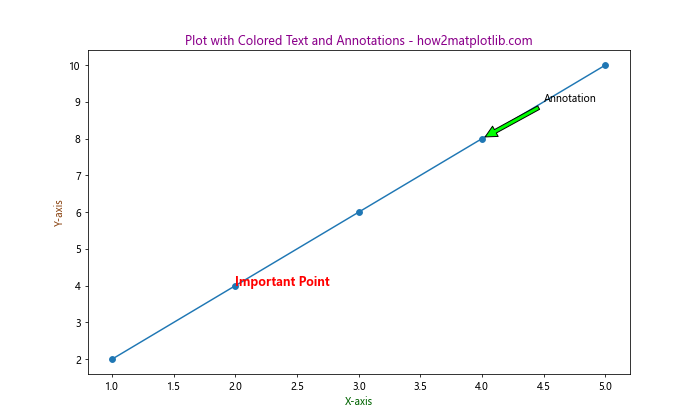
In this example, we use different hex colors for the plot elements, text, annotations, and axis labels.
Creating Custom Markers with Matplotlib Hex Colors Display
Matplotlib allows you to create custom markers using hex colors. Here’s an example:
import matplotlib.pyplot as plt
import numpy as np

# Define custom marker
custom_marker = {
    'marker': 'H',
    'markersize': 15,
    'markeredgecolor': '#000000',
    'markerfacecolor': '#FF69B4',
    'markeredgewidth': 2
}

# Generate some data
x = np.linspace(0, 10, 10)
y = np.sin(x)

plt.figure(figsize=(10, 6))
plt.plot(x, y, **custom_marker, linestyle='None', label='Custom Marker')
plt.plot(x, y, color='#1F77B4', label='Line')

plt.title('Plot with Custom Markers - how2matplotlib.com')
plt.xlabel('X-axis')
plt.ylabel('Y-axis')
plt.legend()
plt.grid(True)

plt.show()
Output:
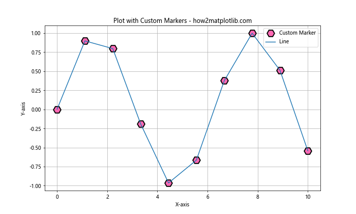
In this example, we create a custom hexagon marker with a black edge and a pink fill using hex colors.
Using Matplotlib Hex Colors Display in Subplots
When working with multiple subplots, hex colors can help maintain consistency across different plots. Here’s an example:
import matplotlib.pyplot as plt
import numpy as np

# Generate some data
x = np.linspace(0, 10, 100)
y1 = np.sin(x)
y2 = np.cos(x)
y3 = np.tan(x)

# Create subplots
fig, (ax1, ax2, ax3) = plt.subplots(3, 1, figsize=(10, 12))

# Plot data with custom colors
ax1.plot(x, y1, color='#FF0000', label='Sin')
ax2.plot(x, y2, color='#00FF00', label='Cos')
ax3.plot(x, y3, color='#0000FF', label='Tan')

# Customize subplots
for ax in (ax1, ax2, ax3):
    ax.set_xlabel('X-axis')
    ax.set_ylabel('Y-axis')
    ax.legend()
    ax.grid(True)

ax1.set_title('Sine Function - how2matplotlib.com')
ax2.set_title('Cosine Function - how2matplotlib.com')
ax3.set_title('Tangent Function - how2matplotlib.com')

plt.tight_layout()
plt.show()
Output:
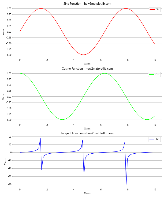
In this example, we use different hex colors for eachsubplot, creating a visually distinct and coherent set of plots.
Matplotlib Hex Colors Display in Filled Contour Plots
Filled contour plots are an excellent way to visualize 3D data in a 2D format, and hex colors can be used effectively to represent different levels. Here’s an example:
import matplotlib.pyplot as plt
import numpy as np

# Generate data
x = np.linspace(-3, 3, 100)
y = np.linspace(-3, 3, 100)
X, Y = np.meshgrid(x, y)
Z = np.sin(X) * np.cos(Y)

# Create custom colormap
hex_colors = ['#0000FF', '#00FFFF', '#00FF00', '#FFFF00', '#FF0000']
n_bins = 100
custom_cmap = plt.cm.colors.LinearSegmentedColormap.from_list('custom', hex_colors, N=n_bins)

# Create the plot
fig, ax = plt.subplots(figsize=(10, 8))
cs = ax.contourf(X, Y, Z, cmap=custom_cmap, levels=20)
cbar = fig.colorbar(cs)

# Customize the plot
ax.set_title('Filled Contour Plot with Custom Hex Colors - how2matplotlib.com')
ax.set_xlabel('X-axis')
ax.set_ylabel('Y-axis')
cbar.set_label('Z values')

plt.show()
Output:
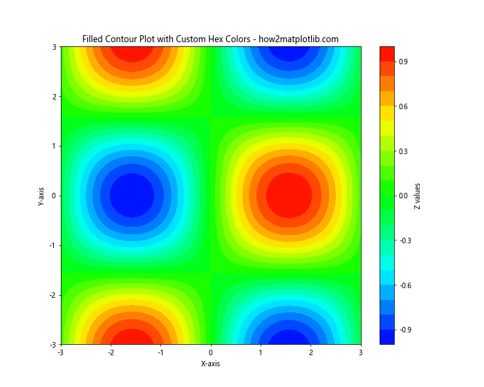
In this example, we create a custom colormap using hex colors and apply it to a filled contour plot.
Using Matplotlib Hex Colors Display for Error Bars
Error bars are an important feature in many scientific plots, and hex colors can be used to customize their appearance. Here’s an example:
import matplotlib.pyplot as plt
import numpy as np

# Generate some data
x = np.linspace(0, 10, 10)
y = np.sin(x)
error = 0.1 + 0.2 * np.random.rand(len(x))

fig, ax = plt.subplots(figsize=(10, 6))

# Plot data with error bars
ax.errorbar(x, y, yerr=error, fmt='o', color='#1F77B4',
            ecolor='#FF7F0E', capsize=5, capthick=2,
            label='Data with Error Bars - how2matplotlib.com')

# Customize the plot
ax.set_title('Error Bar Plot with Custom Hex Colors')
ax.set_xlabel('X-axis')
ax.set_ylabel('Y-axis')
ax.legend()
ax.grid(True)

plt.show()
Output:
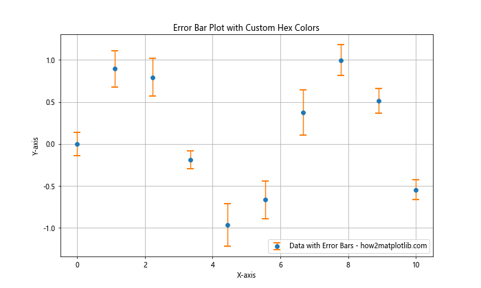
In this example, we use different hex colors for the data points and the error bars, making them visually distinct.
Matplotlib Hex Colors Display in Polar Plots
Polar plots are useful for visualizing directional or cyclical data, and hex colors can enhance their visual appeal. Here’s an example:
import matplotlib.pyplot as plt
import numpy as np

# Generate data
r = np.arange(0, 2, 0.01)
theta = 2 * np.pi * r

fig, ax = plt.subplots(figsize=(8, 8), subplot_kw=dict(projection='polar'))

# Plot data with custom colors
ax.plot(theta, r, color='#FF1493', linewidth=2)
ax.fill(theta, r, color='#FF69B4', alpha=0.3)

# Customize the plot
ax.set_title('Polar Plot with Custom Hex Colors - how2matplotlib.com')
ax.set_rticks([0.5, 1, 1.5, 2])
ax.grid(True)

plt.show()
Output:
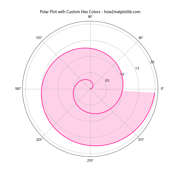
In this example, we use different hex colors for the line and the filled area in the polar plot.
Using Matplotlib Hex Colors Display in Histograms
Histograms are a great way to visualize the distribution of data, and hex colors can be used to customize their appearance. Here’s an example:
import matplotlib.pyplot as plt
import numpy as np

# Generate some random data
data = np.random.randn(1000)

fig, ax = plt.subplots(figsize=(10, 6))

# Create histogram with custom colors
n, bins, patches = ax.hist(data, bins=30, edgecolor='#000000', linewidth=1)

# Color the bars based on their height
cm = plt.cm.get_cmap('viridis')
bin_centers = 0.5 * (bins[:-1] + bins[1:])
col = bin_centers - min(bin_centers)
col /= max(col)

for c, p in zip(col, patches):
    plt.setp(p, 'facecolor', cm(c))

# Customize the plot
ax.set_title('Histogram with Custom Hex Colors - how2matplotlib.com')
ax.set_xlabel('Values')
ax.set_ylabel('Frequency')

plt.show()
Output:
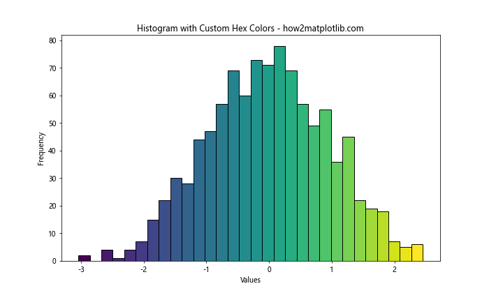
In this example, we use a colormap to assign different hex colors to the histogram bars based on their height.
Matplotlib Hex Colors Display in Box Plots
Box plots are useful for visualizing the distribution of data across different categories, and hex colors can help distinguish between these categories. Here’s an example:
import matplotlib.pyplot as plt
import numpy as np

# Generate some random data
np.random.seed(42)
data = [np.random.normal(0, std, 100) for std in range(1, 4)]

fig, ax = plt.subplots(figsize=(10, 6))

# Create box plot with custom colors
box_colors = ['#FF9999', '#66B2FF', '#99FF99']
whisker_colors = ['#FF0000', '#0000FF', '#00FF00']

bplot = ax.boxplot(data, patch_artist=True)

for patch, color in zip(bplot['boxes'], box_colors):
    patch.set_facecolor(color)

for whisker, color in zip(bplot['whiskers'], whisker_colors):
    whisker.set_color(color)

# Customize the plot
ax.set_title('Box Plot with Custom Hex Colors - how2matplotlib.com')
ax.set_xlabel('Groups')
ax.set_ylabel('Values')

plt.show()
Output:
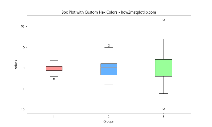
In this example, we use different hex colors for the boxes and whiskers in the box plot.
Matplotlib hex colors display Conclusion
Matplotlib hex colors display is a powerful feature that allows for precise control over the visual appearance of your plots. From simple line plots to complex 3D visualizations, hex colors can be used to enhance the clarity and aesthetic appeal of your data visualizations.
Throughout this article, we’ve explored various ways to use hex colors in Matplotlib, including:
- Basic usage in line plots
- Creating custom color palettes
- Using hex colors in scatter plots and bar charts
- Creating color gradients
- Customizing colormaps
- Applying hex colors to pie charts and heatmaps
- Using hex colors in 3D plots
- Customizing text and annotations
- Creating custom markers
- Applying hex colors to subplots
- Using hex colors in filled contour plots
- Customizing error bars
- Enhancing polar plots
- Applying hex colors to histograms
- Using hex colors in box plots
By mastering the use of hex colors in Matplotlib, you can create more visually appealing and informative data visualizations. Remember that while hex colors offer a wide range of possibilities, it’s important to use them judiciously to ensure your plots remain clear and easy to interpret.