How to Create a Matplotlib Two Colors One Line Plot: A Comprehensive Guide
Matplotlib two colors one line is a powerful visualization technique that allows you to represent data with different colors on a single line plot. This approach is particularly useful when you want to highlight specific segments of your data or show transitions between different states. In this comprehensive guide, we’ll explore various methods to create matplotlib two colors one line plots, providing detailed explanations and easy-to-understand code examples.
Understanding Matplotlib Two Colors One Line Plots
Before diving into the specifics of creating matplotlib two colors one line plots, it’s essential to understand the concept and its applications. Matplotlib two colors one line plots involve using multiple colors to represent different segments of a single line in a plot. This technique can be used to:
- Highlight specific data ranges
- Show transitions between different states or conditions
- Emphasize changes in trends
- Improve data visualization and interpretation
By mastering matplotlib two colors one line techniques, you can create more informative and visually appealing plots that effectively communicate your data insights.
Basic Matplotlib Two Colors One Line Plot
Let’s start with a simple example of creating a matplotlib two colors one line plot. In this example, we’ll create a line plot with two different colors for different segments of the line.
import matplotlib.pyplot as plt
import numpy as np

# Generate sample data
x = np.linspace(0, 10, 100)
y = np.sin(x)

# Create the plot
fig, ax = plt.subplots()

# Plot the first segment (0 to 5) in blue
ax.plot(x[x <= 5], y[x <= 5], color='blue', label='First half')

# Plot the second segment (5 to 10) in red
ax.plot(x[x > 5], y[x > 5], color='red', label='Second half')

# Add labels and title
ax.set_xlabel('X-axis')
ax.set_ylabel('Y-axis')
ax.set_title('Matplotlib Two Colors One Line Plot - how2matplotlib.com')

# Add legend
ax.legend()

# Show the plot
plt.show()
Output:
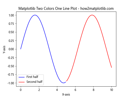
In this example, we create a sine wave and split it into two segments at x=5. The first segment (0 to 5) is plotted in blue, while the second segment (5 to 10) is plotted in red. This basic matplotlib two colors one line plot demonstrates how to use different colors for different parts of a single line.
Using LineCollection for Matplotlib Two Colors One Line Plots
For more complex matplotlib two colors one line plots, we can use the LineCollection object from matplotlib. This approach allows us to create a single line with multiple color segments based on specific conditions or thresholds.
import matplotlib.pyplot as plt
import numpy as np
from matplotlib.collections import LineCollection

# Generate sample data
x = np.linspace(0, 10, 100)
y = np.sin(x)

# Create points
points = np.array([x, y]).T.reshape(-1, 1, 2)
segments = np.concatenate([points[:-1], points[1:]], axis=1)

# Create a custom colormap
cmap = plt.get_cmap('coolwarm')
norm = plt.Normalize(y.min(), y.max())
colors = cmap(norm(y))

# Create the line collection
lc = LineCollection(segments, colors=colors, linewidth=2)

# Create the plot
fig, ax = plt.subplots()
ax.add_collection(lc)

# Set plot limits and labels
ax.set_xlim(x.min(), x.max())
ax.set_ylim(y.min(), y.max())
ax.set_xlabel('X-axis')
ax.set_ylabel('Y-axis')
ax.set_title('Matplotlib Two Colors One Line Plot with LineCollection - how2matplotlib.com')

# Show the plot
plt.show()
Output:
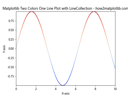
In this example, we use LineCollection to create a matplotlib two colors one line plot where the color of the line changes continuously based on the y-values. The ‘coolwarm’ colormap is used to represent the transition from low to high values.
Matplotlib Two Colors One Line Plot with Threshold
Sometimes, you may want to create a matplotlib two colors one line plot based on a specific threshold. This can be useful for highlighting values above or below a certain point.
import matplotlib.pyplot as plt
import numpy as np

# Generate sample data
x = np.linspace(0, 10, 100)
y = np.sin(x) + np.random.normal(0, 0.1, 100)

# Define threshold
threshold = 0.5

# Create the plot
fig, ax = plt.subplots()

# Plot values below threshold in blue
ax.plot(x[y <= threshold], y[y <= threshold], color='blue', label='Below threshold')

# Plot values above threshold in red
ax.plot(x[y > threshold], y[y > threshold], color='red', label='Above threshold')

# Add threshold line
ax.axhline(y=threshold, color='green', linestyle='--', label='Threshold')

# Add labels and title
ax.set_xlabel('X-axis')
ax.set_ylabel('Y-axis')
ax.set_title('Matplotlib Two Colors One Line Plot with Threshold - how2matplotlib.com')

# Add legend
ax.legend()

# Show the plot
plt.show()
Output:
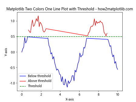
This example creates a matplotlib two colors one line plot where values below the threshold (0.5) are plotted in blue, and values above the threshold are plotted in red. A green dashed line represents the threshold.
Matplotlib Two Colors One Line Plot with Gradient
To create a smooth transition between two colors in a matplotlib two colors one line plot, we can use a gradient approach. This technique is particularly useful for visualizing continuous changes in data.
import matplotlib.pyplot as plt
import numpy as np
from matplotlib.colors import LinearSegmentedColormap

# Generate sample data
x = np.linspace(0, 10, 100)
y = np.sin(x)

# Create custom colormap
colors = ['blue', 'red']
n_bins = 100
cmap = LinearSegmentedColormap.from_list('custom', colors, N=n_bins)

# Create the plot
fig, ax = plt.subplots()

# Plot the line with gradient colors
for i in range(len(x) - 1):
    ax.plot(x[i:i+2], y[i:i+2], color=cmap(i / n_bins))

# Add labels and title
ax.set_xlabel('X-axis')
ax.set_ylabel('Y-axis')
ax.set_title('Matplotlib Two Colors One Line Plot with Gradient - how2matplotlib.com')

# Show the plot
plt.show()
Output:
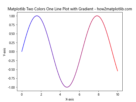
In this example, we create a custom colormap that transitions from blue to red. The line is then plotted segment by segment, with each segment’s color determined by its position in the gradient.
Matplotlib Two Colors One Line Plot with Multiple Thresholds
For more complex data visualization, you might need to use multiple thresholds in your matplotlib two colors one line plot. This approach allows you to represent different ranges or categories within your data.
import matplotlib.pyplot as plt
import numpy as np

# Generate sample data
x = np.linspace(0, 10, 100)
y = np.sin(x) + np.random.normal(0, 0.2, 100)

# Define thresholds
low_threshold = -0.5
high_threshold = 0.5

# Create the plot
fig, ax = plt.subplots()

# Plot values below low threshold in blue
ax.plot(x[y <= low_threshold], y[y <= low_threshold], color='blue', label='Low')

# Plot values between thresholds in green
mask = (y > low_threshold) & (y <= high_threshold)
ax.plot(x[mask], y[mask], color='green', label='Medium')

# Plot values above high threshold in red
ax.plot(x[y > high_threshold], y[y > high_threshold], color='red', label='High')

# Add threshold lines
ax.axhline(y=low_threshold, color='cyan', linestyle='--', label='Low threshold')
ax.axhline(y=high_threshold, color='magenta', linestyle='--', label='High threshold')

# Add labels and title
ax.set_xlabel('X-axis')
ax.set_ylabel('Y-axis')
ax.set_title('Matplotlib Two Colors One Line Plot with Multiple Thresholds - how2matplotlib.com')

# Add legend
ax.legend()

# Show the plot
plt.show()
Output:
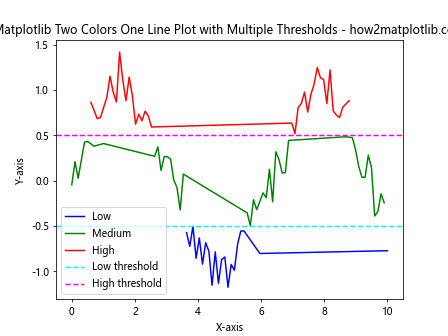
This example creates a matplotlib two colors one line plot with three color segments based on two thresholds. Values below the low threshold are blue, values between the thresholds are green, and values above the high threshold are red.
Matplotlib Two Colors One Line Plot with Custom Colormaps
Creating custom colormaps can enhance your matplotlib two colors one line plots by allowing you to use specific colors that match your data or branding requirements.
import matplotlib.pyplot as plt
import numpy as np
from matplotlib.colors import LinearSegmentedColormap

# Generate sample data
x = np.linspace(0, 10, 100)
y = np.sin(x)

# Create custom colormap
colors = ['#1f77b4', '#ff7f0e', '#2ca02c']  # Blue, Orange, Green
n_bins = 100
cmap = LinearSegmentedColormap.from_list('custom', colors, N=n_bins)

# Create the plot
fig, ax = plt.subplots()

# Plot the line with custom colormap
points = np.array([x, y]).T.reshape(-1, 1, 2)
segments = np.concatenate([points[:-1], points[1:]], axis=1)
lc = plt.LineCollection(segments, cmap=cmap, norm=plt.Normalize(y.min(), y.max()))
lc.set_array(y)
line = ax.add_collection(lc)

# Add colorbar
cbar = fig.colorbar(line, ax=ax)
cbar.set_label('Y-values')

# Set plot limits and labels
ax.set_xlim(x.min(), x.max())
ax.set_ylim(y.min(), y.max())
ax.set_xlabel('X-axis')
ax.set_ylabel('Y-axis')
ax.set_title('Matplotlib Two Colors One Line Plot with Custom Colormap - how2matplotlib.com')

# Show the plot
plt.show()
In this example, we create a custom colormap using three colors (blue, orange, and green) and apply it to our matplotlib two colors one line plot. The colorbar shows the transition between these colors based on the y-values.
Matplotlib Two Colors One Line Plot with Date/Time Data
When working with time series data, you might want to create a matplotlib two colors one line plot that highlights different time periods or seasons.
import matplotlib.pyplot as plt
import numpy as np
import pandas as pd

# Generate sample data
dates = pd.date_range(start='2023-01-01', end='2023-12-31', freq='D')
values = np.sin(np.arange(len(dates)) * 2 * np.pi / 365) + np.random.normal(0, 0.1, len(dates))

# Create DataFrame
df = pd.DataFrame({'date': dates, 'value': values})

# Define seasons
def get_season(date):
    month = date.month
    if month in [12, 1, 2]:
        return 'Winter'
    elif month in [3, 4, 5]:
        return 'Spring'
    elif month in [6, 7, 8]:
        return 'Summer'
    else:
        return 'Autumn'

df['season'] = df['date'].apply(get_season)

# Create the plot
fig, ax = plt.subplots(figsize=(12, 6))

# Plot each season with a different color
for season, color in zip(['Winter', 'Spring', 'Summer', 'Autumn'], ['blue', 'green', 'red', 'orange']):
    season_data = df[df['season'] == season]
    ax.plot(season_data['date'], season_data['value'], color=color, label=season)

# Add labels and title
ax.set_xlabel('Date')
ax.set_ylabel('Value')
ax.set_title('Matplotlib Two Colors One Line Plot with Seasonal Data - how2matplotlib.com')

# Add legend
ax.legend()

# Rotate x-axis labels for better readability
plt.xticks(rotation=45)

# Show the plot
plt.tight_layout()
plt.show()
Output:
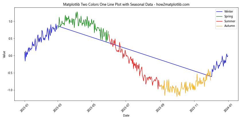
This example creates a matplotlib two colors one line plot for a full year of data, with different colors representing each season. The plot helps visualize seasonal patterns in the data.
Matplotlib Two Colors One Line Plot with Annotations
Adding annotations to your matplotlib two colors one line plot can provide additional context and highlight important points or regions in your data.
import matplotlib.pyplot as plt
import numpy as np

# Generate sample data
x = np.linspace(0, 10, 100)
y = np.sin(x)

# Create the plot
fig, ax = plt.subplots()

# Plot the first half in blue
ax.plot(x[x <= 5], y[x <= 5], color='blue', label='First half')

# Plot the second half in red
ax.plot(x[x > 5], y[x > 5], color='red', label='Second half')

# Add annotations
ax.annotate('Peak', xy=(np.pi/2, 1), xytext=(np.pi/2, 1.2),
            arrowprops=dict(facecolor='black', shrink=0.05))

ax.annotate('Trough', xy=(3*np.pi/2, -1), xytext=(3*np.pi/2, -1.2),
            arrowprops=dict(facecolor='black', shrink=0.05))

# Add labels and title
ax.set_xlabel('X-axis')
ax.set_ylabel('Y-axis')
ax.set_title('Matplotlib Two Colors One Line Plot with Annotations - how2matplotlib.com')

# Add legend
ax.legend()

# Show the plot
plt.show()
Output:
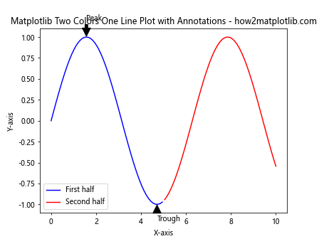
In this example, we create a matplotlib two colors one line plot of a sine wave and add annotations to highlight the peak and trough of the wave.
Matplotlib Two Colors One Line Plot with Shaded Regions
Combining a matplotlib two colors one line plot with shaded regions can help emphasize specific areas of interest in your data.
import matplotlib.pyplot as plt
import numpy as np

# Generate sample data
x = np.linspace(0, 10, 100)
y = np.sin(x)

# Create the plot
fig, ax = plt.subplots()

# Plot the entire line in gray
ax.plot(x, y, color='gray', alpha=0.5, label='Full data')

# Plot the highlighted region in red
highlight_start = 2
highlight_end = 8
ax.plot(x[(x >= highlight_start) & (x <= highlight_end)],
        y[(x >= highlight_start) & (x <= highlight_end)],
        color='red', label='Highlighted region')

# Add shaded region
ax.fill_between(x, y, where=(x >= highlight_start) & (x <= highlight_end),
                color='red', alpha=0.2)

# Add labels and title
ax.set_xlabel('X-axis')
ax.set_ylabel('Y-axis')
ax.set_title('Matplotlib Two Colors One Line Plot with Shaded Region - how2matplotlib.com')

# Add legend
ax.legend()

# Show the plot
plt.show()
Output:
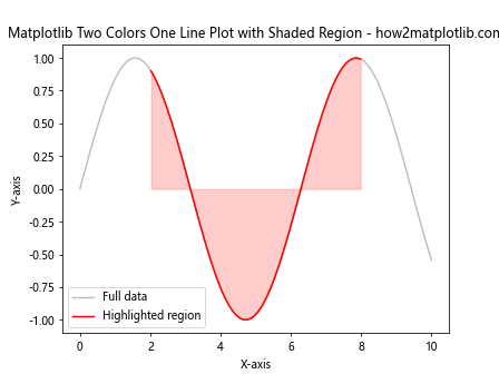
This example creates a matplotlib two colors one line plot where a specific region of the data is highlighted in red and shaded, while the rest of the data is shown in gray.
Matplotlib Two Colors One Line Plot with Markers
Adding markers to your matplotlib two colors one line plot can help emphasize specific data points or transitions between different segments.
import matplotlib.pyplot as plt
import numpy as np

# Generate sample data
x = np.linspace(0, 10, 20)
y = np.sin(x)

# Create the plot
fig, ax= plt.subplots()

# Plot the first half in blue with circle markers
ax.plot(x[x <= 5], y[x <= 5], color='blue', marker='o', linestyle='-', label='First half')

# Plot the second half in red with square markers
ax.plot(x[x > 5], y[x > 5], color='red', marker='s', linestyle='-', label='Second half')

# Add labels and title
ax.set_xlabel('X-axis')
ax.set_ylabel('Y-axis')
ax.set_title('Matplotlib Two Colors One Line Plot with Markers - how2matplotlib.com')

# Add legend
ax.legend()

# Show the plot
plt.show()
Output:
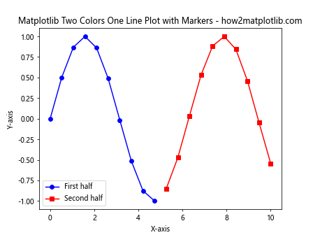
In this example, we create a matplotlib two colors one line plot where the first half of the data is plotted in blue with circle markers, and the second half is plotted in red with square markers. This approach helps to visually distinguish between the two segments of the data.
Matplotlib Two Colors One Line Plot with Logarithmic Scale
For data that spans multiple orders of magnitude, using a logarithmic scale in your matplotlib two colors one line plot can be beneficial.
import matplotlib.pyplot as plt
import numpy as np

# Generate sample data
x = np.logspace(0, 3, 100)
y = np.exp(-x/500) * np.sin(x)

# Create the plot
fig, ax = plt.subplots()

# Plot the first half in blue
ax.semilogx(x[x <= 100], y[x <= 100], color='blue', label='First half')

# Plot the second half in red
ax.semilogx(x[x > 100], y[x > 100], color='red', label='Second half')

# Add labels and title
ax.set_xlabel('X-axis (log scale)')
ax.set_ylabel('Y-axis')
ax.set_title('Matplotlib Two Colors One Line Plot with Logarithmic Scale - how2matplotlib.com')

# Add legend
ax.legend()

# Show the plot
plt.show()
Output:
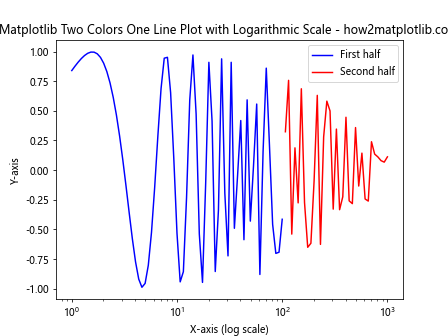
This example creates a matplotlib two colors one line plot with a logarithmic x-axis. The data is split into two segments at x=100, with the first half plotted in blue and the second half in red.
Matplotlib Two Colors One Line Plot with Dual Y-axes
When dealing with data that has different scales or units, using dual y-axes in your matplotlib two colors one line plot can be helpful.
import matplotlib.pyplot as plt
import numpy as np

# Generate sample data
x = np.linspace(0, 10, 100)
y1 = np.sin(x)
y2 = np.exp(x/2)

# Create the plot
fig, ax1 = plt.subplots()

# Plot the sine wave on the primary y-axis
ax1.plot(x, y1, color='blue', label='Sine wave')
ax1.set_xlabel('X-axis')
ax1.set_ylabel('Sine wave', color='blue')
ax1.tick_params(axis='y', labelcolor='blue')

# Create a secondary y-axis
ax2 = ax1.twinx()

# Plot the exponential function on the secondary y-axis
ax2.plot(x, y2, color='red', label='Exponential')
ax2.set_ylabel('Exponential', color='red')
ax2.tick_params(axis='y', labelcolor='red')

# Add title
plt.title('Matplotlib Two Colors One Line Plot with Dual Y-axes - how2matplotlib.com')

# Add legend
lines1, labels1 = ax1.get_legend_handles_labels()
lines2, labels2 = ax2.get_legend_handles_labels()
ax1.legend(lines1 + lines2, labels1 + labels2, loc='upper left')

# Show the plot
plt.show()
Output:
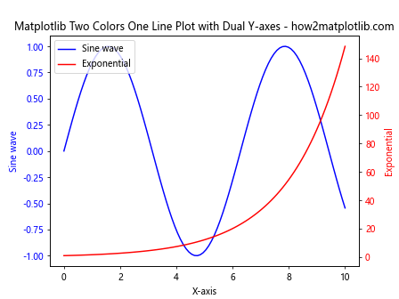
This example creates a matplotlib two colors one line plot with two different y-axes. The sine wave is plotted on the primary y-axis in blue, while the exponential function is plotted on the secondary y-axis in red.
Matplotlib Two Colors One Line Plot with Subplots
Using subplots in your matplotlib two colors one line plot can help you compare different aspects of your data side by side.
import matplotlib.pyplot as plt
import numpy as np

# Generate sample data
x = np.linspace(0, 10, 100)
y1 = np.sin(x)
y2 = np.cos(x)

# Create the plot with subplots
fig, (ax1, ax2) = plt.subplots(1, 2, figsize=(12, 5))

# Plot sine wave in the first subplot
ax1.plot(x[x <= 5], y1[x <= 5], color='blue', label='First half')
ax1.plot(x[x > 5], y1[x > 5], color='red', label='Second half')
ax1.set_title('Sine Wave - how2matplotlib.com')
ax1.set_xlabel('X-axis')
ax1.set_ylabel('Y-axis')
ax1.legend()

# Plot cosine wave in the second subplot
ax2.plot(x[x <= 5], y2[x <= 5], color='green', label='First half')
ax2.plot(x[x > 5], y2[x > 5], color='orange', label='Second half')
ax2.set_title('Cosine Wave - how2matplotlib.com')
ax2.set_xlabel('X-axis')
ax2.set_ylabel('Y-axis')
ax2.legend()

# Adjust layout and show the plot
plt.tight_layout()
plt.show()
Output:
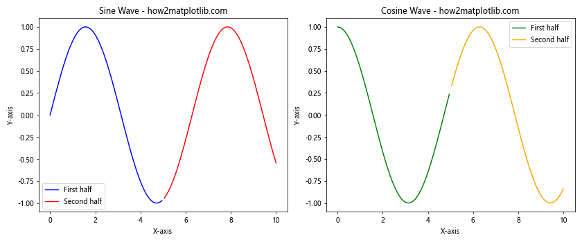
This example creates a matplotlib two colors one line plot with two subplots, each showing a different trigonometric function (sine and cosine). Both subplots use different colors for the first and second halves of the data.
Matplotlib Two Colors One Line Plot with Error Bars
Adding error bars to your matplotlib two colors one line plot can help represent uncertainty or variability in your data.
import matplotlib.pyplot as plt
import numpy as np

# Generate sample data
x = np.linspace(0, 10, 20)
y = np.sin(x)
errors = np.random.normal(0, 0.1, len(x))

# Create the plot
fig, ax = plt.subplots()

# Plot the first half in blue with error bars
ax.errorbar(x[x <= 5], y[x <= 5], yerr=errors[x <= 5], color='blue', label='First half', capsize=5)

# Plot the second half in red with error bars
ax.errorbar(x[x > 5], y[x > 5], yerr=errors[x > 5], color='red', label='Second half', capsize=5)

# Add labels and title
ax.set_xlabel('X-axis')
ax.set_ylabel('Y-axis')
ax.set_title('Matplotlib Two Colors One Line Plot with Error Bars - how2matplotlib.com')

# Add legend
ax.legend()

# Show the plot
plt.show()
This example creates a matplotlib two colors one line plot with error bars. The first half of the data is plotted in blue, and the second half in red, with error bars representing the uncertainty in the y-values.
Matplotlib two colors one line Conclusion
Matplotlib two colors one line plots are a versatile and powerful tool for data visualization. By using different colors within a single line plot, you can effectively highlight important features, transitions, or segments in your data. Throughout this comprehensive guide, we've explored various techniques and examples for creating matplotlib two colors one line plots, including:
- Basic two-color line plots
- Using LineCollection for continuous color changes
- Plotting with thresholds
- Creating gradient color transitions
- Working with multiple thresholds
- Using custom colormaps
- Visualizing date/time data
- Adding annotations and shaded regions
- Incorporating markers and logarithmic scales
- Using dual y-axes and subplots
- Adding error bars to represent uncertainty
By mastering these techniques, you can create more informative and visually appealing plots that effectively communicate your data insights. Remember to experiment with different color combinations, styles, and additional elements to find the best representation for your specific data and audience.