Comprehensive Guide to Matplotlib.axis.Axis.get_majorticklines() Function in Python
Matplotlib.axis.Axis.get_majorticklines() function in Python is a powerful tool for manipulating and customizing the major tick lines in Matplotlib plots. This function is an essential part of the Matplotlib library, which is widely used for creating high-quality visualizations in Python. In this comprehensive guide, we’ll explore the Matplotlib.axis.Axis.get_majorticklines() function in depth, covering its usage, parameters, and various applications in data visualization.
Understanding the Basics of Matplotlib.axis.Axis.get_majorticklines()
The Matplotlib.axis.Axis.get_majorticklines() function is a method of the Axis class in Matplotlib. Its primary purpose is to return a list of Line2D objects representing the major tick lines on an axis. These major tick lines are the longer lines that appear at regular intervals along an axis, typically accompanied by numeric labels.
To better understand how the Matplotlib.axis.Axis.get_majorticklines() function works, let’s start with a simple example:
import matplotlib.pyplot as plt

# Create a simple plot
fig, ax = plt.subplots()
ax.plot([1, 2, 3, 4], [1, 4, 2, 3])

# Get the major tick lines
major_ticks = ax.xaxis.get_majorticklines()

# Customize the major tick lines
for line in major_ticks:
    line.set_color('red')
    line.set_markersize(10)
    line.set_markeredgewidth(2)

plt.title('How to use get_majorticklines() - how2matplotlib.com')
plt.show()
Output:
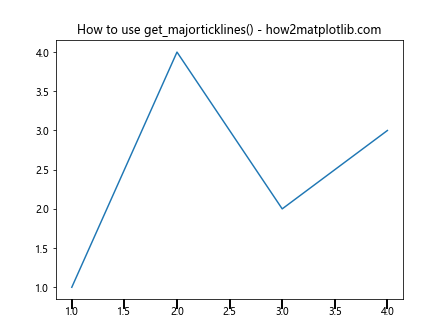
In this example, we create a simple line plot and then use the Matplotlib.axis.Axis.get_majorticklines() function to retrieve the major tick lines of the x-axis. We then iterate through these lines and customize their appearance by changing their color, size, and edge width.
Exploring the Parameters of Matplotlib.axis.Axis.get_majorticklines()
The Matplotlib.axis.Axis.get_majorticklines() function doesn’t take any parameters. It simply returns a list of Line2D objects representing the major tick lines. However, understanding the properties of these Line2D objects is crucial for effective customization.
Here’s an example that demonstrates how to access and modify various properties of the major tick lines:
import matplotlib.pyplot as plt

fig, ax = plt.subplots()
ax.plot([1, 2, 3, 4], [1, 4, 2, 3])

major_ticks = ax.yaxis.get_majorticklines()

for line in major_ticks:
    line.set_color('green')
    line.set_linestyle('--')
    line.set_linewidth(2)
    line.set_markersize(8)
    line.set_markeredgecolor('blue')
    line.set_markerfacecolor('yellow')

plt.title('Customizing Major Tick Lines - how2matplotlib.com')
plt.show()
Output:
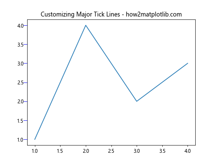
In this example, we use the Matplotlib.axis.Axis.get_majorticklines() function to get the major tick lines of the y-axis. We then customize various properties of these lines, including color, line style, line width, marker size, and marker colors.
Applying Matplotlib.axis.Axis.get_majorticklines() to Different Plot Types
The Matplotlib.axis.Axis.get_majorticklines() function can be used with various types of plots in Matplotlib. Let’s explore how to apply this function to different plot types:
Bar Plot
import matplotlib.pyplot as plt
import numpy as np

categories = ['A', 'B', 'C', 'D']
values = [3, 7, 2, 5]

fig, ax = plt.subplots()
ax.bar(categories, values)

major_ticks = ax.xaxis.get_majorticklines()
for line in major_ticks:
    line.set_color('purple')
    line.set_linewidth(3)

plt.title('Bar Plot with Custom Major Tick Lines - how2matplotlib.com')
plt.show()
Output:
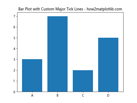
In this example, we create a bar plot and use the Matplotlib.axis.Axis.get_majorticklines() function to customize the major tick lines on the x-axis.
Scatter Plot
import matplotlib.pyplot as plt
import numpy as np

x = np.random.rand(50)
y = np.random.rand(50)

fig, ax = plt.subplots()
ax.scatter(x, y)

major_ticks_x = ax.xaxis.get_majorticklines()
major_ticks_y = ax.yaxis.get_majorticklines()

for line in major_ticks_x + major_ticks_y:
    line.set_color('orange')
    line.set_markersize(12)

plt.title('Scatter Plot with Custom Major Tick Lines - how2matplotlib.com')
plt.show()
Output:
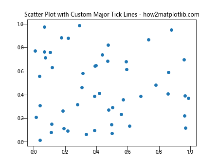
In this scatter plot example, we use the Matplotlib.axis.Axis.get_majorticklines() function to customize the major tick lines on both the x-axis and y-axis.
Advanced Techniques with Matplotlib.axis.Axis.get_majorticklines()
Now that we’ve covered the basics, let’s explore some advanced techniques using the Matplotlib.axis.Axis.get_majorticklines() function:
Selective Customization
Sometimes, you may want to customize only specific major tick lines. Here’s how you can achieve this:
import matplotlib.pyplot as plt
import numpy as np

fig, ax = plt.subplots()
ax.plot(np.random.rand(10))

major_ticks = ax.xaxis.get_majorticklines()

for i, line in enumerate(major_ticks):
    if i % 2 == 0:  # Customize every other tick line
        line.set_color('red')
        line.set_linewidth(3)
    else:
        line.set_color('blue')
        line.set_linewidth(1)

plt.title('Selective Customization of Major Tick Lines - how2matplotlib.com')
plt.show()
Output:
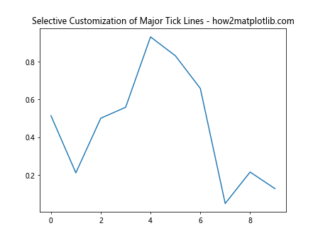
In this example, we use the Matplotlib.axis.Axis.get_majorticklines() function to selectively customize every other major tick line on the x-axis.
Animating Major Tick Lines
The Matplotlib.axis.Axis.get_majorticklines() function can also be used in animations. Here’s a simple example:
import matplotlib.pyplot as plt
import matplotlib.animation as animation
import numpy as np

fig, ax = plt.subplots()
line, = ax.plot(np.random.rand(10))

def animate(frame):
    line.set_ydata(np.random.rand(10))
    major_ticks = ax.yaxis.get_majorticklines()
    for tick in major_ticks:
        tick.set_color(plt.cm.viridis(frame / 100))
    return line, *major_ticks

ani = animation.FuncAnimation(fig, animate, frames=100, blit=True)
plt.title('Animated Major Tick Lines - how2matplotlib.com')
plt.show()
Output:
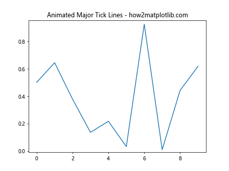
In this animation, we use the Matplotlib.axis.Axis.get_majorticklines() function to change the color of the major tick lines on the y-axis in each frame.
Combining Matplotlib.axis.Axis.get_majorticklines() with Other Axis Customizations
The Matplotlib.axis.Axis.get_majorticklines() function can be effectively combined with other axis customization techniques to create highly customized plots. Let’s explore some examples:
Custom Tick Positions and Labels
import matplotlib.pyplot as plt
import numpy as np

fig, ax = plt.subplots()
ax.plot(np.random.rand(10))

# Set custom tick positions and labels
ax.set_xticks([0, 2, 4, 6, 8])
ax.set_xticklabels(['A', 'B', 'C', 'D', 'E'])

# Customize major tick lines
major_ticks = ax.xaxis.get_majorticklines()
for line in major_ticks:
    line.set_color('green')
    line.set_markersize(15)

plt.title('Custom Tick Positions and Labels - how2matplotlib.com')
plt.show()
Output:
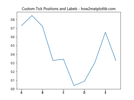
In this example, we combine custom tick positions and labels with the Matplotlib.axis.Axis.get_majorticklines() function to create a unique x-axis appearance.
Logarithmic Scale with Custom Major Tick Lines
import matplotlib.pyplot as plt
import numpy as np

fig, ax = plt.subplots()
ax.plot(np.logspace(0, 3, 50))
ax.set_xscale('log')

major_ticks = ax.xaxis.get_majorticklines()
for line in major_ticks:
    line.set_color('purple')
    line.set_linewidth(2)
    line.set_markersize(10)

plt.title('Logarithmic Scale with Custom Major Tick Lines - how2matplotlib.com')
plt.show()
Output:
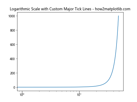
This example demonstrates how to use the Matplotlib.axis.Axis.get_majorticklines() function with a logarithmic scale to customize the appearance of major tick lines.
Handling Multiple Subplots with Matplotlib.axis.Axis.get_majorticklines()
When working with multiple subplots, you can use the Matplotlib.axis.Axis.get_majorticklines() function to customize each subplot individually. Here’s an example:
import matplotlib.pyplot as plt
import numpy as np

fig, (ax1, ax2) = plt.subplots(2, 1, figsize=(8, 10))

ax1.plot(np.random.rand(10))
ax2.plot(np.random.rand(10))

# Customize major tick lines for the first subplot
major_ticks_1 = ax1.xaxis.get_majorticklines()
for line in major_ticks_1:
    line.set_color('red')
    line.set_linewidth(2)

# Customize major tick lines for the second subplot
major_ticks_2 = ax2.xaxis.get_majorticklines()
for line in major_ticks_2:
    line.set_color('blue')
    line.set_linewidth(2)

plt.suptitle('Multiple Subplots with Custom Major Tick Lines - how2matplotlib.com')
plt.tight_layout()
plt.show()
Output:
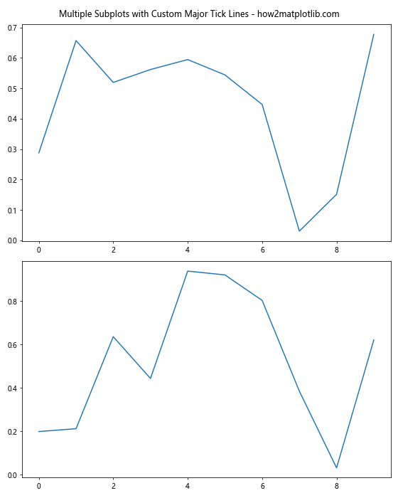
In this example, we create two subplots and use the Matplotlib.axis.Axis.get_majorticklines() function to customize the major tick lines of each subplot independently.
Using Matplotlib.axis.Axis.get_majorticklines() with Different Matplotlib Styles
Matplotlib offers various built-in styles that can be combined with the Matplotlib.axis.Axis.get_majorticklines() function for even more customization options. Let’s explore a few examples:
Seaborn Style with Custom Major Tick Lines
import matplotlib.pyplot as plt
import seaborn as sns
import numpy as np

sns.set_style("darkgrid")

fig, ax = plt.subplots()
ax.plot(np.random.rand(10))

major_ticks = ax.xaxis.get_majorticklines()
for line in major_ticks:
    line.set_color('yellow')
    line.set_markersize(12)

plt.title('Seaborn Style with Custom Major Tick Lines - how2matplotlib.com')
plt.show()
Output:
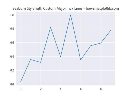
In this example, we use the Seaborn style and combine it with custom major tick lines using the Matplotlib.axis.Axis.get_majorticklines() function.
Ggplot Style with Custom Major Tick Lines
import matplotlib.pyplot as plt
import numpy as np

plt.style.use('ggplot')

fig, ax = plt.subplots()
ax.plot(np.random.rand(10))

major_ticks = ax.yaxis.get_majorticklines()
for line in major_ticks:
    line.set_color('blue')
    line.set_linewidth(3)

plt.title('Ggplot Style with Custom Major Tick Lines - how2matplotlib.com')
plt.show()
Output:
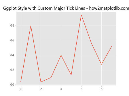
This example demonstrates how to use the ggplot style in combination with the Matplotlib.axis.Axis.get_majorticklines() function to customize the y-axis major tick lines.
Troubleshooting Common Issues with Matplotlib.axis.Axis.get_majorticklines()
When working with the Matplotlib.axis.Axis.get_majorticklines() function, you may encounter some common issues. Let’s address a few of them:
Issue 1: Changes Not Visible
Sometimes, you might find that the changes made to the major tick lines are not visible. This can often be resolved by calling plt.draw() after making the changes:
import matplotlib.pyplot as plt
import numpy as np

fig, ax = plt.subplots()
ax.plot(np.random.rand(10))

major_ticks = ax.xaxis.get_majorticklines()
for line in major_ticks:
    line.set_color('red')
    line.set_linewidth(3)

plt.draw()  # Force update of the plot
plt.title('Forcing Update of Major Tick Lines - how2matplotlib.com')
plt.show()
Output:
Issue 2: Inconsistent Appearance Across Different Backends
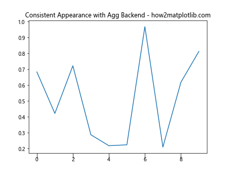
The appearance of major tick lines can sometimes vary depending on the backend used by Matplotlib. To ensure consistency, you can specify the backend explicitly:
import matplotlib
matplotlib.use('Agg')  # Use the Agg backend
import matplotlib.pyplot as plt
import numpy as np

fig, ax = plt.subplots()
ax.plot(np.random.rand(10))

major_ticks = ax.xaxis.get_majorticklines()
for line in major_ticks:
    line.set_color('green')
    line.set_markersize(10)

plt.title('Consistent Appearance with Agg Backend - how2matplotlib.com')
plt.show()
Output:
Best Practices for Using Matplotlib.axis.Axis.get_majorticklines()
To make the most of the Matplotlib.axis.Axis.get_majorticklines() function, consider the following best practices:
- Always check the current state of the major tick lines before making changes.
- Use meaningful colors and styles that enhance the readability of your plot.
- Combine major tick line customization with other axis properties for a cohesive look.
- Test your plots on different platforms and backends to ensure consistency.
- Document your customizations for easier maintenance and reproducibility.
Here’s an example that incorporates these best practices:
import matplotlib.pyplot as plt
import numpy as np

def customize_major_ticks(ax, color='red', linewidth=2, markersize=10):
    """
    Customize major tick lines of the given axis.

    Parameters:
    ax (matplotlib.axes.Axes): The axis to customize
    color (str): Color of the major tick lines
    linewidth (float): Width of the major tick lines
    markersize (float): Size of the major tick markers
    """
    major_ticks = ax.xaxis.get_majorticklines()
    for line in major_ticks:
        line.set_color(color)
        line.set_linewidth(linewidth)
        line.set_markersize(markersize)

fig, ax = plt.subplots()
ax.plot(np.random.rand(10))

customize_major_ticks(ax, color='blue', linewidth=1.5, markersize=8)

plt.title('Best Practices for Major Tick Line Customization - how2matplotlib.com')
plt.show()
Output:
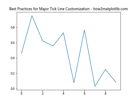
This example demonstrates a reusable function for customizing major tick lines, incorporating best practices for clarity and maintainability.
Conclusion
The Matplotlib.axis.Axis.get_majorticklines() function is a powerful tool in the Matplotlib library that allows for precise control and customization of major tick lines in plots. Throughout this comprehensive guide, we’ve explored various aspects of this function, from basic usage to advanced techniques and best practices.
We’ve seen how the Matplotlib.axis.Axis.get_majorticklines() function can be applied to different types of plots, combined with other axis customizations, and used in conjunction with various Matplotlib styles. We’ve also addressed common issues and provided solutions to ensure smooth implementation in your data visualization projects.
By mastering the Matplotlib.axis.Axis.get_majorticklines() function, you can create more visually appealing and informative plots that effectively communicate your data. Remember to experiment with different customizations and always consider the overall design and readability of your visualizations.
As you continue to work with Matplotlib and the get_majorticklines() function, keep in mind the following key points:
- The function returns a list of Line2D objects representing major tick lines.
- You can customize various properties of these lines, including color, width, style, and marker characteristics.
- The function can be used with different plot types and combined with other axis customizations for comprehensive control over your plot’s appearance.
- Always consider the context of your data and the purpose of your visualization when customizing major tick lines.
To further illustrate the versatility of the Matplotlib.axis.Axis.get_majorticklines() function, let’s explore a few more advanced examples:
Customizing Major Tick Lines in 3D Plots
The Matplotlib.axis.Axis.get_majorticklines() function can also be used with 3D plots. Here’s an example:
import matplotlib.pyplot as plt
import numpy as np
from mpl_toolkits.mplot3d import Axes3D

fig = plt.figure()
ax = fig.add_subplot(111, projection='3d')

x = np.random.rand(100)
y = np.random.rand(100)
z = np.random.rand(100)

ax.scatter(x, y, z)

for axis in [ax.xaxis, ax.yaxis, ax.zaxis]:
    major_ticks = axis.get_majorticklines()
    for line in major_ticks:
        line.set_color('red')
        line.set_linewidth(2)
        line.set_markersize(8)

plt.title('3D Plot with Custom Major Tick Lines - how2matplotlib.com')
plt.show()
Output:
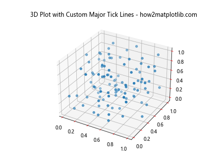
In this example, we customize the major tick lines for all three axes in a 3D scatter plot using the Matplotlib.axis.Axis.get_majorticklines() function.
Creating a Custom Tick Formatter with Major Tick Line Customization
You can combine the Matplotlib.axis.Axis.get_majorticklines() function with custom tick formatters for even more control over your plot’s appearance:
import matplotlib.pyplot as plt
import numpy as np
from matplotlib.ticker import FuncFormatter

def currency_formatter(x, p):
    return f'${x:,.2f}'

fig, ax = plt.subplots()
x = np.linspace(0, 10000, 100)
y = x ** 2

ax.plot(x, y)
ax.yaxis.set_major_formatter(FuncFormatter(currency_formatter))

major_ticks = ax.yaxis.get_majorticklines()
for line in major_ticks:
    line.set_color('green')
    line.set_linewidth(2)
    line.set_markersize(10)

plt.title('Custom Tick Formatter with Major Tick Line Customization - how2matplotlib.com')
plt.show()
Output:
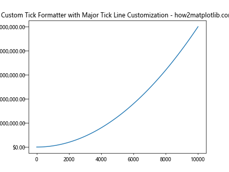
This example demonstrates how to use a custom tick formatter to display currency values on the y-axis while also customizing the major tick lines using the Matplotlib.axis.Axis.get_majorticklines() function.
Creating a Dual-Axis Plot with Customized Major Tick Lines
The Matplotlib.axis.Axis.get_majorticklines() function can be particularly useful when working with dual-axis plots:
import matplotlib.pyplot as plt
import numpy as np

fig, ax1 = plt.subplots()

x = np.linspace(0, 10, 100)
y1 = np.sin(x)
y2 = np.exp(x)

ax1.plot(x, y1, 'b-')
ax1.set_ylabel('Sine', color='b')

ax2 = ax1.twinx()
ax2.plot(x, y2, 'r-')
ax2.set_ylabel('Exponential', color='r')

# Customize major tick lines for both axes
for ax, color in [(ax1, 'blue'), (ax2, 'red')]:
    major_ticks = ax.yaxis.get_majorticklines()
    for line in major_ticks:
        line.set_color(color)
        line.set_linewidth(2)
        line.set_markersize(8)

plt.title('Dual-Axis Plot with Customized Major Tick Lines - how2matplotlib.com')
plt.show()
Output:
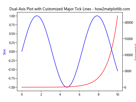
In this example, we create a dual-axis plot and use the Matplotlib.axis.Axis.get_majorticklines() function to customize the major tick lines for both y-axes independently.
Combining Major and Minor Tick Line Customization
While we’ve focused on the Matplotlib.axis.Axis.get_majorticklines() function, it’s worth noting that you can also customize minor tick lines using a similar approach. Here’s an example that combines both:
import matplotlib.pyplot as plt
import numpy as np

fig, ax = plt.subplots()
x = np.linspace(0, 10, 100)
y = np.sin(x)

ax.plot(x, y)

# Customize major tick lines
major_ticks = ax.xaxis.get_majorticklines()
for line in major_ticks:
    line.set_color('red')
    line.set_linewidth(2)
    line.set_markersize(10)

# Customize minor tick lines
minor_ticks = ax.xaxis.get_minorticklines()
for line in minor_ticks:
    line.set_color('blue')
    line.set_linewidth(1)
    line.set_markersize(5)

ax.xaxis.set_minor_locator(plt.MultipleLocator(0.5))

plt.title('Combined Major and Minor Tick Line Customization - how2matplotlib.com')
plt.show()
Output:
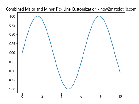
This example demonstrates how to customize both major and minor tick lines, creating a visually distinct hierarchy between them.
In conclusion, the Matplotlib.axis.Axis.get_majorticklines() function is a versatile tool that allows for fine-grained control over the appearance of major tick lines in Matplotlib plots. By mastering this function and combining it with other Matplotlib features, you can create highly customized and visually appealing data visualizations that effectively communicate your data insights.