Comprehensive Guide to Matplotlib.axis.Axis.get_majorticklocs() Function in Python
Matplotlib.axis.Axis.get_majorticklocs() function in Python is an essential tool for data visualization enthusiasts and professionals alike. This function, part of the powerful Matplotlib library, allows users to retrieve the locations of major tick marks on an axis. Understanding and utilizing this function can significantly enhance your ability to create precise and informative plots. In this comprehensive guide, we’ll explore the Matplotlib.axis.Axis.get_majorticklocs() function in depth, covering its usage, parameters, return values, and practical applications.
Introduction to Matplotlib.axis.Axis.get_majorticklocs()
Matplotlib.axis.Axis.get_majorticklocs() function in Python is a method of the Axis class in Matplotlib. It returns an array of locations for the major tick marks on the specified axis. These locations are crucial for understanding the scale and distribution of data points in your plots. The function is particularly useful when you need to customize tick positions, create secondary axes, or perform calculations based on the current tick locations.
Let’s start with a simple example to demonstrate the basic usage of Matplotlib.axis.Axis.get_majorticklocs():
import matplotlib.pyplot as plt
import numpy as np

# Create a simple plot
x = np.linspace(0, 10, 100)
y = np.sin(x)
plt.plot(x, y)

# Get major tick locations
major_ticks = plt.gca().xaxis.get_majorticklocs()

print("Major tick locations:", major_ticks)
plt.title("Matplotlib.axis.Axis.get_majorticklocs() Example - how2matplotlib.com")
plt.show()
Output:
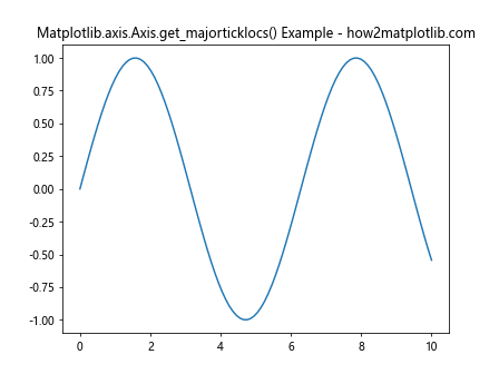
In this example, we create a simple sine wave plot and then use the Matplotlib.axis.Axis.get_majorticklocs() function to retrieve the locations of major tick marks on the x-axis. The function returns an array of float values representing the positions of the major ticks.
Understanding the Return Value of get_majorticklocs()
The Matplotlib.axis.Axis.get_majorticklocs() function returns a numpy array of float values. These values correspond to the positions of the major tick marks along the axis. It’s important to note that the returned values are in data coordinates, not pixel coordinates.
Let’s examine the return value more closely with another example:
import matplotlib.pyplot as plt
import numpy as np

# Create a plot with custom x-axis limits
plt.figure(figsize=(10, 6))
plt.plot([1, 2, 3, 4], [1, 4, 2, 3])
plt.xlim(0, 5)

# Get major tick locations for both x and y axes
x_major_ticks = plt.gca().xaxis.get_majorticklocs()
y_major_ticks = plt.gca().yaxis.get_majorticklocs()

print("X-axis major tick locations:", x_major_ticks)
print("Y-axis major tick locations:", y_major_ticks)

plt.title("Matplotlib.axis.Axis.get_majorticklocs() Return Values - how2matplotlib.com")
plt.show()
Output:
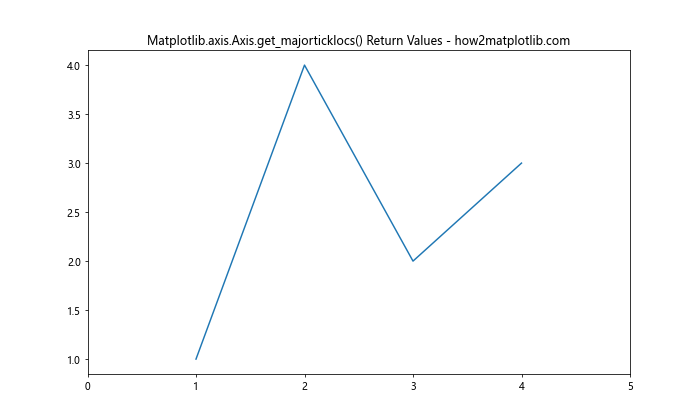
In this example, we create a plot with custom x-axis limits and use Matplotlib.axis.Axis.get_majorticklocs() to retrieve the major tick locations for both x and y axes. The returned arrays will contain the positions of the major ticks in data coordinates.
Customizing Tick Locations with get_majorticklocs()
One of the primary use cases for Matplotlib.axis.Axis.get_majorticklocs() is to customize tick locations. By retrieving the current tick locations, you can modify them or use them as a reference for creating new tick positions.
Here’s an example that demonstrates how to use get_majorticklocs() to create custom tick locations:
import matplotlib.pyplot as plt
import numpy as np

# Create a simple plot
x = np.linspace(0, 10, 100)
y = np.sin(x)
plt.plot(x, y)

# Get current major tick locations
current_ticks = plt.gca().xaxis.get_majorticklocs()

# Create custom tick locations by doubling the current ones
custom_ticks = current_ticks * 2

# Set the new tick locations
plt.xticks(custom_ticks)

plt.title("Custom Tick Locations with get_majorticklocs() - how2matplotlib.com")
plt.show()
Output:
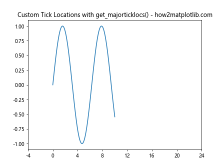
In this example, we first retrieve the current major tick locations using Matplotlib.axis.Axis.get_majorticklocs(). We then create custom tick locations by doubling the values of the current ticks. Finally, we set these new tick locations using plt.xticks().
Using get_majorticklocs() with Different Axis Scales
Matplotlib.axis.Axis.get_majorticklocs() works with various axis scales, including linear, logarithmic, and symlog scales. Let’s explore how the function behaves with different scales:
import matplotlib.pyplot as plt
import numpy as np

# Create subplots for different scales
fig, (ax1, ax2, ax3) = plt.subplots(1, 3, figsize=(15, 5))

# Linear scale
ax1.plot(np.linspace(0, 10, 100), np.exp(np.linspace(0, 10, 100)))
ax1.set_title("Linear Scale")
linear_ticks = ax1.xaxis.get_majorticklocs()
print("Linear scale ticks:", linear_ticks)

# Logarithmic scale
ax2.plot(np.linspace(0, 10, 100), np.exp(np.linspace(0, 10, 100)))
ax2.set_yscale('log')
ax2.set_title("Logarithmic Scale")
log_ticks = ax2.yaxis.get_majorticklocs()
print("Logarithmic scale ticks:", log_ticks)

# Symlog scale
ax3.plot(np.linspace(-10, 10, 100), np.linspace(-10, 10, 100)**3)
ax3.set_yscale('symlog')
ax3.set_title("Symlog Scale")
symlog_ticks = ax3.yaxis.get_majorticklocs()
print("Symlog scale ticks:", symlog_ticks)

plt.suptitle("Matplotlib.axis.Axis.get_majorticklocs() with Different Scales - how2matplotlib.com")
plt.tight_layout()
plt.show()
Output:
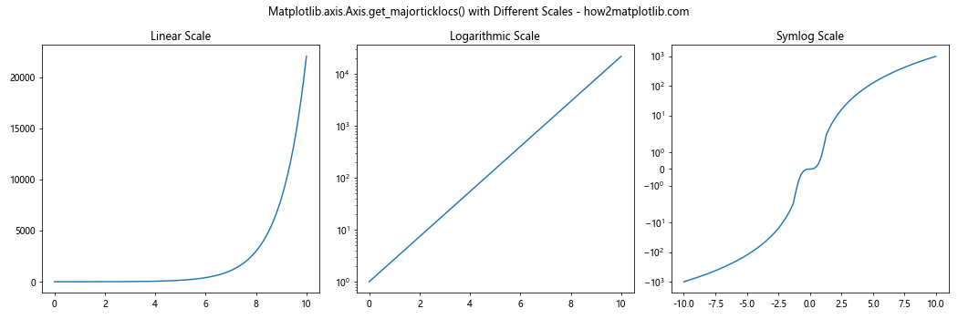
This example demonstrates how Matplotlib.axis.Axis.get_majorticklocs() returns different tick locations based on the axis scale. For linear scales, the ticks are evenly spaced. For logarithmic scales, the ticks are spaced logarithmically. For symlog scales, the ticks are spaced symmetrically around zero on a logarithmic scale.
Using get_majorticklocs() for Data Analysis
Matplotlib.axis.Axis.get_majorticklocs() can be a valuable tool for data analysis, especially when you need to perform calculations based on the current axis scale. Here’s an example that demonstrates how to use the function to calculate the average y-value between major tick marks:
import matplotlib.pyplot as plt
import numpy as np

# Create sample data
x = np.linspace(0, 10, 1000)
y = np.sin(x) + np.random.normal(0, 0.1, 1000)

# Plot the data
plt.figure(figsize=(12, 6))
plt.plot(x, y, alpha=0.5)

# Get major tick locations
major_ticks = plt.gca().xaxis.get_majorticklocs()

# Calculate average y-value between major ticks
for i in range(len(major_ticks) - 1):
    start, end = major_ticks[i], major_ticks[i+1]
    mask = (x >= start) & (x < end)
    avg_y = np.mean(y[mask])
    plt.axhline(avg_y, xmin=start/10, xmax=end/10, color='r', linestyle='--')
    plt.text(start, avg_y, f'{avg_y:.2f}', verticalalignment='bottom')

plt.title("Data Analysis with get_majorticklocs() - how2matplotlib.com")
plt.show()
Output:
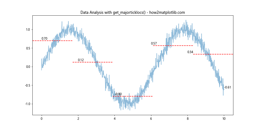
In this example, we use Matplotlib.axis.Axis.get_majorticklocs() to get the major tick locations on the x-axis. We then calculate the average y-value between each pair of adjacent ticks and plot horizontal lines representing these averages.
Creating Secondary Axes with get_majorticklocs()
Matplotlib.axis.Axis.get_majorticklocs() can be particularly useful when creating secondary axes that need to align with the primary axis. Here's an example that demonstrates how to create a secondary x-axis with a different scale:
import matplotlib.pyplot as plt
import numpy as np

# Create primary axis
fig, ax1 = plt.subplots(figsize=(10, 6))
x = np.linspace(0, 10, 100)
y = np.sin(x)
ax1.plot(x, y)
ax1.set_xlabel('X')
ax1.set_ylabel('sin(x)')

# Create secondary axis
ax2 = ax1.twiny()
ax2.set_xlabel('X squared')

# Get major tick locations from primary axis
primary_ticks = ax1.xaxis.get_majorticklocs()

# Set secondary axis ticks and labels
ax2.set_xticks(primary_ticks)
ax2.set_xticklabels([f'{x**2:.1f}' for x in primary_ticks])

plt.title("Secondary Axis with get_majorticklocs() - how2matplotlib.com")
plt.show()
Output:
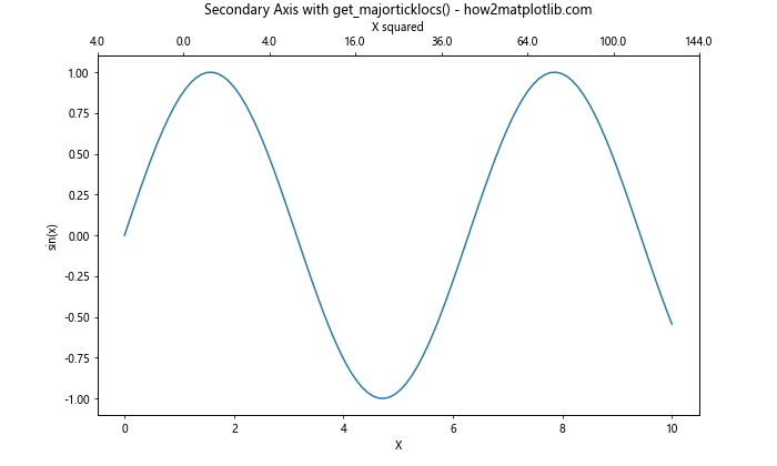
In this example, we create a primary axis with a sine wave plot. We then create a secondary x-axis using ax1.twiny(). We use Matplotlib.axis.Axis.get_majorticklocs() to get the major tick locations from the primary axis and use these to set the tick positions on the secondary axis. The tick labels on the secondary axis show the squared values of the primary axis ticks.
Handling Non-linear Transformations with get_majorticklocs()
Matplotlib.axis.Axis.get_majorticklocs() can be particularly useful when dealing with non-linear transformations of your data. Here's an example that demonstrates how to use the function with a logarithmic transformation:
import matplotlib.pyplot as plt
import numpy as np

# Create data
x = np.linspace(1, 1000, 1000)
y = np.log10(x)

# Create plot with log scale
fig, ax = plt.subplots(figsize=(10, 6))
ax.plot(x, y)
ax.set_xscale('log')

# Get major tick locations
major_ticks = ax.xaxis.get_majorticklocs()

# Add vertical lines at major ticks
for tick in major_ticks:
    ax.axvline(tick, color='r', linestyle='--', alpha=0.5)

# Add text annotations
for tick in major_ticks:
    ax.text(tick, ax.get_ylim()[1], f'{tick:.0f}',
            horizontalalignment='center', verticalalignment='bottom')

plt.title("Non-linear Transformations with get_majorticklocs() - how2matplotlib.com")
plt.show()
Output:
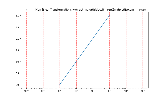
In this example, we create a plot with a logarithmic x-scale. We use Matplotlib.axis.Axis.get_majorticklocs() to get the positions of the major ticks on this logarithmic scale. We then add vertical lines at these positions and annotate them with their actual values.
Customizing Tick Density with get_majorticklocs()
Matplotlib.axis.Axis.get_majorticklocs() can be used in conjunction with other Matplotlib functions to customize the density of tick marks. Here's an example that demonstrates how to increase the number of major ticks:
import matplotlib.pyplot as plt
import numpy as np

# Create data
x = np.linspace(0, 10, 100)
y = np.sin(x)

# Create plot
fig, (ax1, ax2) = plt.subplots(2, 1, figsize=(10, 10))

# Default ticks
ax1.plot(x, y)
ax1.set_title("Default Ticks")

# Custom ticks
ax2.plot(x, y)
ax2.set_title("Custom Ticks")

# Get current major tick locations
current_ticks = ax2.xaxis.get_majorticklocs()

# Create new tick locations with double density
new_ticks = np.linspace(current_ticks[0], current_ticks[-1], len(current_ticks)*2 - 1)

# Set new tick locations
ax2.set_xticks(new_ticks)

plt.suptitle("Customizing Tick Density with get_majorticklocs() - how2matplotlib.com")
plt.tight_layout()
plt.show()
Output:
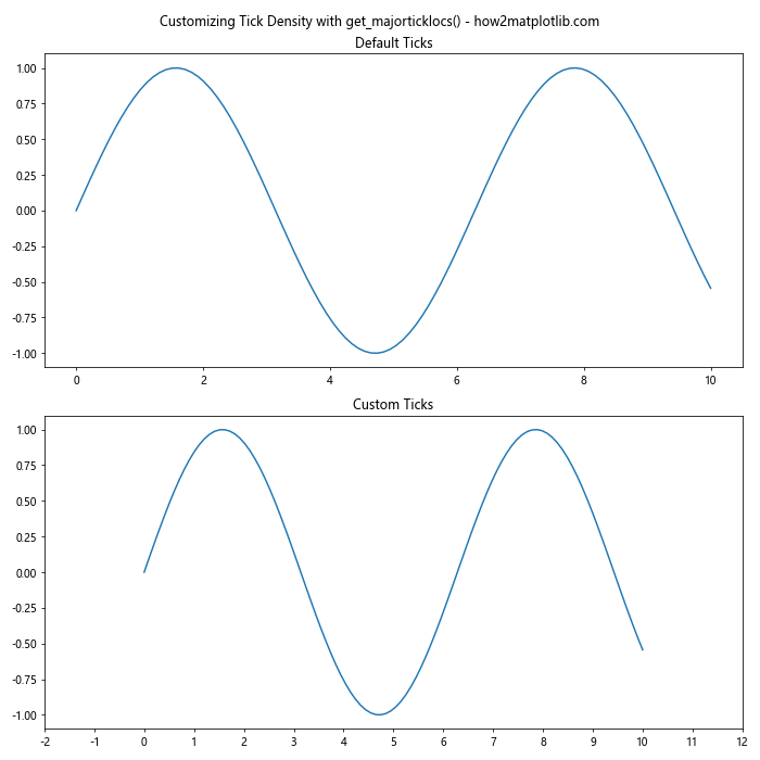
In this example, we create two subplots: one with default tick marks and another with customized tick marks. We use Matplotlib.axis.Axis.get_majorticklocs() to get the current major tick locations, then create a new set of tick locations with double the density. Finally, we set these new tick locations using ax2.set_xticks().
Using get_majorticklocs() with Polar Plots
Matplotlib.axis.Axis.get_majorticklocs() can also be used with polar plots. Here's an example that demonstrates how to customize the radial ticks in a polar plot:
import matplotlib.pyplot as plt
import numpy as np

# Create data for polar plot
theta = np.linspace(0, 2*np.pi, 100)
r = np.sin(5*theta)

# Create polar plot
fig, ax = plt.subplots(subplot_kw=dict(projection='polar'))
ax.plot(theta, r)

# Get major tick locations for radial axis
radial_ticks = ax.yaxis.get_majorticklocs()

# Customize radial ticks
new_radial_ticks = np.linspace(radial_ticks[0], radial_ticks[-1], 10)
ax.set_yticks(new_radial_ticks)

# Add labels to radial ticks
ax.set_yticklabels([f'{tick:.1f}' for tick in new_radial_ticks])

plt.title("Polar Plot with get_majorticklocs() - how2matplotlib.com")
plt.show()
Output:
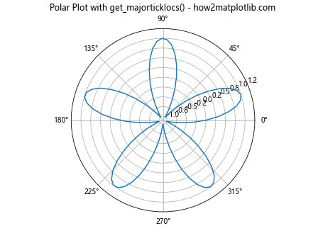
In this example, we create a polar plot and use Matplotlib.axis.Axis.get_majorticklocs() to get the major tick locations for the radial axis. We then create a new set of radial ticks with a custom density and set these new ticks using ax.set_yticks(). Finally, we add custom labels to these radial ticks.
Combining get_majorticklocs() with Colorbar Customization
Matplotlib.axis.Axis.get_majorticklocs() can be useful when customizing colorbars in your plots. Here's an example that demonstrates how to use the function to create custom tick locations on a colorbar:
import matplotlib.pyplot as plt
import numpy as np

# Create sample data
x, y = np.meshgrid(np.linspace(-2, 2, 100), np.linspace(-2, 2, 100))
z = np.sin(x) * np.cos(y)

# Create plot with colorbar
fig, ax = plt.subplots(figsize=(10, 8))
im = ax.imshow(z, cmap='viridis', extent=[-2, 2, -2, 2])
cbar = plt.colorbar(im)

# Get major tick locations from colorbar
cbar_ticks = cbar.ax.yaxis.get_majorticklocs()

# Create custom tick locations
custom_ticks = np.linspace(cbar_ticks[0], cbar_ticks[-1], 10)

# Set custom tick locations and labels on colorbar
cbar.set_ticks(custom_ticks)
cbar.set_ticklabels([f'{tick:.2f}' for tick in custom_ticks])

plt.title("Colorbar Customization with get_majorticklocs() - how2matplotlib.com")
plt.show()
Output:
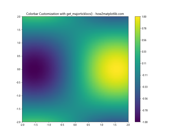
In this example, we create a 2D plot with a colorbar. We use Matplotlib.axis.Axis.get_majorticklocs() to get the current major tick locations on the colorbar. We then create a new set of custom tick locations and use these to customize the colorbar ticks and labels.
Error Handling and Edge Cases with get_majorticklocs()
When using Matplotlib.axis.Axis.get_majorticklocs(), it's important to consider potential error cases and edge scenarios. Here's an example that demonstrates how to handle some common issues:
import matplotlib.pyplot as plt
import numpy as np

def plot_with_ticks(ax, x, y, title):
    ax.plot(x, y)
    ax.set_title(title)

    try:
        ticks = ax.xaxis.get_majorticklocs()
        if len(ticks) == 0:
            print(f"Warning: No major ticks found for {title}")
        elif np.isnan(ticks).any():
            print(f"Warning: NaN values in major ticks for {title}")
        else:
            print(f"Major ticks for {title}: {ticks}")
    except Exception as e:
        print(f"Error getting major ticks for {title}: {str(e)}")

# Create subplots for different scenarios
fig, (ax1, ax2, ax3) = plt.subplots(3, 1, figsize=(10, 15))

# Normal case
x1 = np.linspace(0, 10, 100)
y1 = np.sin(x1)
plot_with_ticks(ax1, x1, y1, "Normal Case")

# Empty plot
plot_with_ticks(ax2, [], [], "Empty Plot")

# Single point plot
plot_with_ticks(ax3, [1], [1], "Single Point Plot")

plt.suptitle("Error Handling with get_majorticklocs() - how2matplotlib.com")
plt.tight_layout()
plt.show()
Output:
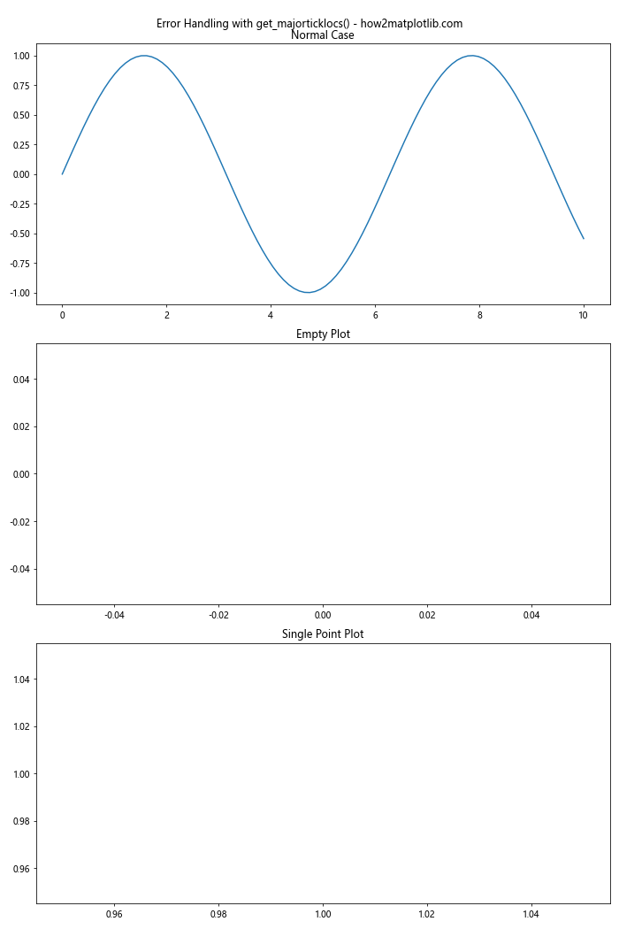
In this example, we create a function plot_with_ticks() that attempts to get the major tick locations using Matplotlib.axis.Axis.get_majorticklocs() and handles potential issues. We then use this function to plot three different scenarios: a normal plot, an empty plot, and a plot with a single point. This demonstrates how the function behaves in different edge cases.
Conclusion
Matplotlib.axis.Axis.get_majorticklocs() function in Python is a powerful tool for customizing and analyzing plots in Matplotlib. Throughout this comprehensive guide, we've explored various aspects of this function, including its basic usage, return values, and applications in different plotting scenarios.