How to Master Matplotlib Default Colors: A Comprehensive Guide
Matplotlib default colors are an essential aspect of data visualization in Python. Understanding and effectively utilizing these colors can significantly enhance the clarity and appeal of your plots. This comprehensive guide will delve deep into the world of matplotlib default colors, exploring their various applications, customization options, and best practices.
Introduction to Matplotlib Default Colors
Matplotlib, a popular plotting library in Python, comes with a set of default colors that are automatically applied to plots when no specific color is specified. These default colors are carefully chosen to provide a visually appealing and distinguishable palette for various plot elements.
Let’s start with a simple example to demonstrate the use of matplotlib default colors:
import matplotlib.pyplot as plt

# Data for plotting
x = [1, 2, 3, 4, 5]
y1 = [2, 4, 6, 8, 10]
y2 = [1, 3, 5, 7, 9]

# Create a plot using matplotlib default colors
plt.plot(x, y1, label='Line 1')
plt.plot(x, y2, label='Line 2')
plt.title('Simple Plot with Matplotlib Default Colors - how2matplotlib.com')
plt.xlabel('X-axis')
plt.ylabel('Y-axis')
plt.legend()
plt.show()
Output:
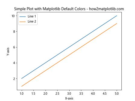
In this example, we create a simple line plot with two lines. Matplotlib automatically assigns different default colors to each line, making them easily distinguishable.
Understanding the Matplotlib Color Cycle
The matplotlib default colors are part of a color cycle that the library uses to automatically assign colors to plot elements. This cycle ensures that each new element receives a different color, promoting visual diversity in your plots.
Let’s explore the default color cycle:
import matplotlib.pyplot as plt

# Get the current color cycle
color_cycle = plt.rcParams['axes.prop_cycle'].by_key()['color']

# Print the default colors
print("Matplotlib Default Colors - how2matplotlib.com:")
for color in color_cycle:
    print(color)

# Create a plot to visualize the default colors
for i, color in enumerate(color_cycle):
    plt.plot([0, 1], [i, i], color=color, linewidth=10)

plt.title('Matplotlib Default Color Cycle - how2matplotlib.com')
plt.yticks(range(len(color_cycle)), [f'Color {i+1}' for i in range(len(color_cycle))])
plt.xlabel('Color Representation')
plt.show()
Output:
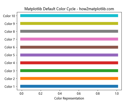
This code snippet prints the hexadecimal values of the default colors and creates a visual representation of the color cycle.
Customizing Matplotlib Default Colors
While the default colors in matplotlib are well-chosen, you may want to customize them to suit your specific needs or to match a particular style guide. Matplotlib provides several ways to modify the default color cycle.
Changing the Color Cycle
You can change the color cycle for all plots in your script by modifying the axes.prop_cycle parameter:
import matplotlib.pyplot as plt
import cycler

# Define a custom color cycle
custom_colors = ['#FF1493', '#00BFFF', '#32CD32', '#FFD700', '#FF4500']

# Set the custom color cycle
plt.rcParams['axes.prop_cycle'] = cycler.cycler(color=custom_colors)

# Create a plot with the custom color cycle
x = range(5)
for i in range(5):
    plt.plot(x, [i*j for j in x], label=f'Line {i+1}')

plt.title('Custom Color Cycle - how2matplotlib.com')
plt.xlabel('X-axis')
plt.ylabel('Y-axis')
plt.legend()
plt.show()
Output:
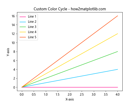
This example demonstrates how to set a custom color cycle using specific hexadecimal color values.
Using Named Colors
Matplotlib also provides a set of named colors that you can use instead of hexadecimal values. These named colors can make your code more readable and easier to understand:
import matplotlib.pyplot as plt

# List of some named colors in matplotlib
named_colors = ['red', 'blue', 'green', 'yellow', 'purple', 'orange', 'pink']

# Create a plot using named colors
for i, color in enumerate(named_colors):
    plt.plot([0, 1], [i, i], color=color, linewidth=10, label=color)

plt.title('Matplotlib Named Colors - how2matplotlib.com')
plt.yticks(range(len(named_colors)), [color.capitalize() for color in named_colors])
plt.xlabel('Color Representation')
plt.legend(loc='center left', bbox_to_anchor=(1, 0.5))
plt.tight_layout()
plt.show()
Output:
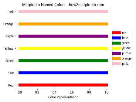
This code creates a visual representation of some of the named colors available in matplotlib.
Applying Matplotlib Default Colors to Different Plot Types
Matplotlib default colors can be applied to various types of plots. Let’s explore how these colors work with different plot types.
Bar Plots
Bar plots are excellent for comparing categorical data. Here’s how matplotlib default colors are applied to a bar plot:
import matplotlib.pyplot as plt
import numpy as np

categories = ['Category A', 'Category B', 'Category C', 'Category D']
values = [23, 45, 56, 78]

plt.figure(figsize=(10, 6))
bars = plt.bar(categories, values)

# Automatically color the bars using default colors
for i, bar in enumerate(bars):
    bar.set_color(plt.rcParams['axes.prop_cycle'].by_key()['color'][i])

plt.title('Bar Plot with Matplotlib Default Colors - how2matplotlib.com')
plt.xlabel('Categories')
plt.ylabel('Values')
plt.show()
Output:
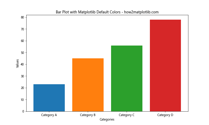
In this example, each bar is automatically assigned a different color from the default color cycle.
Scatter Plots
Scatter plots are useful for showing the relationship between two variables. Let’s see how matplotlib default colors can enhance a scatter plot:
import matplotlib.pyplot as plt
import numpy as np

# Generate random data
np.random.seed(42)
x = np.random.rand(50)
y = np.random.rand(50)
colors = np.random.rand(50)
sizes = 1000 * np.random.rand(50)

plt.scatter(x, y, c=colors, s=sizes, alpha=0.5, cmap='viridis')
plt.colorbar(label='Color Value')

plt.title('Scatter Plot with Matplotlib Default Colormap - how2matplotlib.com')
plt.xlabel('X-axis')
plt.ylabel('Y-axis')
plt.show()
Output:
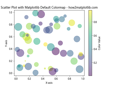
This scatter plot uses the default ‘viridis’ colormap to represent an additional dimension of data through color.
Pie Charts
Pie charts are great for showing the composition of a whole. Matplotlib default colors can make pie chart segments easily distinguishable:
import matplotlib.pyplot as plt

# Data for the pie chart
sizes = [30, 25, 20, 15, 10]
labels = ['A', 'B', 'C', 'D', 'E']

plt.pie(sizes, labels=labels, autopct='%1.1f%%', startangle=90)
plt.axis('equal')  # Equal aspect ratio ensures that pie is drawn as a circle
plt.title('Pie Chart with Matplotlib Default Colors - how2matplotlib.com')
plt.show()
Output:
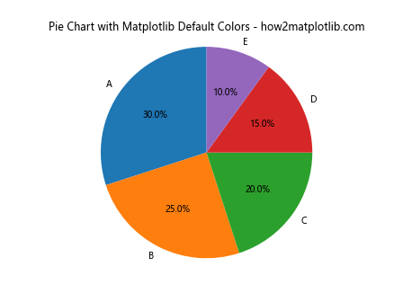
In this pie chart, each segment is automatically assigned a different color from the default color cycle.
Advanced Color Customization in Matplotlib
While the default colors in matplotlib are versatile, there are times when you need more advanced color customization options. Let’s explore some of these techniques.
Using Colormaps
Colormaps are a powerful way to represent data, especially when dealing with continuous variables. Matplotlib provides a wide range of colormaps:
import matplotlib.pyplot as plt
import numpy as np

# Generate sample data
x = np.linspace(0, 10, 100)
y = np.linspace(0, 10, 100)
X, Y = np.meshgrid(x, y)
Z = np.sin(X) * np.cos(Y)

# Create a contour plot with a colormap
plt.contourf(X, Y, Z, cmap='coolwarm')
plt.colorbar(label='Z Value')

plt.title('Contour Plot with Coolwarm Colormap - how2matplotlib.com')
plt.xlabel('X-axis')
plt.ylabel('Y-axis')
plt.show()
Output:

This example uses the ‘coolwarm’ colormap to represent the Z values in a contour plot.
Creating Custom Colormaps
You can also create custom colormaps tailored to your specific needs:
import matplotlib.pyplot as plt
import matplotlib.colors as mcolors
import numpy as np

# Define custom colors
colors = ['#FF0000', '#FFFF00', '#00FF00', '#00FFFF', '#0000FF']

# Create a custom colormap
n_bins = 100
cmap = mcolors.LinearSegmentedColormap.from_list('custom_cmap', colors, N=n_bins)

# Generate sample data
data = np.random.rand(10, 10)

# Create a heatmap with the custom colormap
plt.imshow(data, cmap=cmap)
plt.colorbar(label='Value')

plt.title('Heatmap with Custom Colormap - how2matplotlib.com')
plt.xlabel('X-axis')
plt.ylabel('Y-axis')
plt.show()
Output:

This code creates a custom colormap and applies it to a heatmap.
Color Accessibility and Best Practices
When working with matplotlib default colors or custom color schemes, it’s important to consider color accessibility to ensure your visualizations are readable by all audiences, including those with color vision deficiencies.
Using Colorblind-Friendly Palettes
Matplotlib provides colorblind-friendly colormaps that you can use to make your plots more accessible:
import matplotlib.pyplot as plt
import numpy as np

# Generate sample data
x = np.linspace(0, 10, 100)
y1 = np.sin(x)
y2 = np.cos(x)
y3 = np.tan(x)

# Plot using a colorblind-friendly palette
plt.figure(figsize=(10, 6))
plt.plot(x, y1, color='#0072B2', label='sin(x)')
plt.plot(x, y2, color='#D55E00', label='cos(x)')
plt.plot(x, y3, color='#009E73', label='tan(x)')

plt.title('Colorblind-Friendly Plot - how2matplotlib.com')
plt.xlabel('X-axis')
plt.ylabel('Y-axis')
plt.legend()
plt.grid(True)
plt.show()
Output:
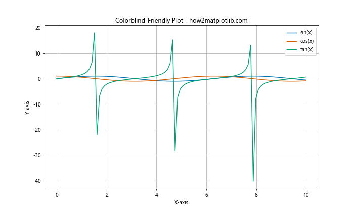
This example uses a colorblind-friendly color palette to ensure the plot is accessible to a wider audience.
Using Markers and Line Styles
In addition to colors, you can use different markers and line styles to distinguish between plot elements:
import matplotlib.pyplot as plt
import numpy as np

x = np.linspace(0, 10, 100)
y1 = np.sin(x)
y2 = np.cos(x)
y3 = np.tan(x)

plt.plot(x, y1, color='blue', linestyle='-', marker='o', label='sin(x)')
plt.plot(x, y2, color='red', linestyle='--', marker='s', label='cos(x)')
plt.plot(x, y3, color='green', linestyle=':', marker='^', label='tan(x)')

plt.title('Plot with Different Markers and Line Styles - how2matplotlib.com')
plt.xlabel('X-axis')
plt.ylabel('Y-axis')
plt.legend()
plt.grid(True)
plt.show()
Output:
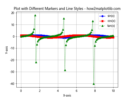
This plot uses different colors, line styles, and markers to make each line easily distinguishable.
Color Theory and Matplotlib
Understanding color theory can help you make more informed decisions when customizing matplotlib colors. Let’s explore some color theory concepts and how they apply to data visualization.
Complementary Colors
Complementary colors are opposite each other on the color wheel and can create strong contrast in your plots:
import matplotlib.pyplot as plt
import numpy as np

# Generate sample data
x = np.linspace(0, 10, 100)
y1 = np.sin(x)
y2 = -np.sin(x)

# Plot using complementary colors
plt.figure(figsize=(10, 6))
plt.plot(x, y1, color='#FF0000', label='Positive Sine')  # Red
plt.plot(x, y2, color='#00FFFF', label='Negative Sine')  # Cyan

plt.title('Complementary Colors in Matplotlib - how2matplotlib.com')
plt.xlabel('X-axis')
plt.ylabel('Y-axis')
plt.legend()
plt.grid(True)
plt.show()
Output:
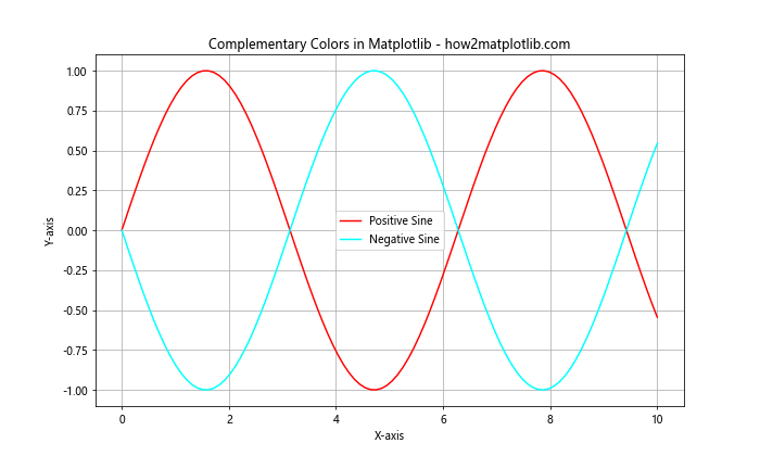
This example uses red and cyan, which are complementary colors, to create a visually striking plot.
Analogous Colors
Analogous colors are next to each other on the color wheel and can create a harmonious look:
import matplotlib.pyplot as plt
import numpy as np

# Generate sample data
categories = ['A', 'B', 'C', 'D', 'E']
values = [23, 45, 56, 78, 32]

# Create a bar plot with analogous colors
plt.figure(figsize=(10, 6))
bars = plt.bar(categories, values)

# Set analogous colors
analogous_colors = ['#FF0000', '#FF8000', '#FFFF00', '#80FF00', '#00FF00']
for bar, color in zip(bars, analogous_colors):
    bar.set_color(color)

plt.title('Bar Plot with Analogous Colors - how2matplotlib.com')
plt.xlabel('Categories')
plt.ylabel('Values')
plt.show()
Output:
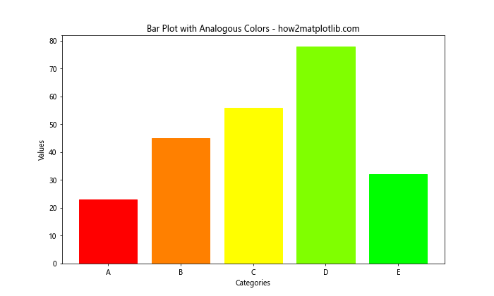
This bar plot uses analogous colors (shades of red, orange, yellow, and green) to create a cohesive look.
Matplotlib Default Colors in Different Styles
Matplotlib provides various built-in styles that can change the overall look of your plots, including the default colors. Let’s explore some of these styles.
Using the ‘seaborn’ Style
The ‘seaborn’ style provides a more modern and aesthetically pleasing look:
import matplotlib.pyplot as plt
import numpy as np

# Set the style to 'seaborn'
plt.style.use('seaborn')

# Generate sample data
x = np.linspace(0, 10, 100)
y1 = np.sin(x)
y2 = np.cos(x)

# Create the plot
plt.figure(figsize=(10, 6))
plt.plot(x, y1, label='sin(x)')
plt.plot(x, y2, label='cos(x)')

plt.title('Plot with Seaborn Style - how2matplotlib.com')
plt.xlabel('X-axis')
plt.ylabel('Y-axis')
plt.legend()
plt.show()
This example demonstrates how the ‘seaborn’ style affects the default colors and overall appearance of the plot.
Using the ‘ggplot’ Style
The ‘ggplot’ style mimics the aesthetic of the ggplot2 library in R:
import matplotlib.pyplot as plt
import numpy as np

# Set the style to 'ggplot'
plt.style.use('ggplot')

# Generate sample data
categories = ['A', 'B', 'C', 'D', 'E']
values1 = [23, 45, 56, 78, 32]
values2 = [15, 30, 45, 20, 35]

# Create a grouped bar plot
x = np.arange(len(categories))
width = 0.35

fig, ax = plt.subplots(figsize=(10, 6))
rects1 = ax.bar(x - width/2, values1, width, label='Group 1')
rects2 = ax.bar(x + width/2, values2, width, label='Group 2')

ax.set_xticks(x, categories)
ax.set_xlabel('Categories')
ax.set_ylabel('Values')
ax.set_title('Grouped Bar Plot with ggplot Style - how2matplotlib.com')
ax.legend()

plt.tight_layout()
plt.show()
Output:

This grouped bar plot uses the ‘ggplot’ style, which changes the default colors and overall aesthetic of the plot.
Color Mapping in Matplotlib
Color mapping is a powerful technique in data visualization that allows you to represent an additional dimension of data through color. Let’s explore some advanced color mapping techniques in matplotlib.
Continuous Color Mapping
Continuous color mapping is useful when you want to represent a range of values with a smooth color transition:
import matplotlib.pyplot as plt
import numpy as np

# Generate sample data
x = np.linspace(0, 10, 100)
y = np.linspace(0, 10, 100)
X, Y = np.meshgrid(x, y)
Z = np.sin(X) * np.cos(Y)

# Create a contour plot with continuous color mapping
plt.figure(figsize=(10, 8))
contour = plt.contourf(X, Y, Z, cmap='viridis', levels=20)
plt.colorbar(contour, label='Z Value')

plt.title('Continuous Color Mapping - how2matplotlib.com')
plt.xlabel('X-axis')
plt.ylabel('Y-axis')
plt.show()
Output:

This example uses the ‘viridis’ colormap to create a smooth color transition representing the Z values in a contour plot.
Discrete Color Mapping
Discrete color mapping is useful when you want to represent distinct categories or ranges of values:
import matplotlib.pyplot as plt
import numpy as np

# Generate sample data
np.random.seed(42)
data = np.random.randint(0, 5, (10, 10))

# Create a discrete color map
cmap = plt.cm.get_cmap('Set1', 5)  # 5 distinct colors

# Create a heatmap with discrete color mapping
plt.figure(figsize=(10, 8))
heatmap = plt.imshow(data, cmap=cmap)
plt.colorbar(heatmap, label='Category', ticks=range(5))

plt.title('Discrete Color Mapping - how2matplotlib.com')
plt.xlabel('X-axis')
plt.ylabel('Y-axis')
plt.show()
Output:

This heatmap uses a discrete colormap to represent five distinct categories in the data.
Customizing Colorbars in Matplotlib
Colorbars are an essential component of color-mapped plots, providing a legend for interpreting the colors. Let’s explore some ways to customize colorbars in matplotlib.
Positioning the Colorbar
You can control the position and size of the colorbar:
import matplotlib.pyplot as plt
import numpy as np

# Generate sample data
x = np.linspace(0, 10, 100)
y = np.linspace(0, 10, 100)
X, Y = np.meshgrid(x, y)
Z = np.sin(X) * np.cos(Y)

# Create the main plot
fig, ax = plt.subplots(figsize=(10, 8))
contour = ax.contourf(X, Y, Z, cmap='coolwarm', levels=20)

# Add a colorbar with custom position
cbar = fig.colorbar(contour, ax=ax, orientation='horizontal', pad=0.2, aspect=30)
cbar.set_label('Z Value', fontsize=12)

plt.title('Contour Plot with Custom Colorbar Position - how2matplotlib.com')
plt.xlabel('X-axis')
plt.ylabel('Y-axis')
plt.show()
Output:

This example places a horizontal colorbar below the main plot and adjusts its aspect ratio.
Customizing Colorbar Ticks
You can customize the ticks and labels on the colorbar:
import matplotlib.pyplot as plt
import numpy as np

# Generate sample data
x = np.linspace(0, 10, 100)
y = np.linspace(0, 10, 100)
X, Y = np.meshgrid(x, y)
Z = np.sin(X) * np.cos(Y)

# Create the main plot
fig, ax = plt.subplots(figsize=(10, 8))
contour = ax.contourf(X, Y, Z, cmap='viridis', levels=20)

# Add a colorbar with custom ticks
cbar = fig.colorbar(contour, ax=ax)
cbar.set_ticks([-1, -0.5, 0, 0.5, 1])
cbar.set_ticklabels(['Low', 'Medium-Low', 'Medium', 'Medium-High', 'High'])
cbar.set_label('Custom Scale', fontsize=12)

plt.title('Contour Plot with Custom Colorbar Ticks - how2matplotlib.com')
plt.xlabel('X-axis')
plt.ylabel('Y-axis')
plt.show()
Output:

This example customizes the colorbar ticks and labels to use descriptive text instead of numerical values.
Color Normalization in Matplotlib
Color normalization is the process of mapping data values to colors. Matplotlib provides several normalization methods to handle different types of data distributions.
Linear Normalization
Linear normalization is the default method and works well for data with a relatively uniform distribution:
import matplotlib.pyplot as plt
import numpy as np
from matplotlib.colors import Normalize

# Generate sample data
np.random.seed(42)
data = np.random.rand(10, 10)

# Create a linear normalization
norm = Normalize(vmin=0, vmax=1)

# Create a heatmap with linear normalization
plt.figure(figsize=(10, 8))
heatmap = plt.imshow(data, cmap='viridis', norm=norm)
plt.colorbar(heatmap, label='Value')

plt.title('Heatmap with Linear Color Normalization - how2matplotlib.com')
plt.xlabel('X-axis')
plt.ylabel('Y-axis')
plt.show()
Output:

This heatmap uses linear normalization to map values between 0 and 1 to colors.
Logarithmic Normalization
Logarithmic normalization is useful for data with a large range of values:
import matplotlib.pyplot as plt
import numpy as np
from matplotlib.colors import LogNorm

# Generate sample data with a large range
np.random.seed(42)
data = np.random.rand(10, 10) * 1000

# Create a logarithmic normalization
norm = LogNorm(vmin=1, vmax=1000)

# Create a heatmap with logarithmic normalization
plt.figure(figsize=(10, 8))
heatmap = plt.imshow(data, cmap='viridis', norm=norm)
plt.colorbar(heatmap, label='Value (log scale)')

plt.title('Heatmap with Logarithmic Color Normalization - how2matplotlib.com')
plt.xlabel('X-axis')
plt.ylabel('Y-axis')
plt.show()
Output:

This example uses logarithmic normalization to better represent data with a large range of values.
Matplotlib default colors Conclusion
Matplotlib default colors provide a solid foundation for creating visually appealing and informative plots. By understanding how to use and customize these colors, you can significantly enhance the effectiveness of your data visualizations. From simple line plots to complex heatmaps, the proper use of color can make your data come alive and convey information more clearly.
Remember that while default colors are a great starting point, don’t be afraid to experiment with custom color schemes, different colormaps, and various normalization techniques to find the best representation for your specific data and audience. Always consider color accessibility and choose color schemes that are inclusive for all viewers.