How to Master Matplotlib Label Colors: A Comprehensive Guide
Matplotlib label colors are an essential aspect of data visualization that can significantly enhance the readability and aesthetics of your plots. In this comprehensive guide, we’ll explore various techniques and best practices for customizing label colors in Matplotlib. From basic color assignments to advanced color mapping, we’ll cover everything you need to know to become proficient in using Matplotlib label colors effectively.
Understanding the Basics of Matplotlib Label Colors
Matplotlib label colors refer to the colors applied to various textual elements in a plot, such as axis labels, tick labels, titles, and legends. By default, Matplotlib uses black for most labels, but customizing these colors can greatly improve the visual appeal and clarity of your plots.
Let’s start with a simple example of changing the color of axis labels:
import matplotlib.pyplot as plt

fig, ax = plt.subplots()
ax.set_xlabel('X-axis (how2matplotlib.com)', color='red')
ax.set_ylabel('Y-axis (how2matplotlib.com)', color='blue')
ax.set_title('Matplotlib Label Colors Example', color='green')
plt.show()
Output:
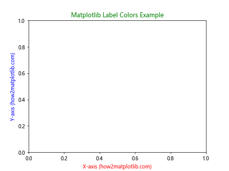
In this example, we’ve set the x-axis label to red, the y-axis label to blue, and the title to green. This demonstrates the basic method of changing label colors in Matplotlib.
Customizing Tick Label Colors
Tick labels are another important element where color customization can be applied. Here’s how you can change the color of tick labels:
import matplotlib.pyplot as plt

fig, ax = plt.subplots()
ax.set_xticklabels(['A', 'B', 'C', 'D'], color='purple')
ax.set_yticklabels(['1', '2', '3', '4'], color='orange')
ax.set_title('Tick Label Colors (how2matplotlib.com)')
plt.show()
Output:
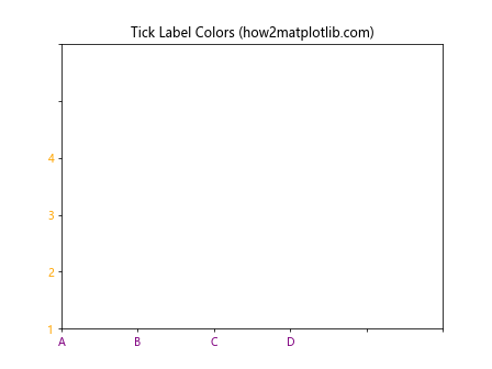
This code changes the x-axis tick labels to purple and the y-axis tick labels to orange. Note that we’ve also set custom tick labels in this example.
Using RGB and RGBA Values for Matplotlib Label Colors
While named colors are convenient, Matplotlib also supports RGB and RGBA values for more precise color control. Here’s an example:
import matplotlib.pyplot as plt

fig, ax = plt.subplots()
ax.set_xlabel('X-axis (how2matplotlib.com)', color=(0.2, 0.4, 0.6))
ax.set_ylabel('Y-axis (how2matplotlib.com)', color=(0.8, 0.2, 0.3, 0.7))
ax.set_title('RGB and RGBA Colors', color='#FF5733')
plt.show()
Output:
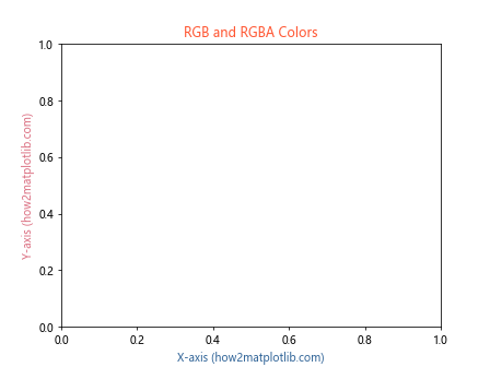
In this example, we’ve used an RGB tuple for the x-axis label, an RGBA tuple for the y-axis label (with alpha for transparency), and a hexadecimal color code for the title.
Applying Matplotlib Label Colors to Legends
Legends are crucial for interpreting multi-series plots. Here’s how to customize legend label colors:
import matplotlib.pyplot as plt

fig, ax = plt.subplots()
ax.plot([1, 2, 3], label='Series 1 (how2matplotlib.com)')
ax.plot([3, 2, 1], label='Series 2 (how2matplotlib.com)')
legend = ax.legend()
legend.get_texts()[0].set_color('red')
legend.get_texts()[1].set_color('blue')
plt.show()
Output:
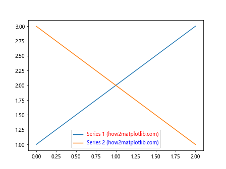
This code creates a plot with two series and customizes the color of each legend label individually.
Dynamic Label Colors Based on Data
Sometimes, you might want to set label colors dynamically based on your data. Here’s an example:
import matplotlib.pyplot as plt
import numpy as np

data = np.random.randn(100)
fig, ax = plt.subplots()
scatter = ax.scatter(range(100), data, c=data, cmap='viridis')
colorbar = plt.colorbar(scatter)
colorbar.set_label('Data Value (how2matplotlib.com)', color='purple')
ax.set_title('Dynamic Label Colors', color=plt.cm.viridis(np.mean(data)))
plt.show()
Output:
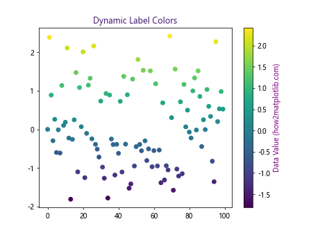
In this example, we’ve created a scatter plot where the point colors are based on the data values. We’ve also set the colorbar label color to purple and the title color to the average color of the data points.
Using Colormaps for Matplotlib Label Colors
Matplotlib’s colormaps can be a powerful tool for creating visually appealing label color schemes. Here’s how to use a colormap for label colors:
import matplotlib.pyplot as plt
import numpy as np

fig, ax = plt.subplots()
cmap = plt.get_cmap('coolwarm')
for i, label in enumerate(['A', 'B', 'C', 'D']):
    color = cmap(i / 3)
    ax.text(i, 0, f'{label} (how2matplotlib.com)', color=color, fontsize=12)
ax.set_xlim(-0.5, 3.5)
ax.set_ylim(-0.5, 0.5)
ax.set_title('Colormap-based Label Colors')
plt.show()
Output:
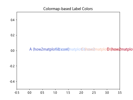
This code uses the ‘coolwarm’ colormap to assign colors to text labels, creating a smooth color transition.
Handling Matplotlib Label Colors in Dark Mode
When creating plots for dark backgrounds, it’s important to adjust label colors for visibility. Here’s an example:
import matplotlib.pyplot as plt

plt.style.use('dark_background')
fig, ax = plt.subplots()
ax.plot([1, 2, 3], [1, 2, 3], label='Data (how2matplotlib.com)')
ax.set_xlabel('X-axis', color='lightgray')
ax.set_ylabel('Y-axis', color='lightgray')
ax.set_title('Dark Mode Plot', color='white')
ax.legend(labelcolor='lightgray')
plt.show()
Output:
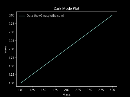
This code sets up a dark background and adjusts label colors to be visible against it.
Matplotlib Label Colors for Accessibility
When designing plots, it’s crucial to consider color accessibility. Here’s an example using a colorblind-friendly palette:
import matplotlib.pyplot as plt
import seaborn as sns

fig, ax = plt.subplots()
palette = sns.color_palette("colorblind")
ax.plot([1, 2, 3], color=palette[0], label='Series 1 (how2matplotlib.com)')
ax.plot([3, 2, 1], color=palette[1], label='Series 2 (how2matplotlib.com)')
ax.set_xlabel('X-axis', color=palette[2])
ax.set_ylabel('Y-axis', color=palette[3])
ax.set_title('Colorblind-friendly Plot', color=palette[4])
ax.legend()
plt.show()
Output:
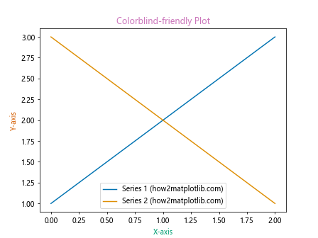
This example uses Seaborn’s colorblind palette to ensure that the plot is accessible to individuals with color vision deficiencies.
Animating Matplotlib Label Colors
Adding animation to label colors can create engaging and dynamic visualizations. Here’s a simple example:
import matplotlib.pyplot as plt
import matplotlib.animation as animation
import numpy as np

fig, ax = plt.subplots()
x = np.linspace(0, 2*np.pi, 100)
line, = ax.plot(x, np.sin(x))
ax.set_xlim(0, 2*np.pi)
ax.set_ylim(-1, 1)

def animate(frame):
    line.set_ydata(np.sin(x + frame/10))
    ax.set_title(f'Frame {frame} (how2matplotlib.com)', color=plt.cm.viridis(frame/100))
    return line, ax

ani = animation.FuncAnimation(fig, animate, frames=100, interval=50, blit=True)
plt.show()
This code creates an animated sine wave plot where the title color changes over time.
Using Gradients for Matplotlib Label Colors
Gradient colors can add a sophisticated touch to your labels. Here’s how to create a gradient text effect:
import matplotlib.pyplot as plt
from matplotlib import transforms

fig, ax = plt.subplots(figsize=(10, 2))
ax.set_xlim(0, 10)
ax.set_ylim(0, 1)

gradient = ax.imshow([[0,1]], extent=[0,10,0,1], cmap='cool', aspect='auto')
gradient.set_clip_path(None)

ax.text(5, 0.5, 'Gradient Text (how2matplotlib.com)', ha='center', va='center', fontsize=20,
        color='white', fontweight='bold', transform=ax.transAxes)

ax.set_axis_off()
plt.show()
Output:

This example creates a horizontal gradient background and overlays white text on top, creating the illusion of gradient-colored text.
Matplotlib Label Colors in 3D Plots
When working with 3D plots, label colors can help distinguish between different axes. Here’s an example:
import matplotlib.pyplot as plt
import numpy as np

fig = plt.figure()
ax = fig.add_subplot(111, projection='3d')

x = np.arange(-5, 5, 0.25)
y = np.arange(-5, 5, 0.25)
X, Y = np.meshgrid(x, y)
Z = np.sin(np.sqrt(X**2 + Y**2))

surf = ax.plot_surface(X, Y, Z, cmap='viridis')

ax.set_xlabel('X-axis (how2matplotlib.com)', color='red')
ax.set_ylabel('Y-axis (how2matplotlib.com)', color='green')
ax.set_zlabel('Z-axis (how2matplotlib.com)', color='blue')
ax.set_title('3D Plot with Colored Labels', color='purple')

plt.show()
Output:
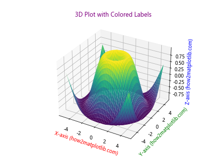
This code creates a 3D surface plot with differently colored axis labels to help distinguish between the x, y, and z axes.
Customizing Matplotlib Label Colors for Multiple Subplots
When working with multiple subplots, you might want to customize label colors for each subplot individually. Here’s how:
import matplotlib.pyplot as plt

fig, (ax1, ax2) = plt.subplots(1, 2, figsize=(10, 4))

ax1.plot([1, 2, 3], [1, 2, 3])
ax1.set_title('Subplot 1 (how2matplotlib.com)', color='red')
ax1.set_xlabel('X-axis', color='blue')
ax1.set_ylabel('Y-axis', color='green')

ax2.plot([3, 2, 1], [1, 2, 3])
ax2.set_title('Subplot 2 (how2matplotlib.com)', color='purple')
ax2.set_xlabel('X-axis', color='orange')
ax2.set_ylabel('Y-axis', color='brown')

plt.tight_layout()
plt.show()
Output:
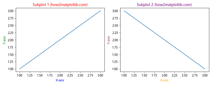
This example creates two subplots with different label color schemes for each.
Using Matplotlib Label Colors with Time Series Data
When working with time series data, color-coded labels can help highlight specific time periods. Here’s an example:
import matplotlib.pyplot as plt
import pandas as pd
import numpy as np

dates = pd.date_range(start='2023-01-01', end='2023-12-31', freq='D')
data = np.cumsum(np.random.randn(len(dates)))

fig, ax = plt.subplots(figsize=(12, 6))
ax.plot(dates, data)

ax.set_xlabel('Date (how2matplotlib.com)', color='purple')
ax.set_ylabel('Value', color='green')

for i, month in enumerate(['Jan', 'Apr', 'Jul', 'Oct']):
    color = plt.cm.viridis(i/3)
    ax.axvline(pd.Timestamp(f'2023-{month}-01'), color=color, linestyle='--', alpha=0.5)
    ax.text(pd.Timestamp(f'2023-{month}-01'), ax.get_ylim()[1], month,
            color=color, ha='center', va='bottom')

ax.set_title('Time Series with Colored Labels', color='red')
plt.show()
Output:
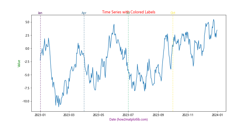
This code creates a time series plot with color-coded vertical lines and labels for specific months.
Matplotlib Label Colors in Polar Plots
Polar plots can benefit from carefully chosen label colors to enhance readability. Here’s an example:
import matplotlib.pyplot as plt
import numpy as np

fig, ax = plt.subplots(subplot_kw=dict(projection='polar'))

r = np.arange(0, 2, 0.01)
theta = 2 * np.pi * r

ax.plot(theta, r)
ax.set_rticks([0.5, 1, 1.5])
ax.set_rlabel_position(22.5)

ax.set_title("Polar Plot (how2matplotlib.com)", color='purple')
ax.tick_params(colors='green')
plt.setp(ax.get_yticklabels(), color='blue')

plt.show()
Output:

This example creates a polar plot with customized colors for the title, radial labels, and angular labels.
Matplotlib label colors Conclusion
Mastering Matplotlib label colors is a crucial skill for creating effective and visually appealing data visualizations. Throughout this guide, we’ve explored various techniques for customizing label colors, from basic color assignments to advanced color mapping and dynamic color selection. We’ve covered how to apply colors to different plot elements, use colormaps, handle dark mode scenarios, ensure accessibility, and even animate label colors.
Remember that while color can greatly enhance your plots, it’s important to use it judiciously. Always consider the context of your data, the medium in which your plot will be displayed, and the needs of your audience. With practice and experimentation, you’ll develop an intuition for when and how to use color effectively in your Matplotlib labels.