How to Customize Matplotlib Scatter Plot Point Size: A Comprehensive Guide
Matplotlib scatter point size is a crucial aspect of creating effective and visually appealing scatter plots. In this comprehensive guide, we’ll explore various techniques to customize the size of scatter plot points using Matplotlib, one of the most popular data visualization libraries in Python. We’ll cover everything from basic size adjustments to advanced techniques for creating dynamic and informative scatter plots.
Understanding Matplotlib Scatter Plot Basics
Before diving into the specifics of adjusting matplotlib scatter point size, let’s start with the basics of creating a scatter plot using Matplotlib. A scatter plot is an excellent way to visualize the relationship between two variables, with each point representing a data point.
Here’s a simple example to create a basic scatter plot:
import matplotlib.pyplot as plt
import numpy as np

# Generate sample data
x = np.random.rand(50)
y = np.random.rand(50)

# Create a scatter plot
plt.scatter(x, y)
plt.title('Basic Scatter Plot - how2matplotlib.com')
plt.xlabel('X-axis')
plt.ylabel('Y-axis')
plt.show()
Output:
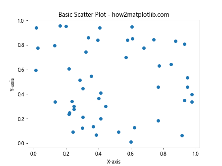
In this example, we create a basic scatter plot using random data points. The plt.scatter() function is the core function for creating scatter plots in Matplotlib.
Adjusting Matplotlib Scatter Point Size
Now that we understand the basics, let’s explore how to adjust the matplotlib scatter point size. The size of scatter points can be controlled using the s parameter in the plt.scatter() function.
Here’s an example demonstrating how to set a fixed size for all points:
import matplotlib.pyplot as plt
import numpy as np

x = np.random.rand(50)
y = np.random.rand(50)

plt.scatter(x, y, s=100)  # Set point size to 100
plt.title('Scatter Plot with Larger Points - how2matplotlib.com')
plt.xlabel('X-axis')
plt.ylabel('Y-axis')
plt.show()
Output:
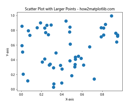
In this example, we set the s parameter to 100, which increases the size of all scatter points. The s parameter accepts a single value or an array-like object of the same length as x and y.
Varying Matplotlib Scatter Point Size Based on Data
One of the most powerful features of matplotlib scatter point size customization is the ability to vary point sizes based on data. This allows you to represent an additional dimension of information in your scatter plot.
Here’s an example that demonstrates how to vary point sizes based on a third variable:
import matplotlib.pyplot as plt
import numpy as np

x = np.random.rand(50)
y = np.random.rand(50)
sizes = np.random.rand(50) * 1000  # Generate random sizes

plt.scatter(x, y, s=sizes, alpha=0.5)
plt.title('Scatter Plot with Varying Point Sizes - how2matplotlib.com')
plt.xlabel('X-axis')
plt.ylabel('Y-axis')
plt.show()
Output:
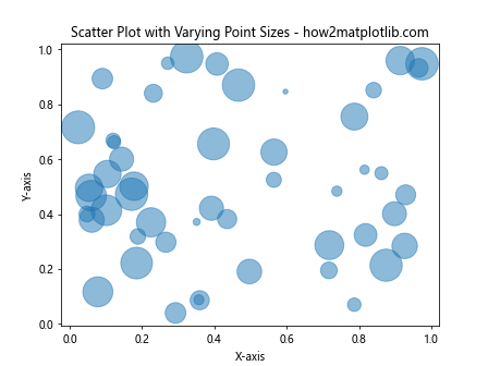
In this example, we generate random sizes for each point and pass them to the s parameter. The alpha parameter is used to set the transparency of the points, which can be helpful when dealing with overlapping points.
Using Matplotlib Scatter Point Size to Represent Categories
Another useful application of matplotlib scatter point size is to represent different categories or groups within your data. By assigning different sizes to different categories, you can create more informative visualizations.
Here’s an example that demonstrates this technique:
import matplotlib.pyplot as plt
import numpy as np

x = np.random.rand(100)
y = np.random.rand(100)
categories = np.random.choice(['A', 'B', 'C'], 100)

sizes = {'A': 50, 'B': 100, 'C': 200}
colors = {'A': 'red', 'B': 'green', 'C': 'blue'}

for category in ['A', 'B', 'C']:
    mask = categories == category
    plt.scatter(x[mask], y[mask], s=sizes[category], c=colors[category], label=category, alpha=0.7)

plt.title('Scatter Plot with Sizes Representing Categories - how2matplotlib.com')
plt.xlabel('X-axis')
plt.ylabel('Y-axis')
plt.legend()
plt.show()
Output:
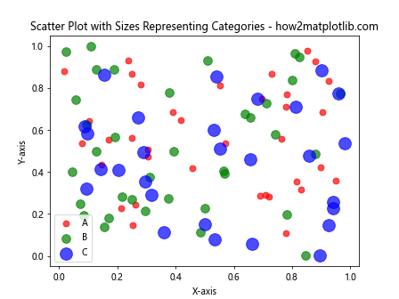
In this example, we create three categories (A, B, and C) and assign different sizes and colors to each category. This allows us to represent both the category and an additional dimension of information through the point size.
Scaling Matplotlib Scatter Point Size
When working with real-world data, you may need to scale the matplotlib scatter point size to ensure that your visualization remains clear and informative. There are several techniques you can use to scale point sizes effectively.
Here’s an example that demonstrates how to scale point sizes using a logarithmic scale:
import matplotlib.pyplot as plt
import numpy as np

x = np.random.rand(100)
y = np.random.rand(100)
values = np.random.randint(1, 1000, 100)

sizes = np.log(values) * 10  # Scale sizes logarithmically

plt.scatter(x, y, s=sizes, alpha=0.6)
plt.title('Scatter Plot with Logarithmically Scaled Point Sizes - how2matplotlib.com')
plt.xlabel('X-axis')
plt.ylabel('Y-axis')
plt.colorbar(label='Log-scaled Values')
plt.show()
Output:
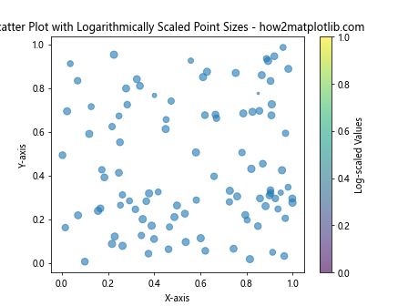
In this example, we use a logarithmic scale to prevent extremely large values from dominating the visualization. The np.log() function is used to compute the logarithm of the values, which are then multiplied by 10 to adjust the overall size range.
Using Matplotlib Scatter Point Size with Colormaps
Combining matplotlib scatter point size adjustments with colormaps can create even more informative visualizations. This technique allows you to represent two additional dimensions of information: one through size and another through color.
Here’s an example that demonstrates this approach:
import matplotlib.pyplot as plt
import numpy as np

x = np.random.rand(100)
y = np.random.rand(100)
sizes = np.random.rand(100) * 500
colors = np.random.rand(100)

plt.scatter(x, y, s=sizes, c=colors, cmap='viridis', alpha=0.7)
plt.title('Scatter Plot with Size and Color Encoding - how2matplotlib.com')
plt.xlabel('X-axis')
plt.ylabel('Y-axis')
plt.colorbar(label='Color Values')
plt.show()
Output:
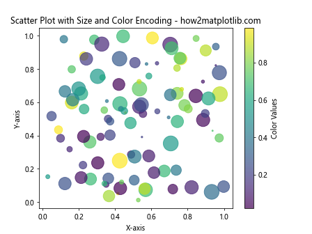
In this example, we use both the s parameter to set varying sizes and the c parameter to set varying colors. The cmap parameter specifies the colormap to use for the color encoding.
Animating Matplotlib Scatter Point Size Changes
Creating animations that show changes in matplotlib scatter point size over time can be a powerful way to visualize temporal data or emphasize certain aspects of your data.
Here’s an example that demonstrates how to create a simple animation of changing point sizes:
import matplotlib.pyplot as plt
import numpy as np
from matplotlib.animation import FuncAnimation

fig, ax = plt.subplots()
x = np.random.rand(20)
y = np.random.rand(20)
scatter = ax.scatter(x, y, s=100)

def update(frame):
    sizes = np.random.rand(20) * 500
    scatter.set_sizes(sizes)
    return scatter,

ani = FuncAnimation(fig, update, frames=50, interval=200, blit=True)
plt.title('Animated Scatter Plot with Changing Point Sizes - how2matplotlib.com')
plt.xlabel('X-axis')
plt.ylabel('Y-axis')
plt.show()
Output:
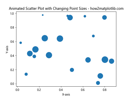
In this example, we create an animation where the sizes of the scatter points change randomly over time. The FuncAnimation class is used to create the animation, with the update function defining how the sizes change in each frame.
Customizing Matplotlib Scatter Point Size for Bubble Charts
Bubble charts are a specific type of scatter plot where the size of each point represents a third variable. Matplotlib scatter point size adjustments are crucial for creating effective bubble charts.
Here’s an example of how to create a bubble chart:
import matplotlib.pyplot as plt
import numpy as np

x = np.random.rand(50)
y = np.random.rand(50)
populations = np.random.randint(100000, 10000000, 50)

plt.scatter(x, y, s=populations/50000, alpha=0.5)
plt.title('Bubble Chart - Population Representation - how2matplotlib.com')
plt.xlabel('X-axis')
plt.ylabel('Y-axis')

# Add a size legend
for pop in [100000, 1000000, 5000000]:
    plt.scatter([], [], s=pop/50000, c='gray', alpha=0.5, label=f'{pop/1000000:.1f}M')

plt.legend(scatterpoints=1, frameon=False, labelspacing=1, title='Population')
plt.show()
Output:
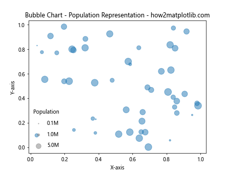
In this example, we create a bubble chart where the size of each bubble represents a population value. We also add a size legend to help interpret the bubble sizes.
Handling Overlapping Points with Matplotlib Scatter Point Size
When working with large datasets, overlapping points can become an issue in scatter plots. Adjusting matplotlib scatter point size and transparency can help mitigate this problem.
Here’s an example that demonstrates how to handle overlapping points:
import matplotlib.pyplot as plt
import numpy as np

x = np.random.normal(0, 1, 1000)
y = np.random.normal(0, 1, 1000)

plt.figure(figsize=(10, 10))
plt.scatter(x, y, s=10, alpha=0.1)
plt.title('Scatter Plot with Overlapping Points - how2matplotlib.com')
plt.xlabel('X-axis')
plt.ylabel('Y-axis')
plt.show()
Output:
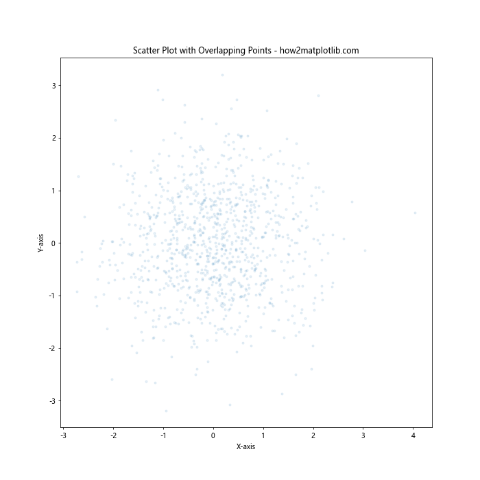
In this example, we use a small point size (s=10) and low opacity (alpha=0.1) to make overlapping points more visible. This technique allows patterns in dense areas to emerge more clearly.
Using Matplotlib Scatter Point Size with 3D Plots
Matplotlib also supports 3D scatter plots, where point size can add an additional dimension of information to your visualization.
Here’s an example of a 3D scatter plot with varying point sizes:
import matplotlib.pyplot as plt
import numpy as np

fig = plt.figure(figsize=(10, 8))
ax = fig.add_subplot(111, projection='3d')

n = 100
x = np.random.rand(n)
y = np.random.rand(n)
z = np.random.rand(n)
sizes = np.random.rand(n) * 100

scatter = ax.scatter(x, y, z, s=sizes, c=sizes, cmap='viridis', alpha=0.6)

ax.set_xlabel('X-axis')
ax.set_ylabel('Y-axis')
ax.set_zlabel('Z-axis')
plt.colorbar(scatter, label='Size and Color Scale')
plt.title('3D Scatter Plot with Varying Point Sizes - how2matplotlib.com')
plt.show()
Output:
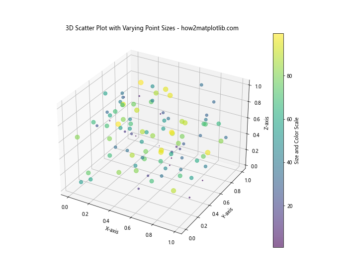
In this example, we create a 3D scatter plot where both the size and color of points vary based on a fourth dimension of data.
Combining Matplotlib Scatter Point Size with Other Plot Types
Matplotlib allows you to combine different plot types, including scatter plots with customized point sizes, to create rich, informative visualizations.
Here’s an example that combines a scatter plot with a line plot:
import matplotlib.pyplot as plt
import numpy as np

x = np.linspace(0, 10, 100)
y1 = np.sin(x)
y2 = np.cos(x)

plt.plot(x, y1, label='sin(x)')
plt.scatter(x[::10], y2[::10], s=100*np.abs(y2[::10]), c='red', alpha=0.5, label='cos(x)')

plt.title('Combined Line and Scatter Plot - how2matplotlib.com')
plt.xlabel('X-axis')
plt.ylabel('Y-axis')
plt.legend()
plt.show()
Output:
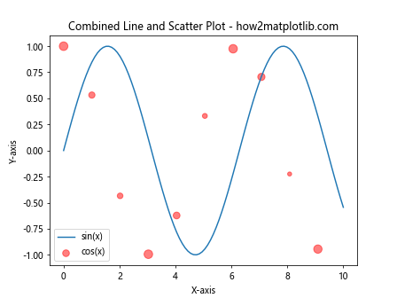
In this example, we plot a sine wave as a line and cosine values as scatter points. The size of the scatter points is proportional to the absolute value of the cosine function.
Best Practices for Using Matplotlib Scatter Point Size
When working with matplotlib scatter point size, it’s important to follow some best practices to ensure your visualizations are effective and easy to interpret:
- Scale appropriately: Ensure that the range of point sizes is appropriate for your data and doesn’t obscure important patterns.
Use transparency: When dealing with overlapping points, use transparency to reveal density and patterns.
Provide a legend or scale: Always include a legend or scale that explains what the point sizes represent.
Consider your audience: Choose size ranges that are easily distinguishable by your target audience.
Combine with other attributes: Use size in combination with color, shape, or other attributes to represent multiple dimensions of data.
Test for colorblindness: Ensure your visualizations are accessible to colorblind individuals by using colorblind-friendly palettes and relying on size differences in addition to color.
Troubleshooting Common Issues with Matplotlib Scatter Point Size
When working with matplotlib scatter point size, you may encounter some common issues. Here are some tips for troubleshooting: