How to Master Matplotlib Scatter Plot Size: A Comprehensive Guide
Matplotlib scatter size is a crucial aspect of data visualization that allows you to represent additional dimensions of your data through the size of points in a scatter plot. This comprehensive guide will explore various techniques and best practices for manipulating matplotlib scatter size to create informative and visually appealing plots. We’ll cover everything from basic size adjustments to advanced techniques for representing complex datasets.
Understanding the Basics of Matplotlib Scatter Size
Before diving into more advanced topics, it’s essential to understand the fundamentals of matplotlib scatter size. In matplotlib, the scatter function allows you to create scatter plots, and one of its parameters is ‘s’, which controls the size of the markers.
Let’s start with a simple example:
import matplotlib.pyplot as plt
import numpy as np

x = np.random.rand(50)
y = np.random.rand(50)
sizes = np.random.rand(50) * 1000

plt.figure(figsize=(10, 6))
plt.scatter(x, y, s=sizes, alpha=0.5)
plt.title('Basic Matplotlib Scatter Size Example - how2matplotlib.com')
plt.xlabel('X-axis')
plt.ylabel('Y-axis')
plt.show()
Output:
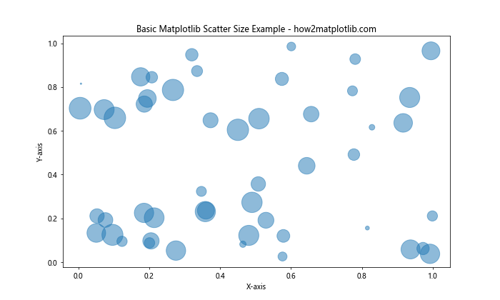
In this example, we create a scatter plot with random x and y values, and the size of each point is determined by the ‘sizes’ array. The ‘s’ parameter in plt.scatter() sets the size of each marker.
Controlling Matplotlib Scatter Size with Fixed Values
One of the simplest ways to adjust matplotlib scatter size is by using a fixed value for all points. This approach is useful when you want to emphasize the position of the points rather than any additional dimension of the data.
Here’s an example of how to set a fixed size for all points:
import matplotlib.pyplot as plt
import numpy as np

x = np.random.rand(100)
y = np.random.rand(100)

plt.figure(figsize=(10, 6))
plt.scatter(x, y, s=50)  # Fixed size of 50
plt.title('Fixed Matplotlib Scatter Size - how2matplotlib.com')
plt.xlabel('X-axis')
plt.ylabel('Y-axis')
plt.show()
Output:
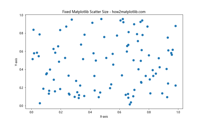
In this example, all points have a fixed size of 50. You can adjust this value to make the points larger or smaller as needed.
Varying Matplotlib Scatter Size Based on Data
One of the most powerful features of matplotlib scatter size is the ability to represent an additional dimension of your data through the size of the points. This technique allows you to visualize three-dimensional data on a two-dimensional plot.
Let’s look at an example where we vary the size based on a third variable:
import matplotlib.pyplot as plt
import numpy as np

x = np.random.rand(100)
y = np.random.rand(100)
z = np.random.rand(100)

plt.figure(figsize=(10, 6))
plt.scatter(x, y, s=z*1000, alpha=0.5)
plt.title('Variable Matplotlib Scatter Size - how2matplotlib.com')
plt.xlabel('X-axis')
plt.ylabel('Y-axis')
plt.colorbar(label='Z-value')
plt.show()
Output:
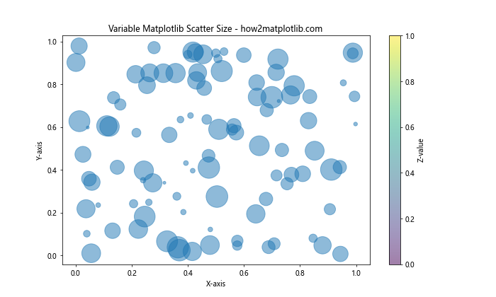
In this example, the size of each point is determined by the ‘z’ variable, which is multiplied by 1000 to make the size differences more noticeable.
Scaling Matplotlib Scatter Size
When working with real-world data, you may need to scale the sizes of your scatter points to ensure they’re visually appropriate. Matplotlib scatter size can be adjusted using various scaling techniques.
Here’s an example of how to use logarithmic scaling:
import matplotlib.pyplot as plt
import numpy as np

x = np.random.rand(100)
y = np.random.rand(100)
sizes = np.random.randint(1, 1000, 100)

plt.figure(figsize=(10, 6))
plt.scatter(x, y, s=np.log(sizes), alpha=0.5)
plt.title('Logarithmic Scaling of Matplotlib Scatter Size - how2matplotlib.com')
plt.xlabel('X-axis')
plt.ylabel('Y-axis')
plt.show()
Output:
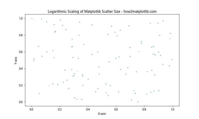
In this example, we use np.log() to scale the sizes logarithmically, which can be useful when dealing with data that spans several orders of magnitude.
Using Matplotlib Scatter Size with Categorical Data
Matplotlib scatter size can also be used effectively with categorical data. By assigning different sizes to different categories, you can create visually distinct groups within your scatter plot.
Here’s an example:
import matplotlib.pyplot as plt
import numpy as np

categories = ['A', 'B', 'C']
x = np.random.rand(90)
y = np.random.rand(90)
c = np.repeat(categories, 30)
sizes = {'A': 50, 'B': 100, 'C': 200}

plt.figure(figsize=(10, 6))
for category in categories:
    mask = c == category
    plt.scatter(x[mask], y[mask], s=sizes[category], label=category, alpha=0.6)

plt.title('Matplotlib Scatter Size with Categories - how2matplotlib.com')
plt.xlabel('X-axis')
plt.ylabel('Y-axis')
plt.legend()
plt.show()
Output:
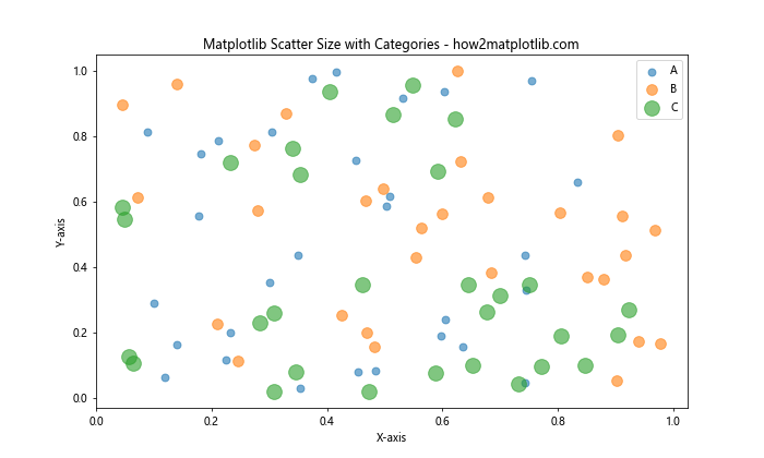
In this example, we assign different sizes to each category, making it easy to distinguish between them in the plot.
Combining Matplotlib Scatter Size with Color
To create even more informative visualizations, you can combine matplotlib scatter size with color coding. This technique allows you to represent four dimensions of data in a single plot.
Here’s an example:
import matplotlib.pyplot as plt
import numpy as np

x = np.random.rand(100)
y = np.random.rand(100)
colors = np.random.rand(100)
sizes = np.random.randint(50, 500, 100)

plt.figure(figsize=(10, 6))
scatter = plt.scatter(x, y, c=colors, s=sizes, alpha=0.6, cmap='viridis')
plt.colorbar(scatter)
plt.title('Matplotlib Scatter Size and Color - how2matplotlib.com')
plt.xlabel('X-axis')
plt.ylabel('Y-axis')
plt.show()
Output:
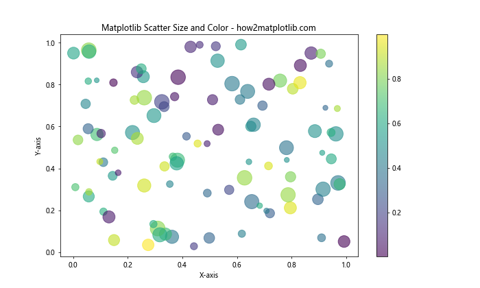
In this example, both the size and color of each point vary based on different data dimensions, providing a rich visualization of the dataset.
Creating a Bubble Chart with Matplotlib Scatter Size
Bubble charts are a specific type of scatter plot where the size of each bubble (point) represents a third variable. Matplotlib scatter size is perfect for creating these types of charts.
Here’s an example of a simple bubble chart:
import matplotlib.pyplot as plt
import numpy as np

x = np.random.rand(20)
y = np.random.rand(20)
z = np.random.rand(20)

plt.figure(figsize=(10, 6))
plt.scatter(x, y, s=z*1000, alpha=0.5)
plt.title('Bubble Chart using Matplotlib Scatter Size - how2matplotlib.com')
plt.xlabel('X-axis')
plt.ylabel('Y-axis')
for i, txt in enumerate(np.round(z, 2)):
    plt.annotate(txt, (x[i], y[i]))
plt.show()
Output:
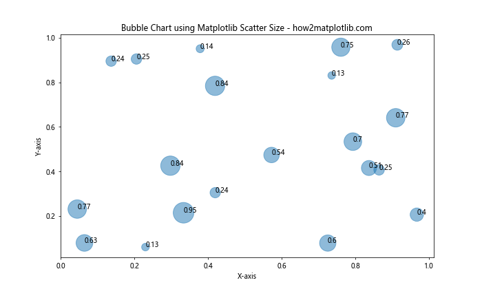
In this bubble chart, the size of each bubble represents the ‘z’ value, and we’ve added annotations to show the exact values.
Adjusting Matplotlib Scatter Size for Overlapping Points
When dealing with large datasets, overlapping points can become an issue. Matplotlib scatter size can be adjusted to address this problem.
Here’s an example using alpha blending and smaller point sizes:
import matplotlib.pyplot as plt
import numpy as np

x = np.random.normal(0, 1, 1000)
y = np.random.normal(0, 1, 1000)

plt.figure(figsize=(10, 6))
plt.scatter(x, y, s=10, alpha=0.1)
plt.title('Handling Overlapping Points with Matplotlib Scatter Size - how2matplotlib.com')
plt.xlabel('X-axis')
plt.ylabel('Y-axis')
plt.show()
Output:
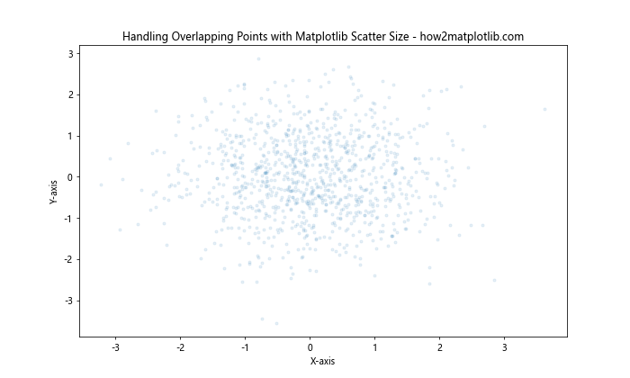
In this example, we use small point sizes (s=10) and low alpha values (alpha=0.1) to make overlapping points more visible.
Using Matplotlib Scatter Size in Subplots
When creating multiple scatter plots in a single figure, you can apply different size settings to each subplot.
Here’s an example:
import matplotlib.pyplot as plt
import numpy as np

x = np.random.rand(50)
y = np.random.rand(50)
sizes1 = np.random.randint(10, 100, 50)
sizes2 = np.random.randint(100, 500, 50)

fig, (ax1, ax2) = plt.subplots(1, 2, figsize=(15, 6))

ax1.scatter(x, y, s=sizes1, alpha=0.5)
ax1.set_title('Subplot 1: Smaller Sizes - how2matplotlib.com')
ax1.set_xlabel('X-axis')
ax1.set_ylabel('Y-axis')

ax2.scatter(x, y, s=sizes2, alpha=0.5)
ax2.set_title('Subplot 2: Larger Sizes - how2matplotlib.com')
ax2.set_xlabel('X-axis')
ax2.set_ylabel('Y-axis')

plt.tight_layout()
plt.show()
Output:
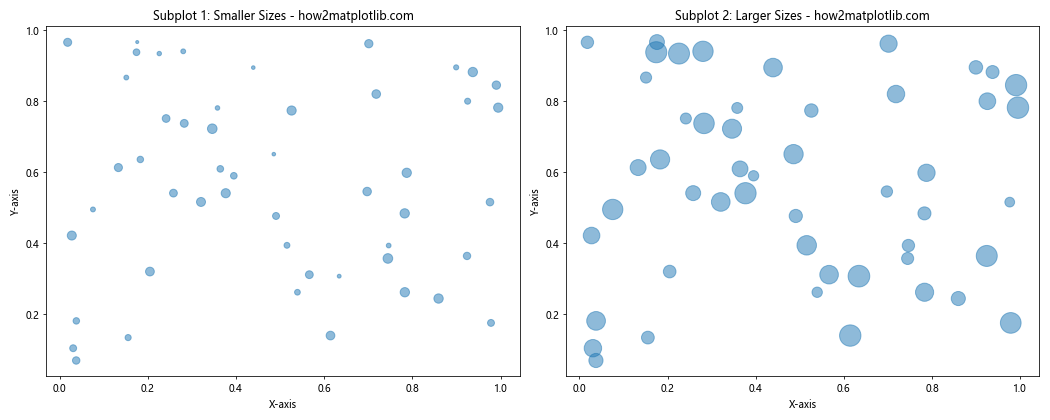
This example demonstrates how to create two subplots with different matplotlib scatter size settings.
Animating Matplotlib Scatter Size
You can create dynamic visualizations by animating the size of scatter points over time. This technique is particularly useful for showing how data changes across different time periods or conditions.
Here’s a simple example of how to create an animation with changing scatter sizes:
import matplotlib.pyplot as plt
import matplotlib.animation as animation
import numpy as np

fig, ax = plt.subplots(figsize=(10, 6))

x = np.random.rand(20)
y = np.random.rand(20)
sizes = np.random.randint(50, 300, 20)

scatter = ax.scatter(x, y, s=sizes)
ax.set_xlim(0, 1)
ax.set_ylim(0, 1)
ax.set_title('Animated Matplotlib Scatter Size - how2matplotlib.com')

def update(frame):
    sizes = np.random.randint(50, 300, 20)
    scatter.set_sizes(sizes)
    return scatter,

ani = animation.FuncAnimation(fig, update, frames=50, interval=200, blit=True)
plt.show()
Output:
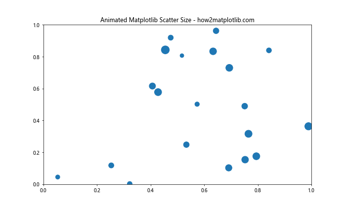
This animation updates the sizes of the scatter points randomly in each frame.
Using Matplotlib Scatter Size with Real-World Data
Let’s apply what we’ve learned to a real-world dataset. We’ll use the famous Iris dataset to demonstrate how matplotlib scatter size can enhance data visualization.
from sklearn.datasets import load_iris
import matplotlib.pyplot as plt

iris = load_iris()
X = iris.data
y = iris.target

plt.figure(figsize=(12, 8))
scatter = plt.scatter(X[:, 0], X[:, 1], c=y, s=X[:, 2]*50, alpha=0.6, cmap='viridis')
plt.colorbar(scatter)
plt.title('Iris Dataset Visualization using Matplotlib Scatter Size - how2matplotlib.com')
plt.xlabel('Sepal Length')
plt.ylabel('Sepal Width')
plt.show()
Output:
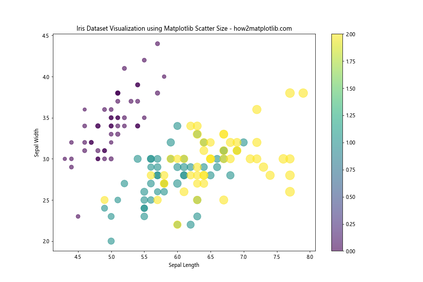
In this example, we use the sepal length and width for the x and y coordinates, the petal length for the size of the points, and the species as the color.
Advanced Techniques for Matplotlib Scatter Size
For more complex visualizations, you might want to use advanced techniques to control matplotlib scatter size. One such technique is using a custom scaling function.
Here’s an example that uses a custom logarithmic scaling function:
import matplotlib.pyplot as plt
import numpy as np

def custom_size_scaling(values, min_size=10, max_size=1000):
    min_val, max_val = np.min(values), np.max(values)
    return min_size + (max_size - min_size) * (np.log(values) - np.log(min_val)) / (np.log(max_val) - np.log(min_val))

x = np.random.rand(100)
y = np.random.rand(100)
z = np.random.randint(1, 1000, 100)

plt.figure(figsize=(10, 6))
plt.scatter(x, y, s=custom_size_scaling(z), alpha=0.6)
plt.title('Custom Scaling for Matplotlib Scatter Size - how2matplotlib.com')
plt.xlabel('X-axis')
plt.ylabel('Y-axis')
plt.colorbar(label='Z-value (log-scaled size)')
plt.show()
Output:
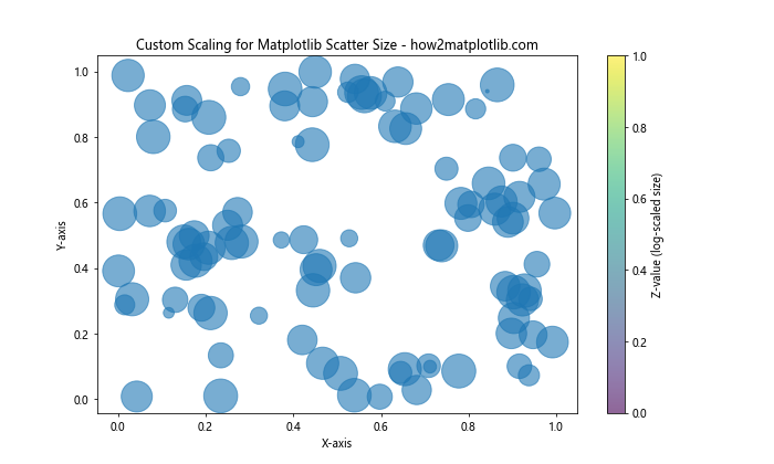
This custom scaling function provides more control over the range of sizes in your scatter plot.
Handling Large Datasets with Matplotlib Scatter Size
When working with large datasets, rendering a scatter plot with varying sizes for each point can be computationally expensive. In such cases, you might want to use techniques like hexbin plots or density plots.
Here’s an example of a hexbin plot that uses color to represent density:
import matplotlib.pyplot as plt
import numpy as np

x = np.random.normal(0, 1, 100000)
y = np.random.normal(0, 1, 100000)

plt.figure(figsize=(10, 6))
plt.hexbin(x, y, gridsize=20, cmap='YlOrRd')
plt.colorbar(label='Count in bin')
plt.title('Hexbin Plot for Large Datasets - how2matplotlib.com')
plt.xlabel('X-axis')
plt.ylabel('Y-axis')
plt.show()
Output:
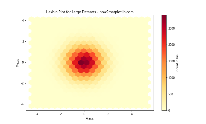
While this doesn’t directly use matplotlib scatter size, it’s an effective alternative for visualizing large datasets.
Customizing Marker Styles with Matplotlib Scatter Size
In addition to size, you can also customize the marker style in scatter plots. This can be particularly useful when you want to represent different categories or types of data points.
Here’s an example that combines different marker styles with varying sizes:
import matplotlib.pyplot as plt
import numpy as np

x = np.random.rand(60)
y = np.random.rand(60)
colors = ['r', 'g', 'b']
markers = ['o', 's', '^']
sizes = [50, 100, 200]

plt.figure(figsize=(10, 6))
for i in range(3):
    plt.scatter(x[i*20:(i+1)*20], y[i*20:(i+1)*20],
                c=colors[i], marker=markers[i], s=sizes[i],
                alpha=0.6, label=f'Group {i+1}')

plt.title('Custom Markers with Matplotlib Scatter Size - how2matplotlib.com')
plt.xlabel('X-axis')
plt.ylabel('Y-axis')
plt.legend()
plt.show()
Output:
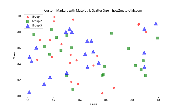
This example demonstrates how to use different colors, marker styles, and sizes to represent different groups in your data.
Using Matplotlib Scatter Size in 3D Plots
While we’ve focused on 2D scatter plots so far, matplotlib also supports 3D scatter plots where the size of the points can add a fourth dimension to your visualization.
Here’s an example of a 3D scatter plot with varying point sizes:
import matplotlib.pyplot as plt
from mpl_toolkits.mplot3d import Axes3D
import numpy as np

fig = plt.figure(figsize=(10, 8))
ax = fig.add_subplot(111, projection='3d')

n = 100
x = np.random.rand(n)
y = np.random.rand(n)
z = np.random.rand(n)
sizes = np.random.rand(n) * 100

scatter = ax.scatter(x, y, z, s=sizes, c=sizes, cmap='viridis', alpha=0.6)

ax.set_xlabel('X-axis')
ax.set_ylabel('Y-axis')
ax.set_zlabel('Z-axis')
ax.set_title('3D Scatter Plot with Varying Sizes - how2matplotlib.com')

plt.colorbar(scatter, label='Size and Color')
plt.show()
Output:
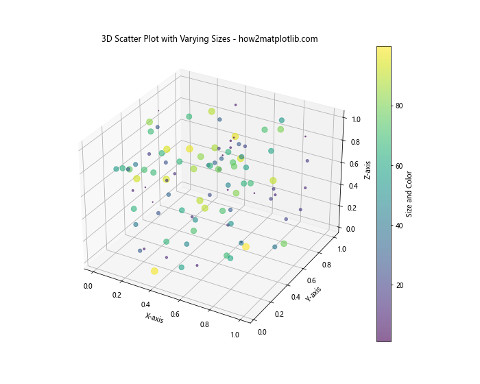
This 3D scatter plot uses point size to represent a fourth dimension of the data, in addition to the x, y, and z coordinates.
Combining Matplotlib Scatter Size with Other Plot Types
Matplotlib scatter size can be effectively combined with other types of plots to create rich, informative visualizations. Let’s look at an example that combines a scatter plot with a line plot:
import matplotlib.pyplot as plt
import numpy as np

x = np.linspace(0, 10, 50)
y1 = np.sin(x)
y2 = np.cos(x)
sizes = np.random.randint(20, 200, 50)

plt.figure(figsize=(12, 6))
plt.plot(x, y1, label='sin(x)')
plt.scatter(x, y2, s=sizes, c=y2, cmap='coolwarm', alpha=0.6, label='cos(x)')
plt.colorbar(label='cos(x) value')
plt.title('Combining Line Plot with Scatter Plot - how2matplotlib.com')
plt.xlabel('X-axis')
plt.ylabel('Y-axis')
plt.legend()
plt.show()
Output:
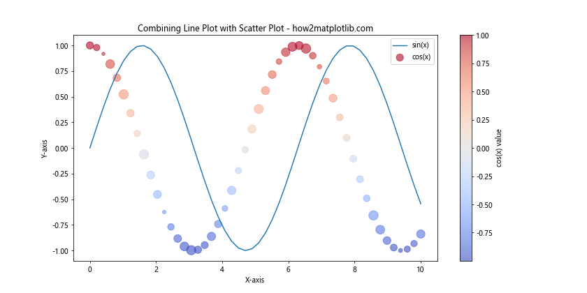
In this example, we’ve plotted sin(x) as a line and cos(x) as scatter points with varying sizes.
Best Practices for Using Matplotlib Scatter Size
When working with matplotlib scatter size, it’s important to follow some best practices to ensure your visualizations are effective and easy to interpret:
- Scale appropriately: Ensure that the range of sizes you use is appropriate for your plot. Too large sizes can obscure other points, while too small sizes can be hard to see.
Use a legend or colorbar: When size represents a variable, include a legend or colorbar to help readers interpret the sizes.
Consider overlapping: For dense datasets, consider using transparency (alpha) to handle overlapping points.
Consistent scaling: When comparing multiple scatter plots, use consistent size scaling across all plots.
Combine with color: Using both size and color can effectively represent two variables in one plot.
Here’s an example that demonstrates these best practices: