How to Create Stunning 3D Scatter Plots with Matplotlib: A Comprehensive Guide
Matplotlib scatter 3d is a powerful tool for visualizing three-dimensional data in Python. This article will explore the various aspects of creating 3D scatter plots using Matplotlib, providing detailed explanations and examples to help you master this visualization technique. Whether you’re a data scientist, researcher, or simply someone interested in data visualization, this guide will equip you with the knowledge and skills to create impressive 3D scatter plots.
Understanding Matplotlib Scatter 3D
Matplotlib scatter 3d is a feature of the Matplotlib library that allows users to create three-dimensional scatter plots. These plots are excellent for visualizing relationships between three variables simultaneously. Unlike 2D scatter plots, which show the relationship between two variables, 3D scatter plots add an extra dimension, providing a more comprehensive view of the data.
To create a matplotlib scatter 3d plot, you’ll need to use the Axes3D class from the mpl_toolkits.mplot3d module. This class extends the functionality of regular Matplotlib axes to support 3D plotting. Let’s start with a basic example:
import matplotlib.pyplot as plt
from mpl_toolkits.mplot3d import Axes3D
import numpy as np

# Generate sample data
x = np.random.rand(100)
y = np.random.rand(100)
z = np.random.rand(100)

# Create a 3D scatter plot
fig = plt.figure(figsize=(10, 8))
ax = fig.add_subplot(111, projection='3d')
ax.scatter(x, y, z)

# Set labels and title
ax.set_xlabel('X-axis')
ax.set_ylabel('Y-axis')
ax.set_zlabel('Z-axis')
ax.set_title('Basic Matplotlib Scatter 3D Plot - how2matplotlib.com')

plt.show()
Output:
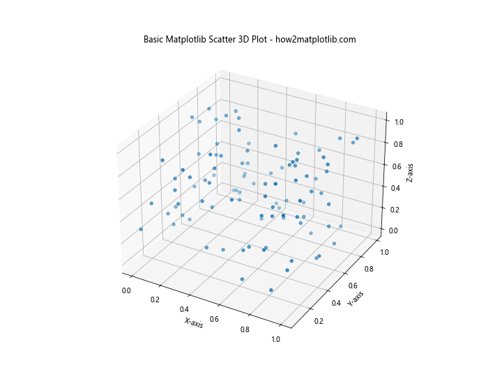
In this example, we first import the necessary modules and generate random data for our x, y, and z coordinates. We then create a figure and add a 3D subplot using add_subplot(111, projection='3d'). The scatter() method is used to create the 3D scatter plot, and we set labels for each axis and a title for the plot.
Customizing Matplotlib Scatter 3D Plots
One of the strengths of matplotlib scatter 3d is the ability to customize various aspects of the plot. Let’s explore some of these customization options:
Changing Marker Size and Color
You can adjust the size and color of the markers in your matplotlib scatter 3d plot to emphasize certain data points or improve visibility:
import matplotlib.pyplot as plt
from mpl_toolkits.mplot3d import Axes3D
import numpy as np

# Generate sample data
x = np.random.rand(100)
y = np.random.rand(100)
z = np.random.rand(100)

# Create a 3D scatter plot with custom marker size and color
fig = plt.figure(figsize=(10, 8))
ax = fig.add_subplot(111, projection='3d')
scatter = ax.scatter(x, y, z, s=50, c=z, cmap='viridis')

# Set labels and title
ax.set_xlabel('X-axis')
ax.set_ylabel('Y-axis')
ax.set_zlabel('Z-axis')
ax.set_title('Customized Matplotlib Scatter 3D Plot - how2matplotlib.com')

# Add a colorbar
plt.colorbar(scatter)

plt.show()
Output:
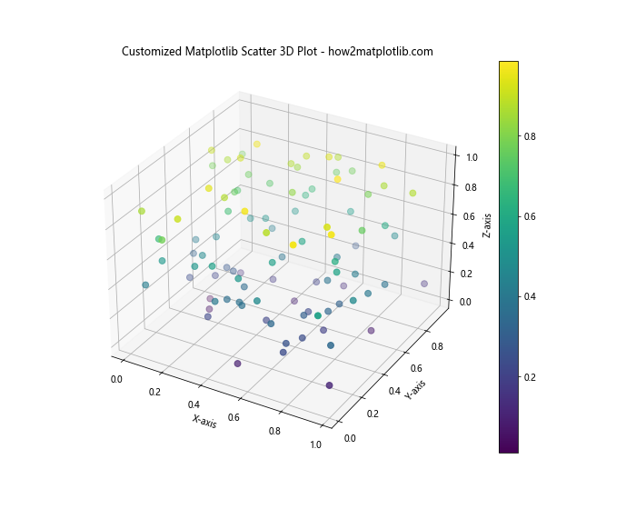
In this example, we use the s parameter to set the marker size to 50, and the c parameter to color the markers based on the z-values. The cmap parameter specifies the colormap to use. We also add a colorbar to show the relationship between colors and z-values.
Adding a Custom Colormap
Matplotlib scatter 3d plots can be enhanced by using custom colormaps. This can help in highlighting specific ranges of data or creating visually appealing plots:
import matplotlib.pyplot as plt
from mpl_toolkits.mplot3d import Axes3D
import numpy as np
from matplotlib.colors import LinearSegmentedColormap

# Generate sample data
x = np.random.rand(100)
y = np.random.rand(100)
z = np.random.rand(100)

# Create a custom colormap
colors = ['#1f77b4', '#ff7f0e', '#2ca02c', '#d62728', '#9467bd']
n_bins = len(colors)
cmap = LinearSegmentedColormap.from_list('Custom cmap', colors, N=n_bins)

# Create a 3D scatter plot with custom colormap
fig = plt.figure(figsize=(10, 8))
ax = fig.add_subplot(111, projection='3d')
scatter = ax.scatter(x, y, z, c=z, cmap=cmap)

# Set labels and title
ax.set_xlabel('X-axis')
ax.set_ylabel('Y-axis')
ax.set_zlabel('Z-axis')
ax.set_title('Matplotlib Scatter 3D with Custom Colormap - how2matplotlib.com')

# Add a colorbar
plt.colorbar(scatter)

plt.show()
Output:
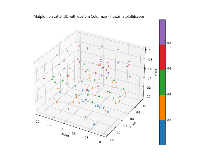
In this example, we create a custom colormap using LinearSegmentedColormap.from_list(). We define a list of colors and use them to create a new colormap. This custom colormap is then applied to our matplotlib scatter 3d plot.
Adding Labels and Annotations to Matplotlib Scatter 3D Plots
Labels and annotations can greatly enhance the information conveyed by your matplotlib scatter 3d plot. Let’s explore how to add these elements:
Adding Text Labels to Data Points
You can add text labels to specific data points in your matplotlib scatter 3d plot to highlight important information:
import matplotlib.pyplot as plt
from mpl_toolkits.mplot3d import Axes3D
import numpy as np

# Generate sample data
x = np.random.rand(10)
y = np.random.rand(10)
z = np.random.rand(10)

# Create a 3D scatter plot with labels
fig = plt.figure(figsize=(10, 8))
ax = fig.add_subplot(111, projection='3d')
scatter = ax.scatter(x, y, z)

# Add labels to each point
for i, (xi, yi, zi) in enumerate(zip(x, y, z)):
    ax.text(xi, yi, zi, f'Point {i+1}', fontsize=8)

# Set labels and title
ax.set_xlabel('X-axis')
ax.set_ylabel('Y-axis')
ax.set_zlabel('Z-axis')
ax.set_title('Matplotlib Scatter 3D with Point Labels - how2matplotlib.com')

plt.show()
Output:
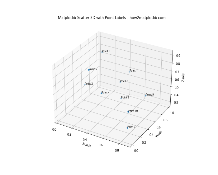
In this example, we use a loop to add a text label to each point in our matplotlib scatter 3d plot. The text() method is used to place the labels at the coordinates of each point.
Handling Large Datasets in Matplotlib Scatter 3D Plots
When working with large datasets, creating matplotlib scatter 3d plots can become challenging due to performance issues and visual clutter. Here are some techniques to handle large datasets effectively:
Using Alpha Transparency
Alpha transparency can help reduce visual clutter in matplotlib scatter 3d plots with many data points:
import matplotlib.pyplot as plt
from mpl_toolkits.mplot3d import Axes3D
import numpy as np

# Generate a large sample dataset
n_points = 10000
x = np.random.rand(n_points)
y = np.random.rand(n_points)
z = np.random.rand(n_points)

# Create a 3D scatter plot with alpha transparency
fig = plt.figure(figsize=(10, 8))
ax = fig.add_subplot(111, projection='3d')
scatter = ax.scatter(x, y, z, alpha=0.1)

# Set labels and title
ax.set_xlabel('X-axis')
ax.set_ylabel('Y-axis')
ax.set_zlabel('Z-axis')
ax.set_title('Matplotlib Scatter 3D with Alpha Transparency - how2matplotlib.com')

plt.show()
Output:
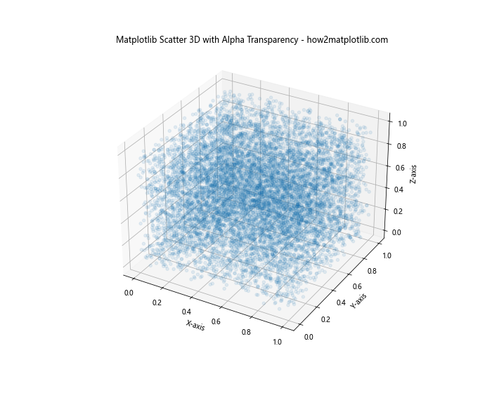
In this example, we set the alpha parameter to 0.1, which makes each point 90% transparent. This helps to reveal density patterns in the data that might otherwise be obscured.
Using a Subset of Data
Another approach to handling large datasets in matplotlib scatter 3d plots is to use a subset of the data:
import matplotlib.pyplot as plt
from mpl_toolkits.mplot3d import Axes3D
import numpy as np

# Generate a large sample dataset
n_points = 100000
x = np.random.rand(n_points)
y = np.random.rand(n_points)
z = np.random.rand(n_points)

# Create a 3D scatter plot with a subset of data
fig = plt.figure(figsize=(10, 8))
ax = fig.add_subplot(111, projection='3d')
subset_size = 10000
subset_indices = np.random.choice(n_points, subset_size, replace=False)
scatter = ax.scatter(x[subset_indices], y[subset_indices], z[subset_indices])

# Set labels and title
ax.set_xlabel('X-axis')
ax.set_ylabel('Y-axis')
ax.set_zlabel('Z-axis')
ax.set_title('Matplotlib Scatter 3D with Data Subset - how2matplotlib.com')

plt.show()
Output:
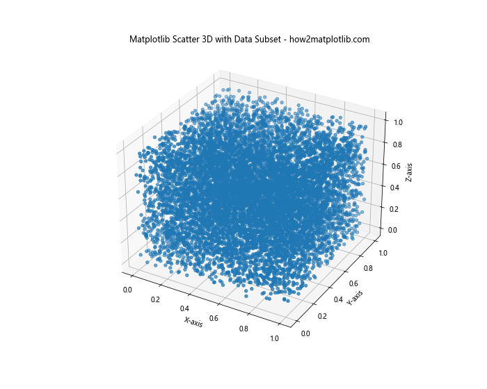
In this example, we randomly select a subset of 10,000 points from our larger dataset of 100,000 points. This approach can significantly improve performance while still providing a representative view of the data.
Advanced Techniques for Matplotlib Scatter 3D Plots
Let’s explore some advanced techniques to create more sophisticated matplotlib scatter 3d plots:
Creating Multiple Scatter Plots in One Figure
You can create multiple matplotlib scatter 3d plots in a single figure to compare different datasets or views:
import matplotlib.pyplot as plt
from mpl_toolkits.mplot3d import Axes3D
import numpy as np

# Generate sample data for two datasets
n_points = 1000
x1, y1, z1 = np.random.rand(3, n_points)
x2, y2, z2 = np.random.rand(3, n_points)

# Create a figure with two 3D scatter plots
fig = plt.figure(figsize=(15, 6))

# First subplot
ax1 = fig.add_subplot(121, projection='3d')
scatter1 = ax1.scatter(x1, y1, z1, c=z1, cmap='viridis')
ax1.set_title('Dataset 1 - how2matplotlib.com')

# Second subplot
ax2 = fig.add_subplot(122, projection='3d')
scatter2 = ax2.scatter(x2, y2, z2, c=z2, cmap='plasma')
ax2.set_title('Dataset 2 - how2matplotlib.com')

# Set labels for both subplots
for ax in [ax1, ax2]:
    ax.set_xlabel('X-axis')
    ax.set_ylabel('Y-axis')
    ax.set_zlabel('Z-axis')

# Add colorbars
plt.colorbar(scatter1, ax=ax1)
plt.colorbar(scatter2, ax=ax2)

plt.tight_layout()
plt.show()
Output:
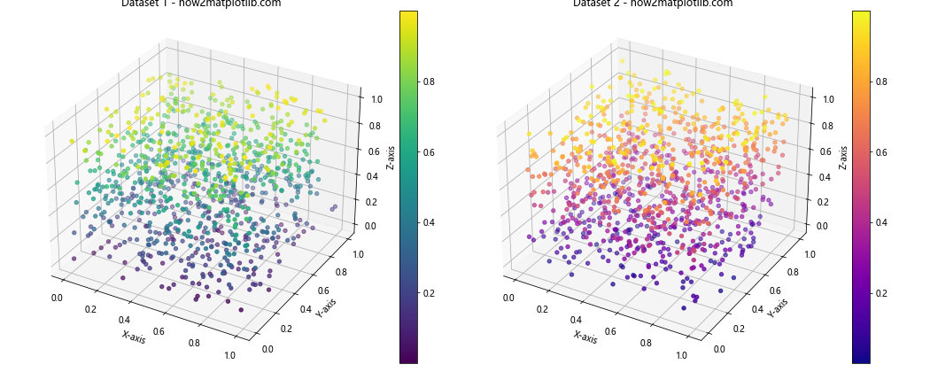
In this example, we create two matplotlib scatter 3d plots side by side in a single figure. This allows for easy comparison between two datasets or different views of the same data.
Animating Matplotlib Scatter 3D Plots
Animations can add an extra dimension to your matplotlib scatter 3d plots, allowing you to show changes over time or different perspectives:
import matplotlib.pyplot as plt
from mpl_toolkits.mplot3d import Axes3D
import numpy as np
from matplotlib.animation import FuncAnimation

# Generate sample data
n_points = 1000
x = np.random.rand(n_points)
y = np.random.rand(n_points)
z = np.random.rand(n_points)

# Create a figure and 3D axis
fig = plt.figure(figsize=(10, 8))
ax = fig.add_subplot(111, projection='3d')

# Initial scatter plot
scatter = ax.scatter(x, y, z)

# Set labels and title
ax.set_xlabel('X-axis')
ax.set_ylabel('Y-axis')
ax.set_zlabel('Z-axis')
ax.set_title('Animated Matplotlib Scatter 3D Plot - how2matplotlib.com')

# Animation update function
def update(frame):
    ax.view_init(elev=10., azim=frame)
    return scatter,

# Create the animation
anim = FuncAnimation(fig, update, frames=np.linspace(0, 360, 100), interval=50, blit=True)

plt.show()
Output:
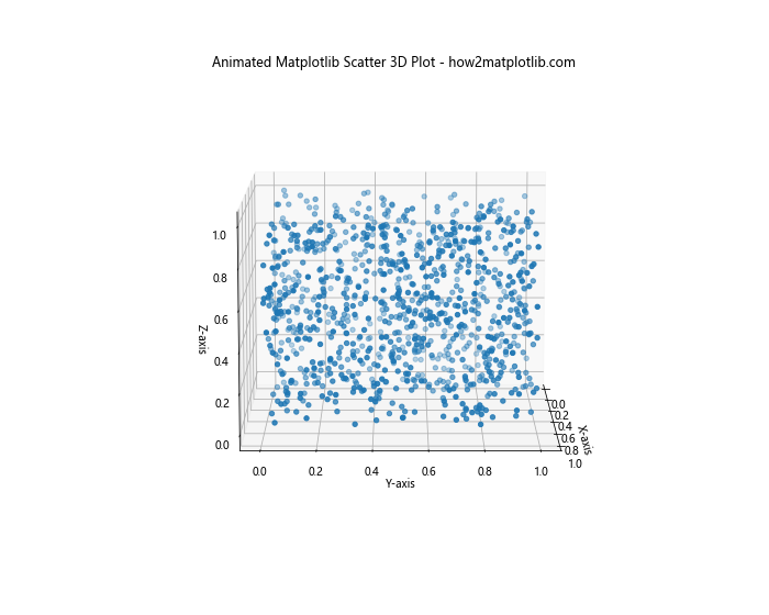
In this example, we create an animated matplotlib scatter 3d plot that rotates around the z-axis. The FuncAnimation class is used to create the animation, with the update function changing the view angle in each frame.
Combining Matplotlib Scatter 3D with Other Plot Types
Matplotlib scatter 3d plots can be combined with other types of plots to create more informative visualizations:
Combining Matplotlib Scatter 3D with Surface Plots
You can combine matplotlib scatter 3d plots with surface plots to show relationships between scattered points and a continuous surface:
import matplotlib.pyplot as plt
from mpl_toolkits.mplot3d import Axes3D
import numpy as np

# Generate data for the surface plot
x = np.linspace(-5, 5, 100)
y = np.linspace(-5, 5, 100)
X, Y = np.meshgrid(x, y)
Z = np.sin(np.sqrt(X**2 + Y**2))

# Generate data for the scatter plot
n_points = 500
x_scatter = np.random.uniform(-5, 5, n_points)
y_scatter = np.random.uniform(-5, 5, n_points)
z_scatter = np.sin(np.sqrt(x_scatter**2 + y_scatter**2)) + np.random.normal(0, 0.1, n_points)

# Create a figure and 3D axis
fig = plt.figure(figsize=(12, 10))
ax = fig.add_subplot(111, projection='3d')

# Plot the surface
surf = ax.plot_surface(X, Y, Z, cmap='viridis', alpha=0.7)

# Create the scatter plot
scatter = ax.scatter(x_scatter, y_scatter, z_scatter, c='red', s=20)

# Set labels and title
ax.set_xlabel('X-axis')
ax.set_ylabel('Y-axis')
ax.set_zlabel('Z-axis')
ax.set_title('Matplotlib Scatter 3D with Surface Plot - how2matplotlib.com')

# Add a colorbar for the surface plot
plt.colorbar(surf)

plt.show()
Output:
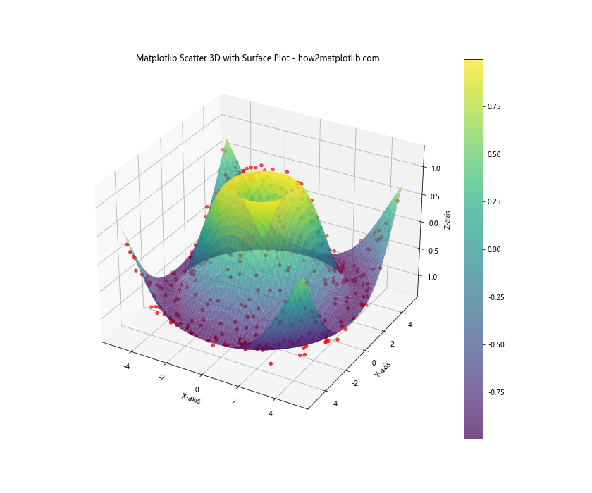
In this example, we create a surface plot using plot_surface() and overlay a scatter plot on top of it. This combination allows us to visualize how the scattered points relate to the underlying surface.
Optimizing Matplotlib Scatter 3D Plots for Performance
When working with large datasets or creating complex visualizations, optimizing your matplotlib scatter 3d plots for performance becomes crucial. Here are some techniques to improve the performance of your plots:
Using the plot() Method Instead of scatter()
For large datasets, using the plot() method instead of scatter() can significantly improve performance:
import matplotlib.pyplot as plt
from mpl_toolkits.mplot3d import Axes3D
import numpy as np

# Generate a large sample dataset
n_points = 100000
x = np.random.rand(n_points)
y = np.random.rand(n_points)
z = np.random.rand(n_points)

# Create a figure and 3D axis
fig = plt.figure(figsize=(10, 8))
ax = fig.add_subplot(111, projection='3d')

# Use plot() instead of scatter()
ax.plot(x, y, z, 'o', markersize=2, alpha=0.1)

# Set labels and title
ax.set_xlabel('X-axis')
ax.set_ylabel('Y-axis')
ax.set_zlabel('Z-axis')
ax.set_title('Optimized Matplotlib Scatter 3D Plot - how2matplotlib.com')

plt.show()
Output:
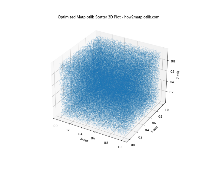
In this example, we use the plot() method with the ‘o’ marker style to create a scatter-like plot. This approach is generally faster than scatter() for large datasets.
Using view_init() for Optimal Viewing Angle
Finding the right viewing angle can help reveal patterns in your data. The view_init() method allows you to set the elevation and azimuth angles:
import matplotlib.pyplot as plt
from mpl_toolkits.mplot3d import Axes3D
import numpy as np

# Generate sample data
n_points = 5000
x = np.random.rand(n_points)
y = np.random.rand(n_points)
z = np.random.rand(n_points)

# Create a figure and 3D axis
fig = plt.figure(figsize=(10, 8))
ax = fig.add_subplot(111, projection='3d')

# Create the scatter plot
scatter = ax.scatter(x, y, z, c=z, cmap='viridis', s=10)

# Set the viewing angle
ax.view_init(elev=20, azim=45)

# Set labels and title
ax.set_xlabel('X-axis')
ax.set_ylabel('Y-axis')
ax.set_zlabel('Z-axis')
ax.set_title('Matplotlib Scatter 3D with Optimal Viewing Angle - how2matplotlib.com')

# Add a colorbar
plt.colorbar(scatter)

plt.show()
Output:
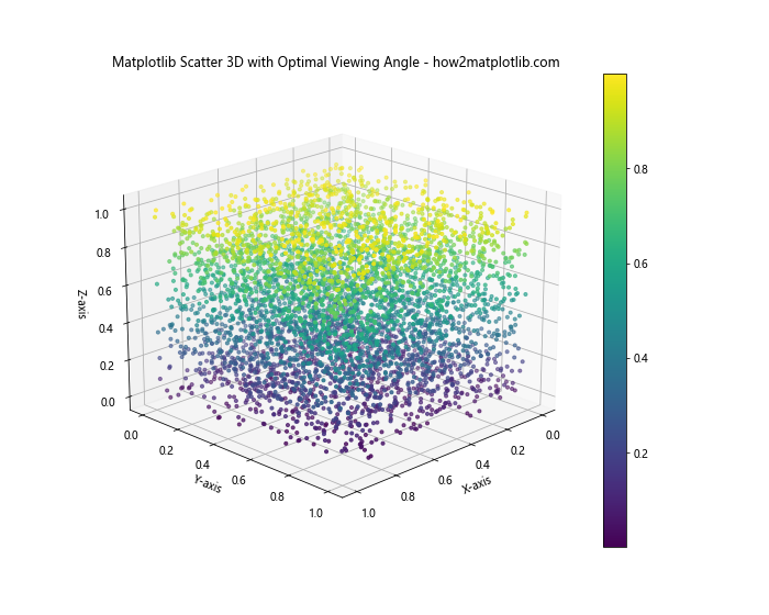
In this example, we use view_init() to set the elevation angle to 20 degrees and the azimuth angle to 45 degrees. Experiment with different angles to find the best view for your data.
Customizing Axes and Grids in Matplotlib Scatter 3D Plots
Customizing the axes and grids in your matplotlib scatter 3d plots can enhance their readability and aesthetic appeal:
Adjusting Axis Limits and Ticks
You can adjust the axis limits and ticks to focus on specific regions of your data:
import matplotlib.pyplot as plt
from mpl_toolkits.mplot3d import Axes3D
import numpy as np

# Generate sample data
n_points = 1000
x = np.random.rand(n_points) * 10
y = np.random.rand(n_points) * 10
z = np.random.rand(n_points) * 10

# Create a figure and 3D axis
fig = plt.figure(figsize=(10, 8))
ax = fig.add_subplot(111, projection='3d')

# Create the scatter plot
scatter = ax.scatter(x, y, z, c=z, cmap='viridis')

# Set axis limits
ax.set_xlim(0, 10)
ax.set_ylim(0, 10)
ax.set_zlim(0, 10)

# Set custom ticks
ax.set_xticks(np.arange(0, 11, 2))
ax.set_yticks(np.arange(0, 11, 2))
ax.set_zticks(np.arange(0, 11, 2))

# Set labels and title
ax.set_xlabel('X-axis')
ax.set_ylabel('Y-axis')
ax.set_zlabel('Z-axis')
ax.set_title('Matplotlib Scatter 3D with Custom Axes - how2matplotlib.com')

# Add a colorbar
plt.colorbar(scatter)

plt.show()
Output:
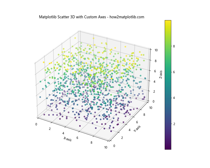
In this example, we set the axis limits using set_xlim(), set_ylim(), and set_zlim(). We also customize the tick locations using set_xticks(), set_yticks(), and set_zticks().
Customizing Grid Lines
You can customize the appearance of grid lines in your matplotlib scatter 3d plot:
import matplotlib.pyplot as plt
from mpl_toolkits.mplot3d import Axes3D
import numpy as np

# Generate sample data
n_points = 1000
x = np.random.rand(n_points)
y = np.random.rand(n_points)
z = np.random.rand(n_points)

# Create a figure and 3D axis
fig = plt.figure(figsize=(10, 8))
ax = fig.add_subplot(111, projection='3d')

# Create the scatter plot
scatter = ax.scatter(x, y, z, c=z, cmap='viridis')

# Customize grid lines
ax.grid(True, linestyle='--', linewidth=0.5, alpha=0.7)

# Set labels and title
ax.set_xlabel('X-axis')
ax.set_ylabel('Y-axis')
ax.set_zlabel('Z-axis')
ax.set_title('Matplotlib Scatter 3D with Custom Grid - how2matplotlib.com')

# Add a colorbar
plt.colorbar(scatter)

plt.show()
Output:
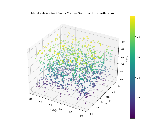
In this example, we use the grid() method to customize the appearance of the grid lines. We set the linestyle to dashed, adjust the linewidth, and set the alpha value for transparency.
Saving and Exporting Matplotlib Scatter 3D Plots
Once you’ve created your matplotlib scatter 3d plot, you may want to save it for later use or export it in various formats:
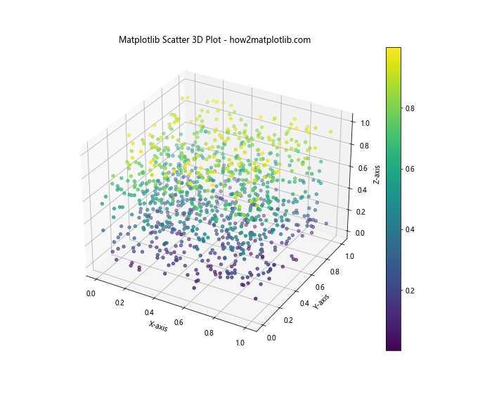
Saving as an Image File
You can save your matplotlib scatter 3d plot as an image file in various formats:
import matplotlib.pyplot as plt
from mpl_toolkits.mplot3d import Axes3D
import numpy as np

# Generate sample data
n_points = 1000
x = np.random.rand(n_points)
y = np.random.rand(n_points)
z = np.random.rand(n_points)

# Create a figure and 3D axis
fig = plt.figure(figsize=(10, 8))
ax = fig.add_subplot(111, projection='3d')

# Create the scatter plot
scatter = ax.scatter(x, y, z, c=z, cmap='viridis')

# Set labels and title
ax.set_xlabel('X-axis')
ax.set_ylabel('Y-axis')
ax.set_zlabel('Z-axis')
ax.set_title('Matplotlib Scatter 3D Plot - how2matplotlib.com')

# Add a colorbar
plt.colorbar(scatter)

# Save the plot as a PNG file
plt.savefig('matplotlib_scatter_3d_plot.png', dpi=300, bbox_inches='tight')

plt.show()
Output:

In this example, we use plt.savefig() to save the plot as a PNG file. The dpi parameter sets the resolution, and bbox_inches='tight' ensures that the entire plot is saved without cutting off any parts.
Exporting as a Vector Graphics File
For high-quality prints or further editing, you can export your matplotlib scatter 3d plot as a vector graphics file:
import matplotlib.pyplot as plt
from mpl_toolkits.mplot3d import Axes3D
import numpy as np

# Generate sample data
n_points = 1000
x = np.random.rand(n_points)
y = np.random.rand(n_points)
z = np.random.rand(n_points)

# Create a figure and 3D axis
fig = plt.figure(figsize=(10, 8))
ax = fig.add_subplot(111, projection='3d')

# Create the scatter plot
scatter = ax.scatter(x, y, z, c=z, cmap='viridis')

# Set labels and title
ax.set_xlabel('X-axis')
ax.set_ylabel('Y-axis')
ax.set_zlabel('Z-axis')
ax.set_title('Matplotlib Scatter 3D Plot - how2matplotlib.com')

# Add a colorbar
plt.colorbar(scatter)

# Save the plot as an SVG file
plt.savefig('matplotlib_scatter_3d_plot.svg', format='svg', bbox_inches='tight')

plt.show()
Output:
In this example, we save the plot as an SVG file, which is a vector graphics format. This allows for scaling without loss of quality and easy editing in vector graphics software.
Matplotlib Scatter 3D Conclusion
Matplotlib scatter 3d is a powerful tool for visualizing three-dimensional data in Python. Throughout this comprehensive guide, we’ve explored various aspects of creating and customizing 3D scatter plots using Matplotlib. From basic plots to advanced techniques, we’ve covered a wide range of topics to help you master the art of 3D data visualization.
Key takeaways from this guide include:
- The basics of creating matplotlib scatter 3d plots using the
Axes3Dclass. - Customizing plot appearance through marker size, color, and custom colormaps.
- Adding labels and annotations to enhance the information conveyed by the plot.
- Techniques for handling large datasets, including alpha transparency and data subsets.
- Advanced techniques such as creating multiple plots and animations.
- Combining matplotlib scatter 3d plots with other plot types for more comprehensive visualizations.
- Optimizing plots for performance and finding the best viewing angles.
- Customizing axes and grids to improve readability and aesthetics.
- Saving and exporting plots in various formats for different use cases.
By mastering these techniques, you’ll be well-equipped to create stunning and informative 3D visualizations using matplotlib scatter 3d. Remember to experiment with different approaches and customize your plots to best suit your data and audience.