How to Use Matplotlib Scatter Color by Value: A Comprehensive Guide
Matplotlib scatter color by value is a powerful technique for visualizing data in scatter plots. This article will explore various aspects of using color to represent values in scatter plots using Matplotlib, a popular data visualization library in Python. We’ll cover everything from basic concepts to advanced techniques, providing numerous examples along the way.
Understanding Matplotlib Scatter Color by Value
Matplotlib scatter color by value is a method of representing data points in a scatter plot where the color of each point is determined by a corresponding value. This technique allows you to add an extra dimension to your visualization, making it possible to display three-dimensional data on a two-dimensional plot.
Let’s start with a simple example to illustrate this concept:
import matplotlib.pyplot as plt
import numpy as np

# Generate sample data
x = np.random.rand(50)
y = np.random.rand(50)
values = np.random.rand(50)

# Create scatter plot with color mapped to values
plt.figure(figsize=(8, 6))
scatter = plt.scatter(x, y, c=values, cmap='viridis')
plt.colorbar(scatter)
plt.title('Matplotlib Scatter Color by Value - how2matplotlib.com')
plt.xlabel('X-axis')
plt.ylabel('Y-axis')
plt.show()
Output:
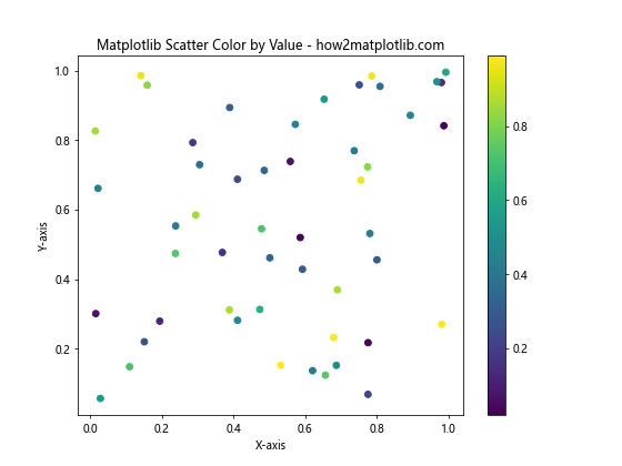
In this example, we create a scatter plot where the color of each point is determined by the values array. The cmap parameter specifies the colormap to use, and we add a colorbar to show the mapping between colors and values.
Choosing the Right Colormap
When using matplotlib scatter color by value, selecting an appropriate colormap is crucial for effectively conveying information. Matplotlib offers a wide range of colormaps, each suited for different types of data and visualization goals.
Here’s an example comparing different colormaps:
import matplotlib.pyplot as plt
import numpy as np

# Generate sample data
x = np.random.rand(100)
y = np.random.rand(100)
values = np.random.rand(100)

# Create subplots for different colormaps
fig, axs = plt.subplots(2, 2, figsize=(12, 10))
cmaps = ['viridis', 'plasma', 'coolwarm', 'YlOrRd']

for ax, cmap in zip(axs.flat, cmaps):
    scatter = ax.scatter(x, y, c=values, cmap=cmap)
    ax.set_title(f'Colormap: {cmap}')
    plt.colorbar(scatter, ax=ax)
    ax.set_xlabel('X-axis')
    ax.set_ylabel('Y-axis')

plt.suptitle('Matplotlib Scatter Color by Value - Colormap Comparison - how2matplotlib.com')
plt.tight_layout()
plt.show()
Output:
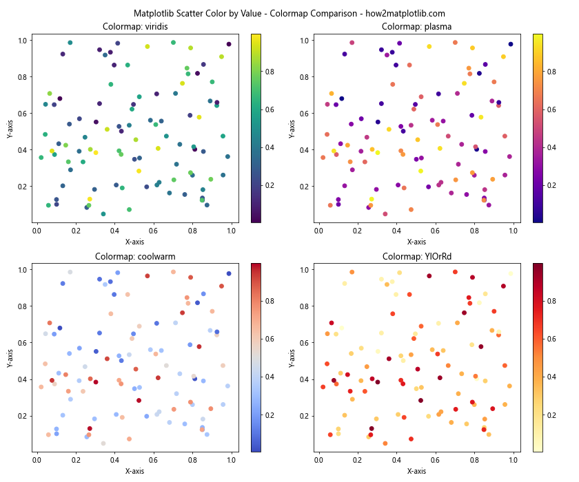
This example demonstrates four different colormaps: ‘viridis’, ‘plasma’, ‘coolwarm’, and ‘YlOrRd’. Each subplot uses a different colormap to represent the same data, allowing you to compare their effectiveness.
Customizing Color Ranges
When using matplotlib scatter color by value, you may want to customize the range of colors to highlight specific aspects of your data. This can be achieved by setting the vmin and vmax parameters in the scatter function.
Here’s an example illustrating how to customize color ranges:
import matplotlib.pyplot as plt
import numpy as np

# Generate sample data
x = np.random.rand(100)
y = np.random.rand(100)
values = np.random.randn(100)  # Use normal distribution for values

# Create scatter plot with custom color range
plt.figure(figsize=(10, 6))
scatter = plt.scatter(x, y, c=values, cmap='coolwarm', vmin=-2, vmax=2)
plt.colorbar(scatter)
plt.title('Matplotlib Scatter Color by Value - Custom Color Range - how2matplotlib.com')
plt.xlabel('X-axis')
plt.ylabel('Y-axis')
plt.show()
Output:
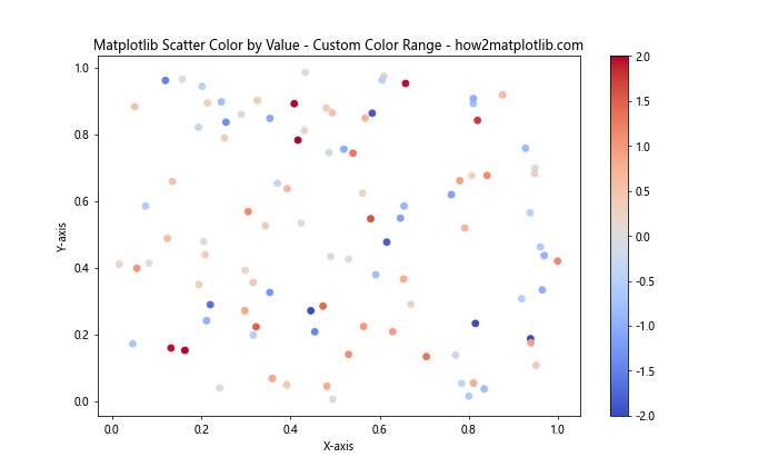
In this example, we set vmin=-2 and vmax=2 to focus on values within two standard deviations of the mean. This helps to highlight the distribution of values more effectively.
Using Discrete Colors
While continuous colormaps are common for matplotlib scatter color by value, you can also use discrete colors to represent categories or ranges of values. This is particularly useful when dealing with categorical data or when you want to emphasize specific thresholds.
Here’s an example of using discrete colors:
import matplotlib.pyplot as plt
import numpy as np

# Generate sample data
x = np.random.rand(200)
y = np.random.rand(200)
values = np.random.randint(0, 4, 200)

# Define discrete colors and labels
colors = ['red', 'green', 'blue', 'purple']
labels = ['Category A', 'Category B', 'Category C', 'Category D']

# Create scatter plot with discrete colors
plt.figure(figsize=(10, 6))
scatter = plt.scatter(x, y, c=[colors[v] for v in values])

# Add legend
legend_elements = [plt.Line2D([0], [0], marker='o', color='w', label=label,
                   markerfacecolor=color, markersize=10)
                   for color, label in zip(colors, labels)]
plt.legend(handles=legend_elements, title='Categories')

plt.title('Matplotlib Scatter Color by Value - Discrete Colors - how2matplotlib.com')
plt.xlabel('X-axis')
plt.ylabel('Y-axis')
plt.show()
Output:
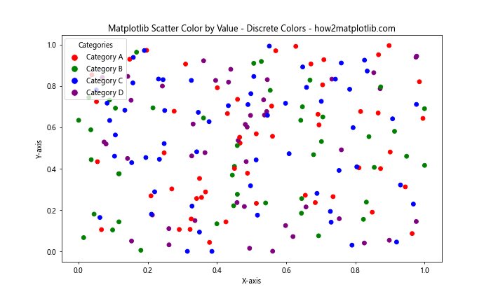
This example uses discrete colors to represent four different categories. We create a custom legend to show the mapping between colors and categories.
Handling Large Datasets
When dealing with large datasets, matplotlib scatter color by value can become computationally intensive and may result in overlapping points. In such cases, you can use techniques like alpha blending or hexbin plots to better visualize the data distribution.
Here’s an example using alpha blending:
import matplotlib.pyplot as plt
import numpy as np

# Generate large sample data
n_points = 10000
x = np.random.randn(n_points)
y = np.random.randn(n_points)
values = np.random.rand(n_points)

# Create scatter plot with alpha blending
plt.figure(figsize=(10, 6))
scatter = plt.scatter(x, y, c=values, cmap='viridis', alpha=0.5)
plt.colorbar(scatter)
plt.title('Matplotlib Scatter Color by Value - Large Dataset - how2matplotlib.com')
plt.xlabel('X-axis')
plt.ylabel('Y-axis')
plt.show()
Output:
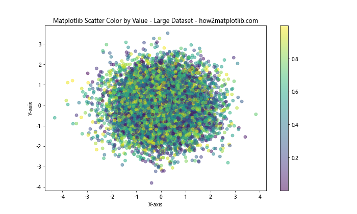
In this example, we use alpha=0.5 to make the points semi-transparent, allowing us to see overlapping data points more clearly.
Combining with Other Plot Types
Matplotlib scatter color by value can be combined with other plot types to create more complex visualizations. For example, you can overlay a scatter plot on top of a contour plot or a heatmap.
Here’s an example combining a scatter plot with a contour plot:
import matplotlib.pyplot as plt
import numpy as np

# Generate sample data
x = np.random.rand(100)
y = np.random.rand(100)
z = np.sin(x*10) + np.cos(y*10)

# Create contour plot
plt.figure(figsize=(10, 6))
xx, yy = np.meshgrid(np.linspace(0, 1, 100), np.linspace(0, 1, 100))
zz = np.sin(xx*10) + np.cos(yy*10)
contour = plt.contourf(xx, yy, zz, cmap='coolwarm', alpha=0.5)

# Overlay scatter plot
scatter = plt.scatter(x, y, c=z, cmap='viridis', edgecolor='black')

plt.colorbar(scatter, label='Z-value')
plt.title('Matplotlib Scatter Color by Value with Contour Plot - how2matplotlib.com')
plt.xlabel('X-axis')
plt.ylabel('Y-axis')
plt.show()
Output:
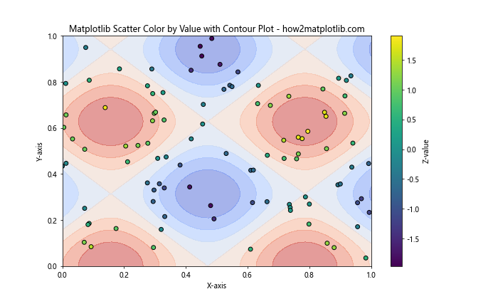
This example creates a contour plot of a 2D function and overlays a scatter plot with points colored according to their z-values.
Handling Missing Data
When working with real-world datasets, you may encounter missing values. Matplotlib scatter color by value can be adapted to handle such cases by using masked arrays or custom colormaps.
Here’s an example of handling missing data:
import matplotlib.pyplot as plt
import numpy as np

# Generate sample data with missing values
x = np.random.rand(100)
y = np.random.rand(100)
values = np.random.rand(100)
values[np.random.choice(100, 20, replace=False)] = np.nan  # Introduce missing values

# Create custom colormap with a color for missing values
cmap = plt.cm.viridis
cmap.set_bad('gray')

# Create scatter plot
plt.figure(figsize=(10, 6))
scatter = plt.scatter(x, y, c=values, cmap=cmap)
plt.colorbar(scatter)
plt.title('Matplotlib Scatter Color by Value - Handling Missing Data - how2matplotlib.com')
plt.xlabel('X-axis')
plt.ylabel('Y-axis')
plt.show()
Output:
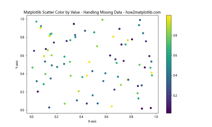
In this example, we introduce missing values (NaN) into our dataset and use a custom colormap that assigns a specific color (gray) to represent missing data points.
Creating Animated Scatter Plots
Matplotlib scatter color by value can be used to create animated visualizations, allowing you to show how data changes over time or across different dimensions.
Here’s an example of creating a simple animated scatter plot:
import matplotlib.pyplot as plt
import numpy as np
from matplotlib.animation import FuncAnimation

# Generate initial data
n_points = 100
x = np.random.rand(n_points)
y = np.random.rand(n_points)
values = np.random.rand(n_points)

# Create figure and scatter plot
fig, ax = plt.subplots(figsize=(8, 6))
scatter = ax.scatter(x, y, c=values, cmap='viridis')
plt.colorbar(scatter)

# Update function for animation
def update(frame):
    global values
    values = np.roll(values, 1)  # Shift values
    scatter.set_array(values)
    return scatter,

# Create animation
ani = FuncAnimation(fig, update, frames=100, interval=50, blit=True)

plt.title('Animated Matplotlib Scatter Color by Value - how2matplotlib.com')
plt.xlabel('X-axis')
plt.ylabel('Y-axis')
plt.show()
Output:
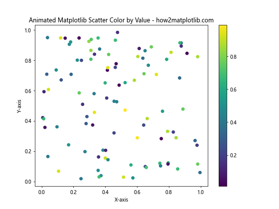
This example creates an animated scatter plot where the colors of the points change over time, simulating a dynamic dataset.
Using Custom Colormaps
While Matplotlib provides many built-in colormaps, you can also create custom colormaps to suit your specific needs when using matplotlib scatter color by value.
Here’s an example of creating and using a custom colormap:
import matplotlib.pyplot as plt
import numpy as np
from matplotlib.colors import LinearSegmentedColormap

# Generate sample data
x = np.random.rand(100)
y = np.random.rand(100)
values = np.random.rand(100)

# Define custom colormap
colors = ['darkblue', 'royalblue', 'lightgreen', 'yellow', 'red']
n_bins = 100
cmap = LinearSegmentedColormap.from_list('custom_cmap', colors, N=n_bins)

# Create scatter plot with custom colormap
plt.figure(figsize=(10, 6))
scatter = plt.scatter(x, y, c=values, cmap=cmap)
plt.colorbar(scatter)
plt.title('Matplotlib Scatter Color by Value - Custom Colormap - how2matplotlib.com')
plt.xlabel('X-axis')
plt.ylabel('Y-axis')
plt.show()
Output:
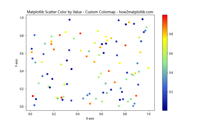
This example creates a custom colormap that transitions from dark blue to red, passing through royal blue, light green, and yellow. The custom colormap is then applied to the scatter plot.
Adjusting Point Sizes
In addition to using color to represent values, you can also adjust the size of the points in a scatter plot to convey additional information.
Here’s an example that combines matplotlib scatter color by value with varying point sizes:
import matplotlib.pyplot as plt
import numpy as np

# Generate sample data
x = np.random.rand(100)
y = np.random.rand(100)
colors = np.random.rand(100)
sizes = 100 * np.random.rand(100)

# Create scatter plot with varying colors and sizes
plt.figure(figsize=(10, 6))
scatter = plt.scatter(x, y, c=colors, s=sizes, cmap='viridis', alpha=0.7)
plt.colorbar(scatter)
plt.title('Matplotlib Scatter Color by Value with Varying Sizes - how2matplotlib.com')
plt.xlabel('X-axis')
plt.ylabel('Y-axis')
plt.show()
Output:
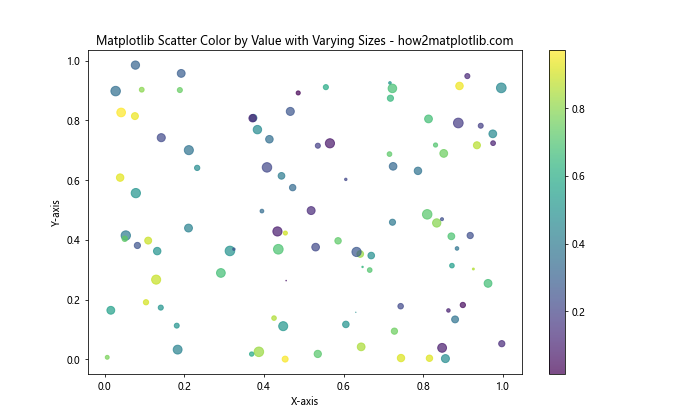
In this example, both the color and size of each point vary based on different values, allowing you to represent two additional dimensions of data in a single plot.
Handling Categorical Data
While matplotlib scatter color by value is often used with continuous data, it can also be adapted for categorical data. This involves using discrete colors and creating a custom legend.
Here’s an example of using scatter plots with categorical data:
import matplotlib.pyplot as plt
import numpy as np

# Generate sample categorical data
categories = ['A', 'B', 'C', 'D']
x = np.random.rand(100)
y = np.random.rand(100)
cat_values = np.random.choice(categories, 100)

# Define color mapping
color_map = {'A': 'red', 'B': 'green', 'C': 'blue', 'D': 'purple'}

# Create scatter plot
plt.figure(figsize=(10, 6))
for cat in categories:
    mask = cat_values == cat
    plt.scatter(x[mask], y[mask], c=color_map[cat], label=cat, alpha=0.7)

plt.legend()
plt.title('Matplotlib Scatter Color by Categorical Value - how2matplotlib.com')
plt.xlabel('X-axis')
plt.ylabel('Y-axis')
plt.show()
Output:
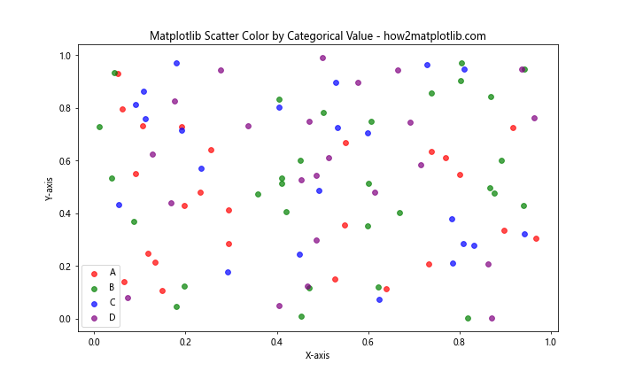
This example creates a scatter plot where each point is colored according to its category, with a legend showing the mapping between categories and colors.
Creating 3D Scatter Plots
Matplotlib scatter color by value can be extended to 3D scatter plots, allowing you to visualize four-dimensional data (three spatial dimensions plus color).
Here’s an example of a 3D scatter plot with color representing a fourth dimension:
import matplotlib.pyplot as plt
import numpy as np

# Generate sample 3D data
n_points = 1000
x = np.random.rand(n_points)
y = np.random.rand(n_points)
z = np.random.rand(n_points)
values = np.sin(x*10) + np.cos(y*10) + np.sin(z*10)

# Create 3D scatter plot
fig = plt.figure(figsize=(10, 8))
ax = fig.add_subplot(111, projection='3d')
scatter = ax.scatter(x, y, z, c=values, cmap='viridis')

plt.colorbar(scatter)
ax.set_title('3D Matplotlib Scatter Color by Value - how2matplotlib.com')
ax.set_xlabel('X-axis')
ax.set_ylabel('Y-axis')
ax.set_zlabel('Z-axis')
plt.show()
Output:
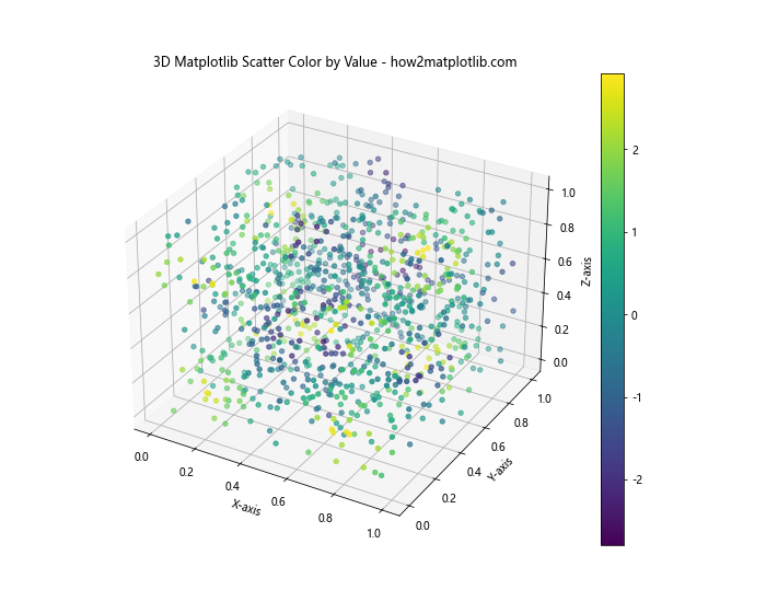
This example creates a 3D scatter plot where the color of each point is determined by a function of its x, y, and z coordinates.
Optimizing for Large Datasets
When dealing with very large datasets, rendering individual points can become slow and may not effectively show the data distribution. In such cases, you can use techniques like hexbin plots or 2D histograms.
Here’s an example using a hexbin plot:
import matplotlib.pyplot as plt
import numpy as np

# Generate large sample data
n_points = 100000
x = np.random.randn(n_points)
y = np.random.randn(n_points)
values = x*y

# Create hexbin plot
plt.figure(figsize=(10, 6))
hb = plt.hexbin(x, y, C=values, gridsize=50, cmap='viridis')
plt.colorbar(hb, label='Density')
plt.title('Matplotlib Hexbin Plot for Large Datasets - how2matplotlib.com')
plt.xlabel('X-axis')
plt.ylabel('Y-axis')
plt.show()
Output:
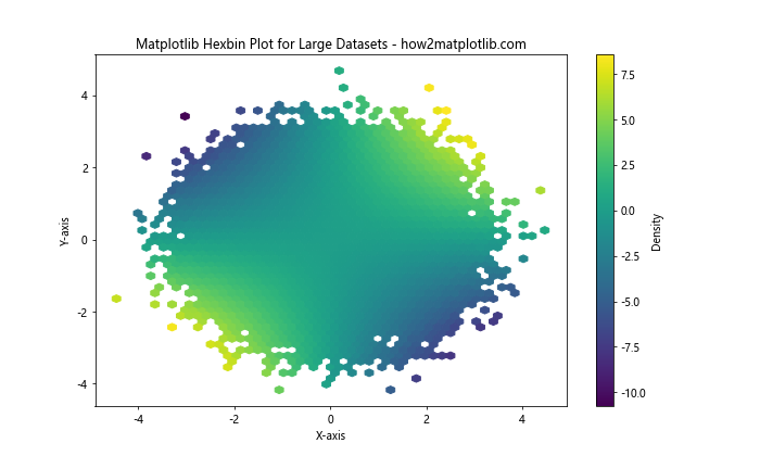
This example uses a hexbin plot to visualize a large dataset, where the color of each hexagon represents the density or average value of points in that area.
Combining with Subplots
Matplotlib scatter color by value can be combined with subplots to create more complex visualizations or to compare different aspects of your data.
Here’s an example using subplots:
import matplotlib.pyplot as plt
import numpy as np

# Generate sample data
x = np.random.rand(100)
y = np.random.rand(100)
values1 = np.sin(x*10)
values2 = np.cos(y*10)

# Create subplots
fig, (ax1, ax2) = plt.subplots(1, 2, figsize=(12, 5))

# First subplot
scatter1 = ax1.scatter(x, y, c=values1, cmap='viridis')
ax1.set_title('Scatter Plot 1')
ax1.set_xlabel('X-axis')
ax1.set_ylabel('Y-axis')
plt.colorbar(scatter1, ax=ax1)

# Second subplot
scatter2 = ax2.scatter(x, y, c=values2, cmap='plasma')
ax2.set_title('Scatter Plot 2')
ax2.set_xlabel('X-axis')
ax2.set_ylabel('Y-axis')
plt.colorbar(scatter2, ax=ax2)

plt.suptitle('Matplotlib Scatter Color by Value - Subplots - how2matplotlib.com')
plt.tight_layout()
plt.show()
Output:
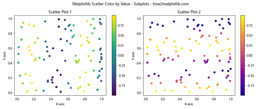
This example creates two scatter plots side by side, each using a different set of values for coloring the points.
Adding Text Labels
You can enhance your matplotlib scatter color by value plots by adding text labels to specific points of interest.
Here’s an example that adds labels to the top 5 points with the highest values:
import matplotlib.pyplot as plt
import numpy as np

# Generate sample data
x = np.random.rand(50)
y = np.random.rand(50)
values = np.random.rand(50)

# Create scatter plot
plt.figure(figsize=(10, 6))
scatter = plt.scatter(x, y, c=values, cmap='viridis')
plt.colorbar(scatter)

# Add labels to top 5 points
top_5_indices = np.argsort(values)[-5:]
for i in top_5_indices:
    plt.annotate(f'Point {i}', (x[i], y[i]), xytext=(5, 5), textcoords='offset points')

plt.title('Matplotlib Scatter Color by Value with Labels - how2matplotlib.com')
plt.xlabel('X-axis')
plt.ylabel('Y-axis')
plt.show()
Output:
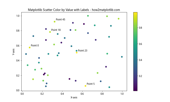
This example adds text labels to the five points with the highest values, making it easy to identify specific data points of interest.
Creating Bubble Charts
Bubble charts are a variation of scatter plots where the size of each point represents an additional dimension of data. You can combine this with matplotlib scatter color by value to create informative visualizations.
Here’s an example of a bubble chart:
import matplotlib.pyplot as plt
import numpy as np

# Generate sample data
x = np.random.rand(50)
y = np.random.rand(50)
colors = np.random.rand(50)
sizes = 1000 * np.random.rand(50)

# Create bubble chart
plt.figure(figsize=(10, 6))
scatter = plt.scatter(x, y, c=colors, s=sizes, alpha=0.6, cmap='viridis')
plt.colorbar(scatter)
plt.title('Matplotlib Bubble Chart with Color by Value - how2matplotlib.com')
plt.xlabel('X-axis')
plt.ylabel('Y-axis')
plt.show()
Output:
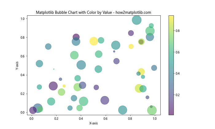
In this example, the color of each bubble represents one value, while the size represents another, allowing you to visualize four dimensions of data in a single plot.
Handling Time Series Data
Matplotlib scatter color by value can be used effectively with time series data to show how values change over time.
Here’s an example using datetime data:
import matplotlib.pyplot as plt
import numpy as np
import pandas as pd

# Generate sample time series data
dates = pd.date_range(start='2023-01-01', end='2023-12-31', freq='D')
values = np.cumsum(np.random.randn(len(dates)))

# Create scatter plot
plt.figure(figsize=(12, 6))
scatter = plt.scatter(dates, values, c=values, cmap='coolwarm')
plt.colorbar(scatter)
plt.title('Matplotlib Scatter Color by Value - Time Series - how2matplotlib.com')
plt.xlabel('Date')
plt.ylabel('Value')
plt.xticks(rotation=45)
plt.tight_layout()
plt.show()
Output:
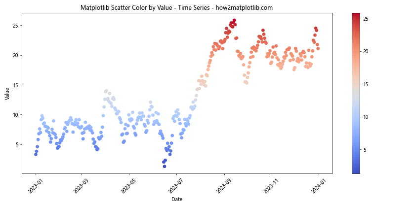
This example creates a scatter plot of time series data where the color of each point represents its value, allowing you to easily identify trends and anomalies over time.
Matplotlib scatter color by value Conclusion
Matplotlib scatter color by value is a versatile and powerful technique for visualizing multidimensional data. By mapping colors to values, you can add an extra dimension to your scatter plots, making it possible to represent complex relationships in your data more effectively.
Throughout this article, we’ve explored various aspects of using matplotlib scatter color by value, including:
- Basic concepts and implementation
- Choosing and customizing colormaps
- Handling large datasets and optimizing performance
- Combining with other plot types and creating subplots
- Dealing with categorical data and missing values
- Creating animated and 3D scatter plots
- Using custom colormaps and adjusting point sizes
- Adding text labels and using logarithmic color scales
- Creating bubble charts and handling time series data
By mastering these techniques, you’ll be able to create more informative and visually appealing scatter plots that effectively communicate the patterns and relationships in your data.
Remember that the key to creating effective visualizations with matplotlib scatter color by value is to choose appropriate colormaps, scales, and additional visual elements that best suit your data and the story you want to tell. Experiment with different approaches and always consider your audience when designing your plots.