How to Customize Matplotlib Scatter Plot Marker Size: A Comprehensive Guide
Matplotlib scatter marker size is an essential aspect of creating effective and visually appealing scatter plots. In this comprehensive guide, we’ll explore various techniques and methods to customize the marker size in Matplotlib scatter plots. We’ll cover everything from basic size adjustments to advanced techniques for creating dynamic and informative visualizations. By the end of this article, you’ll have a thorough understanding of how to manipulate matplotlib scatter marker size to enhance your data visualizations.
Understanding Matplotlib Scatter Plots and Marker Size
Before diving into the specifics of customizing matplotlib scatter marker size, let’s first understand what scatter plots are and why marker size is important. Scatter plots are two-dimensional plots that use dots to represent the values of two different variables. The position of each dot on the horizontal and vertical axis represents the values of the individual data points.
The marker size in a scatter plot refers to the size of these individual dots. By adjusting the matplotlib scatter marker size, you can convey additional information about your data points, emphasize certain aspects of your data, or simply improve the overall aesthetics of your visualization.
Here’s a basic example of a scatter plot with default marker sizes:
import matplotlib.pyplot as plt
import numpy as np

x = np.random.rand(50)
y = np.random.rand(50)

plt.figure(figsize=(8, 6))
plt.scatter(x, y)
plt.title("Basic Scatter Plot - how2matplotlib.com")
plt.xlabel("X-axis")
plt.ylabel("Y-axis")
plt.show()
Output:
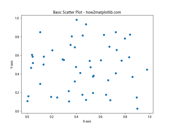
In this example, we create a simple scatter plot using random data points. The marker size is set to the default value, which is typically 6 points (or 20 pixels).
Setting a Uniform Matplotlib Scatter Marker Size
One of the simplest ways to customize the matplotlib scatter marker size is to set a uniform size for all markers. This can be achieved using the s parameter in the plt.scatter() function. The s parameter accepts a single value or an array-like object of values representing the marker area in points^2.
Here’s an example of setting a uniform marker size:
import matplotlib.pyplot as plt
import numpy as np

x = np.random.rand(50)
y = np.random.rand(50)

plt.figure(figsize=(8, 6))
plt.scatter(x, y, s=100)
plt.title("Scatter Plot with Uniform Marker Size - how2matplotlib.com")
plt.xlabel("X-axis")
plt.ylabel("Y-axis")
plt.show()
Output:
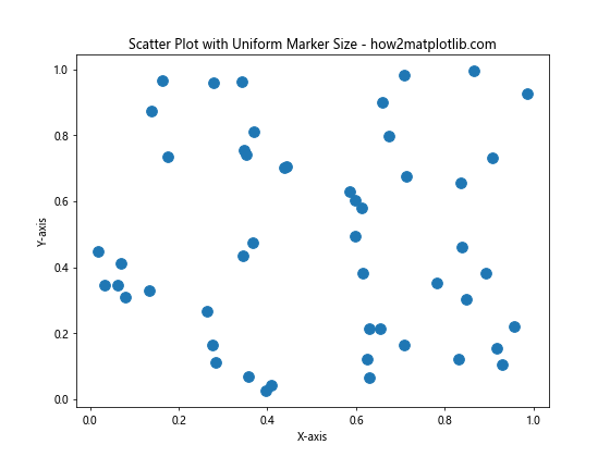
In this example, we set the s parameter to 100, which results in larger markers compared to the default size. The marker size is now uniform across all data points.
Varying Matplotlib Scatter Marker Size Based on Data
One of the most powerful features of matplotlib scatter plots is the ability to vary marker sizes based on a third variable. This allows you to represent three-dimensional data in a two-dimensional plot. To achieve this, you can pass an array of values to the s parameter, where each value corresponds to the size of the respective data point.
Here’s an example of varying marker sizes based on a third variable:
import matplotlib.pyplot as plt
import numpy as np

x = np.random.rand(50)
y = np.random.rand(50)
sizes = np.random.rand(50) * 500  # Generate random sizes between 0 and 500

plt.figure(figsize=(8, 6))
plt.scatter(x, y, s=sizes, alpha=0.5)
plt.title("Scatter Plot with Varying Marker Sizes - how2matplotlib.com")
plt.xlabel("X-axis")
plt.ylabel("Y-axis")
plt.colorbar(label="Marker Size")
plt.show()
Output:
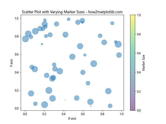
In this example, we generate random sizes for each data point and pass them to the s parameter. We also set alpha=0.5 to make the markers semi-transparent, which can help when dealing with overlapping points.
Scaling Matplotlib Scatter Marker Size
When working with real-world data, you may need to scale the marker sizes to fit within a reasonable range. This is particularly important when dealing with widely varying values. Matplotlib doesn’t provide built-in scaling for marker sizes, but you can easily implement your own scaling function.
Here’s an example of scaling marker sizes using a custom function:
import matplotlib.pyplot as plt
import numpy as np

def scale_sizes(sizes, min_size=20, max_size=200):
    return ((sizes - np.min(sizes)) / (np.max(sizes) - np.min(sizes))) * (max_size - min_size) + min_size

x = np.random.rand(50)
y = np.random.rand(50)
original_sizes = np.random.randint(1, 1000, 50)
scaled_sizes = scale_sizes(original_sizes)

plt.figure(figsize=(8, 6))
plt.scatter(x, y, s=scaled_sizes, alpha=0.5)
plt.title("Scatter Plot with Scaled Marker Sizes - how2matplotlib.com")
plt.xlabel("X-axis")
plt.ylabel("Y-axis")
plt.colorbar(label="Original Size")
plt.show()
Output:
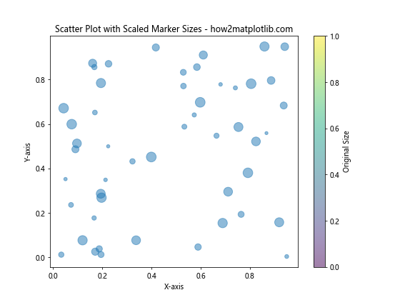
In this example, we define a scale_sizes function that scales the input sizes to a range between min_size and max_size. This ensures that all markers are visible and within a reasonable size range.
Using Matplotlib Scatter Marker Size to Represent Categories
Another useful application of matplotlib scatter marker size is to represent different categories or groups within your data. By assigning different sizes to different categories, you can create more informative visualizations.
Here’s an example of using marker sizes to represent categories:
import matplotlib.pyplot as plt
import numpy as np

np.random.seed(42)
x = np.random.rand(100)
y = np.random.rand(100)
categories = np.random.choice(['A', 'B', 'C'], 100)

size_map = {'A': 50, 'B': 100, 'C': 200}
sizes = [size_map[cat] for cat in categories]

plt.figure(figsize=(8, 6))
for cat in ['A', 'B', 'C']:
    mask = categories == cat
    plt.scatter(x[mask], y[mask], s=size_map[cat], alpha=0.5, label=f'Category {cat}')

plt.title("Scatter Plot with Marker Sizes Representing Categories - how2matplotlib.com")
plt.xlabel("X-axis")
plt.ylabel("Y-axis")
plt.legend()
plt.show()
Output:
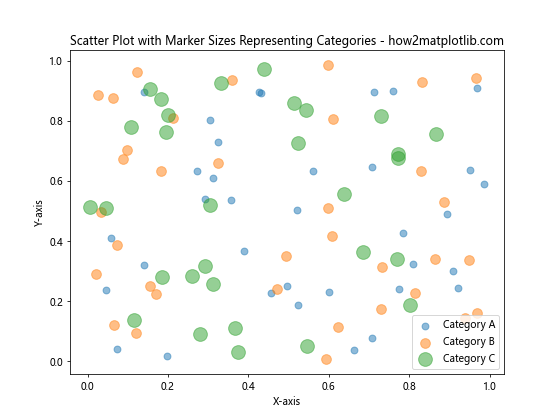
In this example, we assign different marker sizes to three categories (A, B, and C). This allows us to visually distinguish between different groups in our data.
Combining Matplotlib Scatter Marker Size with Color Mapping
To create even more informative visualizations, you can combine varying marker sizes with color mapping. This allows you to represent four dimensions of data in a single scatter plot: x-position, y-position, marker size, and color.
Here’s an example of combining marker sizes with color mapping:
import matplotlib.pyplot as plt
import numpy as np

np.random.seed(42)
x = np.random.rand(100)
y = np.random.rand(100)
sizes = np.random.rand(100) * 500
colors = np.random.rand(100)

plt.figure(figsize=(10, 8))
scatter = plt.scatter(x, y, s=sizes, c=colors, alpha=0.5, cmap='viridis')
plt.title("Scatter Plot with Varying Sizes and Colors - how2matplotlib.com")
plt.xlabel("X-axis")
plt.ylabel("Y-axis")
plt.colorbar(scatter, label="Color Value")

# Add a size legend
size_legend = plt.legend(*scatter.legend_elements("sizes", num=4),
                         loc="upper right", title="Size")
plt.gca().add_artist(size_legend)

plt.show()
Output:
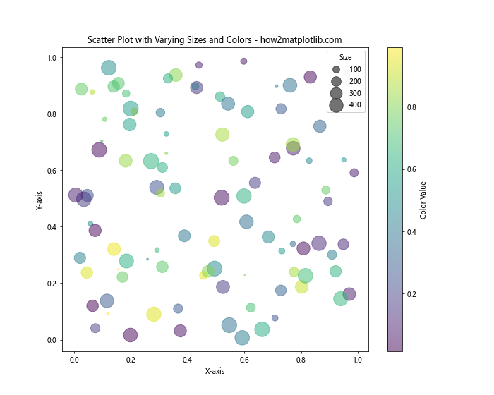
In this example, we use both the s parameter for marker sizes and the c parameter for color mapping. We also add a colorbar and a size legend to help interpret the visualization.
Animating Matplotlib Scatter Marker Size Changes
To create dynamic visualizations, you can animate changes in matplotlib scatter marker size over time. This can be particularly useful for showing how data evolves or changes across different time periods or conditions.
Here’s an example of animating marker size changes:
import matplotlib.pyplot as plt
import numpy as np
from matplotlib.animation import FuncAnimation

np.random.seed(42)
x = np.random.rand(20)
y = np.random.rand(20)
sizes = np.random.rand(20) * 500

fig, ax = plt.subplots(figsize=(8, 6))
scatter = ax.scatter(x, y, s=sizes, alpha=0.5)
ax.set_xlim(0, 1)
ax.set_ylim(0, 1)
ax.set_title("Animated Scatter Plot - how2matplotlib.com")

def update(frame):
    new_sizes = sizes * (1 + np.sin(frame * 0.1))
    scatter.set_sizes(new_sizes)
    return scatter,

ani = FuncAnimation(fig, update, frames=100, interval=50, blit=True)
plt.show()
Output:
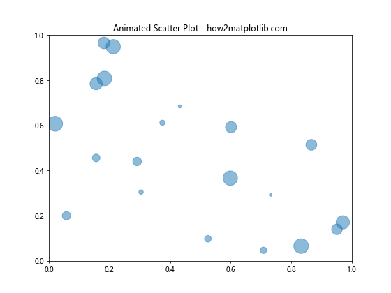
In this example, we create an animation where the marker sizes oscillate based on a sine function. This creates a pulsating effect in the scatter plot.
Using Matplotlib Scatter Marker Size with Subplots
When working with multiple datasets or comparing different aspects of your data, you may want to create multiple scatter plots with customized marker sizes in a single figure. Matplotlib’s subplot functionality allows you to achieve this easily.
Here’s an example of creating subplots with customized marker sizes:
import matplotlib.pyplot as plt
import numpy as np

np.random.seed(42)
x1, y1 = np.random.rand(2, 50)
x2, y2 = np.random.rand(2, 50)
sizes1 = np.random.rand(50) * 300
sizes2 = np.random.rand(50) * 300

fig, (ax1, ax2) = plt.subplots(1, 2, figsize=(12, 5))

ax1.scatter(x1, y1, s=sizes1, alpha=0.5)
ax1.set_title("Subplot 1 - how2matplotlib.com")
ax1.set_xlabel("X-axis")
ax1.set_ylabel("Y-axis")

ax2.scatter(x2, y2, s=sizes2, alpha=0.5)
ax2.set_title("Subplot 2 - how2matplotlib.com")
ax2.set_xlabel("X-axis")
ax2.set_ylabel("Y-axis")

plt.tight_layout()
plt.show()
Output:
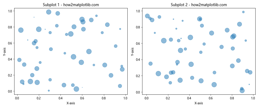
In this example, we create two subplots side by side, each with its own scatter plot and customized marker sizes.
Adjusting Matplotlib Scatter Marker Size for Overlapping Points
When dealing with large datasets or clustered data points, overlapping markers can become an issue. One way to address this is by adjusting the marker size based on the density of points in a given area. This technique is often referred to as “overplotting correction.”
Here’s an example of adjusting marker sizes for overlapping points:
import matplotlib.pyplot as plt
import numpy as np
from scipy.stats import gaussian_kde

np.random.seed(42)
x = np.random.normal(0, 1, 1000)
y = np.random.normal(0, 1, 1000)

# Calculate point density
xy = np.vstack([x, y])
z = gaussian_kde(xy)(xy)

fig, (ax1, ax2) = plt.subplots(1, 2, figsize=(12, 5))

ax1.scatter(x, y, alpha=0.5)
ax1.set_title("Original Scatter Plot - how2matplotlib.com")

scatter = ax2.scatter(x, y, c=z, s=50 / (z + 1), alpha=0.5, cmap='viridis')
ax2.set_title("Density-Adjusted Scatter Plot - how2matplotlib.com")

plt.colorbar(scatter, ax=ax2, label="Point Density")
plt.tight_layout()
plt.show()
Output:
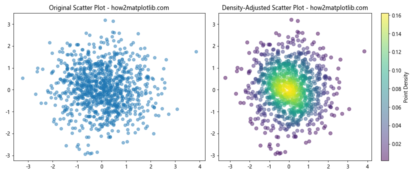
In this example, we use a Gaussian kernel density estimation to calculate the density of points. We then adjust the marker size inversely to the density, making points in dense areas smaller and points in sparse areas larger.
Creating a Bubble Chart with Matplotlib Scatter Marker Size
Bubble charts are a variation of scatter plots where the marker size represents a third variable, often used to show the relationship between three numeric variables. Matplotlib’s scatter function makes it easy to create bubble charts by customizing the marker size.
Here’s an example of creating a bubble chart:
import matplotlib.pyplot as plt
import numpy as np

np.random.seed(42)
x = np.random.rand(20)
y = np.random.rand(20)
sizes = np.random.rand(20) * 1000
colors = np.random.rand(20)

plt.figure(figsize=(10, 8))
scatter = plt.scatter(x, y, s=sizes, c=colors, alpha=0.5, cmap='viridis')
plt.title("Bubble Chart - how2matplotlib.com")
plt.xlabel("X-axis")
plt.ylabel("Y-axis")
plt.colorbar(scatter, label="Color Value")

# Add a size legend
size_legend = plt.legend(*scatter.legend_elements("sizes", num=4),
                         loc="upper right", title="Size")
plt.gca().add_artist(size_legend)

plt.show()
Output:
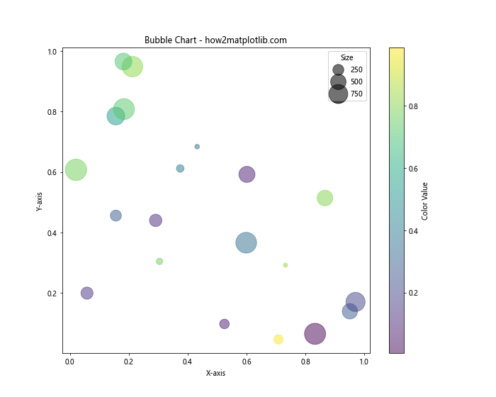
In this example, we create a bubble chart where the x and y positions represent two variables, the marker size represents a third variable, and the color represents a fourth variable.
Using Matplotlib Scatter Marker Size with 3D Plots
While we’ve focused on 2D scatter plots so far, Matplotlib also supports 3D scatter plots. You can customize the marker size in 3D plots just as you would in 2D plots, adding an extra dimension to your visualizations.
Here’s an example of a 3D scatter plot with customized marker sizes:
import matplotlib.pyplot as plt
import numpy as np

np.random.seed(42)
x = np.random.rand(100)
y = np.random.rand(100)
z = np.random.rand(100)
sizes = np.random.rand(100) * 100

fig = plt.figure(figsize=(10, 8))
ax = fig.add_subplot(111, projection='3d')

scatter = ax.scatter(x, y, z, s=sizes, c=sizes, alpha=0.5, cmap='viridis')
ax.set_title("3D Scatter Plot with Varying Marker Sizes - how2matplotlib.com")
ax.set_xlabel("X-axis")
ax.set_ylabel("Y-axis")
ax.set_zlabel("Z-axis")

plt.colorbar(scatter, label="Size and Color Value")
plt.show()
Output:
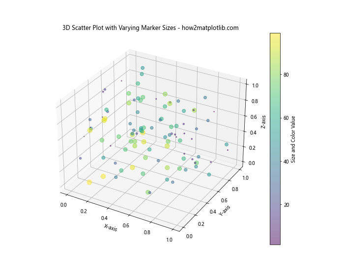
In this example, we create a 3D scatter plot where the marker size and color both represent the same variable, creating a visually striking representation of four-dimensional data.
Saving Matplotlib ScatterPlots with Custom Marker Sizes
When you’ve created a scatter plot with custom marker sizes, you may want to save it for later use or to include in a report or presentation. Matplotlib provides several options for saving your plots with high quality.
Here’s an example of saving a scatter plot with custom marker sizes:
import matplotlib.pyplot as plt
import numpy as np

np.random.seed(42)
x = np.random.rand(50)
y = np.random.rand(50)
sizes = np.random.rand(50) * 500

plt.figure(figsize=(8, 6))
plt.scatter(x, y, s=sizes, alpha=0.5)
plt.title("Scatter Plot with Custom Marker Sizes - how2matplotlib.com")
plt.xlabel("X-axis")
plt.ylabel("Y-axis")

# Save the plot as a PNG file
plt.savefig("custom_marker_sizes_scatter.png", dpi=300, bbox_inches="tight")

# Save the plot as a vector graphics file (SVG)
plt.savefig("custom_marker_sizes_scatter.svg", format="svg", bbox_inches="tight")

plt.show()
Output:
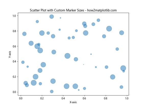
In this example, we save the plot in both PNG and SVG formats. The dpi parameter controls the resolution of the PNG file, while the SVG format preserves the vector nature of the plot, allowing for lossless scaling.
Advanced Techniques for Matplotlib Scatter Marker Size Customization
As you become more comfortable with matplotlib scatter marker size customization, you may want to explore more advanced techniques. These can help you create even more sophisticated and informative visualizations.
Using Marker Size to Represent Confidence Intervals
One advanced technique is to use marker size to represent confidence intervals or uncertainty in your data points. This can be particularly useful in scientific or statistical visualizations.
Here’s an example of using marker size to represent confidence intervals:
import matplotlib.pyplot as plt
import numpy as np

np.random.seed(42)
x = np.linspace(0, 10, 20)
y = 2 * x + 1 + np.random.normal(0, 2, 20)
errors = np.random.uniform(0.5, 2, 20)

plt.figure(figsize=(10, 6))
plt.errorbar(x, y, yerr=errors, fmt='none', ecolor='gray', alpha=0.5)
plt.scatter(x, y, s=1000 / (errors ** 2), alpha=0.5)
plt.title("Scatter Plot with Marker Size Representing Confidence - how2matplotlib.com")
plt.xlabel("X-axis")
plt.ylabel("Y-axis")
plt.show()
Output:
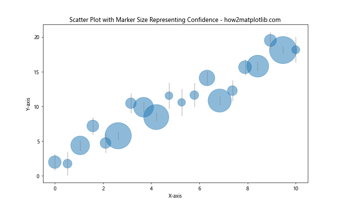
In this example, we use error bars to show the uncertainty in each data point, and we also adjust the marker size inversely to the square of the error. This means that data points with smaller errors (higher confidence) have larger markers.
Creating a Scatter Plot Matrix with Custom Marker Sizes
When working with multivariate data, a scatter plot matrix can be a useful tool to visualize relationships between multiple variables. You can incorporate custom marker sizes into a scatter plot matrix to add an extra dimension to your visualization.
Here’s an example of creating a scatter plot matrix with custom marker sizes:
import matplotlib.pyplot as plt
import numpy as np
import pandas as pd
from pandas.plotting import scatter_matrix

np.random.seed(42)
data = {
    'A': np.random.rand(100),
    'B': np.random.rand(100),
    'C': np.random.rand(100),
    'D': np.random.rand(100)
}
df = pd.DataFrame(data)
sizes = np.random.rand(100) * 100

fig, axes = plt.subplots(4, 4, figsize=(12, 12))
scatter_matrix(df, ax=axes, diagonal='hist')

for i in range(4):
    for j in range(4):
        if i != j:
            axes[i, j].clear()
            axes[i, j].scatter(df.iloc[:, j], df.iloc[:, i], s=sizes, alpha=0.5)

plt.suptitle("Scatter Plot Matrix with Custom Marker Sizes - how2matplotlib.com")
plt.tight_layout()
plt.show()
Output:
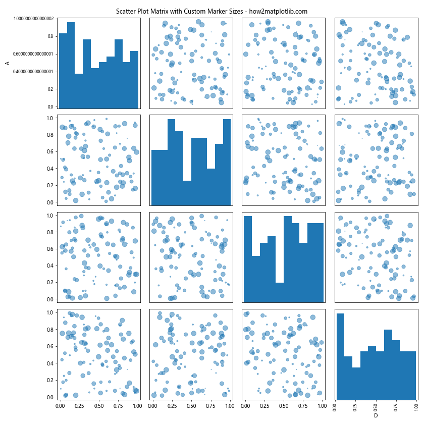
In this example, we create a scatter plot matrix for four variables, with custom marker sizes applied to each scatter plot within the matrix.
Best Practices for Using Matplotlib Scatter Marker Size
As we conclude our comprehensive guide on matplotlib scatter marker size, let’s review some best practices to ensure your visualizations are effective and informative:
- Use marker size purposefully: Only vary marker size when it adds meaningful information to your visualization. Avoid using it purely for aesthetic reasons if it doesn’t convey additional data.
Scale appropriately: When using marker size to represent a variable, ensure that the scaling is appropriate. Very large markers can obscure other data points, while very small markers may be difficult to see.
Consider overplotting: In dense scatter plots, consider using transparency (alpha) or density-based sizing to address overplotting issues.
Provide a legend or colorbar: When using varying marker sizes, always include a legend or colorbar to help readers interpret the sizes correctly.
Combine with other visual elements: Consider combining marker size variation with color mapping or different marker shapes to represent even more dimensions of your data.
Keep it simple: While it’s possible to represent many variables using position, size, color, and shape, be careful not to overwhelm your audience. Sometimes, multiple simpler plots can be more effective than a single complex one.
Test for accessibility: Ensure that your visualizations are accessible to all users, including those with color vision deficiencies. Consider using both size and color to represent important information.
Maintain consistency: When creating multiple plots for comparison, maintain consistent sizing scales across plots to avoid misleading comparisons.
By following these best practices and leveraging the techniques we’ve covered in this guide, you’ll be well-equipped to create informative and visually appealing scatter plots using matplotlib scatter marker size customization.