How to Master Matplotlib Scatter Plot Labeling: A Comprehensive Guide
Matplotlib scatter label points are an essential feature for creating informative and visually appealing scatter plots. This comprehensive guide will explore various techniques and best practices for labeling points in Matplotlib scatter plots. We’ll cover everything from basic labeling to advanced customization options, providing you with the knowledge and skills to create professional-looking scatter plots with well-labeled points.
Understanding Matplotlib Scatter Plots and Point Labeling
Matplotlib scatter plots are a powerful tool for visualizing relationships between two variables. By adding labels to the points in a scatter plot, we can provide additional context and information to the viewer. Matplotlib scatter label points allow us to identify specific data points, highlight important observations, or add explanatory text to our plots.
Let’s start with a basic example of creating a scatter plot with labeled points:
import matplotlib.pyplot as plt

x = [1, 2, 3, 4, 5]
y = [2, 4, 1, 5, 3]
labels = ['A', 'B', 'C', 'D', 'E']

plt.figure(figsize=(8, 6))
plt.scatter(x, y)

for i, label in enumerate(labels):
    plt.annotate(f'{label} (how2matplotlib.com)', (x[i], y[i]), xytext=(5, 5), textcoords='offset points')

plt.xlabel('X-axis')
plt.ylabel('Y-axis')
plt.title('Basic Matplotlib Scatter Plot with Labeled Points')
plt.show()
Output:
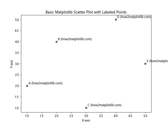
In this example, we create a simple scatter plot and use the annotate function to add labels to each point. The xytext parameter specifies the offset of the label from the point, and textcoords='offset points' ensures that the offset is relative to the point’s position.
Customizing Matplotlib Scatter Label Points
Matplotlib offers numerous options for customizing the appearance of scatter plot labels. Let’s explore some of these options to create more visually appealing and informative plots.
Adjusting Label Font Properties
You can customize the font properties of your labels to make them stand out or match your plot’s overall style:
import matplotlib.pyplot as plt

x = [1, 2, 3, 4, 5]
y = [2, 4, 1, 5, 3]
labels = ['A', 'B', 'C', 'D', 'E']

plt.figure(figsize=(8, 6))
plt.scatter(x, y)

for i, label in enumerate(labels):
    plt.annotate(f'{label} (how2matplotlib.com)', (x[i], y[i]),
                 xytext=(5, 5), textcoords='offset points',
                 fontsize=12, fontweight='bold', color='red')

plt.xlabel('X-axis')
plt.ylabel('Y-axis')
plt.title('Matplotlib Scatter Plot with Customized Label Font')
plt.show()
Output:
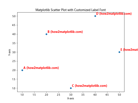
In this example, we’ve adjusted the fontsize, fontweight, and color of the labels to make them more prominent.
Adding Arrows to Labels
To clearly indicate which point a label belongs to, you can add arrows:
import matplotlib.pyplot as plt

x = [1, 2, 3, 4, 5]
y = [2, 4, 1, 5, 3]
labels = ['A', 'B', 'C', 'D', 'E']

plt.figure(figsize=(8, 6))
plt.scatter(x, y)

for i, label in enumerate(labels):
    plt.annotate(f'{label} (how2matplotlib.com)', (x[i], y[i]),
                 xytext=(20, 20), textcoords='offset points',
                 arrowprops=dict(arrowstyle='->', connectionstyle='arc3,rad=0.5'))

plt.xlabel('X-axis')
plt.ylabel('Y-axis')
plt.title('Matplotlib Scatter Plot with Labeled Points and Arrows')
plt.show()
Output:
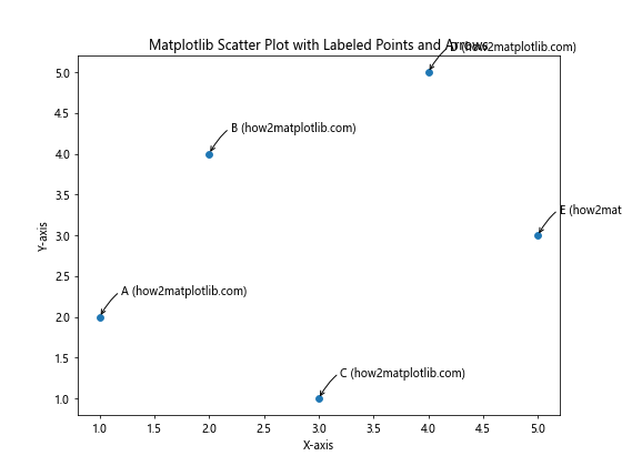
This code adds curved arrows connecting the labels to their respective points, making it easier to identify which label belongs to which point.
Advanced Techniques for Matplotlib Scatter Label Points
As you become more comfortable with basic labeling techniques, you can explore more advanced options to create sophisticated and informative scatter plots.
Selective Labeling
In some cases, you may want to label only specific points of interest rather than all points in your scatter plot:
import matplotlib.pyplot as plt
import numpy as np

np.random.seed(42)
x = np.random.rand(50)
y = np.random.rand(50)

plt.figure(figsize=(10, 8))
scatter = plt.scatter(x, y, c=y, cmap='viridis')

threshold = 0.8
for i, (xi, yi) in enumerate(zip(x, y)):
    if yi > threshold:
        plt.annotate(f'Point {i} (how2matplotlib.com)', (xi, yi),
                     xytext=(5, 5), textcoords='offset points')

plt.colorbar(scatter)
plt.xlabel('X-axis')
plt.ylabel('Y-axis')
plt.title('Matplotlib Scatter Plot with Selectively Labeled Points')
plt.show()
Output:
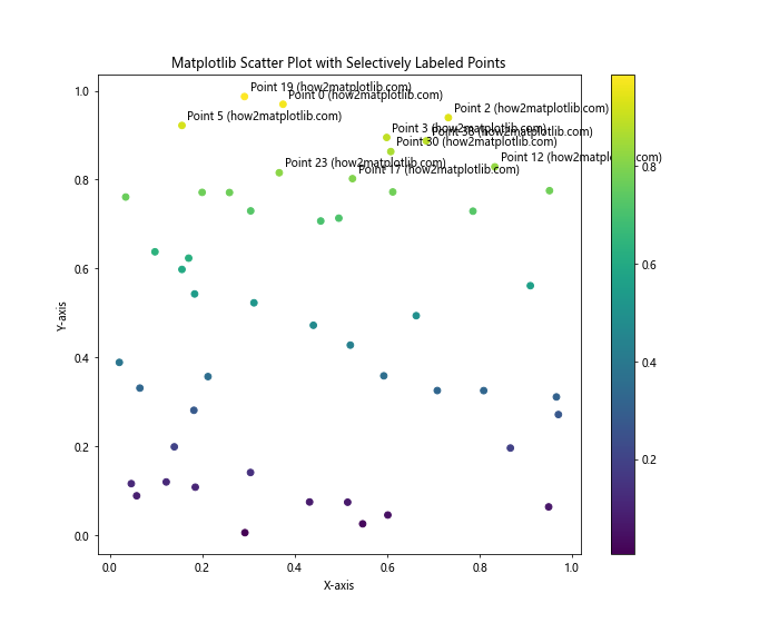
In this example, we only label points that have a y-value above a certain threshold, highlighting the most significant data points.
Using Text Boxes for Labels
To make your labels stand out even more, you can use text boxes:
import matplotlib.pyplot as plt
from matplotlib.patches import Rectangle

x = [1, 2, 3, 4, 5]
y = [2, 4, 1, 5, 3]
labels = ['A', 'B', 'C', 'D', 'E']

plt.figure(figsize=(8, 6))
plt.scatter(x, y)

for i, label in enumerate(labels):
    bbox_props = dict(boxstyle="round,pad=0.3", fc="white", ec="gray", alpha=0.7)
    plt.annotate(f'{label} (how2matplotlib.com)', (x[i], y[i]),
                 xytext=(10, 10), textcoords='offset points',
                 bbox=bbox_props)

plt.xlabel('X-axis')
plt.ylabel('Y-axis')
plt.title('Matplotlib Scatter Plot with Text Box Labels')
plt.show()
Output:
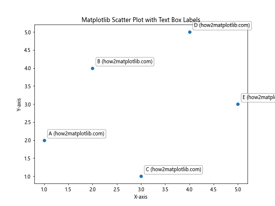
This code adds a white, semi-transparent text box around each label, making them easier to read against a busy background.
Handling Overlapping Labels in Matplotlib Scatter Plots
When dealing with dense scatter plots, label overlap can become a significant issue. Let’s explore some techniques to address this problem.
Adjusting Label Positions
One simple approach is to manually adjust the position of overlapping labels:
import matplotlib.pyplot as plt
import numpy as np

np.random.seed(42)
x = np.random.rand(20)
y = np.random.rand(20)

plt.figure(figsize=(10, 8))
plt.scatter(x, y)

offsets = [(0, 10), (10, 0), (-10, 0), (0, -10)]
for i, (xi, yi) in enumerate(zip(x, y)):
    offset = offsets[i % len(offsets)]
    plt.annotate(f'Point {i} (how2matplotlib.com)', (xi, yi),
                 xytext=offset, textcoords='offset points')

plt.xlabel('X-axis')
plt.ylabel('Y-axis')
plt.title('Matplotlib Scatter Plot with Adjusted Label Positions')
plt.show()
Output:
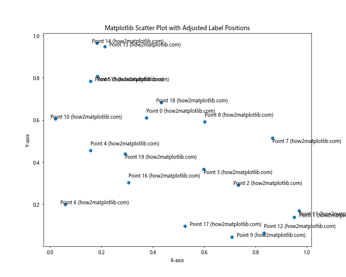
This example uses a predefined set of offsets to position labels in different directions around their points, reducing overlap.
Incorporating Data Values in Matplotlib Scatter Label Points
Sometimes, you may want to include actual data values in your labels to provide more detailed information about each point.
Displaying X and Y Coordinates
Here’s an example that shows how to include both x and y coordinates in the labels:
import matplotlib.pyplot as plt
import numpy as np

np.random.seed(42)
x = np.random.rand(10)
y = np.random.rand(10)

plt.figure(figsize=(10, 8))
plt.scatter(x, y)

for i, (xi, yi) in enumerate(zip(x, y)):
    plt.annotate(f'Point {i}: ({xi:.2f}, {yi:.2f}) (how2matplotlib.com)', (xi, yi),
                 xytext=(5, 5), textcoords='offset points')

plt.xlabel('X-axis')
plt.ylabel('Y-axis')
plt.title('Matplotlib Scatter Plot with Coordinate Labels')
plt.show()
Output:
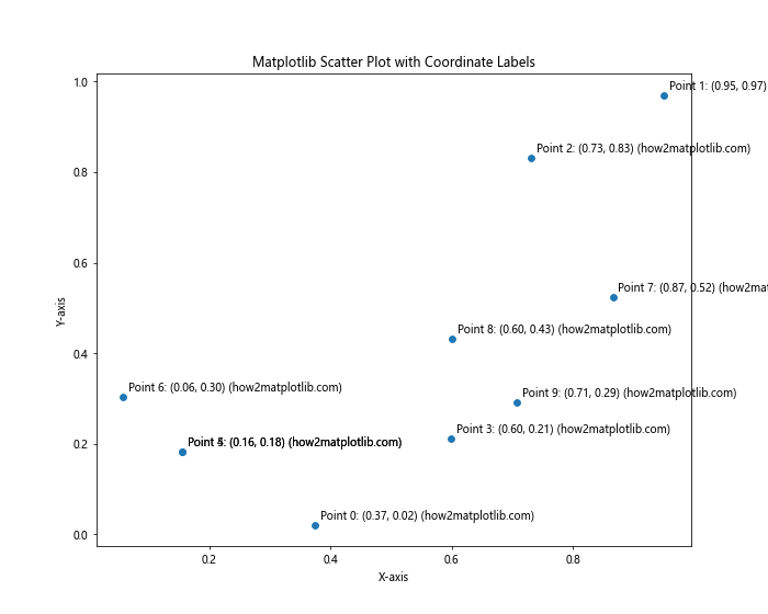
This example includes both x and y coordinates in the labels, rounded to two decimal places for readability.
Styling Matplotlib Scatter Label Points for Different Plot Types
Different types of scatter plots may require different labeling approaches. Let’s explore some specific scenarios.
Labeling Bubble Charts
Bubble charts are scatter plots where point size represents a third variable. Here’s how to effectively label a bubble chart:
import matplotlib.pyplot as plt
import numpy as np

np.random.seed(42)
x = np.random.rand(15)
y = np.random.rand(15)
sizes = np.random.randint(20, 500, 15)

plt.figure(figsize=(12, 9))
scatter = plt.scatter(x, y, s=sizes, alpha=0.5)

for i, (xi, yi, size) in enumerate(zip(x, y, sizes)):
    plt.annotate(f'Point {i}: Size={size} (how2matplotlib.com)', (xi, yi),
                 xytext=(0, 5), textcoords='offset points', ha='center')

plt.xlabel('X-axis')
plt.ylabel('Y-axis')
plt.title('Matplotlib Bubble Chart with Labeled Points')
plt.show()
Output:
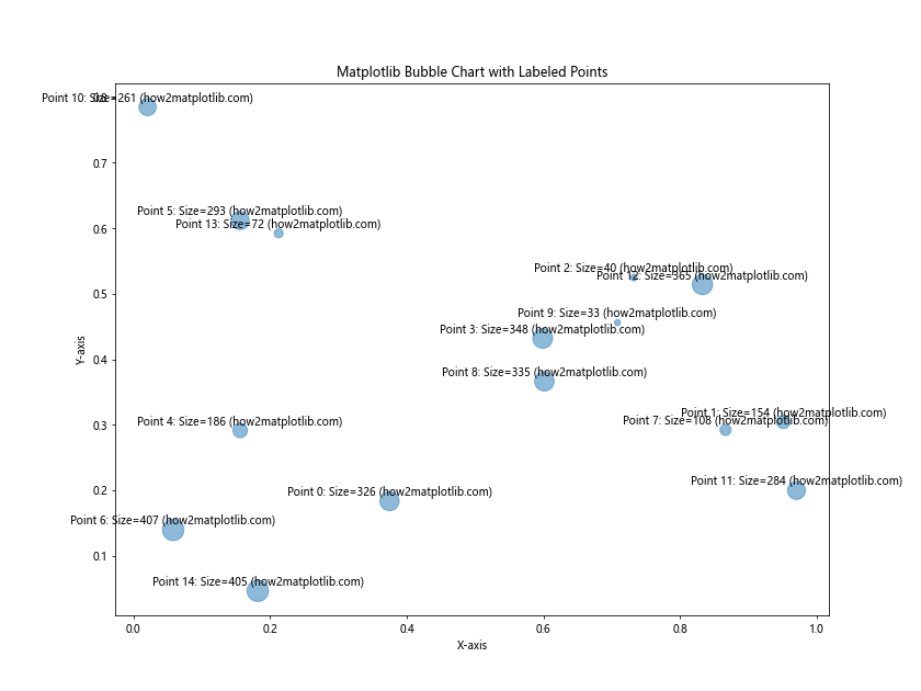
This example labels each bubble with its size, positioning the labels above the center of each bubble.
Labeling 3D Scatter Plots
For 3D scatter plots, you’ll need to use a slightly different approach:
import matplotlib.pyplot as plt
from mpl_toolkits.mplot3d import Axes3D
import numpy as np

np.random.seed(42)
x = np.random.rand(10)
y = np.random.rand(10)
z = np.random.rand(10)

fig = plt.figure(figsize=(12, 9))
ax = fig.add_subplot(111, projection='3d')
scatter = ax.scatter(x, y, z)

for i, (xi, yi, zi) in enumerate(zip(x, y, z)):
    ax.text(xi, yi, zi, f'Point {i} (how2matplotlib.com)', fontsize=8)

ax.set_xlabel('X-axis')
ax.set_ylabel('Y-axis')
ax.set_zlabel('Z-axis')
ax.set_title('3D Matplotlib Scatter Plot with Labeled Points')
plt.show()
Output:
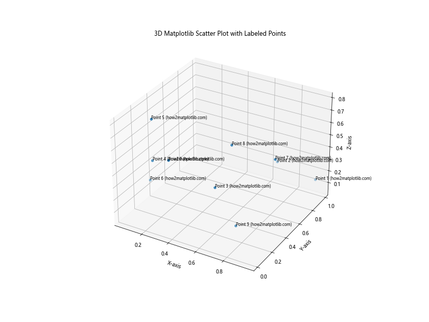
This code creates a 3D scatter plot with labels positioned at each point’s 3D coordinates.
Best Practices for Matplotlib Scatter Label Points
To create effective and visually appealing scatter plots with labeled points, consider the following best practices:
- Clarity: Ensure that labels are easy to read and don’t obscure the data points.
- Consistency: Use a consistent labeling style throughout your plot.
- Relevance: Only label points that are significant or of interest to your audience.
- Color: Choose label colors that contrast well with the background and data points.
- Size: Use an appropriate font size that balances readability with plot aesthetics.
- Positioning: Carefully position labels to minimize overlap and maintain clarity.
Here’s an example that incorporates these best practices:
import matplotlib.pyplot as plt
import numpy as np

np.random.seed(42)
x = np.random.rand(50)
y = np.random.rand(50)
colors = np.random.rand(50)
sizes = np.random.randint(20, 200, 50)

plt.figure(figsize=(12, 9))
scatter = plt.scatter(x, y, c=colors, s=sizes, alpha=0.6, cmap='viridis')

for i, (xi, yi, size) in enumerate(zip(x, y, sizes)):
    if size > 150:  # Only label large points
        plt.annotate(f'Point {i} (how2matplotlib.com)', (xi, yi),
                     xytext=(5, 5), textcoords='offset points',
                     fontsize=8, color='darkred', fontweight='bold',
                     bbox=dict(boxstyle="round,pad=0.3", fc="white", ec="gray", alpha=0.7))

plt.colorbar(scatter, label='Color Value')
plt.xlabel('X-axis')
plt.ylabel('Y-axis')
plt.title('Matplotlib Scatter Plot with Best Practice Labeling')
plt.show()
Output:
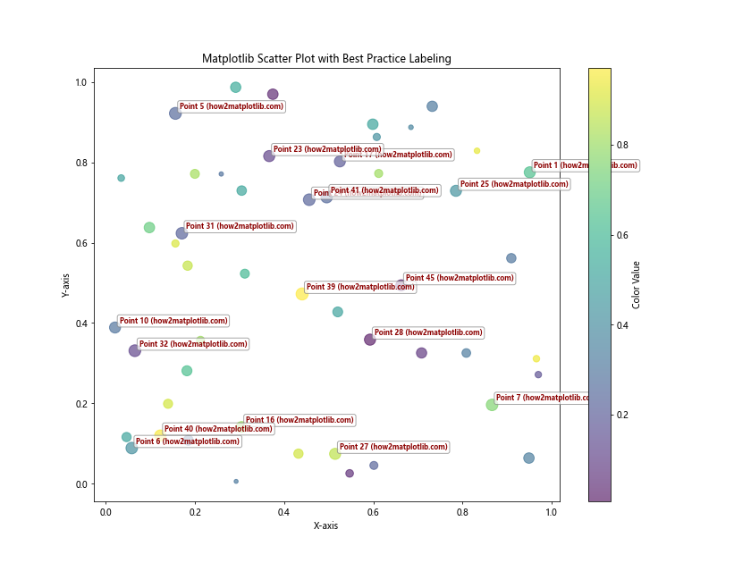
This example demonstrates best practices by selectively labeling only the larger points, using a consistent style, and ensuring labels are clear and readable.
Advanced Customization of Matplotlib Scatter Label Points
For even more control over your scatter plot labels, you can create custom label styles and positioning algorithms.
Custom Label Styles
Here’s an example of creating custom label styles using path effects:
import matplotlib.pyplot as plt
import numpy as np
from matplotlib.patheffects import withStroke

np.random.seed(42)
x = np.random.rand(15)
y = np.random.rand(15)

plt.figure(figsize=(10, 8))
plt.scatter(x, y)

for i, (xi, yi) in enumerate(zip(x, y)):
    text = plt.text(xi, yi, f'Point {i} (how2matplotlib.com)',
                    fontsize=10, color='white', fontweight='bold',
                    ha='center', va='center')
    text.set_path_effects([withStroke(linewidth=3, foreground='black')])

plt.xlabel('X-axis')
plt.ylabel('Y-axis')
plt.title('Matplotlib Scatter Plot with Custom Label Styles')
plt.show()
Output:
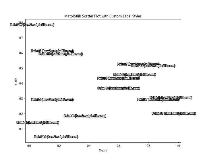
This example creates labels with a white fill and black outline, making them stand out against any background.
Dynamic Label Positioning
For more complex plots, you might want to implement a dynamic label positioning algorithm:
import matplotlib.pyplot as plt
import numpy as np

def find_label_position(x, y, occupied, step=0.05):
    directions = [(0, 1), (1, 0), (0, -1), (-1, 0),
                  (1, 1), (-1, 1), (1, -1), (-1, -1)]
    for dx, dy in directions:
        for i in range(1, 20):
            new_x, new_y = x + i * step * dx, y + i * step * dy
            if (new_x, new_y) not in occupied:
                return new_x, new_y
    return x, y

np.random.seed(42)
x = np.random.rand(30)
y = np.random.rand(30)

plt.figure(figsize=(12, 9))
plt.scatter(x, y)

occupied = set()
for i, (xi, yi) in enumerate(zip(x, y)):
    label_x, label_y = find_label_position(xi, yi, occupied)
    plt.annotate(f'Point {i} (how2matplotlib.com)', (xi, yi),
                 xytext=(label_x, label_y), textcoords='data',
                 arrowprops=dict(arrowstyle='->', connectionstyle='arc3,rad=0.3'))
    occupied.add((label_x, label_y))

plt.xlabel('X-axis')
plt.ylabel('Y-axis')
plt.title('Matplotlib Scatter Plot with Dynamically Positioned Labels')
plt.show()
Output:
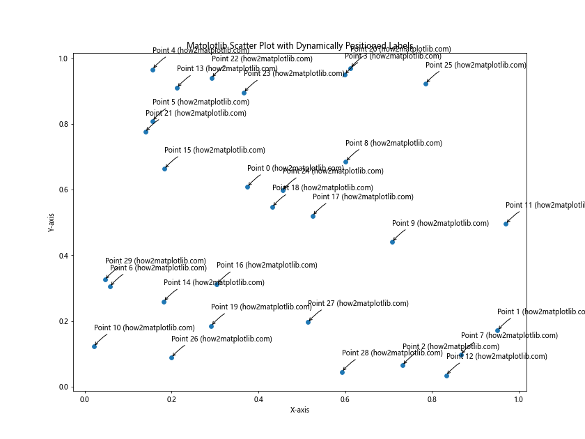
This example implements a simple algorithm to find non-overlapping positions for labels.
Integrating Matplotlib Scatter Label Points with Other Plot Elements
Scatter plots often work in conjunction with other plot elements. Let’s explore how to integrate labeled scatter points with other visualizations.
Combining Scatter Plots with Line Plots
Here’s an example that combines a scatter plot with a line plot and labels key points:
import matplotlib.pyplot as plt
import numpy as np

np.random.seed(42)
x = np.linspace(0, 10, 100)
y = 2 * np.sin(x) + np.random.normal(0, 0.5, 100)

plt.figure(figsize=(12, 9))
plt.plot(x, y, 'b-', alpha=0.5)
scatter = plt.scatter(x, y, c=y, cmap='viridis', s=50)

# Label local maxima and minima
peaks = np.where((y[1:-1] > y[:-2]) & (y[1:-1] > y[2:]))[0] + 1
troughs = np.where((y[1:-1] < y[:-2]) & (y[1:-1] < y[2:]))[0] + 1

for i in np.concatenate([peaks, troughs]):
    plt.annotate(f'{"Max" if i in peaks else "Min"} (how2matplotlib.com)',
                 (x[i], y[i]), xytext=(5, 5), textcoords='offset points')

plt.colorbar(scatter, label='Y Value')
plt.xlabel('X-axis')
plt.ylabel('Y-axis')
plt.title('Matplotlib Scatter Plot with Line and Labeled Extrema')
plt.show()
Output:
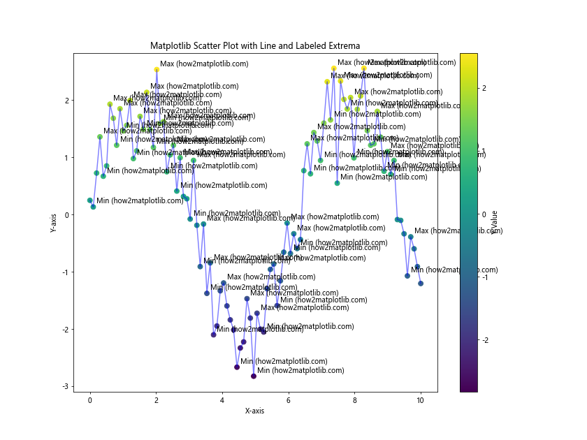
This example combines a scatter plot with a line plot and labels the local maxima and minima.
Scatter Plot with Marginal Histograms
Here's a more complex example that combines a scatter plot with marginal histograms:
import matplotlib.pyplot as plt
import numpy as np

np.random.seed(42)
x = np.random.randn(1000)
y = x + np.random.randn(1000) * 0.5

fig = plt.figure(figsize=(12, 9))
gs = fig.add_gridspec(3, 3)

ax_scatter = fig.add_subplot(gs[1:, :-1])
ax_histx = fig.add_subplot(gs[0, :-1], sharex=ax_scatter)
ax_histy = fig.add_subplot(gs[1:, -1], sharey=ax_scatter)

ax_scatter.scatter(x, y, alpha=0.5)
ax_histx.hist(x, bins=50)
ax_histy.hist(y, bins=50, orientation='horizontal')

ax_histx.tick_params(axis="x", labelbottom=False)
ax_histy.tick_params(axis="y", labelleft=False)

# Label some interesting points
for i in range(5):
    idx = np.random.randint(0, len(x))
    ax_scatter.annotate(f'Point {i} (how2matplotlib.com)', (x[idx], y[idx]),
                        xytext=(5, 5), textcoords='offset points')

ax_scatter.set_xlabel('X-axis')
ax_scatter.set_ylabel('Y-axis')
ax_scatter.set_title('Matplotlib Scatter Plot with Marginal Histograms and Labels')
plt.tight_layout()
plt.show()
Output:
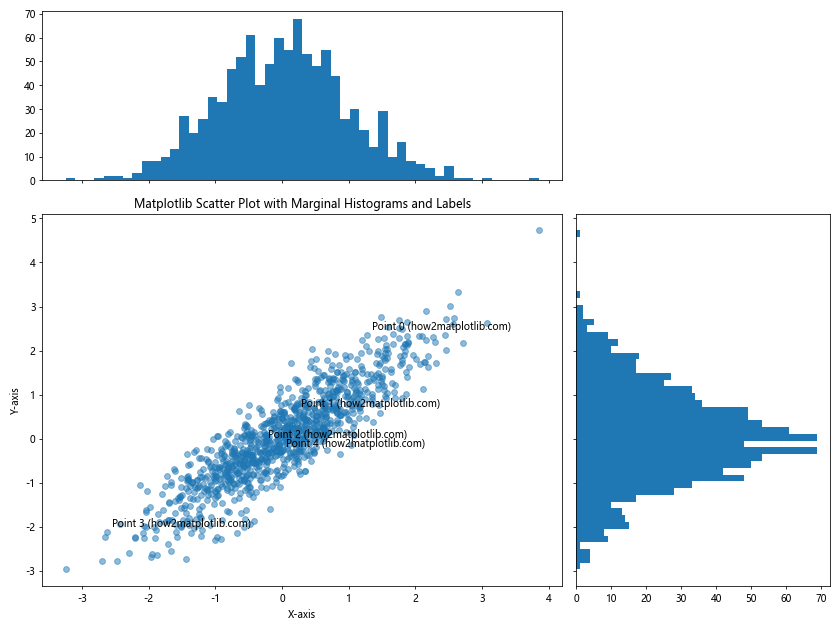
This example creates a scatter plot with marginal histograms and labels a few randomly selected points.
Optimizing Matplotlib Scatter Label Points for Large Datasets
When dealing with large datasets, labeling every point can become impractical. Here are some strategies for handling large datasets effectively.
Labeling a Subset of Points
This example labels only a subset of points based on certain criteria:
import matplotlib.pyplot as plt
import numpy as np

np.random.seed(42)
x = np.random.randn(1000)
y = np.random.randn(1000)

plt.figure(figsize=(12, 9))
plt.scatter(x, y, alpha=0.5)

# Label points that are far from the origin
threshold = 2.5
for i, (xi, yi) in enumerate(zip(x, y)):
    if np.sqrt(xi**2 + yi**2) > threshold:
        plt.annotate(f'Point {i} (how2matplotlib.com)', (xi, yi),
                     xytext=(5, 5), textcoords='offset points', fontsize=8)

plt.xlabel('X-axis')
plt.ylabel('Y-axis')
plt.title('Matplotlib Scatter Plot with Selective Labeling for Large Dataset')
plt.show()
Output:
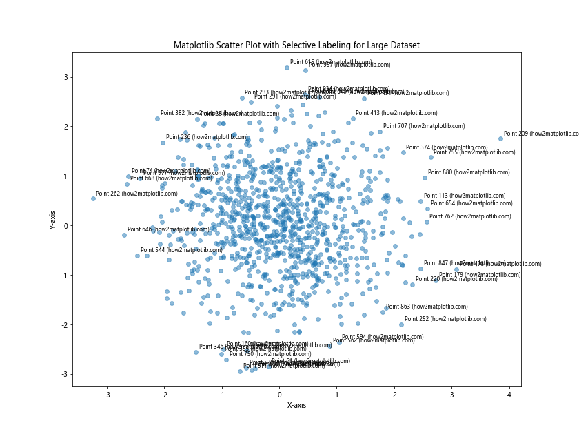
This example only labels points that are more than 2.5 units away from the origin.
Matplotlib scatter label points Conclusion
Matplotlib scatter label points are a powerful tool for enhancing the informativeness and visual appeal of your scatter plots. Throughout this comprehensive guide, we've explored various techniques for creating, customizing, and optimizing labeled scatter plots in Matplotlib.
We've covered basic labeling techniques, advanced customization options, strategies for handling overlapping labels, and methods for integrating scatter plots with other visualization elements. We've also addressed common issues and provided solutions for working with large datasets.
By mastering these techniques, you'll be able to create professional-quality scatter plots that effectively communicate your data insights. Remember to always consider your audience and the specific requirements of your visualization when applying these techniques.