How to Master Matplotlib Cmap Colors: A Comprehensive Guide

How to Master Matplotlib Cmap Colors: A Comprehensive Guide

Matplotlib cmap colors are an essential aspect of data visualization in Python. This comprehensive guide will explore the various ways to use colormaps (cmaps) and colors in Matplotlib, providing detailed explanations and practical examples. Whether you’re a beginner or an experienced data scientist, this article will help you enhance your visualizations using Matplotlib cmap colors.

Understanding Matplotlib Cmap Colors

Matplotlib cmap colors refer to the color mapping functionality provided by the Matplotlib library. Colormaps are used to represent data values as colors in visualizations such as heatmaps, scatter plots, and 3D surfaces. They allow you to map numerical data to a range of colors, making it easier to interpret and analyze complex datasets.

Let’s start with a simple example to demonstrate the use of Matplotlib cmap colors:

import matplotlib.pyplot as plt
import numpy as np

# Generate sample data
x = np.linspace(0, 10, 100)
y = np.sin(x)

# Create a scatter plot with a colormap
plt.scatter(x, y, c=y, cmap='viridis')
plt.colorbar(label='Sin(x)')
plt.title('Scatter plot with Matplotlib cmap colors - how2matplotlib.com')
plt.xlabel('X')
plt.ylabel('Y')
plt.show()

Output:

How to Master Matplotlib Cmap Colors: A Comprehensive Guide

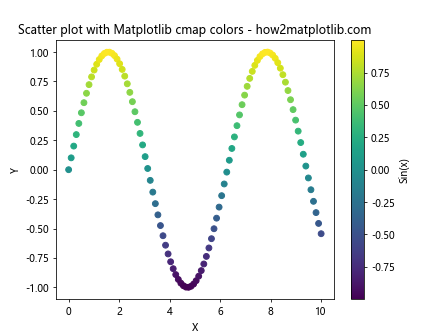
In this example, we create a scatter plot where the color of each point is determined by its y-value. The cmap='viridis' parameter specifies the colormap to use, and plt.colorbar() adds a color scale to the plot.

Types of Matplotlib Cmap Colors

Matplotlib offers a wide variety of colormaps to choose from. These can be broadly categorized into sequential, diverging, and qualitative colormaps. Let’s explore each type with examples:

Sequential Colormaps

Sequential colormaps are ideal for representing data that progresses from low to high values. They typically use a gradient of colors that increase in intensity or brightness.

import matplotlib.pyplot as plt
import numpy as np

# Generate sample data
data = np.random.rand(10, 10)

# Create a heatmap with a sequential colormap
plt.imshow(data, cmap='Blues')
plt.colorbar(label='Value')
plt.title('Heatmap with Sequential Colormap - how2matplotlib.com')
plt.show()

Output:

How to Master Matplotlib Cmap Colors: A Comprehensive Guide

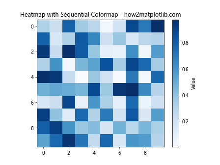
In this example, we use the ‘Blues’ colormap to create a heatmap. The colormap ranges from light blue (low values) to dark blue (high values), making it easy to identify patterns in the data.

Diverging Colormaps

Diverging colormaps are useful for data that has a meaningful midpoint, such as temperature anomalies or correlation coefficients. They typically use two different hues that diverge from a neutral color at the midpoint.

import matplotlib.pyplot as plt
import numpy as np

# Generate sample data
x = np.linspace(-1, 1, 100)
y = np.linspace(-1, 1, 100)
X, Y = np.meshgrid(x, y)
Z = X * Y

# Create a contour plot with a diverging colormap
plt.contourf(X, Y, Z, cmap='RdBu', levels=20)
plt.colorbar(label='X * Y')
plt.title('Contour plot with Diverging Colormap - how2matplotlib.com')
plt.xlabel('X')
plt.ylabel('Y')
plt.show()

Output:

How to Master Matplotlib Cmap Colors: A Comprehensive Guide

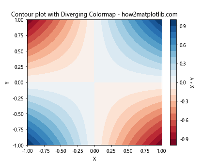
This example uses the ‘RdBu’ (Red-Blue) diverging colormap to visualize the product of X and Y. The colormap transitions from red (negative values) through white (values near zero) to blue (positive values).

Qualitative Colormaps

Qualitative colormaps are designed for categorical data, where colors are used to distinguish between different categories rather than represent numerical values.

import matplotlib.pyplot as plt
import numpy as np

# Generate sample data
categories = ['A', 'B', 'C', 'D', 'E']
values = np.random.rand(5, 5)

# Create a bar plot with a qualitative colormap
plt.bar(categories, values.mean(axis=1), color=plt.cm.Set3(np.linspace(0, 1, 5)))
plt.title('Bar plot with Qualitative Colormap - how2matplotlib.com')
plt.xlabel('Category')
plt.ylabel('Mean Value')
plt.show()

Output:

How to Master Matplotlib Cmap Colors: A Comprehensive Guide

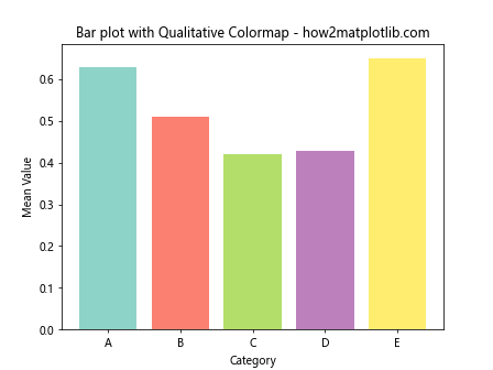
In this example, we use the ‘Set3’ qualitative colormap to assign distinct colors to different categories in a bar plot.

Creating Custom Matplotlib Cmap Colors

While Matplotlib provides many built-in colormaps, you can also create custom colormaps to suit your specific needs. Here’s an example of how to create a custom colormap:

import matplotlib.pyplot as plt
import matplotlib.colors as mcolors
import numpy as np

# Define custom colors
colors = ['#FF0000', '#00FF00', '#0000FF']  # Red, Green, Blue

# Create a custom colormap
n_bins = 100
cmap = mcolors.LinearSegmentedColormap.from_list('custom_cmap', colors, N=n_bins)

# Generate sample data
data = np.random.rand(10, 10)

# Create a heatmap with the custom colormap
plt.imshow(data, cmap=cmap)
plt.colorbar(label='Value')
plt.title('Heatmap with Custom Colormap - how2matplotlib.com')
plt.show()

Output:

How to Master Matplotlib Cmap Colors: A Comprehensive Guide

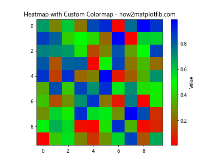
This example demonstrates how to create a custom colormap that transitions from red to green to blue. The LinearSegmentedColormap.from_list() function is used to create the colormap from a list of colors.

Manipulating Matplotlib Cmap Colors

Matplotlib provides various ways to manipulate colormaps to achieve desired effects. Let’s explore some common techniques:

Reversing Colormaps

You can reverse any colormap by appending ‘_r’ to its name:

import matplotlib.pyplot as plt
import numpy as np

# Generate sample data
data = np.random.rand(10, 10)

# Create two subplots
fig, (ax1, ax2) = plt.subplots(1, 2, figsize=(12, 5))

# Plot with original colormap
im1 = ax1.imshow(data, cmap='viridis')
ax1.set_title('Original Viridis - how2matplotlib.com')
plt.colorbar(im1, ax=ax1)

# Plot with reversed colormap
im2 = ax2.imshow(data, cmap='viridis_r')
ax2.set_title('Reversed Viridis - how2matplotlib.com')
plt.colorbar(im2, ax=ax2)

plt.tight_layout()
plt.show()

Output:

How to Master Matplotlib Cmap Colors: A Comprehensive Guide

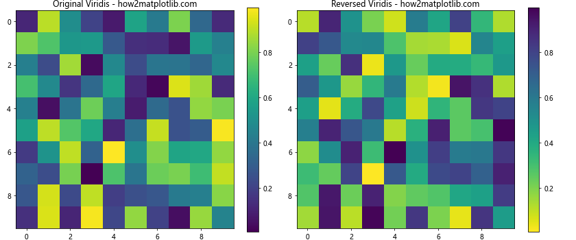
This example shows the ‘viridis’ colormap and its reversed version ‘viridis_r’ side by side.

Truncating Colormaps

You can use a subset of a colormap by truncating it:

import matplotlib.pyplot as plt
import numpy as np
from matplotlib.colors import LinearSegmentedColormap

# Generate sample data
data = np.random.rand(10, 10)

# Create a truncated colormap
cmap = plt.get_cmap('viridis')
truncated_cmap = LinearSegmentedColormap.from_list('trunc_viridis', cmap(np.linspace(0.2, 0.8, 100)))

# Create a heatmap with the truncated colormap
plt.imshow(data, cmap=truncated_cmap)
plt.colorbar(label='Value')
plt.title('Heatmap with Truncated Colormap - how2matplotlib.com')
plt.show()

Output:

How to Master Matplotlib Cmap Colors: A Comprehensive Guide

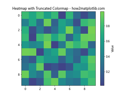
This example demonstrates how to create a truncated version of the ‘viridis’ colormap, using only the middle 60% of the original colormap.

Advanced Techniques with Matplotlib Cmap Colors

Let’s explore some advanced techniques for working with Matplotlib cmap colors:

Discrete Colormaps

Sometimes, you may want to use a discrete set of colors instead of a continuous colormap. Here’s how to create a discrete colormap:

import matplotlib.pyplot as plt
import numpy as np
from matplotlib.colors import BoundaryNorm, ListedColormap

# Generate sample data
data = np.random.randint(0, 5, (10, 10))

# Create a discrete colormap
cmap = ListedColormap(['#FF0000', '#00FF00', '#0000FF', '#FFFF00', '#FF00FF'])
bounds = [0, 1, 2, 3, 4, 5]
norm = BoundaryNorm(bounds, cmap.N)

# Create a heatmap with the discrete colormap
plt.imshow(data, cmap=cmap, norm=norm)
plt.colorbar(label='Category', ticks=[0.5, 1.5, 2.5, 3.5, 4.5], boundaries=bounds)
plt.title('Heatmap with Discrete Colormap - how2matplotlib.com')
plt.show()

Output:

How to Master Matplotlib Cmap Colors: A Comprehensive Guide

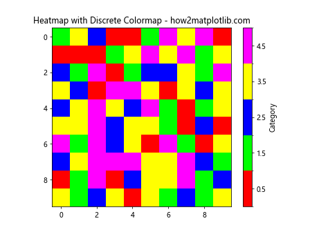
This example creates a discrete colormap with five distinct colors, each representing a different category in the data.

Combining Colormaps

You can create more complex colormaps by combining existing ones:

import matplotlib.pyplot as plt
import numpy as np
from matplotlib.colors import LinearSegmentedColormap

# Generate sample data
data = np.random.rand(10, 10)

# Combine two colormaps
cmap1 = plt.get_cmap('viridis')
cmap2 = plt.get_cmap('plasma')
colors1 = cmap1(np.linspace(0, 1, 128))
colors2 = cmap2(np.linspace(0, 1, 128))
colors = np.vstack((colors1, colors2))
combined_cmap = LinearSegmentedColormap.from_list('combined_cmap', colors)

# Create a heatmap with the combined colormap
plt.imshow(data, cmap=combined_cmap)
plt.colorbar(label='Value')
plt.title('Heatmap with Combined Colormap - how2matplotlib.com')
plt.show()

Output:

How to Master Matplotlib Cmap Colors: A Comprehensive Guide

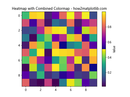
This example demonstrates how to create a new colormap by combining the ‘viridis’ and ‘plasma’ colormaps.

Best Practices for Using Matplotlib Cmap Colors

When working with Matplotlib cmap colors, it’s important to follow some best practices to ensure your visualizations are effective and accessible:

  1. Choose appropriate colormaps: Use sequential colormaps for continuous data, diverging colormaps for data with a meaningful midpoint, and qualitative colormaps for categorical data.

  2. Consider color blindness: Use colormaps that are perceptually uniform and color-blind friendly, such as ‘viridis’, ‘plasma’, or ‘cividis’.

  3. Provide context: Always include a colorbar with appropriate labels to help viewers interpret the colors in your visualization.

  4. Be consistent: Use consistent colormaps across related visualizations to make comparisons easier.

  5. Avoid rainbow colormaps: Rainbow colormaps like ‘jet’ can be misleading and are generally not recommended for scientific visualizations.

Let’s implement these best practices in an example:

import matplotlib.pyplot as plt
import numpy as np

# Generate sample data
x = np.linspace(0, 10, 100)
y = np.linspace(0, 10, 100)
X, Y = np.meshgrid(x, y)
Z = np.sin(X) * np.cos(Y)

# Create a figure with two subplots
fig, (ax1, ax2) = plt.subplots(1, 2, figsize=(12, 5))

# Plot with a perceptually uniform colormap (good practice)
im1 = ax1.imshow(Z, cmap='viridis', extent=[0, 10, 0, 10])
ax1.set_title('Good: Viridis Colormap - how2matplotlib.com')
ax1.set_xlabel('X')
ax1.set_ylabel('Y')
plt.colorbar(im1, ax=ax1, label='sin(X) * cos(Y)')

# Plot with a rainbow colormap (not recommended)
im2 = ax2.imshow(Z, cmap='jet', extent=[0, 10, 0, 10])
ax2.set_title('Bad: Jet Colormap - how2matplotlib.com')
ax2.set_xlabel('X')
ax2.set_ylabel('Y')
plt.colorbar(im2, ax=ax2, label='sin(X) * cos(Y)')

plt.tight_layout()
plt.show()

Output:

How to Master Matplotlib Cmap Colors: A Comprehensive Guide

This example compares a good practice (using the perceptually uniform ‘viridis’ colormap) with a less recommended practice (using the rainbow ‘jet’ colormap).

Matplotlib Cmap Colors in 3D Plots

Matplotlib cmap colors can also be used effectively in 3D plots. Let’s explore an example:

import matplotlib.pyplot as plt
import numpy as np
from mpl_toolkits.mplot3d import Axes3D

# Generate sample data
x = np.linspace(-5, 5, 50)
y = np.linspace(-5, 5, 50)
X, Y = np.meshgrid(x, y)
Z = np.sin(np.sqrt(X**2 + Y**2))

# Create a 3D surface plot
fig = plt.figure(figsize=(10, 8))
ax = fig.add_subplot(111, projection='3d')
surf = ax.plot_surface(X, Y, Z, cmap='coolwarm', linewidth=0, antialiased=False)

# Add a color bar
fig.colorbar(surf, shrink=0.5, aspect=5, label='sin(sqrt(X^2 + Y^2))')

ax.set_xlabel('X')
ax.set_ylabel('Y')
ax.set_zlabel('Z')
ax.set_title('3D Surface Plot with Matplotlib Cmap Colors - how2matplotlib.com')

plt.show()

Output:

How to Master Matplotlib Cmap Colors: A Comprehensive Guide

This example creates a 3D surface plot using the ‘coolwarm’ colormap to represent the z-values of the surface.

Animating Matplotlib Cmap Colors

You can create dynamic visualizations by animating Matplotlib cmap colors. Here’s an example of a simple animation:

import matplotlib.pyplot as plt
import numpy as np
from matplotlib.animation import FuncAnimation

# Generate initial data
x = np.linspace(0, 2*np.pi, 100)
y = np.sin(x)

# Create the figure and axis
fig, ax = plt.subplots()
line, = ax.plot(x, y, color='blue')
scatter = ax.scatter(x, y, c=y, cmap='viridis', s=50)
plt.colorbar(scatter)

ax.set_xlim(0, 2*np.pi)
ax.set_ylim(-1.5, 1.5)
ax.set_title('Animated Matplotlib Cmap Colors - how2matplotlib.com')

# Update function for the animation
def update(frame):
    y = np.sin(x + frame/10)
    line.set_ydata(y)
    scatter.set_offsets(np.c_[x, y])
    scatter.set_array(y)
    return line, scatter

# Create the animation
anim = FuncAnimation(fig, update, frames=100, interval=50, blit=True)

plt.show()

Output:

How to Master Matplotlib Cmap Colors: A Comprehensive Guide

This example creates an animation of a sine wave, where the color of the scatter points changes based on their y-values using the ‘viridis’ colormap.

Customizing Colorbars with Matplotlib Cmap Colors

Colorbars are an essential component when using Matplotlib cmap colors. Let’s explore how to customize colorbars:

import matplotlib.pyplot as plt
import numpy as np

# Generate sample data
data = np.random.rand(10, 10)

# Create a figure with custom colorbar
fig, ax = plt.subplots(figsize=(10, 8))
im = ax.imshow(data,cmap='viridis')

# Create a colorbar with custom settings
cbar = plt.colorbar(im, ax=ax, orientation='vertical', pad=0.1)
cbar.set_label('Value', rotation=270, labelpad=15)
cbar.ax.tick_params(size=0)
cbar.outline.set_visible(False)

# Add custom ticks and labels
cbar.set_ticks([0, 0.25, 0.5, 0.75, 1])
cbar.set_ticklabels(['Low', 'Medium-Low', 'Medium', 'Medium-High', 'High'])

ax.set_title('Customized Colorbar with Matplotlib Cmap Colors - how2matplotlib.com')
plt.show()

Output:

How to Master Matplotlib Cmap Colors: A Comprehensive Guide

This example demonstrates how to create a customized colorbar with specific ticks, labels, and formatting.

Using Matplotlib Cmap Colors with Different Plot Types

Matplotlib cmap colors can be applied to various types of plots. Let’s explore some examples:

Scatter Plot with Colormap

import matplotlib.pyplot as plt
import numpy as np

# Generate sample data
x = np.random.rand(100)
y = np.random.rand(100)
colors = np.random.rand(100)
sizes = 1000 * np.random.rand(100)

# Create a scatter plot with colormap
plt.figure(figsize=(10, 8))
scatter = plt.scatter(x, y, c=colors, s=sizes, cmap='viridis', alpha=0.7)
plt.colorbar(scatter, label='Random Value')

plt.title('Scatter Plot with Matplotlib Cmap Colors - how2matplotlib.com')
plt.xlabel('X')
plt.ylabel('Y')
plt.show()

Output:

How to Master Matplotlib Cmap Colors: A Comprehensive Guide

This example creates a scatter plot where both the color and size of points vary based on data values.

Contour Plot with Colormap

import matplotlib.pyplot as plt
import numpy as np

# Generate sample data
x = np.linspace(-3, 3, 100)
y = np.linspace(-3, 3, 100)
X, Y = np.meshgrid(x, y)
Z = np.sin(X) * np.cos(Y)

# Create a contour plot with colormap
plt.figure(figsize=(10, 8))
contour = plt.contourf(X, Y, Z, levels=20, cmap='RdYlBu')
plt.colorbar(contour, label='sin(X) * cos(Y)')

plt.title('Contour Plot with Matplotlib Cmap Colors - how2matplotlib.com')
plt.xlabel('X')
plt.ylabel('Y')
plt.show()

Output:

How to Master Matplotlib Cmap Colors: A Comprehensive Guide

This example creates a contour plot using the ‘RdYlBu’ colormap to represent the values of the function sin(X) * cos(Y).

Matplotlib Cmap Colors in Real-World Applications

Let’s explore how Matplotlib cmap colors can be applied in real-world scenarios:

Visualizing Temperature Data

import matplotlib.pyplot as plt
import numpy as np

# Generate sample temperature data
months = ['Jan', 'Feb', 'Mar', 'Apr', 'May', 'Jun', 'Jul', 'Aug', 'Sep', 'Oct', 'Nov', 'Dec']
cities = ['New York', 'Los Angeles', 'Chicago', 'Houston', 'Phoenix']
temperatures = np.random.randint(30, 100, size=(len(cities), len(months)))

# Create a heatmap of temperatures
plt.figure(figsize=(12, 8))
im = plt.imshow(temperatures, cmap='coolwarm')
plt.colorbar(im, label='Temperature (°F)')

# Customize the plot
plt.title('Monthly Temperatures by City - how2matplotlib.com')
plt.xlabel('Month')
plt.ylabel('City')
plt.xticks(range(len(months)), months, rotation=45)
plt.yticks(range(len(cities)), cities)

# Add text annotations
for i in range(len(cities)):
    for j in range(len(months)):
        plt.text(j, i, temperatures[i, j], ha='center', va='center', color='white')

plt.tight_layout()
plt.show()

Output:

How to Master Matplotlib Cmap Colors: A Comprehensive Guide

This example creates a heatmap to visualize monthly temperatures for different cities, using the ‘coolwarm’ colormap to represent temperature variations.

Visualizing Correlation Matrix

import matplotlib.pyplot as plt
import numpy as np
import seaborn as sns

# Generate sample correlation data
np.random.seed(0)
data = np.random.randn(5, 5)
corr = np.corrcoef(data)

# Create a correlation heatmap
plt.figure(figsize=(10, 8))
sns.heatmap(corr, annot=True, cmap='coolwarm', vmin=-1, vmax=1, center=0)

plt.title('Correlation Matrix Heatmap - how2matplotlib.com')
plt.show()

Output:

How to Master Matplotlib Cmap Colors: A Comprehensive Guide

This example uses Seaborn (which is built on top of Matplotlib) to create a correlation matrix heatmap, using the ‘coolwarm’ colormap to represent correlation values.

Matplotlib Cmap Colors Conclusion

Matplotlib cmap colors are a powerful tool for enhancing data visualizations. Throughout this comprehensive guide, we’ve explored various aspects of using colormaps in Matplotlib, from basic usage to advanced techniques. We’ve covered different types of colormaps, custom colormap creation, best practices, and real-world applications.

By mastering Matplotlib cmap colors, you can create more informative and visually appealing plots that effectively communicate your data insights. Remember to choose appropriate colormaps for your data type, consider color blindness accessibility, and always provide context with colorbars and labels.

As you continue to work with Matplotlib, experiment with different colormaps and techniques to find the best ways to represent your specific datasets. With practice, you’ll develop an intuitive understanding of how to use color effectively in your data visualizations.

Keep exploring and refining your skills with Matplotlib cmap colors, and you’ll be able to create stunning and informative visualizations that bring your data to life.

Like(0)