How to Change Line Color in Matplotlib
How to Change Line Color in Matplotlib is an essential skill for anyone working with data visualization in Python. Matplotlib is a powerful library that allows you to create a wide variety of plots and charts, and changing the line color is a fundamental aspect of customizing your visualizations. In this comprehensive guide, we’ll explore various methods and techniques for changing line colors in Matplotlib, providing you with the knowledge and tools to create visually appealing and informative plots.
Understanding the Basics of Line Color in Matplotlib
Before we dive into the specifics of how to change line color in Matplotlib, it’s important to understand the basics of how colors are represented in this library. Matplotlib supports various color formats, including:
- Named colors (e.g., ‘red’, ‘blue’, ‘green’)
- Hex color codes (e.g., ‘#FF0000’ for red)
- RGB tuples (e.g., (1, 0, 0) for red)
- RGBA tuples (e.g., (1, 0, 0, 1) for opaque red)
Let’s start with a simple example of how to change line color in Matplotlib using named colors:
import matplotlib.pyplot as plt

x = [1, 2, 3, 4, 5]
y = [2, 4, 6, 8, 10]

plt.plot(x, y, color='red')
plt.title('How to Change Line Color in Matplotlib - how2matplotlib.com')
plt.xlabel('X-axis')
plt.ylabel('Y-axis')
plt.show()
Output:
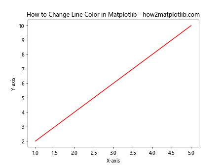
In this example, we’ve created a basic line plot and set the color to ‘red’ using the color parameter in the plot() function. This is the simplest way to change line color in Matplotlib.
Using Hex Color Codes to Change Line Color
Another popular method for changing line color in Matplotlib is using hex color codes. Hex color codes provide a wider range of color options and allow for more precise color selection. Here’s an example of how to change line color in Matplotlib using a hex color code:
import matplotlib.pyplot as plt

x = [1, 2, 3, 4, 5]
y = [2, 4, 6, 8, 10]

plt.plot(x, y, color='#00FF00')
plt.title('How to Change Line Color in Matplotlib - how2matplotlib.com')
plt.xlabel('X-axis')
plt.ylabel('Y-axis')
plt.show()
Output:
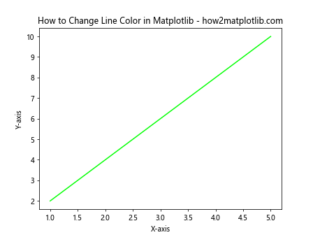
In this example, we’ve used the hex color code ‘#00FF00’ to set the line color to bright green. Hex color codes allow you to specify any color by combining red, green, and blue values in hexadecimal format.
Changing Line Color Using RGB and RGBA Tuples
For even more precise control over line colors, you can use RGB (Red, Green, Blue) or RGBA (Red, Green, Blue, Alpha) tuples. These tuples allow you to specify exact color values and, in the case of RGBA, control the opacity of the line. Here’s an example of how to change line color in Matplotlib using RGB and RGBA tuples:
import matplotlib.pyplot as plt

x = [1, 2, 3, 4, 5]
y1 = [2, 4, 6, 8, 10]
y2 = [1, 3, 5, 7, 9]

plt.plot(x, y1, color=(0.5, 0, 0.5))  # RGB tuple
plt.plot(x, y2, color=(0, 0.8, 0.8, 0.5))  # RGBA tuple
plt.title('How to Change Line Color in Matplotlib - how2matplotlib.com')
plt.xlabel('X-axis')
plt.ylabel('Y-axis')
plt.show()
Output:
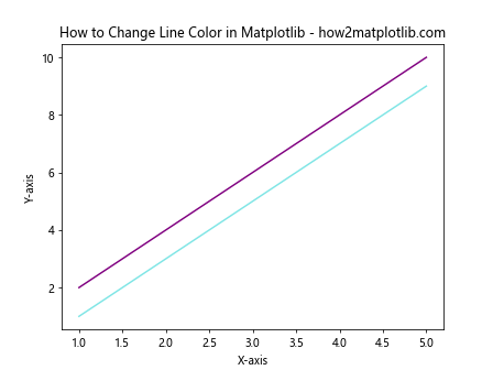
In this example, we’ve created two lines with different colors. The first line uses an RGB tuple (0.5, 0, 0.5) to create a purple color, while the second line uses an RGBA tuple (0, 0.8, 0.8, 0.5) to create a semi-transparent cyan color.
Changing Line Color for Multiple Lines
When working with multiple lines in a single plot, you may want to assign different colors to each line. Matplotlib makes this easy by allowing you to specify colors for each line individually. Here’s an example of how to change line color in Matplotlib for multiple lines:
import matplotlib.pyplot as plt

x = [1, 2, 3, 4, 5]
y1 = [2, 4, 6, 8, 10]
y2 = [1, 3, 5, 7, 9]
y3 = [1, 2, 3, 4, 5]

plt.plot(x, y1, color='red', label='Line 1')
plt.plot(x, y2, color='blue', label='Line 2')
plt.plot(x, y3, color='green', label='Line 3')
plt.title('How to Change Line Color in Matplotlib - how2matplotlib.com')
plt.xlabel('X-axis')
plt.ylabel('Y-axis')
plt.legend()
plt.show()
Output:
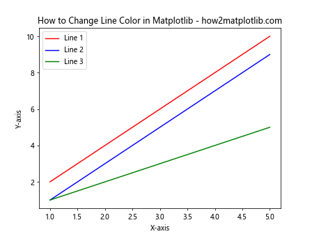
In this example, we’ve created three lines with different colors and added labels to each line. The legend() function is used to display a legend showing the color and label for each line.
Changing Line Color Based on Data Values
Sometimes, you may want to change line color in Matplotlib based on the actual data values. This can be achieved using the LineCollection class from Matplotlib. Here’s an example:
import matplotlib.pyplot as plt
import numpy as np
from matplotlib.collections import LineCollection

x = np.linspace(0, 10, 100)
y = np.sin(x)
z = np.cos(x)

points = np.array([x, y]).T.reshape(-1, 1, 2)
segments = np.concatenate([points[:-1], points[1:]], axis=1)

fig, ax = plt.subplots(figsize=(10, 6))
lc = LineCollection(segments, cmap='coolwarm', norm=plt.Normalize(z.min(), z.max()))
lc.set_array(z)
line = ax.add_collection(lc)
fig.colorbar(line, ax=ax)

ax.set_xlim(x.min(), x.max())
ax.set_ylim(y.min(), y.max())
plt.title('How to Change Line Color in Matplotlib Based on Data Values - how2matplotlib.com')
plt.xlabel('X-axis')
plt.ylabel('Y-axis')
plt.show()
Output:
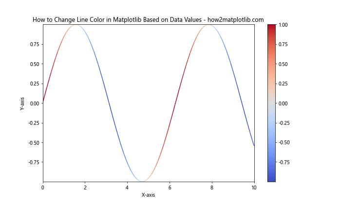
In this example, we’ve created a line plot where the color of the line changes based on the values of a third variable (z). This technique is particularly useful for visualizing multivariate data.
Changing Line Color in Subplots
When working with subplots in Matplotlib, you may want to change line color for each subplot independently. Here’s an example of how to change line color in Matplotlib when using subplots:
import matplotlib.pyplot as plt
import numpy as np

x = np.linspace(0, 10, 100)
y1 = np.sin(x)
y2 = np.cos(x)

fig, (ax1, ax2) = plt.subplots(1, 2, figsize=(12, 5))

ax1.plot(x, y1, color='red')
ax1.set_title('Sine Wave - how2matplotlib.com')
ax1.set_xlabel('X-axis')
ax1.set_ylabel('Y-axis')

ax2.plot(x, y2, color='blue')
ax2.set_title('Cosine Wave - how2matplotlib.com')
ax2.set_xlabel('X-axis')
ax2.set_ylabel('Y-axis')

plt.tight_layout()
plt.show()
Output:

In this example, we’ve created two subplots, each with a different line color. This allows you to customize the appearance of each subplot independently.
Using Custom Color Cycles
Matplotlib provides default color cycles for plotting multiple lines, but you can also create your own custom color cycles. This is useful when you want to change line color in Matplotlib for multiple lines with specific colors of your choice. Here’s an example:
import matplotlib.pyplot as plt
import numpy as np

x = np.linspace(0, 10, 100)
custom_colors = ['#FF1493', '#00BFFF', '#32CD32', '#FFD700', '#FF4500']
plt.rcParams['axes.prop_cycle'] = plt.cycler(color=custom_colors)

for i in range(5):
    plt.plot(x, np.sin(x + i), label=f'Line {i+1}')

plt.title('How to Change Line Color in Matplotlib Using Custom Color Cycles - how2matplotlib.com')
plt.xlabel('X-axis')
plt.ylabel('Y-axis')
plt.legend()
plt.show()
Output:
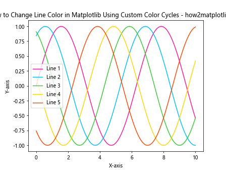
In this example, we’ve defined a custom color cycle using hex color codes and applied it to our plot. This allows you to have full control over the colors used in your visualizations.
Changing Line Color Dynamically
In some cases, you may want to change line color in Matplotlib dynamically based on user input or other conditions. Here’s an example of how to achieve this using interactive widgets:
import matplotlib.pyplot as plt
import numpy as np
from ipywidgets import interact, interactive, fixed
import ipywidgets as widgets

def plot_with_color(color):
    x = np.linspace(0, 10, 100)
    y = np.sin(x)

    plt.figure(figsize=(10, 6))
    plt.plot(x, y, color=color)
    plt.title(f'How to Change Line Color in Matplotlib Dynamically - how2matplotlib.com\nCurrent Color: {color}')
    plt.xlabel('X-axis')
    plt.ylabel('Y-axis')
    plt.show()

interact(plot_with_color, color=['red', 'blue', 'green', 'orange', 'purple']);
This example creates an interactive plot where you can change the line color using a dropdown menu. Note that this code will only work in a Jupyter Notebook environment.
Changing Line Color and Style Simultaneously
When customizing your plots, you might want to change both the line color and style at the same time. Matplotlib allows you to do this easily by combining color and linestyle parameters. Here’s an example:
import matplotlib.pyplot as plt
import numpy as np

x = np.linspace(0, 10, 100)
y1 = np.sin(x)
y2 = np.cos(x)
y3 = np.tan(x)

plt.plot(x, y1, color='red', linestyle='-', label='Sine')
plt.plot(x, y2, color='blue', linestyle='--', label='Cosine')
plt.plot(x, y3, color='green', linestyle=':', label='Tangent')

plt.title('How to Change Line Color and Style in Matplotlib - how2matplotlib.com')
plt.xlabel('X-axis')
plt.ylabel('Y-axis')
plt.legend()
plt.ylim(-2, 2)
plt.show()
Output:
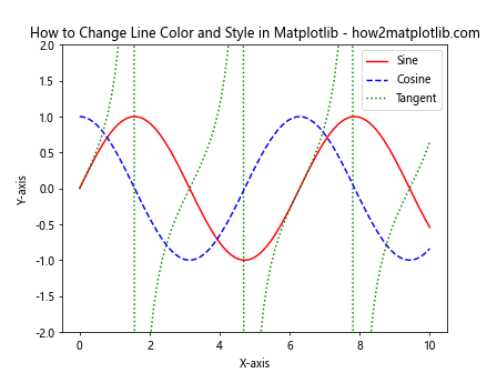
In this example, we’ve changed both the line color and style for three different trigonometric functions, creating a visually distinct plot for each function.
Changing Line Color for Specific Data Ranges
Sometimes, you might want to change line color in Matplotlib for specific ranges of your data. This can be useful for highlighting certain regions or thresholds in your plot. Here’s an example of how to achieve this:
import matplotlib.pyplot as plt
import numpy as np

x = np.linspace(0, 10, 1000)
y = np.sin(x)

fig, ax = plt.subplots(figsize=(10, 6))

ax.plot(x[y >= 0], y[y >= 0], color='red', label='Positive')
ax.plot(x[y < 0], y[y < 0], color='blue', label='Negative')

plt.title('How to Change Line Color in Matplotlib for Specific Data Ranges - how2matplotlib.com')
plt.xlabel('X-axis')
plt.ylabel('Y-axis')
plt.legend()
plt.show()
Output:
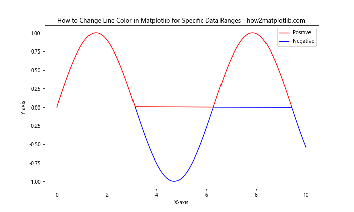
In this example, we've plotted a sine wave with different colors for positive and negative y-values, effectively highlighting the different regions of the function.
Using Color Maps for Continuous Color Changes
When dealing with continuous data, you might want to change line color in Matplotlib smoothly based on a third variable. This can be achieved using color maps and the scatter function. Here's an example:
import matplotlib.pyplot as plt
import numpy as np

x = np.linspace(0, 10, 100)
y = np.sin(x)
z = x

plt.figure(figsize=(10, 6))
plt.scatter(x, y, c=z, cmap='viridis', s=5)
plt.colorbar(label='X-value')
plt.title('How to Change Line Color in Matplotlib Using Color Maps - how2matplotlib.com')
plt.xlabel('X-axis')
plt.ylabel('Y-axis')
plt.show()
Output:
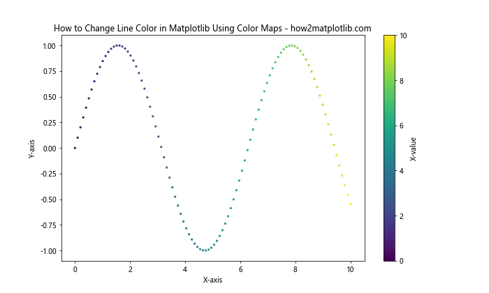
In this example, we've created a scatter plot where the color of each point changes based on its x-value, creating a smooth color transition along the sine wave.
Changing Line Color in 3D Plots
Matplotlib also allows you to create 3D plots, and changing line color in these plots can help distinguish between different data series or highlight specific features. Here's an example of how to change line color in a 3D plot:
import matplotlib.pyplot as plt
import numpy as np

fig = plt.figure(figsize=(10, 8))
ax = fig.add_subplot(111, projection='3d')

t = np.linspace(0, 10, 100)
x = np.cos(t)
y = np.sin(t)
z = t

ax.plot(x, y, z, color='red', label='Spiral')
ax.plot(x, y, 0, color='blue', label='Projection')

ax.set_xlabel('X-axis')
ax.set_ylabel('Y-axis')
ax.set_zlabel('Z-axis')
ax.legend()
plt.title('How to Change Line Color in Matplotlib 3D Plots - how2matplotlib.com')
plt.show()
Output:
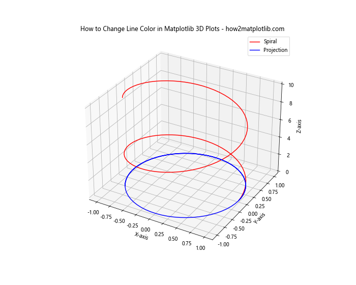
In this example, we've created a 3D spiral plot with a red line and its projection on the xy-plane in blue. This demonstrates how to change line color in Matplotlib for 3D visualizations.
Changing Line Color Based on Categorical Data
When working with categorical data, you might want to assign different colors to different categories. Here's an example of how to change line color in Matplotlib based on categorical data:
import matplotlib.pyplot as plt
import numpy as np
import pandas as pd

np.random.seed(42)
dates = pd.date_range(start='2023-01-01', end='2023-12-31', freq='D')
data = pd.DataFrame({
    'Date': dates,
    'Value': np.cumsum(np.random.randn(len(dates))),
    'Category': np.random.choice(['A', 'B', 'C'], size=len(dates))
})

plt.figure(figsize=(12, 6))
for category, group in data.groupby('Category'):
    plt.plot(group['Date'], group['Value'], label=category)

plt.title('How to Change Line Color in Matplotlib Based on Categorical Data - how2matplotlib.com')
plt.xlabel('Date')
plt.ylabel('Value')
plt.legend()
plt.show()
Output:
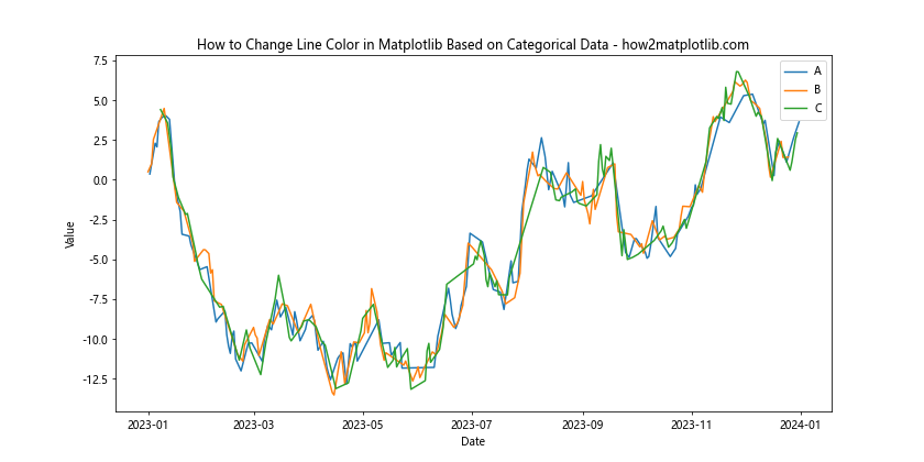
In this example, we've created a line plot where each category (A, B, C) is represented by a different color. This is particularly useful when visualizing time series data with multiple categories.
Changing Line Color in Polar Plots
Matplotlib also supports polar plots, which can be useful for visualizing cyclical data. Changing line color in polar plots follows the same principles as in Cartesian plots. Here's an example:
import matplotlib.pyplot as plt
import numpy as np

theta = np.linspace(0, 2*np.pi, 100)
r1 = 0.5 + np.cos(theta)
r2 = 1 + 0.5 * np.sin(2*theta)

plt.figure(figsize=(8, 8))
ax = plt.subplot(111, projection='polar')
ax.plot(theta, r1, color='red', label='Pattern 1')
ax.plot(theta, r2, color='blue', label='Pattern 2')

plt.title('How to Change Line Color in Matplotlib Polar Plots - how2matplotlib.com')
plt.legend()
plt.show()
Output:
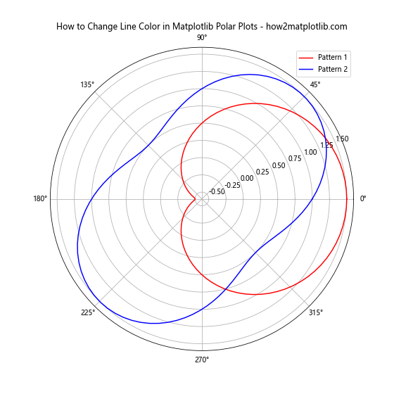
In this example, we've created two different patterns in a polar plot, each with a different color. This demonstrates how to change line color in Matplotlib for polar coordinates.
Changing Line Color Dynamically with Animation
For more interactive visualizations, you might want to change line color dynamically over time. This can be achieved using Matplotlib's animation features. Here's an example:
import matplotlib.pyplot as plt
import numpy as np
from matplotlib.animation import FuncAnimation

fig, ax = plt.subplots(figsize=(10, 6))
x = np.linspace(0, 2*np.pi, 100)
line, = ax.plot(x, np.sin(x), color='red')

def update(frame):
    line.set_ydata(np.sin(x + frame/10))
    line.set_color(plt.cm.viridis(frame / 100))
    return line,

ani = FuncAnimation(fig, update, frames=100, interval=50, blit=True)
plt.title('How to Change Line Color Dynamically in Matplotlib - how2matplotlib.com')
plt.xlabel('X-axis')
plt.ylabel('Y-axis')
plt.show()
Output:
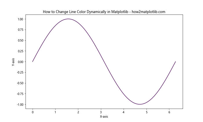
In this example, we've created an animation where both the sine wave and its color change over time. The color transitions through the 'viridis' colormap as the animation progresses.
Conclusion: Mastering Line Color Changes in Matplotlib
Throughout this comprehensive guide, we've explored numerous techniques for changing line color in Matplotlib. From basic color assignments using named colors and hex codes to more advanced techniques like custom colormaps, gradient colors, and dynamic color changes, we've covered a wide range of methods to enhance your data visualizations.
Remember that changing line color is just one aspect of creating effective visualizations with Matplotlib. Combine these techniques with other customization options like line styles, markers, labels, and annotations to create truly informative and visually appealing plots.