How to Change the Color of a Graph Plot in Matplotlib
How to change the color of a graph plot in Matplotlib is an essential skill for data visualization enthusiasts and professionals alike. Matplotlib, a powerful plotting library for Python, offers a wide range of color customization options that can significantly enhance the visual appeal and clarity of your graphs. In this comprehensive guide, we’ll explore various techniques and methods to change the color of graph plots in Matplotlib, providing you with the knowledge and tools to create stunning visualizations.
Understanding Color in Matplotlib
Before diving into the specifics of how to change the color of a graph plot in Matplotlib, it’s crucial to understand how colors are represented in this library. Matplotlib supports various color formats, including:
- Named colors (e.g., ‘red’, ‘blue’, ‘green’)
- Hex color codes (e.g., ‘#FF0000’ for red)
- RGB tuples (e.g., (1, 0, 0) for red)
- RGBA tuples (e.g., (1, 0, 0, 1) for opaque red)
Let’s start with a simple example of how to change the color of a line plot using a named color:
import matplotlib.pyplot as plt

x = [1, 2, 3, 4, 5]
y = [2, 4, 6, 8, 10]

plt.plot(x, y, color='red')
plt.title('How to Change Color in Matplotlib - how2matplotlib.com')
plt.xlabel('X-axis')
plt.ylabel('Y-axis')
plt.show()
Output:
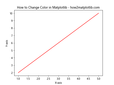
In this example, we’ve set the color of the line to ‘red’ using the color parameter in the plot() function. This is one of the simplest ways to change the color of a graph plot in Matplotlib.
Changing Colors in Different Plot Types
How to change the color of a graph plot in Matplotlib depends on the type of plot you’re creating. Let’s explore how to modify colors in various plot types:
Line Plots
For line plots, you can change the color of the line using the color parameter:
import matplotlib.pyplot as plt

x = [1, 2, 3, 4, 5]
y1 = [2, 4, 6, 8, 10]
y2 = [1, 3, 5, 7, 9]

plt.plot(x, y1, color='#FF0000')  # Red line
plt.plot(x, y2, color='#00FF00')  # Green line
plt.title('How to Change Line Colors - how2matplotlib.com')
plt.xlabel('X-axis')
plt.ylabel('Y-axis')
plt.show()
Output:
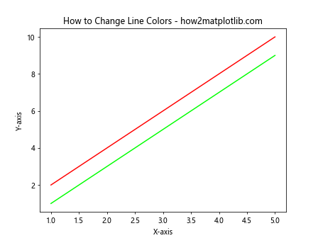
In this example, we’ve used hex color codes to set different colors for two lines in the same plot.
Scatter Plots
For scatter plots, you can use the c parameter to change the color of the markers:
import matplotlib.pyplot as plt
import numpy as np

x = np.random.rand(50)
y = np.random.rand(50)

plt.scatter(x, y, c='purple')
plt.title('How to Change Scatter Plot Colors - how2matplotlib.com')
plt.xlabel('X-axis')
plt.ylabel('Y-axis')
plt.show()
Output:
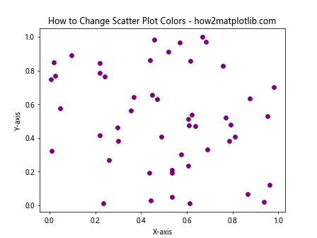
This example demonstrates how to change the color of all markers in a scatter plot to purple.
Bar Plots
To change the color of bars in a bar plot, you can use the color parameter:
import matplotlib.pyplot as plt

categories = ['A', 'B', 'C', 'D']
values = [3, 7, 2, 5]

plt.bar(categories, values, color='orange')
plt.title('How to Change Bar Colors - how2matplotlib.com')
plt.xlabel('Categories')
plt.ylabel('Values')
plt.show()
Output:
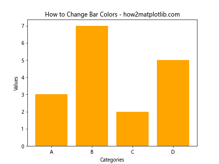
This example shows how to set all bars in a bar plot to orange.
Using Color Maps
Color maps are an excellent way to represent data with a range of colors. Matplotlib provides numerous built-in color maps that you can use to change the color of your graph plots. Here’s an example of how to use a color map in a scatter plot:
import matplotlib.pyplot as plt
import numpy as np

x = np.random.rand(100)
y = np.random.rand(100)
colors = np.random.rand(100)

plt.scatter(x, y, c=colors, cmap='viridis')
plt.colorbar()
plt.title('How to Use Color Maps - how2matplotlib.com')
plt.xlabel('X-axis')
plt.ylabel('Y-axis')
plt.show()
Output:
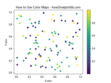
In this example, we’ve used the ‘viridis’ color map to color the scatter plot points based on the values in the colors array.
Customizing Individual Elements
Sometimes, you may want to change the color of specific elements in your graph plot. Matplotlib allows you to do this with ease. Here’s an example of how to change the color of individual bars in a bar plot:
import matplotlib.pyplot as plt

categories = ['A', 'B', 'C', 'D']
values = [3, 7, 2, 5]
colors = ['red', 'green', 'blue', 'yellow']

plt.bar(categories, values, color=colors)
plt.title('How to Change Individual Bar Colors - how2matplotlib.com')
plt.xlabel('Categories')
plt.ylabel('Values')
plt.show()
Output:
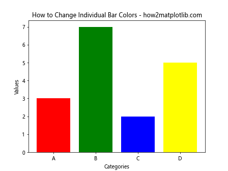
In this example, we’ve assigned different colors to each bar by passing a list of colors to the color parameter.
Changing Colors in Subplots
When working with subplots, you can change the color of each subplot independently. Here’s an example:
import matplotlib.pyplot as plt

fig, (ax1, ax2) = plt.subplots(1, 2, figsize=(10, 4))

x = [1, 2, 3, 4, 5]
y1 = [2, 4, 6, 8, 10]
y2 = [1, 3, 5, 7, 9]

ax1.plot(x, y1, color='red')
ax1.set_title('Subplot 1 - how2matplotlib.com')

ax2.plot(x, y2, color='blue')
ax2.set_title('Subplot 2 - how2matplotlib.com')

plt.tight_layout()
plt.show()
Output:
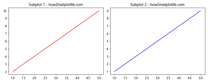
This example demonstrates how to change the color of lines in two different subplots.
Using RGB and RGBA Values
For more precise color control, you can use RGB or RGBA values to change the color of your graph plots. Here’s an example:
import matplotlib.pyplot as plt

x = [1, 2, 3, 4, 5]
y = [2, 4, 6, 8, 10]

plt.plot(x, y, color=(0.1, 0.2, 0.5))  # RGB
plt.title('How to Use RGB Colors - how2matplotlib.com')
plt.xlabel('X-axis')
plt.ylabel('Y-axis')
plt.show()
Output:
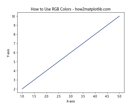
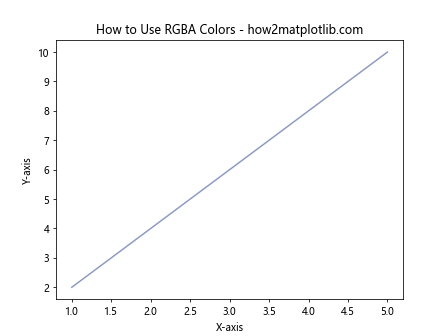
In this example, we’ve used an RGB tuple to set the color of the line. You can also use RGBA values to control transparency:
import matplotlib.pyplot as plt

x = [1, 2, 3, 4, 5]
y = [2, 4, 6, 8, 10]

plt.plot(x, y, color=(0.1, 0.2, 0.5, 0.5))  # RGBA with 50% opacity
plt.title('How to Use RGBA Colors - how2matplotlib.com')
plt.xlabel('X-axis')
plt.ylabel('Y-axis')
plt.show()
Output:
Changing Colors in 3D Plots
Matplotlib also supports 3D plotting, and you can change the colors in these plots as well. Here’s an example of how to change the color of a 3D surface plot:
import matplotlib.pyplot as plt
import numpy as np
from mpl_toolkits.mplot3d import Axes3D

fig = plt.figure()
ax = fig.add_subplot(111, projection='3d')

x = np.arange(-5, 5, 0.25)
y = np.arange(-5, 5, 0.25)
X, Y = np.meshgrid(x, y)
Z = np.sin(np.sqrt(X**2 + Y**2))

surf = ax.plot_surface(X, Y, Z, cmap='coolwarm')
fig.colorbar(surf)

ax.set_title('How to Change Colors in 3D Plots - how2matplotlib.com')
plt.show()
Output:
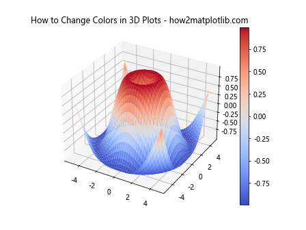
In this example, we’ve used the ‘coolwarm’ color map to color the 3D surface based on the Z values.
Changing Colors Dynamically
You can also change the color of your graph plots dynamically based on data values. Here’s an example of how to change the color of a line plot based on the y-values:
import matplotlib.pyplot as plt
import numpy as np

x = np.linspace(0, 10, 100)
y = np.sin(x)

plt.scatter(x, y, c=y, cmap='viridis')
plt.colorbar()
plt.title('How to Change Colors Dynamically - how2matplotlib.com')
plt.xlabel('X-axis')
plt.ylabel('Y-axis')
plt.show()
Output:
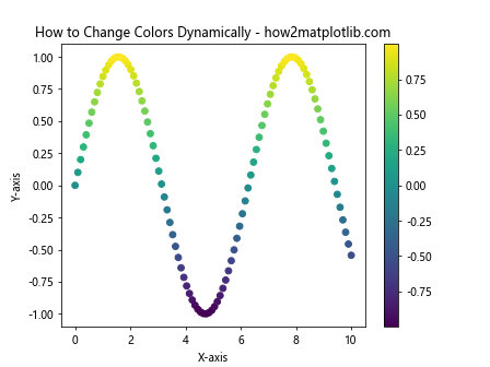
In this example, the color of each point in the scatter plot changes based on its y-value, using the ‘viridis’ color map.
Customizing Color Cycles
Matplotlib uses a default color cycle when plotting multiple lines or data series. You can customize this color cycle to change the colors of your graph plots automatically. Here’s how:
import matplotlib.pyplot as plt
import numpy as np

plt.rcParams['axes.prop_cycle'] = plt.cycler(color=['r', 'g', 'b', 'y'])

x = np.linspace(0, 10, 100)

for i in range(4):
    plt.plot(x, np.sin(x + i))

plt.title('How to Customize Color Cycles - how2matplotlib.com')
plt.xlabel('X-axis')
plt.ylabel('Y-axis')
plt.show()
Output:
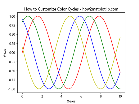
In this example, we’ve set a custom color cycle using plt.rcParams and plt.cycler. The lines will automatically use the colors in the specified order.
Changing Colors in Filled Plots
For filled plots like area plots or filled contour plots, you can change both the fill color and the edge color. Here’s an example of how to change colors in an area plot:
import matplotlib.pyplot as plt
import numpy as np

x = np.linspace(0, 10, 100)
y1 = np.sin(x)
y2 = np.cos(x)

plt.fill_between(x, y1, y2, color='lightblue', alpha=0.5)
plt.plot(x, y1, color='blue', label='sin(x)')
plt.plot(x, y2, color='red', label='cos(x)')
plt.title('How to Change Colors in Filled Plots - how2matplotlib.com')
plt.xlabel('X-axis')
plt.ylabel('Y-axis')
plt.legend()
plt.show()
Output:
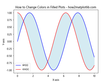
In this example, we’ve used ‘lightblue’ with 50% opacity for the filled area, and blue and red for the lines.
Using Named Colors
Matplotlib provides a wide range of named colors that you can use to change the color of your graph plots. Here’s an example showcasing some of these named colors:
import matplotlib.pyplot as plt

colors = ['dodgerblue', 'limegreen', 'crimson', 'gold', 'purple']
values = [3, 7, 2, 5, 4]

plt.bar(colors, values, color=colors)
plt.title('How to Use Named Colors - how2matplotlib.com')
plt.xlabel('Colors')
plt.ylabel('Values')
plt.show()
Output:
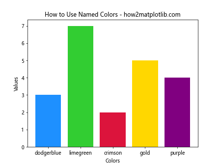
This example demonstrates how to use named colors for both the x-axis labels and the bar colors.
Changing Colors in Heatmaps
Heatmaps are an excellent way to visualize 2D data, and changing their colors can significantly impact the interpretation of the data. Here’s how to change colors in a heatmap:
import matplotlib.pyplot as plt
import numpy as np

data = np.random.rand(10, 10)

plt.imshow(data, cmap='hot')
plt.colorbar()
plt.title('How to Change Colors in Heatmaps - how2matplotlib.com')
plt.show()
Output:
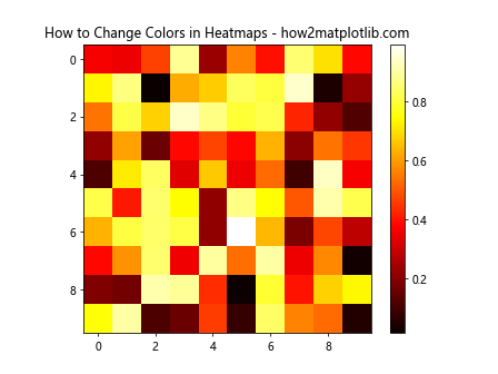
In this example, we’ve used the ‘hot’ color map to represent the data in the heatmap.
Changing Colors in Pie Charts
Pie charts are often used to show proportions, and changing their colors can help distinguish between different categories. Here’s how to change colors in a pie chart:
import matplotlib.pyplot as plt

sizes = [30, 20, 25, 15, 10]
labels = ['A', 'B', 'C', 'D', 'E']
colors = ['#ff9999', '#66b3ff', '#99ff99', '#ffcc99', '#ff99cc']

plt.pie(sizes, labels=labels, colors=colors, autopct='%1.1f%%', startangle=90)
plt.axis('equal')
plt.title('How to Change Colors in Pie Charts - how2matplotlib.com')
plt.show()
Output:
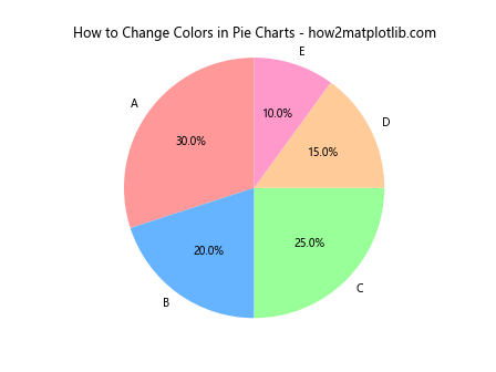
In this example, we’ve used custom hex color codes for each slice of the pie chart.
Conclusion
Learning how to change the color of a graph plot in Matplotlib is a crucial skill for creating effective and visually appealing data visualizations. Throughout this comprehensive guide, we’ve explored various techniques and methods to modify colors in different types of plots, from simple line graphs to complex 3D visualizations.
We’ve covered how to change colors using named colors, hex codes, RGB and RGBA values, and color maps. We’ve also looked at how to customize individual elements, work with subplots, and dynamically change colors based on data values. Additionally, we’ve explored how to change colors in specific plot types like scatter plots, bar charts, heatmaps, and pie charts.
By mastering these techniques, you’ll be able to create more informative and visually striking graphs that effectively communicate your data. Remember, the key to successful data visualization is not just in the data itself, but in how you present it. Thoughtful use of color can make your graphs more readable, highlight important information, and guide your audience’s attention to key insights.