How to Change the Number of Ticks in Matplotlib
How to Change the Number of Ticks in Matplotlib is an essential skill for data visualization enthusiasts and professionals alike. Matplotlib, a powerful plotting library for Python, offers various methods to customize the number of ticks on your plots. In this extensive guide, we’ll explore different techniques to change the number of ticks in Matplotlib, providing you with the knowledge to create visually appealing and informative graphs.
Understanding Ticks in Matplotlib
Before diving into how to change the number of ticks in Matplotlib, it’s crucial to understand what ticks are and their role in data visualization. Ticks are the marks along the axes of a plot that indicate specific values. They help readers interpret the scale and range of the data being presented. Matplotlib allows you to customize these ticks, including their number, position, and appearance.
Types of Ticks in Matplotlib
When learning how to change the number of ticks in Matplotlib, it’s important to know that there are two main types of ticks:
- Major ticks: These are the primary, more prominent ticks on an axis.
- Minor ticks: These are smaller, secondary ticks that appear between major ticks for more precise readings.
Both major and minor ticks can be adjusted to suit your visualization needs.
Basic Methods to Change the Number of Ticks in Matplotlib
Let’s start with some basic methods to change the number of ticks in Matplotlib. These techniques are straightforward and can be applied to most plot types.
Using set_xticks() and set_yticks()
One of the simplest ways to change the number of ticks in Matplotlib is by using the set_xticks() and set_yticks() methods. These methods allow you to explicitly set the positions of the ticks on the x and y axes, respectively.
Here’s an example of how to change the number of ticks in Matplotlib using these methods:
import matplotlib.pyplot as plt
import numpy as np

# Generate data
x = np.linspace(0, 10, 100)
y = np.sin(x)

# Create the plot
plt.figure(figsize=(10, 6))
plt.plot(x, y)

# Set the number of ticks on x-axis
plt.gca().set_xticks(np.arange(0, 11, 2))

# Set the number of ticks on y-axis
plt.gca().set_yticks(np.arange(-1, 1.1, 0.5))

plt.title("How to Change the Number of Ticks in Matplotlib - how2matplotlib.com")
plt.xlabel("X-axis")
plt.ylabel("Y-axis")
plt.grid(True)
plt.show()
Output:
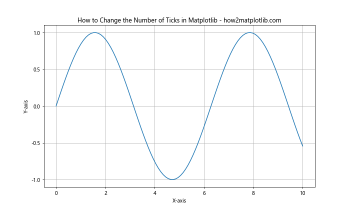
In this example, we’ve set 6 ticks on the x-axis (0, 2, 4, 6, 8, 10) and 5 ticks on the y-axis (-1, -0.5, 0, 0.5, 1). The np.arange() function is used to generate evenly spaced values for the ticks.
Using set_xlim() and set_ylim() with set_xticks() and set_yticks()
When changing the number of ticks in Matplotlib, it’s often useful to combine set_xlim() and set_ylim() with set_xticks() and set_yticks(). This approach allows you to set both the range of the axes and the number of ticks simultaneously.
Here’s an example:
import matplotlib.pyplot as plt
import numpy as np

# Generate data
x = np.linspace(0, 10, 100)
y = np.cos(x)

# Create the plot
plt.figure(figsize=(10, 6))
plt.plot(x, y)

# Set x-axis limits and ticks
plt.xlim(0, 10)
plt.xticks(np.arange(0, 11, 1))

# Set y-axis limits and ticks
plt.ylim(-1, 1)
plt.yticks(np.arange(-1, 1.1, 0.2))

plt.title("How to Change the Number of Ticks in Matplotlib - how2matplotlib.com")
plt.xlabel("X-axis")
plt.ylabel("Y-axis")
plt.grid(True)
plt.show()
Output:
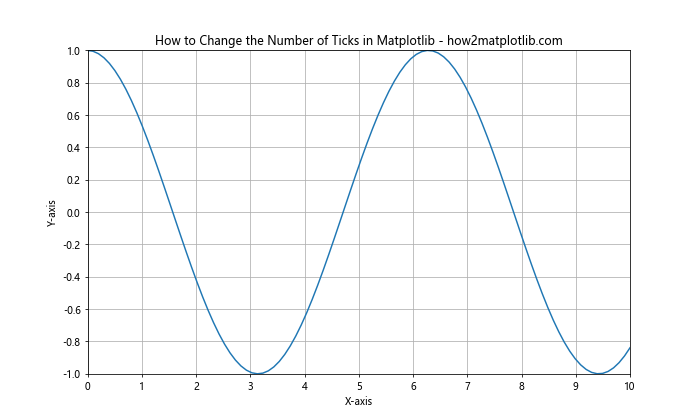
In this example, we’ve set the x-axis range from 0 to 10 with 11 ticks, and the y-axis range from -1 to 1 with 11 ticks. This method gives you precise control over both the range and the number of ticks.
Advanced Techniques to Change the Number of Ticks in Matplotlib
Now that we’ve covered the basics, let’s explore some more advanced techniques to change the number of ticks in Matplotlib. These methods offer greater flexibility and control over your tick placement.
Using MultipleLocator
The MultipleLocator class from Matplotlib’s ticker module is a powerful tool for changing the number of ticks in Matplotlib. It allows you to set ticks at multiples of a given base value.
Here’s an example of how to use MultipleLocator:
import matplotlib.pyplot as plt
import numpy as np
from matplotlib.ticker import MultipleLocator

# Generate data
x = np.linspace(0, 20, 200)
y = np.sin(x)

# Create the plot
fig, ax = plt.subplots(figsize=(12, 6))
ax.plot(x, y)

# Set major ticks on x-axis
ax.xaxis.set_major_locator(MultipleLocator(2))

# Set minor ticks on x-axis
ax.xaxis.set_minor_locator(MultipleLocator(0.5))

# Set major ticks on y-axis
ax.yaxis.set_major_locator(MultipleLocator(0.5))

# Set minor ticks on y-axis
ax.yaxis.set_minor_locator(MultipleLocator(0.1))

plt.title("How to Change the Number of Ticks in Matplotlib - how2matplotlib.com")
plt.xlabel("X-axis")
plt.ylabel("Y-axis")
plt.grid(True)
plt.show()
Output:
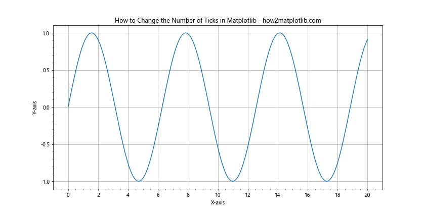
In this example, we’ve set major ticks every 2 units and minor ticks every 0.5 units on the x-axis. For the y-axis, we’ve set major ticks every 0.5 units and minor ticks every 0.1 units. This approach gives you fine-grained control over both major and minor ticks.
Using MaxNLocator
Another useful class for changing the number of ticks in Matplotlib is MaxNLocator. This locator tries to choose the best location for a maximum number of intervals.
Here’s how you can use MaxNLocator:
import matplotlib.pyplot as plt
import numpy as np
from matplotlib.ticker import MaxNLocator

# Generate data
x = np.linspace(0, 15, 150)
y = np.exp(-x/3.0)

# Create the plot
fig, ax = plt.subplots(figsize=(12, 6))
ax.plot(x, y)

# Set the number of ticks on x-axis
ax.xaxis.set_major_locator(MaxNLocator(nbins=10))

# Set the number of ticks on y-axis
ax.yaxis.set_major_locator(MaxNLocator(nbins=8))

plt.title("How to Change the Number of Ticks in Matplotlib - how2matplotlib.com")
plt.xlabel("X-axis")
plt.ylabel("Y-axis")
plt.grid(True)
plt.show()
Output:
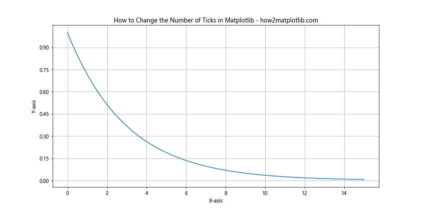
In this example, we’ve used MaxNLocator to set approximately 10 bins (and thus 11 ticks) on the x-axis and 8 bins (9 ticks) on the y-axis. The actual number of ticks may vary slightly as MaxNLocator tries to choose aesthetically pleasing locations.
Customizing Tick Labels When Changing the Number of Ticks in Matplotlib
When you change the number of ticks in Matplotlib, you might also want to customize the tick labels. This can help improve the readability and aesthetics of your plot.
Using set_xticklabels() and set_yticklabels()
After setting the tick locations, you can use set_xticklabels() and set_yticklabels() to customize the tick labels. This is particularly useful when you want to display text labels instead of numerical values.
Here’s an example:
import matplotlib.pyplot as plt
import numpy as np

# Generate data
categories = ['A', 'B', 'C', 'D', 'E']
values = [3, 7, 2, 5, 8]

# Create the plot
fig, ax = plt.subplots(figsize=(10, 6))
ax.bar(categories, values)

# Set x-axis ticks and labels
ax.set_xticks(range(len(categories)))
ax.set_xticklabels(categories)

# Set y-axis ticks and labels
ax.set_yticks(range(0, 10, 2))
ax.set_yticklabels([f'{i}%' for i in range(0, 10, 2)])

plt.title("How to Change the Number of Ticks in Matplotlib - how2matplotlib.com")
plt.xlabel("Categories")
plt.ylabel("Values")
plt.show()
Output:
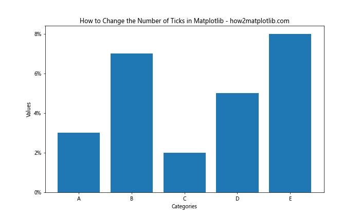
In this example, we’ve created a bar plot with custom x-axis labels (A, B, C, D, E) and y-axis labels (0%, 2%, 4%, 6%, 8%). This technique allows you to change the number of ticks in Matplotlib while also customizing their appearance.
Using FuncFormatter
For more complex label formatting when changing the number of ticks in Matplotlib, you can use the FuncFormatter class. This allows you to define a function that formats the tick labels.
Here’s an example:
import matplotlib.pyplot as plt
import numpy as np
from matplotlib.ticker import FuncFormatter

def currency_formatter(x, p):
    return f"${x:,.0f}"

# Generate data
x = np.linspace(0, 10, 11)
y = x ** 2 * 1000

# Create the plot
fig, ax = plt.subplots(figsize=(12, 6))
ax.plot(x, y)

# Set the number of ticks on x-axis
ax.xaxis.set_major_locator(plt.MaxNLocator(11))

# Set the number of ticks on y-axis and format labels
ax.yaxis.set_major_locator(plt.MaxNLocator(10))
ax.yaxis.set_major_formatter(FuncFormatter(currency_formatter))

plt.title("How to Change the Number of Ticks in Matplotlib - how2matplotlib.com")
plt.xlabel("X-axis")
plt.ylabel("Y-axis (USD)")
plt.grid(True)
plt.show()
Output:
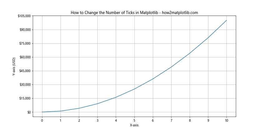
In this example, we’ve defined a custom formatter function currency_formatter that adds a dollar sign and comma separators to the y-axis labels. This technique allows you to change the number of ticks in Matplotlib while also applying complex formatting to the labels.
Changing the Number of Ticks in Matplotlib for Different Plot Types
The techniques for changing the number of ticks in Matplotlib can be applied to various types of plots. Let’s explore how to adjust ticks for some common plot types.
Changing Ticks in Scatter Plots
Scatter plots often benefit from careful tick placement to highlight the distribution of data points. Here’s an example of how to change the number of ticks in Matplotlib for a scatter plot:
import matplotlib.pyplot as plt
import numpy as np

# Generate data
np.random.seed(42)
x = np.random.rand(50) * 10
y = np.random.rand(50) * 10

# Create the scatter plot
fig, ax = plt.subplots(figsize=(10, 8))
ax.scatter(x, y, alpha=0.6)

# Set the number of ticks on both axes
ax.xaxis.set_major_locator(plt.MultipleLocator(1))
ax.yaxis.set_major_locator(plt.MultipleLocator(1))

# Set minor ticks
ax.xaxis.set_minor_locator(plt.MultipleLocator(0.5))
ax.yaxis.set_minor_locator(plt.MultipleLocator(0.5))

plt.title("How to Change the Number of Ticks in Matplotlib - Scatter Plot - how2matplotlib.com")
plt.xlabel("X-axis")
plt.ylabel("Y-axis")
plt.grid(True, which='both', linestyle='--', alpha=0.7)
plt.show()
Output:
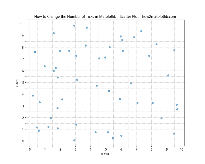
In this example, we’ve set major ticks every 1 unit and minor ticks every 0.5 units on both axes. This helps to provide a clear reference grid for the scattered points.
Changing Ticks in Histograms
When creating histograms, changing the number of ticks in Matplotlib can help to better represent the distribution of data. Here’s an example:
import matplotlib.pyplot as plt
import numpy as np

# Generate data
np.random.seed(42)
data = np.random.normal(0, 1, 1000)

# Create the histogram
fig, ax = plt.subplots(figsize=(12, 6))
n, bins, patches = ax.hist(data, bins=30, edgecolor='black')

# Set the number of ticks on x-axis
ax.xaxis.set_major_locator(plt.MultipleLocator(0.5))
ax.xaxis.set_minor_locator(plt.MultipleLocator(0.1))

# Set the number of ticks on y-axis
ax.yaxis.set_major_locator(plt.MaxNLocator(10))

plt.title("How to Change the Number of Ticks in Matplotlib - Histogram - how2matplotlib.com")
plt.xlabel("Values")
plt.ylabel("Frequency")
plt.grid(True, which='major', linestyle='--', alpha=0.7)
plt.show()
Output:
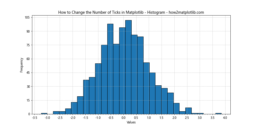
In this histogram example, we’ve set major ticks every 0.5 units and minor ticks every 0.1 units on the x-axis. For the y-axis, we’ve used MaxNLocator to automatically determine an appropriate number of ticks based on the data range.
Advanced Tick Customization Techniques in Matplotlib
As you become more proficient in changing the number of ticks in Matplotlib, you might want to explore some advanced customization techniques. These methods allow for even greater control over the appearance and behavior of your plot’s ticks.
Using LogLocator for Logarithmic Scales
When dealing with data that spans several orders of magnitude, a logarithmic scale can be useful. Matplotlib’s LogLocator is designed to place ticks appropriately on a logarithmic scale.
Here’s an example of how to change the number of ticks in Matplotlib using LogLocator:
import matplotlib.pyplot as plt
import numpy as np
from matplotlib.ticker import LogLocator, ScalarFormatter

# Generate data
x = np.logspace(0, 5, 100)
y = x ** 2

# Create the plot
fig, ax = plt.subplots(figsize=(12, 6))
ax.plot(x, y)

# Set logarithmic scale for both axes
ax.set_xscale('log')
ax.set_yscale('log')

# Set the number of ticks using LogLocator
ax.xaxis.set_major_locator(LogLocator(numticks=10))
ax.yaxis.set_major_locator(LogLocator(numticks=10))

# Format the tick labels to show actual values instead of powers of 10
ax.xaxis.set_major_formatter(ScalarFormatter())
ax.yaxis.set_major_formatter(ScalarFormatter())

plt.title("How to Change the Number of Ticks in Matplotlib - Log Scale - how2matplotlib.com")
plt.xlabel("X-axis (log scale)")
plt.ylabel("Y-axis (log scale)")
plt.grid(True, which='both', linestyle='--', alpha=0.7)
plt.show()
Output:
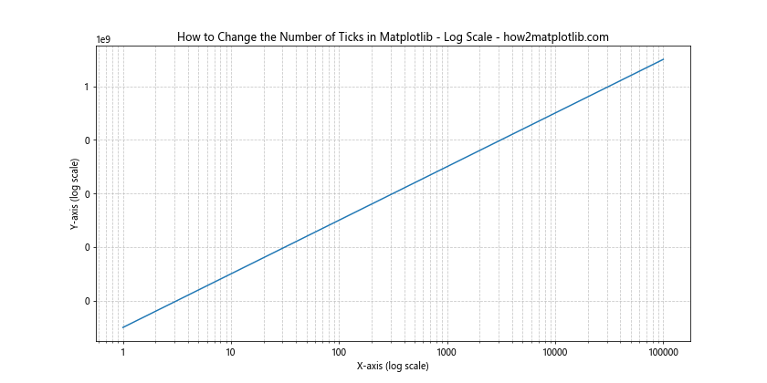
In this example, we’ve used LogLocator to set approximately 10 ticks on both the x and y axes, which are on a logarithmic scale. We’ve also used ScalarFormatter to display the actual values instead of powers of 10.
Using FixedLocator for Custom Tick Positions
Sometimes, you might want to place ticks at very specific positions that don’t follow a regular pattern. In such cases, the FixedLocator class is useful for changing the number of ticks in Matplotlib.
Here’s an example:
import matplotlib.pyplot as plt
import numpy as np
from matplotlib.ticker import FixedLocator

# Generate data
x = np.linspace(0, 10, 100)
y = np.sin(x) * np.exp(-x/10)

# Create the plot
fig, ax = plt.subplots(figsize=(12, 6))
ax.plot(x, y)

# Set custom tick positions
custom_ticks = [0, 0.5, 1, 2, 3, 5, 8, 10]
ax.xaxis.set_major_locator(FixedLocator(custom_ticks))

# Set y-axis ticks
ax.yaxis.set_major_locator(plt.MultipleLocator(0.1))

plt.title("How to Change the Number of Ticks in Matplotlib - Custom Ticks - how2matplotlib.com")
plt.xlabel("X-axis")
plt.ylabel("Y-axis")
plt.grid(True, linestyle='--', alpha=0.7)
plt.show()
Output:
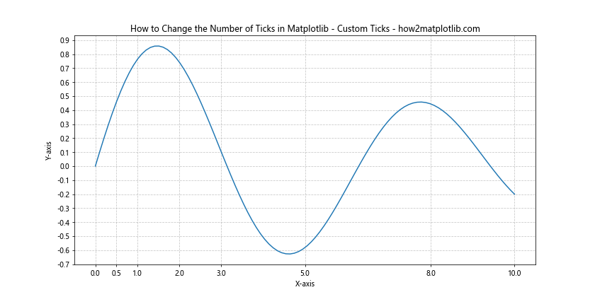
In this example, we’ve used FixedLocator to place ticks at specific positions on the x-axis. This is particularly useful when you want to highlight certain values or intervals in your data.
Handling Overlapping Ticks When Changing the Number of Ticks in Matplotlib
As you experiment with changing the number of ticks in Matplotlib, you might encounter situations where tick labels overlap, especially on the x-axis. Here are some techniques to handle this issue:
Rotating Tick Labels
One common solution is to rotate the tick labels. This works well when you have long labels or many ticks.
import matplotlib.pyplot as plt
import numpy as np

# Generate data
categories = ['Category A', 'Category B', 'Category C', 'Category D', 'Category E', 'Category F', 'Category G']
values = np.random.rand(len(categories))

# Create the plot
fig, ax = plt.subplots(figsize=(12, 6))
ax.bar(categories, values)

# Rotate and align the tick labels so they look better
plt.setp(ax.get_xticklabels(), rotation=45, ha='right')

# Use a tight layout to prevent the labels from going off the bottom of the figure
plt.tight_layout()

plt.title("How to Change the Number of Ticks in Matplotlib - Rotated Labels - how2matplotlib.com")
plt.xlabel("Categories")
plt.ylabel("Values")
plt.show()
Output:
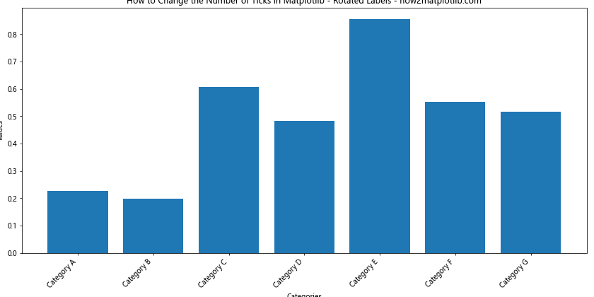
In this example, we’ve rotated the x-axis labels by 45 degrees and aligned them to the right. This allows for more labels to fit without overlapping.
Using Tick Locators with AutoMinorLocator
Another approach to handle overlapping ticks when changing the number of ticks in Matplotlib is to use a combination of major and minor ticks. The AutoMinorLocator can automatically add minor ticks between major ticks.
import matplotlib.pyplot as plt
import numpy as np
from matplotlib.ticker import AutoMinorLocator

# Generate data
x = np.linspace(0, 10, 1000)
y = np.sin(2 * np.pi * x) * np.exp(-x/10)

# Create the plot
fig, ax = plt.subplots(figsize=(12, 6))
ax.plot(x, y)

# Set major ticks
ax.xaxis.set_major_locator(plt.MultipleLocator(1))
ax.yaxis.set_major_locator(plt.MultipleLocator(0.2))

# Add minor ticks
ax.xaxis.set_minor_locator(AutoMinorLocator())
ax.yaxis.set_minor_locator(AutoMinorLocator())

plt.title("How to Change the Number of Ticks in Matplotlib - Major and Minor Ticks - how2matplotlib.com")
plt.xlabel("X-axis")
plt.ylabel("Y-axis")
plt.grid(True, which='both', linestyle='--', alpha=0.7)
plt.show()
Output:
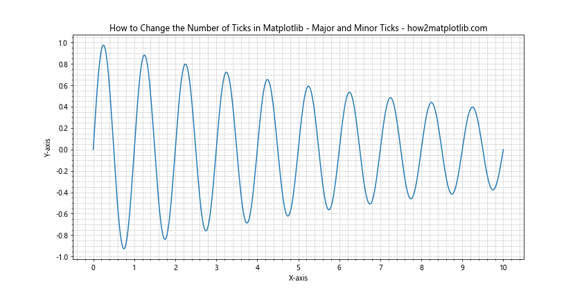
In this example, we’ve set major ticks at regular intervals and used AutoMinorLocator to add minor ticks automatically. This provides more reference points without cluttering the axis labels.
Best Practices for Changing the Number of Ticks in Matplotlib
As you become more comfortable with changing the number of ticks in Matplotlib, it’s important to keep some best practices in mind:
- Balance: Strive for a balance between providing enough information and avoiding clutter. Too many ticks can make a plot hard to read, while too few can make it imprecise.
Consistency: Try to maintain consistency in tick spacing and labeling across different plots in the same project or publication.
Readability: Ensure that tick labels are easily readable. This might involve rotating labels, adjusting font sizes, or using scientific notation for very large or small numbers.
Context: Consider the context of your data. For example, if you’re plotting time series data, you might want to align ticks with meaningful time intervals.
Aesthetics: Remember that tick placement can affect the overall aesthetics of your plot. Well-placed ticks can enhance the visual appeal of your visualization.
Troubleshooting Common Issues When Changing the Number of Ticks in Matplotlib
Even with a good understanding of how to change the number of ticks in Matplotlib, you might encounter some issues. Here are some common problems and their solutions: