Comprehensive Guide to Using Matplotlib.artist.Artist.set_label() in Python for Data Visualization
Matplotlib.artist.Artist.set_label() in Python is a powerful method used in data visualization to set labels for various plot elements. This function is an essential part of the Matplotlib library, which is widely used for creating static, animated, and interactive visualizations in Python. In this comprehensive guide, we’ll explore the ins and outs of Matplotlib.artist.Artist.set_label(), providing detailed explanations and numerous examples to help you master this important aspect of data visualization.
Understanding Matplotlib.artist.Artist.set_label() in Python
Matplotlib.artist.Artist.set_label() in Python is a method that belongs to the Artist class in Matplotlib. It is used to set a label for an Artist instance, which can be any graphical element in a Matplotlib plot, such as lines, markers, text, or patches. The label is typically used in legend creation, allowing you to identify different elements in your plot easily.
The basic syntax for using Matplotlib.artist.Artist.set_label() in Python is as follows:
import matplotlib.pyplot as plt

# Create a plot element (e.g., a line)
line, = plt.plot([1, 2, 3, 4], [1, 4, 2, 3])

# Set the label for the line
line.set_label('Data from how2matplotlib.com')

# Display the legend
plt.legend()

plt.show()
Output:
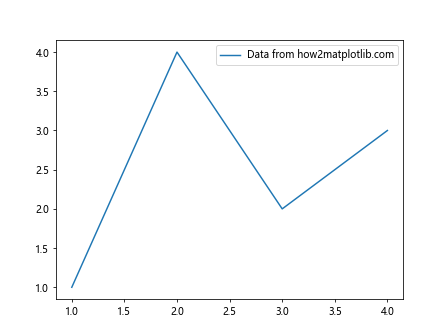
In this example, we create a simple line plot and use Matplotlib.artist.Artist.set_label() in Python to set a label for the line. The label is then displayed in the legend.
The Importance of Matplotlib.artist.Artist.set_label() in Data Visualization
Matplotlib.artist.Artist.set_label() in Python plays a crucial role in creating informative and easy-to-understand visualizations. By setting labels for different plot elements, you can:
- Identify different data series in multi-line plots
- Distinguish between various categories in bar charts or scatter plots
- Provide context for specific elements in complex visualizations
- Enhance the overall readability and interpretability of your plots
Let’s explore some more advanced uses of Matplotlib.artist.Artist.set_label() in Python with detailed examples.
Using Matplotlib.artist.Artist.set_label() with Different Plot Types
Line Plots
Line plots are one of the most common types of visualizations where Matplotlib.artist.Artist.set_label() in Python is frequently used. Here’s an example demonstrating how to use it with multiple lines:
import matplotlib.pyplot as plt
import numpy as np

x = np.linspace(0, 10, 100)
y1 = np.sin(x)
y2 = np.cos(x)

line1, = plt.plot(x, y1)
line2, = plt.plot(x, y2)

line1.set_label('Sine wave from how2matplotlib.com')
line2.set_label('Cosine wave from how2matplotlib.com')

plt.legend()
plt.title('Sine and Cosine Waves')
plt.xlabel('X-axis')
plt.ylabel('Y-axis')

plt.show()
Output:
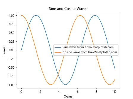
In this example, we create two line plots representing sine and cosine waves. We use Matplotlib.artist.Artist.set_label() in Python to set labels for each line, making it easy to distinguish between them in the legend.
Scatter Plots
Scatter plots are another common visualization where Matplotlib.artist.Artist.set_label() in Python can be very useful. Here’s an example:
import matplotlib.pyplot as plt
import numpy as np

np.random.seed(42)
x1 = np.random.rand(50)
y1 = np.random.rand(50)
x2 = np.random.rand(50) + 0.5
y2 = np.random.rand(50) + 0.5

scatter1 = plt.scatter(x1, y1, c='red', alpha=0.5)
scatter2 = plt.scatter(x2, y2, c='blue', alpha=0.5)

scatter1.set_label('Group A from how2matplotlib.com')
scatter2.set_label('Group B from how2matplotlib.com')

plt.legend()
plt.title('Scatter Plot of Two Groups')
plt.xlabel('X-axis')
plt.ylabel('Y-axis')

plt.show()
Output:
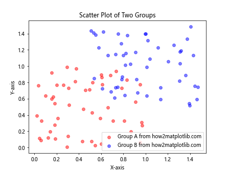
In this scatter plot example, we create two groups of points and use Matplotlib.artist.Artist.set_label() in Python to label each group. This makes it easy to identify which points belong to which group in the legend.
Bar Charts
Bar charts are yet another type of plot where Matplotlib.artist.Artist.set_label() in Python can be very helpful. Here’s an example:
import matplotlib.pyplot as plt
import numpy as np

categories = ['A', 'B', 'C', 'D']
values1 = [4, 7, 2, 5]
values2 = [3, 6, 4, 3]

x = np.arange(len(categories))
width = 0.35

fig, ax = plt.subplots()
rects1 = ax.bar(x - width/2, values1, width)
rects2 = ax.bar(x + width/2, values2, width)

rects1.set_label('Group 1 from how2matplotlib.com')
rects2.set_label('Group 2 from how2matplotlib.com')

ax.set_xlabel('Categories')
ax.set_ylabel('Values')
ax.set_title('Grouped Bar Chart')
ax.set_xticks(x)
ax.set_xticklabels(categories)
ax.legend()

plt.show()
Output:
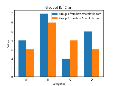
In this grouped bar chart example, we use Matplotlib.artist.Artist.set_label() in Python to label each group of bars. This allows us to easily distinguish between the two groups in the legend.
Advanced Techniques with Matplotlib.artist.Artist.set_label() in Python
Now that we’ve covered the basics, let’s explore some more advanced techniques using Matplotlib.artist.Artist.set_label() in Python.
Setting Labels for Multiple Artists at Once
Sometimes, you may want to set labels for multiple artists at once. Here’s how you can do that:
import matplotlib.pyplot as plt
import numpy as np

x = np.linspace(0, 10, 100)
y1 = np.sin(x)
y2 = np.cos(x)
y3 = np.tan(x)

lines = plt.plot(x, y1, x, y2, x, y3)

for i, line in enumerate(lines):
    line.set_label(f'Line {i+1} from how2matplotlib.com')

plt.legend()
plt.title('Multiple Lines with Labels')
plt.xlabel('X-axis')
plt.ylabel('Y-axis')

plt.show()
Output:
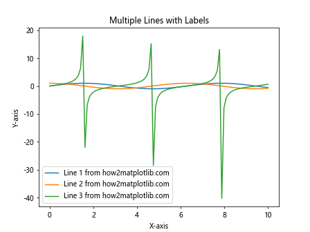
In this example, we create multiple lines and use a loop to set labels for each line using Matplotlib.artist.Artist.set_label() in Python.
Using Matplotlib.artist.Artist.set_label() with Subplots
Matplotlib.artist.Artist.set_label() in Python can also be used effectively with subplots. Here’s an example:
import matplotlib.pyplot as plt
import numpy as np

x = np.linspace(0, 10, 100)
y1 = np.sin(x)
y2 = np.cos(x)

fig, (ax1, ax2) = plt.subplots(1, 2, figsize=(12, 5))

line1, = ax1.plot(x, y1)
line1.set_label('Sine wave from how2matplotlib.com')
ax1.legend()
ax1.set_title('Sine Wave')

line2, = ax2.plot(x, y2)
line2.set_label('Cosine wave from how2matplotlib.com')
ax2.legend()
ax2.set_title('Cosine Wave')

plt.tight_layout()
plt.show()
Output:
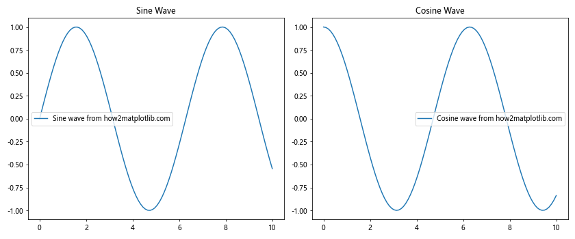
In this example, we create two subplots and use Matplotlib.artist.Artist.set_label() in Python to set labels for the lines in each subplot.
Customizing Label Appearance
You can customize the appearance of labels set with Matplotlib.artist.Artist.set_label() in Python by modifying the legend properties. Here’s an example:
import matplotlib.pyplot as plt
import numpy as np

x = np.linspace(0, 10, 100)
y1 = np.sin(x)
y2 = np.cos(x)

line1, = plt.plot(x, y1)
line2, = plt.plot(x, y2)

line1.set_label('Sine wave from how2matplotlib.com')
line2.set_label('Cosine wave from how2matplotlib.com')

plt.legend(loc='upper right', fontsize=12, frameon=True, fancybox=True, shadow=True)
plt.title('Customized Legend')
plt.xlabel('X-axis')
plt.ylabel('Y-axis')

plt.show()
Output:
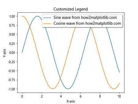
In this example, we use Matplotlib.artist.Artist.set_label() in Python to set labels for two lines and then customize the legend appearance using various parameters.
Common Pitfalls and Best Practices
When using Matplotlib.artist.Artist.set_label() in Python, there are some common pitfalls to avoid and best practices to follow:
- Make sure to call
plt.legend()orax.legend()after setting labels, or the legend won’t appear. - Use clear and concise labels that accurately describe the data or element.
- Avoid setting labels for elements you don’t want to appear in the legend.
- Remember that Matplotlib.artist.Artist.set_label() in Python sets the label for a single artist. For multiple artists, you’ll need to call it multiple times or use a loop.
Here’s an example demonstrating these best practices:
import matplotlib.pyplot as plt
import numpy as np

x = np.linspace(0, 10, 100)
y1 = np.sin(x)
y2 = np.cos(x)

fig, ax = plt.subplots()

line1, = ax.plot(x, y1)
line2, = ax.plot(x, y2)
ax.axhline(y=0, color='k', linestyle='--')  # Horizontal line at y=0

line1.set_label('Sine wave from how2matplotlib.com')
line2.set_label('Cosine wave from how2matplotlib.com')
# We don't set a label for the horizontal line as we don't want it in the legend

ax.legend()
ax.set_title('Sine and Cosine Waves with Best Practices')
ax.set_xlabel('X-axis')
ax.set_ylabel('Y-axis')

plt.show()
Output:
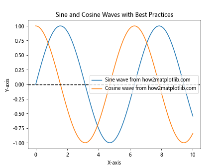
In this example, we follow best practices by setting clear labels, only labeling the elements we want in the legend, and calling ax.legend() after setting the labels.
Matplotlib.artist.Artist.set_label() in Animations
Matplotlib.artist.Artist.set_label() in Python can also be used in animations. Here’s an example of an animated plot where the label changes over time:
import matplotlib.pyplot as plt
import numpy as np
from matplotlib.animation import FuncAnimation

fig, ax = plt.subplots()
x = np.linspace(0, 10, 100)
line, = ax.plot(x, np.sin(x))

def update(frame):
    y = np.sin(x + frame / 10)
    line.set_ydata(y)
    line.set_label(f'Frame {frame} from how2matplotlib.com')
    ax.legend()
    return line,

ani = FuncAnimation(fig, update, frames=range(100), interval=50, blit=True)
plt.show()
Output:
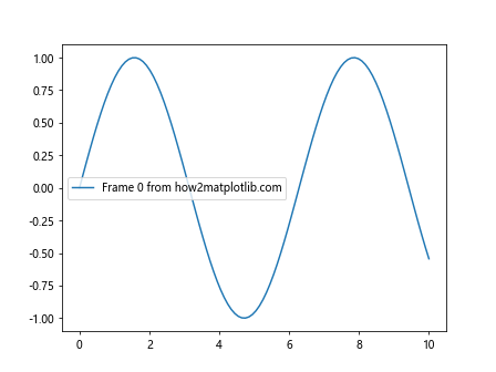
In this animation example, we use Matplotlib.artist.Artist.set_label() in Python to update the label of the line in each frame of the animation.
Matplotlib.artist.Artist.set_label() in 3D Plots
Matplotlib.artist.Artist.set_label() in Python can also be used in 3D plots. Here’s an example:
import matplotlib.pyplot as plt
import numpy as np
from mpl_toolkits.mplot3d import Axes3D

fig = plt.figure()
ax = fig.add_subplot(111, projection='3d')

t = np.linspace(0, 10, 100)
x = np.sin(t)
y = np.cos(t)
z = t

line, = ax.plot(x, y, z)
line.set_label('3D spiral from how2matplotlib.com')

ax.legend()
ax.set_xlabel('X-axis')
ax.set_ylabel('Y-axis')
ax.set_zlabel('Z-axis')
ax.set_title('3D Plot with Label')

plt.show()
Output:
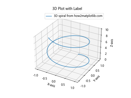
In this 3D plot example, we use Matplotlib.artist.Artist.set_label() in Python to set a label for a 3D spiral.
Matplotlib.artist.Artist.set_label() with Custom Legends
Matplotlib.artist.Artist.set_label() in Python can be used to create custom legends. Here’s an example:
import matplotlib.pyplot as plt
import numpy as np

x = np.linspace(0, 10, 100)
y1 = np.sin(x)
y2 = np.cos(x)

fig, ax = plt.subplots()

line1, = ax.plot(x, y1)
line2, = ax.plot(x, y2)

line1.set_label('Sine wave from how2matplotlib.com')
line2.set_label('Cosine wave from how2matplotlib.com')

# Create a custom legend
legend_elements = [
    plt.Line2D([0], [0], color=line1.get_color(), label=line1.get_label()),
    plt.Line2D([0], [0], color=line2.get_color(), label=line2.get_label()),
    plt.Line2D([0], [0], color='r', linestyle='--', label='Custom line from how2matplotlib.com')
]

ax.legend(handles=legend_elements)
ax.set_title('Plot with Custom Legend')
ax.set_xlabel('X-axis')
ax.set_ylabel('Y-axis')

plt.show()
Output:
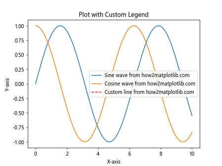
In this example, we use Matplotlib.artist.Artist.set_label() in Python to set labels for two lines and then create a custom legend that includes these labels along with an additional custom element.
Advanced Applications of Matplotlib.artist.Artist.set_label() in Python
Let’s explore some more advanced applications of Matplotlib.artist.Artist.set_label() in Python to further enhance your data visualization skills.
Using Matplotlib.artist.Artist.set_label() with Filled Areas
Matplotlib.artist.Artist.set_label() in Python can be used with filled areas to create informative area plots. Here’s an example:
import matplotlib.pyplot as plt
import numpy as np

x = np.linspace(0, 10, 100)
y1 = np.sin(x)
y2 = np.cos(x)

fig, ax = plt.subplots()

area1 = ax.fill_between(x, 0, y1, alpha=0.3)
area2 = ax.fill_between(x, 0, y2, alpha=0.3)

area1.set_label('Sine area from how2matplotlib.com')
area2.set_label('Cosine area from how2matplotlib.com')

ax.legend()
ax.set_title('Area Plot with Labels')
ax.set_xlabel('X-axis')
ax.set_ylabel('Y-axis')

plt.show()
Output:
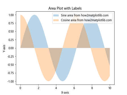
In this example, we use Matplotlib.artist.Artist.set_label() in Python to label filled areas in an area plot.
Matplotlib.artist.Artist.set_label() with Pie Charts
Matplotlib.artist.Artist.set_label() in Python can also be used with pie charts. Here’s an example:
import matplotlib.pyplot as plt

sizes = [30, 20, 25, 15, 10]
labels = ['A', 'B', 'C', 'D', 'E']
colors = ['red', 'green', 'blue', 'yellow', 'orange']

fig, ax = plt.subplots()

wedges, texts, autotexts = ax.pie(sizes, colors=colors, autopct='%1.1f%%', startangle=90)

for i, wedge in enumerate(wedges):
    wedge.set_label(f'{labels[i]} from how2matplotlib.com')

ax.legend(title="Categories")
ax.set_title('Pie Chart with Labels')

plt.show()
Output:
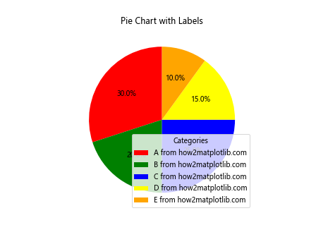
In this pie chart example, we use Matplotlib.artist.Artist.set_label() in Python to set labels for each wedge of the pie.
Using Matplotlib.artist.Artist.set_label() with Histograms
Matplotlib.artist.Artist.set_label() in Python can be applied to histograms as well. Here’s an example:
import matplotlib.pyplot as plt
import numpy as np

np.random.seed(42)
data1 = np.random.normal(0, 1, 1000)
data2 = np.random.normal(2, 1, 1000)

fig, ax = plt.subplots()

n, bins, patches = ax.hist([data1, data2], bins=30, alpha=0.7, density=True)

patches[0][0].set_label('Distribution 1 from how2matplotlib.com')
patches[1][0].set_label('Distribution 2 from how2matplotlib.com')

ax.legend()
ax.set_title('Histogram with Labels')
ax.set_xlabel('Value')
ax.set_ylabel('Frequency')

plt.show()
Output:
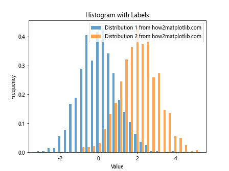
In this histogram example, we use Matplotlib.artist.Artist.set_label() in Python to label different distributions in the histogram.
Matplotlib.artist.Artist.set_label() in Heatmaps
Matplotlib.artist.Artist.set_label() in Python can be used with heatmaps to label different components. Here’s an example:
import matplotlib.pyplot as plt
import numpy as np

data = np.random.rand(10, 10)

fig, ax = plt.subplots()

heatmap = ax.imshow(data, cmap='viridis')
heatmap.set_label('Random data from how2matplotlib.com')

plt.colorbar(heatmap, label='Value')
ax.set_title('Heatmap with Label')
ax.set_xlabel('X-axis')
ax.set_ylabel('Y-axis')

plt.show()
Output:
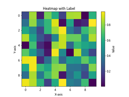
In this heatmap example, we use Matplotlib.artist.Artist.set_label() in Python to set a label for the heatmap itself.
Best Practices for Using Matplotlib.artist.Artist.set_label() in Python
To make the most of Matplotlib.artist.Artist.set_label() in Python, consider the following best practices:
- Be Concise: Keep your labels short and to the point. Long labels can clutter your legend and make it hard to read.
Be Descriptive: While being concise, make sure your labels clearly describe what the plot element represents.
Use Consistent Formatting: If you’re labeling multiple elements, use a consistent format for all labels.
Avoid Redundancy: Don’t repeat information in your labels that’s already present in your axis labels or title.
Use Color Wisely: If you’re using colors to distinguish between different plot elements, make sure your labels correspond to these colors.
Consider Your Audience: Tailor your labels to your audience. Use technical terms if appropriate, but avoid jargon if your audience is general.
Update Labels Dynamically: In interactive or animated plots, consider updating labels dynamically to reflect changing data.
Here’s an example incorporating these best practices: