How to Create a Residual Plot in Python
How to Create a Residual Plot in Python is an essential skill for data scientists and analysts working with regression models. Residual plots are powerful tools for assessing the fit of a model and identifying potential issues such as heteroscedasticity or non-linearity. In this comprehensive guide, we’ll explore various methods and techniques to create residual plots using Python and its popular data visualization library, Matplotlib. We’ll cover everything from basic residual plots to more advanced variations, providing you with the knowledge and skills to effectively analyze your regression models.
Understanding Residual Plots and Their Importance
Before diving into how to create a residual plot in Python, it’s crucial to understand what residual plots are and why they’re important in data analysis. A residual plot is a scatter plot that shows the relationship between the residuals (the differences between observed and predicted values) and the predicted values or independent variables in a regression model.
Residual plots are essential for several reasons:
- Model Fit Assessment: They help evaluate how well a regression model fits the data.
- Assumption Checking: Residual plots can reveal violations of regression assumptions, such as linearity and homoscedasticity.
- Outlier Detection: They can highlight potential outliers or influential points in the dataset.
- Pattern Identification: Residual plots can reveal patterns that suggest the need for model improvements or additional variables.
Now that we understand the importance of residual plots, let’s explore how to create them in Python using Matplotlib.
Basic Residual Plot Creation
To create a basic residual plot in Python, we’ll use Matplotlib along with NumPy for data manipulation. Here’s a simple example of how to create a residual plot:
import numpy as np
import matplotlib.pyplot as plt

# Generate sample data
np.random.seed(42)
x = np.linspace(0, 10, 100)
y = 2 * x + 1 + np.random.normal(0, 1, 100)

# Fit a linear regression model
coeffs = np.polyfit(x, y, 1)
y_pred = np.polyval(coeffs, x)

# Calculate residuals
residuals = y - y_pred

# Create the residual plot
plt.figure(figsize=(10, 6))
plt.scatter(y_pred, residuals, alpha=0.6)
plt.xlabel('Predicted Values')
plt.ylabel('Residuals')
plt.title('How to Create a Residual Plot in Python: Basic Example')
plt.axhline(y=0, color='r', linestyle='--')
plt.text(5, 2, 'how2matplotlib.com', fontsize=12, alpha=0.5)
plt.show()
Output:
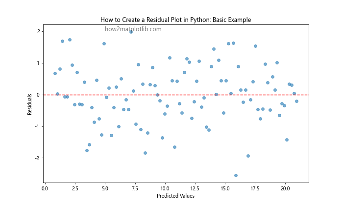
In this example, we first generate sample data with a linear relationship and some added noise. We then fit a linear regression model using NumPy’s polyfit function and calculate the predicted values. The residuals are computed by subtracting the predicted values from the observed values.
The residual plot is created using Matplotlib’s scatter function, with predicted values on the x-axis and residuals on the y-axis. We add a horizontal line at y=0 to help visualize the distribution of residuals around zero.
Creating Residual Plots with Seaborn
While Matplotlib is powerful, Seaborn, a statistical data visualization library built on top of Matplotlib, can simplify the process of creating residual plots. Here’s how to create a residual plot using Seaborn:
import numpy as np
import matplotlib.pyplot as plt
import seaborn as sns

# Generate sample data
np.random.seed(42)
x = np.linspace(0, 10, 100)
y = 2 * x + 1 + np.random.normal(0, 1.5, 100)

# Fit a linear regression model
coeffs = np.polyfit(x, y, 1)
y_pred = np.polyval(coeffs, x)

# Create the residual plot using Seaborn
plt.figure(figsize=(10, 6))
sns.residplot(x=y_pred, y=y-y_pred, lowess=True, scatter_kws={'alpha': 0.5})
plt.xlabel('Predicted Values', fontsize=12)
plt.ylabel('Residuals', fontsize=12)
plt.title('How to Create a Residual Plot in Python: Seaborn Example', fontsize=14)
plt.text(10, 3, 'how2matplotlib.com', fontsize=12, alpha=0.5)
plt.show()
Output:
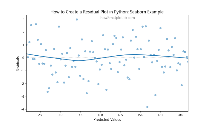
Seaborn’s residplot function automatically creates a residual plot with a fitted line to help identify patterns in the residuals. This can be particularly useful when learning how to create a residual plot in Python, as it provides additional insights into the model’s performance.
Multiple Residual Plots for Comparison
When working with multiple models or variables, it can be helpful to create multiple residual plots for comparison. Here’s an example of how to create multiple residual plots in a single figure:
import numpy as np
import matplotlib.pyplot as plt

# Generate sample data
np.random.seed(42)
x1 = np.linspace(0, 10, 100)
x2 = np.linspace(0, 10, 100)**2
y = 2 * x1 + 0.5 * x2 + 1 + np.random.normal(0, 2, 100)

# Fit linear regression models
coeffs1 = np.polyfit(x1, y, 1)
y_pred1 = np.polyval(coeffs1, x1)
coeffs2 = np.polyfit(x2, y, 1)
y_pred2 = np.polyval(coeffs2, x2)

# Calculate residuals
residuals1 = y - y_pred1
residuals2 = y - y_pred2

# Create multiple residual plots
fig, (ax1, ax2) = plt.subplots(1, 2, figsize=(16, 6))

ax1.scatter(y_pred1, residuals1, alpha=0.6)
ax1.set_xlabel('Predicted Values (Model 1)')
ax1.set_ylabel('Residuals')
ax1.set_title('How to Create a Residual Plot: Model 1')
ax1.axhline(y=0, color='r', linestyle='--')

ax2.scatter(y_pred2, residuals2, alpha=0.6)
ax2.set_xlabel('Predicted Values (Model 2)')
ax2.set_ylabel('Residuals')
ax2.set_title('How to Create a Residual Plot: Model 2')
ax2.axhline(y=0, color='r', linestyle='--')

plt.suptitle('How to Create a Residual Plot in Python: Multiple Models Comparison', fontsize=16)
plt.text(0.5, -0.1, 'how2matplotlib.com', fontsize=12, alpha=0.5, ha='center', transform=fig.transFigure)
plt.tight_layout()
plt.show()
Output:
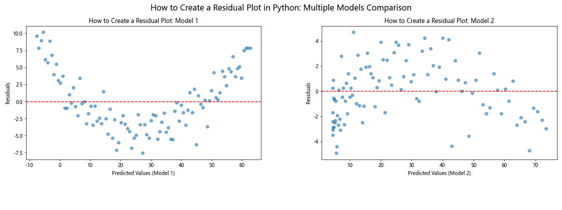
This example demonstrates how to create two residual plots side by side, allowing for easy comparison between different models or variables. This technique is particularly useful when you’re exploring how to create a residual plot in Python for multiple regression analyses.
Residual Plots with Colored Points
Another useful variation when learning how to create a residual plot in Python is to color the points based on a third variable. This can help identify patterns or relationships that might not be apparent in a standard residual plot:
import numpy as np
import matplotlib.pyplot as plt

# Generate sample data
np.random.seed(42)
x = np.linspace(0, 10, 100)
y = 2 * x + 1 + np.random.normal(0, 1.5, 100)
z = np.sin(x) + np.random.normal(0, 0.5, 100)

# Fit a linear regression model
coeffs = np.polyfit(x, y, 1)
y_pred = np.polyval(coeffs, x)

# Calculate residuals
residuals = y - y_pred

# Create the residual plot with colored points
plt.figure(figsize=(12, 8))
scatter = plt.scatter(y_pred, residuals, c=z, cmap='viridis', alpha=0.6, s=80)
plt.colorbar(scatter, label='Z Value')
plt.xlabel('Predicted Values', fontsize=14)
plt.ylabel('Residuals', fontsize=14)
plt.title('How to Create a Residual Plot in Python: Colored by Z Value', fontsize=16)
plt.axhline(y=0, color='r', linestyle='--', linewidth=2)
plt.text(10, 3, 'how2matplotlib.com', fontsize=12, alpha=0.5)
plt.show()
Output:
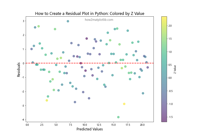
In this example, we’ve added a third variable z and used it to color the points in the residual plot. This can help identify if there’s any relationship between the residuals and this additional variable, which might suggest the need for including it in the model.
Animated Residual Plots
For a more dynamic visualization of how residuals change across different model complexities, we can create an animated residual plot. This can be particularly useful when exploring how to create a residual plot in Python for polynomial regression models of varying degrees:
import numpy as np
import matplotlib.pyplot as plt
from matplotlib.animation import FuncAnimation

# Generate sample data
np.random.seed(42)
x = np.linspace(0, 10, 100)
y = 3 * x**2 - 5 * x + 2 + np.random.normal(0, 10, 100)

# Create the figure and axis
fig, ax = plt.subplots(figsize=(10, 6))

# Initialize scatter plot
scatter = ax.scatter([], [], alpha=0.6)
line, = ax.plot([], [], 'r--')

ax.set_xlabel('Predicted Values')
ax.set_ylabel('Residuals')
ax.set_title('How to Create a Residual Plot in Python: Animated')
ax.text(0.5, 0.02, 'how2matplotlib.com', transform=ax.transAxes, fontsize=12, alpha=0.5, ha='center')

# Animation update function
def update(frame):
    degree = frame + 1
    coeffs = np.polyfit(x, y, degree)
    y_pred = np.polyval(coeffs, x)
    residuals = y - y_pred

    scatter.set_offsets(np.c_[y_pred, residuals])
    line.set_data([min(y_pred), max(y_pred)], [0, 0])

    ax.set_xlim(min(y_pred), max(y_pred))
    ax.set_ylim(min(residuals), max(residuals))

    ax.set_title(f'How to Create a Residual Plot in Python: Degree {degree}')

    return scatter, line

# Create the animation
anim = FuncAnimation(fig, update, frames=5, interval=1000, blit=True)
plt.show()
Output:
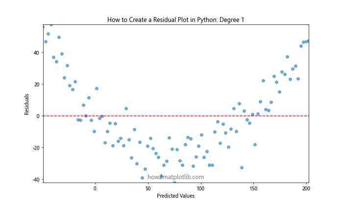
This animated plot shows how the residuals change as we increase the degree of the polynomial regression model. It provides a visual representation of how the model fit improves (or potentially overfits) as complexity increases.
Residual Plots for Time Series Data
When working with time series data, it’s important to consider the temporal aspect when creating residual plots. Here’s an example of how to create a residual plot for time series data:
import numpy as np
import matplotlib.pyplot as plt
import pandas as pd

# Generate sample time series data
np.random.seed(42)
dates = pd.date_range(start='2023-01-01', end='2023-12-31', freq='D')
trend = np.linspace(0, 10, len(dates))
seasonality = 5 * np.sin(2 * np.pi * np.arange(len(dates)) / 365)
noise = np.random.normal(0, 1, len(dates))
y = trend + seasonality + noise

# Create a DataFrame
df = pd.DataFrame({'date': dates, 'value': y})

# Fit a simple linear trend
coeffs = np.polyfit(np.arange(len(dates)), y, 1)
y_pred = np.polyval(coeffs, np.arange(len(dates)))

# Calculate residuals
residuals = y - y_pred

# Create the residual plot
plt.figure(figsize=(12, 8))
plt.scatter(df['date'], residuals, alpha=0.6)
plt.xlabel('Date', fontsize=14)
plt.ylabel('Residuals', fontsize=14)
plt.title('How to Create a Residual Plot in Python: Time Series Example', fontsize=16)
plt.axhline(y=0, color='r', linestyle='--', linewidth=2)
plt.text(df['date'].iloc[-1], max(residuals), 'how2matplotlib.com', fontsize=12, alpha=0.5, ha='right')

# Rotate x-axis labels for better readability
plt.gcf().autofmt_xdate()

plt.show()
Output:
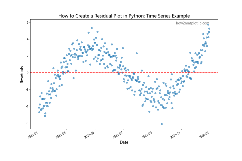
This example demonstrates how to create a residual plot for time series data, which can help identify seasonal patterns or trends that the model hasn’t captured.
Residual Plots with Confidence Intervals
Adding confidence intervals to your residual plots can provide additional insight into the model’s performance. Here’s how to create a residual plot with confidence intervals:
import numpy as np
import matplotlib.pyplot as plt
from scipy import stats

# Generate sample data
np.random.seed(42)
x = np.linspace(0, 10, 100)
y = 2 * x + 1 + np.random.normal(0, 1.5, 100)

## Fit a linear regression model
coeffs = np.polyfit(x, y, 1)
y_pred = np.polyval(coeffs, x)

# Calculate residuals
residuals = y - y_pred

# Calculate confidence intervals
n = len(x)
dof = n - 2
t = stats.t.ppf(0.975, dof)
s_err = np.sqrt(np.sum(residuals**2) / dof)
ci = t * s_err * np.sqrt(1/n + (x - np.mean(x))**2 / np.sum((x - np.mean(x))**2))

# Create the residual plot with confidence intervals
plt.figure(figsize=(12, 8))
plt.scatter(y_pred, residuals, alpha=0.6)
plt.fill_between(y_pred, -ci, ci, alpha=0.2, color='gray')
plt.xlabel('Predicted Values', fontsize=14)
plt.ylabel('Residuals', fontsize=14)
plt.title('How to Create a Residual Plot in Python: With Confidence Intervals', fontsize=16)
plt.axhline(y=0, color='r', linestyle='--', linewidth=2)
plt.text(max(y_pred), max(ci), 'how2matplotlib.com', fontsize=12, alpha=0.5, ha='right')
plt.show()
Output:
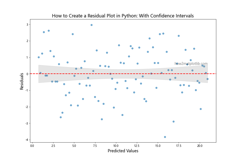
In this example, we calculate the confidence intervals using the t-distribution and add them to the residual plot as a shaded region. This helps visualize the range within which we expect most of the residuals to fall, making it easier to identify potential outliers or heteroscedasticity.
3D Residual Plots
When dealing with multiple independent variables, a 3D residual plot can be useful. Here’s how to create a 3D residual plot in Python:
import numpy as np
import matplotlib.pyplot as plt
from mpl_toolkits.mplot3d import Axes3D

# Generate sample data
np.random.seed(42)
x1 = np.linspace(0, 10, 100)
x2 = np.linspace(0, 10, 100)
y = 2 * x1 + 3 * x2 + 1 + np.random.normal(0, 2, 100)

# Fit a multiple linear regression model
X = np.column_stack((x1, x2))
coeffs = np.linalg.lstsq(np.column_stack((np.ones(len(X)), X)), y, rcond=None)[0]
y_pred = coeffs[0] + coeffs[1] * x1 + coeffs[2] * x2

# Calculate residuals
residuals = y - y_pred

# Create the 3D residual plot
fig = plt.figure(figsize=(12, 8))
ax = fig.add_subplot(111, projection='3d')
scatter = ax.scatter(x1, x2, residuals, c=residuals, cmap='viridis', alpha=0.6)
ax.set_xlabel('X1')
ax.set_ylabel('X2')
ax.set_zlabel('Residuals')
ax.set_title('How to Create a Residual Plot in Python: 3D Example')
plt.colorbar(scatter, label='Residual Value')
ax.text2D(0.05, 0.95, 'how2matplotlib.com', transform=ax.transAxes, fontsize=12, alpha=0.5)
plt.show()
Output:
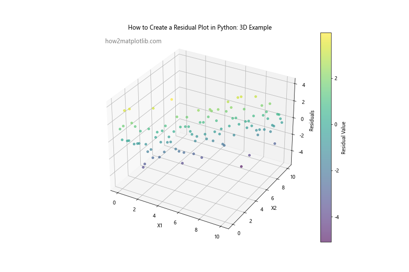
This 3D residual plot allows you to visualize how the residuals vary across two independent variables simultaneously, which can be particularly useful for identifying complex patterns or interactions between variables.
Residual Plots with Marginal Distributions
Combining residual plots with marginal distributions can provide additional insights into the distribution of residuals and predicted values. Here’s how to create such a plot:
import numpy as np
import matplotlib.pyplot as plt
from scipy import stats

# Generate sample data
np.random.seed(42)
x = np.linspace(0, 10, 100)
y = 2 * x + 1 + np.random.normal(0, 1.5, 100)

# Fit a linear regression model
coeffs = np.polyfit(x, y, 1)
y_pred = np.polyval(coeffs, x)

# Calculate residuals
residuals = y - y_pred

# Create the main figure and grid
fig = plt.figure(figsize=(12, 12))
gs = fig.add_gridspec(3, 3)

# Residual plot
ax_main = fig.add_subplot(gs[1:, :-1])
ax_main.scatter(y_pred, residuals, alpha=0.6)
ax_main.set_xlabel('Predicted Values', fontsize=12)
ax_main.set_ylabel('Residuals', fontsize=12)
ax_main.axhline(y=0, color='r', linestyle='--')

# Marginal distribution of predicted values
ax_right = fig.add_subplot(gs[1:, -1], sharey=ax_main)
ax_right.hist(y_pred, orientation='horizontal', bins=20, alpha=0.6)
ax_right.set_xlabel('Count')
ax_right.axhline(y=0, color='r', linestyle='--')

# Marginal distribution of residuals
ax_top = fig.add_subplot(gs[0, :-1], sharex=ax_main)
ax_top.hist(residuals, bins=20, alpha=0.6)
ax_top.set_ylabel('Count')

# Add a normal distribution curve to the residuals histogram
x_norm = np.linspace(min(residuals), max(residuals), 100)
y_norm = stats.norm.pdf(x_norm, np.mean(residuals), np.std(residuals))
ax_top.plot(x_norm, y_norm * len(residuals) * (max(residuals) - min(residuals)) / 20, 'r-', lw=2)

plt.suptitle('How to Create a Residual Plot in Python: With Marginal Distributions', fontsize=16)
plt.text(0.5, 0.02, 'how2matplotlib.com', fontsize=12, alpha=0.5, ha='center', transform=fig.transFigure)
plt.tight_layout()
plt.show()
Output:
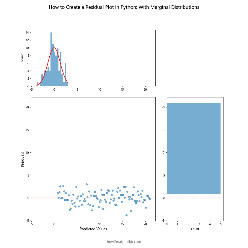
This plot combines the residual scatter plot with histograms showing the distributions of both the predicted values and the residuals. The normal distribution curve added to the residuals histogram helps in assessing whether the residuals follow a normal distribution, which is an important assumption in many regression models.
Residual Plots for Heteroscedasticity Detection
Heteroscedasticity is a common issue in regression analysis, where the variability of residuals is not constant across all levels of the independent variables. Here’s how to create a residual plot specifically designed to detect heteroscedasticity:
import numpy as np
import matplotlib.pyplot as plt

# Generate sample data with heteroscedasticity
np.random.seed(42)
x = np.linspace(0, 10, 100)
y = 2 * x + 1 + np.random.normal(0, 0.5 * x, 100)  # Variance increases with x

# Fit a linear regression model
coeffs = np.polyfit(x, y, 1)
y_pred = np.polyval(coeffs, x)

# Calculate residuals
residuals = y - y_pred

# Create the residual plot for heteroscedasticity detection
plt.figure(figsize=(12, 8))
plt.scatter(y_pred, np.abs(residuals), alpha=0.6)
plt.xlabel('Predicted Values', fontsize=14)
plt.ylabel('Absolute Residuals', fontsize=14)
plt.title('How to Create a Residual Plot in Python: Heteroscedasticity Detection', fontsize=16)

# Add a trend line
z = np.polyfit(y_pred, np.abs(residuals), 1)
p = np.poly1d(z)
plt.plot(y_pred, p(y_pred), "r--", alpha=0.8)

plt.text(max(y_pred), max(np.abs(residuals)), 'how2matplotlib.com', fontsize=12, alpha=0.5, ha='right')
plt.show()
Output:
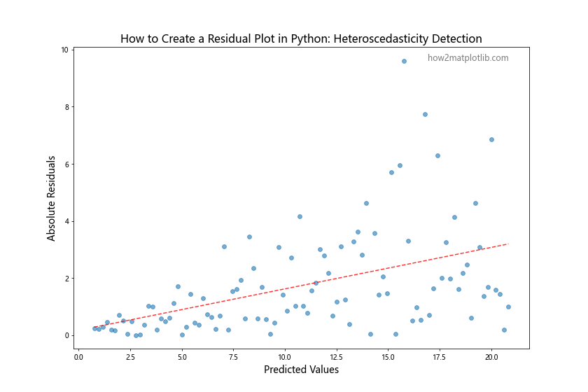
In this example, we plot the absolute values of residuals against predicted values. An upward trend in this plot (as shown by the red dashed line) indicates the presence of heteroscedasticity, where the spread of residuals increases as the predicted values increase.
Residual Plots for Non-Linear Relationships
When dealing with non-linear relationships, it’s important to create residual plots that can reveal these patterns. Here’s an example of how to create a residual plot for a non-linear relationship:
import numpy as np
import matplotlib.pyplot as plt

# Generate sample data with a non-linear relationship
np.random.seed(42)
x = np.linspace(0, 10, 100)
y = 2 * x**2 - 5 * x + 3 + np.random.normal(0, 10, 100)

# Fit a linear regression model (intentionally misspecified)
coeffs = np.polyfit(x, y, 1)
y_pred = np.polyval(coeffs, x)

# Calculate residuals
residuals = y - y_pred

# Create the residual plot
plt.figure(figsize=(12, 8))
plt.scatter(x, residuals, alpha=0.6)
plt.xlabel('X Values', fontsize=14)
plt.ylabel('Residuals', fontsize=14)
plt.title('How to Create a Residual Plot in Python: Non-Linear Relationship', fontsize=16)
plt.axhline(y=0, color='r', linestyle='--', linewidth=2)

# Add a quadratic trend line to highlight the non-linear pattern
z = np.polyfit(x, residuals, 2)
p = np.poly1d(z)
plt.plot(x, p(x), "r-", alpha=0.8)

plt.text(max(x), max(residuals), 'how2matplotlib.com', fontsize=12, alpha=0.5, ha='right')
plt.show()
Output:
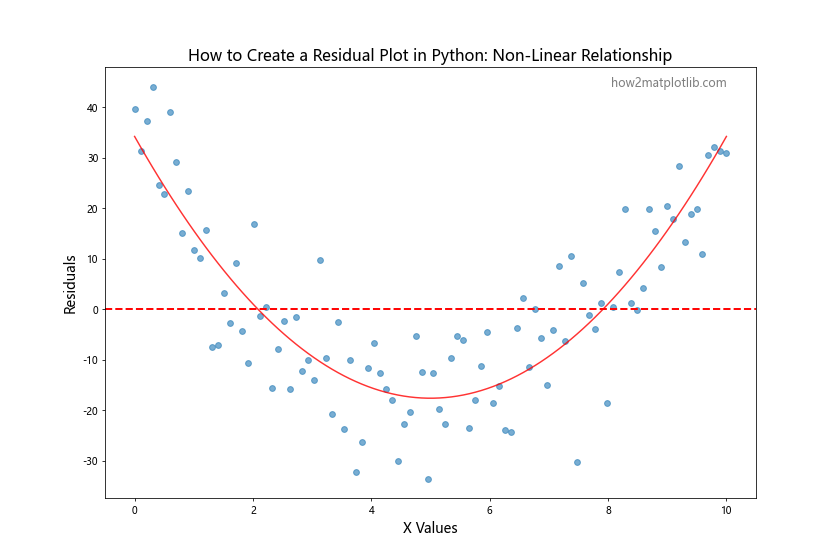
In this example, we’ve intentionally fit a linear model to non-linear data. The resulting residual plot clearly shows a quadratic pattern, indicating that a linear model is not appropriate for this data and that a higher-order polynomial model might be more suitable.
Conclusion
Learning how to create a residual plot in Python is an essential skill for anyone working with regression analysis and data visualization. Throughout this comprehensive guide, we’ve explored various techniques and approaches to creating informative and insightful residual plots using Matplotlib and other Python libraries.
We’ve covered a wide range of topics, including:
- Basic residual plot creation
- Customizing residual plots for better visualization
- Using Seaborn for simplified residual plot creation
- Creating multiple residual plots for model comparison
- Adding color to residual plots to visualize additional variables
- Animating residual plots to show model complexity changes
- Creating residual plots for time series data
- Adding confidence intervals to residual plots
- Creating 3D residual plots for multiple independent variables
- Combining residual plots with marginal distributions
- Detecting heteroscedasticity using residual plots
- Identifying non-linear relationships with residual plots
By mastering these techniques, you’ll be well-equipped to analyze and interpret your regression models, identify potential issues, and make informed decisions about model improvements.
Remember that residual plots are just one tool in the data scientist’s toolkit. They should be used in conjunction with other diagnostic tools and statistical tests to get a comprehensive understanding of your model’s performance and assumptions.