How to Create Boxplots by Group in Matplotlib
How to Create Boxplots by Group in Matplotlib is an essential skill for data visualization in Python. Boxplots are powerful tools for displaying the distribution of data across different categories or groups. In this comprehensive guide, we’ll explore various techniques and best practices for creating boxplots by group using Matplotlib. We’ll cover everything from basic boxplot creation to advanced customization options, providing you with the knowledge and tools to effectively visualize your grouped data.
Understanding Boxplots and Their Importance
Before diving into how to create boxplots by group in Matplotlib, it’s crucial to understand what boxplots are and why they’re valuable for data analysis. Boxplots, also known as box-and-whisker plots, provide a visual summary of the distribution of a dataset. They display the median, quartiles, and potential outliers in a compact and informative manner.
When creating boxplots by group in Matplotlib, you can compare the distributions of multiple categories side by side, making it easy to identify differences and similarities between groups. This is particularly useful when analyzing data with multiple variables or categories.
Basic Boxplot Creation in Matplotlib
Let’s start with the basics of how to create boxplots by group in Matplotlib. We’ll begin with a simple example to illustrate the fundamental concepts.
import matplotlib.pyplot as plt
import numpy as np

# Generate sample data
np.random.seed(42)
group1 = np.random.normal(100, 10, 200)
group2 = np.random.normal(90, 20, 200)
group3 = np.random.normal(110, 15, 200)

# Create boxplot
fig, ax = plt.subplots(figsize=(8, 6))
ax.boxplot([group1, group2, group3], labels=['Group 1', 'Group 2', 'Group 3'])

ax.set_title('How to Create Boxplots by Group in Matplotlib - Basic Example')
ax.set_ylabel('Values')
plt.suptitle('how2matplotlib.com', fontsize=10, color='gray')
plt.show()
Output:
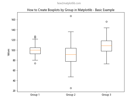
In this example, we create three groups of data using numpy’s random normal distribution. We then use Matplotlib’s boxplot function to create a basic boxplot for these groups. The labels parameter is used to provide names for each group.
Customizing Boxplot Appearance
When learning how to create boxplots by group in Matplotlib, it’s important to know how to customize their appearance. Matplotlib offers various options to modify the colors, styles, and other visual aspects of boxplots.
import matplotlib.pyplot as plt
import numpy as np

np.random.seed(42)
data = [np.random.normal(100, 10, 200),
        np.random.normal(90, 20, 200),
        np.random.normal(110, 15, 200)]

fig, ax = plt.subplots(figsize=(8, 6))
bp = ax.boxplot(data, patch_artist=True)

colors = ['lightblue', 'lightgreen', 'lightpink']
for patch, color in zip(bp['boxes'], colors):
    patch.set_facecolor(color)

ax.set_xticklabels(['Group A', 'Group B', 'Group C'])
ax.set_title('How to Create Boxplots by Group in Matplotlib - Customized Colors')
ax.set_ylabel('Values')
plt.suptitle('how2matplotlib.com', fontsize=10, color='gray')
plt.show()
Output:
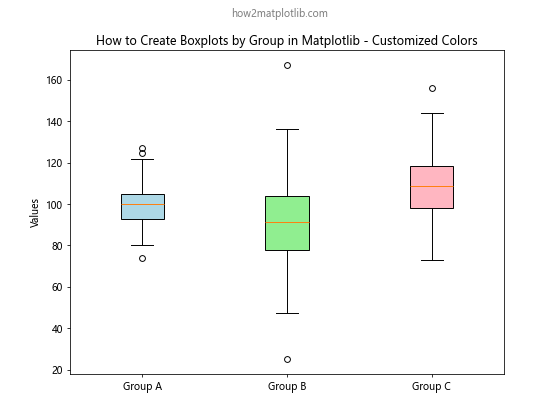
In this example, we use the patch_artist=True parameter to allow filling of the boxes with colors. We then iterate through the boxes and set custom colors for each group.
Adding Data Points to Boxplots
When creating boxplots by group in Matplotlib, you might want to show the individual data points alongside the boxplots. This can provide additional insight into the distribution of the data.
import matplotlib.pyplot as plt
import numpy as np

np.random.seed(42)
data = [np.random.normal(100, 10, 30),
        np.random.normal(90, 20, 30),
        np.random.normal(110, 15, 30)]

fig, ax = plt.subplots(figsize=(10, 6))
bp = ax.boxplot(data, patch_artist=True)

for i, d in enumerate(data):
    y = d
    x = np.random.normal(i+1, 0.04, len(y))
    ax.plot(x, y, 'r.', alpha=0.2)

ax.set_xticklabels(['Group X', 'Group Y', 'Group Z'])
ax.set_title('How to Create Boxplots by Group in Matplotlib with Data Points')
ax.set_ylabel('Values')
plt.suptitle('how2matplotlib.com', fontsize=10, color='gray')
plt.show()
Output:
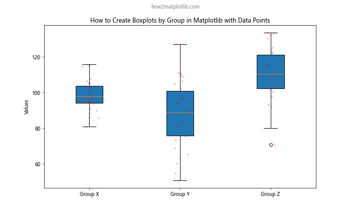
In this example, we add individual data points to the boxplot using ax.plot(). The points are slightly jittered along the x-axis to avoid overlapping.
Creating Horizontal Boxplots
While vertical boxplots are common, you might sometimes want to create horizontal boxplots when learning how to create boxplots by group in Matplotlib. This can be particularly useful when dealing with long category names or when you want to emphasize the comparison between groups.
import matplotlib.pyplot as plt
import numpy as np

np.random.seed(42)
data = [np.random.normal(100, 10, 200),
        np.random.normal(90, 20, 200),
        np.random.normal(110, 15, 200)]

fig, ax = plt.subplots(figsize=(10, 6))
bp = ax.boxplot(data, vert=False, patch_artist=True)

ax.set_yticklabels(['Group Alpha', 'Group Beta', 'Group Gamma'])
ax.set_title('How to Create Boxplots by Group in Matplotlib - Horizontal')
ax.set_xlabel('Values')
plt.suptitle('how2matplotlib.com', fontsize=10, color='gray')
plt.show()
Output:
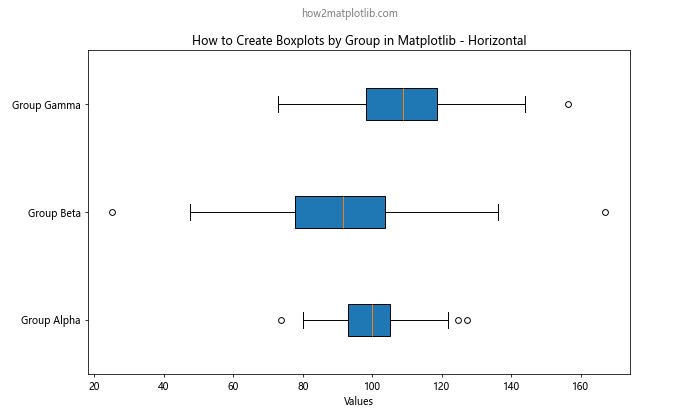
In this example, we use the vert=False parameter in the boxplot function to create horizontal boxplots. We also switch from set_xticklabels to set_yticklabels for labeling the groups.
Comparing Multiple Variables
When learning how to create boxplots by group in Matplotlib, you might encounter situations where you need to compare multiple variables across different groups. Matplotlib allows you to create such complex visualizations easily.
import matplotlib.pyplot as plt
import numpy as np

np.random.seed(42)
data1 = [np.random.normal(100, 10, 200),
         np.random.normal(90, 20, 200),
         np.random.normal(110, 15, 200)]
data2 = [np.random.normal(95, 12, 200),
         np.random.normal(85, 18, 200),
         np.random.normal(105, 14, 200)]

fig, ax = plt.subplots(figsize=(12, 6))
bp1 = ax.boxplot(data1, positions=np.array(range(len(data1)))*2.0-0.4, widths=0.6)
bp2 = ax.boxplot(data2, positions=np.array(range(len(data2)))*2.0+0.4, widths=0.6)

ax.set_xticks(range(0, len(data1) * 2, 2))
ax.set_xticklabels(['Group I', 'Group II', 'Group III'])
ax.set_title('How to Create Boxplots by Group in Matplotlib - Multiple Variables')
ax.set_ylabel('Values')
ax.legend([bp1["boxes"][0], bp2["boxes"][0]], ['Variable A', 'Variable B'], loc='upper right')
plt.suptitle('how2matplotlib.com', fontsize=10, color='gray')
plt.show()
Output:
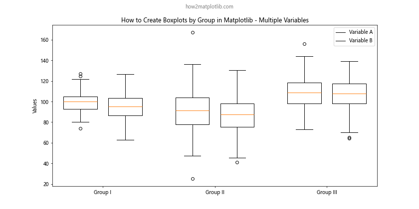
In this example, we create two sets of boxplots side by side for each group. We use the positions parameter to control the placement of each boxplot.
Adding Statistical Annotations
When creating boxplots by group in Matplotlib, it can be helpful to add statistical annotations to provide more context about the data. Let’s see how to add mean values to our boxplots.
import matplotlib.pyplot as plt
import numpy as np

np.random.seed(42)
data = [np.random.normal(100, 10, 200),
        np.random.normal(90, 20, 200),
        np.random.normal(110, 15, 200)]

fig, ax = plt.subplots(figsize=(10, 6))
bp = ax.boxplot(data)

for i, d in enumerate(data):
    mean = np.mean(d)
    ax.text(i+1, mean, f'Mean: {mean:.2f}', horizontalalignment='center', verticalalignment='bottom')

ax.set_xticklabels(['Group 1', 'Group 2', 'Group 3'])
ax.set_title('How to Create Boxplots by Group in Matplotlib with Mean Annotations')
ax.set_ylabel('Values')
plt.suptitle('how2matplotlib.com', fontsize=10, color='gray')
plt.show()
Output:
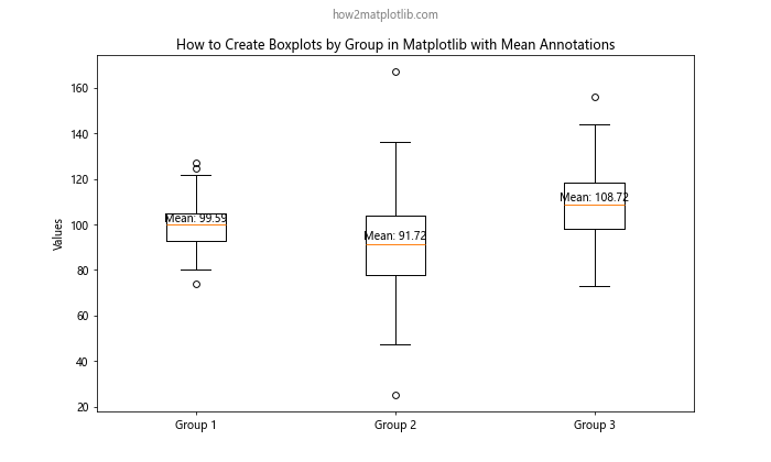
In this example, we calculate the mean for each group and add it as a text annotation above each boxplot.
Creating Grouped Boxplots with Pandas
When learning how to create boxplots by group in Matplotlib, you’ll often work with pandas DataFrames. Pandas integrates well with Matplotlib and provides convenient methods for creating grouped boxplots.
import matplotlib.pyplot as plt
import pandas as pd
import numpy as np

np.random.seed(42)
df = pd.DataFrame({
    'group': np.repeat(['A', 'B', 'C'], 200),
    'values': np.concatenate([
        np.random.normal(100, 10, 200),
        np.random.normal(90, 20, 200),
        np.random.normal(110, 15, 200)
    ])
})

fig, ax = plt.subplots(figsize=(10, 6))
df.boxplot(column='values', by='group', ax=ax)

ax.set_title('How to Create Boxplots by Group in Matplotlib using Pandas')
ax.set_ylabel('Values')
plt.suptitle('how2matplotlib.com', fontsize=10, color='gray')
plt.show()
Output:
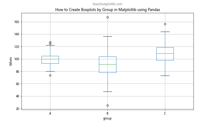
In this example, we create a pandas DataFrame with grouped data and use the boxplot method to create a grouped boxplot directly from the DataFrame.
Customizing Boxplot Elements
When creating boxplots by group in Matplotlib, you have fine-grained control over individual elements of the boxplot. Let’s explore how to customize various components.
import matplotlib.pyplot as plt
import numpy as np

np.random.seed(42)
data = [np.random.normal(100, 10, 200),
        np.random.normal(90, 20, 200),
        np.random.normal(110, 15, 200)]

fig, ax = plt.subplots(figsize=(10, 6))
bp = ax.boxplot(data)

plt.setp(bp['boxes'], color='blue', linewidth=2)
plt.setp(bp['whiskers'], color='green', linestyle='--')
plt.setp(bp['medians'], color='red', linewidth=2)
plt.setp(bp['fliers'], marker='o', markerfacecolor='purple', markersize=8)

ax.set_xticklabels(['Group X', 'Group Y', 'Group Z'])
ax.set_title('How to Create Boxplots by Group in Matplotlib - Customized Elements')
ax.set_ylabel('Values')
plt.suptitle('how2matplotlib.com', fontsize=10, color='gray')
plt.show()
Output:
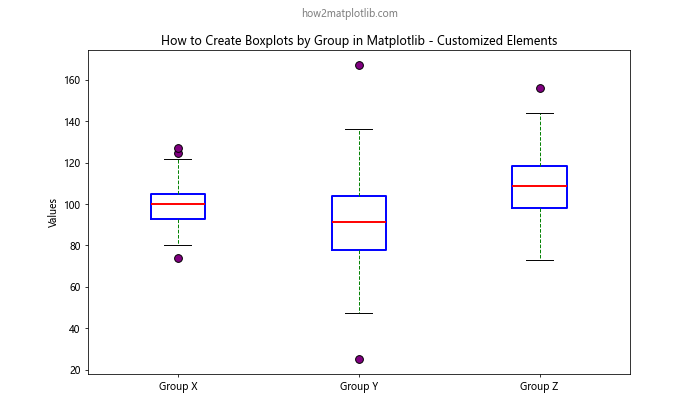
In this example, we use plt.setp() to customize different elements of the boxplot, such as the color and style of boxes, whiskers, medians, and outliers.
Creating Notched Boxplots
Notched boxplots can be useful when you want to show the confidence interval around the median. Here’s how to create notched boxplots when learning how to create boxplots by group in Matplotlib.
import matplotlib.pyplot as plt
import numpy as np

np.random.seed(42)
data = [np.random.normal(100, 10, 200),
        np.random.normal(90, 20, 200),
        np.random.normal(110, 15, 200)]

fig, ax = plt.subplots(figsize=(10, 6))
bp = ax.boxplot(data, notch=True, patch_artist=True)

colors = ['lightblue', 'lightgreen', 'lightpink']
for patch, color in zip(bp['boxes'], colors):
    patch.set_facecolor(color)

ax.set_xticklabels(['Group A', 'Group B', 'Group C'])
ax.set_title('How to Create Boxplots by Group in Matplotlib - Notched Boxplots')
ax.set_ylabel('Values')
plt.suptitle('how2matplotlib.com', fontsize=10, color='gray')
plt.show()
Output:
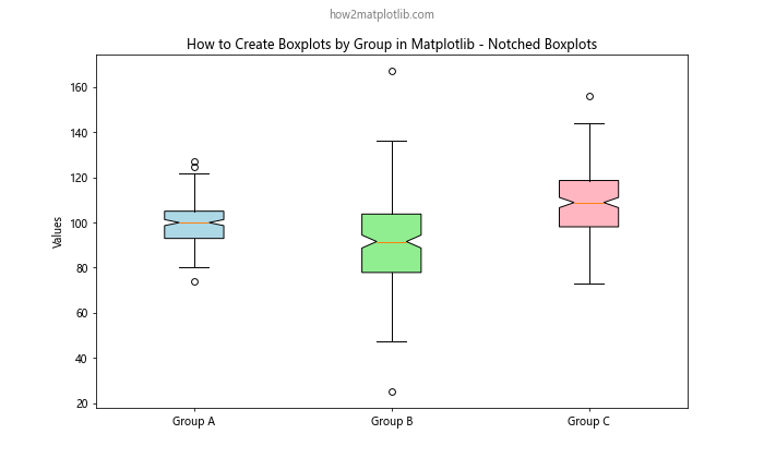
In this example, we use the notch=True parameter to create notched boxplots. The notches represent the 95% confidence interval around the median.
Adding a Violin Plot Overlay
When creating boxplots by group in Matplotlib, you might want to combine them with other plot types for more comprehensive data visualization. Let’s see how to overlay violin plots on boxplots.
import matplotlib.pyplot as plt
import numpy as np

np.random.seed(42)
data = [np.random.normal(100, 10, 200),
        np.random.normal(90, 20, 200),
        np.random.normal(110, 15, 200)]

fig, ax = plt.subplots(figsize=(10, 6))
bp = ax.boxplot(data, patch_artist=True)
vp = ax.violinplot(data, showmeans=True, showextrema=False, showmedians=False)

for body in vp['bodies']:
    body.set_alpha(0.3)

ax.set_xticklabels(['Group 1', 'Group 2', 'Group 3'])
ax.set_title('How to Create Boxplots by Group in Matplotlib with Violin Plot Overlay')
ax.set_ylabel('Values')
plt.suptitle('how2matplotlib.com', fontsize=10, color='gray')
plt.show()
Output:
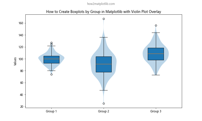
In this example, we create both boxplots and violin plots on the same axes. The violin plots are made semi-transparent to allow the boxplots to be visible underneath.
Creating Boxplots with Subgroups
When learning how to create boxplots by group in Matplotlib, you might encounter situations where you need to visualize subgroups within each main group. Here’s how to achieve this:
import matplotlib.pyplot as plt
import numpy as np

np.random.seed(42)
data = {
    'Group A': [np.random.normal(100, 10, 100), np.random.normal(95, 12, 100)],
    'Group B': [np.random.normal(90, 20, 100), np.random.normal(85, 18, 100)],
    'Group C': [np.random.normal(110, 15, 100), np.random.normal(105, 14, 100)]
}

fig, ax = plt.subplots(figsize=(12, 6))
positions = np.arange(1, len(data) * 3, 3)
colors = ['lightblue', 'lightgreen']

for i, (group, subgroups) in enumerate(data.items()):
    bp = ax.boxplot(subgroups, positions=positions[i] + np.array([-0.4, 0.4]), widths=0.6)

for i, (group, subgroups) in enumerate(data.items()):
    bp = ax.boxplot(subgroups, positions=positions[i] + np.array([-0.4, 0.4]), widths=0.6, patch_artist=True)
    for j, box in enumerate(bp['boxes']):
        box.set_facecolor(colors[j])

ax.set_xticks(positions)
ax.set_xticklabels(data.keys())
ax.set_title('How to Create Boxplots by Group in Matplotlib with Subgroups')
ax.set_ylabel('Values')
ax.legend(['Subgroup 1', 'Subgroup 2'], loc='upper right')
plt.suptitle('how2matplotlib.com', fontsize=10, color='gray')
plt.show()
Output:
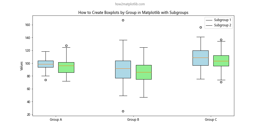
In this example, we create boxplots for subgroups within each main group. We use different colors for each subgroup and position them side by side within their respective main group.
Handling Outliers in Boxplots
When creating boxplots by group in Matplotlib, you might want to customize how outliers are displayed or even remove them entirely. Here’s an example of how to handle outliers:
import matplotlib.pyplot as plt
import numpy as np

np.random.seed(42)
data = [np.random.normal(100, 10, 200),
        np.random.normal(90, 20, 200),
        np.random.normal(110, 15, 200)]

# Add some outliers
data[0] = np.append(data[0], [150, 160])
data[1] = np.append(data[1], [30, 40])
data[2] = np.append(data[2], [180, 190])

fig, (ax1, ax2) = plt.subplots(1, 2, figsize=(15, 6))

# Default boxplot with outliers
bp1 = ax1.boxplot(data)
ax1.set_title('How to Create Boxplots by Group in Matplotlib\nWith Outliers')
ax1.set_ylabel('Values')

# Boxplot with custom outlier representation
bp2 = ax2.boxplot(data, flierprops=dict(marker='o', markerfacecolor='red', markersize=8, linestyle='none'))
ax2.set_title('How to Create Boxplots by Group in Matplotlib\nCustom Outlier Representation')
ax2.set_ylabel('Values')

for ax in (ax1, ax2):
    ax.set_xticklabels(['Group A', 'Group B', 'Group C'])

plt.suptitle('how2matplotlib.com', fontsize=10, color='gray')
plt.tight_layout()
plt.show()
Output:
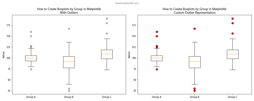
In this example, we create two boxplots side by side. The first shows the default outlier representation, while the second uses custom properties for outliers, making them red circles without connecting lines.
Creating Boxplots with Different Scales
When learning how to create boxplots by group in Matplotlib, you might encounter situations where your groups have significantly different scales. In such cases, you might want to use different scales for each group:
import matplotlib.pyplot as plt
import numpy as np

np.random.seed(42)
data1 = np.random.normal(100, 10, 200)
data2 = np.random.normal(1000, 100, 200)

fig, (ax1, ax2) = plt.subplots(1, 2, figsize=(12, 6))

bp1 = ax1.boxplot([data1, data2])
ax1.set_title('How to Create Boxplots by Group in Matplotlib\nSame Scale')
ax1.set_ylabel('Values')
ax1.set_xticklabels(['Group 1', 'Group 2'])

bp2 = ax2.boxplot([data1, data2], positions=[1, 2], widths=0.6)
ax2.set_yscale('log')
ax2.set_title('How to Create Boxplots by Group in Matplotlib\nLog Scale')
ax2.set_ylabel('Values (log scale)')
ax2.set_xticklabels(['Group 1', 'Group 2'])

plt.suptitle('how2matplotlib.com', fontsize=10, color='gray')
plt.tight_layout()
plt.show()
Output:
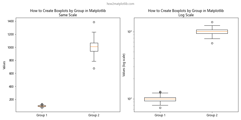
In this example, we create two sets of boxplots. The first uses the same scale for both groups, while the second uses a logarithmic scale to better visualize the differences between the groups with vastly different scales.
Adding Color Gradients to Boxplots
To make your boxplots more visually appealing when creating boxplots by group in Matplotlib, you can add color gradients. Here’s how to achieve this effect:
import matplotlib.pyplot as plt
import numpy as np
from matplotlib.colors import LinearSegmentedColormap

np.random.seed(42)
data = [np.random.normal(100, 10, 200),
        np.random.normal(90, 20, 200),
        np.random.normal(110, 15, 200)]

fig, ax = plt.subplots(figsize=(10, 6))

cmap = LinearSegmentedColormap.from_list("", ["lightblue", "darkblue"])
bp = ax.boxplot(data, patch_artist=True)

for i, box in enumerate(bp['boxes']):
    box.set_facecolor(cmap(i / (len(data) - 1)))

ax.set_xticklabels(['Group X', 'Group Y', 'Group Z'])
ax.set_title('How to Create Boxplots by Group in Matplotlib with Color Gradient')
ax.set_ylabel('Values')
plt.suptitle('how2matplotlib.com', fontsize=10, color='gray')
plt.show()
Output:
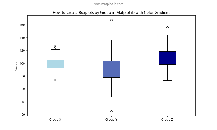
In this example, we create a custom color map using LinearSegmentedColormap and apply it to the boxplots, creating a gradient effect from light blue to dark blue across the groups.
Creating Boxplots with Error Bars
When learning how to create boxplots by group in Matplotlib, you might want to add error bars to show additional statistical information. Here’s an example of how to add error bars to your boxplots:
import matplotlib.pyplot as plt
import numpy as np

np.random.seed(42)
data = [np.random.normal(100, 10, 200),
        np.random.normal(90, 20, 200),
        np.random.normal(110, 15, 200)]

fig, ax = plt.subplots(figsize=(10, 6))

bp = ax.boxplot(data)

for i, d in enumerate(data):
    mean = np.mean(d)
    std = np.std(d)
    ax.errorbar(i+1, mean, yerr=std, fmt='ro', capsize=5, capthick=2)

ax.set_xticklabels(['Group A', 'Group B', 'Group C'])
ax.set_title('How to Create Boxplots by Group in Matplotlib with Error Bars')
ax.set_ylabel('Values')
plt.suptitle('how2matplotlib.com', fontsize=10, color='gray')
plt.show()
Output:
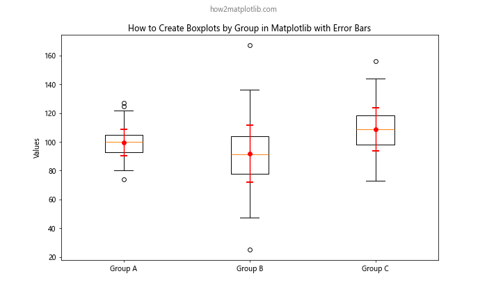
In this example, we add error bars to each boxplot using the errorbar function. The error bars represent one standard deviation above and below the mean for each group.
Creating Boxplots with Swarm Plots
When creating boxplots by group in Matplotlib, you might want to show the individual data points alongside the boxplots. One way to do this is by adding a swarm plot, which shows all data points without overlap. Here’s how to combine boxplots with swarm plots:
import matplotlib.pyplot as plt
import seaborn as sns
import numpy as np
import pandas as pd

np.random.seed(42)
data = pd.DataFrame({
    'group': np.repeat(['A', 'B', 'C'], 200),
    'values': np.concatenate([
        np.random.normal(100, 10, 200),
        np.random.normal(90, 20, 200),
        np.random.normal(110, 15, 200)
    ])
})

fig, ax = plt.subplots(figsize=(10, 6))

sns.boxplot(x='group', y='values', data=data, ax=ax)
sns.swarmplot(x='group', y='values', data=data, color='.25', size=4, ax=ax)

ax.set_title('How to Create Boxplots by Group in Matplotlib with Swarm Plot')
ax.set_ylabel('Values')
plt.suptitle('how2matplotlib.com', fontsize=10, color='gray')
plt.show()
Output:
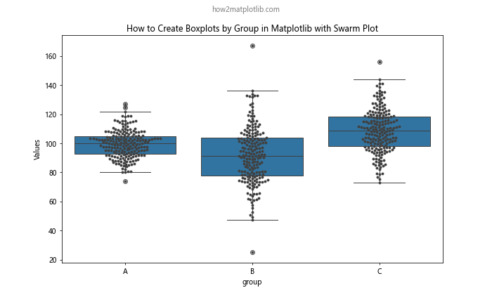
In this example, we use Seaborn (which is built on top of Matplotlib) to create both the boxplot and the swarm plot. The swarm plot adds individual data points to the visualization without overlapping.
Conclusion
In this comprehensive guide on how to create boxplots by group in Matplotlib, we’ve explored a wide range of techniques and customizations. From basic boxplot creation to advanced visualizations combining multiple plot types, you now have the tools to create informative and visually appealing grouped boxplots.
Remember that when creating boxplots by group in Matplotlib, the key is to choose the right visualization for your data and audience. Consider factors such as the number of groups, the scale of your data, and the specific insights you want to highlight.
By mastering these techniques, you’ll be able to create clear, informative, and visually appealing boxplots that effectively communicate the distribution and relationships within your grouped data. Whether you’re working on data analysis, scientific research, or business reporting, the ability to create boxplots by group in Matplotlib is a valuable skill that will enhance your data visualization toolkit.